
Andrew MacLean on the Art and Craft of Head Lopper
Crafting a comic that does unique things with the form is something that greatly interests me, as you may have been able to tell in the look at Island Magazine and 8House last week. There are more than one way to skin a cat, which is a gross saying, but applicable to comics: they don’t all have to be 20 page stories and out. So anytime I see someone try something a bit different, I’m intrigued.
Similarly, when someone tells an exciting adventure story with incredible art, a real sense of personality and a clear vision, my Spidey sense kicks on. More people succumb to the latter than the former, but in rare occasions, my Venn diagram of interests spits out a comic that scratches both itches.
That rare occasion list in 2015 has basically been one comic: Andrew MacLean’s Head Lopper. Its first issue – non self published edition – dropped last month at Image, and it was a monstrous beast of a comic that contained a wonderful and engaging story. Instead of a monthly 20 pager, it’s a beefy quarterly comic that allows MacLean to get as deep into his fantasy story as he wants. Sure, it’s $5.99, but you get three or four times the length of your usual comic within, and it’s oh so glorious.
As a new lover of the story, I reached out to MacLean to talk about the book, his art, and to break down the first issue that was primarily comprised of works he had released in self-published editions before. It provides some great insight into how MacLean – who for my money is one of the most exciting talents in comics – does what he does, and does it so well.
Take a read, and if you dig it, make sure to check out the book. Also, feel free to check out more of his work on his DeviantArt page or follow him on Twitter or Tumblr for all the latest head lopping news.
Let’s start with the origins of Head Lopper. What made it a story you wanted to tell, and how did it end up at Image after being initially something you published yourself?
AM: Like many of the projects I’d like to do someday, it started with a single drawing. I ran a blog called Brand New Nostalgia for awhile where we did weekly drawings on a theme. I think we did one that was either “Viking” or “Metal,” I can’t remember which, but I basically drew an early version of Norgal and Agatha. And couldn’t help but think it was something I’d be happy drawing forever. And as time went by I started to wonder what a story with the duo would be like.
But really, I’ve always been in love with the adventure/fantasy genre. As a kid I remember watching Arnold play Conan, and Ray Harry Harryhausen’s creatures in Clash of the Titans as often as I could. So I kind of try to tap into that feeling with Head Lopper.
At the time I was drawing two books for different writers who were self publishing them (Department O and Colonial Souls) and both of the next scripts were late so I had this chunk of time open up. I had started to get an itch to get something out there of my own writing that was just totally whatever I wanted. So I took advantage of that chunk of time, busted out the first chapter of Head Lopper, and self published it. I don’t even think we pitched it or anything.
Eventually I did the second chapter through a Kickstarter and had been self publishing a bit and I was getting worn out on all of that. I was already working on ApocalyptiGirl (for Dark Horse) at the time and said something on Twitter to the effect of maybe giving up on self publishing all together. Upon seeing that my friend Ryan Ottley took the initiative and recommended to Eric Stephenson that he check out Head Lopper. Eric liked it and that was that.
Big thanks, obviously, to Ryan!
One thing I really enjoyed about the first issue was its atypical size and setup. Instead of a single 20-page issue for $3.99 or something, it’s a giant monster of a comic for $5.99 that combines multiple stories into one glorious feast. It’s also a quarterly. I know you explain this in the back of the book, but what led to that decision? Why did you decide to go with a quarterly schedule and a giant-sized book?
AM: I came to the conclusion from a few angles. Like I mentioned in the back, after doing the second chapter, which is 43 pages I believe, I realized how much more that length made sense to me. I’m trying to make Head Lopper pretty simple and fun (I’ve been referring to each issue like chronological one-shots), and the 23 pages format really limits you. I felt pretty much stuck giving cliffhangers and I didn’t want that. I also want Head Lopper to be an action heavy book with fight scenes going on page after page. There’s just not enough time to establish plot, move all the characters across the board, have a huge fight, etc. within just 23 pages. BUT I can’t pull of a 50-60 page book monthly…
Also, many monthly artists are destroying their bodies and relationships for the job. We’re hunched over tables in the dark of night while our family and friends sleep and go on living their lives without us. I can manage my schedule better on the quarterly schedule, and maybe even spend a weekend or two with my wife… or that’s the goal.
The final factor was the fact that I had self published the first two chapters of Head Lopper #1. I didn’t want my returning readers stuck purchasing things they already owned and I really wanted new readers to get caught up as soon as possible. So putting out a Head Lopper #1 as 96 pages with 3 stories, two previously, self-published, and a third all-new, meant that ALL the readers (returning or new) would be all caught up together, while still giving returning readers a reason to grab Head Lopper #1 without feeling ripped off.
I really didn’t think Image would be crazy about the idea of a a big fat oversized quarterly series, since it just doesn’t happen, but Eric was like, “yeah, cool, whatever you want.” And so here we are.
The comic and your art definitely have a Mignola feel to them, even down to the vaguely British isles feel to the world (Norgal’s adventures are reminiscent of Hellboy’s post B.P.R.D. adventures in a very good and original way). It’s entirely its own story though, and you give it a unique style. Beyond just comics, what inspired Norgal’s story and his world, and do you envision this this book as a grander, ongoing tale or more vignettes of Norgal’s life going forward?
AM: Yeah, in large part Mignola is the reason I got into comics as an adult. Towards the end of high school I stopped reading them and then later, after seeing Hellboy pop up here and there, I got curious and checked it out. Mike’s work got me totally reinvigorated for the medium as a whole. So in the early days of working out what my style would be, I was HEAVILY influenced by Mike. Its only over a handful of years that I’ve been able to bring a slew of other artists into the mix. I imagine I’ll always have a bit of that influence in there.
Beyond comics I love books, movies, and music like anyone else. Some of my favorite things to read are the Lord of The Rings, The Song of Ice and Fire, Conan, Dune, Frankenstein, anything. I’m constantly digging around for more adventure books. I love violent and quirky movies, particularly Quentin Tarantino. Hell, I intentionally made the cover to Head Lopper #1 yellow and red in honor of Kill Bill. And I love heavy metal music, which deals a lot with swords and sorcery and other badass things. Head Lopper is a big celebration of all the things I love.
For the first quarterly, the first two stories already existed but in a new package. Going forward, it’s all new, all the time. Is the plan to stay consistent with the way the first issue played out – three stories with transitions in-between them – or is this going to depend entirely on what you come up with as you’re developing each issue?
AM: No, it doesn’t stick with that format actually. Going forward they will read most closely to Part Two in Head Lopper #1. One longer story contained within a single issue. That said, it will all come to a head in the fourth and final issue of the series. My HOPE is we get to do move into another series after a trade comes out, but I haven’t mentioned it to Image yet, but the possibilities are endless where I can take these characters.
What’s your process for creating a Head Lopper story, and what tools do you use in creating the art of the book?
AM: I basically picture each issue or chapter as being a different trial for Norgal and Agatha to overcome, while all the other characters may shift around and scheme in the background, Norgal and Agatha have one specific thing to overcome (or likely kill) right in front of them. So I usually start with figuring out what trial I want to see the duo pitted against, which basically breaks down to what creature/monster and in what setting. Then I look at the background characters like Queen Abigail, Barra, Lulach, the Abbott, The Ferryman, and the Sisters of the Hill, and figure out what moves do I have to make with them in each issue to get them where they need to be by Head Lopper #4.
Most of that I keep in my head, if it gets too heavy I make notes or a bullet list. But when it comes to writing the thing (though I have a scene by scene breakdown in my head) I don’t watch the page count, I just sit down and start scripting – though its nice to try to set up dramatic reveals and whatnot on a page turn, so I aim for that. But otherwise I just let it rip and see where we end up when the end feels right.
Scripting done, I draw the thing. Layout, to pencil, to ink (with a brush), scan, and off to color wizard, Mike Spicer, back to me for letters and writing edits, and done.
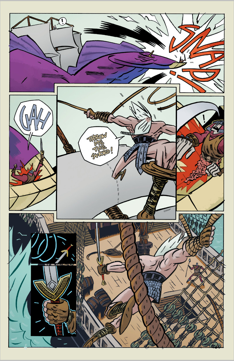
This page is pretty damn genius if you ask me. I really love the middle tier and the interaction between the three panels, with Norgal in the larger, popped out one. There are an array of very clever pages and panel layouts throughout this book, all playing with time and interaction in interesting ways. What’s your approach to laying out a page? Are you tackling that all in one fell swoop or are you adjusting on the fly?
AM: Over time, I’ve learned to make my approach to layouts be more and more about clarity and maximizing space for the most important moments/panels. These days, while I try to vary the panel orientation – horizontal vs landscape – the layouts themselves are pretty simple I think. Like the page in question, I often split the page in my mind into thirds, where you sort of read left to right three times. It’s not so much for aesthetic reasons as it is, like previously mentioned, maximizing space and clarity.
But sometimes I get bored and mix it up. The only times are start putting panels on slants and awkward angles is when the scene is hectic enough that I don’t mind throwing off the reader a bit, because if they were there in person it would be total chaos.
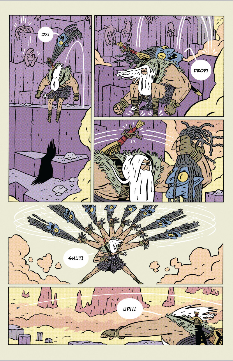
You letter the book yourself, and it leads to some really exciting and surprising choices in that regard. This page showcases your changes in both size and color for Norgal and the poor soldier. I probably know the answer, but is this hand lettered or computer lettered, and was the choice to letter it yourself part of its DIY roots or because you had a specific vision for it?
AM: Well, this first Image issue is split into three parts. The first two parts I previously self-published as independent comics and the third is all new for the Image release. I used to hand letter everything because I like the way it looks having everything come from the same hand (and to me digital art on top of hand art is a little jarring). But the hand lettering added another two to four hours of work per page, so eventually I caved and found a font that looks similar to my hand. So on the second part of the Image release (the second self-published comic I made) it switches to a digital font.
I letter things myself for a couple reasons. First, I’ll be happiest with its outcome when I do it myself. Second, it’s much cheaper for me because with an Image book like mine, I have to hire/pay my co-creators myself. And finally and most importantly (especially with digital lettering), I get one last chance to edit my own writing. Somewhere in making the art things will get pushed around, added to, subtracted from, and so the comic has changed since writing the script. This gives me one last chance to look it over, make the writing the way I want it to be AND make sure it still all looks nice sitting on top of the art.
So yeah, the page above is hand-lettered.
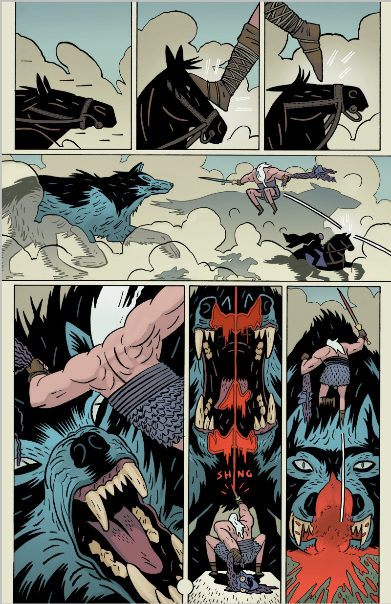
Another thing I enjoy about your storytelling is how you use motion in panels. There are several good examples in the fight with the wolves, but I love this section in particular, especially with the way the first three panels show Norgal’s bold move in the beginning. When it comes to bigger action sequences like this, how much do you choreograph it out before you get to the actual drawing phase? And beyond that, what do you think it takes to make a comic action sequence work visually?
AM: I choreograph it all out. I usually have it worked out in my head and then script it pretty specifically move by move. I’m not trying to fool anyone; Head Lopper is an ACTION book.
What has worked for me thus far in action sequences is just giving it the room to breathe and develop – which is a major reason why Head Lopper is a huge oversized comic released quarterly.
When I script the action, I try to write them for only three or four panels per page so we can see backgrounds, see where the character is coming from and where they will end in their motions (unless they are kind of zoom-in panels like in the page above) but sometimes only one or two panels per page. So the major fights go on page after page. I don’t have a lot of dialogue during fights; they really are all about the action.
The other thing I try to do is have a lot of interactions. Meaning, I try to use elements that aren’t characters. Like here, Norgal enters the battle by jumping off the face of a horse. Think of the action in the Pirates of the Caribbean movies. What made them so fun and quirky was all the interaction with elements around them, not just sword fights and face punching, but the characters were swinging on ropes or running along the walls of a crumbling building or something. I do my best to do those types of things – though it’s easier said then done.
SFX are always a fun thing, especially when you used in clever ways. And I really love the “SHING” sound that’s made after Norgal completes his swipe, and how his cut makes the “I” in the sound. Where do SFX come into your process of work, and how much of that is spur of the moment versus pre-planned back in the script phase?
AM: I don’t script any of the SFX. They honestly become more of a visual element then a story telling bit. I only use them if they fit nicely into the art or if I think the art is unclear without it.
In this case, with the SHING, it was the first cut of the fight so it felt appropriate. And the main reason I used the motion line as the “I” was just that SHING is a five-lettered word and I REALLY wanted it centered. Luckily that middle letter was an “I.” Not sure a “K” would have worked well (laughs).
Let’s talk about the two leads: Norgal and Agatha. Personally, I’m #TeamAgatha all the way, as she’s a blast, but I tend to think she’s pretty happy where she is despite Norgal’s occasional distaste for her. You talked about some of your influences before, but when it came to creating and finalizing their look, did you have any specific inspiration for their looks or was it more just you riffing on the “Viking” or “Metal” concepts?
AM: (laughs) Yeah, someday I’d like to address why they stick together but for the moment I really enjoy just telling the tales of their travels.
But yeah, it’s just a total riff on the Viking/barbarian/heavy metal/monster slayer/ fantasy/swords/sorcery stuff. I don’t really think I’m reinventing the wheel here, just having fun playing with toys.
I do think it’s inevitable your inspirations shine through though. Starting out I was trying to create something that would tap into how I felt as a kid watching Schwarzenegger play Conan and Clash of the Titans with Ray Harryhausen’s monsters.
Typically with books that have head lopping and dark magic and double-crosses and things of that sort, you get stories of singular tones. Funereal is a good word for it. But Head Lopper’s a lot of fun, in some ways. Agatha in specific gives the book an occasional lighthearted vibe (despite her nature), and a lot of times the book feels more like an adventure than anything truly dark. It’s also quite often a very bright book, color wise. Tonally speaking, are you looking to keep things not so grim, both in writing and visuals?
AM: Honestly, I try not to think about it too much. I don’t want to handcuff myself. I come up with ideas, and if I like them, I use them. I don’t find myself saying to myself, “oh that’s too this or that’s too that…” I just follow my gut. For instance, I didn’t set out specifically to make something funny, but there were times where I added something I thought was funny, added it because I liked it, but also thought at best someone reading it would crack a little smile – but people seem to think its really funny.
But yeah, I’m just having fun and I hope that shines through above all.
You can buy Head Lopper #1 at your local comic book shop or digitally today. Seriously. Do it today. You won’t regret it. This is a really good comic.