
Matt Battaglia Talks Comic Marketing and the Art of Indoctrination
The comic art newcomer dishes on the craft behind his new Z2 Comics series
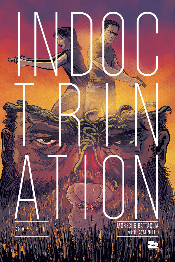
There’s been much discussion about the volume of comics coming out these days, but one of the things that naturally comes with that is there are more publishers releasing them these days as well. Small shops like Z2 Comics have sprung up over the past few years, and for the most part, I haven’t heard a whole lot about what they’re up to, but that’s changed with some recent announcements, including the upcoming Indoctrination from writer Michael Moreci and artist Matt Battaglia.
Indoctrination’s about the influence the leader of an ISIS like organization has, and the efforts of the few who stand against them. It definitely has a True Detective like vibe, pairing procedural elements with the supernatural. Battaglia’s a newcomer, having worked as a colorist in comics on books like Roche Limit (also with Moreci), but he’s someone who has already fostered an interesting career in and out of comics, including time at digital comics giant comiXology. Naturally, I was interested in someone with a multi-faceted role in comics, so Battaglia and I chatted via email about his art, his experience at comiXology, how he and Moreci are marketing this book, how Indoctrination has come together, as well as looking at some of the pages from the first issue with him. Give it a read, and look for Indoctrination #1 in June.
Everyone has their story behind how they built up their art skills, whether it’s going to art school or being self-taught or some combination of both. What’s your backstory, and what made you first want to apply that to comic art?
MB: The early years are pretty hazy, I remember my first introduction into comics was Transformers issues my Grandpa had bought me, you know the G1 Marvel stuff. I’m certain I was always drawing since a young age, though I didn’t take any “school art classes” till High School, still lifes were not of interest to me. The Kubert School was the next town over from where I grew up, and my de facto ‘summer camp’ was Saturdays learning from Fernando Ruiz (Archie vs Predator). I went to college at Rutgers for Graphic Design since that’s a far more reliable career path then banking on “comics”. So beyond the academic points, I just try to keep a sketchbook draw from life (oh how the tables have turned…) when I can, and just keep plugging away at getting better.
For you, you actually made your way into being a comic artist through another role: being a colorist. Was it your objective to use that as a gateway into doing line art? Or is color an important aspect of your approach and that was just a natural progression of your career in comics?
MB: Actually, I never had any inclination to do any coloring, I used to always hate it. But I was drawing a pitch (The Devil’s Hitman) and we had a guy who was going to color it, and I was just battering the poor soul with feedback, to the point where I colored a page in and basically said “this” – at which point I realized I’m a jerk and no one should have to suffer collaborating with me on art duties, so I started coloring it myself. Those pages found their way online and Eric & Chris at BOOM! reached out to me about coloring Dead Letters. Early on there I ended up talking with Marissa Louise and Jordan Boyd who gave me a ton of good tips on how to get better at coloring and actually Jordan hooked me up with Mike when he left Roche Limit vol. 2. But the process of getting into professional comics coloring was more an accident.
At this point though color is one of my favorite aspects of the process, it ties the room together and helps me cover up a lot of the inadequacies in my lineart. I do approach it from a more design standpoint, though, and I do a lot of my work through different layer adjustments and less through any kind of painting approach (attached a couple screens so you can see what I’m talking about).
You’ve worn a couple hats in the comics industry, as in the past, you worked for ComiXology to…some capacity. I’m sure you can’t dig too deep into it, but what was your role there, and I’m curious if you took anything away from that experience as to what works and what doesn’t in comics that you might look to apply to your own work?
MB: Yeah, I worked there as a designer, did work for the site and email marketing, the Facebook ads that you’ve likely seen pop up every now and then are from a template I designed. I learned a lot there about how the digital side of the market works, and it’s interesting. A lot of the sure fire hits are just that, hits. Batman, Walking Dead, Saga, those all do great, obviously. The teachable moment is that you do have a lever to pull there, in the sense that it’s one of the few sales avenues in the comics market where you can (at least somewhat) track your efficacy. If you want to buy some online ads or anything like that, sending people to your comiXology page is one of the few ways to actually make conversion. There’s no clear way to do that for print, which is unfortunate, although I think readers of SKTCHD likely are aware of the difficulties that come with Direct Market sales.
Before getting into the actual meat of Indoctrination as a product, I wanted to ask about how you and Mike are promoting this book. I know you’re taking some unusual – at least for comics – directions with that, especially with digital efforts as you attempt to make your sales channels more trackable. What’s your approach for promoting this book, and what made you want to think a bit outside the box on how comics are typically marketed?
MB: I spent a couple years working in politics at a SuperPAC during the last presidential cycle, where I was doing design for a lot of list building and general advocacy and activation of the community. My general goal here is to put some of those skills to work, test things out and hopefully build an audience for the book. Currently you can sign up for our list and get a download of the preview pages formatted for digital (think Private Eye). Things will be ramping up as we get closer to release. The other aspect is that since the book has a pretty political bend to it, we’re going to be pushing into some different spaces there too. A lot of these things are just starting to kick off so there should be some more reports on this as we get closer to release.
One of the things we’re exploring is making sure we can get the book into the hands of those who aren’t in the Direct Market audience. Going back to working at comiXology, one of the things that I feel very strongly about is that the direct market audience, the digital audience, and the online/book market print purchaser, are three distinctly different customers. The DM audience is loyal to comics as a medium but also the shop as a sort of social outing as well, this is an experience that is simply not duplicated elsewhere. Digital is more of either a casual reader, just take a glance at the top 10 best sellers in any given week, or someone looking to round out their backmatter collection through sales.
There’s one audience that’s simply not served for single issues, and that’s the online/book market buyer – this person will pick up a trade on Amazon or in store at a Barnes & Noble – so we’re trying to work out some ways to capture that market as well while still respecting the DM process. It’s something that we’re starting to see Image dabble in with their print subscriptions, Marvel’s had print subscriptions for a while (heck I used to subscribe to Daredevil & Punisher back in the day…), but it’s really something I think the industry as a whole needs more of.
You’re a rare person who has approached comics from inside the digital realm, as part of the production side of comics, and as a person who has real world experience in generating response within communities. That’s quite the trifecta. While this could overlap with your last answer, I’m curious, short of a complete overhaul of how distribution works, what would you like to see more of from comics to better “activate the community” of comics as you roughly said in regards to your political work?
MB: We’re at a time when people consume comics of some form or another on a daily basis, so there’s a massive untapped audience. Also consider the success that graphic novels have had in the (for lack of the technical word that’s escaping me at the moment) teen girl books market. Clearly readers are into the product. It’s just a matter of getting it into the right hands. Anyway, I think we need to change the system.
Digital books are priced well above what the market’s willing to spend. Look, outside of extremely high demand books, people generally trend towards buying things when they (inevitably) go on sale. Injustice may not be the best book, but it’s a top seller week over week on digital because it’s such a low stakes investment. I think one of the first things that the industry can do is treat its verticals differently. Consider, a digital comic takes about maybe 10-15 minutes to read on your phone and then you’re done with it. Digital comics are the most disposable version of the form. Price them as such. The industry has generally decided that all must be treated equally, but the products – print and digital – are fundamentally different. Would you price a vinyl version of an album and a digital download of an album the same? No, of course not, the music’s the same but they’re a very different product for different consumers. You hamstring growth by not treating the different avenues as just that – different.
There’s also the issue of – if you’re not a direct market consumer – how do you get a floppy (presuming you don’t want to buy digital)? Try explaining pre-orders and FOC numbers to the average consumer, if you read books you either go to a bookstore see if they have it, and if they don’t you go online and buy it from one of many other options. In comics? Not so much. Image has taken a step in upping their online store game but their print subscriptions are priced too high for them to be entry-level friendly. I’d really like to see publishers or creators take on a model of selling print online. I actually think that Chuck Foresman has done a great job with his Patreon model for Revenger.
I think if we saw a more accessible market we’d all do better. Because at the moment it’s hard to stand out on shelves at a comic shop. You see a lot of talk in the twitter-sphere about over flooding the market, but the solution never seems to be broaden it – expand into online sales – it tends to lean towards “the Big 2 must cancel books!” If the DM isn’t working for your book, there are options. We need to get better at taking advantage of those because I guarantee if you can move copies online, you’ll be front and center in the DM in no time.
Your current project is Indoctrination, a new book you’re putting together with your Roche Limit collaborator, Michael Moreci. What made you want to team with Michael again, and what made Indoctrination the kind of story you both wanted to tell?
MB: Mike and I were just talking about projects we had lying around one night, and he shot me the sort of one pager on Indoctrination, this was sometime after I had read that Atlantic piece on ISIS, and the pitch definitely echoed a lot of things that I was thinking about. I saw this great hook for me to have an outlet to tie these two seemingly disparate sides of my interests, because after leaving D.C. I only got more interested and involved in our political climate and the comics work had started taking off at the same time as my leaving D/C.
Working with Mike is always solid – buddy’s a workman and an excellent writer. The pitch hooked me immediately and we’ve been cranking ever since.
To my knowledge – and I’m almost invariably wrong about these things – this is the first comic project you’re providing line art for. Or at least “major” project. What’s your process like (including what tools you use to create your art), and do you find yourself refining that process even as you work on Indoctrination?
MB: First “major” project is correct. I did I think the first 10 pages of the first issue traditionally (brush and ink, yada yada yada) but I’m all digital now. Digital makes sense for a ton of reasons though, time concerns, ease of travel, so I can work on the train if I want, or when I go to visit my folks I’m not lugging all this gear, it’s just my Surface Book tossed in my backpack and I’m good to go. I no longer have to deal with scanning pages, I can easily fix things. Also I have zero pretenses about selling my pages, it’s just not worth the extra time.
My process starts with a grid (I won’t lie, I totally aped Phillips’ Criminal grid), I’ll pull the script up on the left side of my screen, Photoshop on the other and I just draw out the panels borders, I never subtract panels from Mike’s script but sometimes I’ll add in a few here and there for dialogue or I know that I won’t be able to draw the thing clear enough in one so I add an extra to mask my inadequacies. I’ll usually panel out a scene at a time, then I’ll go ahead and sketch in layouts, pulling or taking photo reference as needed and dropping into a folder in the Photoshop doc (I’ll save scenes with guns to layout for weekends when I’ll drop by my folks house, my dad’s gotten into guns and so he gets to serve as reference).
Once the layouts are done I’ll “ink” (all stages are done using Kyle Webster’s brushes), usually I do faces first, but I’ll jump around. Once a page is inked I just send them off to my flatter (this saves me so much time, and really the only thing I’ll ‘flat’ myself is the covers). Once he’s done I’ll go and change out the colors to match the characters and that stuff, then I’ll do my coloring, this is actually the fastest part of the process, because my process is done in essentially two layer masks (sometimes one), and a series of layer adjustments.
I do tend to work in spasms, so I’ll layout a page open up another ink a few panels, get bored, panel out a scene, realize I have flats from the flatter, so I’ll fix the colors on the flats to match my palette, get bored again, go ink, then go back to doing the coloring.
I’m constantly trying to figure out more efficient ways to work, I moved at the beginning of March which really messed up my scheduled for a bit, but I think I’m over that. The one major key is – I realized I can no longer work with a movie on in the background, I have to put on a record in order to focus in, putting on music from my computer or streaming just introduces more distraction. On weekends I like to do the obnoxiously yuppie thing where I go to this coffee joint (that’s not a Starbucks) nearby and sit there and work because there’s nothing to really distract me, I’m not thinking “hm… laundry?” Or the floor could really use a vacuuming, or my dog wants me to stop neglecting her.
I hate to ask cliche questions, but I look at the first panel and all I can think of is Ben Templesmith. Everything from the colors to the mood and linework makes me think of him. And oddly, a lot of your characters and character work makes me think of Matt Kindt. Who and what are your art influences, both in and out of comics?
MB: I’ve obviously read Ben Templesmith, and I enjoyed his work way back on Fell, but honestly I would never have cited him as an influence, though I can see where it’d come from. Also funny enough, I’m aware of Matt Kindt – but I’ve never read any of his work. I’d cite Phillips as an influence, I like the economy of his storytelling, I have to do the cliche thing and cite Frank Miller since discovering DKR was what got me back into reading comics when I was in high school, there was a stretch where a lot of my work looked very Miller-esque. I think I was doing things more traditionally I really was trying to stretch for some Paul Pope style. I find music to be a big influence, but more in the sense that it reminds me to think about tone, so obviously Bruce (the IFC stuff with a Devils & Dust quote, that’s me…), but also Josh Ritter has been getting a lot of spinning time. I watch less TV & movies nowadays just because I’ve realized slowly that I can’t have them on in the background while working anymore. I guess I’m getting old…
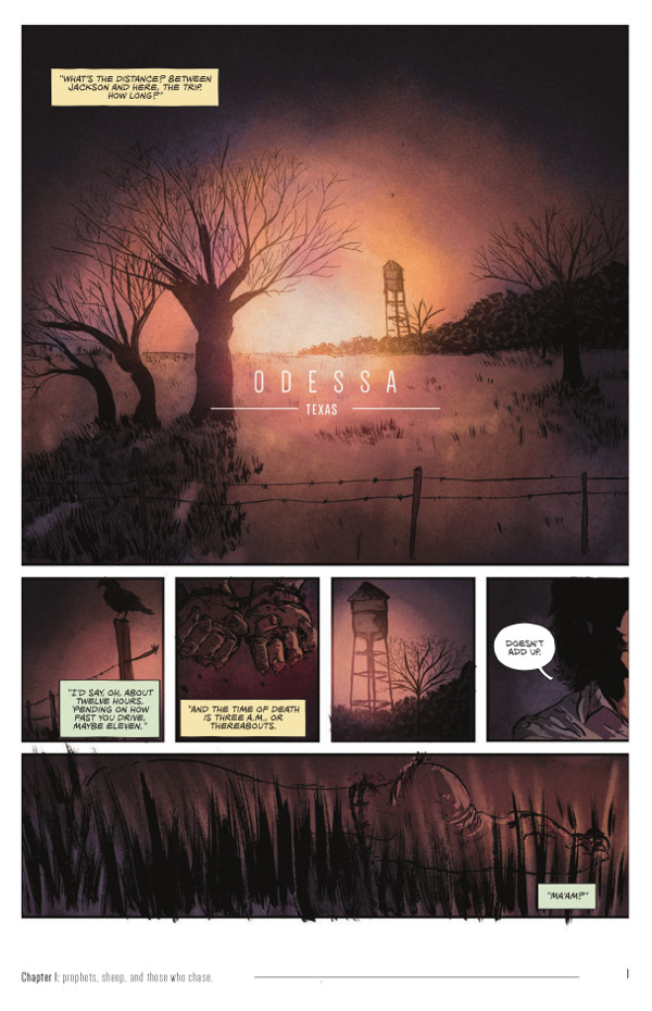
This page shows two design elements that appear on the regular in the first issue: the location ID’s and the titling/chapter elements at the bottom of the page. Both are done in a really clean, unique fashion for comics, and I especially liked the way you guys included the chapter title throughout. It was a really great addition. How did that come together, and was that something you did or you two had a designer help out with those elements?
MB: Oh yeah, that was all me. I did the book design elements of it, including cover, IFC, and the backmatter. The location tags I wanted to match the “bookish” elements so we could have the feel from the cover and IFC pulled into the book itself. The page numbers and chapter title at the bottom serve two purposes, it makes it feel less like an issue and something more premium and I also really like page numbers. We made a conscious decision from the get-go to label everything as “chapter” instead of “issue” and for the credits it just reads “produced by” and “with Jim Campbell” (he letters the book). We wanted the book to feel a little different from other stuff on the shelves, hopefully these little touches do that.
Quick aside – and I don’t know call me a heretic – but I despise when the design elements of a book are done in a comic book-y fashion, I don’t like the comic book letter fonts to show up in any form other than for the actual lettering. I also think that there’s a lot of people in the business who mistake visual noise as “good design” I don’t subscribe to the idea that the more elements you throw down it’s obviously better.
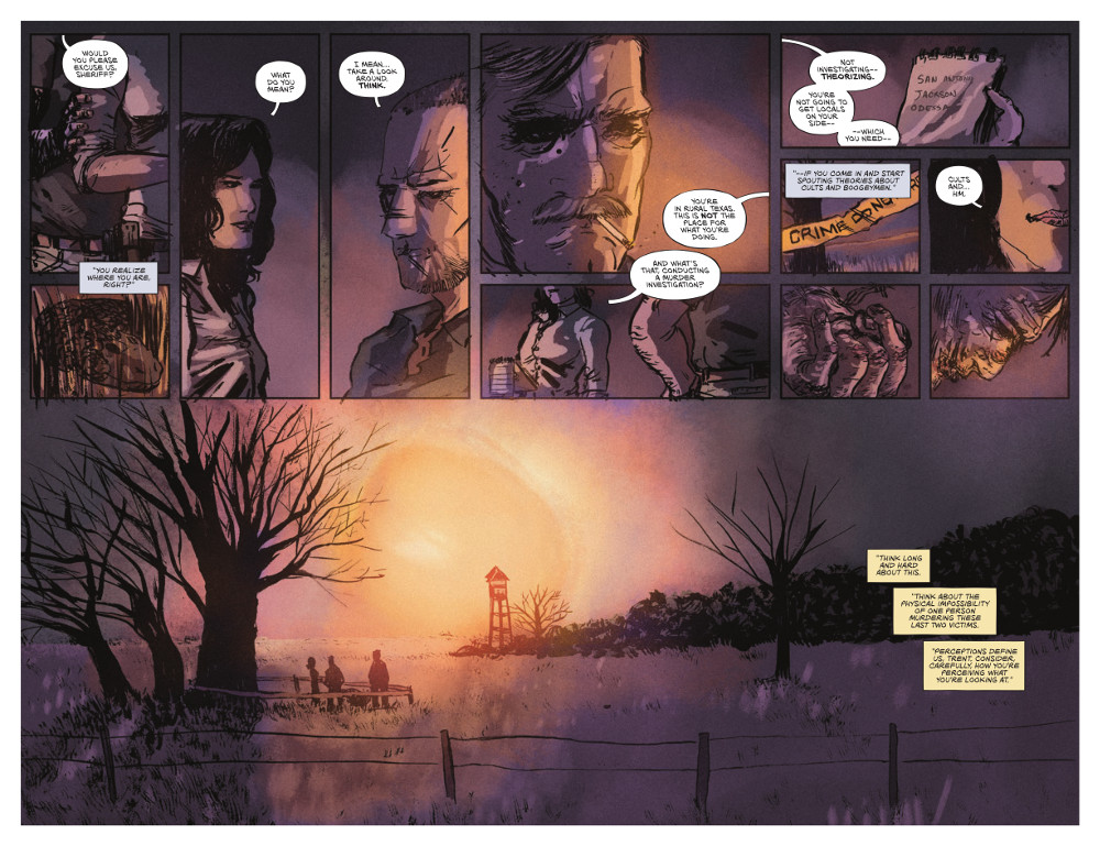
You talked about your colors a bit before and how that’s become one of your favorite parts of the process, but I wanted to ask about your approach on colors. I really love the spread panel and how you handled the lighting elements throughout this scene, and I think it’s funny you say you don’t really have a painting approach given I think “painterly” when I look at this. How do you view color, and how do you like to use it to “cover” up your “inadequacies” like you said?
MB: Well thanks! And that spread’s a great example of covering up my problems. The whole lower panel’s very empty and bland in B&W (not to mention some other technical issues….), but I basically set it at dawn, so it allows me to drop a bunch of different layers to give it the effect of a sun rise, so I can knock out a lot of line art with that sort of glow effect, and the painter effect in the background is just to give some texture to the image. These pages were also done really early on – and you can see towards the end of the issue and especially in issue 2 a real shift.
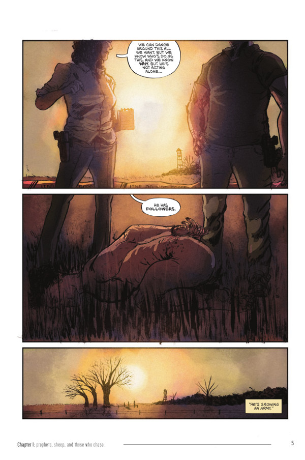
I thought this was an interesting page. It’s a simple three panel layout, but the way the letters are done and the panels are split give the story a great pace to it. When you and Mike were developing this book, did you two discuss the feel you wanted to give it? The intro gives me an extreme True Detective (season one) vibe, and it feels like you guys give the story and characters a lot of room to breathe. Would you say that’s something you two wanted to convey in the work?
MB: I think it’s no secret to say we drew some inspiration from True Detective (who hasn’t?). We don’t want to rush things with the story and it should feel a little more plodding – like a slow burn. The book isn’t really about action set pieces, there will be those, but when things go down if the reader isn’t interested in the story or the characters, the action doesn’t really matter. With that page I think I had originally made the first two panels as one, and chopped out the gutter in the middle afterwards, because the pause is a really necessary beat there.
The first issue takes us to four different locations and disparate locales within each of them. While there isn’t a ton of specificity in each of them yet, I’m curious, are you a research guy? You’ve said you definitely use reference – which everyone should, really – but do you dig deep to build authenticity in locations and details?
MB: I wish I was at a Mitch Gerads level of research and authenticity. I do some, I mean Trent’s house is my Grandparent’s house in San Antonio. I try to do enough research to add some authenticity to it, but I’m not the biggest stickler for it. With guns I use reference because I know too many people who’d make fun of me if I got things blatantly wrong. But since I’m not documenting real events, I feel a little less beholden to making sure everything’s legit. There’s also the time element too, I’d love to dig in really deep and get all the insane details that like you see in Azaceta’s work on Outcast, but I have a full-time job (where I occasionally do comics too, which I hope everyone checks out), I color Roche Limit, I do some politics design, and I do all the art on Indoctrination, so things are pretty busy over here. While I suppose that reads as a cop-out, but it’s the reality of it, so I try to get things to a place where they feel real enough and improve as I go along.