
Michael Cho on the Art and Icons of His Upcoming Theme Cover Month at Marvel
I love comic covers. For many, they’re just an aspect that blocks their path to reaching the heart of the comic – the story inside – but for me, they’re a story unto themselves. A great cover does so much for a comic, as it doesn’t just introduce what you’re reading, but pitches it to you, as if it’s saying “pick me! pick me!” Beyond that, if done right, it’s a wonderful piece of art that you immediately connect with. Then, there’s a third layer. The one where the comic itself tells a story, representative of what the comic itself is all about. When those three aspects combine, it can make a piece of art that isn’t just a stunner, but a meaningful artifact of that comic’s lore.
That’s the reason theme variant months often don’t speak to me (although I may be the exception to that rule). While they can be one of those three things or sometimes even two, the story aspect is one they almost invariably lose me on. I need that grounding and connection for a cover to soar for me as a reader. That’s why artist Michael Cho’s upcoming theme month of covers at Marvel – he’s covering 24 total titles in February – is such a special occasion for me as a fan. Cho’s already one of my favorite cartoonists, having released the beautiful and impactful graphic novel Shoplifter last year. But his theme cover month hits me on all three levels. These covers for 20 of Marvel’s biggest titles are gorgeous pieces of art that look like nothing else on the stands. But what story do they tell, you may ask?
To me, they tell the story of Marvel, past, present and – most importantly – future.
These covers represent their All New All Different line in spectacular fashion, delivering instantly iconic looks at some of their most popular and exciting characters through their simple design and expert craftsmanship. It was love at first sight for me, and as I tend to do, I had to talk with Cho about the work. Below, Cho shares the details as to how this project came together, what appealed to him about it, his process for developing it, how he worked with Marvel on bringing it to life, and much more.
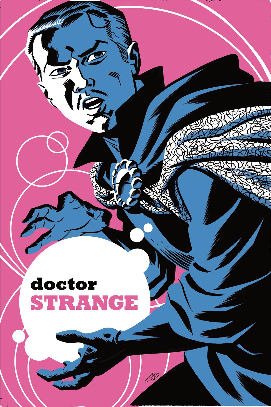
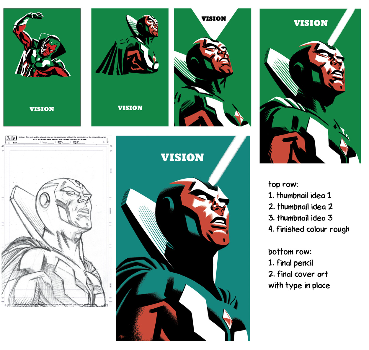
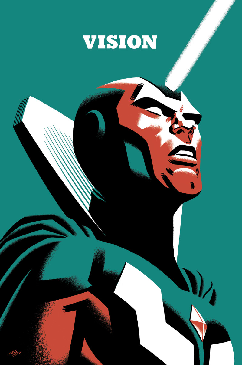
SKTCHD is also debuting Cho’s variant for The Vision by Tom King, Gabriel Hernandez Walta and Jordie Bellaire (which, unrelated, is an amazing comic), and you can see that below. Thanks to both Cho and Marvel for the time and help, and enjoy.
This isn’t your first variant experience before, but it is your first time putting together such a huge amount of them for a theme month like this. How did this project first come together, and as an artist, what appealed to you about it?
MC: Tom Brevoort at Marvel contacted me, in the early summer about doing another variant (for the New Avengers #1), then during discussions, asked me if I’d do a “theme month”. I was initially hesitant, as I was already pretty busy and it was a pretty big amount of covers, but it was a great opportunity to draw so many of my favourite Marvel heroes. I got to check off a bunch of names off the “bucket list” of superheroes I wanted to draw.
Plus, it presented an interesting challenge to see if I could come up with cover designs and images for mainstream comics that were iconic, but at the same time unique and a little different from the normal presentation.
You’ve done a lot of really excellent superhero pinups in the same vein as these before, but those were more for your own personal enjoyment. How does it change your experience drawing, say, Spider-Man, for a job rather than your own entertainment? Also, were those pin-ups part of how you landed the gig to begin with?
MC: Well, not much changes, except consideration for some extra cover matter – logo, UPC box etc. Marvel has been great in giving me total freedom to draw and design as I saw fit, so I treated it much like my personal work – I just followed the muse and drew exactly what I wanted. I have to thank Tom Brevoort and the editors at Marvel for that – they never turned down any of my ideas, no matter how different from the mainstream I thought they were and, in fact, encouraged me to put my stamp on everything including the design and type treatment.
And yes, when I was initially contacted, Tom referenced some drawings of mine that were floating around the internet and asked if I could do something like that.
When the project first came together, was the concept of the covers already developed – meaning, did Marvel already have an idea what they wanted to look like – or was it really just them coming to you saying “we want you to cover our books for a month, go nuts?”
MC: Pretty much. They had a list of covers, and they sent along some great reference for the newer costume designs (I’m a bit behind on the changes on that front). After that, it was just carte blanche.
As you developed the idea, how did the single color backgrounds first come into play? What was it that appealed to you about that idea as the unifying factor to each of them?
MC: I like simplicity, and I think a simple and iconic image stands out on a newsstand, so that’s always a part of my thinking. During initial concept sketches and thumbnails, I drew a few variations of ideas with detailed backgrounds and a narrative. But, as I usually do, I brainstormed with my wife (Claudia Davila – an award winning illustrator and art director) and showed her my sketches. She agreed with me that the direct approach was best and that it helped unify all the covers.
I really appreciate the very clean, classic looking font used on the covers as well, and how the casing changes depending on the type of word it is. It’s a really nice touch that fits the look very well. How did that element come together, and what made you decide to go with the casing switch that you did on them?
MC: I think the type treatment also helps unify all the covers. Initially, I thought I’d just draw the artwork and Marvel would add the standard cover logos in-house, but Tom Brevoort kept encouraging me to do it all myself. And if there’s one thing I’ve learned as an illustrator it’s “whenever someone gives you more control over your work, don’t turn it down”. So I had a flash of inspiration one night and came up with a treatment that I thought would look somewhere between a classic paperback cover and a movie poster teaser. And again, Marvel editorial was great and just let me roll with it.
We’ve seen 12 of the 20 so far, and they’re pretty freaking glorious. How much lead time did you have for putting this project together?
MC: I got the call in early summer, but I was so backed up with other work that I couldn’t start until September when I cleared my schedule to just draw these for the next 3 months. So I’ve been drawing about 7 a month and am aiming to have them all done by end of November or early December.
Start to finish, what was the process like for developing them, and how closely did you interact with Marvel in getting every step approved and finalized?
MC: The process has been pretty organic, actually. Usually, I’ll sit down and spend a couple weeks at the beginning of the month to draw rough for 7 covers at a time. Sometimes I start with thumbnail sketches of concepts, sometimes I just draw different figures and rearrange them. For some of them, they barely changed from the initial thumbnail to the final, while others went through a lot of different revisions (by me, not Marvel). Then I draw a tight colour rough and send it to Marvel for approval. They’ve been great and have approved everything I sent.
After approval, I spend another 2 weeks drawing the final art, doing each in a day or two. The big group shots take two days. I sometimes paint them directly on board and then colour correct them in photoshop, other times I draw the whole thing digitally. And for still others, I do a combination of both traditional and digital, moving back and forth throughout the process.
Above all, the word that comes to mind when I look at these covers is “iconic.” They just fit the characters so well. You’ve done a lot of work in a lot of different capacities in comics, but for you, is creating a whole line of singular images like this a little cooler than the average gig? Is there a little part of you, deep inside, that just thinks “this is awesome?”
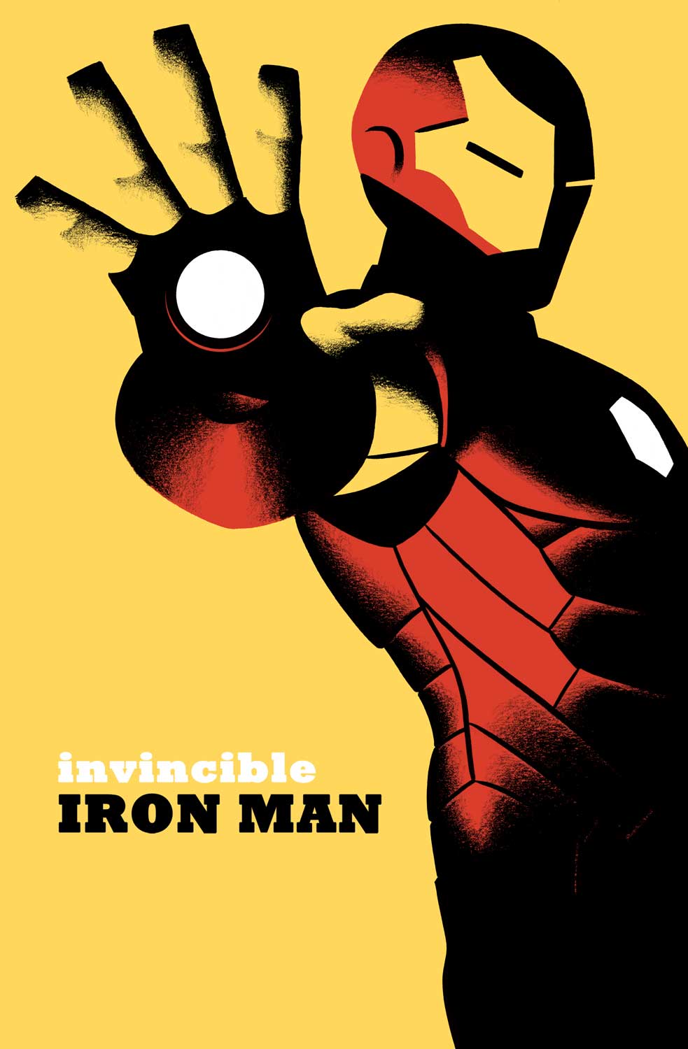
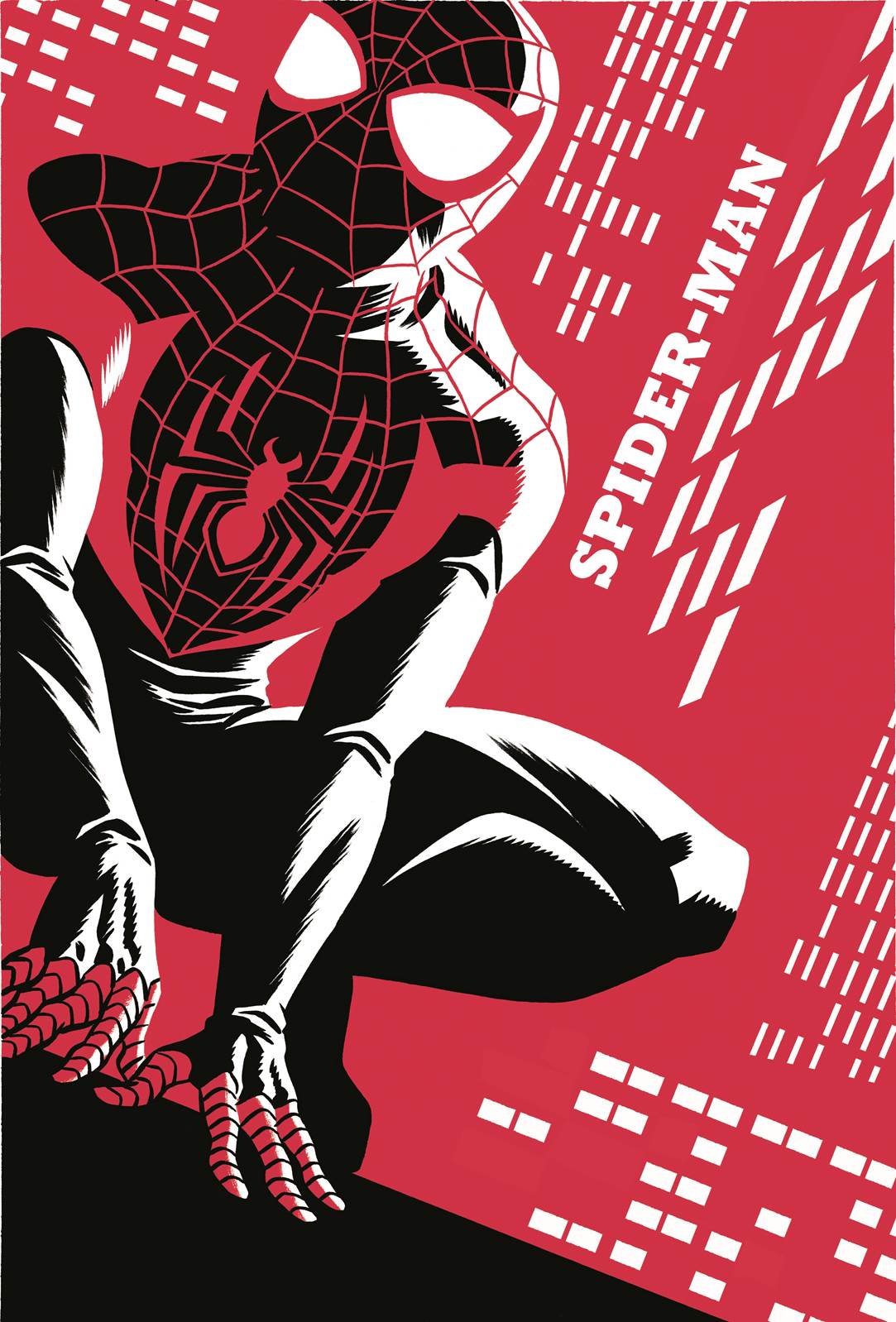
MC: Well, first, thanks for the compliment. And second, yeah, of course. I’ve wanted to be an illustrator since I was 11, and I still find myself amazed sometimes that I get paid to draw all day. I’ve never lost that sense of wonder and gratitude, even after a decade and a half of working professionally. But with comics, it’s extra special. Especially when I get to draw the superheroes I loved as a kid. I’ve always wanted to draw Spider-Man, for example, or Iron Man (two of my childhood favourites) and it’s great to be able to do it now, as an experienced artist, able to bring my fullest to the job and draw exactly what I want.
So, yeah, it’s awesome.
Look for these covers to drop in February from Marvel Comics at participating local comic shops. You can find Cho’s work on covers for the following books:
– A-Force #3
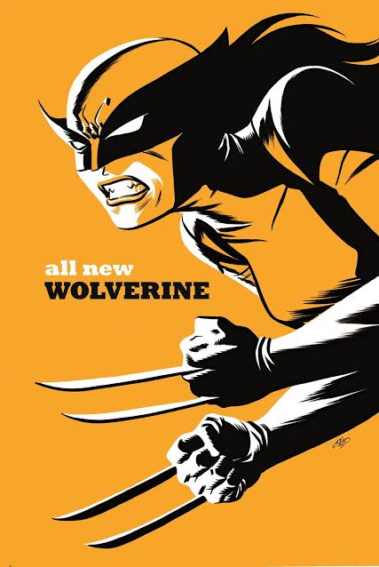
– All-New Wolverine #5
– All-New, All-Different Avengers #5
– Amazing Spider-Man #7
– The Astonishing Ant-Man #5
– Captain Marvel #2
– Daredevil #4
– Doctor Strange #5
– Guardians of Infinity #3
– All-New Hawkeye #4
– Howard The Duck #4
– Invincible Iron Man #6
– The Mighty Thor #4
– Ms. Marvel #4
– Old Man Logan #2
– Rocket Raccoon & Groot #2
– Scarlet Witch #3
– Spider-Gwen #5
– Spider-Man #1
– The Totally Awesome Hulk #3
– The Unbeatable Squirrel Girl #5
– Uncanny Inhumans #5
– Venom: Space Knight #4
– Vision #4