
Talking the Art and Violence of Deadly Class with Wes Craig
The Deadly Class artist talks his art and process
Over the past couple years in my comic writing, I’ve talked a fair bit about how much I like Wes Craig’s art. In fact, in my recent SKTCHIES awards, I declared him “the best artist, straight up,” and it’s for good reason: the guy is amazing. While his book with Rick Remender, Deadly Class, is a team effort; I’d be lying if I said Craig’s art wasn’t the main draw for me. He’s a virtuoso, and someone who takes a great story and turns it into something transcendent and unforgettable.
With our year in review efforts fresh in mind – as well as the new arc starting right before the new year – I spoke with Craig about his work in this week’s art feature. Craig talks about his experience working on his longest run ever, Jordan Boyd taking over color duties, his process, the violence of the book, and much more. It’s a great chat with one of the best around, with insight into how he works and what his approach is.
Deadly Class #18 – the second issue of the new arc – drops on January 27th from Image Comics at your local comic book shop and on digital comic purveyors on your smart phones and tablets. Give it a read, and if you haven’t even started yet, do it now. It’s incredible.
The fourth arc of Deadly Class started with issue #17 and it may have been the most insane issue yet, and that’s saying something. Now that you’re a ways into the series, how do you feel things have changed at all in terms of process or the way you think of your art as you get more comfortable? Or is there little change to the way you think about your work and collaborate with partners as you move deeper into a series?
WC: The main difference is that I think the characters are a lot more consistent and worked out now. They look different in the first few issues. It’s a bit like rewatching the pilot of your favourite TV show and noticing the actors haven’t quite pinned down their characters yet, they’re acting weird. But I think I’m in a good groove now.
Aside from that, I approach each issue the same way, I try and get across the emotion of the characters, and I try and present it in an interesting way.
The longest I’ve worked on a comic before this was about six issues, I’m starting issue #20 of Deadly Class right now. So this is a whole different thing. I used to find that, working for other companies, I’d loose motivation after three or four issues of a series. That doesn’t happen anymore and while part of it is just getting older and being more professional, the main difference is that me and Rick own these characters, I’m very invested in them, and I know I’ll be the one to draw the whole thing, start to finish, so that keeps me very motivated.
One substantial change between where you started and where you are now is that Jordan Boyd took over from Lee Loughridge on colors. Loughridge had established a real look and feel to the colors of the book already. When it came to that transition, did that change anything for you and the rest of the team? Did you advise Jordan at all, or was it more of a situation where you knew he’s a good fit for the book and he’s figured everything out himself?
WC: Lee’s minimalist style really helped set the look for the series, we didn’t want to change that. So when we were looking for a new colorist we looked for someone who could work in that style, but also maybe bring their own voice to it. I think that Jordan’s done an amazing job of that. I think for readers, the transition from Lee to Jordan’s work looked smooth, and as we’ve gone along he’s introduced some of his own flourishes and tastes, and it looks great.
In terms of crafting your art, are you a traditional guy, digital guy, or do you create your art with a mix of both? If you can, I’d love to hear what your process is going from scripts to passing art on to Jordan for coloring.
WC: I’m traditional mostly. I take Rick’s script and do roughs, I ink those loosely which is a bit time consuming but helps me work out all positive and negative shapes (whites and blacks). I include word balloons placement for Rus Wooton, and colour notes for Jordan if I have any on the roughs.
I scan in the roughs, show them to the team so they know what to expect. Then I blow up the rough to printed comic size. I do full pencils on that, scan that in. And then I print that out on 11×17 bristol board in blueline (light blue line doesn’t get picked up by scanners so only your inks show), ink it, scan, fix it up in photoshop using a wacom tablet mostly. And voila!
One thing that can overwhelm many artists is the schedule of work comics present. I know Deadly Class is working off of what is effectively known as the “Saga schedule” these days, but how has the workload been? Has handling an ongoing series like this been something you’ve both handled well and found ways to improve efficiency on as you’ve moved along?
WC: Yeah, keeping up with the schedule can be a little rough sometimes, but generally speaking I have a few days off between each issue. I wish I could work a bit faster, but what can you do? I get to wake up and draw comics in my pyjamas, so really, I have nothing to complain about.
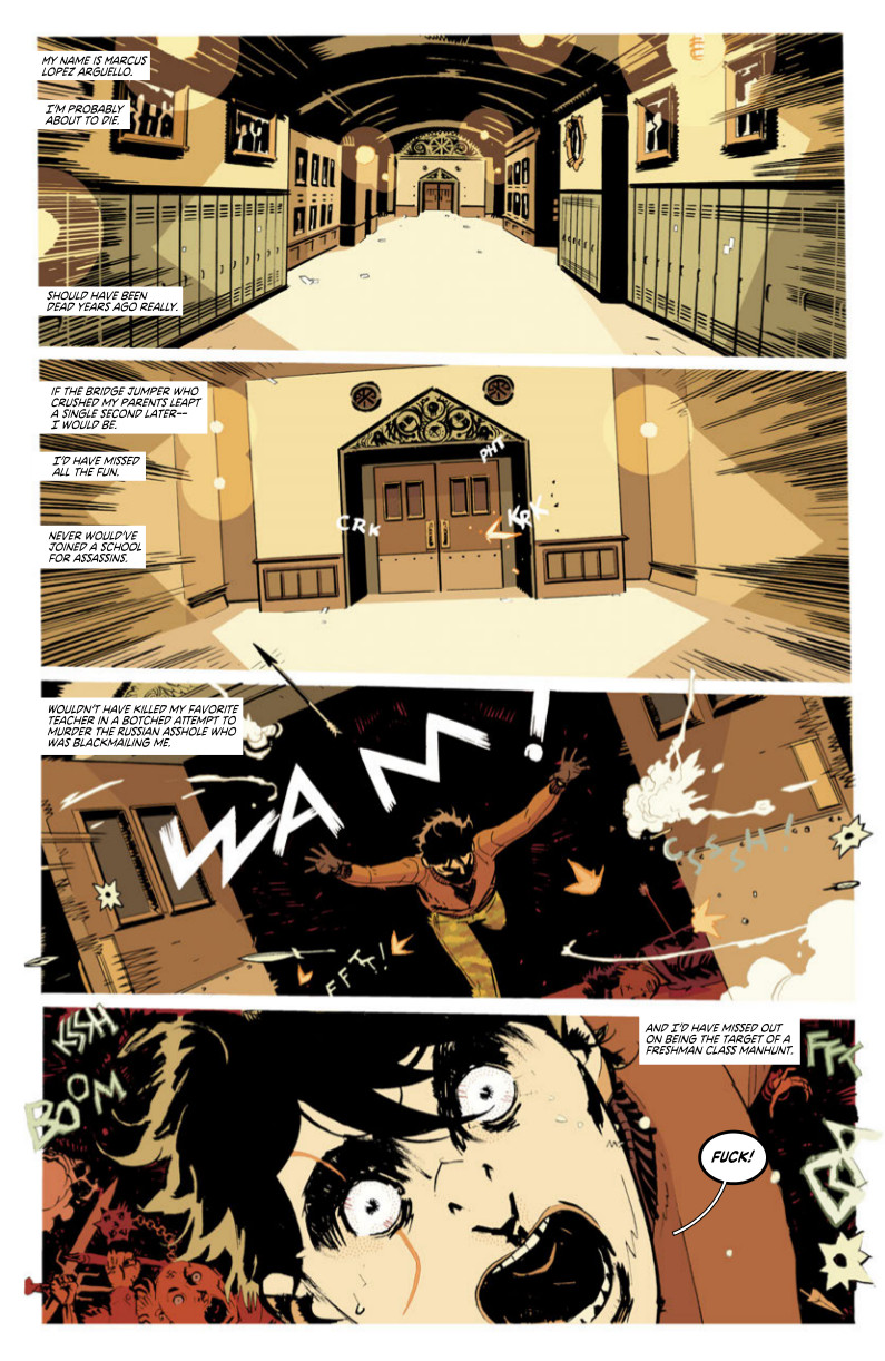
I thought the first page of issue #17 did a hell of setting the table for the insanity within. For something like this, with the zoom on the door and Marcus building the intensity panel by panel, how much of that is from the script and how much is you finding the best way to make the scene work?
WC: This was all Rick. He had this in the script and I thought it was a great idea. I could see it real clearly when I read it. Starting off silent, then hearing the echoes behind the doors as we get closer, then just full on craziness as Marcus pushes through the doors. I hope I got that across.
One element I found to be really interesting was the light box that almost framed the focal points in the first and second panels. What’s that element meant to do? Is that just a lighting effect, or did you mean it to bring something else to the page?
WC: I’d like to say there’s some cool hidden meaning to it, but no. Haha. That was Jordan’s thing, I think he just wanted to add focus to the doors.
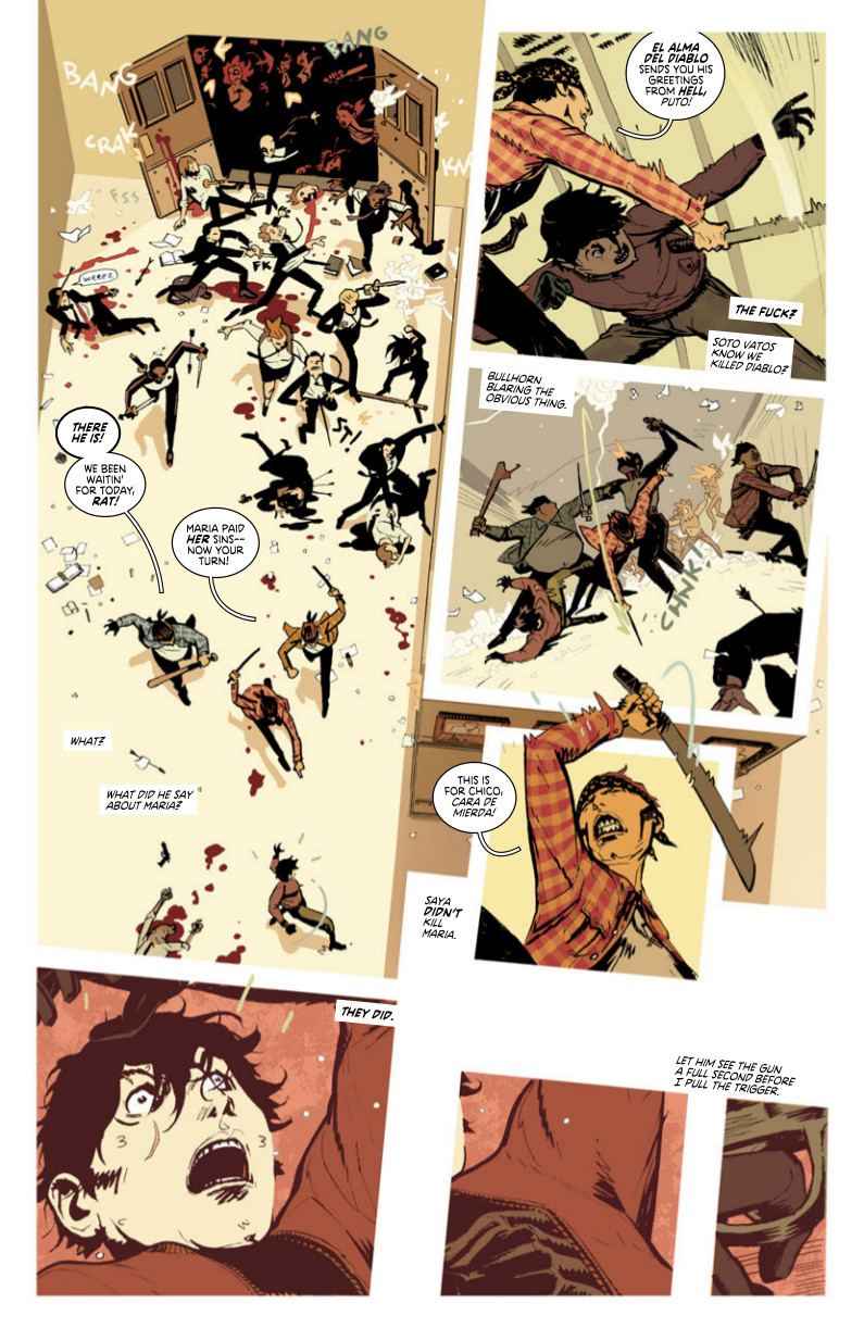
This page has a lot of different angles and perspectives going on. It adds to the chaos going on within it. When you’re laying out a page – especially one as busy as this – do you go any deeper than roughs for something like this to really figure out the movements? Or do you keep it pretty rough no matter what?
WC: I don’t think I spent more time drawing the roughs to work out the placement, but I probably thought about it longer, worked some of it out in my head. I comics, between the size of the page, how many panels are on there, and putting in the balloons, a lot of the composition is figured out for you.
There were several pages in this issue like this that either had a upwards or downwards angle to the panels going left to right. While those on occasion aren’t atypical for you, it seemed heavier in this issue. Is the idea behind that angle to the panels to give the page momentum that matches the action on the page? Or is it meant to do something else?
WC: Yeah, it adds momentum. And it needed some angles that I don’t use that often because it’s a lot of craziness with a lot of characters so you need to find ways to fit in a lot of information and hopefully not be too confusing.
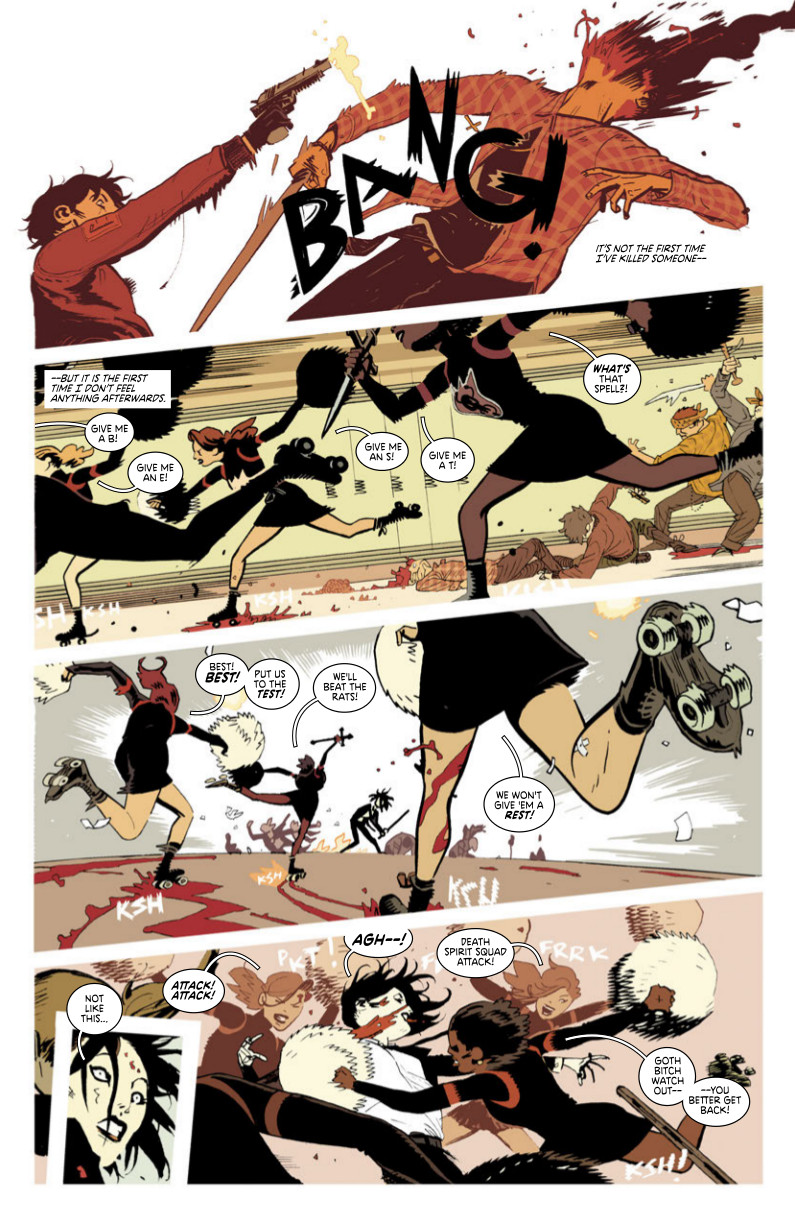
I wanted to ask about your SFX. There are a ton of great examples throughout this issue, but I really loved the BANG! at the top. It matches the action in the panel very well. When it comes to SFX, is that something you plan into the page from the start, or is that something you figure out as you’re working on it?
WC: It’s all planned out. Sometimes I forget certain sound effects and Rus has to cover for me by approximating my hand drawn letters. I’m getting better at that. But yeah, like the look of hand-drawn letters that are incorporated into the art work. So there you go.
While you’ve had to tackle some pretty violent situations in the book already, this issue finds the book at the most gruesome. For you, is it important to find ways to bring these sequences to life in different ways so readers aren’t desensitized to what’s happening on the page?
WC: Yeah, that’s my toughest job I think. We’re presenting kids doing very violent things and so when it’s done, I want to show it has consequences and it’s definitely not “cool” or “badass” or some stupid shit like that. Is it better to “imply” the violence? Like Hitchcock? Or is it better, if you’re going to do a violent comic, to show how nasty it actually is? I don’t know…
It’s an ongoing concern for me (laughs).
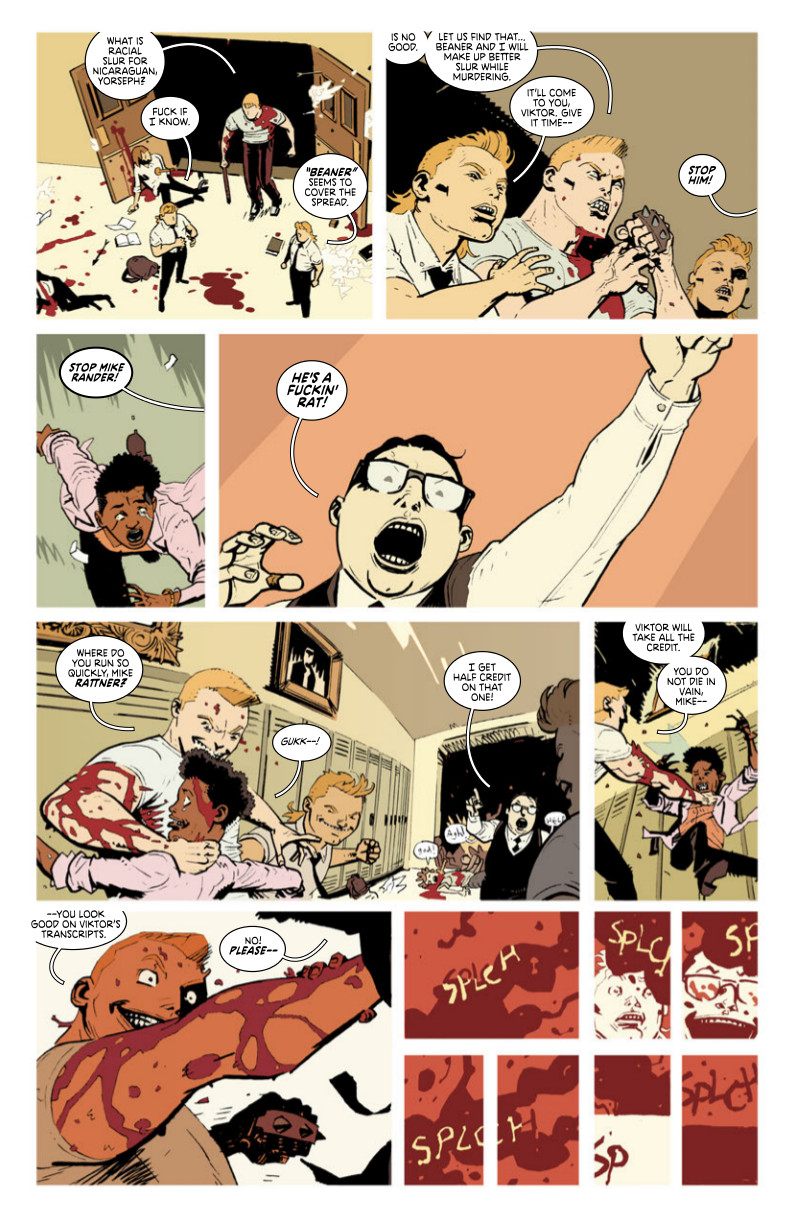
One thing I really like about your art is how sometimes you’ll use very, very small panels to rapidly convey information or the passage of time (or both). What is it that appeals to you about that? What do you think they help create in the reader’s experience?
WC: I think they help do a lot of things. They help create atmosphere, they help put the reader inside the comic, they help give the scene more texture. I’ve always liked it in the work of some of my favourite cartoonists: Mignola, Mazzucchelli, Krigstein, Eisner, Ware, and I really like that feeling it gives. For me it really pulls me in to the story.