
The Art of the Cover: John Paul Leon on His Craft and Career
The cover artist of the upcoming Sheriff of Babylon talks about his art
Everyone has a favorite part of a comic, whether it’s the writing, art, coloring, production value, plot or some other aspect of the book that makes your fan flag fly. Typically it’s some combination of all of those things that do it for us, but we all have our favorites. For me, one of the elements I appreciate the most in comics are the covers. There’s just something special about a great cover, both in how it tells a story in miniature and exists as a singularly superb piece of art.
There are many cover artists whose work continually impresses me – Mike Del Mundo, Jenny Frison and Chris Samnee are three off the top of my head – but perhaps the artist who does most of all is John Paul Leon. He’s famous for interiors on books like Earth X and a recent run on Detective Comics, but his cover work on books like DMZ and The Massive is some of the industry’s best.
Because of my love of his work and his new cover gigs coming up on both The Ninth Wave (another collaboration with writer Brian Wood) and Sheriff of Babylon (the upcoming Vertigo series from Tom King and Mitch Gerads that was previously known as Sheriff of Baghdad), I reached out to Leon to talk about his career, craft, process and a whole lot more. We dig into some of my favorite covers from him as well, and it’s an interesting look into how one of the most talented artists in comics works. Take a look below for that conversation, and thanks to JP for the talk.
Everyone has a different path on his or her way to comics, but what is your art background? You went to school for art, right?
JPL: Yes, I went to School of Visual Arts between 1990-94. Majored in illustration, but we also had a good amount of straight up studio drawing and painting classes in that program. Also, I was able to take some comics storytelling courses at SVA. Among them Will Eisner’s class and Walter Simonson’s graphic novel classes.
Before that, I was lucky enough to go to the New World School of the Arts, a local ‘magnet school’ in my hometown of Miami, Fl. New World was/is a public high school where students focus on a specific art discipline: Music, Dance, Theater, or Visual Arts. The days are much longer than the typical school day, but the training was great (Live figure drawing in high school!–nudes(!)–The models, not the students).
While you’ve done a fair amount of work with other publishers and writers, it seems you have found a home at DC/Vertigo and with writer Brian Wood, especially considering you have both Sheriff of Babylon and The Ninth Wave coming up. Is there something in specific that appeals to you about working at Vertigo and with Brian?
JPL: I guess I’m just attracted to stories that have a sense of authenticity to them. Something in them that is unexpected and makes you say, ” Yeah, I recognize that. That feels real.” Now, I’m invested. The subject matter doesn’t matter anymore. Both Brian Wood and Tom King give you moments like that in their writing.
The DMZ gig came about a few years back. I used to always separate Brian’s DMZ comics from the bundles. His logo treatments and bold design sense just jumped out at me and seemed more akin to magazine or poster design than your typical comic book covers. So DMZ was always on my radar, but I’d never read the book. However, when I was asked by Will Dennis and Brian to take over the monthly cover gig, I couldn’t say no. Creatively, I was being asked to do something new: monthly covers, pencils, inks, and colors. So I was in, strictly on those demands. But then I started reading Brian’s scripts. His specificity and attention to detail was something I connected with immediately. In his stories, Brian is constantly placing his characters in morally compromising situations and raising questions that I think are especially pertinent to modern audiences. Unfortunately, for scheduling reasons, Brain and I have yet to get together on some interiors. Something that must be remedied!
Sheriff of Babylon is a book that I would have been very excited to draw also, but again, the schedule didn’t line up for me. Tom King and I had previously worked together on an 8-pager called Black Death in America, for Vertigo’s CMYK series. When I learned what SOB is about and knowing something of Tom’s history during the Iraq war, I knew this would be a special book with a strong streak of authenticity running throughout. That same care and attention to detail is right there in Mitch Gerad’s artwork. From what I know, Mitch has a great reverence and respect for our military, and it shows in his drawing. Also, the guy is coloring his own stuff! It’s a very potent brew between Tom’s writing and Mitch’s art.
I’ve spoken to a lot of artists in my years of writing, and there are a few names that appear as influences over and over. Mike Mignola. Alex Toth. Jorge Zaffino. Your name is one that often joins them. I’m curious though, who and what influences the influencer? What do you look to when you’re in a creative rut?
JPL: Well I don’t think I belong in that company, but it’s nice to know that some other artists think so highly of my stuff that they would include me with those guys. Of course the list of influences is always a double edged sword where you list some names then later say, “Shit, I forgot about ..” There are some constants though; Toth, Zaffino, believe it or not, Moebius. Lately, a lot of Robert Fawcett.
Influences are an ever changing, constant thing though. Besides the fact that there are influences coming in totally under the radar, unconsciously, I try and find a particular artist or group of artists, or even a ‘school’ or style of illustration/comic art that fits whatever job I’m working on. So this is strictly for me to get some kind of angle on the thing, and not so much to try and duplicate a specific art style. It somehow anchors me to an aesthetic and keeps me from drifting too much. It helps when I feel forced to decide what NOT to do. In the end however, the work just ends up looking like my stuff and I usually feel disappointed that I wasn’t nearly as radical as initially intended. I’ll give you an example of what the hell I’m trying to say:
A couple of years ago, I did an Animal Man job, issue 20. It’s a movie within a comic, and I got really excited about the idea of doing the whole book in an eight panel grid format, each panel of identical size and shape, more or less that 1.85:1 movie frame aspect ratio. That would be perfect. It’s a movie. The panels should stay the same size. Also, I thought it would be cool to NOT do word balloons. Do it all in subtitle format, as if you were watching the DVD with the captions turned on. Sound effects too. If a dog barks, you don’t see ‘Woof Woof’, instead: (dog barking in distance). Of course it would have to be laid out so that you read it properly from left to right, but it would be an interesting challenge. How strange that this idea got me so excited to work on this thing. I felt like this is how the best comics are made. The writer writes the story and breaks it all down as precisely as possible. The artist takes that script and breaks it down visually as he/she sees fit, using the script as a blueprint, always keeping how BEST to tell the writer’s story visually as the priority. Then the writer takes what the artist has done, which may be very different from the ‘stage direction’ and panelation (?) that was spelled out in the script (maybe not), and rewrites the dialogue as needed. Also, the artist redraws as needed. This last stage being the most collaborative. So, in essence, both guys/gals take the story as far out as they can possibly go without breaking it, then return to find common ground.
So my eight panel grid and subtitle idea did not meet with much approval from the powers that be. I caved and compromised. Instead, I stuck to an eight panel grid format, but expanded panels from time to time, Watchmen style. The end result was OK, but I still think it would’ve been better, clearer, more appropriate my way. So that was my big bright idea before even putting pencil to paper on this job, but then a weird thing happened while I was drawing the thing. There are a lot of figures standing around in rooms talking in this story. I don’t mind that at all, and when I started to think of it as a newspaper strip, thinking of Jim Holdaway and Leonard Starr, it somehow focused me. I don’t think it even shows in the art, except maybe one head where I was thinking a little too much about Modesty Blaise! This is more of a mental posture that helps me focus.
I came across in several other interviews you’ve done over a multi-year span that your dream project would be to write your own material for you to draw. Is that still something you’d still like to do? It seems that now more than ever would be a time where you could do such a thing, at least from a marketplace standpoint.
JPL: Yes. Making the time to work for myself has always been difficult. Especially when I look at the calendar and there’s a different deadline each week. I’ve never taken the attitude that I should just do enough to get the job done and move on. I put everything into my work for hire stuff and afterwards there isn’t much left for me. It’s a liability.
You’ve done some very notable interior work in your career, but in recent years, you’ve mostly focused your work on covers. Why is that? Is that all you have time for these days, or have you just found yourself preferring cover work to interiors?
JPL: I love doing both covers and interiors. They present different challenges. Interiors can be particularly rewarding. At its best, I can really feel immersed in a different time and space.—In a very tactile way. Weird. There is this quality to interior work that I love. You get a script and it’s all spelled out for you right there on the page (hopefully!). You read it and see the progression of the story from point A to Z, whatever. So it’s in your mind as a linear sequence of events. But then, when I start laying out the thing, I notice that what I’m doing is bringing to life a series of ‘verticalities’ moving along a horizontal timeline. So, this conjunction between the moment, the moment, the moment, moving along this timeline, creates the illusion of the passage of time as we understand it. But nothing is actually moving, and your mind, as reader of this thing, is participating.—Bringing your own experiences and filling in the gaps. We’ve served up the bricks and the reader’s bringing the mortar.
Covers for me are about making that one beautiful piece of art that serves a function. Depending on the job, it can be bolder, more graphic, or more literal. It’s also important to try and zig while others zag, since a big part of an effective cover is that it stand out. Lately, I’ve been feeling that the more story specific the image, the better. Literal. Conservative, from a picture making POV. Thinking of Fawcett again, and others. Hey, maybe next we can go back to putting word balloons and captions on the cover!
The reason my interior output has been sporadic the past few years is due to a couple of things. Kurt Busiek and I have been chipping away at Batman: Creature of the Night for way too long now, partially due to some health issues on my end and the fact that since the book has not been scheduled (I understand that’s about to change). So we haven’t had a deadline to work against. I don’t know about Kurt, but I sort of need a deadline to push against. So, consequently, when I’ve been offered interior work that sounds cool, like a couple of issues of Detective, and I have the luxury of being able to go back to COTN afterwards, I’ve taken the opportunity. As I write this, I’m working on pencils to the last few pages of issue 3 for Creature of the Night, which is a four issue series.
When it comes to an average cover, what’s your process, and what tools do you use? Are you more of a traditional or digital guy, or do you use both depending on the task?
JPL: Mostly traditional. The first thing I’ll usually do is collect A LOT of reference. Then I’ll start to work out a sketch at print size; using first pencil, then ink and white. Get that drawing to where I think it’s working. At this stage I have a very good idea of the specific reference shots I’m going to need for the finish. Then I’ll scan that drawing and import it to Photoshop, fit it into a template with the logo and move things around in the composition if need be. Shut the logo layer off and work out some very rough color, then reintroduce logo and work out color for that along with image. I don’t want to feel handcuffed at any stage, so I try to leave room to work out some problems at each stage. I think this is one reason why licensing work usually ends up being a very frustrating and disappointing experience for me. They want everything resolved, except the actual drawing, in the sketch stage. So by the time I’m drawing the finish, there’s NO room for deviation. Forget it, you should be drawing with blinders on. If they could chop off your hand and just use that to get simply a more polished version of that sketch, they’d do it!
Got off the rails there for a second. Sorry. So, if the piece is approved….Oh yeah, I usually try to do one sketch that I can really commit to. Sometimes they ‘require’ more than one sketch. I’m happy to do more, but I do think that it dilutes things. A lot of thought and consideration goes into that one committed sketch. It’s my shot at a home run, instead of three base hits. I could always take another turn at bat!
Anyway—If approved, I’ll blow up the sketch to about 11×17 and lightbox that onto a sheet of 2-ply Bristol, usually plate finish. Once the main shapes are laid in, I’ll scrap the Xerox, set the lightbox aside, and get down to the drawing, using HB lead, and keeping all that reference handy. Again, not too tight because the ink lines are the ones that count and God forbid it gets too polished! Once I feel there’s enough resolved in pencil and feel comfortable just continuing the drawing in ink, I just start drawing in ink.—Eventually going back in to white stuff out and redrawing things. Usually, Ill start thin, a hunt 107 nib/dip pen, and get heavier as I go: Brushes, markers, and lately a couple of great Pelikan fountain pens will usually work their way in.
After the B&W drawing is done, it gets scanned and back into PS. Since DMZ, I’ve done a lot of covers where different sections will be drawn on individual sheets of paper. It ultimately makes it easier to separate into layers. Maybe a background will be drawn separately, or a texture or other element, especially if it’s a montage. Coloring the piece usually takes me about a day and I tend to go in a lot of different directions, experimenting with different looks. It’s a very inefficient process! In all of this, I’m afraid of settling on a set method. So this is a general structure, but I try to be free within that structure.
Based off your earlier answer, it seems one of the biggest changes for you in taking over covers on DMZ was the coloring. As someone who is really well known for your very powerful black and white art, how big of a transition was it to coloring your own covers for this project? Do you feel it was a bit of a process to get used to, or was it a really exciting change for you creatively that you latched onto immediately?
JPL: Both. I’d colored a few pin-ups and covers previous to this, but the DMZ gig was the first consistent job where I was handling full art chores on the covers. It was great fun, and still is! I still feel I’m searching for a natural way to integrate my B&W drawings and color. Each job presents different challenges. Sometimes it’s nice to see a clear distinction between the two, other times maybe not. Especially in cases where atmosphere plays a big role in the picture, like issue 27 of The Massive.
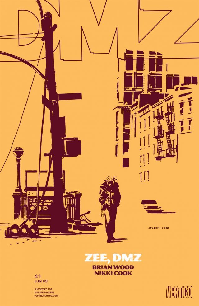
Let’s talk about this cover in specific. It’s one of my favorites from DMZ. I love how we get the best of both worlds from you here, with the deep, resonant blacks forming Zee and the landscape while the saturated yellow gives those blacks meaning. For both this cover and others beyond it, how do you like to utilize color in your storytelling, and if you can recall, what led to yellow being the choice here?
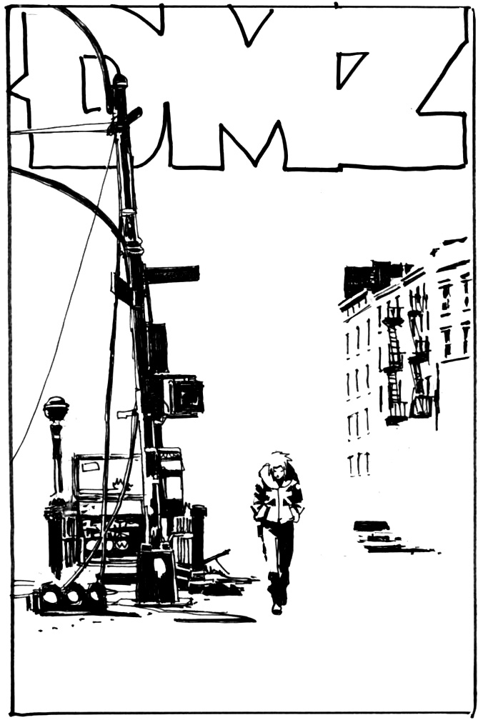 JPL: Thanks, David. Let me see if I can remember (It was a few years ago!). I think it’s pretty safe to say that on that cover, as is often the case, I really felt it was done in B&W. For me there is a lot of space in that picture. Yes, negative space of course, in terms of the picture plane, but what I mean by space is, again, atmosphere. In a completely different way than Massive #27. I feel the white has a lot of life in it. My mind imagines much more information than is actually drawn there (Even sounds or street noise). So I knew I was going to go with one color for the white and another color for the black. That’s it. It was my attempt to preserve what I thought made it a cool image—Simplicity that evokes the sense of a larger world. I don’t remember why I chose those specific colors, but I remember not wanting to choose literal or ‘realistic’ colors. Those unnatural colors, I believe, emphasize the fact that this is a two-dimensional image. It’s almost a logo. But that quality of atmosphere is still there.
Walter Simonson, in an interview, said that one of the things he enjoys most about classic American illustration is that, with some artist’s work, you look at their painting and you’re really seeing two things at once. You’re aware of the actual story that is being communicated–the narrative of the picture. But you’re also aware of how the paint or ink marks are applied on the actual picture plane. So you have this tension between the imaginary three-dimensional space being portrayed and the reality of marks on a flat surface. I’m also really excited by that push and pull of opposites. Sometimes I wonder how abstract can I get and still communicate a narrative. Other times, I find myself going the other way and wanting to keep my marks just as deliberate, but as quiet and restrained as possible. Lately, I’ve been finding restraint very rewarding.
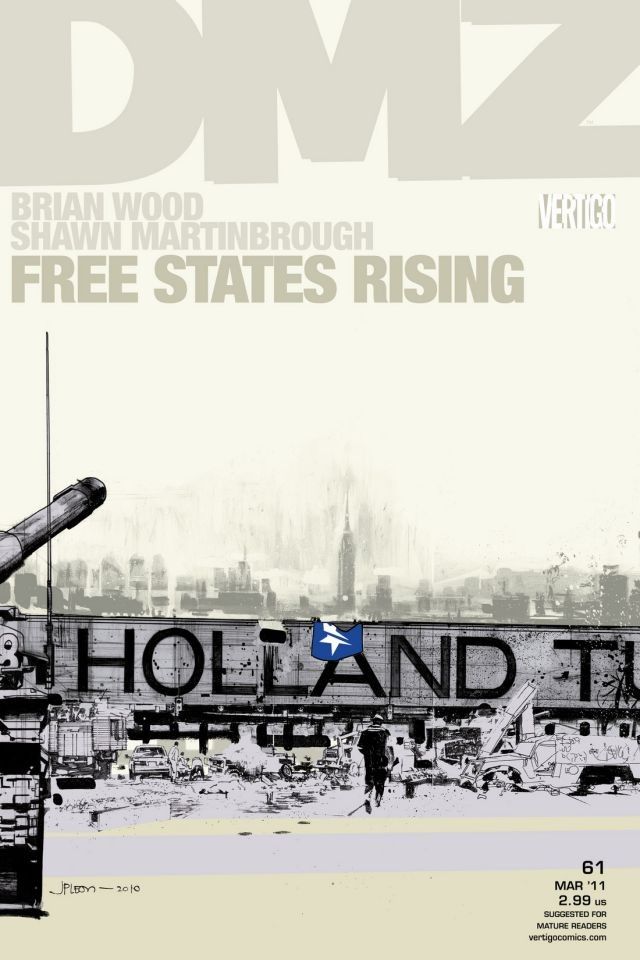
This is another one of my favorites, at least in part because I really loved this arc in general. We were just talking about color though, and for me, this cover works as well as it does thanks to how omnipresent the whites are. It seems to me that with a cover and the limited real estate it gives you, how you choose to not use space defines a work almost as much as how much you choose to use it. Both this cover and the cover to #41 showcase how effectively you use negative space. When you’re developing a cover, how do you approach it to actively leverage space in favor of the piece you’re creating?
JPL: I do my cover sketches at print size and it really helps to have the logo so that everything is taken into consideration for the design. I try to develop the drawing and the design along the same line, but sometimes they start to veer off in different directions and other times they make hard breaks against each other. But this friction between drawing and design is constant and it’s part of the fun. I can feel myself leaning one way or the other. What best tells the story is the rudder that hopefully guides my decisions. I think the most successful covers for me are the ones where these three elements are as unified as possible.
To put this heady stuff in more practical terms: often times, a figure or part of a figure looks great against a lot of negative space, but my sense of the drawing is that I need to better establish the space the figure is in. This is especially true doing interiors, because you have to pass the baton to the next panel. I have to sacrifice that lovely negative space and resolve the relationship between the figure and the space it’s in. Basically, draw a fucking background! As I start to draw, something in me rejects this. I feel like I’ve violated something that was precious to me. At this point, drawing and design are sharply opposed. I have to see it through and resolve the drawing. As I draw I may start to feel on which side of this tug-of-war ‘storytelling’ comes down.
These more open covers work, but for me they have to be earned or they’ll start to feel like a formula.
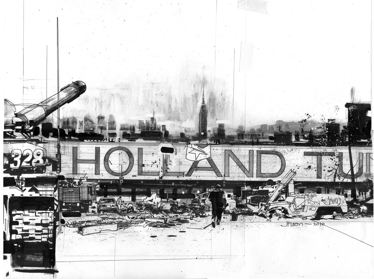
This was a weird cover. The drawing just started growing horizontally. I had to tape an extra sheet of Bristol to keep going. I think the Holland Tunnel sign just kept pushing me to go wider! So the original is larger than usual. But then, the proportions were all screwed up because it was too wide and I didn’t just want to use half of the drawing! That Holland Tunnel sign is ugly and beautiful at the same time. I mean the actual sign! I wanted to at least get the ‘Holland’ in there. So I did something I’d never done before or since, I used the transform tool to compress the whole thing accordion style and somehow it worked. I guess all that wreckage and mess along the middle ground could withstand the compression. But it’s strange to me that the figure works too.
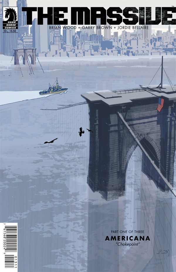
On The Massive, you were occasionally asked to show off major, ruined cityscapes like this one. It’s brilliant stuff, but not to be too much of a neophyte, but is that all hand drawn? I know there are all kinds of 3D modeling tools an artist can use, but I have to ask because you’re a mad genius if all that detail is you.
JPL: Ha! Thanks again, David! Yeah, it’s all hand drawn. How could I pass up a chance to draw the Brooklyn Bridge?! Besides that, I’m kind of old school in the sense that if I don’t suffer and struggle with a drawing, I just don’t trust it. And I struggled here!
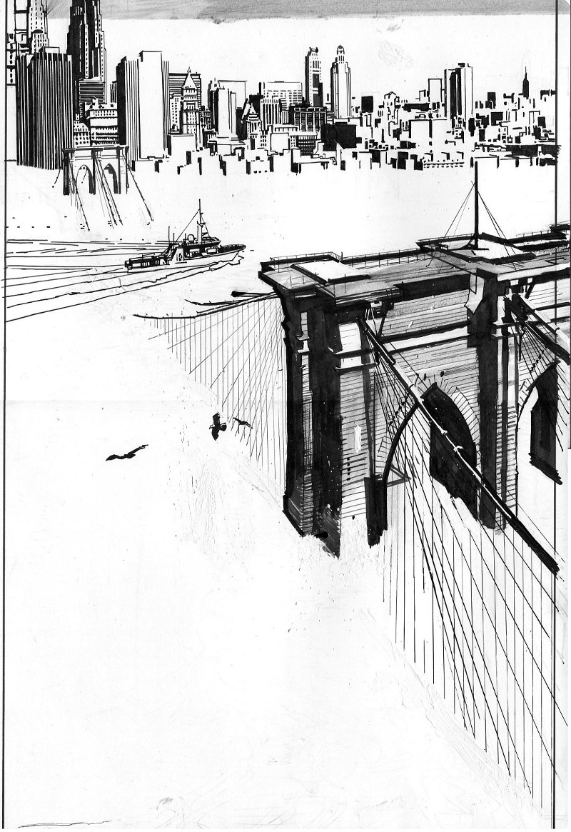 It was drawn on three separate sheets though. I knew I was going to use color holds on it so I kept the bridge, ship, and city line art on my main sheet. The water/waves texture on another, and a general swath of grey ink wash just in case on the last sheet. The elements were shifted around a bit in Photoshop. Made the ship smaller (although the proportions are probably more correct on the original), shrunk the far end of the bridge and city a bit to add space, and shifted the seagulls around.
Despite their more fantastical variations, most of your projects you’ve taken on for covers are built on very real world settings. You said you use a lot of reference. How much of that reference is for getting aspects like bridges and cityscapes right? Do you fall down the rabbit hole of researching settings pretty easily?
JPL: I certainly do. I try to amass a large amount of reference for everything, especially locations and costumes or important machines, like an Airbus A380 or a Ford Crown Vic! I have to pore over this stuff again and again—Internalize it so that I feel I have a tactile understanding of what the hell I’m going to have to draw. Because, I’d like to get to the point where I can start to draw specific places or things without actually looking at the reference. At least give the feeling of authenticity. I’m not interested in being slavishly precise. Also, I need to have a good idea of what I’ve got and where it is in my files. I may remember halfway through a drawing, “shit, I have a good shot of a hand holding that gun from an angle I could use. Invariably, I have to flip the image though. What’s that about? Always have to flip the image.
Speaking of real world settings, the location and players in Sheriff of Babylon are very much based in reality. When you were talking about it before, it seems this project is important to you at least in part because of authenticity that drives it. How important to you is it to reflect that on your covers?
JPL: It’s everything to me. But for me, getting stuff to feel authentic can be tricky. I can’t go at the problem too directly and just say, “ Well, I’m just going to draw the hell out of EVERYTHING!” Again, I want to leave things open for the viewer. We don’t experience the world like a camera. For me, creating the feeling of reality is more important than accuracy.
The three things I look for in a great cover are: does it stand out on a comic stand; is it a great piece of individual art; and does it reflect the comic inside? That’s a tough act to do, and not every cover does it. Yours regularly do in a big way. What do you think makes a great cover, and what do you look to bring to each and every cover you work on?
JPL: Those are pretty good, David. I think you’ve pretty much got it there!
As a kid I used to stop, go back and look at the cover a few times when I was reading a comic. I still do that! My favorite covers are the ones that not only grab me at first glance, but also stand up to scrutiny and evolve as you return to it while reading the story. You may start to see things you hadn’t noticed before.
I don’t want to bore people – or myself!
I like to approach each cover like I’ve never done a cover before and see where that takes me, without repeating myself. Most importantly, I’d like to try and do something that’s true to the story and is an invitation to the reader to enter another world.