
The Wizard of Nobrow: Talking Fantasy Sports No. 1 with Sam Bosma
We talk the recent graphic novel with the Ignatz Award winning cartoonist
One of my favorite characteristics in a comic is when the story genuinely surprises me. When I say that, I don’t just mean the writing, but how the story is delivered and the feelings it evokes. When a comic can do that, my love of it rises dramatically. The recent Nobrow Press release of Sam Bosma’s Ignatz Award winning graphic novel Fantasy Sports No. 1 definitely surprised me, and it did so in a very good way.
Not that I wasn’t naturally inclined to like it anyways, and if you read my review, you’d know why. I’m a big fan of basketball and of the type of dungeon crawling games that inspired much of this story. But Bosma’s cartooning was so assured and full of personality that it made me love it even more than I thought was possible, and quickly made this one of my favorite books of the year. It’s a very legit comic, and it showcases the incredible talent Bosma is.
For this week’s art feature, I reached out to Bosma to talk about how his life in comics came together, what players inspired the game of the characters in the comic, who his influences are, how some storytelling choices came together, and much more. You can read that interview about his art stylings in full below, and if you haven’t read his book yet, what are you waiting for? Get on it people. This comic is good.
Let’s start with the basics. How did you first decide you wanted to make comics as a living, and what was your path to getting where you are?
SB: The comics thing really happened by accident. I went to school for illustration, since drawing was more or less the only thing I liked to do. I grew up playing games, reading books, and watching cartoons. I didn’t read many comics as a kid. Out of school I did a lot of illustration work for books, magazines, ad campaigns, that sort of thing. After doing that for a living for a couple of years, and not being entirely happy, I figured that my best work was going to come from self-initiated projects. I wanted to tell my own stories, and making comics seemed like the only realistic option I had of doing that by myself.
For Fantasy Sports Vol. 1, it seems there are two main inspirations: old school puzzle/action/RPG games like The Legend of Zelda and, well, the world of basketball. What was the inspiration for that story, and what were the biggest influences as far as the look and feel of the book?
SB: This first book was a challenge to myself — first, to make a comic that I could self publish and sell (this was back when it was just Fantasy Basketball), and second, to convey some of what I love about basketball to readers who were lukewarm to sports. Most of my illustration is in the fantasy genre, and I thought that if I could simplify basketball down to something more combative, I could combine the two. Make something that I really enjoyed drawing. Dungeon crawlers, not just Zelda but table-top RPGs as well, have a nice, clean, easily conveyable format: go through a zone, clobbering each successively stronger foe until you reach the boss and claim their treasure. Part of what I love about Dungeons and Dragons is that character dynamics, even those between enemy creatures can alter the feel of the story in huge ways. I didn’t want enemies who just existed to cough up experience points. There’s some more exploration I plan to do there, definitely.
When this story was originally released as Fantasy Basketball, it was in black-and-white. When you were going through the process of putting together the new package with NoBrow, why did you decide to expand it to full color? Was that a difficult experience trying to rethink a book you had already completed with a completely different perspective in mind?
SB: The decision to expand it to full color came hand in hand with the decision to increase the physical size of the page. Originally I made the book in black and white with simple gray tones to enhance the readability of the pages, which mostly featured a lot of panels. When the book blew up, suddenly I had a lot more space. The transition between black and white and color was a difficult one. The contrast I’d already established in the book’s visuals limited what I could do with color. Characters’ skin tones were particularly tricky to nail down, since they were largely left without tone in the first version, but both Mug and Wiz were always intended to be people of color. Getting them to look how I’d imagined them in color was difficult, but I think it worked out alright in the end.
It’s been a bit since the book’s original release, but what was your process for putting that book together? Are you the type that goes full script when writing for yourself? Also, in terms of art, are you more of a traditional, digital or hybrid type of artist?
SB: I do write a full script, but the dialogue is always extremely fluid. The plot more of less stays the same from script to final, but wording is changing until the eleventh hour. Characters are written one way, but maybe the drawing of them reads a different way, so whatever they say has to follow how they’re drawn. I’m an artist first and a writer second, so the words always bend to the will of the pictures.
I work digitally in comics, mostly for speed, but also because Photoshop has such good editing tools. I’m always resizing things or swapping panels out and stuff like that. Doing comics traditionally would take me a lot longer and probably just be a huge headache.
One thing I really loved in this book was the character design. Everyone had their own very unique, very defined looks, and while it wasn’t a huge cast, it was much appreciated. Let’s focus on Wiz and Mug, though. What were your inspirations when you were designing these characters, and how important was it to make them contrast as much visually as they did in personality?
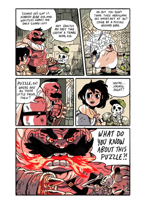
SB: Mug and Wiz are weirdly sort of modeled after cartoon characters from the 40’s — Fleischer stuff and early Disney cartoons as well. I really like how that influenced Manga in the sixties — how rounded and clear Tezuka’s stuff was. Super communicative. I really like that language for comics, it makes reading through the panels smooth and quick. Perfect for action books. Mug is super loosely based on a combination of Peg-Leg Pete, from the Mickey cartoons, and, uh, Wario. Wiz-Kid was built mostly as a contrast to Mug, he’s the id and she’s the super-ego. Wiz is a pretty simple Tezuka hero, sort of inspired by Princess Knight, but made more androgynous.
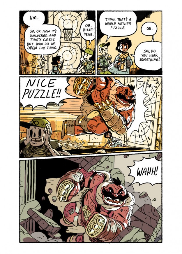
That last panel and Mug’s swollen self really underlined an influence I thought of at times when reading this book: Hayao Miyazaki. It’s a little less evident than maybe the Mignola touches, but especially in that moment, it reminded me of times where characters in Miyazaki films would get enraged or emotional and seemingly increase in size. I might be off base on that one, but are there specific visual touchstones you find that have influenced your art?
SB: I do think the Miyazaki super prevalent in my work — that’s the stuff I grew up watching. I wore out at least two VHS copies of the bastardized American release of Nausicaa (which was called WARRIORS OF THE WIND), in the early 90’s. As for characters inflating, yeah, that’s definitely Ghibli inspired. I really, really love the scene in Laputa where two characters are trying to intimidate each other by puffing up their chests, until their shirts rip open and their buttons pop off. I love big cartoon acting. One of the most famous markers like this that Miyazaki uses is when characters’ hair stands on end when they get angry. I LOVE that one, and almost included an instance of it happening, but thought it was too directly referential.
I really enjoyed how gestural and expressive your characters are, and how their mannerisms match their personality. With Wiz on this page, she relaxes with a cup of tea in this scene, and it’s very tranquil like her (setting up her big finish, of course). Mug of course is always experienced in big movements and powerful expressions. When it comes to character acting like that, how much do you think that out in your art? Do you try to adopt specific sets of movements for each character, or is that just how it came out?
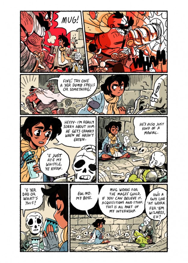
SB: Most of it came pretty naturally after the characters had been figured out. Mug is all big movements, reflecting his big emotions, and Wiz is more subtle and specific. This maintains pretty true throughout the book, even through the basketball segments. Mug is mostly clumsy layups and floaters, where you see Wiz shooting threes and picking up steals. I think the tea part in this page is a little clumsy, though it’s a shorthand way of clarifying Wiz-Kid’s character and specifically how she would rather find nonviolent solutions to her problems.
Unrelated to this page but related to the last question, when it came to the game of each player in the big basketball showdown at the end, did you model the players off any actual players, or were you just trying to match body type to style of play?
SB: The players, or at least Wiz-Kid and He of the Giant Steps, are modeled partially after real players. Mug isn’t an expert at the game, but he fits into the archetype of the low-post bruiser: little finesse but a lot of strength. That’s why Wiz yells at Mug to put Steps on the block (basketball slang for backing down your opponent near the basket). Wiz actually has those floppy socks because Pete Maravich was famous for wearing socks like that through his career. Aside from Pistol-Pete, Wiz is an amalgamation of Steph Curry (this was drawn right after the Warriors made their improbable playoff run in 2013 and Steph went nuts against San Antonio in the second round) and Kyrie Irving (Kyrie had a bananas game at Madison Square Garden that I watched several times). Steps is a combination of Hakeem Olajuwon and Kevin Garnett, both ferocious defenders with long arms and two of my favorite players. He pulls off Kareem’s sky hook in one panel.
This page is a great highlight of another element I really enjoyed: your lettering. Was it all hand lettered? And for the SFX like on the newly anointed captain (or Cap’n), is that something you plan on, or do you just get there and do what feels right?
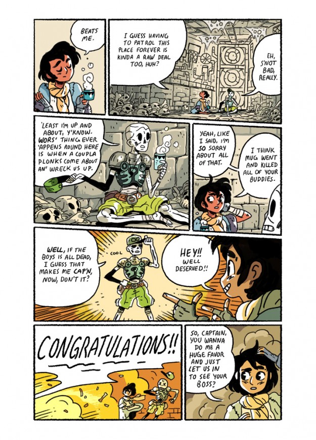
SB: It’s all hand lettered, to match the line quality. Doing hand lettering is one of the most pleasurable and most time-consuming aspects of the job, but I do think it looks better in the end. A few of the sound effects are written into the script, though a lot of them just came up organically as I drew. The “cool” by the Cap’n (whose name is Whistleblower, though I don’t mention that in the book anywhere), was one of the organic ones.
There’s a fair bit of action in this book, although even it’s on the atypical side for a comic or even a dungeon crawler. You pack a ton of energy into those scenes though, and they never lack for visual clarity either. For sequences like Mug finding his own answer to the puzzle or the basketball game itself, what’s your approach for best pairing that energy with clear storytelling? Do you lay out pages first at all to ensure that clarity, or do you just do the damn thing?
SB: Drawing is the most fun part of the book for me, and so it’s not uncommon for me to excise big chunks of dialogue or script in favor of a visual gag or action segment. If I’m clear with the visuals, then the type exists to help support that. I really hate talking head panels, and I try my best to avoid them if they don’t add anything new to the visuals. I write scripts with fluid dialogue but definite signposts I need to hit in each particular scene, and try to guide the viewer between these signposts with action or visual detail. I’m not really a writer — my strength is in the drawing. The story is always pretty clear in the script stage, but the layouts are where it comes to life.