
Love in Blood Splattered Neon: Virgil’s JD Faith Shares the Story Behind His Art
Comic books are an amazing medium for a lot of reasons, but one of my favorites is how they can take you into worlds – any kind of world – that you’ve never experienced before and give you unique insight. Sure, any medium can do that, but because of their inherently niche identity, comics go to a lot of places we wouldn’t expect. I’m not just talking about sci-fi worlds like the ones from comics like Descender or Saga, but places we wouldn’t see much of otherwise like Scalped and Southern Bastards. Ordinary settings that are fictionalized yet based in truth.
The upcoming Image Comics graphic novel Virgil from Steve Orlando, JD Faith, Chris Beckett and Tom Mauer is along those lines. Based in Kingston, Jamaica, it tells a “queersploitation” story of a police officer named Virgil who crosses the entire city for revenge after he is left for dead and his boyfriend Ervan is captured…only because they are a gay couple. Like some of the best stories, it uses its setting not just as a setup for drama, but for revealing harsh truths. As the Virgil Kickstarter page says:
“Welcome to Jamaica. A resort destination. 70% of citizens don’t think gay men and women deserve basic human rights. The world’s highest murder rate.The worst place on Earth to be gay.
And no one knows.”
That makes this comic not just a great one – and it is a hell of a propulsive, irresistible read – but an important one in its own way. But it only works because of how phenomenally crafted it is, as the team delivers a hell of a story that makes us care at the titular hero on his quest for revenge, showcasing the bias and fear that thrives in that culture in the process. Today, we have a conversation with Virgil’s artist JD Faith about the book, how they made their hero’s journey so impactful, the influence of famous neon noir stories, his process, and a whole lot more. It’s an interesting discussion with an up-and-coming talent.
If you’re interested in Faith’s work, follow him on Tumblr or Twitter or drop him a line via email. Virgil’s final order cutoff date – meaning the last time retailers can adjust orders – is Monday, August 17th. Want to guarantee yourself a copy? Let your retailer know to add a copy for you to their orders. You won’t be sorry.
Let’s start in the beginning. What was your path like getting into comics, and what made you want to draw them for a living?
I knew a lot of kids in elementary school who drew comics, the only difference being that I never really stopped. I used to xerox fancomics and pass them out in the schoolyard, which turned into drawing thirty issues of a webcomic throughout high school. For those morbidly curious, the whole thing is archived online.
Drawing and writing that many pages served nicely as a comics bootcamp — helped me figure out storytelling, layouts, whatever. The end of my webcomic coincided with graduation and, coincidentally, needing money. I ended up drawing a few pitches, stuff for writers that paid, anything I could wrangle a page rate out of. I’ve never drawn comics specifically for the money, but I knew I wouldn’t have the time to draw them without it.
This is arguably the biggest project of your career and it’s a hell of an achievement to really step into the spotlight with. From your perspective, how did this project first come together, and as an artist what appealed to you about it?
JDF: I’d been talking to Steve Orlando about a collaboration for awhile — I met him through Jon Cairns, trading collaborators in the way that artists do, and we’d just worked on a sci-fi pitch that had fizzled out. Virgil was, if I remember, third in a list of ideas that Steve was batting around and the one that intrigued me the most.
I was on a real Neon Noir kick after seeing Drive, and a focused revenge story like Virgil’s felt like the perfect template to really experiment with tone and style. Working closely with colorist Chris Beckett, I think the results we got are really cool — I couldn’t stand the idea of being responsible for another desaturated crime comic.
Traditional. Digital. Hybrid work. Everyone works a different way in creating their art, but for you, what’s your process on a book like Virgil, and what tools do you use to bring it together?
JDF: All traditional. It used to be an issue of cost, but now it’s more about what I’m used to. I’ve produced close to a thousand pages on bristol and can’t really imagine changing that just yet. Nothing is concrete, though. I’d been working 11×17 with brush for a few years, but switched to print size and markers for Virgil. Some of my favorite artists work with a brush, but I, oddly, feel more in control with less precise tools. Brushes bring out my desire to make everything clean and pretty; pens let me focus on the quality of the drawing itself.
Everyone around me is doing such beautiful work with digital, though! I get a bit jealous whenever I see somebody drag and drop a figure to eliminate a tangent or anything like that. Makes it tempting for sure.
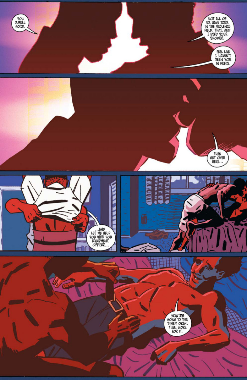
I have to say, I love those first two panels. There’s some magical “Endless Love” type stuff going on in there, and the backlighting adds a lot to the moment. It also just looks good. You said you worked closely, but how much of a back and forth is there between you and Chris Beckett, the colorist, in figuring things like that out as you’re developing the book?
JDF: The back and forth was mostly up front — we did a few versions of the first couple pages, getting the colors flatter and flatter and the palette more and more vibrant until it struck the right tone. I even colored a couple test panels, which Chris topped pretty much immediately. By the end of the book I was pretty hands off, just suggesting some tonal things here and there and getting pages back that looked better than anything I could have imagined. I’ve love to work with him again — I feel like we’re pretty tonally in-sync at this point.
I’m always curious as to how artists work in breaking down pages and panel layouts. For Virgil, did you lay the whole book out to start in any capacity so you knew ahead of time what you were going to be doing in a place like those first two panels? Also, how loose were Steve’s scripts as you worked on the book?
JDF: For better or worse, I tend to work in ten page blocks. An entire issue is too long for me to go without inking, but ten pages lets me break the various “jobs” up nicely. Steve was accommodating to my approach. We both put story first, and any changes I made during the art process were made to express his ideas more clearly. Fight scenes showed the most alterations, with pretty much everything but the major beats changing to flow together better — stuff like a punch instead of a kick.
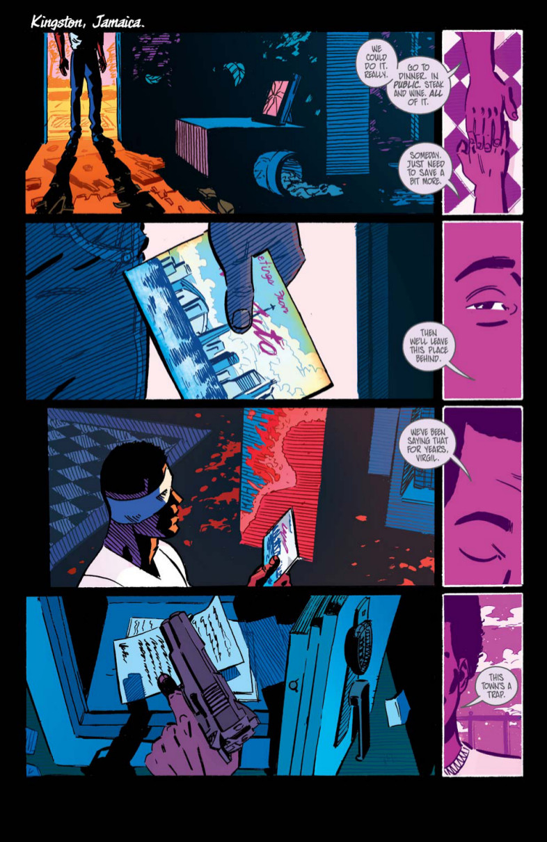
This page has a lot of really exciting storytelling choices with the art. It’s a really effectively told page, with the inset panels progressing Virgil’s past with Ervan while the main thread deals in mostly zoomed shots or slightly off center medium shots of sort looking at the area of the scene. I know we already talked page break downs, but as an artist looking at telling the most effective story you can, how much do you adjust and tinker with shot choices and page structure once you get to one?
JDF: Reading the script, my initial worry was that the flashbacks and present scenes wouldn’t be clearly delineated enough from each other. Putting all of the flashbacks onto their own tier on the right side of the page was one way to compartmentalize them from the other panels, their purple hue another. I had to re-jigger the script a bit to make the whole tier thing work, but it didn’t damage the intent of the scene in any way.
My goal was to establish a rhythm, keeping the reader smoothly flashing between scenes. The present panels are zoomed out, more literal, while the flashbacks are closely cropped and vague like a memory. At least that was the intention!
You talked about the Neon Noir kick you were on before this, and you can see that influence here with the juxtaposition of the dark atmospherics with the bright coloring on the Toronto lettering, the blood, the insets and the area Virgil is walking in from. You see those elements throughout. How did that influence impact your approach to the story and to the overall tone you were going for?
JDF: To be terribly un-artsy about it, I just find that aesthetic exciting. I worried that Virgil would be written off as a niche book at best, a weird to be weird genre exercise at worst. I hoped that something genuinely cool would make people see past any prejudices and let the book be read as what it is — a stylish action comic that happens to have a gay lead. Tonally, this also let us shift into gentler pastels for the kinder moments in Virgil’s life, making the harsher neon more affecting when it kicks back in.
Mostly? I just wanted it to be cool, but I know that cool is a tool best used sparingly.
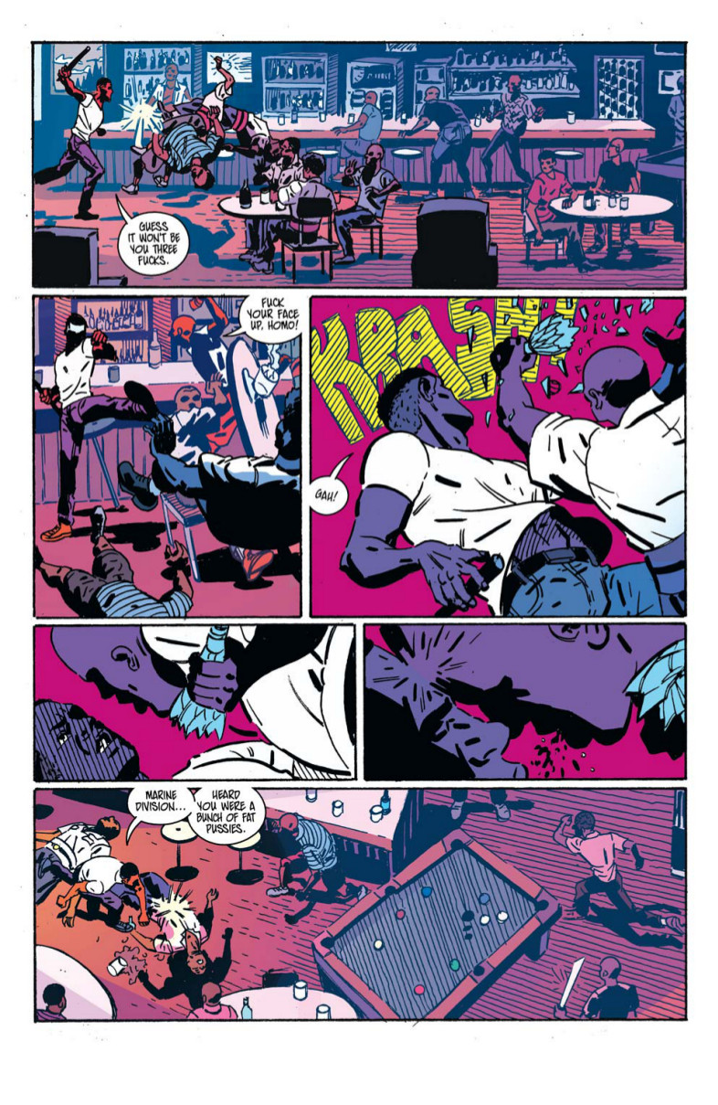
Having spoken with you outside of this interview, I know you’ve taken a lot of pride in the fight scenes in this book. And with great reason. They’re awesome. To you, what makes a great comic action sequence, and how did you look to convey their visceral nature without losing clarity in these scenes?
JDF: Reading comics, what always gets to me is fights that are a series of vaguely connected punches — well drawn, but without visual continuity or a sense of place.
I can understand why, since comics deadlines are harsh and doing it any other way takes a lot more work, but I had the time and wanted to choreograph Virgil’s fights more thoroughly. Interactions with the environment to ground the action were really important to me, so I diagrammed the fight settings for consistency.
I do worry that zooming out as often as I did lost some visceral umph, but I’m hoping the smaller details enabled by this approach make up for it.
Most people will probably digest Virgil in one sitting, which means you don’t want to hit the same beats over and over, visually speaking. Did you make a conscious effort to give these fights a diverse feel throughout the book?
JDF: Luckily, Steve wrote diverse fights in diverse settings, which pretty much negated that problem. A gun fight isn’t going to repeat many of the same beats as a fist fight, and a one on one won’t be the same as one on twenty. This is also the advantage of focusing on environment and spatial consistency — so long as the environment changes, so will the nature of the scenes.
One difficult thing, though, was that there were a lot of scenes that took place in one room for extended periods. Repetition is definitely a problem in those cases, particularly in long talky scenes, so I tried to focus on blocking and moving the characters around enough to avoid talking heads — the whole West Wing walk-and-talk principle.
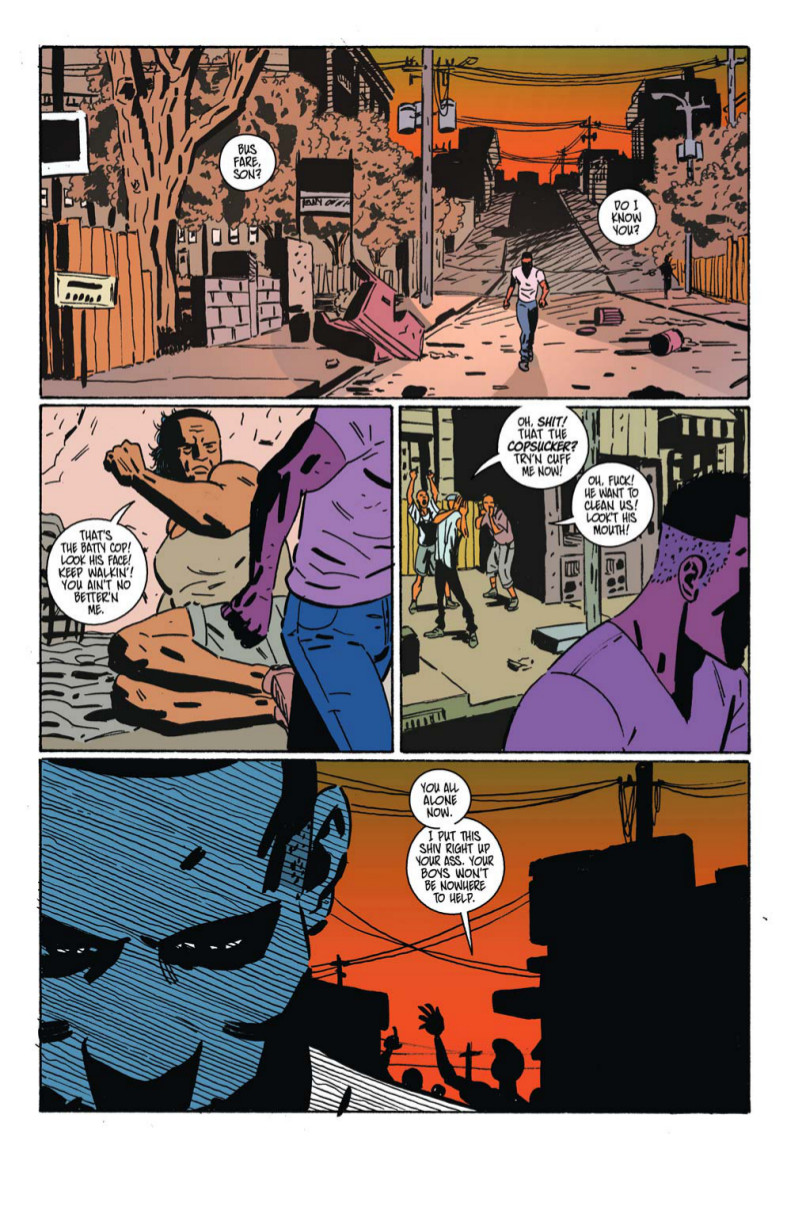
The story of Virgil takes place in Kingston, Jamaica. Did you do any research to try and get the look and feel of the location right? How far down that rabbit hole did you get if you did?
JDF: I did a lot of googling! When drawing a new setting, I like to look at images until I can pull together the tonal hallmarks that identify a setting. Gotham City has gargoyles and pires, Virgil’s Jamaica has telephone wires, palm trees, and slatted roofs. The environments changed as the story went from richer to poorer areas, but those three things always helped me out if the backdrop was looking too much like an American city
One thing I wanted to ask about was Virgil’s face in the last panel. The diagonal lines that go across his face. That’s an element you used fairly often throughout, including on the previous page with the SFX and the pool table. What do you use that for? Is that just giving the image a different shade/texture, or is that something you incorporate in different ways?
JDF: Texture, yeah. I thought it helped the groundhouse feeling. Though not strictly necessary due to the magic of computer coloring, I liked the mid-tone those diagonal lines combined to create.
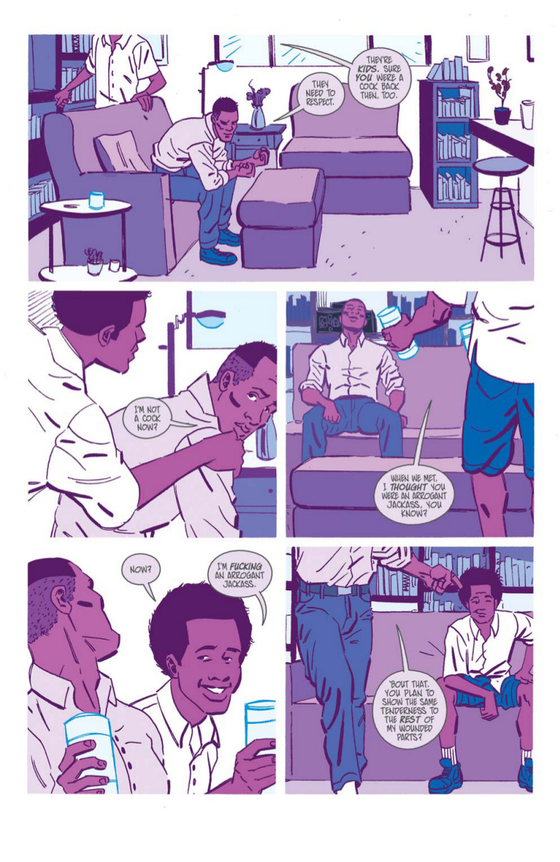
I liked this random flashback sequence, as it was a great way to develop Virgil, Ervan and their relationship. When you were developing this book, how did you go about fleshing out Virgil’s character? Do you go in pretty deep in thinking about things like fighting style, how he walks/holds himself, etc., or do you just get into the storytelling and try and stay consistent throughout?
JDF: When I work on a book, it’s less about establishing the character myself and more about building on what the script has implied. He starts the book in the closet — chest puffed out, long strides, full of masculine posturing. We see his true self only when he’s with Ervan, which later combines with a new ruthlessness as he tries to get him back.
I won’t pretend to know anything about fighting technique, so the style I went for with Virgil was just…brutality, I guess? He’s driven, unfancy. There were a few spots in the script that I changed to fit that — I thought he seemed more likely to kick you in the head than to try some MMA grab.
The last question I have is about the logo for the book. You designed it. What were you going for with it, and how do you think it represents the tone of the book as a whole?
JDF: The logo came about when I’d only done about two drawings for the book — didn’t even have any actual comics pages done, if I remember. I threw it together so that our letterer could do something better, but to my surprise everybody ended up liking it.
I wanted to take a traditionally masculine exploitation logo, something black and blocky, and then to splatter it with hot pink. It works nicely as a summation of the book’s mix of action tropes and unabashed queerness, so I’m happy with it. Fun fact: the pink “blood” on the logo actually made it into the book itself, so look for those big, beautiful splatters!