Sana Takeda on the Beauty and Darkness of Monstress
The gifted artist lets us know how she creates the magic in the pages of her Image Comics hit
One of the most delightful things for a reader visiting a comic shop is what happens when you pick up a book on a whim and find a new favorite. I’m not going to say it happens often – if it did, it’d probably feel less special – but when it does, it’s pretty awesome.
In 2015, one of the titles that fit that bill came home with me because of the cover and frankly the giant size first issue. It was Marjorie Liu and Sana Takeda‘s Monstress. I didn’t know anything about it, but its look and three issues in one package was too much to resist. What I was met with was a stunningly gorgeous, endlessly fascinating story that imagined a dark world struggling with the aftermath of a war between humanity and supernatural forces, centered around a young woman on a mission.
The art has been a massive part of my enjoyment, as Takeda – who previously worked with Liu on X-23 at Marvel – has been blowing me away with every issue and cover. To dig into it a bit, I emailed with Takeda – who lives in Japan – about her work, how she got into the comic industry, her process, what drives some of the decisions she makes with her art, what appeals to her about the project and working with Liu, and more. Give it a read, and if you haven’t picked this book up yet, I highly recommend it.
You’ve been working in American comics for a little while now, but one thing I’m not certain about is your art background. Are you a self-taught artist or do you have formal training? And beyond that, how did you first break into the American comic industry?
ST: I have no experience of learning at any art institute, but I used to draw pictures mimicking pictures inserted in novels or Manga since I was a child. I think this experience has become a foundation of my art career. For a while in my childhood, I stayed in bed for a sickness and was bored everyday, so I scribbled day to day, which may have prepared myself for my art career.
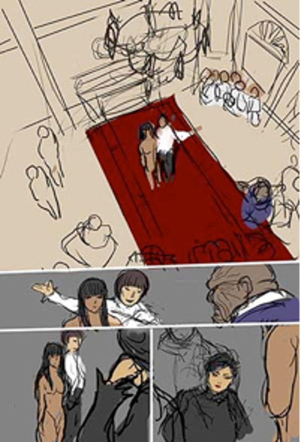
When I was 20 I joined a game company and was involved in creating pictures of athletes in soccer or in the NBA in 3DCG. So it was after I quit the company that I started illustration. It was what I had to for a living.
What helped me get into American comics was that I sent some work to C.B. Cebulski at Marvel and got a reply from him. I was either lucky or he had the flu!
You’ve worked with Marjorie Liu before, and given that Monstress is a creator-owned project, it seems like the two of you enjoy working with each other. What is it that appeals to you about Marjorie as a writer and a collaborator?
ST: I worked with her on X-23 for the first time and was impressed with her outstanding handling of the plot, sense of humor and her intelligence.
I guess when she writes a story, a visual image comes along with it. So whenever I read her story, which is just like water running, I feel as if I were watching a complete film.
This is solely my own opinion, but it is just like the dialogue that makes up a comic. Listening carefully to the writer, you perceive what the writer cherishes in it. And then you get back to the writer with your own perception by drawing the art. Looking at the art, you draw what the writer can get back to you in words.
This dialogue with Marjorie is quite comfortable and exciting for me.
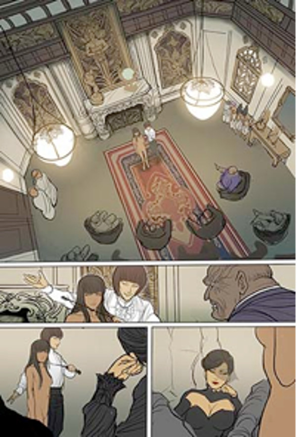
As a reader, Monstress has been an instantly appealing and unique read. But for you as an artist, what made you want to take this project on?
ST: Thank you for your kind words! I felt like working together with her someday in the future when X-23 was over. So I was away for two years from art and comics. Meanwhile she came to Japan, when she said to me “Why not do something together?” I felt so happy but thought she said so as a compliment, as she is such a kind person. I was out of that field for a while.
About a year later she said “Are you ready?” which surprised me. But I replied I would take the chance if I was good enough to do so.
You’re handling full art duties on Monstress, including colors. What’s your process on any given issue? And do you work traditionally, digitally or a mix of both?
ST: Currently I do it all digitally. As I do layouts, I color tentatively, and then drawing the lines and coloring them repeatedly until I finish. Awkward and time-consuming as it is, I find it most comfortable so far.
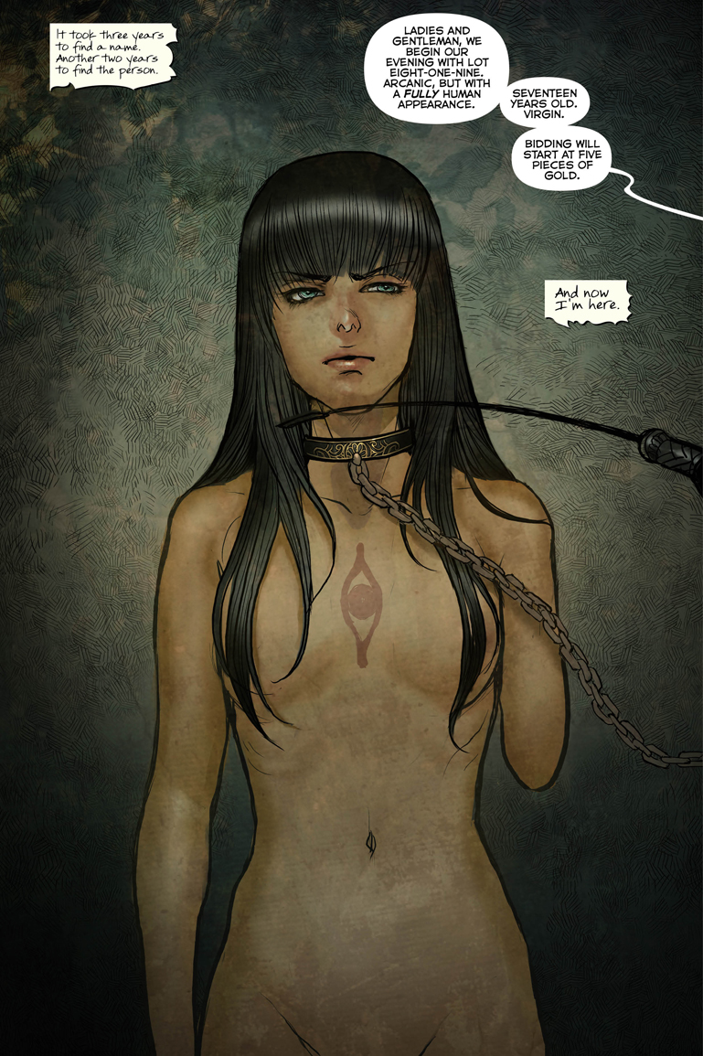
Our first introduction to Maika is her naked to the world and the reader, stripped down but still powerful. Given that its our first introduction to the character, was this a page you needed to put extra consideration in to achieve beauty without sexualizing her and empowerment without taking away from her situation?
ST: When I portray characters. I do not really try to make them look nice, beautiful or robust or look like some figures because doing so can make them look unnatural or ugly.
Instead, I try to imagine thoroughly what his or her character or inner person is like. What he might behave like this in this given situation! If Maika, stripped down, still looks powerful, it is because it is of Maika’s inner person.
Your art on Monstress is different in a lot of ways from what you did on, say, X-23 before, but one thing I’ve noticed and really enjoy is how you’re using thicker inks on the book, especially on characters like Maika here. Why is that? What do you feel that brings to the book?
ST: When I heard of the new project, she mentioned the word “Kaiju,” which was something unexpected. In my mind, she and Kaiju are of completely different worlds. It was the most unexpected word to come out of her mouth. Then I felt she was challenging something completely new so I was also determined to do it in a way I’ve never tried before.
But in reality at the present stage I don’t see any phenomenal difference. It is just that the colors are quieter with more line added, which is essentially no difference.
As the art I used to draw in my teens were of similar colors, I feel I simply went back to where I started.
But anyhow, I am happy that the art of Monstress has made an unprecedented impact.
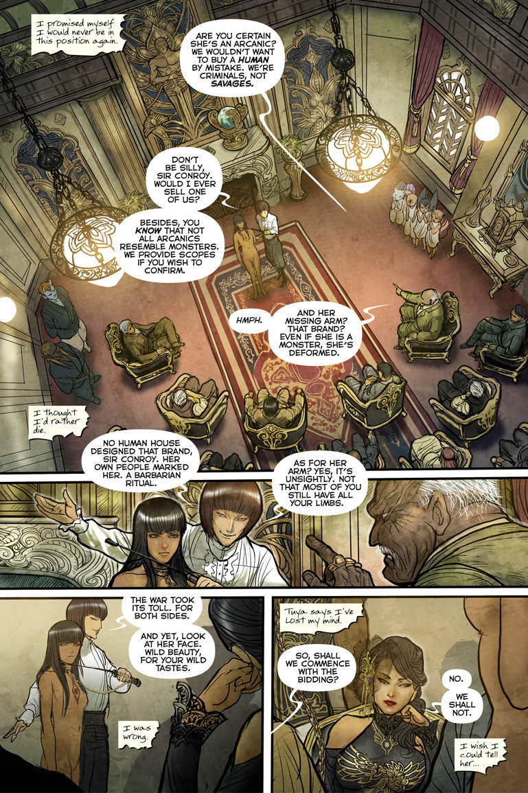
Your character work is excellent, and I really enjoy the small gestures and poses of Sophia in the bottom right panel and Mistress Ilsa in the middle panel. They’re quiet movements, but they add a lot. When you’re doing that kind of work, do you figure it out on the page, or is that an aspect you put a lot of thought into before even getting into roughs?
ST: Usually I convert into motion pictures as I read the script. Then I try to decide on layout as I pick up pictures from scene to scene. Therefore all the gestures or poses are already decided when I finish reading the script. But when setting of characters are contradictory – which is not the case with Monstress – I find it extremely hard to imagine poses or gestures likely to occur, so from the layout I try to work cautiously from stage to stage.
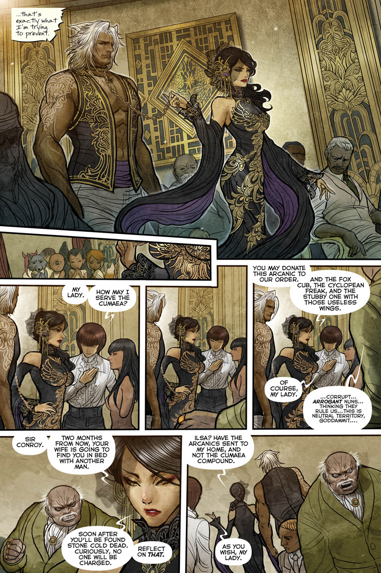
I love the depth and detail you give the art, especially things like costume and hair work on the Cumaea here. For something like Sophia’s dress and her servant’s vest, what do you feel those details do to build the world and the identity of these characters?
ST: Of course I design the costumes or patterns considering each character, personality or situations in which they are placed.
But at the same time I pay more attention to the harmony between each character and background. As I put more visual information into each panel, I can take out visual information given already in the panel so they can look simpler with good balance.
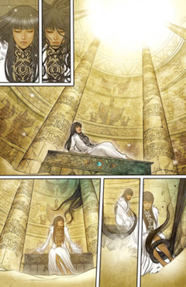
I really like the inset panel right after the Cumaea make their entrance. When it comes to laying out a page, how loose are Marjorie’s scripts? Do you have room to add panels like that, or was something that was straight from the script?
ST: Basically the number of the panels to be inset is fixed already when the script is completed. However, whenever I feel more panels can make it better, I make suggestions and also requests for change can come after she confirms the art.
Usually deciding on the size or layout of the panels is my job, but she can do it when she is writing the script. Especially when it comes to significant and big panels, she gives instructions in the process of her script.
For the panel you are referring to I had no requests. In fact, that panel was originally bigger, but I made it smaller as that panel, being large, can distract the flow of the story.
Also, I can change almost completed pages in order to make the story look better. The page to the right was supposed to be in issue #2 but was moved into issue #3.
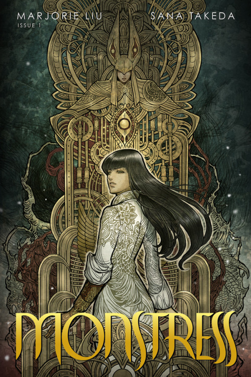
The covers for Monstress so far have been gorgeous and instantly appealing. To be honest, this cover was a big part of the reason I picked the first issue up. For you, what’s your approach on covers, and what are you trying to do when you’re conceiving and drawing the covers to this book?
ST: I struggle whenever I draw the cover.
I’d try to portray the “gorgeousness and ugliness or uneasiness behind it”, which I am not sure of its success in my product.
I am aware that I am not good at drawing art for the cover, which is supposed to attract people’s interest. What I simply try to for Monstress is to demonstrate all I have. I never draw for the purpose of attracting people’s eyes. So is the case of interior art. If you try to draw to impress people, you will end up drawing boring art. All you have to do is to demonstrate all you have!
Art in the header from Monstress #1 and by Sana Takeda. You can find Montress at Image Comics by Takeda and Marjorie Liu.
