
The Beauty in the Ugly: Talking Airboy with Artist Greg Hinkle
In the immortal words of Tim Kasher, we all know art is hard. In the case of both the Cursive frontman and Airboy artist Greg Hinkle, it can be even more difficult because in their works they’ve taken dead aim at a subject that can be especially difficult to tackle: themselves. For Hinkle, that means working with writer James Robinson to create a funhouse mirror version of the real world, developing grotesque, broken versions of self as the pair attempts to create a new Airboy comic in the face of a creative block that vexes them and a bender that spins out of that. It’s a dark book, and one that takes a hard look at the creative process and the vanity of creatives.
But it’s also a beautiful one, as Hinkle’s first major work has revealed him as an incredibly gifted storyteller who is – in my opinion – one of the few artists who has the skill and ability to make a story like this work. He brings San Francisco and the gonzo story that is taking place on its streets to life in a way only he could. Not only that, the guy’s lettering and coloring the book too. He’s a full service talent, and one who I’ve immediately become a big fan of.
In today’s art feature, I talk with Hinkle about his work, tackling real environments and people, art process, influences and much more. Towards the end of the interview, we talk about the controversy that came up in response to the depiction of the transgendered community in the second issue as well. Hinkle reflects on what he learned from the experience, and how it will impact his art going forward.
Take a read, and big thanks to Greg for chatting with me about his work.
Everyone has a different reason for working in comics, but for you, what was it that made you want to pursue a career in comics? Were you a big fan growing up?
GH: You know, I wasn’t really exposed to lots of mainstream comic books early on. The comics page from the newspaper was always around, and I had all the Calvin and Hobbes collections. My grandparents had some collected editions of Gary Larson’s The Farside which I just devoured. Marvel’s GI JOE series from the 80’s introduced me to mainstream comics, as well as the more traditional format.
Once I discovered that there were whole stores dedicated to this stuff… I mean, if there are that many different books, then there have to be people making a living from it, right? Good or bad, I don’t know if I’ve ever really considered another path. I knew I would at least give it a shot, and see if I could hack it. It took 6 months of driving a bus on the tarmac, shuttling passengers between terminals at LAX to realize how bad I wanted to try and give it a go.
Your art has a look that isn’t really like anyone else working in comics, or at least from what I’ve seen, but it’s absolutely perfect for Airboy and the unreal reality of the story. It actually reminds me more of a funhouse mirror reflection of Will Eisner. Who and what were your biggest influences as you developed as an artist, and did you go to school for illustration or anything?
GH: I went to art school in San Francisco after bouncing through 3 other colleges, and “taking some time off” from school for a few years. I was a fine arts major for a while, then seriously considered studying art history full time. I finished with a BFA in Traditional Illustration, which means I still don’t know how to use Photoshop or Illustrator very well, but I can get down with some charcoal.
Discovering Mike Mignola’s Hellboy in college is what reignited my love for comics. His art was graphic and moody, and I’d never seen anything like it before. His efficiency was what really amazed me. When I’d stopped reading regularly, the 90’s Image, heavily crosshatched style was still popular, and digital coloring was starting to gain a foothold. It was an aesthetic that I just assumed was what everyone was looking for, and not one that I thought I could produce. Seeing Mignola’s use of chiaroscuro– and being in art school, I knew to call it chiaroscuro, which made me feel pretty smart at the time– made me feel like maybe I could give it a go after all.
Mignola led to Toth and Frazetta, Al Williamson and Sergio Toppi. I was getting an education on the great illustrators like Robert Fawcett, Albert Dorne and Robert McGinnis at school, and Eduardo Risso, Darwyn Cooke, and Will Eisner at the comic shop. I really appreciate even being mentioned in the same breath as Eisner. I reference his work often. His characters are always in motion, and they emote. They’re actors in the story, not objects, and I’ve always admired that. Same with Jack Davis. Jack Davis is a huge influence.
At the moment I’m obsessing over Chris Samnee, Jason LaTour, Stuart Immonen, Paul Azaceta, Evan Shaner, Jordie Bellaire, and Declan Shalvey. God, I could go on for hours… there are so many good influences right now…
Everyone has a different path to comics, but as someone who is relatively new to the industry, I’m curious: what was your experience like breaking in? What did you find to be the biggest aids in finding jobs, and what were the things you struggled the most with?
GH: Oh man, is it weird to be asked that question! I’ve seen it asked, and asked it myself so many times, it feels strange to have it in front of me.
I spent a lot of time at the Isotope Comic Book Lounge in San Francisco, and ended up meeting a lot of great people, both in and around the comics industry. It’s where I met James Robinson, in fact. I started by making mini-comics, then selling them at conventions, and cultivating an online presence. Talking to professionals at shows, meeting people at book signings, and general networking. Twitter has been a great tool for getting in touch with people and learning how the industry works. I guess it was a pretty uneventful path. I turned to comics full time about 3 years ago.
I think the hardest part has been sticking to it. It took me a long time to get to this point, and its been hard to stick it out. Its hard to watch as the months, and then years go by as you work on the same book, hoping that it all pays off in the long run. I don’t have any side jobs, or many friends nearby, or a reason to leave the house most days, so every day kind of blurs into the next. Sacrificing a huge chunk of life to pursue a dream is scary stuff.
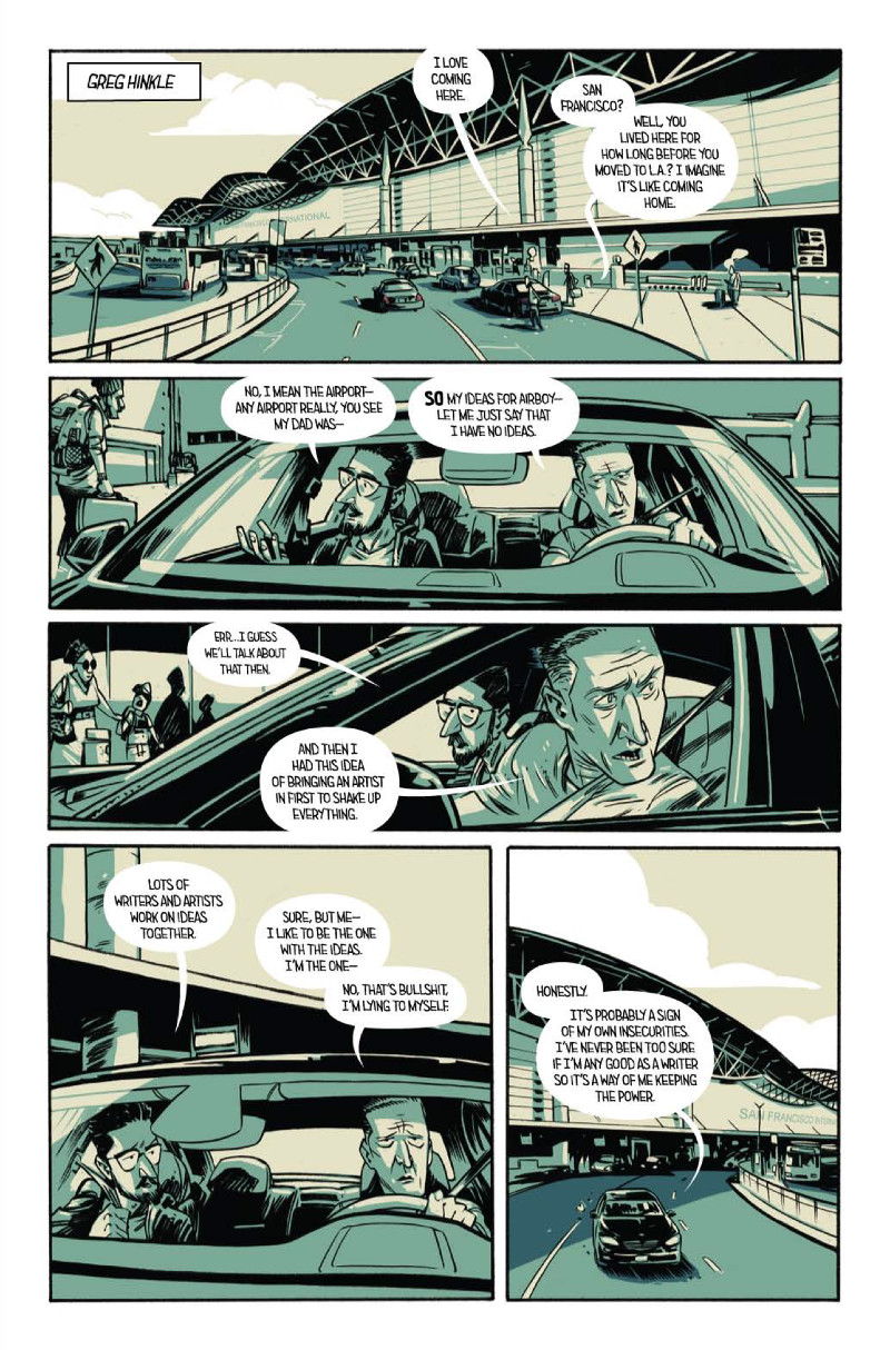
It seems more and more artists are switching to digital due to a lot of the advantages it can offer in terms of flexibility and speed. But some still prefer the raw, tangible feel of working traditionally. Where do you fall on that spectrum, and what’s your process for bringing an issue of Airboy to life?
GH: I’ve always been a traditional guy, but I’m warming up to digital tools. It’s not even that I disliked digital tools either, I just haven’t ever taken the time to learn much about them. All those tools are expensive, for one. I’m using a version of Photoshop from 2008 on a 6 year old iMac. If either of those break, I’m just out of luck. I finally did buy a new Wacom Intuos tablet last month, since I’d worn a spot into the old one. It’s a lot easier for me to rely on traditional methods right now, since I don’t have to upgrade my pens as often.
I receive a script from James, which I print out. I read it through once, just to get a feel for the issue, then go back in and start blocking in the scenes. Who speaks first? Who’s moving around? Coordinating the scenes for myself, so I can position everyone correctly and work out the choreography. I do real small thumbnails with pencil and paper, and scan those into Photoshop. I blow those thumbnails up, rearrange them onto the page templates and flesh out the panels more. This is where I use SketchUp to model interiors, or reference vehicles and props, as well as adding in gestures and expressions. I’ll print those roughs out at final size, then use a lightboard to transfer them onto my paper. I tighten up the scenes in pencil, ink them, erase out the pencils, and scan back into Photoshop for corrections and coloring. I use Illustrator to letter.
I swear it doesn’t feel this complicated as I’m doing it.
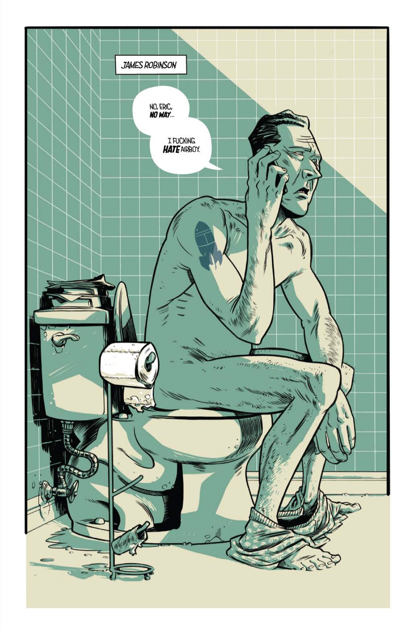
I have to admit, when I saw this very first page, I knew this book was going to be a little bit…different. It’s not every day you see a famous comic writer taking a crap in a comic. I’m curious, what was the development of the project like? How early on did you know that both of you would be characters in your own story, and what was your initial reaction to that idea?
GH: I remember first talking to James about the book after he finished a convention panel, standing by an escalator. James described the premise to me as Adaptation by way of Fear and Loathing in Las Vegas, so we knew from the beginning that we’d be in the book. As much as he described it to me, it wasn’t until I saw the first script that I realized how personal we were going to get. I read the script, and re-read it a couple more times. I was totally excited by the idea. I did have to make some phone calls to my family though.
“Mom, think of it as being cast in an R-rated movie, in which you play a nasty, exaggerated version of yourself.”
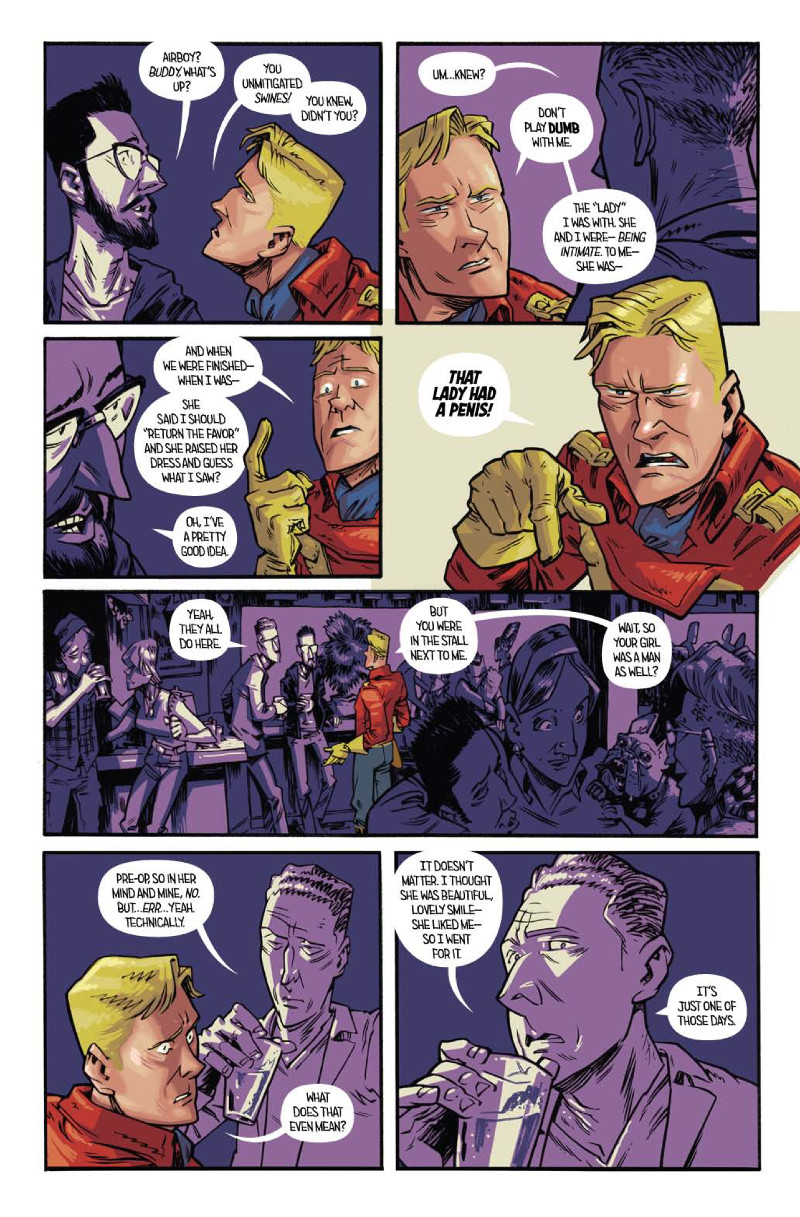
While I highly doubt you and James went on coke fueled benders or anything like that, something like that rocket tattoo on James’s shoulder stands out. While your actions may not have been real, how closely did you reflect reality with the actual look of the fictional versions of you? And this is not a covert attempt at asking about your penises, I swear.
GH: We really didn’t want our comic selves to look too good. We didn’t want to be grotesques, but if we’d been broad-shouldered beefcakes it would’ve become a vanity project. With one cocky exception, it’s not really a flattering story, and the look needed to reflect that.
We changed the look of his rocket tattoo for the book, but it’s real. My tattoos are the same, and my hair was that short when I started on the book. I haven’t had it cut since I started and it’s inching past my shoulders now.
I will say, I’ve had more phone calls and emails about penises on this book than any other project I’ve worked on.
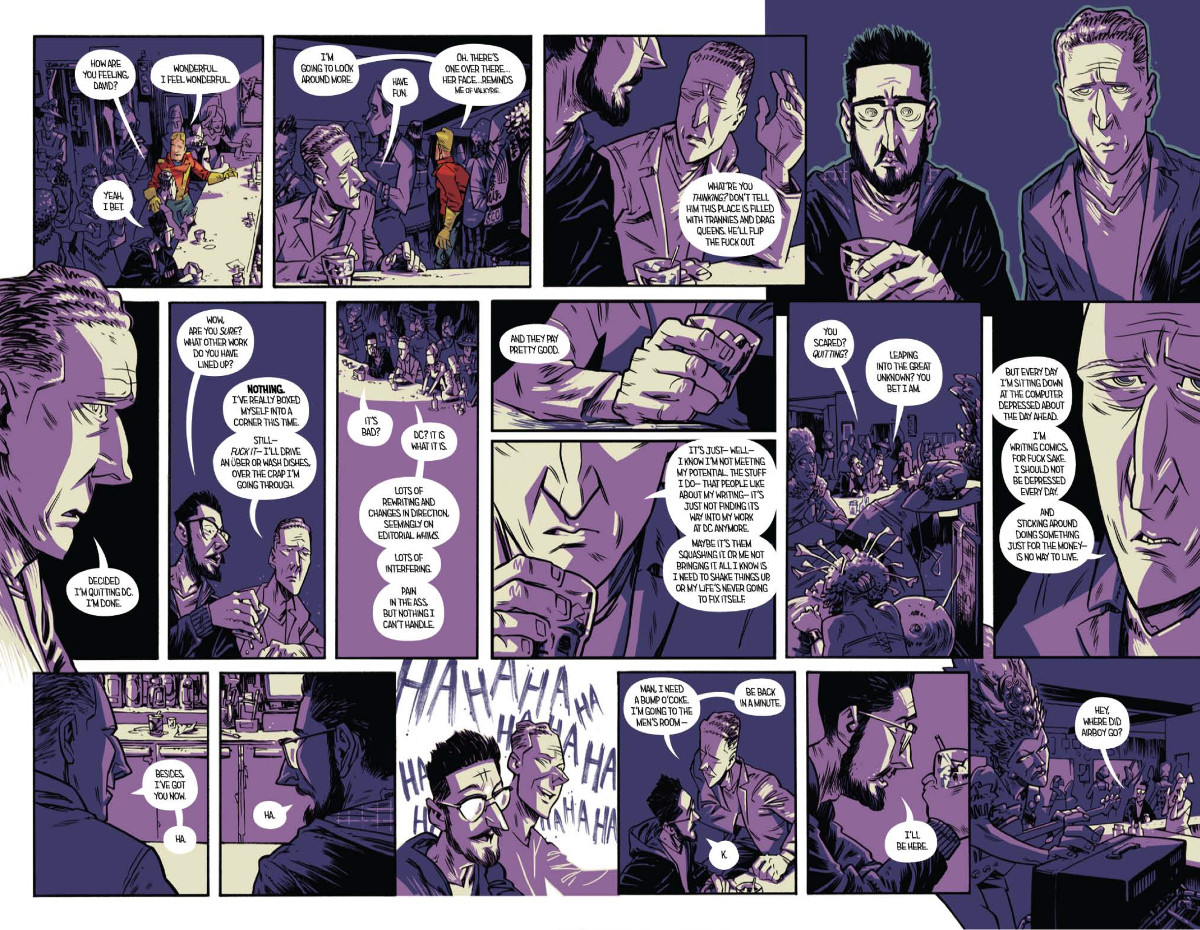
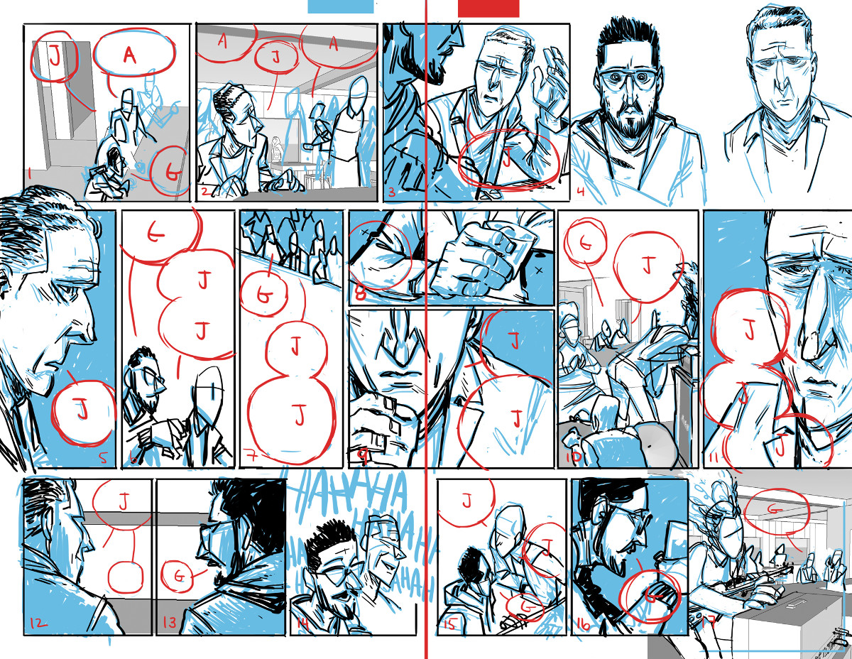
The layouts in this book never really get too crazy, save for a few choice two-page spreads, but this page is a nice look at your approach to telling a story. I really love the simplicity of the bottom three panels, and the frustration it indicates in its progression. What’s your approach for layouts? You said you block them out first, but are you staying pretty close to the script you’re working from, or is it more you figure out how to flow the story from the elements based off your own interpretation?
GH: I’m a simple guy, so I tend to like simple page structure. I admire artists that can make big, elaborate, creatively designed layouts, or that can retain narrative despite a 16 panel grid. I don’t want to get too big for my britches and distract from the story here. I’m happy to sacrifice some creativity for (what I hope is) clarity.
James is providing me with a full script, so I’m sticking pretty close in terms of panel breakdown. There have been more than a few pages which came to me with layout descriptions, which I absolutely love getting. I tend to waffle over stuff at this stage, constantly second-guessing myself and redrawing. At this stage I’m trying to focus on figure and balloon placement, and pages in relation to each other. Broad indications of a figure’s gesture or even just the direction their head is turned is usually enough for me.
This is also the first book I’ve lettered, so I’m very quickly becoming aware of leading the viewer’s eye and the effect balloons have on the panel. The more I can plan out in the layout stage, the easier the next steps become.
I know, it’s revolutionary thinking…
One of the most obviously unique aspects of this book are the colors. For the most part, each environment has its own color, and that environment colors the characters within them (save for one particular exception). How did that idea for the colors come together, and is there a particular reason for them save for the contrast with the full color Airboy?
GH: I really wish I could take more credit for the look of this book. The graphic novel I did before this, THE RATTLER (with writer Jason McNamara), was done in black and white, with splashes of red. I think James liked the monotone theme, and had the look for Airboy figured out when he came to me. I did get to pick the colors, so I was technically involved.
I suppose there’s an art school answer in there somewhere. Something about the drab, monotonous banality of the real world juxtaposed with the four-color vibrancy of unbridled idealism, and something something nostalgic reverence.
I initially thought that the limited palette would allow me to get away without hiring a colorist. It’s only two colors, y’know? Piece of cake. The more I could do myself, the better. It allows me greater control of the finished product, and I don’t have to run things past as many people, I thought. Not that I didn’t want to work with a colorist. I would love to work with a colorist! I think the coloring stage is what takes me the longest.
Be honest: how surreal was it drawing yourself into a comic the first time?
GH: I did a mini-comic a few years ago, which kind of starred myself, so it wasn’t too intimidating for this book. I use myself as reference a lot anyway, so at least this way I don’t have to camouflage it.
The nudity is what got me. As puritanical as it sounds, especially given what’s in the book, the nudity is what threw me off. It took me 6 years to graduate from art school. I can’t tell you how many hours I’ve spent in life drawing classes. And I can count on one finger how many times I drew genitals. I thought it was a ridiculous thing to practice drawing. When was I ever going to need to know how to draw genitals?
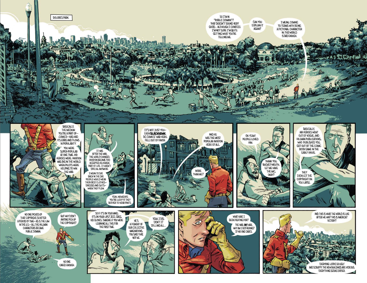
While much of the story is an exaggerated, over the top version of reality, it still exists within very real settings at times. For something like Dolores Park, how important to you as an artist is it to get the details right? Are you someone who meticulously digs into elements like that, or are you just trying to capture the spirit of something?
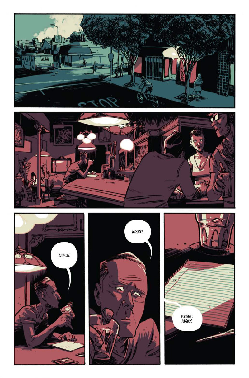
GH: Oh, I’m obsessive about research and reference gathering! I want settings and costumes to be accurate and consistent. I have a huge folder of photo reference for San Francisco Chinatown alleys. And I think we spend maybe 2 panels in a Chinatown alley. I created a bar crawl for our big, bender spread in issue 1. It’s a real route, and the bars are based on real bars. The Dolores Park spread was the result of lots and lots of reference gathering and compositing. I wanted the setting to be believable, and for us to move around that space in a believable way.
For a lot of the interior scenes, like the bars in issue 2, I created basic 3D models in Google SketchUp to keep everything consistent. I’ll dig through premade model furniture to find period appropriate chairs and cars. I might spend more time gathering reference than it’s worth in the long run. I may have a problem…
I’m trying to incorporate a more impressionistic approach to some scenes, but I just love drawing all the folds and buckles and grime.
One of my favorite parts about your art is how expressive and gestural your characters are. You see great examples throughout, but a nice one here is when you’re talking about how popular Blackhawk was, and there’s Watterson-esque glee on the comic version of your face. I love it. When it comes to the character acting in your art, how do you approach that? I know you said you use yourself for reference already, but do you do photo ref for everything, or is some of it you just going for what feels right?
GH: I guess this is where I’m focused more on what feels right. I want the art to heighten the emotion of a scene. God, that sounds so art-schooly. I read through the scripts and try to find the emotional beats. This scene is somber, and this scene is funny. Ok, which delivery of this line is the funniest? What body language heightens that delivery? I suppose it’s all pretty subjective.
Honestly, I spend lots of time making faces in a mirror. If a pose or action is tripping me up, I’ll act it out in front of the full-length mirror in my office. I’ll act it out a few different times, and from different angles. If I’m really struggling with a pose, then I take pictures.
While we’ll get to a more traditional two-page spread here in a minute, you have a few different really dense, fairly complicated two page spreads in which you have to tell a lot of story in not a whole lot of space. It works really well, but I always wonder, does the degree of difficulty for you escalate with a page like this? Is the problem solving element of your art more difficult the bigger and denser a page gets, or can a more traditional two-page action spread drive the same level of anxiety something like this would?
GH: Yes, to both questions.
GH: The spreads have been one of the hardest aspects for me on this book. Thanks for saying that they work. I hadn’t ever used a two-page spread before, so it’s been kind of a crash course. But its still about where you want to lead the viewer’s eye.
I’m constantly fussing with layouts, trying to make sure no one gets confused when they read the book. I’ve stopped reading books after layout choices distract me from the content, so I’m trying to stay mindful on these pages with a high panel count. I’ve found that it’s really, really difficult to keep panels simple. I tend towards excessive details, so the big spreads are pushing me to try and use the space more efficiently.
The action spreads aren’t as hard to lay out, but that usually means a more detailed drawing, so they’re both tough. It is pretty satisfying to finish one though.
 You talked about how you letter the book, but one thing I really enjoyed in this spread was the moment of laughter fictional James and fictional Greg shared, and how you did that SFX by hand (or appeared to). It’s a pretty awesome moment before things go REALLY haywire. How did you decide to add elements like that by hand, and what do you think giving it a more raw feel like that does to elevate the moment?
GH: That was a happy accident! I put those sound effects in while I was doing the layouts, and it just seemed to fit, so I left it in the rough. By the time I was inking, it just felt right. It helped to punctuate the scene.
I’ve always been attracted to the hand lettered sound effects. The uniqueness of each effect appeals to me. And from a pragmatic standpoint, it’s easier for me to draw it in than to figure out how to do it digitally.
Let’s talk about the controversy that surrounded Airboy #2, specifically the handling of the transgendered community within its pages. The issue angered many and was labeled transphobic by GLAAD, leading to James issuing an apology through them. While James has been heard on the subject, you haven’t. For you as both a creator and a person, what have you learned from this experience, and do you think it will impact the way you approach stories in the future?
GH: It’ll have an impact on everything for me, absolutely. It already has.
I’ll stand right beside James and his statement. I can’t presume to word it any better than he did, or to speak for him. I would like to offer my own personal apology to those who were hurt. Because that’s what it boiled down to, to me: we hurt people. And that’s not okay. I am sorry.
I think right now, for me, it’s important that I just listen and make myself more aware of the transgender community, and really all other perspectives. At the very least, if no other good comes from this, my outlook has been changed in a positive way. And at the risk of sounding selfish, I’m thankful to have this happen at the beginning of my career, when it’s still early enough for me to do more positive than negative.
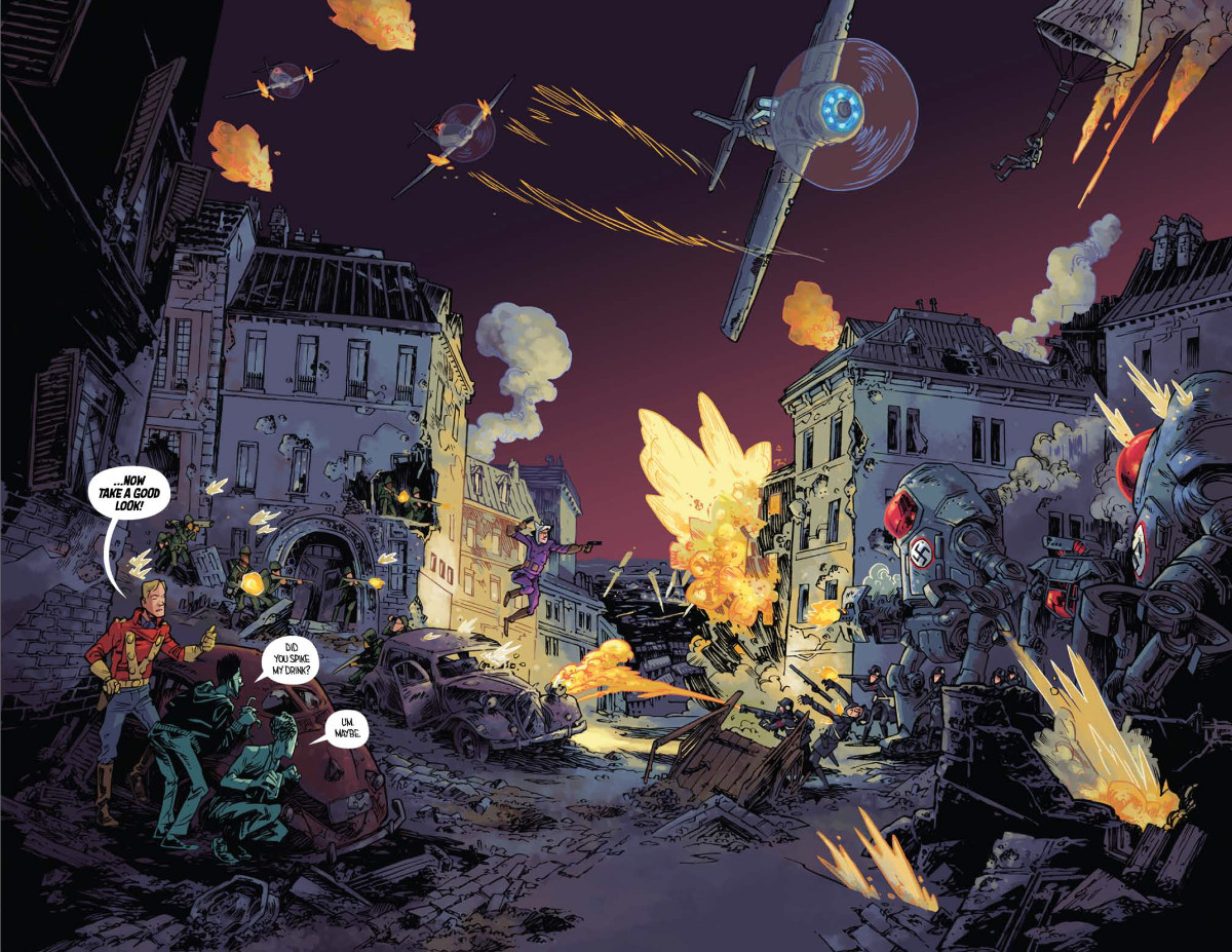
This is where things get really bonkers, as you go from a bar setting to a world filled with giant Nazi bots, flamethrowers, pulp heroes and fighter planes. Does working in a setting like this and designing warbots and things of that sort scratch a different itch for you as an artist than the earlier parts of the story? Or does the setting and subject shift matter little to you?
GH: After drawing bars and crowds of people for two issues, it really felt like I was getting to cut loose with this spread! This environment and setting allowed me a little more freedom since it’s not a specific location. It’s France, but nowhere in particular, so I can get away with reference that’s a little vague.
Subject matter keeps me interested, and my level of interest effects the result. Changing settings gives me a completely different set of problems to solve, and that re-engages my mind. And it’s a world full of stuff I’ve always wanted to draw, so this spread really marked the beginning of my second wind on the book. I definitely get to scratch some new itches in the last two issues.
All art in the piece is by Greg Hinkle and from Airboy #1 and #2.