Skottie Young on the Process and Princesses of I Hate Fairyland
Taking the leap to creator-owned comics can be a big change for any creator. It’s not just making comics at a new publisher; it’s running the show entirely on your own for the most part. They’re both making comics, of course, but there’s a major difference between the two in many ways
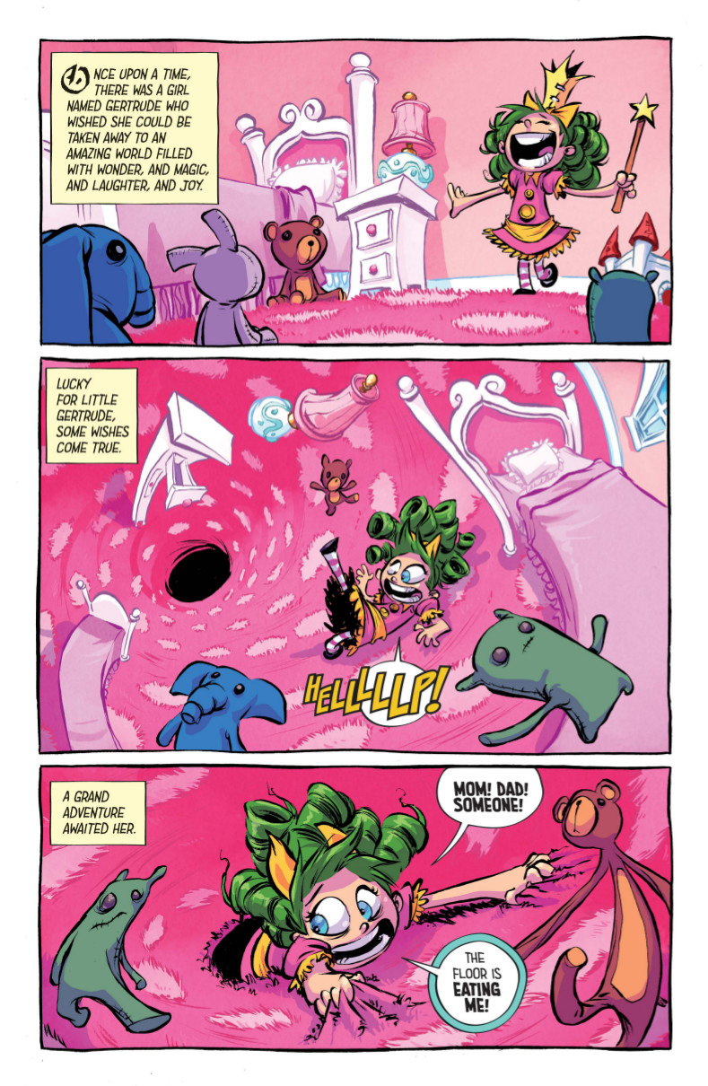
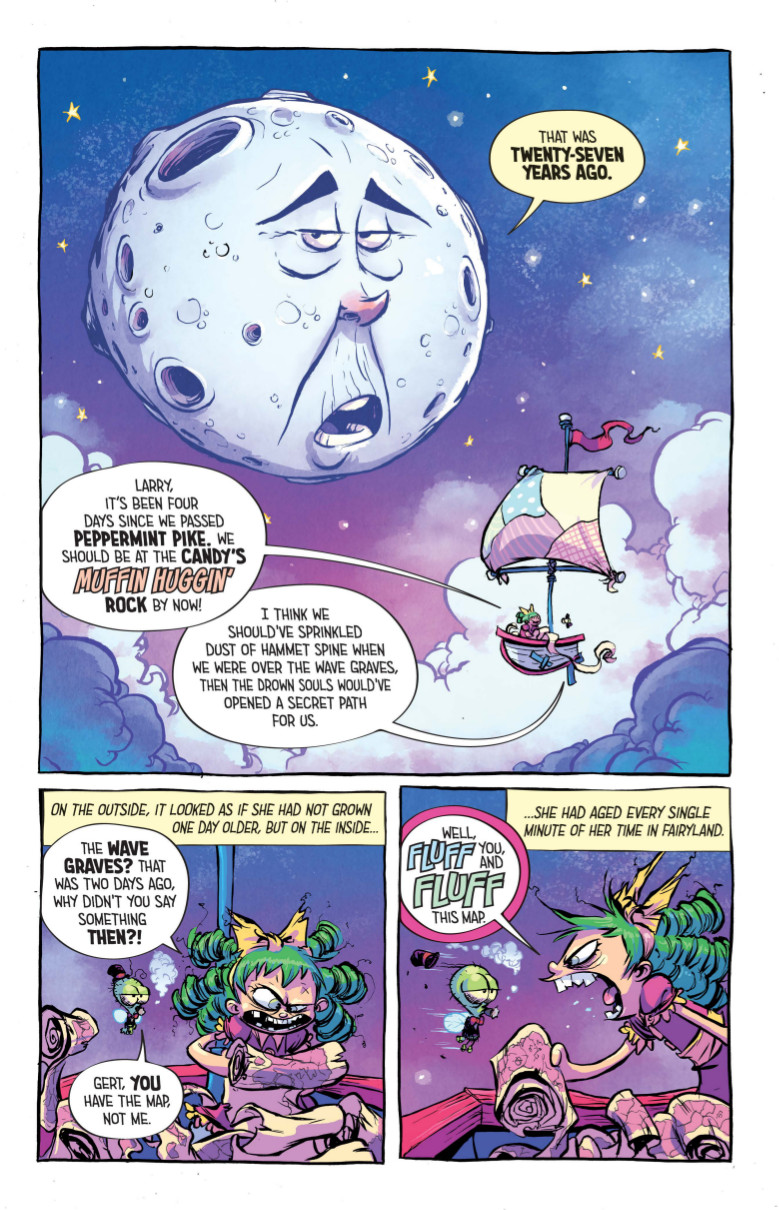
Superstar artist Skottie Young is learning all about that with his first creator-owned project at Image Comics, I Hate Fairyland. The book finds him partnering with long-time collaborator and colorist Jean-Francois Beaulieu and letterer Nate Piekos to tell a tale of Gertrude, a six-year-old girl lost on an adventure in an Oz like world, except she’s been there for 27 years. And hasn’t aged physically. And has been living in a land magic, gumdrops and ebullient princesses. All good things, but you know what they say about too much of a good thing.
Despite the differences between working at Marvel and on your own projects, I’m happy to say that Young stuck the landing on his first work, as I Hate Fairyland #1 is a madcap romp that’s a ton of fun and a perfect send-up of what one might expect from Young. It looks like one of his projects – and by that, I mean it’s beautiful and fun and energetic – but it’s darkly humorous and very strange in the best ways.
To learn more about it and how the book came together, I talked with Young about his art, how the project came together, his process, what it’s like working with Jean-Francois and Nate, Gertrude’s evolution, and much more. Take a look below, and look for I Hate Fairyland #1 in your local comic book shop October 14th. If you’re interested, don’t forget to tell your shop you want it as well.
You’ve been in comics for a while now and so far you’ve primarily worked at Marvel on varying books and in varying capacities. What made this the right time to make the leap to writing and drawing your own stories, and what made I Hate Fairyland the right fit for your first Image book?
SY: Actually, I’m not sure there is a “right time.” That’s why I finally jumped in and decided to tell one of my stories. As an artist, there’s a lot of waiting until the right time. Waiting until the project is perfect or the market is ready or what you think this publisher wants or a million other things that circle around the idea of the time being “right.” I was finally realizing that there is no “right” time, and if there is then it’s RIGHT NOW.
With my Marvel work I’ve always operated under the idea that I’ll do the best I can right now and then try to be better the next time. Draw the best page I can today and try to draw a better one tomorrow. If I waited to turn in a page until it was “right” then we probably wouldn’t be doing this interview (laughs).
So I decided to think like that with my creator owned work. I have a lot of stories I want to tell. Let’s jump in a tell one, have fun and tell another after that. Hopefully over time I’ll get it “right” a time or two. Either way, I’ll have fun in the process.
Keeping with that, that’s pretty much how I chose I Hate Fairyland as my first project. I had about four ideas in various stages of development. I bounced back and forth from week to week, sometimes day to day and in the rare case, I’d switch up from morning to night. Always thinking of a reason Story A would be a better first book with Story B. It went on like this for longer than I care to admit. One day, Jason Howard (Trees, Super Dinosaur) said “just pick one and do it.” So I picked one and I’m doing it.
One of the things I enjoyed the most about the first issue of I Hate Fairyland was that it looked very much like what we expect from a Skottie Young book yet it’s bloody and very darkly funny. Not that I’m saying your other work was false or anything of that sort, but would you say I Hate Fairyland is more the type of story you yourself would want to read and one that gets deeper into your own personal taste than other projects?
SY: You could say that. I’ve hit pretty close in my career. OZ is the kind of thing I love drawing and reading. Big worlds of imagination and wonder. I really enjoy that. Then Rocket Raccoon has the kind of attitude I like to read and write. It’s a bit over the top, zany and hardcore in a humorous way. But Rocket understandably has some traffic cones around it. It’s not my property so there are things that I need to keep in mind while working on that book. So I Hate Fairyland really takes those two sides of me and mashes them together, but with all the traffic cones pulled away. I grew up reading Alice in Wonderland and watching Labyrinth but also reading Lobo, Tank Girl and Trencher. This book lets me throw all that into the pot for some sweet cartoony gumbo.
I know you do a lot of traditional sketches on your online store, but when it comes to I Hate Fairyland, how are you working? Is your side of the work traditional, digital or some combination of both, and what tools are you using to bring the book to life?
SY: I’ve been a mix of digital and traditional since 2008 when I bought my first Cintiq.
I start digitally by thumbnailing each page. I fix the canvas size to about three inches tall and never zoom in and out. I treat it like a traditional canvas as much as I can. I lay out an entire issue at once before moving on to cleaning them up.
The “pencil” stage is more like clean up for me. I zoom in on the canvas, somewhere between print size and 11×17. Again, I keep it fixed 95% of the time. No zooming in and out. This keeps me from getting lost in details that won’t be seen or noticed. Again, treating it like a piece of paper. The only difference is I can adjust panels on the fly. If I draw the panel too big (which I do 100% of the time), I can grab and shrink it a bit and move it to leave room for balloons. Back when I was doing traditional pencils, I would notice that kind of problem but I would be too far down the rabbit hole and never erase to start over. I would tell myself I’d fix it in photoshop after the scan but I never did. I was too busy with the next stages of the process. So digital has actually made me a better artist because it allows me to not only take risks more often but lets me fix things the instant I notice them. And that fix doesn’t involve 6 hours of redrawing.
After that stage, I print it out onto bristol board in light blue and start attacking it with a brush. My pencils are very loose so I do a lot of drawing with ink. It keeps that stage fun and less technical. Then it’s scanning and either coloring it myself or sending it over to my right hand man Jean-Francois Beaulieu to work is magic.
Rinse and repeat.
As a creator-owned project primarily driven by you, what’s your process for bringing an issue to life, and does your process change at all when you’re writing for yourself versus someone else?
SY: It starts with the ideas. I Hate Fairyland started with a concept of a kid getting stuck in a Wonderland like world and growing to hate it. The first thing I do is take index cards and write down set pieces on them. Meaning big, cool moments that I want to be in the book. These are mostly gags or big money scenes. For example, one read:
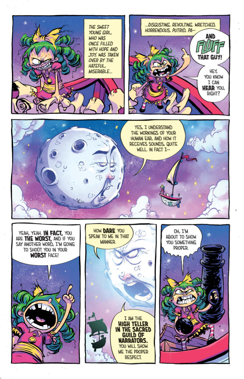
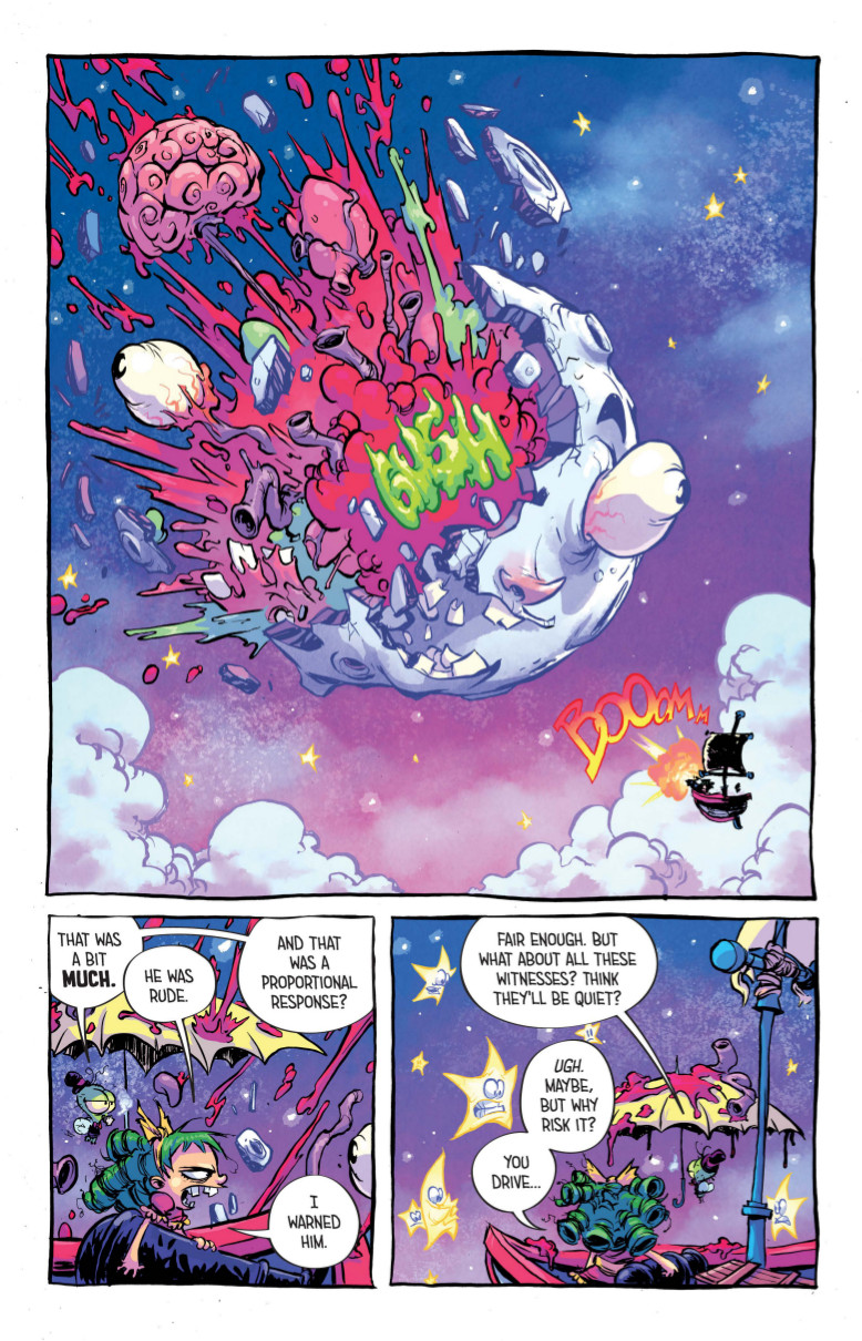
“The Moon is narrating Gert’s story, she’s tired of listening, blows his brains out.”
I’ll have a stack of cards like this. So I know moments I want to hit to make sure it’s a fun comic book. Then use index cards again (you can use real ones or virtual ones in a program called Scrivener). I have a card for each page of the book. I start with twenty. I set them up so I can see facing pages and page turn. I write a sentence on each card that represents what I’ll see on that page. The whole time I’ll have my set piece cards with me so I can see where they’ll fit in the story I’ve started to tell. They all start to fall into place.
I take those 20 cards and start writing a full script to them – page one, panel one – and keep writing until the issue is done. Sometimes the page count may go up as I script because I need a bit of room for this scene or that shot would be way cooler as a double spread. Things like that.
Once I have an issue done, I start that process over for the next issue. For my last few projects, I’ve written the arcs all at once. So for I Hate Fairyland, the whole first arc is fully scripted. All I have to do is draw it. Drawing is like another draft of writing. I see what ideas of mine worked and which didn’t. Some ideas need more pages to breathe. Some shots needs space to breathe. I can adjust that in the art stage.

One of my favorite things about this book is how you invert all of our expectations for this kind of story, and not just in the span of time Gertrude’s quest takes. While she enjoys Princessing in the comfort of her own home, she’s out on the adventure (or at least in the being sucked into the vortex in her bedroom) from the start. It’s a brilliant juxtaposition with the very typical fairy tale narration on the page. What makes this storybook kind of tale and the realities of Gertrude’s adventure something that is so inviting to you?
SY: Wow, thanks! I love having no rules. It’s always fun to create stories in a world where there are no rules. I don’t like using rulers and perspective and all the things we’re supposed to use while drawing the real world. So I play in worlds that make it okay not to use all that stuff. I could have had an entire of issue of Gertrude in her world, happy and playing and showing her life before her thirty year adventure, but that’s the not the story and it definitely would be that fun. I didn’t want to waste any pages where we were having fun.
Your colorist on this book is someone you’ve worked with in the past: Jean-Francois Beaulieu. He does phenomenal work throughout this first issue, and for me, his coloring choices underline the fairy tale feel of this book in a big way – even in this open with the cotton candy colored floor. What makes him such an ideal partner for telling this story, and what do you think he does to bring the best out of the story?
SY: I’ve worked exclusively with Jean-Francois for ten years now. He’s colored every interior page I’ve done for a decade. We read each others mind most of the time and if we don’t, we’re comfortable bouncing ideas back and forth until we hit the look we’re going for on any particular project.
He’s an insane talent with ZERO ego. That’s what makes him so great to work with on any project. We can hunt for palettes and styles and once he nails it we have a seamless process. He’s so familiar with my shapes and line and notes I’ve given him from 7 years ago that he knows what to do in what situation. We’ve developed a great working relationship.

Speaking of collaborators, Nate Piekos is one of the best letterers in comics, and he does really, really great work here. I love the visual treatment he gives Gertrude’s Fantastic Mr. Fox-esque cussing, in particular. When it comes to working with both Nate and Jean-Francois, how closely did you work with them – at least initially – to create a unified, focused look to this tale?
SY: Yeah, Nate is super talented. I’m lucky to have both him and Jean with me on this book. We work pretty close. As the book gets lettered, I see the dialog in new ways and Nate has been right there to switch things up on the fly. Sometimes things work in a script but they don’t flow right on the page in a word balloon so we make changes. It was Nate’s idea to treat the cuss words a bit big and bouncy, similar to something in Cerebus. He’s bringing creative ideas to the table and that’s so important. When everyone feels involved, it’s just great.
Jean and I work really close as well. At the start of any project, we spend some time (maybe too much time) on two to three pages. Jean colors this in different styles of finish and palettes and we just hunt for the look. He’ll send over a page. I’ll scribble some color on it and say “what abut this” then he’s like “what about this.” It goes on like that for awhile and then one day, usually when files need to be turned in, we say “this is the look, let’s go!” (laughs)

Let’s talk about Gertrude. When we first meet her, she’s an adorable, doe-eyed princess in her cotton candy colored room. After twenty-seven years later, she’s a bat out of hell monster ready to ice anyone who talks to her the wrong way. How did Gertrude as a character evolve as you were developing the book, and how important was it to make sure her outside matched her soured inside?
SY: She’s evolved a great deal. She started off as a he and then was going to look his age. Then she was a she but was older. Closer to her age. And slowly, over time she became what we see in the book.
The more I developed he into her and her into little her, (the more) I liked the idea of the big attitude in the little body. It just seemed funnier to me. The book was always meant to be for laughs so I would call up my friends and ask “character gets stuck in Fairyland and after 30 years hates the place. Would it be funnier to have it be a older guy? Young boy? Older woman, young girl?” Everyone had a different answer, so my friends were no help. (laughs) But eventually I went with my thought and told the best and funniest story. A kid who gets all she wants but doesn’t want it anymore.
Her look needed to look ragged and worn and beat to hell but also have remnants of her old cute self. It needed to have a good balance of the light and dark. If she had black hair and black dress and killed things with an axe, then this is a completely different book. But the pink dress, yellow bow and green hair…that’s a look we can staple to this character and have her own it.
The boat floating through the sky that Gertrude and Larry are traveling on reminds me of Little Nemo’s floating bed more than anything. It’s a great variation on the visual language of these types of stories. Throughout this series, are you going to be playing around a lot more with elements like that to give your own spin on what we’ve come to expect from these types of tales?
SY: I’m definitely playing with tropes but trying not to be a parody. I didn’t think of little Nemo there at all but like that it makes you think of that. I want this world to feel new but familiar. Which is what Little Nemo, OZ, Alice and all the rest were doing. Playing with fairytales in a familiar but new way. I’m very intentionally not referencing any stories we know or do direct analogs, at least on purpose. I’ll do my best to just make fun new things up in a way that pays tribute to the idea of fairytales.

One thing I really love about this page is how from a layout standpoint, it recalls page #7 where we’re first introduced to the moon as the narrator. The layouts are the same and the big panel is more or less the same image with a SLIGHTLY different outcome. Was that something type of symmetry was something you were planning or just how it played out? Additionally, you said before that you adjust the story at times during the art phase, but do you alter layouts once you get past thumbnailing at all?
SY: I don’t think I noticed that the panel structures were the same until you mentioned. Damn. Now I kind of want to change that. (laughs) No, it wasn’t intentional. I think the actions and what the page called for just lined up that way. But if it makes me look smarter, then yes, I was being poetic with my pages. Letting them rhyme with each other.
I don’t often adjust the panel layouts but will adjust the art inside. But there’s a first time for everything. In issue two I drew a scene over a few pages. One panel was too cool to be a part of a 5 panel page. I wanted it to be a splash. So I jumped in and starting cutting the page up and added some more back and forth between Gert and Larry. More fun banter. Added two pages to the issue and got my splash. Totally worth it.
I have to bring up the ultra violence which really is first brought to light with the moon’s summary execution on this page. Gertrude’s got a bit of a chip on her shoulder, and it plays out in spectacularly over the top ways at times. I know the original Image books were a big influence to you as a reader and a creator, and you can see that in some of these elements (especially Gertrude’s chain cannon on the next page). As a storyteller, how fun was it to mash up that influence with some of the more traditional elements we would expect from this type of story, and do you find yourself measuring out how frequently you roll out “big money scenes” like this one?
SY: It’s a blast. I loved those 90’s comics where heads were always getting chopped off or shot off or kicked off or punched off. Basically, just heads… off. So over the top. So crazy. Letting you know that this is so out the box that we can just read it and have fun. There’s no real stuff here. Turn that side of you off. Just dive in to the fun stuff.
I don’t know if I think too much about how much to do or not do. I just have moments that I want to create and then things will find a way to attach themselves. Like the moon scene. That was supposed to just be the moon getting blown up, then she sails off. But I gave the stars faces. Then it was like, wait, they witnessed this action. Witnesses might snitch. Snitches get stitches. So she has to deal with the witnesses. So one big act of wacky violence turns into two just because the first one is so over the top. There’s another scene that’s similar later on. It was written very mild and ends with Gert ea…we’ll save it for the book.
If you’re interested in picking up I Hate Fairyland, make sure to pre-order #1 at your local comic book shop with the Diamond code AUG150474. Pre-ordering’s important for creator-owned book, and if you want it, let your shop know.
