
“All Part of the Comic Artist I am in the End”: Andrea Sorrentino on His Art, Path and Latest Works
I remember reading I, Vampire #1 during the New 52 and immediately wondering to myself, “Who is this Andrea Sorrentino guy?!” I’d never seen his art before, which makes sense: I, Vampire was his second project ever, after a six issue God of War mini-series in 2010. But you could just tell he had something already, and it could be something a whole lot more going forward.
It turns out I was correct, as his work in Green Arrow, Old Man Logan, Gideon Falls, and Joker: Killer Smile/Batman: The Smile Killer confirmed everything I suspected. Sorrentino was a star, and an artist with one of the best minds for page design in comics without losing anything on the storytelling front.
With Gideon Falls ending soon, it felt like the right time to talk to Sorrentino about his art on that book and The Smile Killer, as I chatted with the artist for another art feature interview that dives deep into his craft through an examination of pages from both titles. It’s a great chat, with real insight from one of the best artists in comics.
Give it a read below, and like everything this week, it’s open to non-subscribers. If you enjoy this chat, consider subscribing to the site to get more content like this going forward. Also, this interview has been edited for clarity.
I read you were always drawing in your youth, even if it wasn’t necessarily aimed at comic style art. When did those two interests first meet, and as a storyteller, what attracted to you about comic books as a medium to work in?
Andrea Sorrentino: I think my passion for drawing really started with comics. I’ve had Disney comics read by my mom when I couldn’t even read them myself and I could only watch the figures. It’s something I’ve basically grown with, so I think I’ve always seen art I wanted to produce as something that had to be sequential and tell a story in some way.
Then, of course, life can take you on different paths and give you different occasions that you sometimes catch anyways. I got a University grade in Scenography at the Academy of Fine Art here in Italy, I’ve studied Design and I’ve worked as an artist for illustrations before going back to my primary love, comic books. So, a long way to come back home. But I think I took a bit of everything with me at every step and they’re all part of the comic artist I am now in the end.
My love for cinema also forged my way of approaching comics, for sure.
When you were first developing your art and style, what – and perhaps who – did you look to? Was there any formal schooling involved, or was learning about how to draw comics and tell stories in the medium purely self-taught for you?
AS: Well, as I said, I’ve always loved comics since my childhood. And I think, aside from a formal education, this is the best school. Reading a lot of different things – from Italian Fumetti and bandes dessinées to manga and American comics – is the base to develop a certain ‘forma mentis’ that makes you a good storyteller, I think. It teaches you in a passive way. It trains your mind to a certain way of approaching the things you will put on paper. I also attended a comic art school here in Italy anyways, for the basics (anatomy, perspective, etc.) and, as I said, I studied at the Academy of Fine Art.
You’ve worked with Jeff Lemire…a lot at this point. It’s clear there’s something that works with you two. What is it about Jeff that makes him an ideal partner, and someone you’re clearly excited to work with long term?
AS: I think Jeff and I are very similar in the genuine love we have for the comic medium and, in general, for telling stories. I think we just influence each other with excitement each time we start a new project and we still have that kind of will to ‘surprise’ each other with our work.
Also, we probably have a similar work ethic. We both like to work on a regular schedule, in advance of the deadlines, and this makes each other’s work really smooth and with basically zero problems.
And, I think we probably compensate for each other, in the meaning that Jeff tends to be a more intimistic and character driven writer, while I like to flex my muscles in some occasions and try to make some moments bigger and more eye-catching through my storytelling or through some splash pages.
We’ve also developed a trust so that I’ve got the freedom to reinterpret some sequences in a different way from the script to adapt them to my storytelling approach if I need. So it really becomes an organic process that, I think, makes the final result work well.
I wanted to ask about your process, if only for one reason: you are seemingly outrageously fast. It seems Gideon Falls is always coming out, and when you and Jeff did Joker: Killer Smile and Batman: The Smile Killer, it seemed like nothing slowed down, which seems as if it should be impossible! So I’m curious, what’s your art process once you get a script from Jeff, and have you found efficiencies along the way that have made you quicker than you were when you first started making comics?
AS: (laughs) Yes, that Gideon Falls/Joker thing was quite crazy, I have to admit.
I work digitally, so this make things faster in terms of inking and, in general, everything else, but I also think I’m able to put out so much work because I’ve got a very strict work ethic. I work on a page a day, every day, from Monday to Friday, no matter how far or close the deadline is supposed to be. I think if I would start to think about…how far is the deadline, if I can take some spare days and recuperate from the work in the weekend, or taking a break and then need to rush in the latest days before the deadline.. I’ll go crazy.
So I think my ‘secret’ is a regular schedule. It’s like when you work out. You have results if you follow a regular program.
And counting that each month is more than four weeks – so I’m actually able to draw more than 20 pages a month – I was able to draw even more than a full Gideon Falls issue each month. This, paired with the skip month we take between each arc of Gideon Falls, put me in a situation where I was like four or five months ahead of the publication schedule. So, as all I usually want to do is to keep drawing, we decided to do the Joker book.
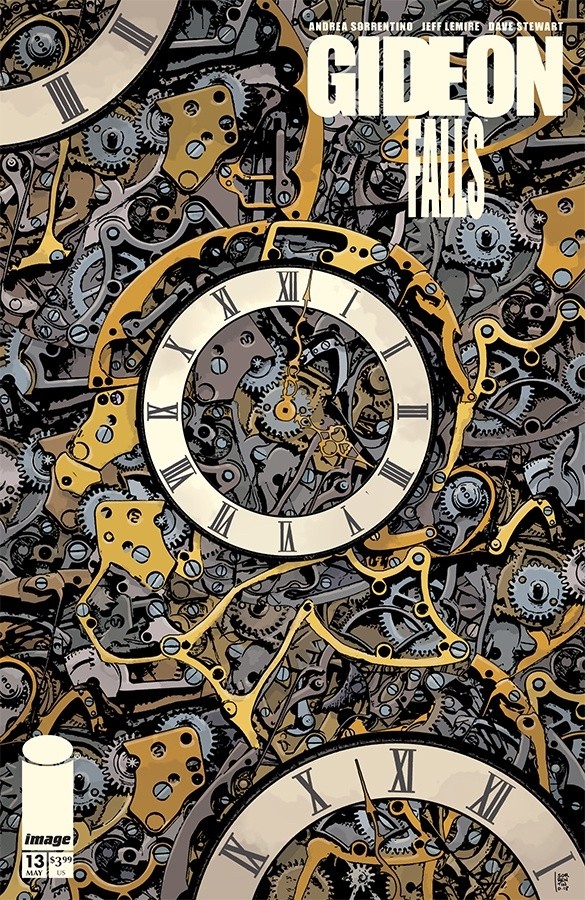
One of the most notable, recurring elements of Gideon Falls are your covers, almost all of which peer within a head in some way, shape or form. Why was that a recurring element you wanted to bring to Gideon Falls? And was it always meant to be just that: a recurring element?
When you begin working on a cover for this series, what are you typically looking to do, and especially for the head focused covers, what do you look to as you attempt to distinguish them from one another? Are they typically developed from the script itself, or does it come from something else? 1
AS: I think a part of it comes from the fact that I don’t consider myself a good ‘figurative’ cover artist. When I was working for DC, my first projects, I’ve always found myself in a situation where either they didn’t like the cover I did, or, following their guidelines, I would come out with a figurative cover I didn’t like at all.
Many years have passed now, so I think I can tell it, but both on I, Vampire and on Green Arrow there were times when I simply wanted to leave cover duty because I couldn’t find a way to make both the cover editor and myself happy with the final result.
So, I think, when they let me – and in the case of Gideon Falls, it was only a choice between Jeff and me – I feel much more comfortable with ‘conceptual’ covers. If you give a peek at my previous work on Green Arrow or Old Man Logan, there’s always a moment when I’ve included a single ‘theme’ for the covers of an arc, and developed it through the different issues of said arc (think of the covers for the Outsiders War or the Broken arc on GA, or the Last Ronin covers for Old Man Logan). I think my brain works much better this way than just putting an image of what’s inside the book on the cover.
And yes, being conceptual, they’re usually tied to the idea behind the story. Readers didn’t know it in the beginning, but now it’s clear Gideon Falls is all about different dimensions, but also different point of views, different angles. And I liked the idea that, as it was the city itself to give the name to the book, we would see our characters through some angles of the city itself. We’ve got Norton, Fred, Clara, and Angie, but the core of the book is Gideon Falls itself and the many ways to look into it.
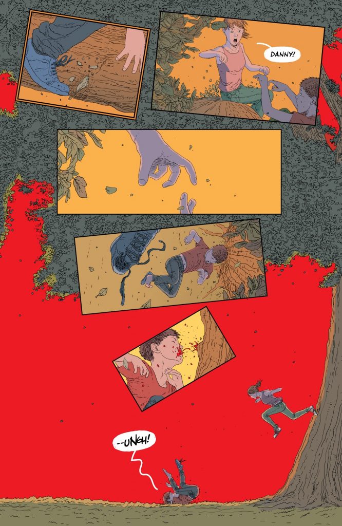
I wanted to ask about motion on the page, as it always feels like you’re directing the eye in a particularly impactful way with your work. Take this page from issue 16, for example. It’s all about a painful fall down the page, and the way you convey that is you use shrinking panels to path the fall downwards. Why is that kind of thing attractive to you as a storyteller?
AS: I think it’s perhaps the most important thing as a comic artist. I’m attracted by comic artists who can control the eye of the readers and give the comic a perfect pace and flow. I think it’s something that, as readers, is hard to get. But when you finish reading, for some reason you enjoyed it. It wasn’t tiring. It was a pleasurable read.
And this is not about how good every character (background, etc.) is drawn in single panels. It’s the skill of the artist as a storyteller that you didn’t even realize gave you this nice feeling. And this is what I obviously try, sometimes because I want to, but often just in an instinctive way, to give to the readers. And between all the skills an artist can learn, I think this is the one you mostly acquire only by reading a lot of comics and watching a lot of movies.
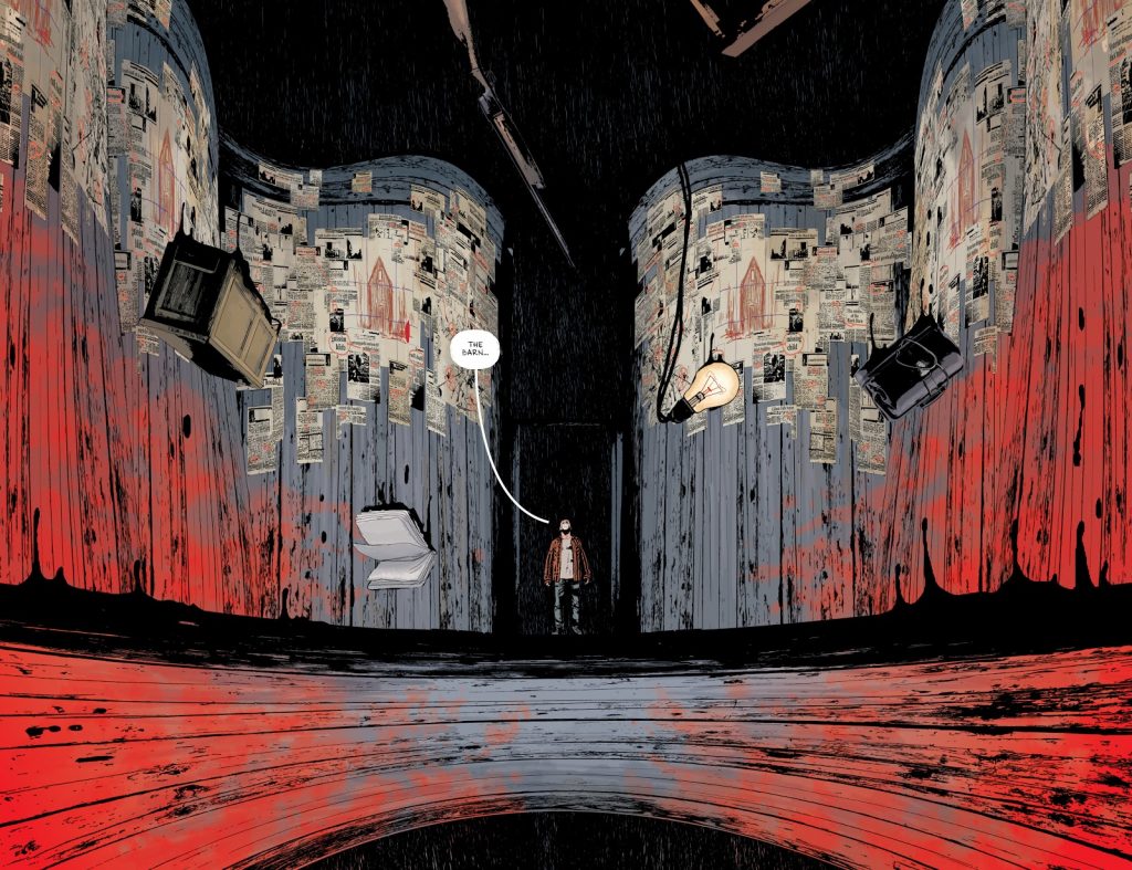
When you work with Jeff, how loose are his scripts? Are you free to find the right answers for a page like this, or is a lot of it specific within the script? PLUS: This page of Norton (or whatever you want to call him!) and how a room feels to him as he enters it is incredible, and it reminds me of some other pages you’ve done in the series where there’s almost a fish-eye or general distortion type feel to what’s happening in these rooms. I’ve never seen anyone else do that before, at least as far as I can recall. When it comes to problem solving for the needs of the story, how do you decide when this kind of thing is the right solution or not?
AS: Jeff’s scripts are never loose. He always gives me at least an idea of how he envisioned the page and the idea the page is supposed to give. And this is very important to me, because I know I’m developing the same idea Jeff had for this scene.
But aside from that, as I said before, my role as artist it to interpret this idea through my own lens, and look for what I consider to be the best way to give readers the same feeling the writer wants to transmit.
Just in this case, this is how it was in the script:
PAGE 14-15
DOUBLE SPREAD
1. We reverse behind Clara and Norton as he stands in the study and takes it all in. He sees all the Black Barn clippings, etc.
2. Tight on Norton’s wide eyes as he takes it all in.
NORTON: The Barn…
So, generally, in cases like this, my role is to pick the idea and look for the best way to put the same the sense of confusion/wonder that Norton had when remembering the barn on the page.
Is it possible to overuse that kind of thing, or is it very feel based?
AS: I think you can end up overusing it when you go crazy just for the sake of going crazy. When you force yourself to do it – because maybe you want to show your muscles – is the moment to not do it.
Again, it’s about trying to put what the writer had in mind on paper in the best possible way. Sometimes you want to have frantic action, so you start shaking the panels. Sometimes you want to show a desperate fall from a tree, so you make the panels fall as well. Sometimes you want to enhance a sense of loss or specularity, as in the next page you’re showing. Some other times you need to push it even further. But as I said, I think it works only if you’ve got a narrative reason behind it.
To remove objectivity from this from the jump, I just wanted to say this page is awesome. It’s just an immediately striking page. But I wanted to ask about the mirror image element, and most specifically, the absence of color in the top portion. I know you don’t color your projects, as you worked with Jordie Bellaire here and with Dave Stewart on Gideon Falls. But is color an important part of what you think of when you’re considering what to do on the page? Or is it very situational?
AS: No, I think color is very important in a comic. I like to read critics online about different comics, and it’s incredible how many critics talk about a certain artist saying he ‘is in a great form’ or ‘is underperforming’ on this or that comic, without realizing that maybe it was a different colorist that gave them a totally different feel.
In regards to my process, I learned that the best way is always – when you can, and i’ve been incredibly lucky in this case – to pick the best in the business and let him or her do his or her magic.
There are some moments when I will give notes about the ‘feel’ I’d like to reach because, obviously, no matter how talented a color artist can be, they can’t read your mind and they have to know what you wanted to convey in a specific moment in the same way I need to read the script in order to get what the writer has in mind.
But yes, I’ve always considered the colors to be a key part of the final look and I’ve declined some projects where I knew I couldn’t have that specific colorist for it.
More specific to your question: Yes, there are many moments while I draw a page where I specifically imagine it colored with a certain approach. Maybe a flat red as a background, or a specific way to render the shades/highlights. Sometimes I’ll chat with the colorist before the beginning of a project, telling them what I’d like them to do when I use a specific art approach. Like ‘sometimes I’m leaving a white background, so maybe you can go with a flat red to make things more dramatic’ or – as it happened with the young Bruce sequences in Batman: The Smile Killer – I’ll say, ‘I’m using a bright line, so I’d like these different kind of colors and rendering that makes for a brighter, happier look.’
Some other times the opposite happens. Maybe I especially like the way a colorist colored a page in an issue and I draw something in a certain way because I know he/she will use the same striking approach again. It happened with the first apparition of the Barn in Gideon Falls #1, where Dave went with an all red over my inks. I liked it so much that I kept using that kind of approach – very sketchy lines with an eerie background – every time the Barn comes out, because i knew Dave would color it that way and the result would be awesome.
Or also with the way Jordie colored the Batman sequences in Smile Killer. I went for a darker approach with inks – like, leaving totally black faces in some moments or going with very dark backgrounds – and I wasn’t sure how they would look once colored. And the result was amazing, so I know I can keep doing this kind of very heavy inks in future projects where Jordie will color my pages.
It can also (rarely) happen that I draw something and I’m not happy how it came out colored so I tend to stop using it and focus on something that will look better.
To sum it all up, i think it’s very important for an artist to coordinate and work in an organic way with your colorist. In the end, it’s the colored page the readers will see so it makes no sense to do an incredible work with the pencil/inks if it’s something that won’t be emphasized (or even worse, if it will lose appeal) once it gets the color treatment.
Related to that: like I said, you worked with Jordie and Dave on these projects. They’re obviously aces but how has it been working with some of the best in the business on colors, and how do you feel each differs in what they do with your line art?
AS: I think both Jordie and Dave, and I think I don’t even need to say it, are two of the most talented color artists the industry has ever had. And I think they share a similar approach to the colors that perfectly complements my art.
They’re what I call – and that’s a totally personal term, so nothing technical – ‘palette colorist,’ as opposed to ‘shape colorists.’ They’re masters to give emotions through a perfect color choice, and they usually use a more flat, less rendered approach. And this matches my art in a perfect way, enhancing the atmospheric and emotional aspect of it.
If you like what you see in my work, please, remember that that a huge part of the magic comes from these two masters.
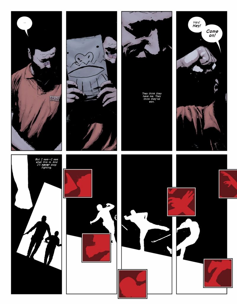
The inset panels on the bottom part of the page are my favorite thing here. I love what you do with them typically but seeing the close up on moments from the fight is brilliant. Why is this kind of tool something you like to use? What do you feel it brings to your ability to depict action and draw attention to specific beats? Also, why red for those insets?
AS: Red is a captivating color. Especially when the things around them are white. It’s like giving readers small beats to their eyes, trying to replicate the feel of a hit during the battle. Also, the sparse positioning of the hits tries to recreate the affect of a fast-paced and chaotic fight. My idea is that if nothing is linear in a brawl between two people, then it won’t be linear on the page either.
If you want to look for what I consider a nice opposite of this, you can look at the fight between Onyx and Katana in Green Arrow: The Outsiders War. They are both skilled martial artists in a one versus one fight saving their energy for the perfect hit, the sequence is much more regular, the beats and the specularity of their moves are depicted with more control on pace and panel placement to give the idea of two perfect warriors using precise movements.
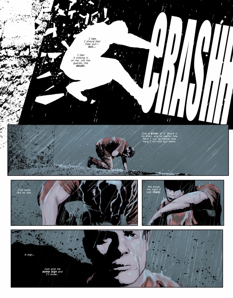
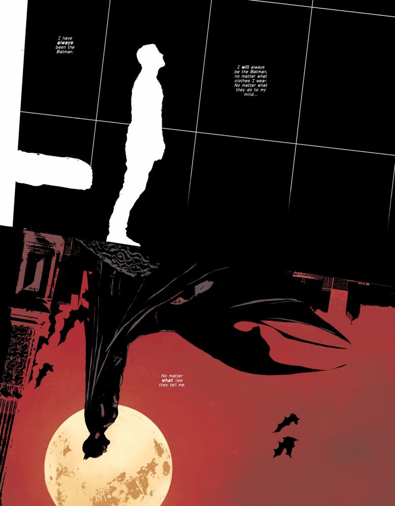
Again, I have to lose all objectivity, but I love that first panel and I’m deeply curious how you brought it to life. I love the fragmenting of the glass, the splatter effect you bring to the black behind Bruce’s diving body, and how the SFX shows his direction. If you can look back on it, how did this specific panel come together? It seems like a lot of thought and different techniques went into it, and I’m interested in its story.
AS: Well, the panel is a direct consequence of the action scene of the previous page. I decided to keep the white silhouette on a black background because this is still a moment where Bruce feels a bit lost, like a hollow presence surrounded by the shadows.
The moment just after had to give some kind of cathartic feel. He’s free from the prison, rain on his face, and the shadows are gone. He’s returning to ‘himself’ again. Frankly, aside from the aforementioned consideration, I don’t think there was much thought behind that specific panel. I just wanted it to look very dynamic, and I added the SFX myself because I wanted to be sure to drive the eye of the reader from left to right while reading it, enhancing the sense of movement of him getting out of the window.
I love that Steve Wands added the lettering inside his shape. It’s a wonderful touch.
Thanks for reading this art feature interview with Andrea Sorrentino. If you enjoyed this chat, consider subscribing to SKTCHD for more content like this going forward.
Andrea chose to answer these two questions at the same time.↩