
“I Sort of Slipped and Fell into Comics”: Sasha E. Head Talks Comics and Design
Design is getting its day in comics. After being just another part of the process for many, the work of people like Tom Muller, Jared K. Fletcher, Jonathan Hickman and more has risen in appreciation, especially after the current era of the X-Men reignited the use of data pages in superhero comics. But good design has long elevated some of your favorite comics, from DC to Drawn & Quarterly, even if it’s done so without you necessarily being aware of just how it’s doing that. They’re often unsung heroes, and ones who typically work behind the scenes at publishers without you even realizing it.
One of the designers whose work I appreciate the most these days is Sasha E. Head. Formerly the Sales & Marketing Production Designer at Image Comics, Head eventually left the publisher and went freelance, working in and out of the comics space. You might have seen her work in Image titles like Decorum or Time Before Time or in Image’s earlier promotional magazine Image+, and she’s currently working on Three Worlds, Three Moons over at Substack with Hickman, Mike Del Mundo, Mike Huddleston and friends. She has a pretty busy dance card, but one thing unifies all of that work: impeccable design perfectly executed by Head.
As a fan of her work, I reached out to see if she might be interested in a chat about the world of comics and design, how her career came together, design influences, and more, while also breaking down efforts she’s put together from projects in the past (or to talk about work she’s doing in the future). That’s what we did over the past few weeks, resulting in a fantastic art feature interview with one of the rising stars in the comics design space, as she brings excellent insight into how she does what she does as I fawn over her work.
This interview is open to non-subscribers, but if you’re interested in supporting more work like this, feel free to look into a subscription, as SKTCHD and the work I do is powered by subscribers like yourself, maybe! Also, this interview has been edited for clarity.
Let’s go back to the beginning, or the relative beginning at the very least. What originally fueled your interest in art and design, and when did you know you wanted to apply it to comics?
Sasha E. Head: I always joke that I sort of slipped and fell into comics. I sort of slipped and fell into design, too. I had actually entered into college expecting to do a painting degree, but ended up taking a typography course to fill a credit, and then realized I really wanted to be in book design. After applying to traditional publishers and failing repeatedly, I had a freelance gig as a magazine designer in the Bay Area. Eric Stephenson at Image Comics actually saw one of the magazines I was designing, and around that time a Production Artist position opened up. Incidentally, the only comics I really owned at that point were Image ones, so it all just came together very nicely.
It’s really weird how much of that was luck and “being in the right place at the right time” based. The two worlds collided before I even knew it was happening, to be frank.
I hate asking the influence question, as it’s undeniably one of the most overused questions one can ask. But with you, a designer, I think it’s a bit more interesting as I have far, far less awareness about whose work inspires designers. Whose work helped push you towards working in design, and is there anyone in particular – either in comics our outside of it – that you turn to when looking for inspiration in your work?
SH: Maybe it’s kind of embarrassing to admit this since I work for him now, but Jonathan Hickman has always been a huge design influence for me — his books were always the most interesting for me to look at, even before I worked at Image. I genuinely enjoy his design philosophy and how he sees the comic as an entire experience. Design is totally a part of that experience.
Outside of comics, I just really love editorial and book design in general. One of my favorite documentaries, Graphic Means: A History of Graphic Design Production, goes into how typesetting and how posters, logos, print media, everything, used to be made before we had computer programs that replaced a lot of the in-between production artist functions. I have always been attracted to 1960s design; specifically how much of the aesthetic is a product of that tactile process. The 1960s were really a great time where function and style came together in interesting ways. I love to consider the process by which we used to bring all of the elements together in both design and art. Being cognizant of that process, and the history of it, has really informed how I lay out text and images, even though I obviously use computer programs to do it.
I really enjoyed the 100 Book Project you were tackling on your website, as I’m 100% the type of person who will at least pick up – and often buy! – a book for its cover. The world of design is obviously much broader than just what we see in comics, or even on book covers. For you as a designer, how important is it for you to continuously broaden your horizons and find good design wherever it is? And, as an extension of that question, do you think it’s important to stretch how design in comics is used beyond what we normally see in comics?
SH: Oh man, I really wish I finished that project. I had started it specifically because at the time, working at Image, I was doing Image+ and the Diamond Previews catalog, and really wanted to experiment on the side outside of periodicals. Try different styles, applications of my favorite fonts that I keep downloading and then never using, working with photography and photobashing instead of illustrations. It was, largely, an exercise just to flex muscles I just wasn’t using on a day to day basis in comic book publishing, and to challenge myself.
This is going to sound a bit humblebrag, but it’s something I worry about genuinely: I think one of the repeated obstacles in my career has been that I want to learn so much, all the time, and my attention is split in so many directions I never quite land on a definitive style that I feel 100% comfortable in. I often worry that my work doesn’t have the polish/refinement that it might have if I, say, focused for a minute on a singular discipline. In my current workload I’m designing a book, creating a soundtrack design, a fantasy interactive fiction UI, and of course, comics. I want to learn a bit of everything, all the time. I do think some of my best ideas have come from having broad tastes, but… boy, I could afford some focus, too.
In that vein though I think it’s very important to introduce new styles and non-traditional comics design into comics. It makes for more interesting books, every time. Is it 100% necessary to have a designer on your comic book? No, not really. But I do get tired of seeing the same self referential cover treatments over and over again.
You worked at Image Comics in production design, both on the comics themselves – I believe! – and in the promotional magazine Image+ that you and David Brothers (amongst others, I’m sure) worked on. I know with the latter you worked closely with creators to give each featured title a look that reflected what they were. What were the biggest things you learned during that time, and did that stretch help crystallize what you wanted to do both in design and in comics?
SH: Going into Image+ the main design hurdle was creating a layout that work harmoniously with any artwork we wanted to put into it, but would still actively maintain its own brand. I looked at a lot of dynamic logos — for example, looked a lot to the old MTV logo. It works over any sort of funky music video no matter the genre, visual art, or photography. The Nickelodeon brand, particularly in the early 2000s, is also masterfully dynamic.
There were tons of ideas and layouts I wanted to do based simply on what I like personally, or would look good with only one kind of art and not all kinds of art…but we needed something that would play well with ALL of Image’s titles, no matter what — and often I didn’t know what was coming until a couple days before we went into production for it. It was an extremely fast paced publication (most issues designed in a week), and I learned a lot about general flexibility and letting that art speak for itself a lot of the time.
This isn’t as “artsy fun,” either, but I learned a whole lot about organization and maintaining a clean workflow. It’s just absolutely imperative when you’re working on those tight deadlines and also want to create something that looks awesome.
You’ve now worked in a number of different comic projects, with your contributions I’m sure ranging wildly across the board depending on which one we’re talking about (which we will here in a second). How did working on specific titles as a freelancer first come together? Was that something you had designs on (forgive me) from the beginning, or did it become a natural extension of the work you did at Image?
SH: Ha!!! Designs on. :)
I left Image Comics (west coast) because I had to move back home to be closer to family (east coast), and I had gotten a marketing agency job but knew that I wanted to maintain some semblance of presence within comics, since I genuinely love them. After I left I had a few creators responding to my goodbye email asking specifically what I was up to and if I wanted to work with them.
My position at Image had me constantly in contact with comics creatives, and we were all on pretty great terms, so the next natural development was to work with some of them after leaving the publishing side. I’m really happy with how it worked out.
This is an interesting page because I imagine it fuses everyone together: Mike Huddleston’s art plus, presumably, you and Jonathan Hickman on design. What’s the process for a spread like this? Does it start with Mike, with you, with something else? How does it work?
SH: For Decorum #1, both Jonathan and I brainstormed separately, and then together, on what we wanted the issues to feel like. He actually made a few infographics and pages — this one above was one of his — and then I riffed off of what he made. We went a couple times back and forth with some of the early info pages, literally swapping the files. Starting on Decorum #2, though, it was me working with the rules we had decided on together.
With every issue of Decorum, Jonathan writes the issue, Mike draws it, then Jonathan and I review the pagination and Jonathan articulates where he wants infographics to go within the story. A few times I have swapped things around, but for the most part, he knows where he wants these pauses and beats to go. Jonathan will tell me what info he wants to display— what’s happening in the story, what is being conveyed, and then for the most part I have free rein to make “something that looks cool.” I make new glyphs if I have to, or make up a few points of data, as long as it hits all the main points that Jonathan wanted to convey within that point of the story.
For the hardcover, you’ll see this spread actually revised, and then three new spreads that are based off it for the sake of the hardcover. It’s honestly a great example of how both Jonathan and I were able to collaborate. The hardcover is the definitive edition of this story; I went back through and tightened up most of the design spreads as I was making new ones. It has been a wild and fun ride.
When it comes to a comics project you tackle, about how early on do you usually start your work? Does it vary wildly from project to project, or is it pretty consistent in your experience?
SH: It really varies, but more often than not, I am the last person on the project. For Decorum the design is a lot more woven into the story, where as for most comics I mostly design pages and information that can be done completely separate from the art pages. A few teams have approached me after being green-lit, a few have approached me so I was a part of the pitch process. I personally really like to be in on the ground floor, since I think that enables me to make something more cohesive with the team, but like most design, you roll with it regardless. I think you have to be massively flexible to be a graphic designer in general.
With your average comic project, I imagine it’d be pretty easy to guess what you designed and what you didn’t. But when Jonathan Hickman, an able designer himself, is working on the book, it gets a bit more nebulous. Let’s go back to the beginning of Decorum to help clarify that. How does the breakdown of design work? I know Hickman developed the basic alphabet within the universe, glyph wise, but from there is it mostly you and Jonathan talking about things up front and you handling everything from then on? Or is there a bit of both of you throughout?
SH: You’re right, that first issue especially is nebulous. I am actually having trouble remember who designed this one for the most part. I think this is probably one of the better examples of an info page where Jonathan made a layout, then I re-configured it, then he went back over it, then I finalized it. The first issue is full of those since we were developing all of the design rules. And it’s completely unique within my experience in comics; I loved it.
Jonathan made the original alphabet and then from there I developed new symbols as we needed them. First he made a basic replacement alphabet, and then something more abstract, and then from there I take elements from each letter to create new words and concepts (for example, Neha and each of the assassin students have their own symbols, The Sisterhood has its own symbol, the AI God, etc. — I used the same repeated glyphs in various contexts if it was info being read/received by the characters within the story, or if it was info specifically for the reader outside of the story).
As I said above, after issue 1 the process was much more linear.
This might seem super random, especially considering it’s extremely difficult to even see on the page here. But I think this type of thing is really interesting from a design standpoint. It directly follows the page I highlighted immediately previous to this one, and what I like about it is it continues the elements from that page while acting as a flow change for readers. I love that. I think some people look at design as more of an aesthetic thing, but do you view that as storytelling? Because something like this feels like an element that’s designed to control pacing…while also looking cool.
SH: This is a part of Jonathan’s comics philosophy that I admire and enjoy so much as both a reader and a designer. First of all, excuse my French, but I love this shit! As a designer — I love doing it, and a lot of people don’t want to do it because I think a lot of folks find it strange, or whatever, so getting the chance to make these sorts of pages on Decorum was just… well, awesome.
You’ll notice that he does a lot of this stuff in his other comics, too — it makes you stop for a moment. You have to spend more time with this and refocus. It’s so easy to just gobble up an issue of a comic in 10 minutes or whatever and then move onto the next thing. Beats like this really force the reader to pause; a lot like splash art pages and comic panel layout, it’s another way to control how the reader consumes and relates to each page and the oncoming scene.
In movies, sometimes an extremely loud and heightened scene will be preceded by multiple smaller, quieter, softer scenes. Inglourious Basterds comes to mind, for me — there are maybe 3 big peaks in that story, and all scenes leading up to those peaks are gradual crescendos up to that. These design pages, while not quite the same slow-burn, are another way to pause, build up, breathe — onto the next scene. That is how I see it and enjoy it, anyway.
But yeah, I might be in the minority here, but I also think stuff like this for the simple sake of aesthetic is also super cool. Doing it because it looks cool is a good enough reason, too. If you have the pages to do it, why not? It’s fun.
(And I am saying this mostly as a response to my design education that taught me “if it doesn’t have a function then it doesn’t belong there” — well, perhaps the function is to look cool. So there!)
While design often incorporates elements from the artist’s work in comics, albeit in a perhaps disconnected way, it felt like the further you got into the Decorum, the more you and Mike’s efforts were united in a way that made both the art and the design pop while connecting disparate parts of an issue. What difference does it make to you when you get to work closely with an artist on a book like Mike Huddleston, so the two of you can factor each other’s positions and work into the storytelling of the issue in a real way? Does that change things in your approach and what you think you can achieve in your work?
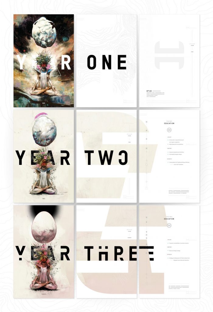
SH: Both Mike and Jonathan are extremely trusting in whatever I want to throw against the wall. Everyone on the team is very agreeable and I think we all honed in on what we wanted to accomplish quickly, so any time I wanted to use some of Mike’s art in a specific way, maybe rip it apart a little and reapply it, he was super open to it every time. I think for the YEAR ONE/YEAR TWO/YEAR THREE we weren’t originally going to put text on the art, but I really wanted to weave the art pages with the design pages for that particular issue. And he often layered the art so I could use it however I wanted! (laughs)
The workflow was a little different than most of the comics projects I’m on, but being an active part of forming these parts of the story was really gratifying and exciting. I was always using parts of his art, and there are parts of my designs that are integrated into his art, as well. It just unfolded naturally.
The beauty of these three spreads is they come in significantly different parts of the issue, with Neha Nori Sood going through training in-between them. When you have repeated, or maybe even self-referential, instances like this, how does that shift your approach? Does it let you dig more into the storytelling aspect of design, and underline that these layouts that bleed into one another are meant to be part of a larger whole?
SH: One of my favorite uses of design (and art, and storytelling in general) is repetition that continuously builds on top of the last repeat. This issue was probably my favorite in regards to the graphics working with the art pretty much perfectly in sync— there’s the art pages, the design pages, and the combined art + design pages, each building up slowly as the issue goes on. It’s a really visually satisfying issue.
Readers often do not see how all of these spreads come together as one unit, but it adds to the overall flow and experience of consuming the story, even if they aren’t immediately aware of it. Personally, I love finding connections and narrative patterns in the design/art/stories I read, so the fact that I could contribute someway to strengthening the rhythm of that issue is so incredibly fun for me.
When it comes to design elements like these, how much of the work is simply staying consistent with already established looks?
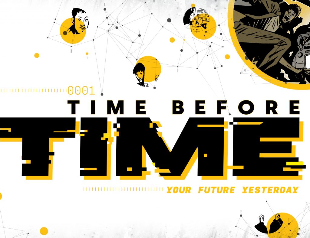
For me, consistency and flexibility is paramount. This spread changes every issue but it also remains largely the same. The art within the dots changes, the configuration of dates changes, but you can always tell (besides the massive logo) that it’s the first spread of Time Before Time. I probably actually create more work for myself than necessary by making it always changing (the same goes for Decorum — the front spread is “the same” but always different — different symbol, different configuration).
I think this is actually one reason to always hire a designer as early as you can. It was really nice with Time Before Time to have the time (ha) to brainstorm these spreads and how they would change, or not change. When I don’t have a lot of time for a series, or when I am only being hired for the first issue, it’s more important to just make something that can always remain the same so that any production artist or maybe even the writer themself can change the basic info but leave everything else the same.
I think logo design is probably the first thing readers think of first when it comes to design work in comics, and this one that you did for Time Before Time is fantastic. When you’re designing a logo, what are you looking to do above all? Is it about matching vibes and aesthetics in the comic itself, delivering an iconic and eye catching look, or something else?
SH: Oh man, so I actually think logo design is probably my weakest point when it comes to design skills, and for a while I was really worried I did not have a place in comics since I think my strongest points involve text layout and page organization (which isn’t always necessarily a priority in a lot of comics).
But for making a logo, like any logo, whether it’s a company, comic, restaurant, whatever, I’m looking to fit the voice and the vibe of the series, and looking to make something that will connect with the artwork in a meaningful way first and foremost. I think if you just focus on what looks cool, and not the tone of the series, you’re going to mislabel it. But looking cool is also, of course, very important. (laughs)
Going into TBT, it was always going to be stark, commanding letters; Declan and I discussed a few “sci-fi” looking fonts, but honestly, I wanted something clean and modern and timeless as the base font, since while the story is a futuristic one, they touch down in a huge range of years, back into the past, too. The typeface family I ended up choosing is called Silka (created by Atipo Foundry), and it has a mono version, which I often use for titles or numbers, since that lends itself to the technological aesthetic.
I just like logos that are made with the same fonts that are used throughout the rest of the content. And that was a goal with TBT — the same typeface used for the logo is the same typeface used in the rest of the series. It’s a bit of a zoomed out view of comics logo design, I think — I work less on how the logo looks alone and more how it looks as one piece of the whole pie. I do not know if this is typical of comics design; I think with comics, primarily the logo often feels separate from the rest of the design; it might look great with the art, or it might be a magnificent design/illustration in its own right, but the rest of the layouts are an afterthought. I often design logos at the same time as designing the rest of the book specifically because I enjoy when each part informs the other.
All the other examples we talk about here are projects you did with Hickman, a designer. Time Before Time is not that. Is there a lot of variance project to project in terms of your experience depending on who your partners are? Or is your role and how you execute it pretty consistent?
SH: Yes, and like we’ve discussed, Jonathan’s projects are unique in my experience in general, but I actually do always try to replicate the same feeling of collaboration. I always give the teams I work with multiple choices as far as the direction we can go in, and I always, always first check with them on what they like or dislike (before even starting), whether that’s in comics, video games, movies, music, whatever. I just think design is stronger when you have more sources informing it. Obviously too many cooks in the kitchen is never good, but I’ve never aimed to simply design something on my own for a team — I’ve always endeavored to design with a team.
That being said, Declan is an accomplished artist in his own right, and he actually did the design for a few of his own books I believe! Sometimes he emails me to ask what I think, but he’s really good at it. I think a lot of writers and artists in comics are just naturally good at design too. Designers bring a structure and can help maintain a set of rules, perhaps, but I think artistic people know what looks good in general and tend to be able to pull it off. (laughs)
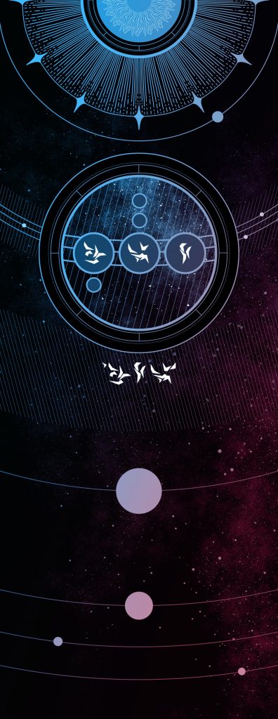
This piece is from Three Worlds, Three Moons, the Substack jam universe you’re working on with Hickman, Mike Del Mundo, Mike Huddleston, and a million others. I know this piece wasn’t you, but it’s a jump off to talk about the project. Per the 3W3M FAQ, “The plan is to eventually make some of the most beautiful books in the market. Designing these is what Sasha Head is primarily going to be working on.”
This is an unusual project in all ways, not the least of which seems to be that you’re approaching it from a long-term perspective as the others are looking at it from a more immediate one. It’s like you’re working on larger scale creative world-building for Three Worlds, Three Moons rather than what you usually do from a design standpoint. How different is this experience because of that, and does approaching a project in this sort of way make it feel creatively fulfilling in a different way?
SH: Absolutely — 3W3M is ongoing, collaborative, very big picture, and involves a lot of world-building I have simply never been afforded as a designer until now. As the FAQ says, I’ll be handling the book design and the production, but until then, I am working largely behind the scenes to develop literal languages and letterforms before we finalize designs.
This project is one that will always be moving and always evolving— we don’t have end dates, we don’t have print approvals to adhere to — we are just creating, and sharing as we do so. Jonathan makes the current infographics to get the ball rolling, but those are all a part of the worldbuilding and not the final state. Things are liable to change every step of the way! 3W3M is an experiment in watching (and sometimes contributing to) the worldbuilding and story creation happen in real time. So as Jonathan et al create these worlds and stories, I am, too, creating design rules and various elements for them.
At the point of writing this, none of my work has been shared yet, but a lot of it, of course, involves letterforms and further developing the various cultures on each of the planets within the galaxy, coming in from a graphic design standpoint, of course. It’s so unlike anything I’ve ever worked on and I honestly think that that was the goal. We’re doing something different and, very importantly, fun for everyone involved, creative team and subscribers alike.
I feel as if you entered comics at a very important time for design’s importance to the medium, as it seems as if its value is really starting to be better appreciated thanks to the work of people like yourself, Tom Muller, Fonografiks, Hickman, Jared K. Fletcher, and others. Appreciation is increasing, but there’s still room to grow. Where would you like to see design go next in comics? Is it just about seeing it in all kinds of comics? Better integration into world-building like you’re seeing in 3W3M? What’s next in your mind?
SH: Jeez, first of all, considering me a part of that lineup of names sort of makes me woozy. (laughs) They are all folks I admire and regularly reference for inspiration!
Well, some comics don’t necessarily need design, right? It’s not for everyone. I think comics are like every other artform, different strokes for different folks, some audiences don’t want or need something that is branded or with design heavily considered. I personally have just always leaned towards purposefully designed comics, as I had owned comics designed by each of those people before I even entered the industry, and I owned them not only because of the art, but because I walked past them on the shelf and thought the same thing I think when I see any other well-design book cover: Oh, I need to buy this.
Some design is just great marketing, and especially today when there are so many comics to choose from and most people have a limited number of issues they can purchase every week or month, marketing (and the design of the whole package) is actually a pretty important part of the equation, besides just the names involved. For example, when I bought most of those first few comics, I really didn’t know any of the names attached. I bought them because they looked cool. That was my entry point, noticing cool art and cool design, and buying it on a whim. In that vein, I think design is just naturally becoming more important, at least with comics outside of existing Marvel and DC IP with long histories and stalwart fanbases.
But I would really love to see more comics integrate design as a form of world-building. It’s not always necessary, but when it’s there… [chef’s kiss] I really love it.
Thanks for reading this art feature interview with designer Sasha E. Head. If you enjoyed this chat, consider subscribing to the site for more content like this and to support the work!