
“It’s the Little Details:” Terry Dodson on the Art and Wonder of “Adventureman”
There’s something about Adventureman.
I’m not sure what it is about this Image Comics series, but it just feels like everyone – Matt Fraction, Terry & Rachel Dodson, Clayton Cowles – is having a grand ol’ time working on it. This story that follows Claire Connell and her son Tommy as they deal with Claire’s possible inheritance of the gifts of the previously believed to be fictional pulp hero Adventureman is a throwback blast, and you can see it on each and every page. They’re luxuriating in the joy of the idea and bringing this world to life.
Maybe no one feels more like that than Terry Dodson himself, whose work is enlivened by opportunities the project presents, from the design and character acting to the heart and insanity. So, naturally, I wanted to talk about his work with him for an art feature interview on the recently released first hardcover volume, and that’s just what we did. Today, Dodson talks with me about Adventureman’s path to reality, working with Matt Fraction, his process, and a whole lot more, before we discuss a bevy of pages from that first volume. As a note, we do discuss events from this first volume, so if you haven’t read it yet and deeply care about going in fresh, beware!
Give it a read, and if you haven’t yet, give Adventureman a read as well. It’s a treasure as well as one of the most fun comics of the year.
We’re not going to get into the story behind Adventureman’s path to being a real thing, as that’s been shared many times over, but I wanted to start with the appeal of the book. When I read it, it feels like such a perfect fit for you. What made this story one you wanted to tackle?
TD: The first unifying factor was the setting of New York – as it is one of the main characters of the story.
Next, it was a completely different setting and type of story than my previous creator-owned projects as I always want to explore new ground with everything I do – to try to go 180 on the previous work.
As an artist, it also had multiple time periods/settings and as we will see, a mixture of these things and I had a lot of things in my mind design wise that lined up perfectly with what Adventureman was going to be – there’s so much for me to play around with.
And, of course the writer Matt Fraction…
Naturally, we can’t separate Adventureman from the writer of the book. You had worked with Matt Fraction in the past. Clearly something jived between the two of you. What was it about Matt’s approach and energy that made this feel like something you wanted to continue forward with? Is there something about the two of you that just agrees with each other, creatively?
TD: From the X-Men days, Matt wrote stories that were very easy for me to draw. Each page was told clearly and made sense and there was never a doubt as to how I would tell that story.
Matt’s work was offbeat enough that it appealed to me – that we were doing something that hadn’t been done before or was typically done (in the X-Men, etc), Matt’s point of view was different and so was mine so it was nice to work on projects that weren’t just regular mainstream ideas.
As we worked on Uncanny and then into The Defenders, we developed a system of going from full script to a plot system which enabled me to tell the actual story in a manner that I was living more comfortable with – being able to push and pull scenes, break down the beats of the actions more to my taste – and this is been really rewarding especially on Adventureman.
What has developed on Adventureman is with that plot system, Matt gives me something, I give him a little bit more back, he writes the next section based off of what I added plus he adds that bit more and then I come back in at that bit more – so we keep surprising each other. This book is growing organically and it keeps things interesting for both of us, as creators we are very excited as we just keep pushing and pushing the book. We are both having an absolute blast on this and we are both very excited to be doing this right now -it’s a very satisfying experience.
Adventureman is a BIG book. Big issues. Big cast. A literally BIG lead character. There’s a lot going on here. I know you had a ton of lead time, but I’m curious if the size and significance of this series has required any changes in your process, particularly with your wife, Rachel? Have you had to change anything up to help make this process manageable, or is it that why the lead time was necessary?
TD: How astute of an observation, of course!
We didn’t intend the first issue to be so big, the first script was 21 pages, but I pushed that out to 32 pages in order to develop the pulp universe (and characters) a bit more but once we have a 32 pages we realized we hadn’t even introduced the main character yet, Claire. So then we added six more pages for that, and it really didn’t seem like you would know what this book was about without introducing Claire’s family so that’s how we end up with a 57 page first issue.
It was a pretty fluid process getting this book out because as it kept growing page-wise, the amount of designing, drawing and coloring increased exponentially as well. Since this was my project, I took that burden on more so Rachel‘s only job was “inker” and I did everything else. I ended up having to do a lot more finishing inking, scanning and cleaning pages just to get the book done – and that just pushed the schedule out a bit more.
Last thing before we get into the pages. The first volume of Adventureman is being released as an oversized hardcover rather than a typical softcover trade. Why did you all decide to go that route? Did it just fit the nature of the book better?
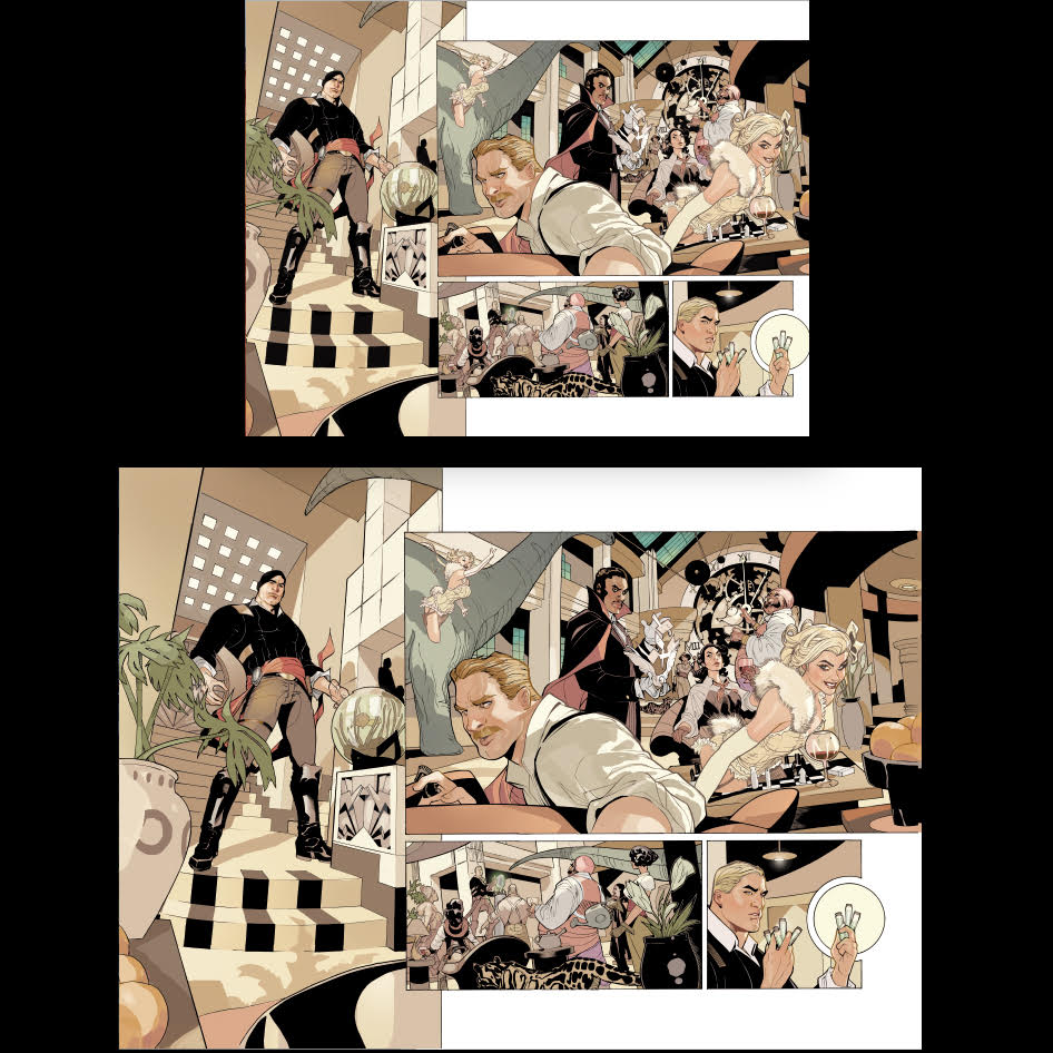
TD: My first two creator-owned projects were for the French market and they publish in the taller, wider, Bande Dessinee hardcover books. Matt and I both love this approach as well, so we knew from the very beginning that this would be the final version for Adventureman. This book was drawn and colored to print primarily at this size and format from day one so. All the original artwork is on 13 x 19 and 14 x 20 paper as opposed to the traditional 11 x 17, so it will actually print well at this format.
Since I drew this book for the wider European format – there are things on the hardcover page that were never published in the comic book format because we lose about an inch on each side of the actual artwork for the narrower floppy (editor’s note: see the image above as an example). So with the bigger hardcover you’re actually getting more of a widescreen, full bleed feel from this book than you’ll get from the floppy version. I imagine it’s gonna be a completely different reading experience – a more big time ADVENTURE feel with this format – so yes, intentional!
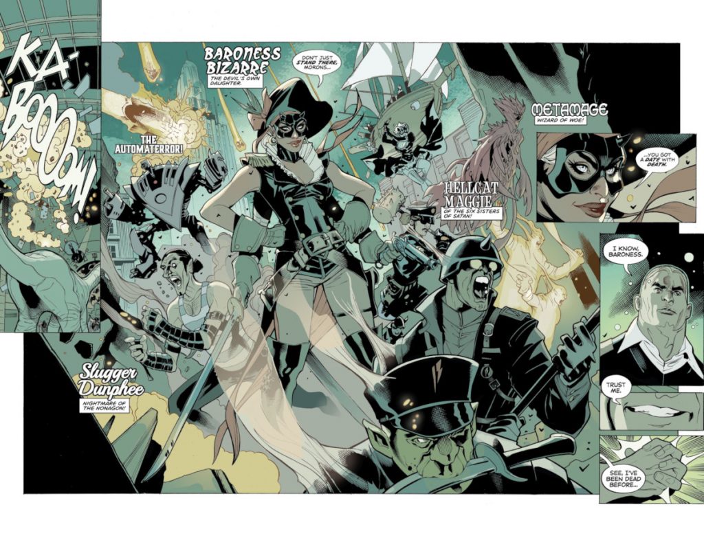
Alright, I wanted to start with a little about design. Adventureman’s crew and Baron Bizarre’s gang are the first characters we really meet in Adventureman #1, and because there’s only one chance at a first impression, I wanted to ask about what went into bringing these characters to life. Did you and Matt go back and forth a lot on the names of these characters, the looks of these characters, and what their general vibes were? Or because a lot of the impact of these characters is up front was it more important to make them representative samples of what this book’s energy would be?
TD: Short answer, years and years of work.
We had to design two fully functioning worlds, the world of the pope 40s Adventureman and the world of today. And not only the world but then eight modern characters and what 16 to 20 pulp era characters. They all had the feel unique and individual enough character and yet be fully functioning in that time and makes sense and they would be showing up again and again so I had to make sure there was something I want to dried something that would make sense and continuity of the story.
Honestly, I could spend interviews talking about the design process for all these things but essentially it was a lot of research into making these characters believe both are on time yet unique and interesting and something that had them in them before and that I really wanted to draw in a year or four years from now. Not easy.
This page is such a perfect introduction to the cast of the book, and it has such great flow for readers as we take it in. When it comes to visualizing pages and figuring out the right layouts to deliver this kind of information, how loose is Matt on just letting you come up with the right answers? And to you, what made this the right answer for the problems this page presented?
TD: Short answer, years and years of work.
Not counting designing the characters, Matt pitched this idea to me in 2010 and I started draw pages in 2017. I spent one full year drawing these pages for number one – hi did a number of covers each month for Marvel or DC dress time as well but it was a year process design t.hat and drawing that first issue.
So, for this particular page, a lot of thought went into this, I knew I needed to have each shot be a real character moment for each of the characters because were introducing so many characters in such a short time and characters were going to spend years with. Easier said than done. The circle gimmick for each character, those are actually the planets that are hanging above in the solar system Mobile that’s hanging over the space, those planets actually have significance to each one of those characters.
Initially, as I designed that page each one those circles was going to be an Art Deco symbol for each character which I never finalized everything with character design to my satisfaction that I was willing to publish, yet! The planets ended up being a happy accident as I looked at that page and knew those circles needed to be symbolize some nature of importance. And bingo, I had Matt come up with what planets represented each one of those main characters!
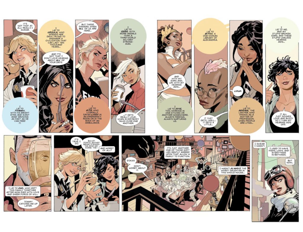
I know you cover this in the back of some of the issues and likely will in the hardcover too, but Claire’s family is an integral part of this book, as well as a magnificently diverse one. What went into designing this family and each of its components, and why was it so important to represent so many different types of people and interests and abilities with them?
TD: In the initial outline, Matt had basic ideas for the characters ‘skill set’ – what they are supposed to be – ‘this is the gymnast, this was the science person,’ but the rest of it was blank. I knew going into it I didn’t want to draw seven true siblings – the same basic family but with different colored hair! Because that is really tough to do and I realized what an amazing opportunity it would be to have a real diverse group of characters by having a multiracial cast in this book. As the artist, it’s so much more fun to draw a variety of characters. And it’s great to have wide cast of characters that different readers can have the opportunity to identify with.
So, I worked up a wide range of characters in my sketchbooks and sent them in the Matt to look at. He set up their names and personalities and jobs/hobbies and then I did another pass on them. And that’s the family we ended up with.
subscribers only.
Learn more about what you get with a subscription