
“I Feel Like I’ve Still Got a Lot to Learn”: Tom Reilly on the Art and Styles of Ant-Man
Standing out can be a struggle for artists in comics. Making a name for yourself is hard enough on its own, but being seen as more than an amalgamation of your influences can make it even more difficult, as you can be defined by what preceded you rather than your own work. 1 That’s especially true at a time when style leads over substance in the eyes of many readers, with a look that pops generating the “ooos” and “ahhs” more than pitch perfect storytelling. Having a style that’s your own can seem like a superpower unto itself, something that defines you and generations to come afterwards.
While I appreciate a great stylist as well, give me the chameleons any day of the week. An artist that can fit any genre and story while still feeling like themselves is as impressive as anything to me, if only because comics are a flexible medium and one that rewards similarly malleable talents. Look at someone like Marcos Martin, who can electrify readers in the fizzy, fantastic future of The Private Eye but also in the Gorey-esque throwback that is Friday, or a master like Stuart Immonen who thrives both in the absurdity of Grass of Parnassus and the grounded, minimalist Moving Pictures. The right answer isn’t just them as an artist; it’s them determining the right solution for the project and then executing it.
Tom Reilly’s like Martin and Immonen. While he has his own look, one that works and works well, he’s capable of anything as long as it’s what the story requires. A perfect example of that is this year’s Ant-Man miniseries, a quartet of issues across different eras that Reilly tackled with writer Al Ewing, colorist Jordie Bellaire, and letterer Cory Petit. Each took place in a different period of comic book history, with Reilly’s style and Bellaire’s colors shifting 2 to match it. If you’ve ever wanted to read a comic where a single artist perfect imbues his work with the energy of 1960s Marvel, does an elite Phil Hester impersonation, delivers on the vibes of today, and envisions the future of the publisher, then look no further than that Ant-Man title.
It takes a heck of a talent to do that, something we already knew Reilly was based off his work on The Thing. But now we have an even better idea of just how exceptional he is thanks to his most recent series. I was a huge fan of what Reilly did on Ant-Man, so naturally, I wanted to dig into that work with him. With that in mind, I reached out to Reilly to see if he would be willing to chat. That’s what we did this week, as we chatted about his art, his influences, the RISD experience, the varying styles of that mini, working with Ewing and Bellaire, designing characters, and much more, discussing all of that as we broke down a variety of pages from the series to dig into his process. One note, though: The last page contains spoilers from the finale, so if you’re concerned about that or haven’t read the story yet, don’t look at the last page!
You can read that interview in full below, which is open to non-subscribers. If you enjoy this interview, consider subscribing to SKTCHD for more features like it!
What came first for you: your passion for comics or art? Did one inspire an interest in the other if one came first?
Tom Reilly: I was drawing before I enjoyed comics, for sure. I’ve been drawing for pretty much as long as I can remember, and while I always enjoyed comics related media, it didn’t really intersect with my art until later. I grew up during the big superhero movie boom of the early 2000’s, I think I was seven or eight when the first Spider-Man movie came out. My dad picked me up a hardcover of Ultimate Spider-Man pretty soon after seeing that, and that’s what started my interest in comics proper.
You went to the Rhode Island School of Design, one of the most renowned art schools in the country, graduating with a BFA in Illustration. How did that experience help you figure out your artistic voice, and set you on a path to where you are now?
Reilly: RISD offered a wide variety of different classes, and you could tailor your experience to what you wanted to learn. I took a lot of illustration, concept art and figure drawing classes while I was there, and have gone on to do a lot of that stuff professionally. Aside from what I learned there artistically, possibly the most important experience I gained was how to handle a large workload. There’s a lot that goes into making comic books, it takes dedication and discipline to hit your deadlines and get your work finished on time. It wasn’t dissimilar at RISD. We always had multiple projects due every week for different classes, and there were many late nights and early mornings spent getting work done. Being able to handle that schedule gave me a lot of confidence when I decided I wanted to get into drawing comics.
I read that you’re a big Alex Toth guy, which makes sense when I look at your art. You certainly have a less is more look, in all the best ways. I feel like that “less is more” approach is something a lot of artists I talk to get to eventually in their career, but you were there pretty much from the start. What were the origins of your love of Toth, and what’s the appeal of the simplicity and power of that approach?
Reilly: I learned about Toth while I was still in school looking at the work of guys like Chris Samnee and Doc Shaner. They were really big inspirations for me starting out (and still are!), so I heard about Toth from reading various interviews of theirs and just checking out their social media profiles and stuff. What I really love about his work, and that style of work in general, is the clarity of it. It’s easy to follow, while still being energetic and fun to look at. The ability to clearly and effectively tell a story is something I always strive for, and I feel it’s easier for me to do that when I don’t get bogged down in the various details of things on a page.
You loved comics. You went to RISD. You were figuring things out. How did that turn into a career as a comics artist? Did you always have designs on that, or was it something that manifested itself later on?
Reilly: It wasn’t something that I really decided to go for until my junior year in school. To be honest, I wasn’t sure what careers there were to be had in the art world, so I spent the first couple years at RISD learning about the different things I could do for a living before I chose one. I’d like to think I chose right!
We’re going to discuss some pages from Ant-Man, your recent mini-series with writer Al Ewing and colorist Jordie Bellaire. It’s a heck of a project, acting as a tour of the idea of the character and the varying incarnations of that idea. Before we get into it, how did this Ant-Man project come together, and what was the appeal of the project for you as an artist?
Reilly: It’s not a super glamorous story! I was finishing up work on The Thing earlier this year, and one of my regular Marvel editors, Darren Shan, sent me an email about working with Al Ewing on an upcoming Ant-Man miniseries meant to celebrate the character’s 60th anniversary. Al had come up with a story that I thought sounded fun, so I said I would do it! I guess that ties into what the appeal of the project was for me as well. I didn’t have a huge attachment to the Ant-Man character before doing this book, but the story seemed like one that I would have a good time drawing.
There were a lot of opportunities to do some cool stuff visually, and to try out some things that I normally wouldn’t do. I also just wanted to work with Al and Darren again, two very cool guys who are great at their jobs. We were also able to bring on Jordie Bellaire, my colorist for The Thing, who’s one of the best in the business. Add letterer Cory Petit, a seasoned pro who’s worked on pretty much everything, and you’ve got the makings of a very solid group. Making comics is a team effort, so I get excited anytime I get to work with people like that.

Let’s start with this page, one in which everything from your lineart to the colors of the gutters transitions from one style or look to another. This page is important in my mind, if only because it establishes the shift within the page itself rather than a hard cut page to page, acting as a primer for readers to understand what they’re going through. This seems like a visual choice, but that brings up an important question: How did you and Al Ewing work together on this project? Was the script pretty open to you figuring out the right solutions for a page like this, or did it really depend on the page?
Reilly: For the most part the script was open, and Al was super supportive of the way I interpreted what he was writing. There were times where he had specific things in mind, but they were more issue-wide specifics rather than page-by-page stuff. In the same way that I drew each issue differently, Al wrote them differently. So there were some specific requirements regarding pacing that Al wanted to include in a couple of these issues, just to make sure that we were staying true to the source material.
Related to that: What’s your process for bringing a page or issue like this to life, from receiving a script or pages to turning them into editorial?
Reilly: Normally when I receive a script, I’ll read through it once or twice to get a feel for the story beats. This is also when I’ll take the time to look up some references for specific things I may need to draw. When it comes to actually drawing the layouts, I’ll usually take the first or second idea that comes to my head and try to make that work. Sometimes I’ll end up changing some things by the time I draw the final pages, but I like to go with my gut most of the time. I take about a week to finish up my layouts, and then send them in for approval.
Once I get the okay I’ll start drawing the finished pages. I’ll take scans of my layouts and print bluelines of them onto 11 x 17 sheets of bristol board. This is a huge time-saver, and helps me make extra sure that I’m putting all my lines down in the right places on the page. I’ll tighten everything up with a round of pencils, and then ink over those. Then I’ll scan the finished inks and do some cleanup on the pages in Photoshop. I’ll usually send in batches of 5 or 10 pages to my editors for approval, until the whole thing is given the okay to be sent in for print. Then the whole process starts again for the next issue!
I wanted to mention one of the most unusual parts of this series, which is how you (and the rest of the team) took on different styles for each era of story. You seemed unusually adept at it, naturally maintaining your line while fitting in to each period. It did make me wonder whether you feel like you have a natural style to your art. Is there one era from this series that feels particularly you, or is style something that you sometimes shift or tweak to better fit each project you take on?
Reilly: I do think I have a natural style. But it’s not something I consciously try and adhere to, and I think it will continue to change as I improve. I feel like I’ve still got a lot to learn, and can continue to get better. That’s a mindset I want to keep for as long as I’m able.
The third issue of Ant-Man definitely has the most “me” in it, at the moment. It’s set in the modern day, so it features my current design sensibilities.

Looking through your website, you’ve done some incredible redesign and design work. That clearly seems to be something you enjoy. You even were able to do it a lot here in Ant-Man, as seen above for one. What is it about the design side of comics and characters you enjoy so much? Is there something about it that speaks to your artistic sensibilities in a very specific way?
Reilly: I just think they’re fun visual exercises! They’re something I can chip away at in between pages that help me relax, while still staying in an artistic zone. Some of them turn out better than others, but what’s important to me is that I have a good time with them. They also make for good practice. There’s a lot of design work in general that goes into making comics, from the looks of more important characters to the incidental characters who only appear once or twice in a series. I’ll do a lot of design work on the page as I’m working on a book, so I think it’s important to keep those skills sharp.
Another thing I really enjoy about designing characters is that it can be a great storytelling device. For example, a character I’ll frequently revisit to do designs for is Cable, and recently I’ve been giving him an 1800’s era revolver along with all his pouches and bigger guns. He’s a time traveler, so I figure he went back in time, fought a cowboy, took his gun, something like that. Adding little storytelling elements to designs adds another level of enjoyment to the process for me.
In this series, you were able to design a new Ant-Man, Dr. Zayn Asghar. I love his look, both in how it incorporates touchstones of Ant-Man’s of the past and feels like it’s own thing with the ant head and the general glow to him. What went into designing this new Ant-Man, and what do you think is the key to achieving a new look to a superhero that doesn’t just work once, but stands out?
Reilly: I feel like a key to designing a legacy character like this is keeping some familiar component from past designs, whether it be colors, shapes, an emblem etc. While designing this look, I saw that the previous ant man suits were predominantly red, with black accents. I knew if I stuck to those colors, the reader would be able to see there was a relationship between the new character and the old ones, without having to be told that he was a new Ant-Man.
Another key, I think, is simplicity. Sometimes you don’t have to do a whole lot of crazy stuff to a design to make it effective. In my case, I ended up inverting the traditional Ant-Man colors, from mostly red and a little black, to mostly black with a little red. I think that sets the design apart from the others, even though it’s a very simple choice. Simplicity is also a strategic choice, in my mind. You’ve gotta draw this character a few hundred times at least, if you make the design super complicated you’re just making it harder for yourself. And for other artists too, if they ever have to draw it!
As for what went into Zayn’s design, I’m pretty sure the prompt I was given for designing him was just to do an Ant-Man x Batman Beyond mashup. Hearing that I’m sure it’s easy to see, with the flat blacks and placement of the red accents. The most important element to me was the helmet. The character’s identity isn’t immediately revealed in the series, so I wanted it to look mysterious. I also wanted it to be a bit unnatural in shape, I thought that would help the character look more futuristic. I ended up with a super simplified version of a real ant’s head, something that didn’t look traditionally heroic and had that strange, sleek look I was going for. For the red accents on the suit, I took inspiration from the original Ant-Man’s circular motif and extended it down the arms to the tops of the hands. I also raised the circular bits and lit them up. Everything looks futuristic if you put lights all over it!

As someone who read Irredeemable Ant-Man in single issues, this page immediately rang extraordinarily true to me. It pairs a very Phil Hester look with a common Robert Kirkman trope of repeating panels over and over for impact (and efficiency). The latter is interesting to me, because it isn’t just a style match, but a storytelling one. How much of a focus was not just matching the look of your art to the era, but manifesting the era in your layouts as well? Was it important for you to deliver a read that was similar to that period?
Reilly: I’ve gotta give Al all the credit for this page, he wanted very specific panel layouts for this issue. To match the storytelling of the source material, just like you said. I think that speaks to Al’s reputation as a student of the game. He not only has a deep understanding of the characters in these stories, but of how previous writers and artists have told those stories. It was super fun to go back and read some of these Irredeemable Ant-Man issues, and then look at Al’s script to see the similarities.
As you were building up to and working on this project, did you give yourself any homework, in the sense that you went back and read some of the comics that fueled these stories for inspiration? Was that a big part of getting the cadences of each comic correct?
Reilly: I did do research for this book, yeah, but I wouldn’t call reading comic books homework! Al would often let me know in the script what issues of older books we were going to be drawing inspiration from, so I’d go back and take a look at those as I was working. I tried not to do too much studying, though. My main goal was to capture the essence of the previous stories, not to recreate their look 1:1. I made a lot of decisions in this series that the artists of the earlier books probably wouldn’t have made, But I felt that as long as the spirit of the older books was there, I could make those decisions in service to the story we were trying to tell.
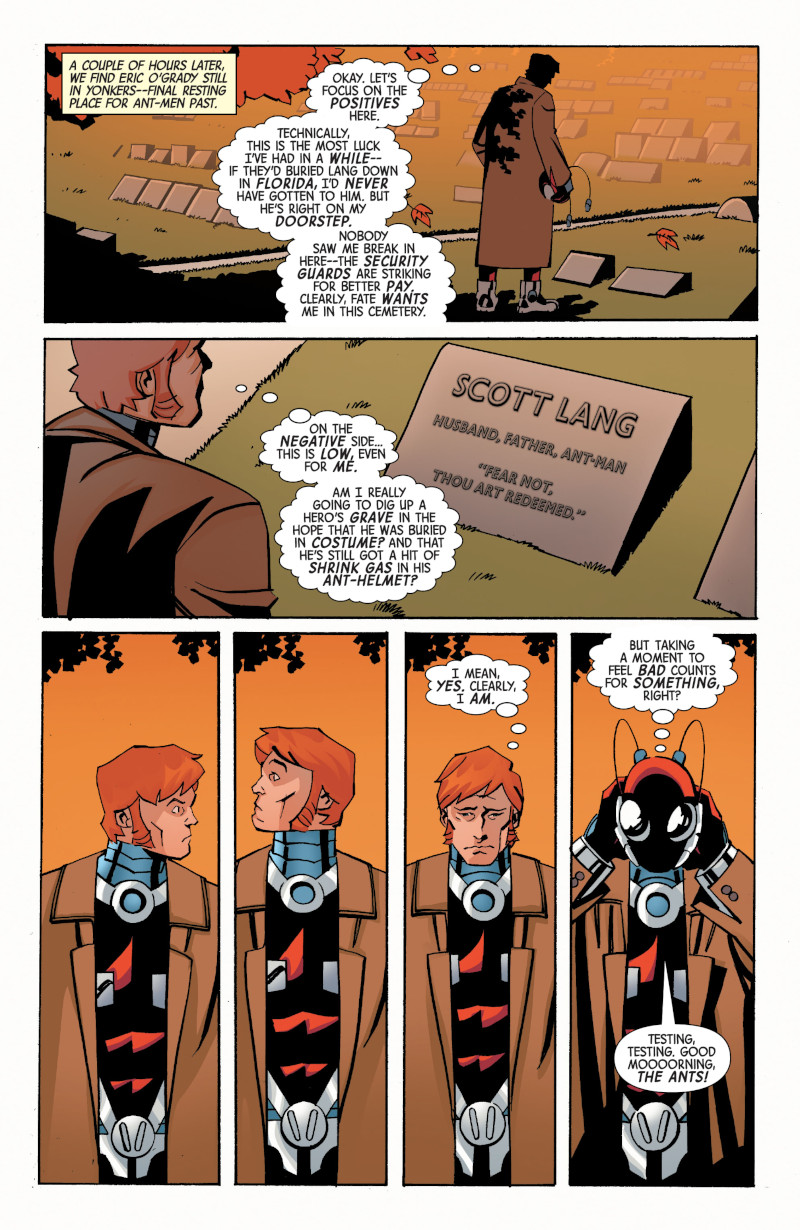
I love the bottom four panels here, both because of how much it feels like that period, but also because it underlines one of my favorite parts of your art: your character acting. It’s a simple sequence, but it says so much about Eric O’Grady, just like so many of your choices elsewhere in this series said something about the other Ant-Men and how your choices in The Thing said so much about Ben Grimm. You just feel like you get characters. What’s the key to that? Do you have a defined approach to bringing characters to life, or is it largely feel-based?
Reilly: For me I would say it’s pretty feel-based. Generally, a lot of these characters already have established personality traits and ways they act, so a lot of the work has already been done for me. You can often tell a lot about a character from the scripts as well, either by how they’re written, or specific information given by the writer. Figuring out how to convey that information through acting is something I always have fun with. In a static medium like comics, I like to exaggerate expressions and poses a bit, just to sell the feeling a bit more. This was especially fun to do with The Thing, as he’s essentially a cartoon character. You can squash and stretch him into any pose or expression you want, and he’s still gonna look like The Thing!
This isn’t the showiest page from a coloring standpoint, but as per usual with Jordie Bellaire, it looks remarkable all the same. You’ve worked with Jordie in the past, but in this series, her impact is perhaps even more acute, as her colors do a lot of heavy lifting to make everything feel era specific – even eras new to us like the future of Dr. Asghar. What is it about Jordie’s colors that just work with your lineart? Also, this is two projects in a row with Jordie, I want to say. Is that coincidence or are you aligned going forward, hopefully?
Reilly: Like I said before, Jordie is one of the best colorists in the industry, and it was a privilege to work with her on this. She had mentioned wanting to work together again after finishing up The Thing, and said she wanted to do some experimenting with how she colored my stuff. Turns out this was the perfect project for that! There’s a really impressive level of versatility on display from her in this series, and I’m super happy with the work she did.
I honestly think her colors work on my lineart because her colors would work over anybody’s lineart. I never really have any input or direction to offer her, I trust her to know the appropriate way to get something done. I really only had input on issue 4, where I’d come up with the flat color, open lineart coloring style for that issue, and she took it and ran with it, and made it look better than I could’ve for sure.
I’d love to work more with Jordie, so here’s hoping!

I wanted to talk about a unique characteristic about this page: it’s the only double page spread in the entire series. That feels like a very specific choice, but it also could be a product of the other styles, and how those eras didn’t really use spreads. Which was it? Was it something that was actively thought about, or was it just story flow dictating that decision?
Reilly: I think in the script this was originally a single page spread, and I requested that we make it a double. This is the climactic moment of the whole series, so I wanted it to feel big! This was also the best way I could think of to properly fit all of the visual information into this scene. There’s a lot going on, and I’m not sure it would be as effective with less room to show it. So I’m glad the team was okay with it!
In a way, this spread feels like a summation of the entire series, as the weapon devolves Ultron from the All-Father Ultron all the way back to his original form and beyond. There’s a version of this that gets the same idea across that isn’t cool as hell. Thankfully, you elected to bring the heat here, making the whole thing pop. Why was this the right approach for this page, and how did Jordie help elevate it to where it ended up?
Reilly: Like I said before, and you stated here, this is the big moment in the series, so I wanted to go big to match the stakes of the story. Plus, if you get the opportunity to draw a giant robot being shot back in time with a science gun, you have to make it count! Jordie definitely enhanced the feeling with the bright colors on this too, she really brought the drama. I also really like Cory Petit’s lettering here, that big speech bubble adds a lot of impact.