Power Ranking Chris Samnee’s Batober Pieces, Through the Use of Science
Today is a day that might be driven by feelings and anger, and with that in mind, I wanted to combat it with reason and joy. And what better way is there to do that than by power ranking one of comics’ great holidays – Chris Samnee’s Batober – through the power of science?!
After all, each year, Samnee takes us on a 31 day tour that perfectly exemplifies the greatness of his art and the complicated, endearing nature of Batman and his world. Through prompts generated by his Instagram followers, Samnee creates singular pieces representing each word, each of which underlines Samnee the artist, Samnee the storyteller, and Samnee the master. And this year’s effort was no different, but somehow maybe even better, as it feels like Samnee fully tapped into his inner Alex Toth here, with each piece simpler yet richer than ones we’ve seen in the past.
So when it comes to power ranking all 31 pieces, that becomes a difficult task because they’re all so good. That’s why I’m turning to science to guide me, as cold hard reason can help me find answers that I might not be able to reach otherwise. So with that in mind, I created five different categories and one bonus – each of which was worth two points – to guide me. Those are:
- The Eye Test: This one is all about execution, meaning quality of work and craft on the piece.
- The “I” Test: My personal bias category, this is purely defined by my personal feelings.
- Prompt Delivery: If the first category is about execution of the art, this is about execution of the idea the prompt is suggesting Samnee execute.
- Cleverness: This combines the first and third categories in a way, but part of the execution of both the art and prompt is connected to how clever the idea of the piece is. So this rates that.
- Intangibles: There are feelings and thoughts connected to these pieces that aren’t so easy to categorize. This is where I rate those intangibles.
- Bonus…The Joker Rule: This one is simple. Does the piece have the Joker in it? Zero points! Does it not? Two points!
I rated each piece based off of those categories, and from there, a consensus ranking was formed off scores of a very theoretical maximum of ten. Now, again, this was crafted using the scientific method 1 so this list is beyond reproach. 2 So if you have feedback, I hate to say it, but your take is likely incorrect. 3 So let’s get to the list, and as you do with these kinds of lists, we’ll be going in reverse order.
One final note: each of these will be eBayed later this month, so happy bidding when that happens. Except on #1! No one bid on it! It’s mine! Pay attention to Samnee’s Twitter and Instagram for more on this.
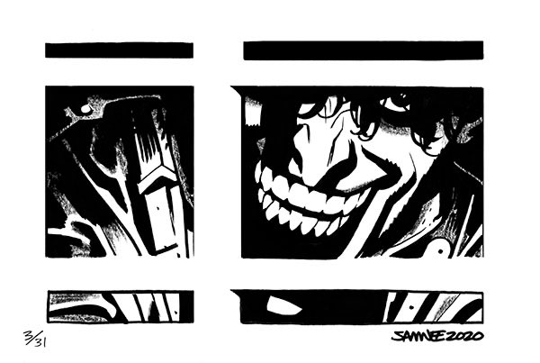
31. Day 3: “Teeth”
Score: 8.5
Why it ranks here: The first victim of the Joker rule is here, as “Teeth” takes last place not because it isn’t great – it is – or because it isn’t terribly unnerving, it just features the Joker so it doesn’t get a bonus lifting it. Why give other pieces bonuses simply for not featuring the Joker? Well, that dude is everywhere right now, and as clearly great as Samnee is at depicting the character, saturation impacts everything, including Batober. Them’s the breaks, and someone has to finish last. For once, it’s the Joker.
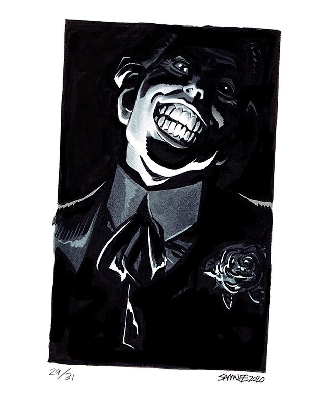
30. Day 29: “Crooked”
Score: 9
Why it ranks here: The second-to-last finisher is the other Joker piece, because Samnee – being a gem – only created two pieces featuring the character. Huzzah! So why does “Crooked” finish ahead of “Teeth” in my power rankings? While I like the former piece slightly better, I enjoy the prompt execution and its cleverness because of how the actual rectangle Samnee’s art exists within is crooked. It’s a smart, subtle twist – literally! – to the idea, and it is enough to separate “Crooked” from the bottom. But hey, this piece maybe #30 overall but it’s #1 in pieces that feature the Joker! Huzzah!
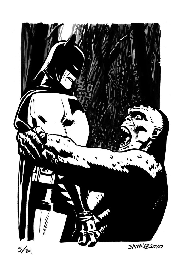
29. Day 5: “Squeeze”
Score: 10.3
Why it ranks here: As with everything on this list, the fifth entry to Batober is an excellent piece. I appreciate its usage of Killer Croc, the lovely background work, the clenched hand Batman has, and a whole lot of other details. But like Batman himself, this was squeezed by a particularly great collection of art, and this one had little peccadillos that dropped it slightly. “Squeeze” is like the Scott Caan of Batober’s “Oceans 11.” Scott Caan is very entertaining in that movie, but it’s still comparing Scott Caan to legends. That’s the conundrum “Squeeze” faces as well.
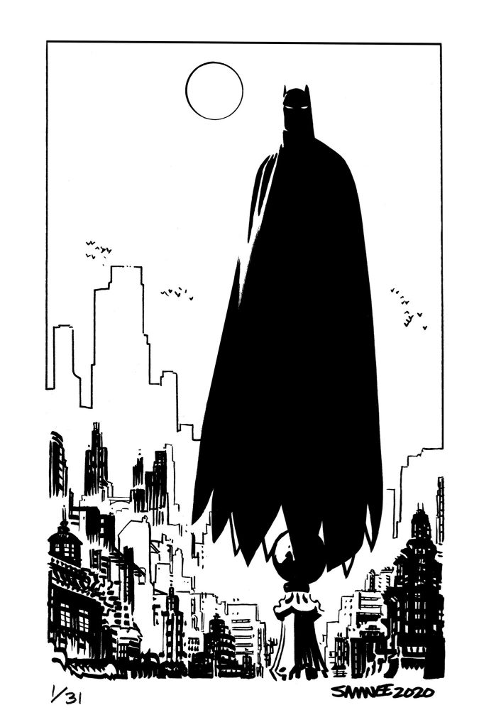
28. Day 1: “Moon”
Score: 10.5
Why it ranks here: I felt genuinely bad for where “Moon” ends up, as it’s a great piece. This was the first piece, and deservedly earned the “oohs” and “ahhhs” of the crowd. It feels almost like Samnee doing a half Mignola, half John Paul Leon thing, and the result is staggering. Just an absolutely incredible piece. However, it earns demerits for one main reason: it’s perhaps the least clever piece when it comes to execution of the prompt. Don’t get me wrong, it absolutely works! It’s fair game! But when you’re splitting hairs, things get a bit micro here.
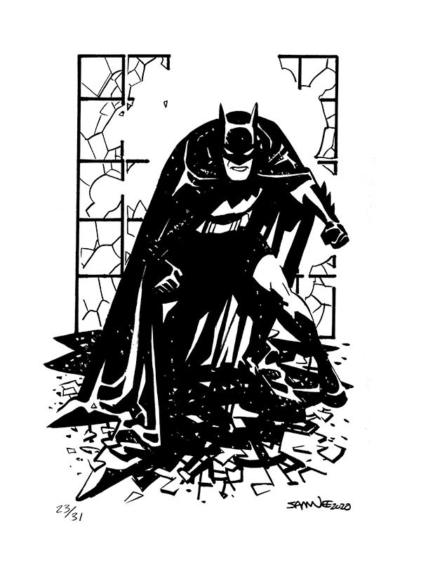
27. Day 23: “Glass”
Score: 10.8
Why it ranks here: This is a great shot of Batman, a menacing stance and certainly something that would make your average henchman fill their britches. Samnee is, predictably, good at this kind of thing. But in the grand scheme of Batober, it’s a fairly ordinary piece relative to the mean, with two particular demerits dragging it down in my rigorous scoring system. First, it’s a pretty straightforward execution of the idea of “Glass.” It works, but it lacks the spice of others. Second, in terms of intangibles, when I showed it to my wife – who is an architect that is endlessly annoyed by how glass breaks in fiction – immediately let out her trademark, “that’s not how glass breaks!” Nice piece, but apparently that’s not how glass breaks!
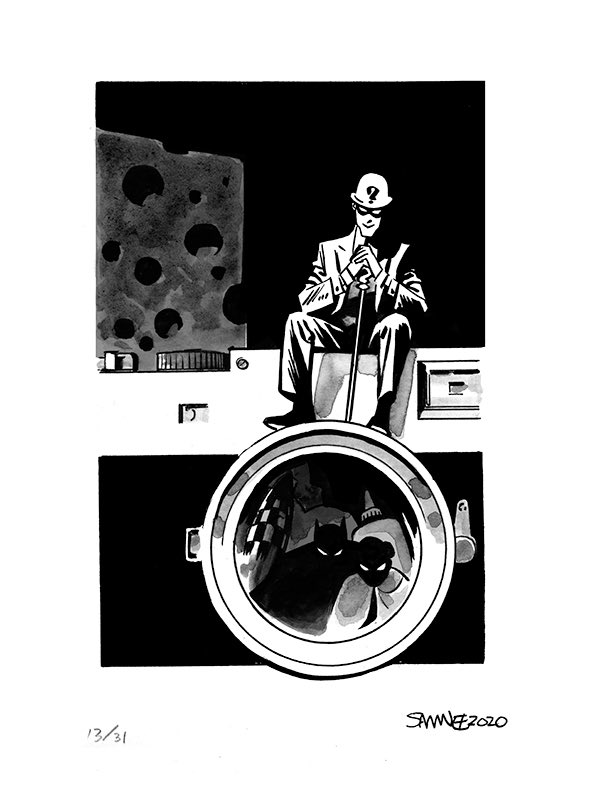
26. Day 13: “Giant”
Score: 11.3
Why it ranks here: This one, fittingly, is a bit of a riddle to me. I really enjoy it, I like the prompt execution, it’s tremendously well done, it’s an iconic camera choice, and it’s certainly an outside the box idea. But I have so many questions about the Riddler’s plan here. How does the camera help him in any way? Why is there a massive piece of cheese behind him? Are he, Batman and Robin all really small or is everything giant, as the prompt suggests? Edward…Edward! My guy! You need better plans, buddy. This is a one way train to Arkham if I’ve ever seen it. Nice piece, but my mind wanders as I dive deep into it.
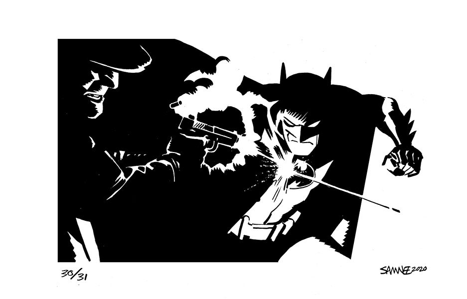
25. Day 30: “Ricochet”
Score: 11.4
Why it ranks here: This is just a tremendous image, with Samnee making a perfect choice for Batman’s face here and using his cape as a way of filling the left side of the image with menacing darkness. Plus: love that white outline on the pistol and the lighting choices throughout. It’s a clever piece. Just not clever enough, my friends!
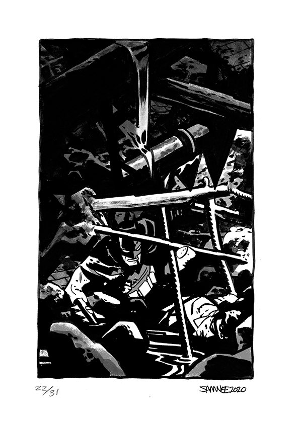
24. Day 22: “Stuck”
Score: 11.5
Why it ranks here: This is a visual metaphor of my experience trying to finalize my selections, as I lift rubble (self-doubt) from my body (rankings). But because this is governed by science, the changes to this list amount to as much as what Robin is doing here: nothing. Anyways, good piece but any time a superhero is buried by rubble I think of Spider-Man. It’s true! Spider-Man has the rubble market cornered, unless we’re including Flintstones comics, in which case Barney does.
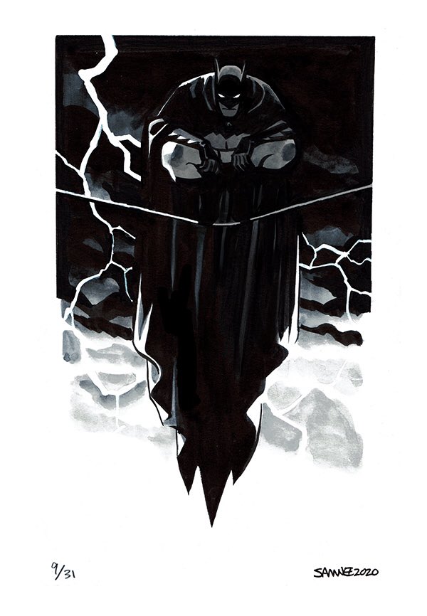
23. Day 9: “Lightning”
Score: 11.6
Why it ranks here: This was one of the toughest rankings of the whole lot, because from a pure composition and execution standpoint, “Lightning” is arguably a top five piece. The wash work here by Samnee is, by itself, absolutely elite, as is the layout of the piece and how the cape drapes. It just drops off a bit because of the relatively straightforward nature of its prompt execution. Does it work? Yes. Does it lack the spice of others? Absolutely. But that’s okay! It’s still fantastic.
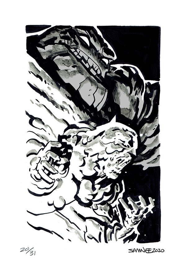
22. Day 20: “Suffocate”
Score: 11.7
Why it ranks here: I’m watching the HBO Max Harley Quinn series right now, and that show’s version of Clayface is less of a supervillain and more of an aspiring off off off off Broadway actor who moonlights as a Jack of all Trades for Harley’s crew. He’s a good dude, albeit one made of mud, and a character who has punched about as many people so far in the series as I have in my life, which is not a high number. That is my dominant vision of Clayface right now.
So thanks, Chris. Thanks for replacing Clayface, man of the stage, with Clayface, man of literally internalizing Batman and, as the prompt suggests, suffocating him. This is much, much scarier.
Also: my guess is that Samnee’s defining vision of Clayface is the one from Batman: The Animated Series. This feels like a clear case of inspiration from Bruce Timm’s version of the character.
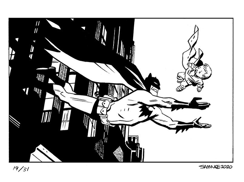
21. Day 19: “Falling”
Score: 11.8
Why it ranks here: The simple heroism of this piece is endearing, and its execution is top notch. But it finishes here not because it isn’t great, but because it makes me ask so many questions. How did this baby fall so far from the building?! What is Batman going to do when he lands, or is he going to use some grappling hook action? I suppose it says more about me than it does about this world that the above Clayface suffocation party doesn’t worry me but this scenario does, but this is troubling from top to bottom. Batman needs to have a serious talk with this baby’s parents after he’s done because DAMN. Although, in hindsight, he does take his wards out crimefighting, so maybe this seems normal to Batman?
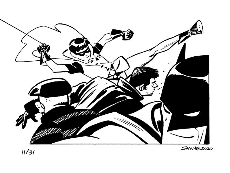
20. Day 11: “Pride”
Score: 12.1
Why it ranks here: This is such a nice piece. It’s all about Samnee’s gifts with facial expressions, and how simple choices – a slight upturn of the mouth, the enthusiasm of youth – can make for an impactful piece. I really enjoy this one, but there are better examples of what this entry accomplishes later on, even if it is excellent.
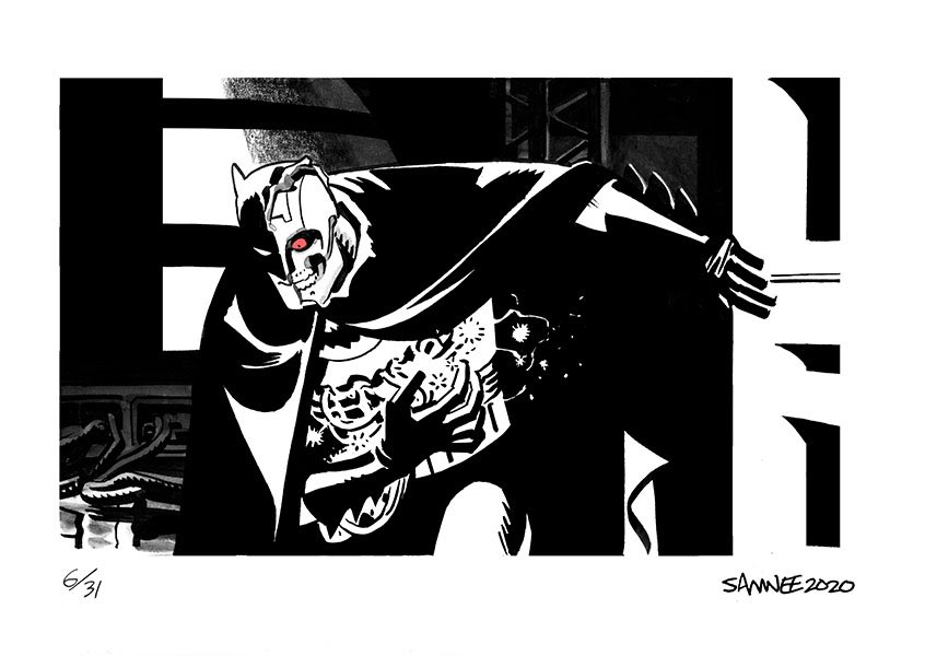
19. Day 6: “Glitch”
Score: 12.2
Why it ranks here: We’ve got another Batman: The Animated Series reference! HARDAC Batman! This is a nice, relatively deep cut for “Glitch” as a prompt, but most of its score comes from that deep cut nature. It’s a good piece – a very good one! – but you gotta be more than very good to break the top half of this list, my friends.
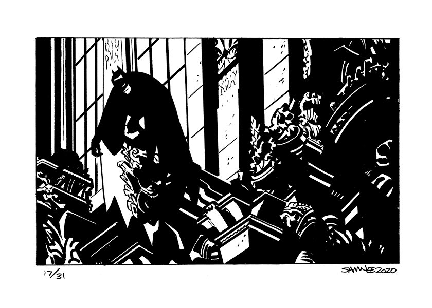
18. Day 17: “Sculpture”
Score: 12.3
Why it ranks here: This is a weirdly heartbreaking piece, as Batman is at his most pensive here. Alone with his thoughts in a place no one else will bother him at, crouched amongst some of his most frequent confederates in the sculptures along the tallest buildings of Gotham. It’s a unique take on the prompt that’s well-executed, but it lacks a little something, something to move it further up the list. So close, though.
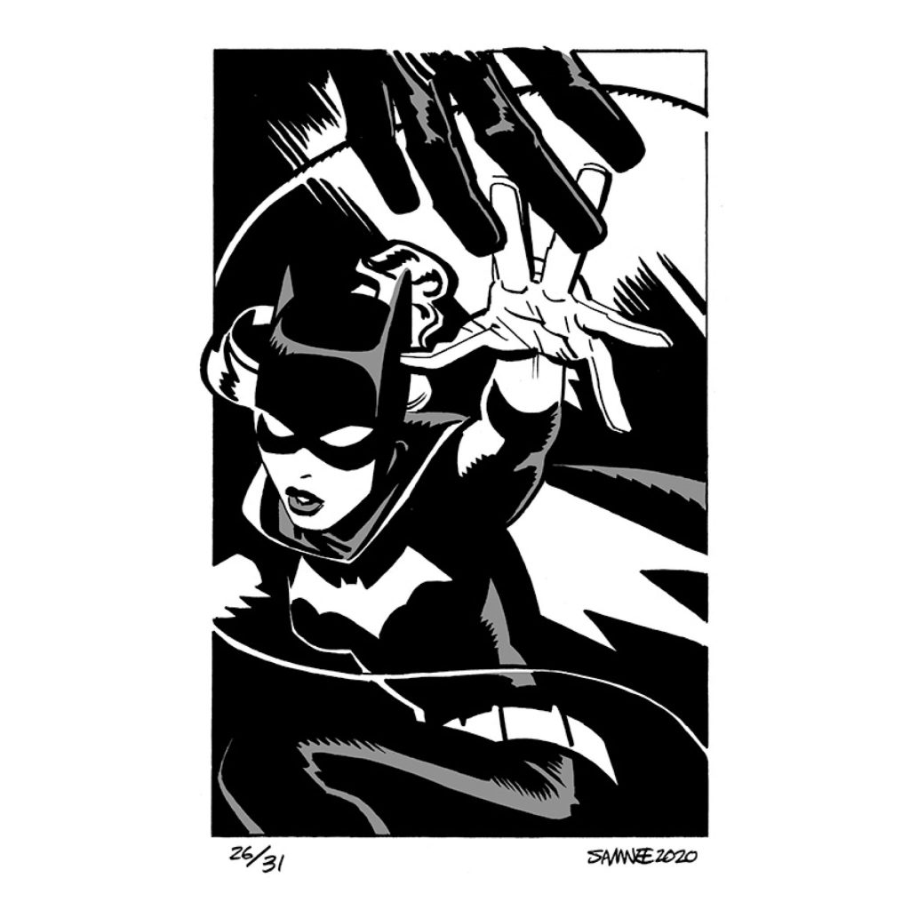
17. Day 26: “Reach”
Score: 12.4
Why it ranks here: This one earns a character bump, in particular, as it’s one of the few pieces to feature a Batgirl. I love seeing his Babs, and I love how the reach the prompt is asking for stems from an off panel Batman. It’s a simple piece, and one that might deserve to be a little further down based off what it actually is. But it’s the first of three pieces to see a bump because of who it features, because even science can be manipulated by unexpected variables.
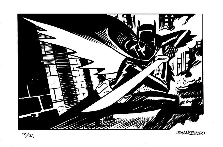
17. Day 18: “Sword”
Score: 12.5
Why it ranks here: I could give you a long, drawn out explanation about why this places where it does, talking about the varying categories and Samnee’s execution and yada yada yada, but the real answer is quite simple and just two words: Cassandra Cain. Sometimes that’s all it takes to finish in the top 17!
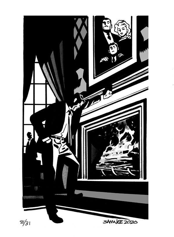
15. Day 8: “Hearth”
Score: 12.7
Why it ranks here: This one is all about the Alfred in the back. While the foreground is loaded with A+ elements, like the invisible weight on Bruce’s shoulders, that smoldering fire, and the placement of the family portrait, Alfred’s presence in the background is the hammer upon which this piece is nailed from. And there’s nothing significant there. All black and white, no face, all simplicity. That lack of detail, particularly the shrouded face, escalates the emotion within this piece, as we can see the pain Alfred feels even if we can’t see a tear in his eyes or hardness in the lines in his face. It’s a clever choice by Samnee, and so much more effective than it might have been otherwise.
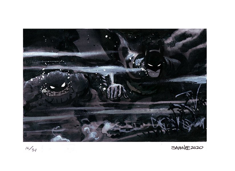
12 (tie). Day 16: “Murky”
Score: 12.8
Why it ranks here: Bringing us back to #22, how great is Samnee’s Clayface? He’s just fantastic. But this piece is also lowkey spectacular, particularly because of how Samnee uses washes and…I think whiteout?…throughout here. From a pure talent and ingenuity standpoint, this one is an A-lister, and the menace Samnee once again delivers upon Clayface is incredible. That said, it’s some tough competition here, so this is what happens to even great pieces like this.
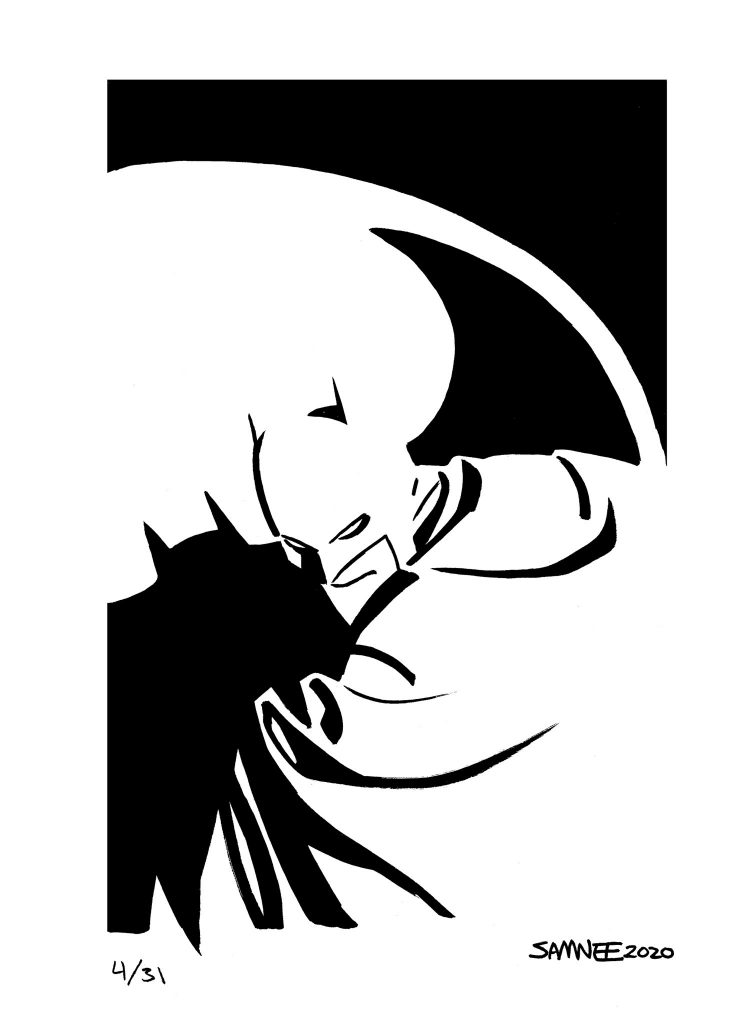
12 (tie). Day 4: “Light”
Score: 12.8
Why it ranks here: The dominant color of these pieces, by and large, is black. That makes sense. He’s the Dark Knight, not the Light Knight. So from a pure change of pace standpoint, I love what Samnee did here, reversing his polarity and making white the dominant color for the entry of “Light.” But I think it’s important to consider what Samnee did here, because it’s actually a lot more impressive than it looks here. Batman is created mostly by the white itself, which means his shape was defined by what was left behind, not what was added. Even more impressive, much of his look was created by the Batsignal and wrinkles in his cape.
That might not seem like much to you, but there’s something inherently mind boggling about this to me. It would be so much easier to just draw Batman. To create him by what is left behind is wild. I love it.
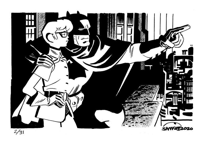
12 (tie). Day 2: “Guide”
Score: 12.8
Why it ranks here: Earlier, I mentioned how simply including Barbara Gordon and Cassandra Cain was enough to earn a boost in the ranking from me, and that’s no different for Carrie Kelley, The Dark Knight Returns’ Robin. But I will say this starts a trend that leads the way for much of the remainder of the list, and that’s Batman and his family. This is a different iteration of Batman, as it’s the older DKR version of the character. But still, Batman – in my opinion – is always better when he has someone close to him to balance it all out. That goes double for Samnee’ version of the character, and I just love the warmth that comes from this piece. Brilliant stuff.
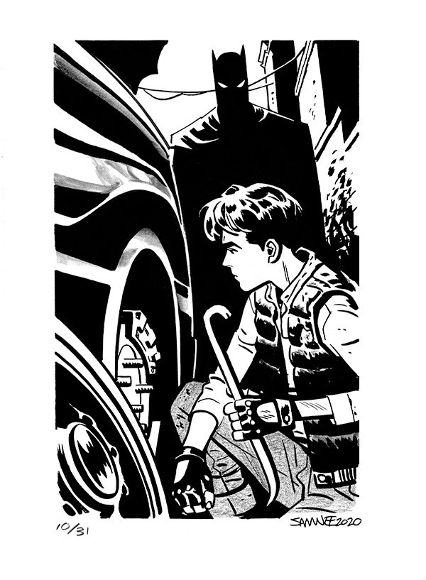
11. Day 10: “Trouble”
Score: 12.9
Why it ranks here: This original ranked higher, but with reconsideration it dropped thanks to what finishes higher than it. But make no mistake: this is a top notch piece. I love the choices Samnee makes in this “Batman meets Jason Todd” piece, as it reflects their original meeting and so much more, from the fateful crowbar to the more hardened nature of Todd. But I also like little details, like the use of what I believe is just pencils to color Todd’s pants. Those little elements aren’t in your face, but they make a big difference without being showy. Nuanced choices by a great that result in real gains. This is the kind of thing that makes Samnee such a genius, even if it isn’t big.
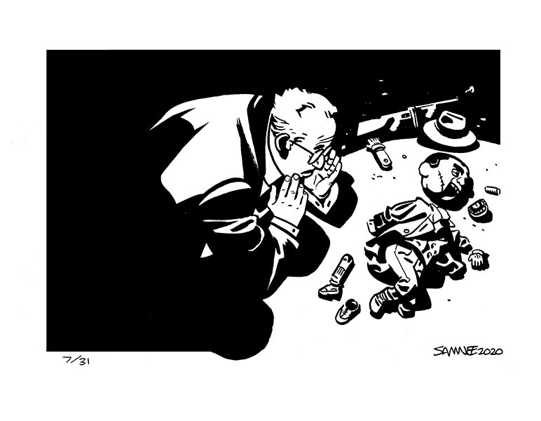
10. Day 7: “Broken”
Score: 13
Why it ranks here: I really thought this one was going to finish higher when I first looked at all the pieces because it has everything I want. Incredible composition. An unexpected but perfect execution of the prompt. Wonderful character work. NO JOKER. This might be the most unexpected piece from the month, and what Samnee delivers with a crestfallen Ventriloquist and a shattered Scarface is brilliant. But when I mathed it all out, “Broken” ends up at the #10. A very solid finish for a Ventriloquist piece, but lower than I initially expected.
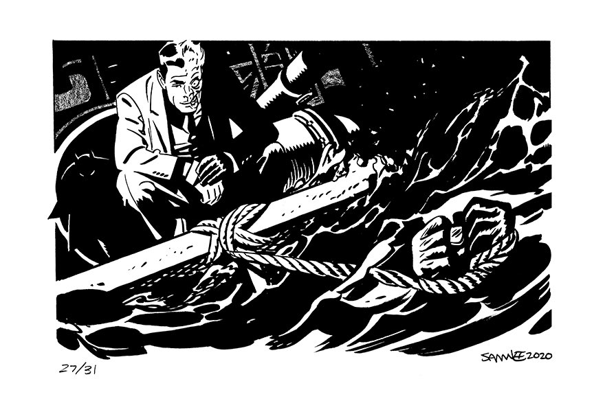
9. Day 27: “Flood”
Score: 13.1
Why it ranks here: This reminds me a bit of the piece that finished in 15th place, as the reason for “Flood” ranking where it does has more to do with what’s in the background than what’s happening up front. While you might think the character who is struggling under the flood of water that Two Face has set upon them is Batman, that’s when you realize before Harvey does that, oh hey, Batman is sneaking up right behind him actually! It’s a quiet detail – just eyes and an outline of his upper half – so it’s easy to miss, but it turns this piece from something relatively ordinary into something extraordinary. Subtle but tremendous. I dig it.
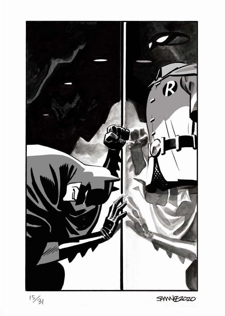
8. Day 15: “Mirror”
Score: 13.2
Why it ranks here: Sorry guys, having a tough time with this one because it just got weirdly dusty in my office. I don’t know what’s going on. It’s super windy today in Anchorage, so maybe something just got in my eye.
Anyways, the choice of this idea for “Mirror” is such a heartbreaker. The reflection of Batman on the glass case where Jason Todd’s empty costume, post death, is encased acting as the titular mirror was an unbelievable choice, and honestly a flex by Samnee. I feel like when he thought of that he let out a Kite Man-esque “hell yeah” because it’s so perfect. But the mirror isn’t just showing Batman’s sadness; it reveals his perceived failure, as he couldn’t protect the boy in his care. It’s a remarkable piece.
Bonus points for using the wash for the reflection. What a smart choice that was. I’m starting to think this Samnee kid has a future in art.
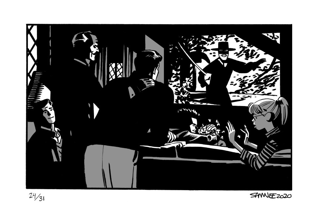
7. Day 24: “Fox”
Score: 13.3
Why it ranks here: This one contains L A Y E R S my friends. It earns maximum cleverness points, because of all the choices made within. It’s Bruce Wayne with the people closest to him in his life sharing in the movie he watched with his mother and father – The Mark of Zorro – the night they were killed. It shows Bruce as a person who has gotten to a healthy enough point in his life where he wants to share this moment with his new family, underlining that they can move forward together, creating new memories from past trauma. It’s a beautiful, heartfelt piece that even without the final twist is well done. But here’s where it escalates further. What does “Zorro” translate to in English?
FOX.
Chris Samnee, you unbelievable so and so.
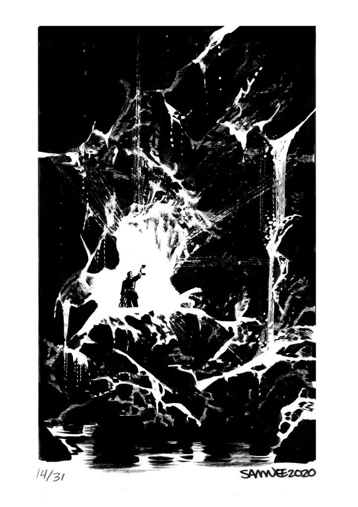
6. Day 14: “Damp”
Score: 13.4
Why it ranks here: I remember visiting Accademia in Florence, Italy to see The Statue of David. With works of art, seeing them in person can be a mixed bag, as you’ve likely seen it before, even if you’ve never seen it in person. That doesn’t always work out, like with the Mona Lisa, an experience that’s more staggering because of the volume of people surrounding the shockingly small painting. That’s not the case with The Statue of David. It’s one of the most astonishing things I’ve seen in my entire life. Looking at this massive sculpture in person boggles the mind, from the execution to its sheer size. But I remember one thought dominating my brain when I looked at it: how could Michaelangelo have seen this work in the original, enormous piece of marble?
That’s what I think of when I think of “Damp,” the 14th entry to Batober. While there is a core drawing in the center of this piece, so much of what defines it isn’t what Samnee added with black but what he subtracted with white. This rendition of the Batcave and the light and elements streaming through it is astonishing, and one of the most inventive pieces from the month. Big fan.
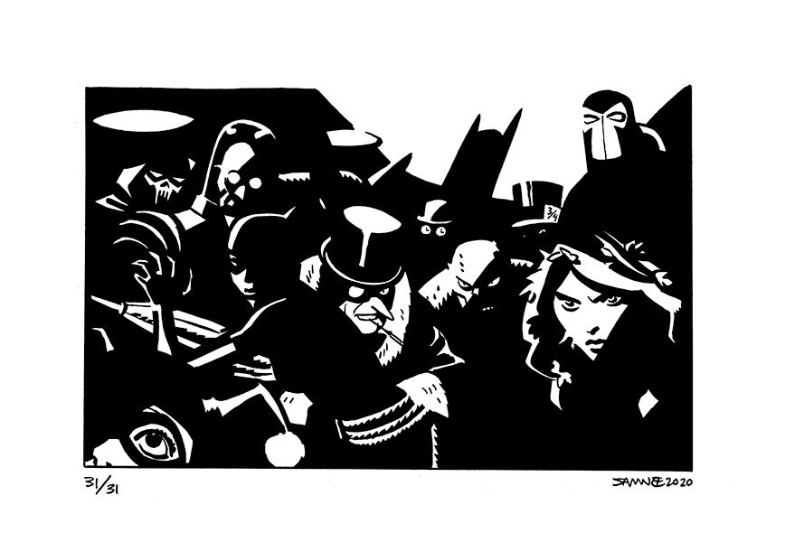
5. Day 31: “Shadow”
Score: 13.5
Why it ranks here: Can you even imagine the inner fortitude it took for Samnee to put together a full rogues gallery piece – including Harley Quinn, Phantasm, Mr. Freeze, The Penguin, Killer Croc, The Riddler, Poison Ivy, Mad Hatter, Bane and one other villain I can’t quite make out – and yet not include Joker? This almost finished #1 just on the strength of that. But even beyond that, this is a remarkable piece for how Samnee used the iconic look of Batman’s shadow, enveloping his enemies without eliminating them completely, as if he’s saying that no matter where they go the Batman will follow.
Some might say this is an obvious choice with the prompt and it should earn demerits for similar reasons to what I said about previous pieces, to which I’d respond, “Do you really want to argue with science?!” It’s a top five piece for a reason, and not just because he managed to include a full line-up of villains without featuring the Clown Prince. That helps, though.
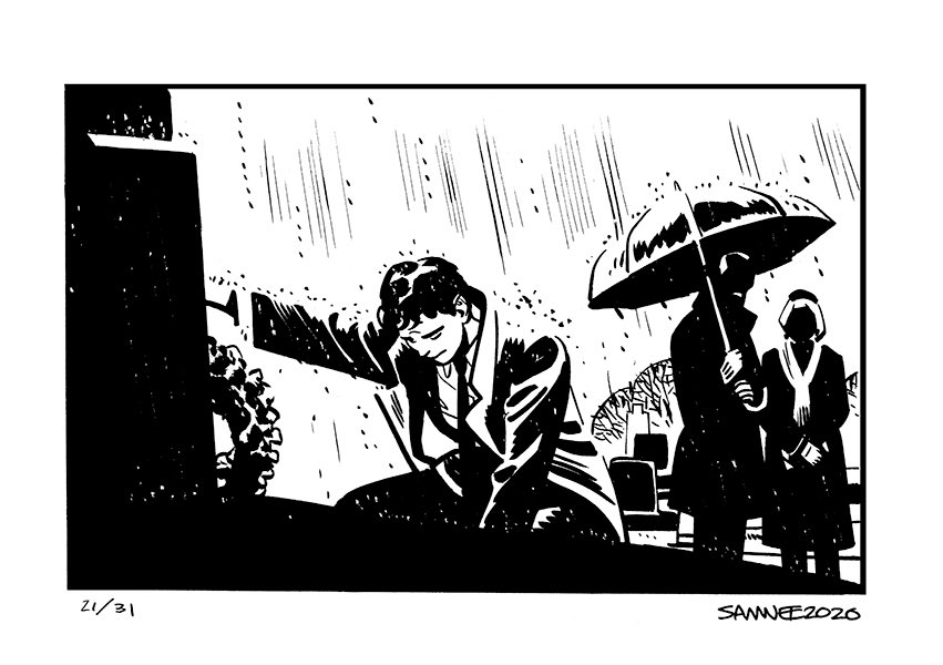
4. Day 21: “Loss”
Score: 13.7
Why it ranks here: While Samnee is often a joyful artist to me, when he wants to nail a sad bit, he can. Case in point: “Loss,” a shot of young Bruce Wayne presumably after the death of his parents. Rain soaked and distraught, the emotions radiate off Wayne thanks to all the choices Samnee made, from the single arm reaching out to the posture to the downturned head. This is a potent piece, loaded with heartbreak and sadness. I love it.
Also: how great is Samnee at depicting rain? It’s a simple solution, but so effective.
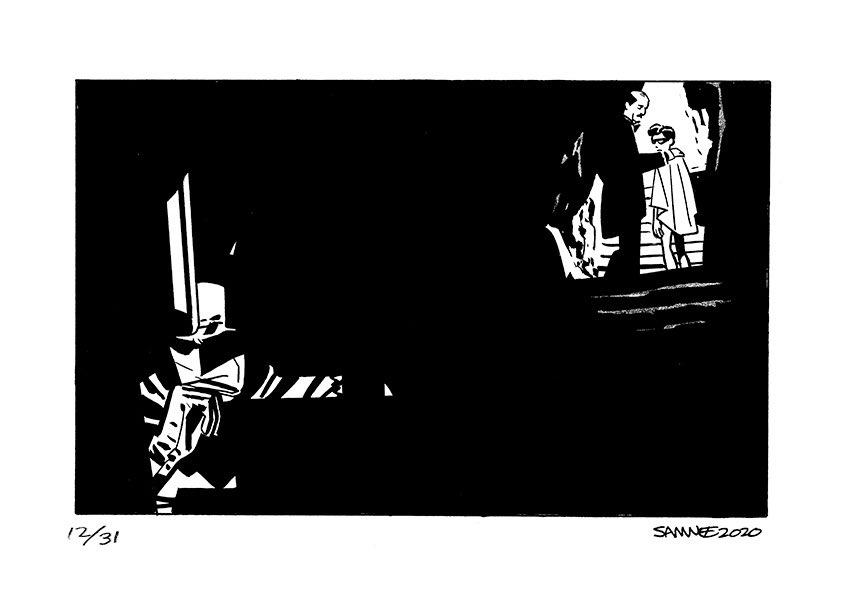
3. Day 12: “Space”
Score: 13.8
Why it ranks here: Good.
Lord.
Chris.
Calm down, my guy! This is too good! While there are roughly infinity billion things Samnee could have done with the idea of “space,” the fact that he turned this into a thoughtful meditation on the driven nature of Batman and how Robin isn’t just looking for a mentor, but a father figure. The space being the sheer black that separates Robin and Alfred from Batman is a brilliant decision, as the only light in the latter’s life comes from the pursuit of his prey and from the family he’s denying in the hopes of avenging the one he lost. It’s an impossible choice, and outrageously great execution of an idea by Samnee.
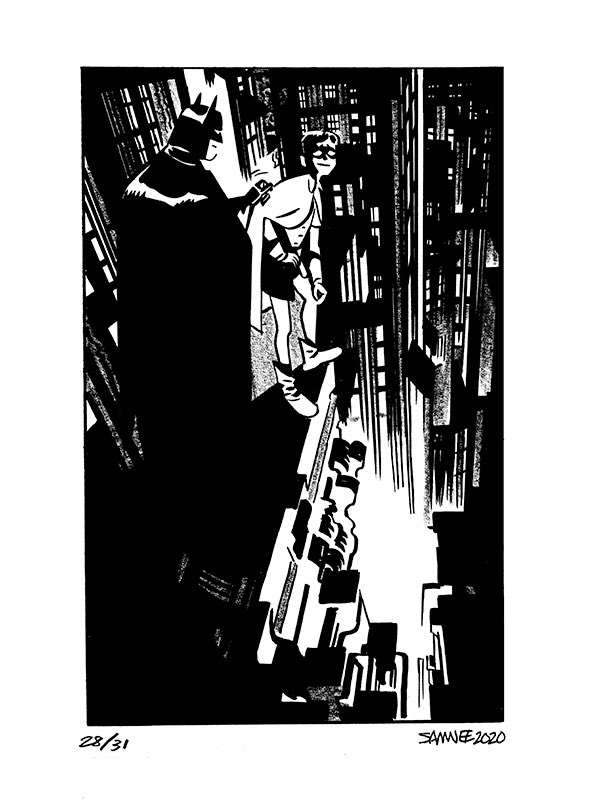
2. Day 28: “Nudge”
Score: 13.9
Why it ranks here: What a tour de force this is. This is, in my opinion, the best piece from the month. That perspective! That cityscape! That nervous trepidation on Robin’s face! That “nudge,” as the prompt suggests, from Batman lovingly motivating his ward. This is an absolute banger of a piece, showcasing a tremendous idea that’s gorgeously executed, saying far more than a thousand words with this single image. This is storytelling to its absolute max, and a perfect example of what makes Samnee one of the, if not the, very best.
But it’s missing one thing!
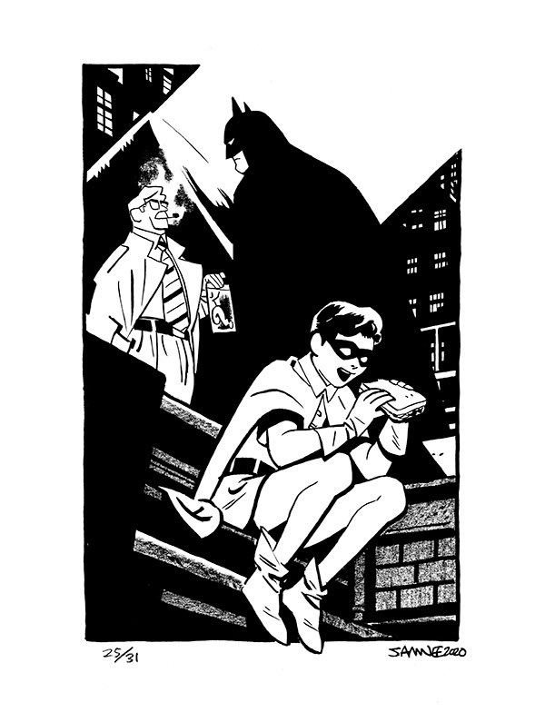
1. Day 25: “Hungry”
Score: 14
Why it ranks here: There are so, so many reasons that this piece gets the top spot. The composition, the idea, its cleverness, how well it fits the prompt, etc. etc. But the number one reason it is at number one should be obvious to anyone who reads SKTCHD or listens to Off Panel: it features a character eating!
Not only any character, but Robin, a growing young man, someone who needs fuel during his long nights crime fighting, eating a sandwich. Not only that, but it’s Robin doing it in the foreground as Batman talks with Gordon about some Riddler based activity, so it shows how they fit eating in around their primary activity. So it features a character eating – a massive plus! – but also says so much about what Batman and Robin do and who they are with Samnee’s choices of foreground and background actions. It says a lot with a relatively simple piece, and I love it so much.
One thing I’m dying to know, though: what kind of sandwich is Robin eating?! I’m betting heavy on tuna, personally, especially considering it’s a long shot. Tons of protein, can load up with veggies so its nourishing, and it isn’t quite as heavy, especially if Alfred leans away from mayo. That’s just what you need for crime fighting fuel. Plus? It’s delicious.
