
“This is a Very Rare Thing”: Peow’s Patrick Crotty on Designing Those Glorious Scott Pilgrim 20th Anniversary Box Sets
If you’re looking to sell me on a comic, one of the best ways you can do that is by giving it amazing production value. Whether you’re talking paper stock, design, or whatever, if you put a project together that looks and feels great, I’ll be paying attention.
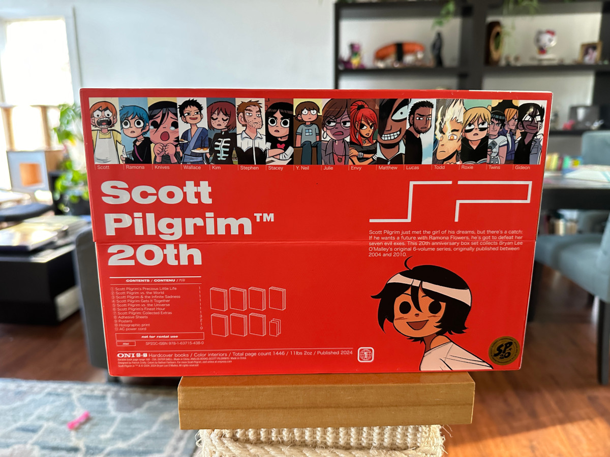
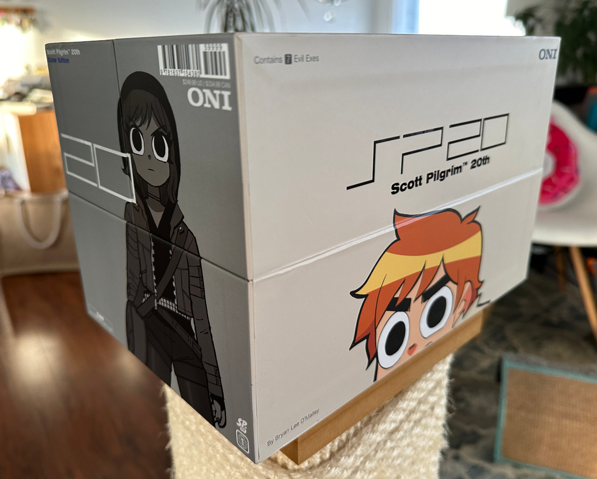
And the Scott Pilgrim 20th Anniversary Box Sets Oni Press released this year to celebrate cartoonist Bryan Lee O’Malley’s creation made me pay attention — and then some. In fact, save for Beehive Books’ Kuroda Edition box set for Ronald Wimberly’s webcomic Gratuitous Ninja, the SP20 box set might be my favorite collection of comics ever if only for its production value. It’s a clamshell set that comes both in color and black & white editions, with each collecting all six volumes of the series in hardcover, a Collected Extras book filled with behind the scenes materials, and fun extras like stickers and prints. That alone is spectacular. But the box itself might be even more impressive.
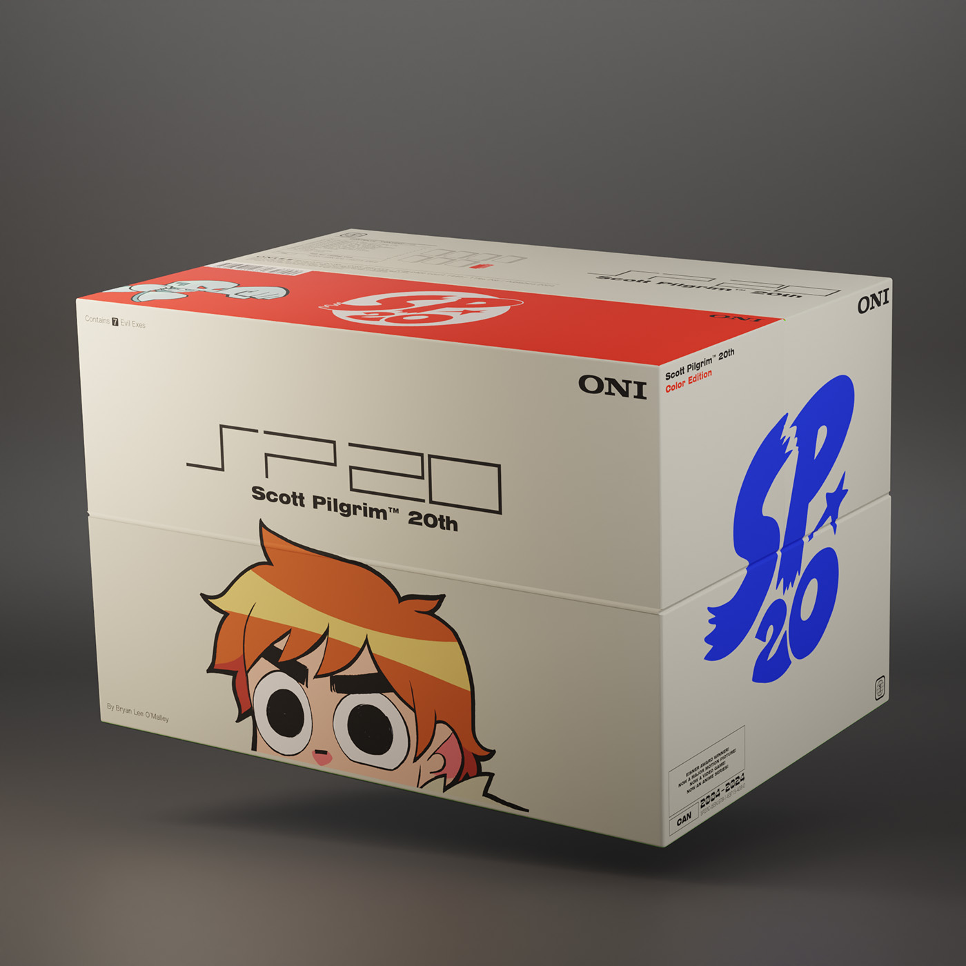
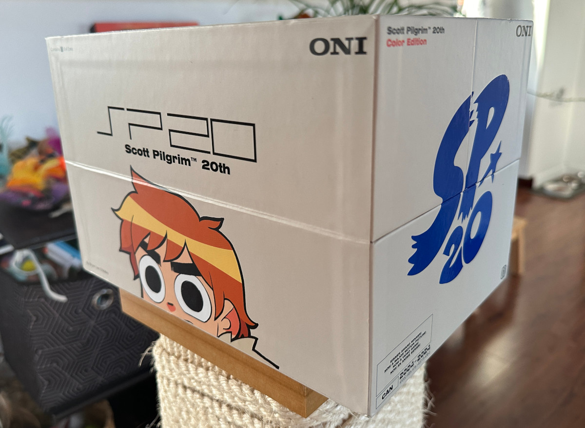
This clamshell box is loaded with smart design and fitting details, like the SP20 itself matching the look of the Sony PlayStation’s “PS2,” the Oni that reflects the “Sony” that came with it, and the Seal of Approval sticker hidden in plain sight on one of its bottom corners. It’s everything you’d want for a Scott Pilgrim box set, as its idea and execution perfectly matches the vibe of O’Malley’s graphic novel series. Even if it wasn’t loaded with great comics, it’d draw people in thanks to how well put together it is.
And because I’m obsessed with production value already and a big fan of this box set, I wanted to learn more about how it came together. That’s why I recently talked with Peow Studio’s Patrick Crotty, the person who designed it. We hopped on Zoom and talked about his background with comic design at Peow and other stops like Random House Graphic, design’s appeal, and more, before we discussed how this box set project came together, the creative process behind it, working with Oni, some of those little details I mentioned, and a whole lot more. It’s a delightful exploration of how a project like this comes together, with a view inside and around the box so you can see what makes it such a special release.
You can find that chat — which has been edited for length and clarity — below.
When it came to Peow, what appealed to you about the world of design and applying that to your books?
Patrick Crotty: We kind of fell into making books at Peow. I have an advertising and PR background, but the other two (Elliot Alfredius and Olle Forsslöf, the co-founders of Peow Studio) have art backgrounds. Since we were working a lot with the production of the books, a big goal with our bookmaking was…there are a lot of people who are publishing stories that are good, but when you have a physical thing, you want every part of it to look nice. We’d look at books like, “Why would you leave these blank pages? This is a space where you could put art or design.”
We were coming wanting to make things look nice visually, so even after the story’s done and it’s on your bookshelf, you would want to keep the book around because this object looks cool. And because of that, we put a lot of time into design. Some people are going to be like, “We’ll put together the book quickly and then we’re going to spend half of our time on making advertisements for this.” Or…”we’re going to spend a lot of our time trying to reach out with PR to get interviews happening about the books.”
But we chose to spend a lot of our time with design, and it was because that’s what we enjoyed. When you start your own company, you get to pick and choose what you do. And we wanted to make the books look cool.
Was part of that oriented on the fact that you saw that as a weakness in the broader comic space? I don’t want to say that there was bad design, but did you think this could be more of a focus?
Patrick: I think more so than that, it was that we saw other books with very nice design, and we felt, “We want to do something like this.”
That was mostly the thing. As I get older, I’m trying to be less and less of a hater on stuff and be more positive, “No, instead of searching for stuff that you think is bad, it’s better to look at stuff that you think is cool and try and go towards that. Instead of saying, ‘I don’t want to be bad.” Say, “I want to try and be good.”
Or how could you improve things.
Patrick: Yeah. I always feel happy when you look at nice looking things.
Early on we were inspired by a lot of other publishers. For example, Nobrow was starting out and they were putting out a lot of books that impressed us. Their printing and paper especially. They’ve taken a bit of a different direction now with what they’re doing, but at the time, Nobrow was very inspirational. We were like, “We want to do stuff like this with our books.”
We’d also just look at a lot of books in general. Even books that we couldn’t read. A lot of Japanese book production is cool and inspiring. So that would also be…what if we could try and translate some of these design concepts, but then have it for our English releases. We were just looking at all different kinds of books. It doesn’t even necessarily have to be comics. Just seeing stuff that was being made elsewhere and trying to apply it to the books that we wanted to make.
Your background was in advertising. Has design always been something you were interested in and focused on even before you got into comics?
Patrick: My interest in design grew because of the group of friends that I was around. Olle and Elliot from Peow, the two other people that I founded it with, they were from art backgrounds, and though their art schools I saw a lot of nice design work and other graphic design students who I though were cool people. Advertising and PR…that’s just my degree. I haven’t worked with it so much. And it was also more of a research-based advertising and PR. If I was going to continue working with that, I would be doing science and research within that field rather than actually working in an agency.
But I did do some design classes in high school, so I got my feet wet there a little bit. I don’t really know how I got into design. I was in a band in high school, and I think maybe making our gig posters was what kinda sparked it.
It seems like you really found your voice working on the Peow books. I know you’ve also done design for other publishers like Random House Graphic. You officially worked for Random House Graphic though, right?
Patrick: Yeah. I was there for almost five years. I was the essentially art director-ish person for Random House Graphic. I was their one designer when they started up and helped shape how that all was looking.
And those are nice-looking books, but I imagine all those projects really helped you find your voice as a designer as you headed towards a big project like the Scott Pilgrim 20th box set.
Patrick: It’s really different. Doing design for graphic novels is very different than just doing other design, because when you’re working on a graphic novel or any comic related things, there’s usually an artist who’s made it. Well, there almost always is, especially if you work with writer/artist cartoonists.
With a prose book, those people are maybe like, “Oh, I’m just good at writing, you do the design,” then you might hire another illustrator to make work for the cover. But when you’re working with artists, they’re like, “Well, I’m an artist too. I have a good idea of what kind of stuff looks interesting to me visually.” And you’re also stuck with their art style too. I can’t ask an artist who does black and white art, “Oh, it’d be really cool if you did this beautiful watercolor painted thing.” And they’re like, “Yeah, but I don’t know how to paint that.” You don’t get to hire a different artist to make the cover art.
There are a lot more limitations. You’re also having to make sure the artist is happy with it. I can’t just do my style. So, it’s like you are designing for essentially another designer, which is a lot trickier than designing for somebody who has no idea about design and is going to be like, “Yeah, do whatever. I trust you.”
Let’s talk about the 20th anniversary box set for Scott Pilgrim, which you designed. It’s a very rare type of project for comics. It’s a giant clamshell box set, it’s covered in art, it has all the books inside, it has to be functional…it has to be all these things. It’s a unique thing. How did that project come together for you?
Patrick: When Peow was kind of wrapping up, before we retired a couple years ago, we were in communication with Bryan (Lee O’Malley). We asked him to do a t-shirt for us — he did! It was very cool — I think during this time, we just talked about doing some other kind of collab together. Nothing specific, just very loose chit-chat. Eventually the collab idea came up in conversation again when Bryan reached out in an email saying something like : Hey, we’re going to be doing a lot of fun projects for the Scott Pilgrim 20th anniversary next year. It’d be cool if you did some T-shirt designs or merch or something.” Again, nothing set in stone, but a few months passed and I reached out to ask about it, and at that point, the whole idea of doing this giant box set came up. Bryan was like, “Hey, actually this is my agenda. It’s not just T-shirts. This is what we’re doing now. A box set.” And I was like, “Wow, of course yes.” It’s like you were saying. This is a very rare thing in book publishing.
So, I was like, “Yes, of course I will just move whatever around to do this.” This is one of the coolest things ever. In terms of book project design, it’s definitely a once in a lifetime type of thing, or at least once in every 20 years. It takes a while before books happen like this. And to my recollection, I think the only other box set that I know that is kind of like this is the Akira box set, and that was for another big anniversary.
But that was used as for reference with the clamshell design. I see you have the Love and Rockets one. That’s nice, but I feel like that leans more towards what we usually see, where it’s more of a nicer slipcase. I think for this one, they were like, “We want to do something special that is above and beyond just a slipcase.”
It feels like what Scott Pilgrim’s box set should be. They also already did a slipcase box set.
Patrick: They have done the collected ones, yeah.
So, it had to be something different. What was the development of this clamshell box set design? Did you work closely with Bryan and Oni in putting it together?
Patrick: When Bryan reached out, they had already been in the initial discussions with Oni, so they already knew that it was going to be a clamshell. They didn’t have the exact measurements, but they had a rough idea of the size and the contents, and that there would be two separate boxes, one color, and one black and white. And they knew they wanted to do extras. Those were not decided at that point though.
So that was the jumping off point. I was working mostly with Bryan and Sierra Hahn And then they were like, “But everything else, we’re open to ideas. Since this is a big fancy expensive box set. We’re open to anything.” It’s very rare that you hear, “You can do whatever with the book.” I don’t think I’ve ever heard that before. Do whatever. And I was like, “Oh, okay,” but in my head I was like, “Wow, this is so insane.” They didn’t actually say “Do whatever” but it was the vibe.
For the first round of concepts, I did some designs, varying from cool to more traditional, safe stuff. And then there was the one with PlayStation-like text. I thought that was kind of a funny joke. When I was doing this stuff, I had this idea that just clicked in my head. I was like, “Oh my God, this is kind of like a video game box set.” And the SP20 was like PS2. It’s the exact same letters. And I thought, “This is too good to be true.” And then I was like, and Sony sounds like Oni, so let’s riff on the Sony logo. When I was sketching it out it felt like the joke fit perfectly. And Bryan plays video games, so he’s going to get it too.
I threw the PS2 concept it in the pitch. I think that was the last idea that I had. I was like, “Here’s all the stuff that I think is safe and good, and then here’s my for fun one.” I had to throw it in. Plus, it was just cool. It was the same vibe and same time era (as the series).
A week or so later, whenever we were getting the feedback, Bryan was like, “Yeah, (the PlayStation one) is my favorite. I think this one is the best.” I was like, “For real? We can go with this. We can go with the joke logo?”
In my head, I was not expecting them to pick that one. I thought it they were going to go with a more prestige classy concept, because it’s such a special box set. Usually as a designer, you put in the for fun ones that you actually like the most, but nobody ever goes with it. I went in with zero expectations of it happening and then it did. And I was like, “This is the most fun I’m going to have doing a book.”
subscribers only.
Learn more about what you get with a subscription