The Frequently Masterful “The Wake” and a Ten Issue Fight Against Format
Does the format of "The Wake" hold it back from greatness?
This review first appeared on Multiversity Comics on August 11, 2014, but was written by me. It has been published here as well with their very kind permission.
Reviewing comics is an often thankless gig, and one that’s nature is frequently against what’s best for both the reviewer and the subject of said review. After all, when you’re in 2014 and there’s a 24 hour news cycle to contend with, a website’s readership expects reviews to hit within a day or two of release. That puts the onus on the reviewer to give as much attention to a book as he or she possibly can before putting down to words what its strengths and weaknesses were in an extremely short amount of time.
And with monthly comics existing as slices of a greater narrative, its hard to really place a story into an overall context when a time crunch is always in effect, and in many ways it’s hard to review an issue outside of that context. It’s a weird place to be in, and for some books, it doesn’t do them any favors.
One book that fits that perfectly for me was the Eisner winning limited series “The Wake”. This series from writer Scott Snyder, Eisner winning artist Sean Murphy and colorist Matt Hollingsworth was one where if my immediate, post-initial read reaction – the one that would have driven my issue to issue reviews – was to be my guiding light, then this was a troubled title that was utterly gorgeous but often incomprehensible. I wasn’t reviewing this title for Multiversity, but having existed on the outside looking in, I wanted to go back and share my thoughts on it and provide perspective on a series I viewed as problematic.
In the process, I wanted to give it a front-to-back reread as a refresher course to make sure I had all of my reviewer ducks in a row, and to ensure that I gave the book the time it deserves. Given that this comic took countless hours for a bevy of creators to make, it seemed only fair that I do that at the very least.
By the time I closed the pages on the final issue, I realized that “The Wake” wasn’t what I thought it was. Yes, it was a series with flaws, but it was a unique and inventive one that was also astoundingly good looking, with fascinating big ideas and two clearly defined sides that fit together but are completely opposing in tone and feel.
That latter point underlines my big takeaway from this series though: “The Wake” is a pitch perfect case against the monthly comic format, and a ten issue reminder of the tricky, sticky parts of long-form graphic storytelling for both creators and reviewers.
That’s not to say that I think monthlies should go anywhere. I’m a monthly reader through and through, and I am riding print until it dies. But many comics are released as single issue floppies mostly because of some combination of “that’s what we do” and the economics behind selling monthly issues/collections at the end versus the alternative, and “The Wake” is a book that suffered in quality because of its delivery system.
Well, at least in my mind. It did just win an Eisner after all, but as I said, reading it in a monthly format did it no favors at all for me. It was a 10 issue series released over 14 months, and because of that some of the more subtle, narrative building elements get lost in the months between issues. There’s a cost there that the narrative pays, and it leaves readers reaching to access memories to connect seemingly disparate points.
If “The Wake” had been released as two graphic novels, clearly divided by the horror fueled, claustrophobic monster story of the first half and the adventurous, open world excitement of the second, the pieces would have fit together far greater, and it could have made the series – especially the schizophrenic final issue – less exposition dependent and more exciting to digest.
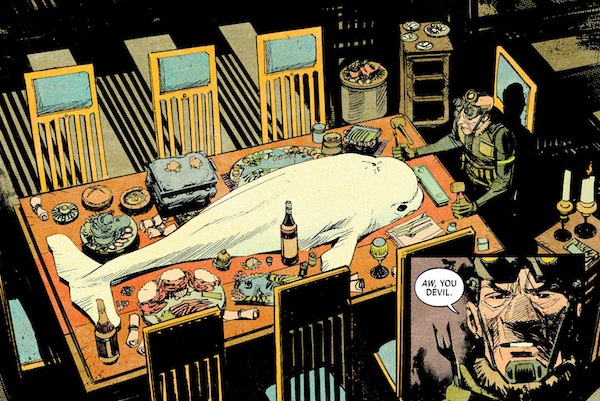
That exposition was the book’s biggest nemesis in my first read through, and it still haunted it the second time through, as Snyder often turned to entire pages dedicated to explaining what we’re seeing. Was it cool? Sure, learning from Dr. Marin (aka mythology’s answer to Carl Sagan) how the mers of the series fit into folklore was a hoot, but it also fragmented the story in ways that made it choppier than it needed to be. By the time the last issue came around and everything needed to be explained, our grand finale turns into an issue that is at least half exposition, laying out the truth of everything in an issue of telling, not showing.
Could a different format have fixed that? I’m not sure. The nature of the story was always meant to deliver everything at the end of the journey. But I have to imagine a different format and the approach change that comes with it could have smoothed out some of the choppiness.
The monthly format also made it difficult for some elements to connect with. On my reread, story beats like Lee and Leeward’s tear duct parallels and the importance of certain flashbacks hit me how they should have, but initially they either fell flat or confused rather than aroused.
The greater problem with these bits of criticism isn’t that the book overall is a struggle. It’s that they reside within a comic that is in many ways some of the finer moments of comic work we’ve seen recently, and they stand out so much because of it.
On one level, to take my reviewer hat off and replace it with a fan’s dolphin one, it’s just really fucking cool. The idea – from the discovery of the mers in the first half to Leeward’s journey to save the world in the second – is a thrilling, original and frankly genius concept, and it’s clear throughout that Snyder is just having a blast with it. It’s a bit of a sprawling beast and there are elements that are a little eye-roll inducing (the tears!), but in one ten issue series we get 2013’s answer to Billy versus the Predator and the most genuinely winning comic book team up in recent memory in Leeward and Dash the Dolphin.
That alone makes this book a success to me, but when you pair that with the often exceptional character work, you have a book that has big ideas and depth to them as well. In particular, I loved Meeks – the hunter from the first half – and the handling of all elements of Leeward, particularly her childhood with her dolphin hat and her badass yet empowering father. Snyder’s a gifted writer in many ways, but the way he can organically build characters and their relationships is perhaps his greatest strength.
It helps a lot when you have someone like Sean Murphy on art, as he can make moments like that one with Leeward’s father all the more effective thanks to the reserved, palpable enthusiasm of childhood.
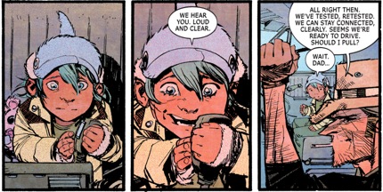
Murphy’s known for his big powerful set pieces and just off the charts amazing vehicles and technology, and while this series has plenty of that, he also shows off his side that really nails emotional story beats like the one above, and this one below from issue #5 that finds Lee saying goodbye to her son, Parker.
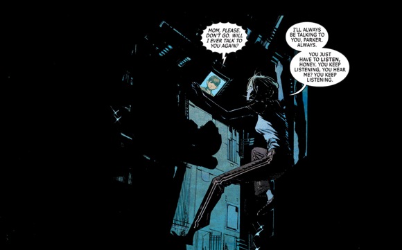
I know, I know. It’s cruel that I cut that page down. But look at that. Everything in the art pairs with the writing so well, showing the desperation Lee has in her pained final moments with her son. Murphy conveys that ably with the posture and position of Lee, as she’s willing to fight with all of her might for just a second more. It helps a lot that Hollingsworth is the colorist, as the lighting here is wildly effective from both a logic standpoint and a dramatic one.
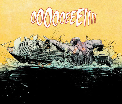
There are so many examples of how this duo does such an incredible job throughout the ten issues, from the frightening scale of the King Mers to the weirdo venom dream states everyone goes into when poisoned by the mers, but my favorite thing about their work is how clearly defined the art in the first half and the second half is. A huge part of that is Hollingsworth, who has two wildly different palettes in the dark, dire opening chapters and the bright, flat hues of the more hopeful latter portion.
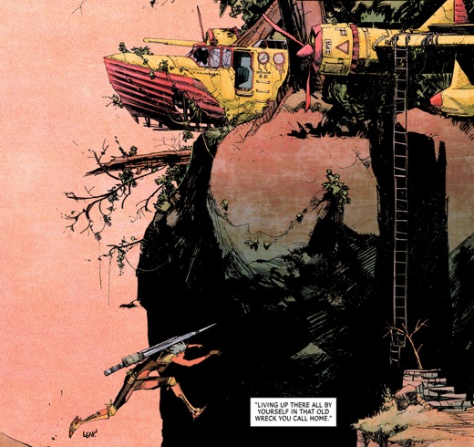
But you can even feel Murphy’s enthusiasm in the second half, and as the world expands, so do the opportunities for him. Dolphin sidekicks, cyborg pirate captains and some of the honest to god best airships these eyes have ever seen are amongst the highlights here, and that half finds one of comic art’s true greats running wild with creativity. It’s a blast to see what he comes up with.
The former half – and some bits in the latter – are expertly composed acts of pure horror, and Murphy’s fierce lines and raw energy makes those moments chill us to the bone all the more. It works in a different way visually than the latter half, but when it gets down to what matters – clearly and completely telling the story – it’s a huge success.
Of course, there are a couple missteps there as well. One is the fact that artist Chris DiBari had to step in for two pages in the last issue. It’s not that DiBari is a bad artist, but for a story that features the same team throughout, two pages from someone with a different, bolder lined style than Murphy stands out, and not in a good way. The other is that – and I’m not sure if this is on Murphy or on Snyder or some combination of both – a big story beat in issue #9 (the arrival of the Governess and her friends) is delivered in such a way that the reader (or at least this one) really doesn’t know where they came from. There’s a lack of clarity there.
But for ten issues, that’s a footnote. Even an element like The Governess herself feeling a bit tacked on and underdeveloped as a villain ultimately doesn’t harm the book too badly, even if her absence (or beefing up) could have improved it dramatically. When you get down to it, the only thing that really hurts “The Wake” as a series is “The Wake” itself, in that its narrative is so reliant on highly expository storytelling and that it was released as a ten issue series rather than two graphic novels.
For me as a reader and as a reviewer, “The Wake” is a microcosm of the issues that some books can suffer from when releasing in a monthly fashion. In a staggered release schedule, this book confused as much as it enthused, even with brilliant art and some phenomenal ideas behind it. But when digested later on in total, it’s clear that it’s greater than the sum of its parts, and a thoughtful, impactful journey from the strong start to the flawed finale. Ultimately, it’s both of those things – the struggle and the success – but more than anything, it certainly was an adventure.
