The Perfect American Family: Gabriel Hernandez Walta Talks the Art of The Vision
I’m always surprised by what motivates me to buy a comic. Sometimes, there’s the gimmes. The books I know I’ll buy as soon as I hear the concept or the creative team. Those are the majority of my purchases. Others are driven by buzz I hear from other readers online. At a certain point, you just can’t ignore the positivity surrounding titles. Every once in a while, I pick up a title based sheerly on a whim fostered by random information.
The Vision was one of those books. When I first heard Marvel was launching a book of The Vision, my initial inclination was it was a typical tie-in to their movie universe. With The Vision debuting in Age of Ultron, of course he’s getting his own series. But the day it was released, I saw a tweet from a retailer with a preview of the book, and I saw the incredible art and the weird high concept about The Vision starting a family. Given my personal fascination with superheroes doing mundane things, I couldn’t resist it.
And boy was I glad I did. This book from Tom King, Gabriel Hernandez Walta, Jordie Bellaire and Clayton Cowles isn’t just one of Marvel’s best books right now, it’s one of the best monthly titles from any publisher. It’s incredible, and Walta’s art is a huge part of it. Naturally, I wanted to talk to him about the book, and today you can read the interview in an art feature. We talk how he got into comics, what appeals to him about this book, his approach, the types of stories he enjoys, why King and Bellaire are the best, and more. Give it a read, and if you haven’t picked up The Vision yet, you need to. It’s incredible, and one of the most unexpected superhero books in recent memory.
Coming from Spain, you probably have a slightly different background than a lot of the artists I speak to. What’s your art background, and what made you want to work in comics?
GHW: Well, the truth is I’ve wanted to be a comic book artist since I can remember…my mother once told me that I used to sleep with comics under my pillow, even before learning to read. So when I finished high school, I decided to study Fine Arts and tried to learn all I could about drawing and painting.
After that, I spent like six years working as a painter and children’s book illustrator, and doing comics for myself in my free time. When I finally got into the comic book industry, all the things that I had learned those years were very useful to achieve my own style.
One thing I find to be really interesting was how you got into working at Marvel. You were one of the artists C.B. Cebulski hired after his Chesterquest endeavor, right? How did you end up getting to meet up with C.B., and were you trying to break into American comics before then?
GHW: In fact, by the time I met Marvel editor Daniel Ketchum and C.B. Cebulski, I had already done a number of books for the American market, including a couple of creator-owned projects (“The Veil” and “The Suicide Forest”, with my pal writer El Torres).
The funny thing is that my portfolio (didn’t have) a single superhero page or pin-up, only samples of my previous work and some personal stuff. Daniel and C.B. liked my style and storytelling and they told me that they wanted to see how I’d draw a superhero book. So two weeks after first reviewing my portfolio, they hired me for an 8-pager in the “Breaking into Comics the Marvel Way!” book.
You’re working on The Vision now and just wrapped up the fifth issue, and I’m always interested in how the experience changes for an artist as you move along. As you progress on a run on a book – either for this or Magneto – do you find yourself getting more comfortable with the book and its characters and doing better work as well?
GHW: Yeah, sure…when you start a new book, you want to show all at once: how you draw the characters, how you establish the tone and, of course, you want the readers to get hooked and buy issue #2!
When the series progresses, you do get more comfortable and start to feel how a character “acts,” without having to think about it in every panel.
That said, there are always new things to do in every issue and, also, the characters evolve, so you just can’t relax and say “now I know how to draw these guys with my eyes closed…” You have to evolve with the book and look for new ways of depicting the same things and always try to improve your storytelling and drawing skills. It’s important to be relaxed, but not to the point of getting bored!
On The Vision, you’re working with your Magneto colorist Jordie Bellaire and a new collaborator in writer Tom King. For you, what’s the experience of working with them like? Do you interact with them on the regular? And when you’re bringing an issue to life, what’s your process from receiving the script to sending art onto Jordie for coloring?
GHW: I just LOVE working with Tom and Jordie. They are not only hugely talented but, also, they are great professionals and really nice people to work with.
We, along with editors Wil Moss and Chris Robinson and letterer Clayton Cowles, are always discussing every stage of every issue.
As for my process, (it) is a very simple one: when I receive Tom’s script, I print it (I’m still a paper guy…) then I read it three or four times trying to imagine all the issue without drawing a line.
I’ve learned that is better for me to wait some time before starting to draw and make the effort to understand the story, as if I were the writer, and then try to visualize all the scenes in my head. This way, is easier for me to figure out what Tom is trying to tell.
After that, I start doing all the thumbnails I need to make sure that the storytelling is the best that I can. This, for me, is the most important part of doing comics, because is the moment in which words become images and, if you don’t do this well, your comic book will be bad, even if your drawings are the most beautiful pieces of art.
When I’m satisfied with the thumbnails, I draw the definitive layouts, placing the main shadow and light parts (and leaving room for captions and balloons!), then I get to final art and send my pages to Jordie.
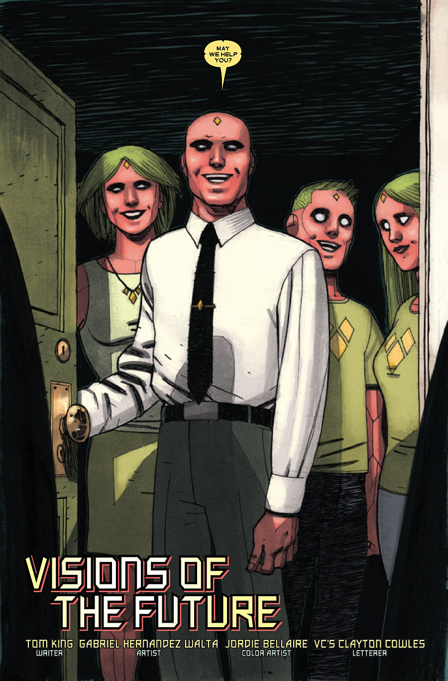
This is our introduction to The Vision and his family in the first issue, and it’s effectively everything you’d expect in meeting a normal family. The smiling family. The mom, dad and two kids. It’s like something from a 1950’s TV show. For you and Tom (through his script), how important was it for you to play this scene as straight as possible? To establish how odd it is through its normalcy?
GHW: That 1950’s feeling was already in Tom’s description of that splash page.
Vision wants to have a Typical American Family kind of life and you get that vibe from all the 50’s era images…the thing is that not even “human families” behave that way.
When it comes to depicting the varying members of the family, do you try to work into your character acting that they aren’t exactly people? If so, how does that factor into your art as you have The Vision family interact with others?
GHW: In this book, (it) is really important…that the “superheroic element” is put in the middle of a normal environment so the weirdness of the Vision family gets more evident when they interact with “normal” people.
I tried not only to make Vision and his family as “perfect specimens” but, also, I wanted to draw the rest of the people like “real” people so the contrast between the synthezoid family and the others were not only a matter of being red and green or not.
It was also important to draw the different locations as real places and not as simple backgrounds. I think that the reader gets more related to what you are telling if he can imagine himself inside those places. It’s like “imagine that you are walking by the street and, suddenly, a flying red guy appears above you”…if you draw the street with the right mundane atmosphere, it will be easier for the reader to get into the story.
Of course, Jordie’s color art is key to get that feeling.
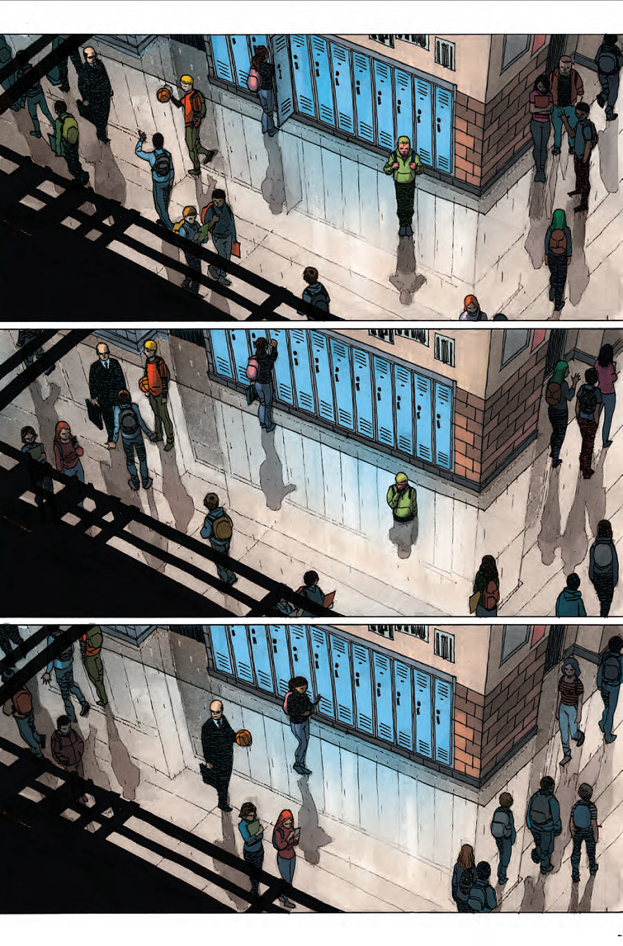
I really like the progression here. It’s three panels that slowly play out Vin’s heartbreaking feeling of being completely alone. When you’re telling a story visually, do you find that you prefer a slower pace?
GHW: What I really like in any story is the contrast between different kinds of pacing.
That said, (it) is true that I feel more comfortable in those peaceful scenes that, also, show some tension. You have to draw more details and backgrounds to slow down the reading pace but when you finally release the tension in a dramatic scene, the effect is more violent.
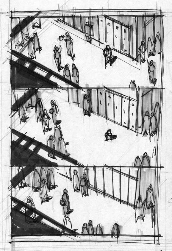
A big part of what makes this sequence work is that the camera is back on the page. Vin’s shown in context of his classmates, as we know he’s so invisible people don’t even notice him phasing through the floor. For you, what made that angle and distance from the scene the right one? And at what phase of your process do you figure that type of thing out?
GHW: Tom is masterfully using this book to show everyday situations, like a teenager feeling different from all the rest, but using this red-and-green family.
For this scene, Tom wrote in his script that he imagined a distant shot, so the reader could see Vin’s isolation in the hallway.
The most important thing was to find a way to show that and still keep the character recognizable. I thought of this page as an animation film scene, so I drew the background on a separate paper and then I made the three panels with all the characters and put it all together with Photoshop.
I had a lot of fun imagining the “choreography” of all the people that walk around Vin and, at the same time, I had to make (it) clear that none of them wanted to get near him.
All of that was already figured out in the thumbnail stage.
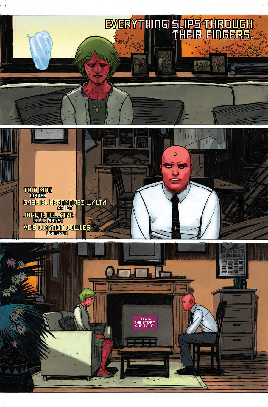
This is a wonderful, quiet scene. It also only has six words on it. The book is one where the art is allowed to carry a lot of the storytelling weight. Do you feel that Tom’s scripts play to your strengths as an artist, and beyond that, are you given leeway to adjust panel layouts if need be?
GHW: Every time I receive a Vision script I tell myself how lucky I am to be involved in this book.
I LOVE Tom’s scripts. He has a wonderful sense of visual storytelling and, at the same time, he is a master at writing. I just try to make justice to what he writes using clear and attractive storytelling, so the readers can easily get all the different levels of narration that Tom puts in every issue.
As for panel layouts, I have always had freedom to make adjustments and figure out the better way to tell the story.
You’ve been working with Jordie Bellaire since your run together on Magneto. In your mind, what do her colors bring out in both your art and the story? What makes her such an essential part of The Vision’s mix?
GHW: As for Jordie, where should I start? Let me say that a Vision issue doesn’t REALLY look like a Vision issue until Jordie colors it and Clayton does the lettering (and, of course, add the awesome Mike Del Mundo’s covers to the pack!).
Jordie is, above all, an amazing storyteller and every decision she takes just enhances what Tom and I have previously released, plus adding many things that weren’t there before.
For example, there was this two page scene in issue #4 in which Viv talks with a boy while walking under the rain. It is a very emotional moment and it gets even more important at the end of the issue (if you want to know why you’ll have to buy it!).
Anyway, as Viv and the boy were walking while talking, I had to draw many establishing shots that showed where they were in every moment. Because of that, I couldn’t do as many close shots as I’d have wanted to show their faces well and I ended feeling not quite satisfied with the emotional impact of those pages.
But then Jordie made her magic. She used her own memories of high school rainy days to give the scene that beautiful atmosphere, with those spotlights contrasting with the dark cloudy day, achieving this way all the emotion that the story needed.
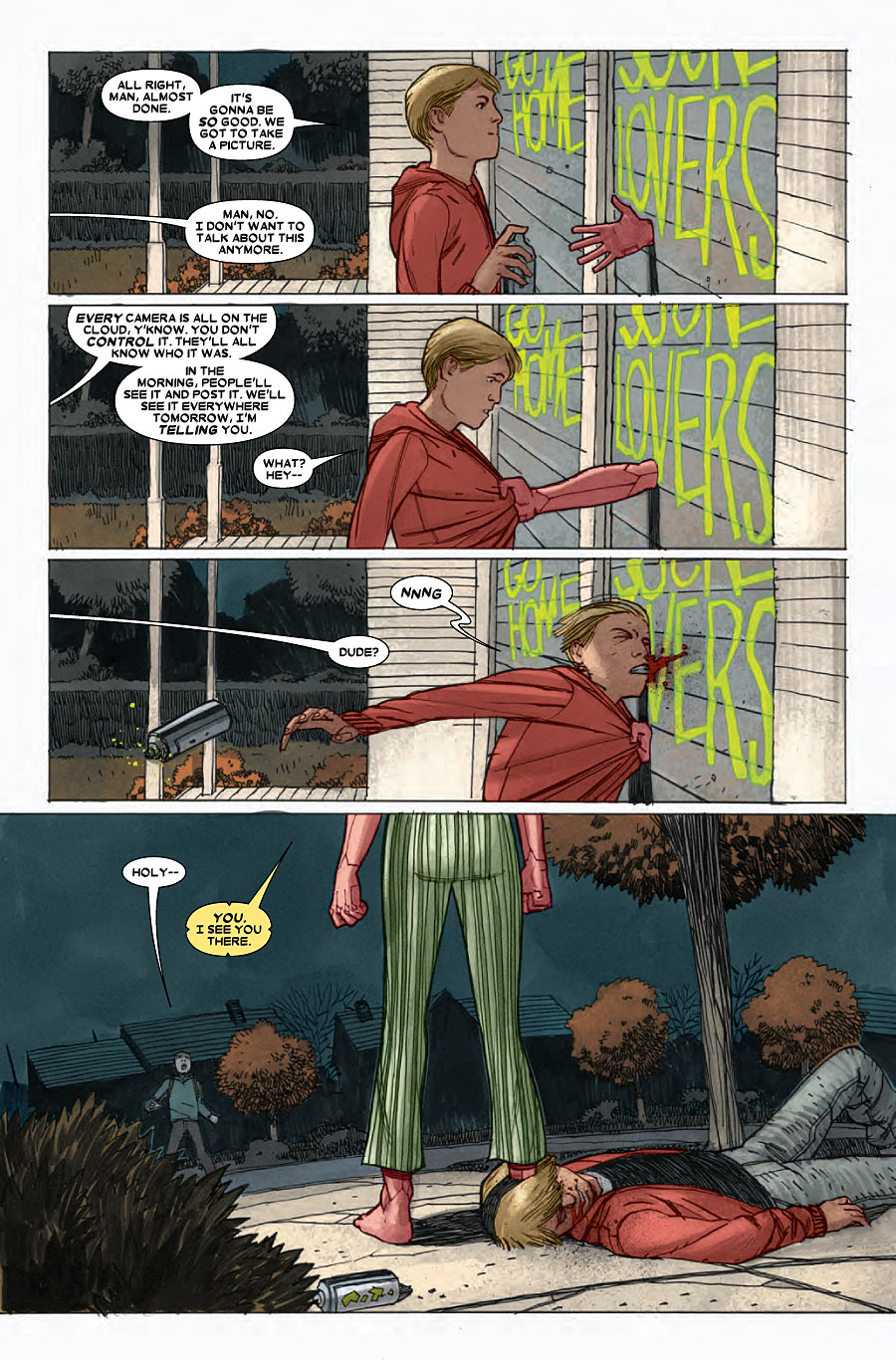
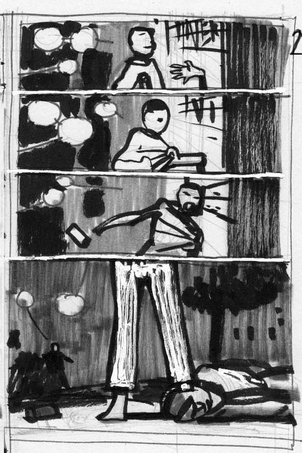
I just love this page. The first three panels playing off each other, as the kid beat by beat realizes what’s happening, are perfect. The facial expressions are so spot on. When it comes to figuring out that part of character acting, what’s your process? Is that something you put a good amount of thought into in the roughs stage, or do you figure that out on the page?
GHW: As I said before, I like to “feel” the history before starting to draw.
In Tom’s script this scene has an almost “slapstick” vibe, but with some creepy elements (the ghost hand and the blood), so I used a Sunday Comic Strip kind of panelling and character acting that could contrast with the more horror stuff of the last panel and the splash that went after this page.
All the decisions were made in the thumbnail stage so, by the time I got to final art, I had more or less (made) clear in my mind the facial expressions and the body language.
Header art from The Vision #1 by Gabriel Hernandez Walta, Jordie Bellaire and Clayton Cowles.
