“Pizza With All the X-Tras”: The Story Behind the X-Men x Pizza Hut Promotion, 30 Years Later
Living in the superhero monoculture of 2023, it can be difficult to imagine a time when Marvel characters weren’t everywhere. Fans of the House of Ideas aren’t just served with all the comics, movies, and TV shows they can possibly imagine; they’re super-served to the point of exhaustion. That isn’t new, of course. But it is the status quo we find ourselves in.
Once upon a time, though, the presence of superheroes was largely kept to comics and the occasional adaptation or bit of merchandise. Growing up in the late 1980s, I was aware of Spider-Man, Batman, 1 and assorted other characters. But as someone who worshiped cartoons and movies, my allegiance lied with The Transformers and The Goonies above all. In fact, I didn’t even start reading comics because of superheroes. It was discovering that there were more Transformers stories in Marvel’s comics that dragged me in. It took a cartoon/toy empire crossing over to inspire me to first dabble in the medium. But again, that was rare at the time.
Then the 1990s hit.
The early stretch of that decade was a remarkable one for non-comics media starring superheroes. We weren’t just given a sudden influx of material to enjoy, but lovingly crafted efforts that sparked a generation of comic fans. There were the Marvel trading cards that launched as a sensation in 1990, spawning a deluge of follow-ups from the company and its peers. The X-Men arcade game hit in 1992, and this side-scrolling beat-‘em-up for anywhere from two 2 to six players 3 consumed quarters at an obscene rate. And then there were the pièces de resistance. Batman: The Animated Series and X-Men: The Animated Series launched in back-to-back months in 1992, creating an enormous wave of passionate fans in the process.
The comics were thriving too, of course, as titles like 1991’s X-Men #1 arrived with staggering, record-setting order numbers. But that stretch was massive for the comics curious, as fans of trading cards, arcade games, and cartoons — who were legion at that point — began to cross over to comics thanks to these efforts. And of all the characters, the X-Men were arguably the most favored.
It wasn’t just these adaptations and translations that helped make the X-Men feel irresistible to prospective comic fans. Of the bevy of product tie-ins and licensing efforts outside those headliners, none captured my heart like Pizza Hut’s X-Men promotion in 1993.
Hitting with two waves of X-Men-related products and merchandise — which included placemats, collector cups, a special personal pan pizza box, custom comics, VHS tapes, trading cards, posters, a coupon book, and a contest to meet a quartet of comic creators — featuring art from starry names like Joe Madureira, Chris Bachalo, Andy Kubert, Bill Sienkiewicz, Joe Quesada, and more, it’s difficult to emphasize just how much pizza this inspired me to eat at the time. 4 It was a smart pairing, as kids love pizza and were obsessed with the X-Men.
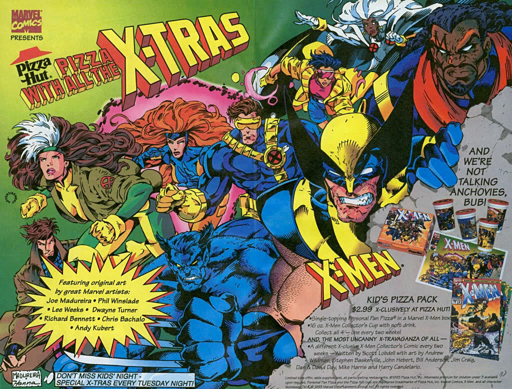
It wasn’t just me, either. Every time this promotion comes up on my podcast, a different comic creator will reach out about their fond memories of this campaign. None is more consistent in that regard than Russell Dauterman. Now a popular Marvel artist, Dauterman was a semi-regular Pizza Hut customer at the time — as well as an avid viewer of the X-Men cartoon. He described this tie-in as a “moment” for him as a budding fan.
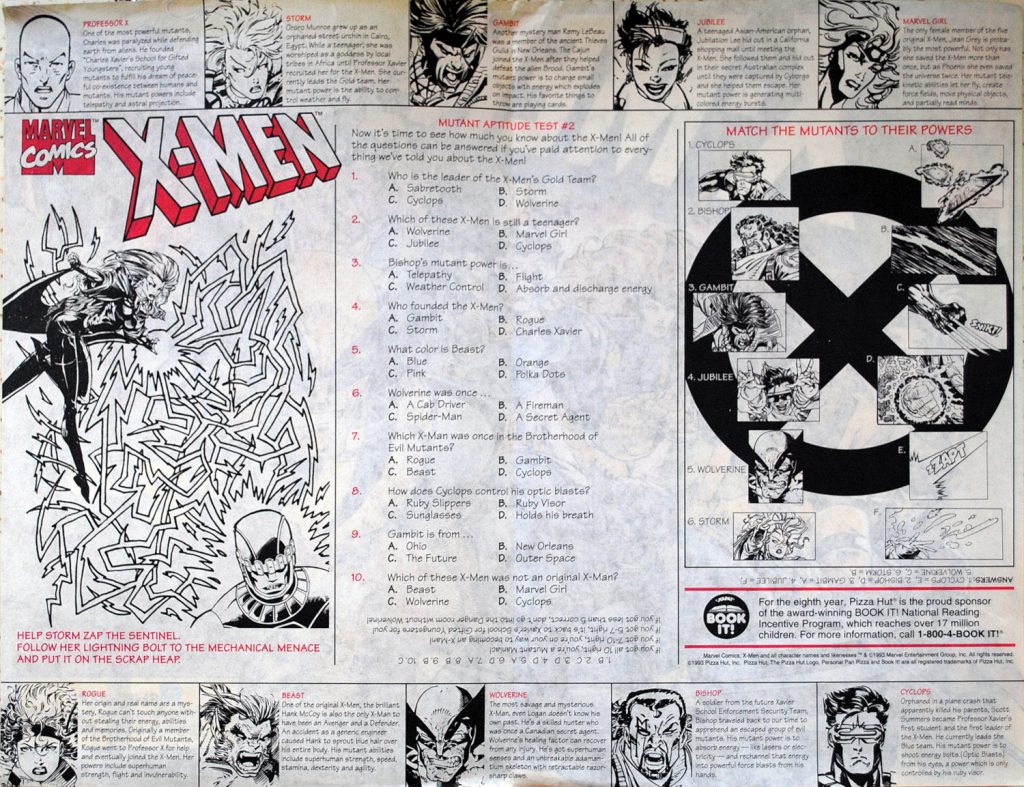
“The Joe Madureira placemat from X-Men x Pizza Hut is one of my favorite pieces of art ever — the team, the composition, costumes, poses, colors, Jean! — I love it so much,” Dauterman told me. “Especially as a kid, thinking the X-Men are the coolest thing ever, to have that reinforced by their seeming omnipresence made it an exciting time to be a fan.”
While its impact has largely been lost to the sands of time, it’s hard not to look at that promotion as a moment, as Dauterman put it. And it’s a moment worth revisiting, 30 years later. So today, we’re going to look back on that promotion, how it came together, the work that went into it, and how it truly is — in its own way — an important part of the comic book story for fans of a certain age, even if it really was just a way to get a whole lot of kids to eat way too much pizza.
In the early 1990s, licensing – or, when a company like Pizza Hut pays to use intellectual property from another like Marvel in relation to a product or service – was growing in importance for Marvel. Comic properties were hot, and licensing presented an opportunity to capitalize on that. The company decided it needed a group to support this effort. That’s when a section of Marvel called Creative Services was born. This small team handled the art and related materials necessary for licensing deals.
A former Marvel intern turned Art Director in its Marketing department, Dana Moreshead was the head of Creative Services from day one, where he and his team – which included his friend Mike Thomas – worked with Licensing Sales and Promotion & Sales to execute varying deals. That covered a broad spectrum of projects, with Moreshead saying they worked on “essentially anything that wasn’t comic book publishing.” This team provided art for video games, theme parks, cereal boxes, Micro Machines, and much more.
Because this was all mostly new to Marvel, Moreshead, Thomas, and the rest of the team had to figure it out on the fly. Marvel’s marketing group, of which Creative Services was a part of, built out style guides to share with licensees 5 to ensure everything related to the publisher was used properly. But from the start, the team had a goal in mind: they wanted to “establish” that “Marvel produces Marvel art,” as Moreshead put it.
Back then, art directors or designers at licensees would eagerly work with Marvel characters, often depicting them in a non-comic way in the process. It was Creative Services’ goal to ensure that anything featuring Marvel’s characters looked like it was produced by Marvel. This was important, because as Moreshead told me, “If you fail, Marvel fans will call you on it.” The team wanted to use Marvel artists for these promotions – which, before then, rarely happened – and they wanted everything they did to include something for the hardcore set, because that’s what they were as well. Each grew up a comic fan, and they understood the disappointment of poorly crafted promotional materials.
“If we could make ourselves happy, then we knew that the super fans would be happy as well,” Moreshead told me.
With the X-Men hotter than even the most scorching pizza at the time, Pizza Hut wanted in on the game. The fast-food pizza joint approached Marvel in 1992 and a deal was quickly struck with its advertising sales group. It was the first of its kind at the publisher. Marvel had never worked with a restaurant chain before. While Moreshead said the hierarchy of fast-food was “McDonald’s, Burger King, and everybody else” at the time, they were thrilled to work with Pizza Hut, and it was perceived as a big deal internally at Marvel. It was an early test for the Creative Services team, as they’d never done anything of its size or visibility before.
The best way to approach it, they found, was to keep it simple. Based off need, they knew that the initial promotion would require designs and art for four cups, a placemat, a personal pan pizza box, and four comics. The comics were easy. They could hand those off to one of their co-workers in Glenn Herdling, who ran Marvel’s Custom Comics department. 6 For the rest, they had to work with Pizza Hut’s advertising agency to acquire the dimensions of and templates for the box, cups, and placemat. From there, it was “off to the races,” as Moreshead told me.
Thomas noted much of it came down to the two of them having a sit down, where they would brainstorm ideas and divvy up the work. While no one remembers precisely when the promotion actually launched — the initial one was in 1993, most likely early summer, but specifics are unclear — what they do recall was deadlines were tight. Speed was the name of the game.
But they wanted to make sure everything looked good and right as well. That was the only way to ensure it would have the impact they hoped it would. While both Moreshead and Thomas provided sketches for the individual elements of the promotion, they had to determine the right artists for the project to guarantee it reflected the comics they represented. The good news was, they “had a pretty deep Rolodex” of artists to start with, as Thomas noted, and they also had one other compelling advantage supporting them.
“This stuff paid way better than regular comic work,” Thomas said.
Artist Scott Koblish came up at Marvel as one of its vaunted art apprentices, dubbed Romita’s Raiders in honor of the publisher’s Art Director John Romita. But by the time this promotion hit, he was a freelancer mainly doing inks, including projects for Creative Services. While he was excited to work on this promotion because one of his earliest jobs was at his local Pizza Hut, the real draw was the money. Koblish recalled that inking a regular comic page at the time would get him $60, but some projects for Creative Services would earn him over $1,000. 7 The difference in rates came down to who was paying the bills.
“It’s Pizza Hut’s advertising agency who we were working with, so we were working with advertising agency budgets, not comic budgets,” Thomas said. “We definitely had more money to spend to get the stuff done, so it very rarely took more than one phone call to get an artist on board.”
Moreshead said they were clear with Pizza Hut’s agency that while they were happy to work with them, they were going to produce “Marvel art with Marvel artists.” Their focus was on X-Men friendly artists from the beginning. As Thomas told me, “We were just picking up the phone and calling X-Men artists at that time.” If those artists were busy, then they found stylistic matches to replace them.
That’s why this initial wave included Andy Kubert, who had drawn issues of Uncanny X-Men before and was about to take over the adjectiveless X-Men title, and then-Excalibur artist Joe Madureira, 8 as well as others who were stylistically flexible like Lee Weeks and Chris Bachalo. 9 They either were known commodities to X-Men fans or could match the look of those who were.
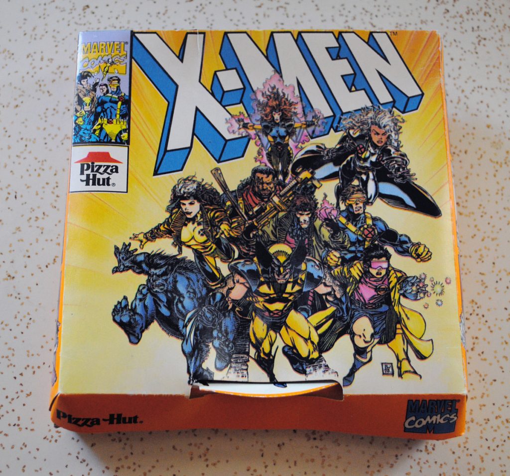
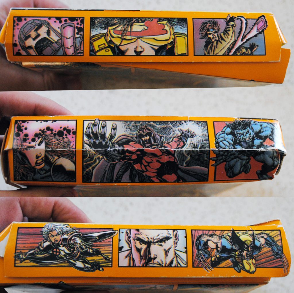
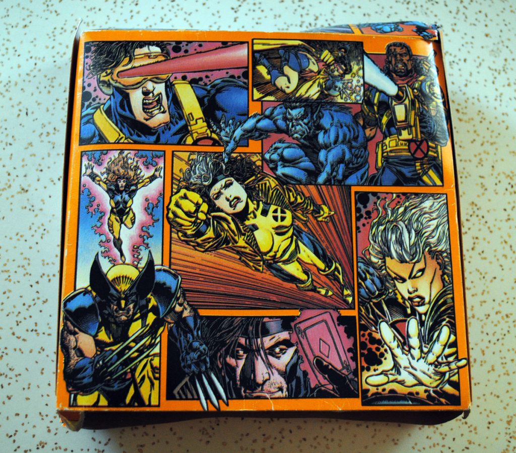
It wasn’t just typical X-Men artists, though. The pair had worked with artist Phil Winslade when they were developing Marvel’s style guides, and while he wasn’t familiar to most fans at the time, they hired him for the top and sides of the pizza box. 10 They trusted that Winslade could get this crucial element right. He nailed it, and that kind of hiring was something Moreshead described as one of the “great thrills” of the project. They enjoyed introducing different artists to the masses and bringing different voices to commercial art.
This type of work was new for most of these artists, but Moreshead and Thomas were there to guide them. That said, they knew that they needed artists who wouldn’t bristle at notes. This wasn’t like comics, where deadlines ruled all and most pages were met with limited changes. The Pizza Hut art didn’t just have to go through Creative Services, but varying people at the company’s agency, all of whom might request changes, from small tweaks to significant adjustments. It was a process filled with much more back-and-forth than comic artists are used to. But again, it paid a lot.
It was also advantageous for these artists because, as Moreshead put it, “Everybody got to have these live portfolio pieces out in the world.” That might not sound like a big deal, but it was, with one example proving that concept to be true.
At the time, Chris Bachalo was mostly known as a Vertigo artist. Both Moreshead and Thomas loved his art, and even though he had only worked on one Marvel project before, 11 they asked Bachalo to draw the art for the cup that featured Storm and Beast.
Initially, the artist was somewhat confounded by the offer. While Bachalo told me he “grew up on superhero comics,” his most recent work was on Shade, the Changing Man and the then-upcoming Death: The High Cost of Living. He viewed himself as “an odd choice.” That unusual nature — and the high pay — made it appealing to him. He leaned into the “fun” and “nostalgic” aspects of the project, feelings that were elevated by a youth spent enjoying Slurpees that came in superhero cups at his local 7-Eleven.
The gig itself was fairly simple. The artist recalled “something dramatic” was requested for the piece, so he “responded with a pseudo-Jim Lee styled action shot of Beast and Storm leaping into action.” The artist prides himself on “being versatile,” so when this job arrived at his doorstep, he didn’t find it to be a “big stretch to embrace a traditional comic book style.” Once the piece was wrapped, that was that. He went back to his Vertigo work.
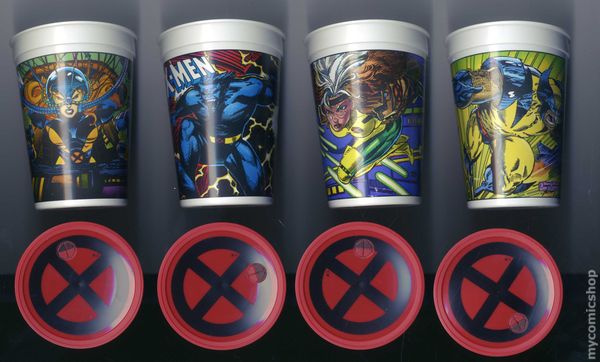
Until late one night, that is, when Moreshead was at Marvel’s offices and writer Scott Lobdell stopped by to visit. Lobdell laid out a conundrum for the Creative Services head. He was about to launch a new series in X-Men Unlimited, but the artist had dropped off the first issue. He wondered if Moreshead knew any artists that might fit the project. Out comes the art for Bachalo’s cup, and Lobdell was in. They immediately called the artist.
“I said (to Bachalo), ‘Lobdell just came down. Do you want to work on an X-Men book?’ Chris is one of the sweetest guys you’ll ever meet, and he said, ‘I have these commitments and I can’t do it, but it’s great. Thanks.’ And hung up,” Moreshead shared. “Five minutes later, my phone rings. (Bachalo says), ‘I talked to my wife, and she said if I don’t do this, I’m crazy. So yeah, throw my name in.’”
“And I think he had the assignment before the end of the week.”
While Bachalo believes his previous Marvel work likely played a part as well, it’s possible that without that cup, the eventual artist of Generation X, X-Men, Uncanny X-Men, Wolverine and the X-Men, and assorted other X-Projects may have never worked with those characters. That makes for a remarkable and unexpected “What if?” from Marvel’s history, and proof of this project’s business card nature for artists.
The Creative Services team quickly roped in talent, but that was only part of the work. As Thomas told me, “Everything back then took so much longer.” The art had to be shipped from the artist to Marvel, then they had to photostat it, it would have to be shot onto a board, the colorist — most likely Paul Mounts, who the team regularly worked with — had to hand paint it, and then assorted other steps had to take place. They were motivated to get it done. But it was still a process.
Thankfully, they were able to use existing artwork on some of it to speed it up, and it featured some iconic talents. If you browse the informational side of the placemat, you can spy art by Jim Lee, John Byrne, John Romita, Jr., and others, as they used some of the finest X-Men artists ever to fill out those details. Between that art and its frontside drawn by Joe Madureira and inker Scott Hanna, that was one good looking placemat.
The team had a blast putting this project together, and the good news is, it “exceeded everybody’s expectations,” Moreshead shared.
“The first one was huge,” Moreshead told me. “(Pizza Hut) had customers who wanted to buy the signs on the counters. We’d get these reports from Pizza Hut and their marketing agency, where they’re like, ‘We’re out of placemats.’ We’re like, ‘What do you mean you’re out of placemats?’ ‘They’re all gone. Please make more placemats.’” 12
The work for this promotion started before X-Men: The Animated Series debuted in 1992, but it debuted in Pizza Hut in 1993 after the series became a massive hit. More than that, the arcade game was a monster, and the comics were amongst the top sellers in the market. Pair all that with the fact that Marvel had never done a promotion like this before, and you had fans who were “starving for this stuff,” as Moreshead put it. It was a giant hit.
Because of the success of this campaign, Pizza Hut immediately wanted to do another. They went even bigger this time. It’s likely most famous for its two VHS tapes, with those featuring episodes of X-Men: The Animated Series and creator interviews. But it also included mini-comics, trading cards and a fold out poster by Bill Sienkiewicz, a second placemat, and a Pizza Hut Super Savings Book featuring the history of the X-Men within its pages, as well as a contest to win lunch with Stan Lee, Bob Harras, Fabian Nicieza, and Scott Lobdell.
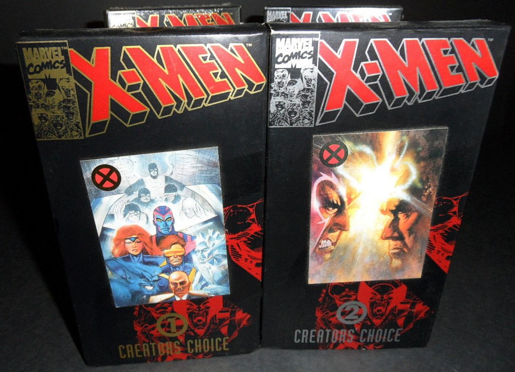
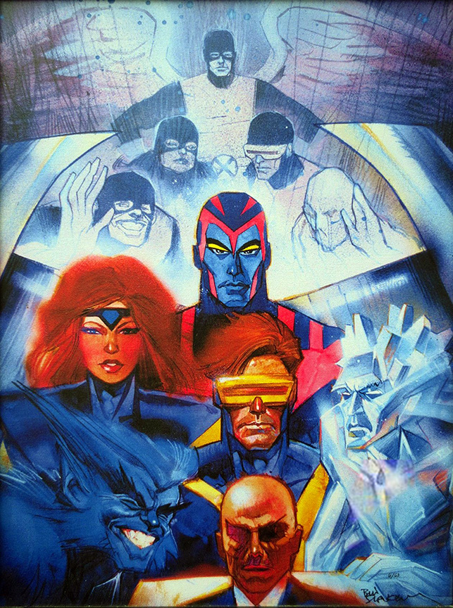
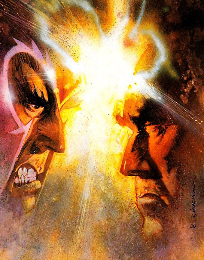
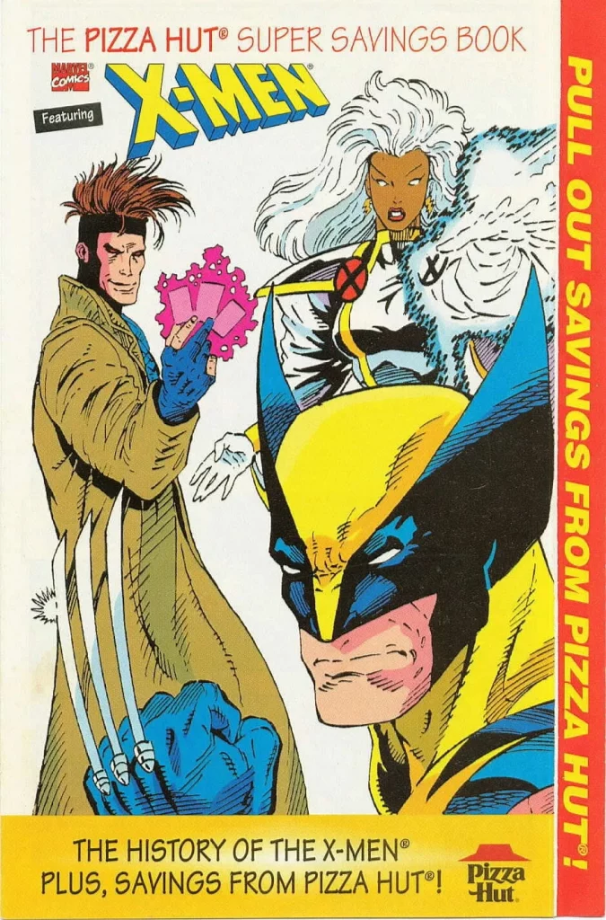
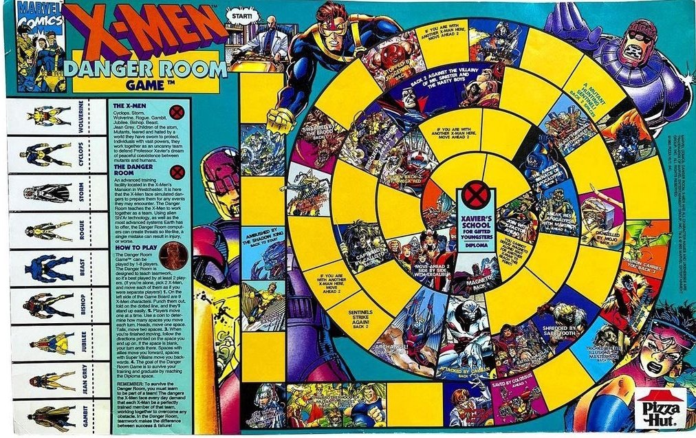
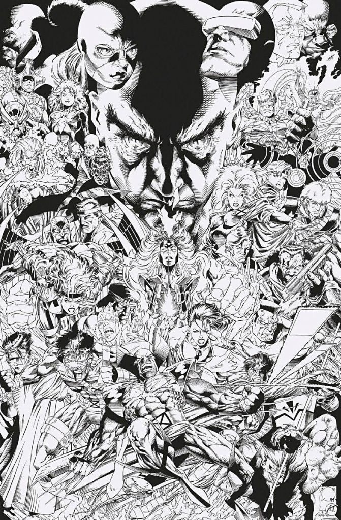
Even if you didn’t win, you won, as the first 25,000 entrants to the contest received a limited edition X-Men poster by Joe Quesada, Art Thibert, Scott Koblish, and Paul Mounts, an effort that Thomas described as a “big deal” because of how big a name Quesada was at the time. 13 It was a lot. More than that, it was a whirlwind that arrived just a few months after the first promotion. So the team divided and conquered, with Moreshead designing the VHS boxes, Thomas getting to work with one of his favorite artists in Sienkiewicz, and the latter painfully recreating the history of Marvel’s Merry Mutants for that coupon book. 14
“We told the history of the X-Men by taking pages from old comics and cutting them apart and reassembling them. This is pre-digital, so we were doing this with stats and X-ACTO knives,” Thomas said. “It was a ton of work.”
That wasn’t the end of a whirlwind period for Creative Services, but the beginning. As Moreshead put it, “When Pizza Hut was a success, everybody came.”
“When the fans responded enthusiastically, it validated everything,” Moreshead shared. “So suddenly, that’s when licensees start coming into the mix thinking, ‘Maybe we should do a promotion as well.’”
What started with Pizza Hut spread to McDonald’s, Burger King, Hardee’s, and beyond. It led to a lot of exciting work for the pair, with the other standout for Thomas being his work on the Maximum Carnage video game. 15 It also led to an incredible number of gigs for artists, with names like Mike Wieringo, Mike Allred, Glenn Fabry, and more debuting at the publisher via Creative Services. 16
Of course, this caused problems internally even as far back as the Pizza Hut promotion. Both Moreshead and Thomas emphasized that the Pizza Hut project was so huge, they had to “use everybody” they could get their hands on, effectively, including artists working on top Marvel books.
“What would happen is editorial would call me up and say, ‘Hey, we love that you’re using our artists, but please, for the love of all that is holy, stop using our artists. You pay better. You have these attractive one-off projects, but we need them to do their covers and their pages and everything else,’” Moreshead shared.
But as Koblish put it, “The person who is buying a license is also buying a good product.” Creative Services had to produce high quality work, because that creates an effective promotion that bolsters Marvel as a whole. Similarly, editorial had to make comics. There was a balancing act there. It created conflict. Thomas even recalls getting chewed out by editors when certain artists used Creative Services as an excuse for why deadlines were blown, while other editors went through his mail in the morning “to see if I was using any of their people.” There was a turf war going on.
“We would get told, ‘The editors are getting mad. You’re using all the best artists. Don’t use these guys anymore. Find other people,’” Thomas said. “Then we’d bring in non-(Marvel) comic people, like Phil Winslade, Mike Allred, Steve Rude, and some other people instead of the regular monthly guys. A few months would go by, and we’d get called back into a meeting, and they’d be like, ‘Guys, people don’t think your stuff looks like what Marvel work looks like right now. You’ve got to start using the regular people more.’”
Despite those challenges, the team looks back on the Pizza Hut promotion fondly. Thomas described it as one of his “favorite projects,” at least in part because it was one of the earliest. It was before the look of everything was defined by the animated series. He emphasized that they had “total free rein” to do what they wanted.
“We were able to hire who we wanted and design it the way we wanted,” Thomas said. “I don’t think there was even a ton of feedback.”
A few years later, when the show had exploded and licensing had become more defined, “everything was much more mechanical,” Thomas said. But for this Pizza Hut promotion at the very least, they just had fun, and did the very best job they could.
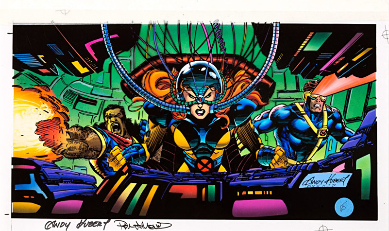
While everyone I talked to agreed that this promotion is mostly forgotten, they agreed that it turned out well. A lot of that came from Moreshead, Thomas, and the rest of Creative Services. As Koblish put it, “The department really cared about presenting things in the best way.” That showed in the work.
But I’d argue this promotion isn’t forgotten so much as it’s just something we aren’t reminded of as often as our favorite comics. It had its impact, and that’s proven each time someone reaches out when I bring it up on the podcast. 17 Sure, these sorts of promotions are designed to sell product, pure and simple. But when you were a kid like Dauterman and I were at the time, it can feel like a lot more than that. It can be meaningful, an important milestone in your story as a fan.
Moreshead told me that sort of sentiment is why he’s stayed in licensing throughout his career. Both he and Thomas moved on from Marvel long ago, but this work has continued to be his focus because of the impact it can have. He knows that firsthand. His love of Marvel was partially inspired by a Marvel lunchbox he had in his childhood that featured art from Jack Kirby and Don Heck. That item made him want to learn more about these characters and this universe, fueling his fandom. When this sort of product or promotion is done right, done with intent to reflect the magic of these characters, it can have an impact. It becomes part of our larger comics story, even if it all started as a plan to sell some pizza and make some dough.
“It all ties into the comic DNA. When it’s authentic, it becomes part of everybody’s shared experience,” Moreshead said. “All that Pizza Hut stuff…it’s not comics.”
“But it is.”
Thanks for reading this feature. If you enjoyed it, consider subscribing to SKTCHD to read more like it, as the site and its articles are entirely powered by subscribers.
Especially after the 1989 movie.↩
Which was fine.↩
Easily the best version.↩
I wanted the pizza, but I needed that X-Men merch.↩
Or the companies that pay for the right to use Marvel characters in ads, like Pizza Hut, for just one example.↩
This department would produce comics for licensees whenever they were needed, ranging from material for this promotion to comics about fire safety.↩
He said it all depended on the project, really. The bigger the promotion, the bigger the paycheck.↩
Madureira had just drawn two issues of Excalibur, so this was before Uncanny X-Men and becoming one of the most popular comic artists. Madureira’s path to getting this gig was also aided by the fact he was a Marvel intern shortly after Moreshead and Thomas. There was familiarity there.↩
Both worked on X-Men titles shortly thereafter, though.↩
Reuben Rude provided the art for the bottom of the box.↩
And it may not have even been released yet, as it was December 1992’s Incredible Hulk #400.↩
Has anyone checked Russell Dauterman’s house?!?!↩
He still is one, of course. But this was right as Quesada was ascending into the stratosphere thanks to work on books like Batman: Sword of Azrael, X-Factor, and X-O Manowar #0. Also, this poster eventually became a variant to 2018’s Uncanny X-Men #1.↩
If you really want to time travel, watch the commercial promoting this part of the campaign. It’s incredible.↩
Which, in case you’re like me and never realized it, featured a Bill Sienkiewicz drawn Carnage on the cover.↩
Many of these projects were pogs. Thomas estimated that they did “close to 500 original art pogs,” featuring art by people like Jim Steranko, Paul Smith, and Allred. Thomas noted that the “The number of people who didn’t do (pogs) is a much, much shorter list.”↩
As well as this frankly bizarre Change.org petition requesting that Pizza Hut honor the promotion’s 30th anniversary with another one.↩

