
“Most of it Came Somewhat Naturally”: Richard Blake on Starting in Comics and Building Hexagon Bridge
Sometimes, all it takes is a cover.
That’s something that happens on occasion for me as a comic fan, where I’m convinced to read a comic I might have otherwise passed on when I see a cover that I just cannot resist. That’s happened multiple times this year alone, and each time I’ve been handsomely rewarded for the decision. The most recent time that happened, though, was with Richard Blake’s Image Comics series Hexagon Bridge. To be honest, I knew nothing about it. All I saw was its first cover and I realized one thing: I had to read this, if only because the vibes were just so appealing. From that cover alone, I described it as feeling like something created by Fumito Ueda of ICO and Shadow of the Colossus fame. And you know what?
I wasn’t entirely wrong.
Hexagon Bridge is about a pair of cartographers — Jacob and Elena Armlen — taking on the challenge of mapping a parallel dimension, getting lost in the process, and the process of their clairvoyant daughter Adley and her pal — the incredible sentient robot Staden — teaming up to rescue them. It’s a small story with massive scale, one told in a contemplative, thoughtful way with beautiful art and an inventive approach. While that Ueda comp still feels right, Hexagon Bridge is something so singular it could only come from one brain: Blake’s. As a fan of the comic and of Blake’s work in it, I had to know more, especially considering that this is the cartoonist’s first ever published work.
So, recently, the two of us chatted about the biggest draws for him as a storyteller, getting into comics after his fine art and film background, how Hexagon Bridge came to be, and more, before we discuss what went into five different pages from the first issue. It’s a conversation about Hexagon Bridge, but it’s also about the creative process for an incredible newcomer to the field, and what’s guiding him down this path. As well as what went into that incredible first cover, of course.
You’ve talked before about how the first comics that really spoke to you were translated Heavy Metal issues from the 1980s, ones featuring the art of people like Moebius and Enki Bilal, especially because of the art and how strange and complex those stories are. Has the latter element, the strangeness and complexity, always been a draw to you as a person and as a storyteller, at least in terms of evoking those feelings? If so, what makes that such a draw?
Richard Blake: I think the primary element that draws me to any work — whether in comics, film, music, or literature — is the atmosphere or sense of place that’s evoked and created within the piece. And the atmosphere that I seem to continually return to is a slightly melancholic, strange, contemplative one. The work of Moebius, Bilal, and Schuiten, reprinted in the pages of those 1980’s Heavy Metal issues, was the first time I encountered that kind of tone in specifically science fiction based comics, and in such a vivid manner. Even if the narratives were incoherent, either due to the translation or to the complexity of the ideas, the artwork was so deliberate and the worlds so uniquely depicted that I just kept returning to them. They just had a vibe that really resonated with me.
The film equivalent to this would of course be the (Moebius inspired) Blade Runner. I remember seeing that film in its original cut on a rented VHS tape, probably at around 9 or 10 years old…I didn’t quite fully comprehend the narrative but the unusual pacing allowed you to just sort of wallow in the beauty of the images and the strange spaces depicted. That was enough for me to be completely mesmerized. Of course, after repeated viewings, the plot and ideas do become more clear. But in my view they are secondary to the visual and auditory experience of the film.
If I had to surmise why I am drawn specifically to this kind of work, I think it has something to do with big ideas presented within a space that allows you to quietly absorb them. The ideas are there but they are often hidden in the details, ambiguous and not easily deciphered. It makes revisiting the work rewarding because you’re always discovering something new.
Your background is in fine art and film, with Hexagon Bridge being your first published comics work after careers elsewhere. What drove you to comics? Is there something this medium offers that others can’t match, in your mind?
Blake: When I first started painting, the work was heavily influenced by artists such as Francis Bacon, Lucien Freud and Frank Auerbach, essentially figurative painting with an emphasis on the physicality of formal materials. As I went through art and grad school the work became more and more idea driven, to an almost extreme degree. I was showing in NY galleries and was having a certain amount of success, but I was beginning to lose enthusiasm for the work. It had gotten too reductive and I missed the more physical approach that had initially drawn me to painting to begin with.
I’d also gotten interested in telling stories, so I began experimenting with film as a potential medium. I worked in film for a number of years, in pretty much every department from editing, storyboarding and cinematography. But again, I found the sheer number of people, equipment, and financial support needed to make even the smallest of productions frustrating and daunting.
At some point around that time, I picked up an issue of The Killer by (Luc) Jacamon and Matz, and that brought me back to those European comics of my youth. It was rediscovering that work combined with the frustration that I’d been feeling with fine art and film that led me to consider comics. At that point everything seemed to really click. I was immediately able to return to all those initial formal elements that had excited me with painting and was able to tell stories all on my own, with an unlimited budget. With comics, I could synthesize everything I’d learned from painting, film, and design into a single cohesive work. That’s what’s so great and unique about the medium, that ability to experiment with story and form in a uniquely direct, unobtrusive manner.
So, from there, you started making Hexagon Bridge fairly directly, right? Or were there fits and starts along the way?
Blake: There was a period of absorbing comics in general and getting a sense of the landscape, with an obvious lean toward French bande dessinée. I was also experimenting with various materials, trying to get a handle on the approach I wanted to take, working with different inks, pens and brushes, different papers, etc. I did quite a bit of sketchbook work as well, but eventually I started producing short stories and pages…just to get some grasp of the medium and language. But I jumped into making Hexagon Bridge fairly quickly, especially once I had the idea and the basic plot structure in place.
Okay, so that brings up a big question you were asked and I feel like I need elaboration on. You were making Hexagon Bridge. You were putting pages up online. You were sending pages out to open submissions and people in comics. Jonathan Hickman saw one of those submissions and then sent it to Eric Stephenson at Image, which is how you ended up there. But how did Hickman get a submission? Was it to Image? Did he just find it online? That’s a fascinating part of the journey to me.
Blake: As mentioned, I was sending stuff out to various open calls and putting stuff up online. Just pages here and there, and some concept art for the book. In 2019, I submitted to the Creators for Creators grant for which I was a finalist. I wasn’t selected for the grant, but it was in that submission that Hickman saw the work and made the incredibly generous offer to bring it to the attention of Eric Stephenson at Image. Of course I said yes, and Jonathan sent the book over. A few days later I got an email from Eric, excited about the book along with the offer to get things moving with it over at Image. It was pretty incredible. I can’t thank Hickman enough for his advocacy and Stephenson for his continued support and for publishing the book.
Creators for Creators 2019! So has this book been in active development since then? Or has it just been something you work on around other projects?
Blake: It has indeed been in development since then. I had a bunch of projects going on at the time, but once the Image deal came together I dropped everything to focus solely on this book. It’s pretty much stayed my central project since then. But this past year, other fine art opportunities have opened up and I find myself making paintings and drawings for a gallery space again at Philippe Labaune in NYC. But the work is related to the book in some manner, so it’s all, in a sense, still the same project.
I should add, though, that much of this time has been spent learning the craft of comics. Even though I had some grasp of an approach going in, I had (and still have) a ton to learn. It was very much a one step forward, two steps back process. I redrew and recolored some of the pages two or three times, and was continually revising things. It really hasn’t been until the last few years that I’ve settled into a process that works well for me.
What was the appeal of Image once Stephenson approached? Did it just feel like a natural fit for the story you wanted to tell?
Blake: It did in the sense that, although Hexagon Bridge has experimental, abstract elements, it’s still firmly rooted in genre fiction. There’s a fairly straightforward story there, even if it’s told in a somewhat elliptical manner. Also, when I began rediscovering comics, I noticed that the majority of books I bought and looked forward to, aside from the European ones, were from Image. That’s still the case. My shelves are stacked with Image creators – Hickman, Remender, Ashley Wood, just to name a few.
Not that I assumed my work was immediately worthy of being in the company of these creators..far from that. But it was something to aspire to. In terms of process, after Stephenson approached and everything got moving it was very much like “okay…go make your book…” which works well for me. Perhaps that’s the result of coming out of painting and fine art, where you sort of retreat into your studio and emerge months later with work. That said, my editor Oliver Zeller was invaluable in terms of an objective eye and voice while still ensuring my underlying vision for the book remained intact.
Cartography and parallel universes. Those are subjects you were taking in when you came up with the idea of Hexagon Bridge. What appealed to you about marrying one deeply ordinary practice — mapmaking — with a science fiction idea?
Blake: Cartography and geography in general has just been an ongoing interest. The idea that “the world” such as it is could be represented on a single sheet or small metal sphere was a source of wonder to me as a kid, particularly before things like Google Earth. There’s also the precise, graphic nature of cartography that’s fascinating. I visited The Beinecke Library at Yale once for research and saw some ancient maps that were just incredibly beautiful in their artistry.
As for marrying the practice of mapmaking with science fiction, the fact that any map is preceded by a survey and measuring of a discovered or known landscape immediately ties the practice, at least for me, to a sense of exploration and adventure. Those are themes you find a lot in science fiction, in some form or another. If you take that a step further, into mapping a parallel dimension, some interesting aesthetic dilemmas also arise. What would a mapping system like that look like? How would it function? What kind of adventures would be involved in attempting such a thing? The visual opportunities in answering those kinds of questions seem endless.
What made the Armlen family, but particularly the young clairvoyant Adley and her sentient robot pal Staden, the perfect leads to go on those adventures?
Blake: The idea of a cartographic family came about while reading John Noble Wilford’s book The Mapmakers, which is a wonderful history of the subject, and discovering the Cassini family – who made The Carte de France, an extensive map of the region, published from 1750 to 1815. They were the central inspiration for The Armlens, who would function as the nucleus of characters in the book. A family of cartographers also provides some context in terms of their specific dealings with The Bridge; why they are venturing into the dimension, and what they are trying to accomplish.
I wanted Adley and Staden to function more like siblings than simply friends. They meet at roughly the same age in terms of their development, grow up together, and bring contrasting talents to the task of finding Jacob and Elena. That specific collaboration is something I find compelling, particularly as they are telepathically linked. I also have a sister, close in age, so I understand that dynamic a bit.
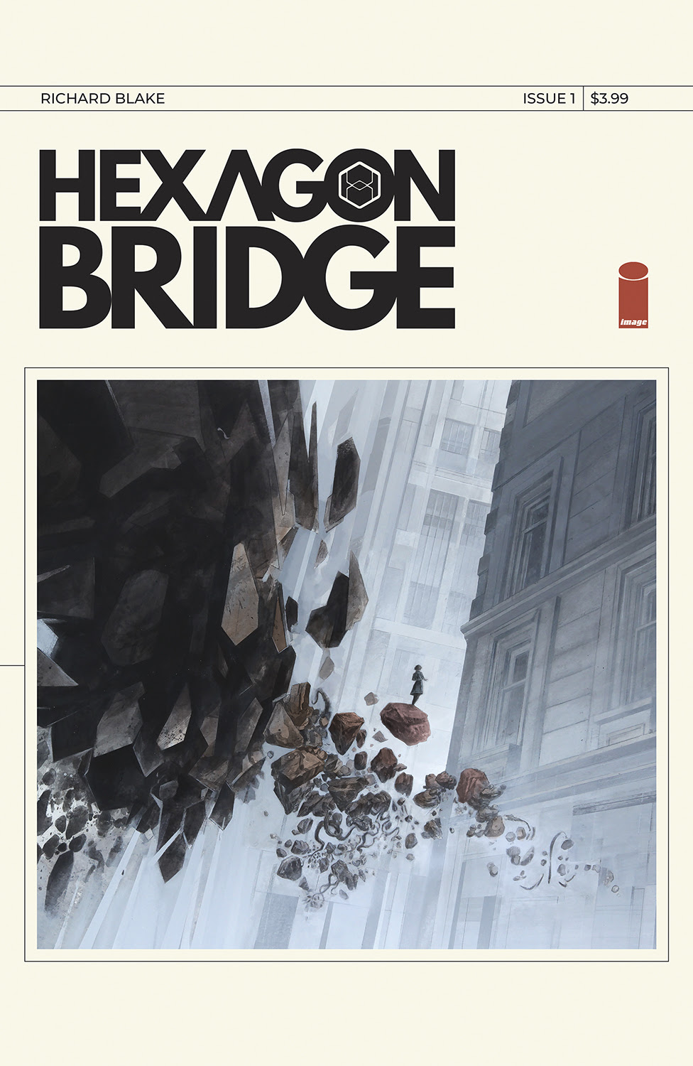
The first page I want to talk about isn’t a page at all. It’s the cover to your first issue. I’m going to be honest: This is what sold me, and it was less the image — which is wonderful and appealing — and more the design of it. It’s so clean and striking and different from what we see from most comics, and it’s a look you use on every issue. What made this the look you wanted for Hexagon Bridge’s covers?
Blake: To begin with, the final covers are definitely a reflection of my design taste, which tends to lean Modernist. The work of Rudolf De Harak, Peter Saville, Wim Crouwel, and The Designers Republic, just to name a few, are all an influence – just that approach of keeping things clear and distilled to essential elements.
I first designed the logo and painted the central illustration. Then, like any design, worked to find a direction that unified those two elements in a manner that reflected the story and the ideas in the book. It took a while and there were a lot of versions, but at some point the idea occurred to me that the book should look like an artifact from the narrative rather than just a reflection of it, like a cartographic manual or something laying around Hexagon 12 (the research outpost in the story).
Finally, I decided to have all the main front cover elements linked to the little map (which really comes into play in issue 3) on the back, as though they’re a readout of something happening within that space. After that everything really clicked into place and it was just a matter of making small adjustments and getting everything balanced. Keeping the look consistent for every issue, again, goes back to that notion of it being a manual or journal from the book. It gets updated but essentially stays the same for pragmatic purposes.
I think it’s great, though, that it stood out for you and I’ve gotten a few comments in that regard. I wish I could say I was coming from a more marketing savvy place, but that just isn’t the case. I just designed it in a way that I liked and what felt right for the project.
Interesting! So, you don’t approach your covers as a marketing piece or as a hook necessarily, but an additional element to the overall piece of art that is this individual comic book?
Blake: Not necessarily a hook. I do hope the covers provoke curiosity in some way. But ultimately, yes, I think it’s more important that they tie into the larger work and arc of the story. They act as an illustration of what that particular issue “feels” like as much as they are about what’s going on in the story, which is always different as new things get introduced in each issue. I listen to a lot of experimental music, and what I love about it is that you often don’t end up in the same place you started. It’s very unpredictable and things get introduced along that way you could not have anticipated. That kind of music is less, for me, about a catchy, melodic tune and more like a sonic journey, with all kinds of interesting shifts and movements. In that way, I hope the book is an immersive journey of sorts and that you don’t end up where you might think.
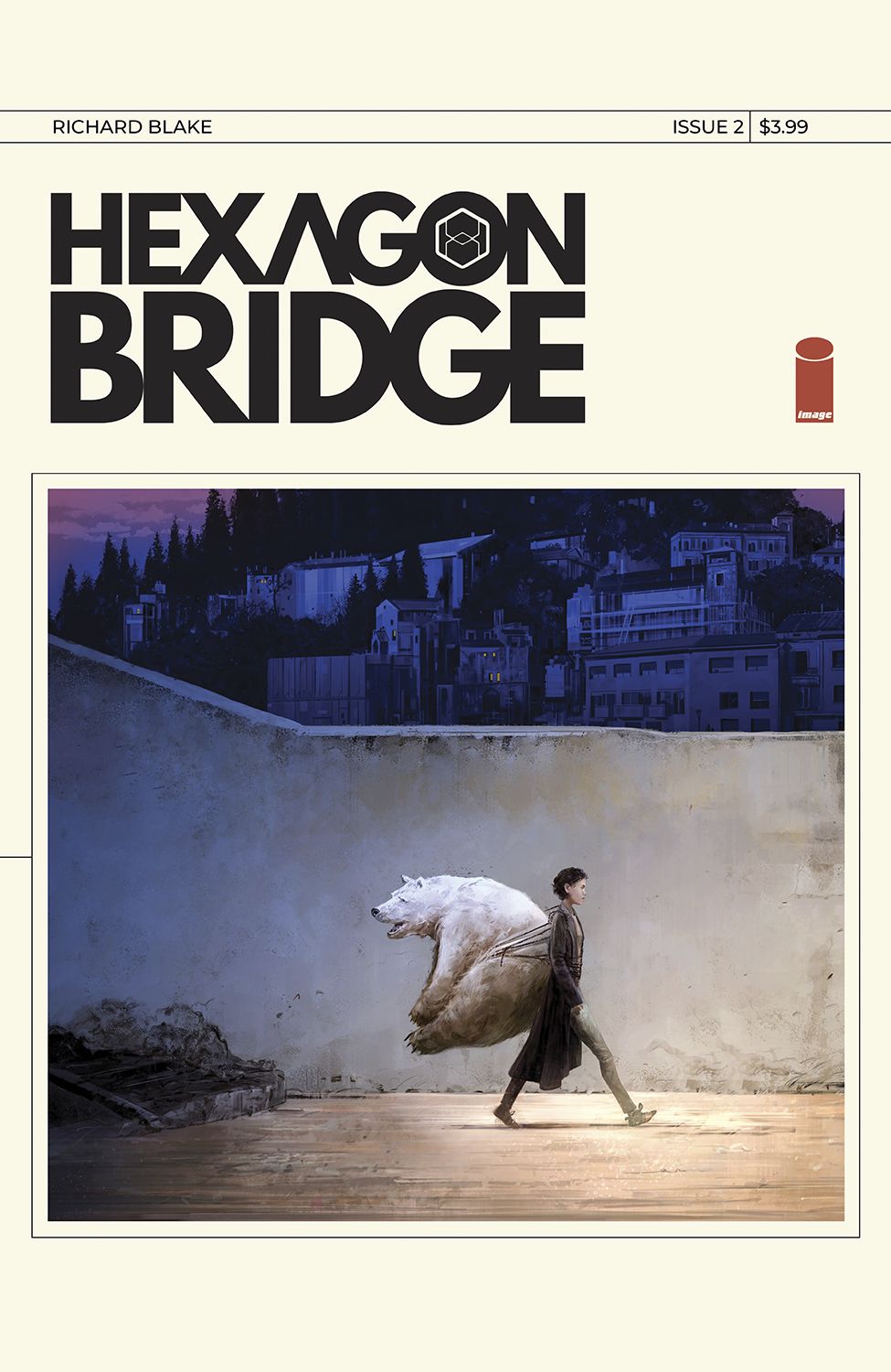
When it comes to your covers, how do you determine the central image you work into it? The second issue is the main reason I ask, because it shows Adley carrying a polar bear on her back, which is an idea that is discussed within but not shown. Is it more about something that ties into the essence and message of the issue? Or is it something else?
Blake: It’s very much, as you suggest, capturing the essence of each issue rather than, say, a preview of sorts. Once I designed the main illustrations to be framed within the cover, that allowed them to, literally, function as self contained pieces. As far as what determines the final image, it’s a matter of gauging the most relevant aspects of that particular issue, and, in a somewhat intuitive manner, working out the final painting. Issue 2, for example, is very much about Adley’s dilemma and the responsibility she is tasked with. Why it’s a polar bear she’s carrying precisely, I’ll let readers determine for themselves, but I hope all the covers are, at the very least, compelling in a way that adds to the subtext of the story.
I also tried to construct each issue like different movements in a piece of music. In that sense each one has its own distinct feel, color palette and pacing. Issue 1 reads quite fast and introduces a lot at once, like a loud overture, while issue 2 is slower, more mundane (at least in terms of the environments) and is a bit more contemplative. Issue 3 speeds up again, and so on. With that musical structure in mind, I tried to have each cover image function like a distinct and singular note in a larger piece.
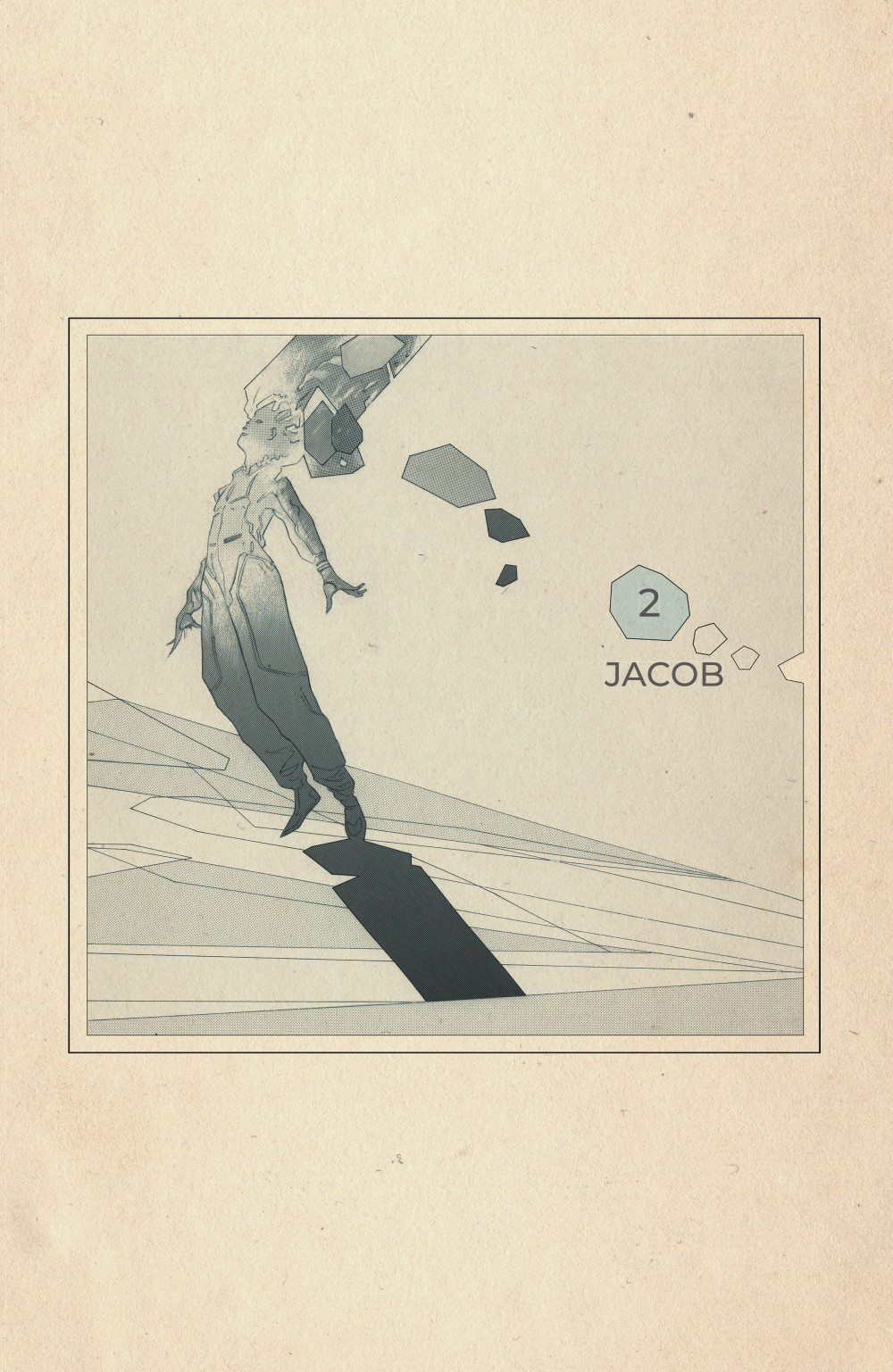
This is another element that I am sure exists for purely storytelling purposes, but I love that you have these chapter breaks that introduce characters and ideas before we get into a section. This is the first one, and it’s been a consistent element throughout. How do these interstitial pages help Hexagon Bridge become what it needs to be as a comic and story?
Blake: Initially I implemented them for practical purposes. I knew I was going to have these sudden context and time shifts. I thought giving a definitive end and beginning to each chapter would provide some ease and flow to the writing. I could have had them up in the corner in the first panel of each page turn, but I don’t think it would have been enough of a full stop. I wanted the reader to know that they’re onto a definite shift in the story. The one place I didn’t add one, and where I could have, was the time leap in issue 2. I actually wanted that shift to be quite sudden, and I felt the “12 Years Later…” heading worked fine in that way. But the chapter breaks did take on a life of their own as standalone pieces and, as you’ll see, work like little idea vessels.
There have been four of these so far, and each has introduced a key player to this narrative. I imagine at a certain point you’ll stop having new characters to introduce. Is this element one that will recur throughout and have defined rules as to how you use them, or is it something you’re exclusively using as a way to introduce the characters at the heart of the story, and you’re just done when you’re done?
Blake: They’ll continue past the character introductions and as the story moves more into the realm of The Bridge, the illustrations become increasingly abstract, like tone poems. Hopefully, they add another layer of subtext, particularly in later parts of the book. They don’t line up one to one to anything going on in that particular chapter, but like the covers, suggest underlying ideas and themes. Also, if you think of The Bridge as another character in the book, it makes sense that some of the chapter breaks are representative of it, and are, accordingly, as mysterious as The Bridge itself.
I wanted to talk about the way you approach page layouts and how you use them for storytelling. You do an exceptional job throughout, and have an advanced feel for that part of the medium for someone who is fairly new to it. What’s your approach to laying out your pages? Do you have a fairly constant approach to it or does it shift depending on what the page needs?
Blake: First of all, thank you! I hope the pages do read and work well. I think like most illustrators I start out with fairly detailed thumbnails, and a lot of the problem solving is worked out there. The benefit of working small, is that you’re really thinking of the entirety of the page, and how each panel relates to the greater whole. Placing in shadows and the lighting set up early on helps determine the flow of the page and allows you to see how large shapes interact and work off each other. Of course you’re also thinking of where speech bubbles will go, but I try to design each page to read visually as much as possible.
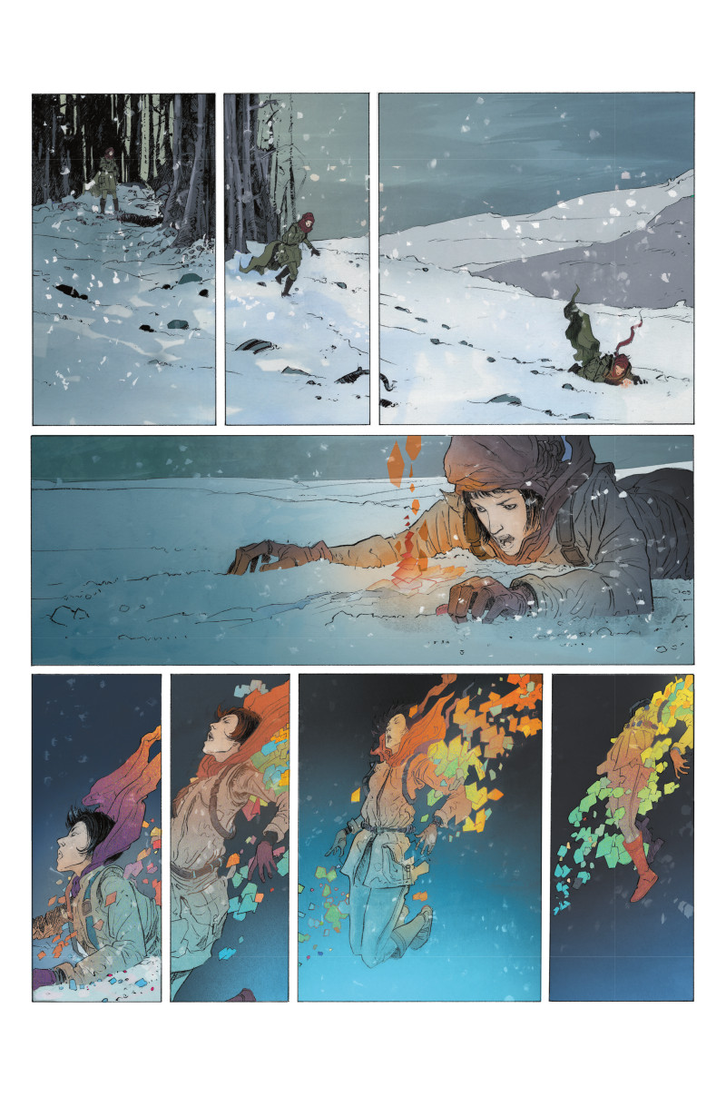
Some pages are worked out intuitively, and others are designed in a very specific manner, with definite goals in mind. For the page layout above I used a centered triangle as a way of unifying the panels and creating flow. I wanted that sequence in particular to have a kind of balletic, choreographed quality, and having a defined shape as a foundation seems to help in achieving that. It’s also an interesting contrast to what’s happening narratively; it’s a dire situation but there’s also this kind of dreamlike flow that, hopefully, has a kind of elegance to it.
I’ll also add that there was a very clear choice to keep the layouts as clear and as simple as possible throughout the book. I, obviously, didn’t adhere to a consistent grid structure, and they do shift a bit vertically, but there are very few overlapping panels or extreme layouts.
I really love the top three panels and the bottom four panels in particular. It’s incredibly effective, and just really draws you in as a reader, especially in how you show Elena running across the three panels with the landscape itself a single image. The blending of the motion with the stable environment is super smart. Is it your preference to add a sense of motion through paneling like you did in those two sections?
Blake: I think that kind of deliberate sense of motion has to do with the general pacing of the book, which is a slow one. My hope is that this kind of pacing invites a certain kind of immersion, particularly as the story itself is about immersion into strange and unpredictable worlds. But again, a lot of this is just my own personal taste.
The films, music or books I enjoy the most move in a certain manner that allow you to take things in a very nuanced, slow pace. Big influences in that regard are films like The Spirit of the Beehive by Victor Erice or The Road Movie Trilogy by Wim Wenders. One key feature of these works is very simple events, painstakingly depicted, but photographed in such a beautiful way they become completely mesmerizing. Kubrick’s films are another example, particularly Barry Lyndon and 2001: A Space Odyssey. Comics of course function differently than film, but I love experimenting with that methodology in my approach to the medium, and the two panels you’ve cited are examples of that.
One major difference between your background in fine art and comics is typically, an image is an image in fine art, and you don’t often have the ability to create a sequence like you do in comics. With that in mind, how much of this part of the job is you learning as you do it, feeling your way through as you go along? Has that required a bit of a change in how you think, or did it come pretty naturally?
Blake: A lot of it has been feeling my way through, but most of it came somewhat naturally. I read a lot of Comics Journal interviews, just to get a sense of things, but I’ve never read any of the major texts on the medium. I think it helped that I did a lot of filmwork after exclusively working in fine art. It’s not one to one, but it did teach me to think sequentially. I did storyboards for two feature films, but it was really shooting and editing my own stuff that taught me the most about stringing images together to tell a story. Just the idea that the relevance of a singular image is defined by what comes before or after it, and the process of generating “meaning” by merging various images together. Having done five years of that before I even drew my first comic page undoubtedly had an impact and helped shape the way I approach my comics work today.
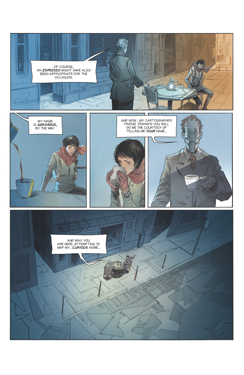
This page finds Elena, one of the wayward cartographers, meeting Gerardus in this other dimension, the maybe antagonist of the story. Worldbuilding is obviously going to be a big part of any view into that side of the story, but one thing I think is fascinating about your worldbuilding in Hexagon Bridge in general is just how dapper everyone is. They’re so well-dressed! Why was that something you decided to do? Is it because it’s all scholars and a fancy robot man in Gerardus, or is just the vibe you’re going for?
Blake: Ha! They do, indeed seem to all have a grasp of fashion, no?
I tried the usual route of sketching up with a bunch of sci-fi costume elements, but everything I did just seemed to look like a million other things I’d seen in video games or films. So, I dispensed with the whole idea of being a futurist in any sense and just tried to take an approach that was a little more timeless and not predictive in any way. At some point I landed on the idea that the culture, in general, of the Hexagon 12 outpost, was a mix of a design/architecture studio and a monastery.
Having spent some time in both of those environments, what becomes clear is that the precise nature of the practice – be it design or ritualized prayer – extends out into everything, including fashion, the way shelves are organized, etc. So, there’s a kind of formality at Hexagon 12, and while there aren’t any uniforms in the strict sense, it’s expected that you are to present yourself in a certain way at all times.
There is one character who wears a kind of uniform and that is Caroline, the designer of Staden’s core software. I wanted to suggest that she comes from a group of engineers that use technology in a somewhat mystical manner and operate like a sect of sorts, a little like the Bene Gesserit in Dune. This whole approach also informed how I wrote the dialogue. Again, much like a monastery, the characters don’t speak very much, and when they do they are trying to communicate very specific things. Humanity seeps through occasionally in their speech, but they are as precise in their words as they are with everything.
As for Gerardus, my idea there was that he was trying to create a comfortable environment for Elena and a sense of familiarity. So he’s somehow tapping into her subconscious and presenting himself in a way she would recognize. Accordingly. he looks a little like Martin Armlen, Elena’s father, and dresses in a similar way. Also, the street he creates is one from a Paris cafe. Staden alludes to this in issue 2 when he says “your parents loved that place,” suggesting that Paris was a city Elena and Jacob spent a lot of time in and had fond memories of, memories Gerardus was tapping into.
This isn’t shown on this page, but whenever we get a view into the Bridge and the dimension it takes people to, the view of it crystallizes and fractures as it zooms out of the events that are transpiring. That’s something that predominantly took place in the first issue, and it’s something that’s really fascinating. Is that because it’s us viewing into the dimension through Adley, the gifted co-lead of the series? Or is it just because you wanted to differentiate between those scenes and dimensions? Whatever the reason, I love it.
Blake: This is actually a small representation of how the landscapes in The Bridge function. I think of them as “memory atolls,” little islands of thought. As such, some are more stable, others are fleeting and fracture apart quickly. Some are a dense, baroque web of structures, endlessly colliding and interacting. The zoom outs in those pages were meant to reiterate that point as much as I could…like tiny dioramas floating in a vast ocean. You’ll see more of the dimension as the issues continue, and these points will be even further illustrated.
I could have set the entire story in The Bridge, but for me, the fact that you don’t see it too much adds to the mystery of it. It’s a foreboding presence throughout the story, always hovering above the characters like a ghost waiting to be confronted. I find that approach more interesting.
I have to ask about your lettering, or more specifically the balloons you use. They’re never a perfect circle or rectangle or anything of the sort, instead mostly an unusual almost quadrilateral with variance from use to use. But on occasion they are different shapes, with more sides appearing the more extreme the dialogue, even being a hexagon at least once. From the outside, this seems like something you put a lot of thought into. Did you have a prevailing structure you followed for these, or is it pretty feel based overall?
Blake: I think the initial inspiration was, of course, all the European stuff I’m into. They tend to use boxes as opposed to balloons, and I prefer that shape for a number of reasons. As for the variance you are alluding to, I wanted them to feel a bit like unfurled maps, adding to the cartography element in the book. The watercolor and paper textures were also chosen to contribute to that whole vibe.
I should add that the lettering is also something I custom made. I was looking for something that was a mix of a comic font and the kind of mechanical hand-lettering you see on maps. I found a few things that were close, but in the end decided to just create it myself in Fontmaker, as my handwriting is pretty close to that aesthetic. It’s not perfect, and from a professional lettering perspective, quite flawed, but it achieves the look I was after.
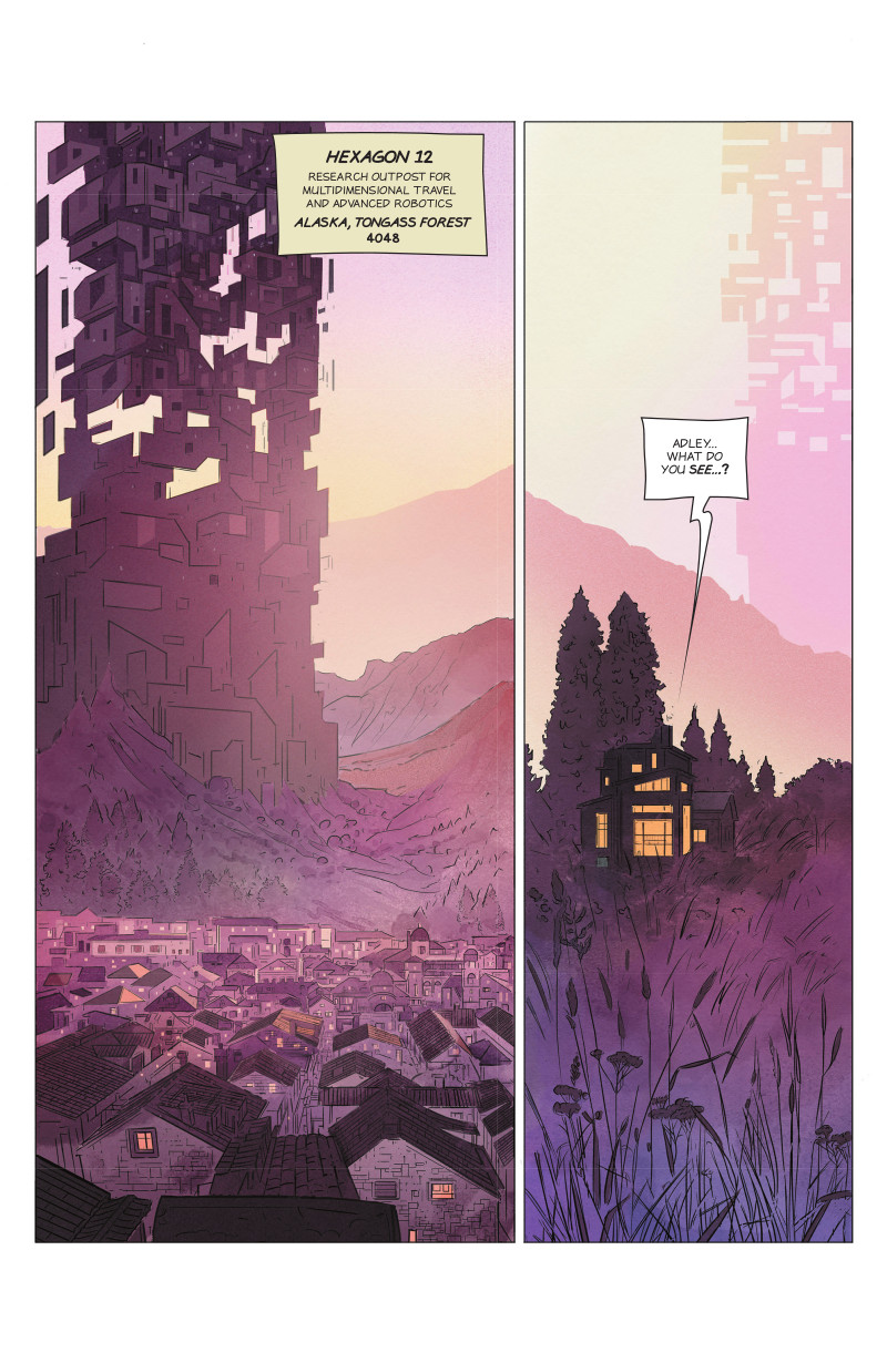
This isn’t a useful technical question, I just have to ask about the location used here because I’m an Alaskan. Why was the Tongass Forest the location you landed on for the core cast in our dimension? My guess is that it’s because this story takes place in the future and because climate change is a thing, but it was hard for me to not contemplate what you were thinking here.
Blake: The choice of Alaska really came out of the backstory I had developed, which of course is not something delved into at all but hinted at. Just to give you some sense of it, Hexagon 12 was meant to be similar to the Manhattan Project at Los Alamos, something I’d always been interested and fascinated with. Among other things, I was reading the Richard Rhodes book on the subject around the time I was formulating the ideas for Hexagon Bridge, and it seemed plausible that after the discovery (or possibility of) travel within another dimension, a community of scientists, engineers, and explorers would gather in a secret location dedicated the endeavor.
Like Los Alamos, they would move their families there and build a community capable of sustaining itself to a degree. All the little houses and cottages you see surrounding the main project site are meant to represent the residential areas for everyone involved. I chose Alaska as it seemed remote enough to conceal a secret project and community, but also close enough to the North American mainland for needed resources.
The last thing I wanted to bring up is your coloring. You do everything yourself, but coloring feels like something you put a lot of thought and effort into, from the shifting hues of this sky to the depth and variety you put into pages and panels a lot of colorists would simplify dramatically, I imagine. How do you like to use color? Is color a huge part of how you think of art, whether it’s on Hexagon Bridge or any other project you might take on?
Blake: The coloring aspect of the book is incredibly important and we could probably do a whole interview dedicated to just that. It’s something I put a lot of thought into and it’s the critical element that unifies all the compositional devices I put into the layouts. Because I’m using a clear-line approach to the drawing, so much falls on the color to differentiate key shapes, create sight lines, and establish grounds. One of the things I love so much about this approach is that it allows me to create a certain kind of diffuse quality with the lighting, adding to the whole dream-like feel.
The main inspirations for the general color palette of the book were Japanese woodblock prints, specifically the work of Hiroshi Yoshida and Utagawa Hiroshige. It’s a more muted palette overall, but when there is a saturated color, it’s really amplified. I use that contrast as much as I can to convey specific emotional beats. Aside from the palette, the other key thing is the digital watercolor brushes I use to lay down all the initial values. What’s great about these brushes is there’s all these subtle nuances in tone mixed with variations in grain and texture. It allows light to really bounce around in interesting and unpredictable ways that makes that whole final lighting pass really quite exciting at times. Taking on the color myself is really an extension of my painting practice. I’m responding to things, often in the moment, and just seeing where they take me.