The Design of Absolute DC: Rafa Sandoval on Coming to the Rescue on Absolute Superman
DC is launching its new Absolute Universe this month, and a trio of titles in Absolute Batman, Absolute Wonder Woman, and Absolute Superman are leading the way. Each is an intriguing reimagining of those characters from strong creative teams, and a lot of digital ink has already been spilled about how these projects came together and why they’re something the publisher is doing. But the most exciting part about each, at least to me, is the art and artists. Nick Dragotta, Hayden Sherman, and Rafa Sandoval have been tasked with creating a new look for some of the most iconic characters the world has ever seen — and each seems to have nailed the job. That kind of work deserves a spotlight.
So, to do that, I’ve written a series of features about what they did to bring the new iterations of these characters to life with insight from the artists themselves. And to close this effort out, we have one about Sandoval’s work designing this new Superman and the unexpected twists and turns that came with that project.
Redesigning a legend is a challenging task for any artist. That’s both because of how hard it can be to come up with something original for characters that have existed for the better part of a century and due to the self-doubt that comes alongside a task like this. The difficulty of such an endavor was proven by the experiences of Nick Dragotta on Absolute Batman and Hayden Sherman on Absolute Wonder Woman. Both are exceptionally talented and thoughtful artists, and yet the roughly year-long journeys they took to reach their final designs came with plenty of tweaks and uncertainty along the way.
It was simply part of the job for these Absolute designers.
The same was not necessarily true for Absolute Superman’s Rafa Sandoval, even if the artist and lifelong fan of the character carried his own self-doubts. The reason for that is simple. He didn’t have a year to craft a public-facing version of his design.
He had about a month.
The artist’s journey began when he wrapped his final issue of the recent House of the Brainiac arc in mid-June 2024, or a little more than a month before the line — and Absolute Superman itself — was announced at San Diego Comic Con. That meant the publisher needed a visual for its reveal, so the project came with a deadline attached. And there’s a reason he came on so late: Sandoval wasn’t the project’s original artist.
While writer Jason Aaron has been a constant on Absolute Superman, it was actually Rafael Albuquerque who was initially hired before he had to bow out due to the catastrophic flooding his home country of Brazil experienced earlier this year. 1 When he departed, the visual development of the project was in its early days. While Albuquerque had brainstormed visual concepts with the rest of the Absolute Superman team and done a few design sketches, 2 there was still a long way to go.
So, DC had to move fast in finding a replacement. That’s a tough task. It couldn’t just be anyone. After all, this was a tremendous undertaking, one with a tight timeline. For that reason, they didn’t just need an artist with a true vision for Absolute Superman; They needed someone who could tap into those gifts quickly, for all their sakes.
That’s why this isn’t the story of an artist who pinch hit for his peer, simply finishing the work someone else started. It’s the tale of one of the defining visual voices of Superman’s recent history stepping into a project late in the game to craft something special, saving the day for everyone involved in the process.
Despite the obvious challenges that came along with this project, it was an easy one for Sandoval to say yes to. The artist recalled that it was Absolute Superman’s editor Chris Conroy who pitched him the job. He viewed it as a “big and incredible proposal” and “a surprise I never expected.” DC wanted him to “create a new Superman,” one that was “insecure” with “many struggles inside him.” It would be a version of the character with obvious “imperfections” that the regular version of character rarely displays. That was an enticing hook. From that pitch alone, the artist could see the potential of what this team might do together.
“I loved that idea,” Sandoval said. “After the first five seconds of conversation, I already knew it was a project I (would) love to do.”
Part of that was simply because of his own affinity for the character. Getting the chance to develop a “more human” Superman “with all the flaws and virtues that implies” — like cartoonist John Byrne once did, Sandoval noted — was appealing to him.

But he also enjoyed the challenge of taking something that had been started but not completed and then finding a way to make it his own. The artist said there were already “a lot of descriptive details about the character” when he signed up, ones he found “useful as a starting point.” Having those to build from was important, both because it was a powerful look — Sandoval emphasized that Albuquerque’s design had a “solidity” to it that brought immediate credibility to the character — and because the artist knew “the right thing to do was to respect” the work of his predecessor.
“I knew I had all the necessary pieces, but I had to assemble the whole puzzle and make it coherent for the readers,” the artist said.
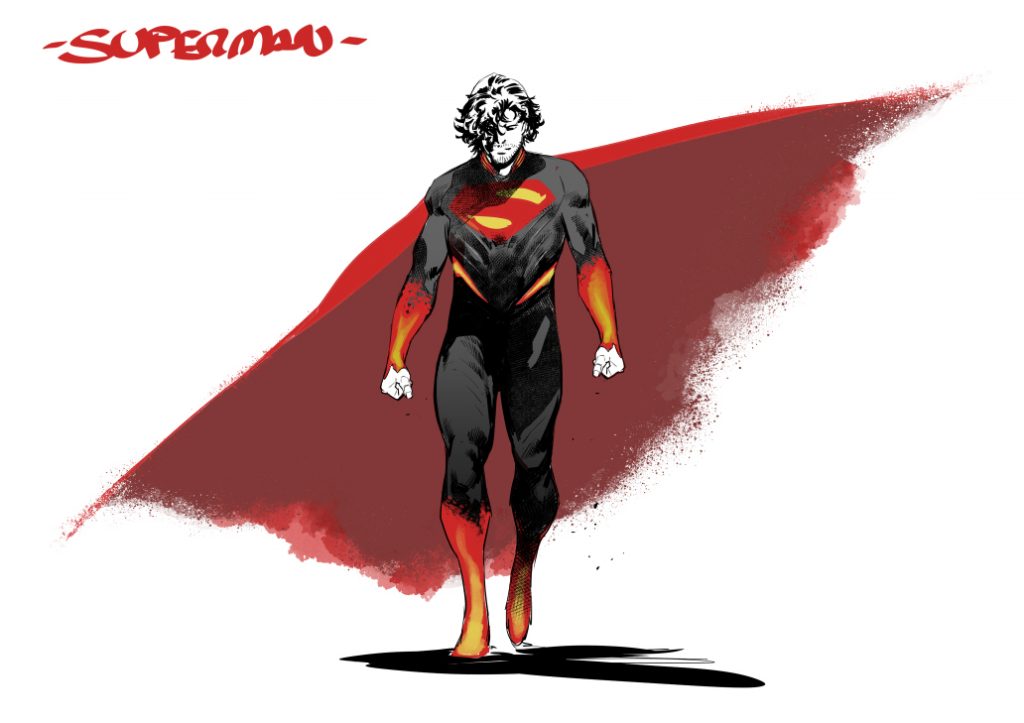
Albuquerque’s original suit designs were a useful place to start. Certain elements of his design stuck around after Sandoval took over. 3 But even then, those were quickly built upon and turned into something new by the incoming artist. And when I say new, I mean it. Sandoval emphasized that beyond Albuquerque’s original design, he tried to utilize as little reference as possible in the development of this look. While he “reviewed several science fiction movies,” none of it was used. In fact, a lot of what he discovered was used as guardrails for the true goal he had for Absolute Superman’s look.
“A completely new and different design was my intention from the first second,” Sandoval said.
There were some goals he had going in for the suit. One was it had to be “flexible and allow for a lot of freedom of movement,” which meant no armor or kneepads or anything else that might restrict how the character acted. He also didn’t want to lose the character’s identity, even as the artist was doing something new altogether. That was important to him both as an artist and as a fan.
“When we talk about Superman, we talk about an iconic character. It’s not as easy as people think to work with these characters,” Sandoval said. “Superman is deeply ingrained in the minds of fans. When you propose changing an icon they idolize, there is a lot of suspicion. That’s normal. I’m also a fan and I know what happens on the other side of the comic book.”

That’s why it was important for him to create a design that “is easy to recognize in its essence without excessive embellishments.” He kept certain aspects that make Kal-El Kal-El, like his “famous lock of hair” and facial structure. But he actively avoided “overloading the new design,” that way when people look at the character, they know “deep down he’s still (Superman)” even though it’s a new take on him.
While this version reflects Sandoval’s vision, he emphasized that it was a collaborative effort. Aaron, Conroy, and the artist were in “constant contact” throughout. That helped him breeze past any doubts he may have had during development. Any time uncertainty crept into Sandoval’s brain about the direction he was headed in, the artist said he had “answers from both” Aaron and Conroy. And some of those helped more than he originally anticipated.
“Sometimes the answers go beyond what was expected and provide certain nuances that I did not know or details that I gave little importance to at the beginning,” Sandoval said.
The artist said that duo’s contributions helped improve the design. But as much as each may have had their own takes about what was necessary for this character and his look, Sandoval emphasized that there was one overriding principle that guided him on Absolute Superman.
“To design a new character isn’t just (drawing) a version with a different outfit and a new hairstyle,” Sandoval said. “That new (look) has to reflect the circumstances of this new Superman.”
Sandoval shared that one of the most helpful resources he had was the “written documentation” the team created for the series. Similarly to how Kelly Thompson’s bible for Absolute Wonder Woman allowed Hayden Sherman to better understand that character and how her circumstances would affect the design, the development that preceded Sandoval showed the artist “how (Absolute Superman) thinks and how he acts.”
“Everything that happens to this Superman visually affects the way he acts, his personality, even the colors of the suit,” Sandoval said. “The new origins are an essential part. He has suffered a great loss. That has affected him a lot.”
That’s why this new look couldn’t just be a “change of aesthetics,” according to the artist. It had to be deeper than that, with the character’s background not just affecting the design but how he behaves on the page. That also means that even though there are plenty of new details to this Superman’s suit, they had to be there for a good reason.
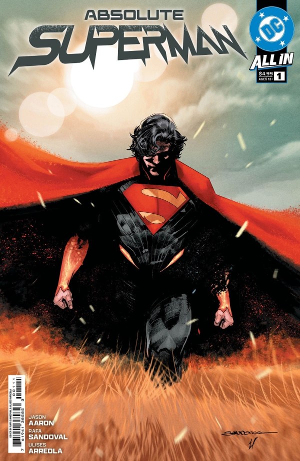
Some of the staples remained, of course. For example, the character’s iconic “S” symbol on his chest is still there, even if it had a slightly new flavor to it. The artist said his goal was for it to “remind us of the classic” but with “a more stylized line.” That aspect was an easy pitch to the rest of the team. Sandoval said he “didn’t have to tweak the first proposals” for the shield much at all.
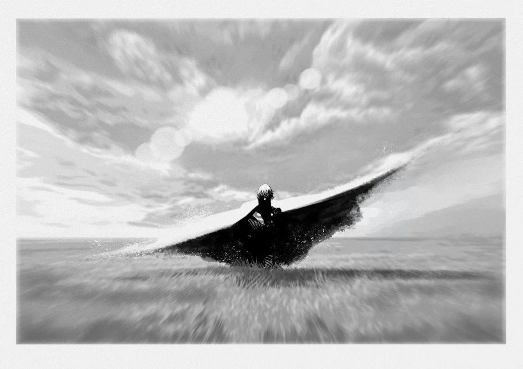
But there are plenty of unique wrinkles to this iteration of the character. Superman’s cape is a perfect example of that, even if that word doesn’t describe it correctly. As the artist told me, “The cape is not exactly a cape.” That was something Aaron was clear about from the start. It’s actually crafted from the dust of Krypton itself, and Sandoval reinforced those origins visually by applying a “special texture” to its design. He also had to ensure that the overall look was flexible, because, as the artist said, Absolute Superman’s cape “has the ability to contract to the point of hiding if the situation demanded it.”
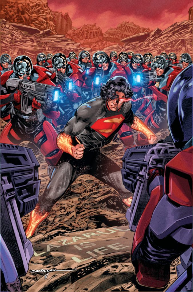
The artist couldn’t really elaborate on some of the details, at least not yet. That’s because “as the series progresses, we will discover why (the character) has this aesthetic, and we will see it has purpose.” That’s reflected in how often Sandoval said things like “this new suit interacts with our character” and it’s “not simply a tight-fitting fabric.” What Absolute Superman is wearing isn’t just a spandex suit.
Its color palette — particularly the bright reds and yellows on his arms and lower legs — has a story behind it. So do the lines that run throughout the suit. The artist compared those to “the veins of a human body,” something that will prove more meaningful when you actually read the comic.
“They are lines through which energy can circulate and be stored,” Sandoval said. “For this reason, they are not an aesthetic complement. The lines are a fundamental part of this new version of Superman.”
This character’s journey affects every aspect of his look. And that truly means every aspect. That even includes one of the more controversial elements of this design: 4 his longer than usual hair. It’s protective, but not in a physical way.
“Superman witnessed the unimaginable, but this new Superman does not have the strong personality of the classic Superman. This new Superman is someone who needs to heal mental wounds and tends to withdraw into himself,” Sandoval said. “(His) long hair helps hide his face from people.”
That’s the beauty of what Sandoval and the rest of the Absolute Superman team are crafting here. The final design for the character is rooted in the soul of this Superman. His experiences shaped every aspect of who he is, both visually and beyond. That kind of thing isn’t always true for character redesigns. The history of those is dotted with of the moment takes meant to be cool more than meaningful. For Aaron, for Conroy, and maybe most especially for Sandoval, this couldn’t be that.
Their new Superman had to have a design that reflected his circumstances and the emotional wounds he carries with him.
That’s why the biggest influence on Sandoval wasn’t Albuquerque, the artist that preceded him. It was the experiences this character has gone through before we meet him. It’s also why the artist looks at it with such pride. When given remarkably challenging circumstances and a tight timeframe to work with, the artist crafted something special with the look of this Absolute Superman — and he can’t wait for people to learn more about it.
“I’m proud of the overall result. This is one of the most complete designs I have made,” Sandoval said. “When I look at it now, I wouldn’t change a thing.”
That impacted him both because the artist could not reach his studio to work and because he was coordinating relief efforts for the region through comic industry-fueled charity auctions.↩
Which is why Albuquerque earns a special thanks in the first issue of this series.↩
From what I understand, those elements were the inclusion of Superman’s “S” shield, the character’s belt, and aspects of the gauntlet and boots.↩
At least amongst certain fans.↩


