The Music of Art: Javier Rodriguez on Spider-Woman, Art and Color
The Spanish artist talks his craft and path to the American market
While I’d never argue that rotating art teams are a good thing, there can be quiet upsides to that practice. Once you get past the initial shock of not having your favorite artist on a book for an issue, you might come across an artist whose work absolutely floors you and – right then and there – becomes one of your favorites. That happened for me with Javier Rodriguez.
While he was surrounded by art titans like Paolo Rivera and Chris Samnee, the artist who blew me away the most from the previous two volumes of Daredevil was actually Rodriguez. The issues he stepped in for line art work – he was already coloring the book for the majority of the run – were rapid fire “panel of the week” generators for me. I read it digitally, and I remember perpetually taking screenshots of layouts and SFX and character acting in Rodriguez’s art just so I could post it on Twitter and share how absurdly great it was. How could this guy be this great?
Later on, he stepped in on art once again on Spider-Woman with Dennis Hopeless, and in the latest volume, he’s hit a new level of storytelling and emotive power with his art. Naturally, I had to talk with him, and today, you can read my conversation via email with Rodriguez about his background, how he views art and color, action sequences, character acting, the musicality of comic art, and much more.
You can find his work on the web as well as his thoughts on Twitter, and make sure to be reading Spider-Woman every month. It’s a great book, and not just because Rodriguez is a brilliant artist.
You’ve been working in comics for quite some time now, and in a couple different roles. What’s your art background, and what inspired you to bring your art to life in the comic book medium?
JR: I went to an art school and I studied Graphic Design and Photography. Comics (have) surround(ed) me since I was kid. My father had a huge collection and I learned to read with comics of all genres and nationalities. But it was at the art school, learning other disciplines, when I realized that comic art is a language by itself. I mean, not only a visual medium but a real language like literature, cinema or music.
I always use the same example but it is the easiest way to explain it: in literature you have verbs for actions or adjectives for descriptions; in music you have sixteenth notes to express more movement or a whole note to express description; in comics you have panel compositions to do that. An opening wide shot contains all: description, adjectives, whole notes…and a succession of tiny panels of close up means verbs or sixty-fourth notes.
When I was teaching comics to beginners I realized that drawing is important but not the most important part to make a comic good. It is a component of the process but the key is to learn how the language works. I started to apply the Bauhaus basic rules of design, how they used the Gestalt to understand how we perceived the form and composition. For example, a horizontal line in a big panel could be a desert and a train that comes across from left to right and it doesn’t matter how good are you drawing trains or deserts, the language is in composition and the use of visual rhythm. This and other basic studies from visual design history helped me a lot.
So I practiced a lot to approach comic language, rooted on the basis of design but subconsciously. Like when you write “red plane flying” you are not thinking: adjective/noun/verb. Or if you know how to play a guitar, Sweet Jane for example, D, A, G, Bm chords and you don’t think where the fingers should go, you know that, you just think in performance. Once you learn the basics you can “speak,” use the language to perform. It’s the same with the comics. At the same level (as) the other disciplines. To me, the excellence in comics is when you are in the “performance” level.
Of course you spend all your life learning but there’s something different once you realize that all your focus is in how to tell the story instead of analyzing the anatomy, perspective or pen or brush.
It’s something magical. You design something to provoke reactions in someone’s mind and you’re not there to explain that, it’s the language, the visual art that does this for you. It’s fascinating and awesome.
While you did a lot of interior line art in Spain, you’ve only recently really become a full time penciler in the American market. Why is that? Were you just overwhelmed with color work, had the opportunity not really presented yourself, or did it just take some time for you to build up the desire to do that?
JR: It’s a long story. I started in the 90’s self-publishing my own comics. I learned how to do the whole print and design process at the art school and comic techniques sharing a humble work space with local artists like German Garcia (an outstanding, talented guy). Those days I played the guitar in an indie rock band with a little local success. In a 90’s rock band you learn a lot of discipline, a lot of DIY philosophy, so I used that for comics too.
Then I started to publish professionally for El Vibora. It was an underground magazine very popular in Spain, my dad collected it since its first issue in 1979. It brought to Spanish readers for first time Robert Crumb, Daniel Clowes, Charles Burns, Yoshihiro Tatsumi, Hernandez Bros., Muñoz y Sampayo, Jamie Hewlett and a lot of amazing Spanish authors like Max, Miguel Gallardo or Martí. Well, it was incredible to be there. I did three long series and some short stories.
And then I started to publish my albums for Glènat Spain, a division of the French big editorial. My first album was Wake Up and it got attention from my friend Marcos Martin. Marcos was working on a new project those days, Batgirl: Year One for DC Comics. And he wants a different color approach than (what) the mainstream comics have at the moment. So he asked me if I want to try and I did few test pages. Matt Idelson, the editor, said yes and there was the start of my career as colorist for the US.
It allowed me to earn money to do my own comics here. So, at the same time that I was writing and drawing a weekly comic series for a children magazine, doing illustrations for El Pais, the main newspaper here, or drawing a manga project for Humanoides Associes in France, I raised a career as colorist there.
When Marcos moved to Marvel I moved with him and I start(ed) working for the Spidey office as colorist. The project that I was drawing for Humanoides Associes, Lolita HR, was absorbent, I had to draw 40 pages each month (manga format). But suddenly Humanoides had money problems and we (the writer Delphine Rieu and I) stopped until we recovered the character rights. I was doing some sample pages for Vertigo Comics while I was doing colors but without success. I was tired of doing random projects. So at one point I decided to stop drawing comics for first time in my life. Marvel offered me an exclusive contract as colorist and I said yes.
Then Stephen Wacker asked me to draw some Spider-Man samples. When I was child drawing superheroes was my dream job and I had an opportunity there so I tried to do my best. My mistake was doing it at the same time that I was coloring. For reasons of the industry, I guess, my page rate as colorist doesn’t allow me to color my own line art, which is a lower rate actually, and I had to do my monthly colorist hours by contract, 2/3 books at the same time that I was drawing. So my first comics for Marvel were not as good as I wanted them to be. For that reason, once I finished my exclusive contract I kept coloring only Daredevil and when Steve gave me another chance to fill-in Chris Samnee on Daredevil I decided to change the way I was working. I asked Alvaro Lopez if he wanted to help me with the inks and I tried to focus on the most important parts of the process to me. The basis, the layouts, the comic structure and the final coloring, the packaging.
I’m so grateful to Steve Wacker (and Ellie Pyle) because, they probably don’t know it, but I’m back to drawing comics because of them.
As someone who has done a lot of color work, I’m curious as to how that impacts your approach to penciling a book. Do you often think about how your colors are going to impact everything as you’re setting up a page or working on a panel? Or is that a separate part of your process?
JR: It depends. If I know that I will do the colors I think in coloured pages from the beginning. Even I add colors to the first drafts. If coloring goes to another artist I try not to think too much about it while I’m drawing, just focusing in black and white, in shapes and forms rather than mood. If I need any special color for narrative reasons I make some notes for the colorist.
It’s fun but I learn a lot of art techniques while coloring other artists. Marcos Martin or Javier Pulido are a big influence to me because, even when they are old friends and we do talk a lot about comics, zooming into their pages to see every detail on a page gave me lots of knowledge.
I did a lot of color work for Alan Davis, for example. I had been in love with Alan comics since I was child, since Excalibur or those fantastic X-Men books in the 80’s. But to have the chance to zoom in and out and to work in an original art page by him and Mark Farmer…wow, it’s another level. Alan’s notes were long and detailed but all of them made a lot of sense. (They) really improved my skills at the end, you know. So I learned a lot coloring other artists and I am lucky because most of them are amazing.
You’ve been working with Dennis Hopeless for a bit now on Spider-Woman, and it seems to be working out tremendously well. How much do you two interact when you’re putting together an issue and arc? And from receiving the script to finishing the page, what’s your process like?
JR: It has been a luxury because Dennis is a master of fabricating characters and I think that this is the kind of work that I enjoy more once I’m in front of the blank page: strong main characters, fun situations and a cool plot. The first arc, the story with the partners of the super-villains, is so original, so fun. You don’t find plots like this easily on current mainstream comics.
My method is simple. When I receive the script I read it like four times. So I “sketch” it in my head. I look for references if I need to and start doing layouts. I question myself about what the writer is trying to say and how I can tell that to reader. And thats because layouts are the biggest issue in the whole process. It’s a lot of invisible work, a hidden mechanism, that makes it all work as a clock machine. So, at that stage I decide to use more or less panels, to move this or that. Sometimes I keep the panel structure from the script but most of the times I change it to accommodate the pacing of the story.
For example, in Spider-Woman #4, one of the books which layouts took me a lot of time, the childbirth scene was very important. You know, we’re telling the story of a pregnant Jessica Drew and you have the main story there. So I decided to cut one page from the beginning of the story, compress the info and leave more room for that important moment. The problem was that the first pages were full of action, so I used panel composition in a very organic way to help that feeling, to create movement at first sight and compress all the info that Dennis wrote there. That allowed me an extra page for the important labor scene.
Dennis writes that Jessica Drew will have a C-Section. I knew how a delivery experience was because my daughter was born the month before and I was there all the time, but our labor experience was different, no surgery at all. So to keep that feeling, all the pain and tension that Jessica was enduring, I decided to use the panel division as a music sheet in four pages. So we open with a half page description panel, all the elements are there for you, the characters and the coming dangers (the Skrulls). Like I mention in the first question, I like to think about what elements are common in all languages so we have a big whole note to start. And then a succession of same size small panels, like sixteenth notes, plenty of emotions, Jess faces, the surgery, the doctor, the danger…to a great finale with a big one, a whole note again, to express the surprise when Jessica sees the baby for first time. And then break all the panel shapes to express the warm and lovely feelings of the new mom, like the strings ending the previous crazy pizzicato and starts with a charming melody. And back to the situation with the same panel shot that we use to open the scene.
This is the work of the artist. Invisible but necessary to do a comic right. And this is impossible if you don’t have the trust of the writer on your side, on your work. Dennis (gave) me a lot of room to do that and I try to respect and bring to visuals to all that he wrote in the script.
Obviously you need (an) editor (that) is on the same wavelength. I can’t work with the script by pieces but I understand that all of us are pretty busy so I try I least to have a sequence, a part of the story complete before drawing anything. Saying that, Dennis gives me full script most of the times and when this is not possible I have a pitch of the whole issue. Once I have the layouts I send them to him and our editor and I change all that they think that doesn’t work. And then I go for pencils.

Dirk was an immediate hit with me. I love how he’s basically just an American teenager in Skrull form. You never really think about Skrulls being young, but he was a great character to see in that regard. When it comes to designing characters and bringing life out in them, how do you approach that? And for someone like Dirk, how much of his look comes from script notes from Dennis and how much is on you?
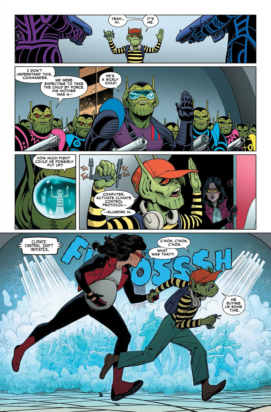
JR: In Dirk’s case, it was all suggested by Dennis, I just added the stripey top and the high waisted trousers. But everything else was pretty detailed on the script. My favorite Skrulls are the Kirby ones, and probably Byrne’s, because (they) were my favorites when I was child. But to be honest I drew them using memory rather than references this time.
To design a character, the best scenario is to have time, a full script and to do a lot of drafts before being in front of the blank page. This never happens with our schedules and the craziest deadlines. So my trick is to draw all as familiar and comfortable as I can. I mean, I know that sounds crazy, but I imagine a huge background, a deep psychological portrait of the character that in my imagination fits with the story. This helps to the character’s evolution later. I know, it doesn’t makes sense but helps me a lot. It will take some time to talk about that, and it’s not within the subject, but reflection and projection are very important for me to build fiction. Having a good character design, the structure of his behavior…means to achieve half of the comic. I said I’m always thinking (of) my approach to comics, of course, which is very focused on characters acting.
And then you have characters that grow up with the story. I’m not sure if Dennis thought how Roger, the Porcupine, developed because I know he loves him (me too). But to me it was natural, organic issue by issue. It’s amazing and one of the reasons for me to love serialized comic books.

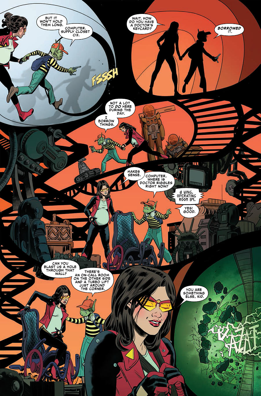
This page has a lot of very interesting color choices, and they all work remarkably. I’m curious, when you’re coloring, how are you deciding on your palette for a scene? Is it more about conveying the right emotions than anything else when it comes to color choices?
JR: In this occasion was all due to Rachelle Rosenberg. Kudos to her. I had a big problem. More or less the first 5 pages of the issue are the ones that I had less time to draw. So I thought of a simple but effective solution. In this case I took as reference the scenario that you see in Elvis Presley’s Jail House Rock movie, but instead of cage bars I thought that a DNA stairs could be appropriate and (befitting) the organic hospital architecture. I wrote a note to Rachelle saying that a backlight would be cool and voila. She nailed it!
One thing you do on the regular is how instead of just using straight panel layouts where each is separated, your layouts often have the characters traveling and interacting with them. Like, this show Dirk and Jessica’s travels from one place to another. It adds a lot of enjoyment to my read. For you, what is the appeal of telling a continuous story in such a way? It seems like something that appeals to you as I know you did it in Daredevil as well.
JR: Yes, I love using all of the elements on the page. All of them. Even the blank space. I think this works well because right now, in my opinion, the mainstream is more focused in other approaches, like a film storyboard and (everything) happen(ing) inside of each frame. But old school comics are full of examples of the use of the panels as a part of the language. You got experimentation with paneling from Yellow Kid to Spirit to Valentina to Arzach…it’s in the language itself. That freedom to use all elements available is the pure comic as I understand (it). To me, to do comics is not a poor way to do movies. It’s more than that. And the evidence is the way that panel interactions work with any reader. The blank space, the gutter…is unique. And wonderful.

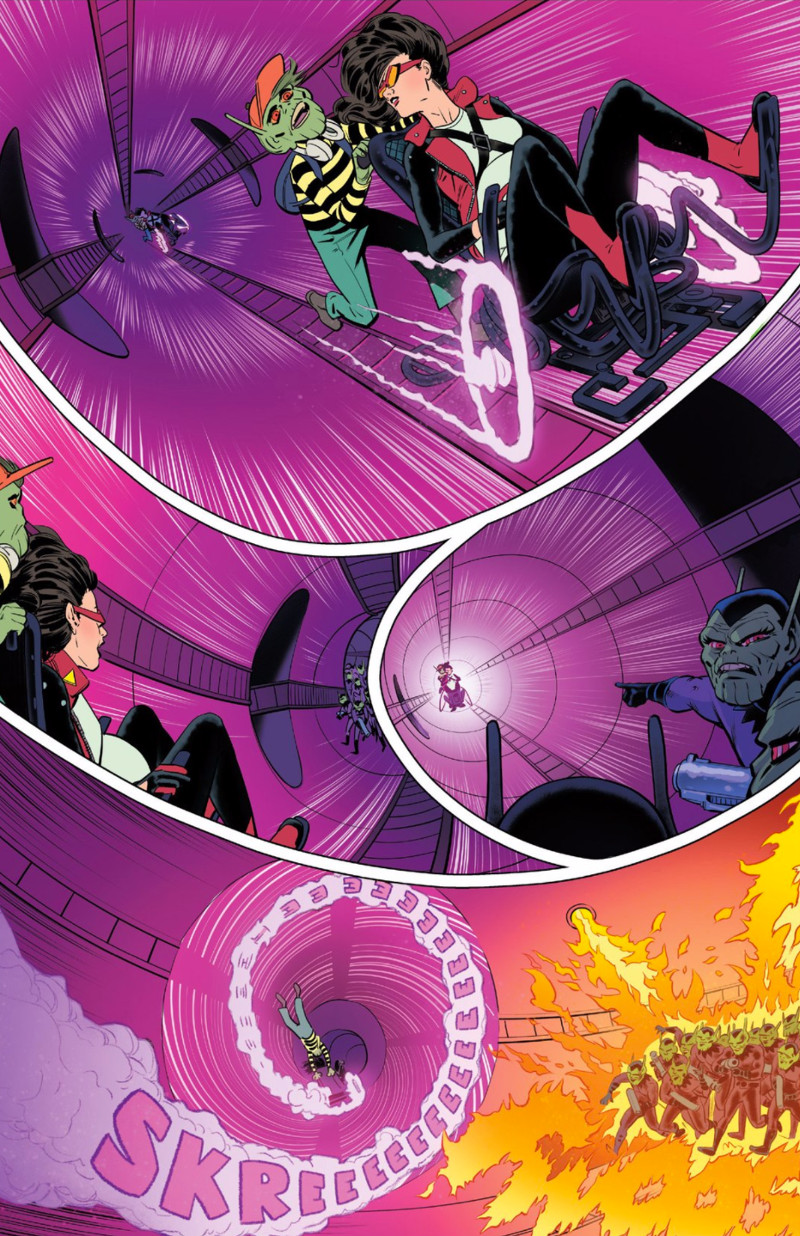
You talked about layouts already, but I wanted to ask about this page. I really love it because of how it feels like it’s perpetually in motion. It’s like you’re using the panel layouts to create a physical representation of the tube Jessica and Dirk are bolting down. It’s spectacular. When it comes to bringing motion to life on your page like this, do you feel like you can go too far? And for something like this, how much do you go back and forth on figuring out the right layout before deciding on one option?
JR: I try to picture it in my head all before I draw anything. So in this particular case, if my memory doesn’t fail me, was a two page action (sequence) in the original script. I think that I edited (it) to have more room later, so I thought it was the best way to make it all easy to understand in one page. To be honest I think that at the end it looks a little bit campy, with the Skrulls burning like this on the last panel. With more time I probably (would have) changed that. But basically in my head (it) was the same that for the whole hospital part. Organic and plenty of holes. All the time looking for round forms and holes. Call me crazy but I did all of this thinking on the childbirth scene and how to suggest that.

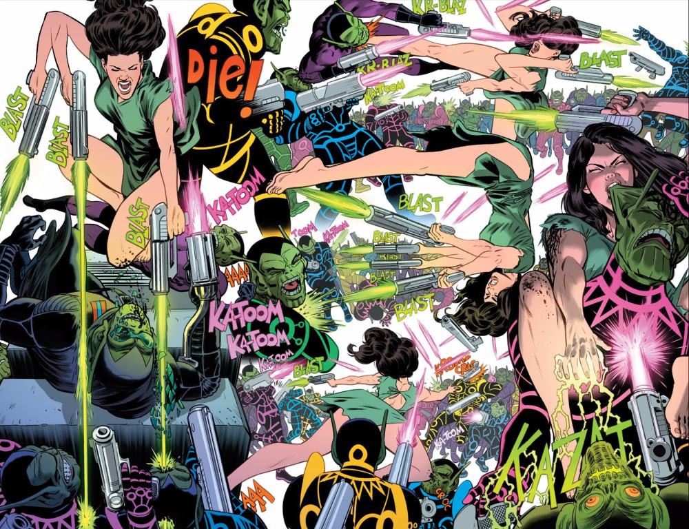
Splash pages are typically showy pieces, but you have a rare ability to take something incredibly busy and apply logic to it. This could have been overwhelming if not handled right, and you handled it perfectly. For a straight action scene, how carefully do you plot choreography, and how do you approach sectioning off a page like this without actual panels?
JR: To draw action I focus my efforts to show verbs, because that’s what the actions are: verbs. So, shoot, fight, grab, bite, kill, jump…are the first things that you should see at first sight. Sounds ridiculous but it’s 100% efficient in any action scene you want to draw. Obviously because we have a lot of visual references we can do just the opposite to evoke something unique. But right now I’m trying to back to the basics and do the comics all straightforward as I can. Pure and raw language. Although it’s not always possible. :-)
