
A World Made From Scratch: Kagan McLeod on Kaptara After Its First Arc
The artist of the Image Comics series talks his art and process
One of the most interesting things about comic art – or art in general, really – is how, if you have the ability to draw and an active enough imagination, anything is possible. Want to retell the history of hip hop? Sure thing. Looking to introduce the world to a school for gifted youngsters? That could be a thing. Dying to deliver a comic about a young man trapped on another planet filled with weird creations, from cat faced battle tanks and a Motivational Orb? Well…sure. I guess.
That last one is a real thing, and what a glorious thing it is. It’s Kaptara, Chip Zdarsky and Kagan McLeod’s glorious Image Comics series that entertains with its absurd and unexpected nature. It feels like raw imagination unleashed on page, but delivered by two very able storytellers. Sure, it’s a bit insane, but Zdarsky and McLeod fine tune that insanity in a way that makes it hard not to love. Its first arc comes to an end today, and to celebrate that, I spoke with McLeod – one of the best artists in comics in my book – about his experience with the book, his process, how they come up with such a spectacular menagerie of creations, coloring the book himself (with help!), and more. It’s a deep dive into the art on the book, and if you’re into the work, there’s a lot to learn here.
However, one important note: the last spread from the issue is revealed further down the page. If you’re not looking to get spoiled – although this is hardly a plot driven book – then I wouldn’t read this interview until you’ve read the comic itself. You’ve been forewarned.
Let’s start back in the beginning of Kagan McLeod. What made you first want to become an artist, and what have been the most important influences in you honing your craft over the years? And that doesn’t have to just be other artistic influences, that could be art school or really anything.
KM: My dad was a staff artist at my city’s newspaper in the early ’80s, so I’ve always been exposed to illustration. I used to trace Howard Pyle pirate drawings with his artograph projector. I started collecting Mad around 1987, which shaped the way I draw for sure. I remember in grade 5, copying a bunch of Mort Drucker caricatures, Cher, George Burns, Madonna, Ronald Reagan — a real zeitgeist snapshot for that year. I arranged them all on my desk before school and when my classmates saw them and flipped out I was like, “What, these old things?” which is basically what I try to do now on instagram.
You’re a pretty busy artist, but for a lot of comic fans, they’re not that familiar with your work because a lot of what you do is outside of the medium. What’s been the biggest driver for you doing most of your work in commercial illustration, and what made you want to get back to comics after your Infinite Kung Fu experience?
KM: What I like about editorial illustration is how quick things happen. A job is in and out the door in a few days, sometimes a few hours. It’s hard to get bored or frustrated with any one project at that pace. There’s also some prestige in working for brands people know, and having lots of readers see your work. In my experience the money is better than in comics, too. But magazine work does have a disposable quality to it. Comics tend to stick with the reader for a lot longer. They’re collected, reread, passed along to friends. Making them is gruelling, but flipping through a book of your own finished work is really satisfying. Kaptara wasn’t like a big decision to get back into field, it was a relief to sign on to, so I could stop procrastinating and make more comics.
You and Chip go back a long ways, and a lot of your desire to initially put the book together came from that friendship. Well, that and your desire to get back to some of the more fun and outlandish character creations you used to put together back when you were in a studio together. Now that you’re one arc down, how is that collaboration going, and what has surprised you the most about crafting a series like this, if anything?
KM: Working with Chip has been like a Gillette Mach 6 shave – completely smooth. Neither of us shave though, which may be why we’ve had no bumps. Occasionally we may get crumbs in our beards but we have each others’ chins/jowels, so we just point them out and brush them away.
The most surprising thing to me is how long the art takes, not having worked on a monthly book before. I like to think of myself as really fast, but every time I sit down for a few hours I realize how many more hours I’ll need to finish whatever part of the process I’m working on. But like I said, fantasizing about flipping through the finished product, and seeing a world made from scratch unfold panel by panel is what keeps me working.
Kaptara definitely feels like a comic with a very free spirit, it all the best ways. I’m curious as to what your process is with Chip in developing issues and arcs, and from that, what’s your process for bringing an issue to life with your art?
KM: We kind of toss around general ideas for things that might happen in the story together, and I may send along an idea for a joke or scene or something, but Chip’s got the final word on the story and how it’s told. In his scripts he gives visual descriptions where appropriate, but leaves it open for me to make something up most of the time. For instance, I think he told me before the script for issue 2 was written, that our heroes were going to be riding some kind of Battlecat-type thing. We needed a cover for Previews solicitation and I came up with the cat tank in a panic. It’s goofy, but I think the readers seem to all want cat tanks, which is reassuring.
When it comes to laying out a page, what are you thinking about? Are you just looking to find the best story flow for the page? And beyond that, how much do you stick to your roughs once you get into an issue?
KM: I used to make thumbnails for each page before pencilling, but lately I’ve been skipping that step and just blocking out blank boxes for panels digitally and going right to pencils once all the panel layouts are roughed in. I don’t think too hard about it, just what needs to be big, what can be small and move on. When I’m behind I’ll send Chip the layouts with stick figures and he can start on the lettering. When I do finish the pencils (digitally, in photoshop for the most part), I print them off at 200% which is pretty big for comics pages. I tape them to the back of some water-colour paper, and trace in ink with a lightbox. My pencils have no line weights, fill-ins or much hatching, so all that fun stuff happens right on the page while inking. I prefer inking by hand to working digital, so in the case of the line weights, there’s no need to make choices twice. Making those choices is part of the fun, and the nature of the real brush, so I save it for the final stage. After inks I do add a layer of warm and cool wash on the art, one – because I’m bad at spotting blacks so my originals would look like a colouring book otherwise, and two – so that the rendering for the colouring stage is pretty much finished after it’s scanned.
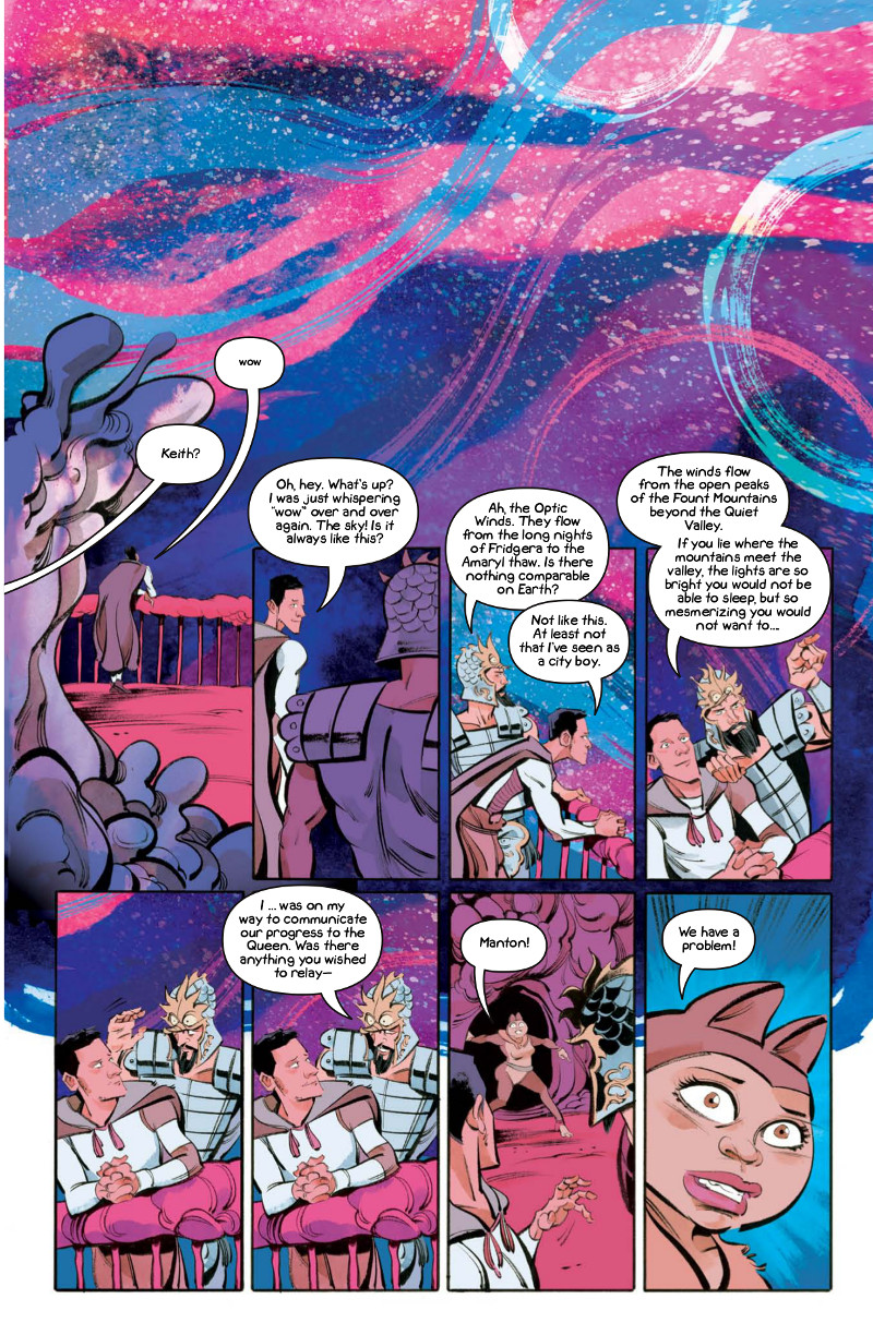
In issue #5, we get our first look at the stunning, northern lights-esque Optic Winds of Kaptara. It’s a stunning sight, and it found me saying “wow” alongside Keith. How much of the world of Kaptara was developed ahead of time? Was an element like that something you and Chip had already decided to include, or is that more of something that comes together as the book goes along?
KM: I’d like to say that a lot goes into planning the whole look of this alien world but there really doesn’t seem to be enough time to think ahead. A lot of the design is just made up on the page as I go. Basically the only thing that was made up ahead of time was a few character designs. For the Optic Winds, I guess I like to make sure the art has as much as a hand-done look as I can manage while still finalizing in photoshop. I prefer collaging in real ink blobs, splooshes and splashes to using custom photoshop or manga studio brushes. Some of them are great, but they still can’t quite get the same look as drawing by hand. Very close, but even then, drawing by hand is really fun. Anyway, much of the backgrounds, including the Optic Winds part are marks that I’ve made on paper, cut and pasted into photoshop colour channels and collaged into what you see on the page.
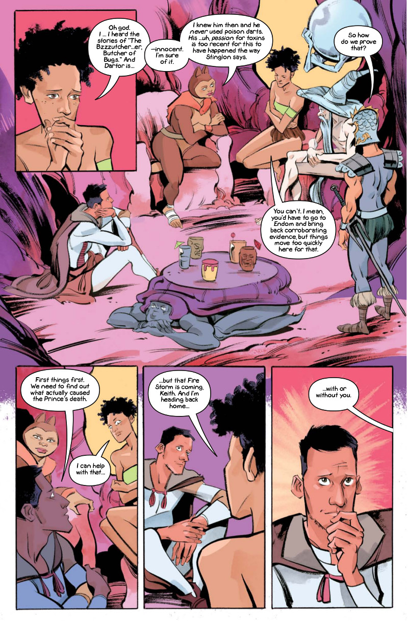
I have to admit: when I first read this issue, I missed that it was one of the native bug creatures that acted as the team’s table. When I went back through it a second time, I saw it and it made me laugh. But that happens a lot in this book (in a good way). As an artist, how important to you is it to not just focus on the primary parts of the action, but fill out the page with little tidbits that add to the page and story?
KM: That’s definitely very important, and I wish I could do more of it (I blame time for not doing so). Chip puts a ton of extras into the Sex Criminals art which is so fun for the readers, so I have to try and do the same here. The Mad artists did that a lot too, throwing in a Max Korn or Portzebie joke that you could tell was not in the script. You could appreciate that these guys loved to draw so much that they would go overboard even when they didn’t have to. Hopefully that comes across in my work, although I always feel like there’s room for more.
A funny thing about the page you just mentioned, I drew and inked the whole page with all the characters sitting around discussing how to get Dartor out of Prison, when Chip pointed out that Dartor himself should not be participating in the discussion. I could patch over with something in photoshop but there was a lot of room to fill, and thus, the coffee table bug was born. If anyone’s wondering, I like to think of them as a race of Tablebeetles who only the Hexamen elite can afford, because they charge an exorbitant amount of space credits at an hourly rate for their services. Laurette would have been completely flummoxed to get the bill for hers, but luckily before she did the firestorm hit and the whole town was… you know.
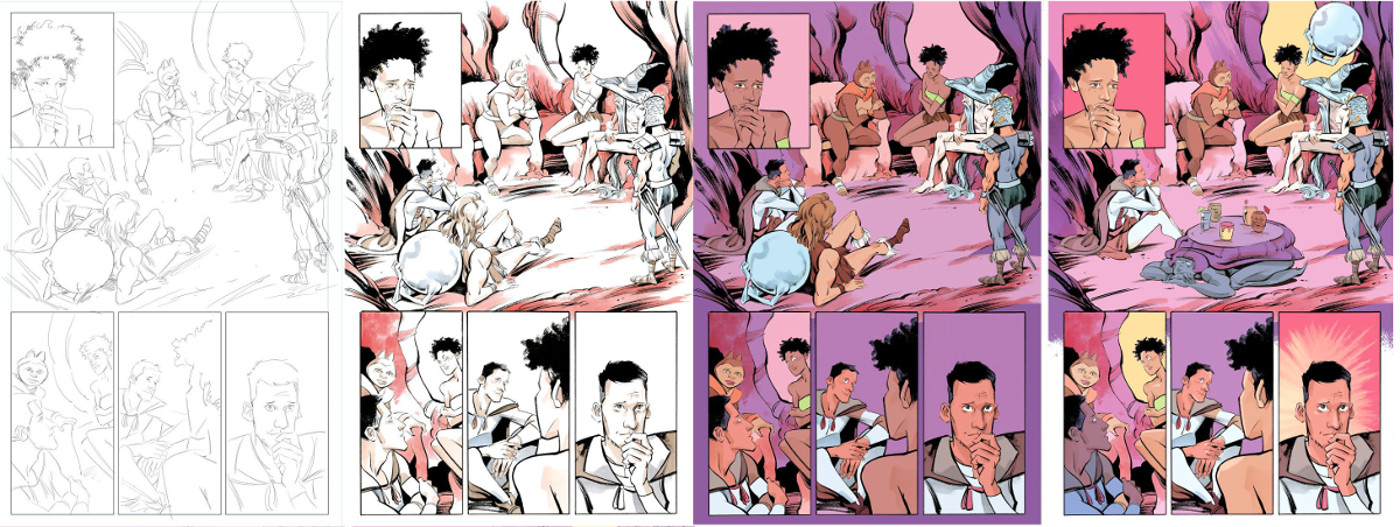
You’re coloring the book, and I really like little elements you do like the color burst behind Keith when he has an idea. When you’re working on that part of the book, how much is built on finding the right answers for each moment? Also, do you find you’re coloring for mood above all else?
KM: Thanks! The bursts and blobs as I mentioned are collaged in, kind of rounding everything out. The figures and objects have a layer of shading done by hand, but I tend to leave room in other areas so I can paste in something from my library of watercolor and ink scans. I think this part brings the page together and keeps it from looking too flat overall. And the flatness again comes from my weakness in spotting blacks, so I try to compensate with very nice colors. As you may have noticed, the mood overall in this book seems to be pinkish purple, which is basically kind of how I remember He-Man’s Eternia feeling as a kid. I may be wrong, I haven’t really looked into it, but that was the jump off anyway.
Becka Kinzie provides color assists for you on the book. What’s her role on the book exactly? Is she flatting, or something a little more than that?
KM: Yes, Becka is flatting the inked pages, though she’s got a good colour sense and helps in choosing palettes for different scenes. Once her work is done it’s easy for me to make selections and make sure everything is balanced and flows neatly with preceding and subsequent scenes.
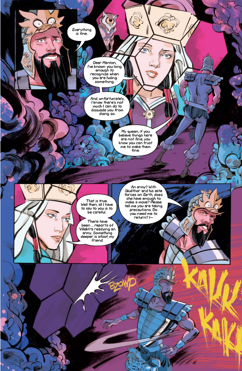
I really love the “KAKK” SFX on this page. It reminds me of a more raw version of the almost calligraphy like SFX (and logo) of Infinite Kung Fu. For SFX, is that all hand drawn or did you find a font that works for you? And is SFX something you think of as you’re putting a page together or is that worked in at the script stage?
KM: Yes, these are hand drawn on the page (sometimes on a separate piece of paper if it’s an afterthought). I have been drawing them in black and selecting them and pasting them into a color channel to make them stand out. I do like the rough calligraphy look, and it’s much faster and easier for me than block letters.
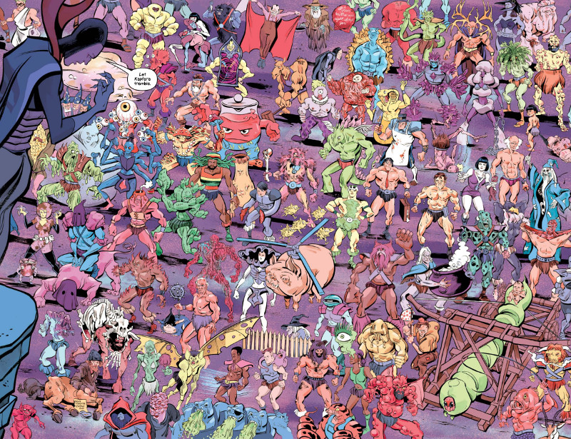
I know these are the last pages of the issue and it’s a big moment, but I have to ask about it. At any point of bringing this spread to life did you think to yourself, “what did I get myself into?”
KM: I knew it would be a lot of work, and I do think it’s worth it to dive into pieces like this. One of the things I didn’t anticipate was how much time we would have to spend on coming up with the characters. Here’s a secret, for the back matter in the trade paperback we provide a short bio for pretty much every character on this spread. So knowing that, I wanted to make sure each one had a name first, which would better instruct me on what to draw, and later us both to come up with some ludicrous backstory for them. It’s amazing how long this takes after you’ve come up with the first 20. There are almost a hundred new characters here, and they seem to get dumber and dumber, which hopefully readers will appreciate. We took a look at some old He-Man characters and their rip offs, and it’s almost impossible to parody them because they’re so crazy to start with.
How much of the development of this page was you and Chip sitting around and riffing on character ideas and generally trying to make each other laugh?
KM: Yes, that’s basically the idea, we came up with a bunch on an airplane coming home from a con, then got together to draw a few. You can see a video of Chip and I actually making up a handful of them here:
We’ll close with the most important question…is that an evil Kool Aid Man? That’s where I look first every time, and my answer is yes.
KM: Yes, his name is Brute Punch. It’s unfortunate that he’s so prominent in the spread being such a terrible idea, but it’s the nature of his large juggish physique. He might be sort of an homage to our favourite discovery while looking up ’80’s characters. Masters of the Universe had a character contest and I believe Bruce Timm drew the finalists based on children’s submissions, and one stood out from the rest as the clear winner. She’s worth looking up — Netta, the beautiful potato-shaped net-woman who holds people down until He-man can get there and stab them I guess.
Kaptara’s first collection arrives December 16th. Haven’t read the book yet? Pick it up for yourself, or maybe get it as a Christmas present for a loved one out there who likes their comics a little on the weird (but awesome!) side.