
“A Good Balance is Necessary”: Álvaro Martinez Bueno on the Horror and Humanity of The Nice House on the Lake
While I’m nowhere near having anything resembling a favorite comics of the year list ready quite yet, one extremely easy addition to my shortlist would be James Tynion IV and Álvaro Martinez Bueno’s DC Black Label series The Nice House on the Lake. This series begins as a once-in-a-lifetime getaway for a group of friends quickly becomes something considerably more horrific, but also much more, as Tynion and Bueno are crafting one of the most engrossing, immersive comics of the year. I’m, perhaps unsurprisingly to you given the intro of this piece, obsessed with it.
What might also be unsurprising is that I reached out to Bueno to chat about his art on the book, and what led him to this project and crafting it in such a way. The Spanish artist is an absolute revelation on the series, taking his already quality art to another level, and recently, we put together a sprawling art feature interview about his art story, breaking into comics, working with Tynion, the stories that best fit him, and more, before we discuss some of my favorite, least spoiler-filled pages from the first issue of this series (which is now four issues deep). It’s a great, insightful chat with one of the best artists in the business today.
It’s also open to non-subscribers. If you enjoy this chat, consider subscribing to SKTCHD for articles like this and more! By doing so, you support the work and get access to all of the site’s content.
I read that you started drawing your own comics back when you were just four years old and you’ve been doing it ever since. I am sure you’ve come a long way with your art, unless you were the most incredible child artist ever. How did you develop your art? Was it all just practice and study and reading, or did you go to a school of some variety to work on your craft?
Álvaro Martinez Bueno: Who says I wasn’t the most incredible child artist ever?! Just kiddin’, I obviously wasn’t. I devoted my life to drawing. It was my main interest and I spent as many hours as I could trying to improve, first by myself, later with private art teachers and then studying (for) a Fine Arts degree. There I became interested in other crafts like painting, filmmaking, illustration of all genres, design, music. I wish I had studied something more comics focused so I had learned all the techniques in comics making that could have been very useful later in my career but perhaps studying Fine Arts made me a more complete artist.
Anyway, I couldn’t thank my parents enough for encouraging me to follow my passion and not trying to persuade me to study another career more “serious,” like sadly happens sometimes with other kids.
You’re from Spain. While it’s a country with an incredible history of exemplary comic artists, your path to breaking in to comics might not be as direct of one as it would be for American artists touring conventions to make connections. What’s your breaking in story? And did your home of Spain play a part in your development, either as an artist or in terms of making connections in comics?
ÁMB: It’s not a very thrilling tale, I’m afraid! I started working with an agent who had a long career representing Spanish pencillers, inkers and colorists in the US market. He showed my samples to Marvel, DC, Dark Horse and Valiant editors and usually got a very polite negative reply. But Warren Simons from Valiant needed someone to fill in half an issue of Harbinger and must have seen something in my work that made him think it was worth the shot. I did 11 pages in a week and started gaining his trust. Lucky for me, I haven’t stopped working since then.
As for your second question, living in Spain doesn’t quite help (with) making connections, for sure. But I’d say I have managed to build strong relationships with a few editors and creators worldwide. Also, we Spanish artists are a very united bunch. Most of us are really good friends. The other half of the question…it’s a very interesting one. I (asked) myself (it) many times and discussed (it) with other Spanish creators often, the role that being Spanish plays in our vision of the medium. I agree Spain is a country with a humongous art tradition, not only in comics but in literature, music, art.
In a way you could say art tradition is bonded to our culture. In the particular case of comics, I’d say we are influenced not only by US comics, but also bandes dessinées, the English magazines, manga and also that millennial art tradition I mentioned. Of course, this is not something exclusive to us, much less in a globalized world. But I think it has been a part of our DNA for decades. I think this translates in many (ways). We do care strongly for storytelling, for conveying rich backgrounds and strong figure work. We are also very committed with design and composition. Javi Rodríguez, David Lafuente, Germán García, Pepe Larraz, David López, Marcos Martin, Gabriel (Hernandez) Walta…there’s so much talent around here.
You worked with James Tynion on Detective Comics and Justice League Dark before, so you already had a connection. How did that lead to The Nice House on the Lake, and what was the appeal of that project for you?
ÁMB: We have built a strong relationship through all those years working in the Batman group series and Justice League Dark that I think is based on mutual admiration, respect for each other’s work and an understanding of how each of us can contribute to the other’s craft. I know I became a better artist illustrating James’ scripts. In my composition approach, in body language, in pacing…I see The Nice House on the Lake as somehow the sublimation of our work together so far but, at the same time, the next step in our collaboration. We are still learning from each other.
The main reason why I decided to jump into this project is quite simple, honestly: I wanted to work with James and Chris Conroy, our editor. Of course, James presented a brilliant pitch and I could see in that first document its potential to become huge. But there was something else at the core of the story that really touched me. This is a horror apocalyptic sci-fi story, but also one of a group of thirty-something friends that are slowly drifting away from each other. I definitely could relate to that, watching my own gang part with the ups and downs of life and realizing that, even if we were like family for decades and we do love each other, getting together again is becoming more and more difficult with each year passing. This is something that I’m sure most people of my age can understand and relate. Well, the The Nice House on the Lake gang managed to get together again but, unfortunately, it’s the end of the world out there!
The bulk of the work you’ve done early in your career has been with superheroes, both for Marvel and, predominantly, DC. The work you’re doing right now is on The Nice House on the Lake, a decidedly not superhero title. Do you feel like one fits you better than the other, both from an art and a personal preference standpoint?
ÁMB: I realized a while back that, for me, drawing comics is trying to emulate that youthful feeling of being by myself in my room drawing the characters that I loved, caring about nothing else. Those are my fondest memories and I try to replicate them every day. Those characters were mostly superheroes, of course, and I realized too that many times, consciously or unconsciously, I’m also trying to replicate drawings or even entire panels from comics that I was absolutely obsessed with back then. Sometimes this surprises me once the page is done. “Shit, this is like that Byrne Alpha Flight panel!”
But while I was mostly attracted to classic superhero artists (Byrne, Davis, Lee, Pacheco) I was also fascinated with those with perhaps a more unique approach to the genre: Sienkiewicz, Barry Windsor-Smith, Golden, Romita, Jr., Chaykin. And then, with adolescence came other kind of readings and obsessions, the Hernandez Bros, Clowes, Hewlett, Shirow, Moebius. And, like I said, later in college I became obsessed with lots of creators from many disciplines, not only comic artists but painters, designers, film directors.
So, in a way, all my previous work in comics was me trying to channel all that superhero lore and The Nice House on the Lake is the recipient of not only that, but also all those later influences. I’m starting to think that I won’t reveal my true final form until I’ll go back to doing superhero stuff but bringing in everything that I’m learning in this series. (laughs)
Let’s start the page breakdown with the double page spread from issue #1. This is one of those pages that feels like it either needed a hyper specific script, utter freedom and trust between the creators, or a mix of both. Which leads me to this: how do you and James work together? Is it pretty loose in terms of you finding the right visual solutions for each page or spread, or does it really depend on the page?
ÁMB: James breaks down the page to panels and provides me with a brief description of the scene, some acting and the dialogue. Sometimes he also indicates the size of a particular panel. After that, I usually have full liberty to compose the page and I can also make small changes to the pacing if I think it is needed, adding or removing panels and stuff like that. But I try to stay close to his guidelines. Anyways, I think that, as we become more confident in our storytelling skills, we better identify the things that each of us can contribute to make the story stronger. That means sometimes stepping aside, and other times taking full control. I have full trust in James’ writing and l believe he feels the same about my art.
Speaking of process, what’s your process when it comes to working on an issue of this book, from getting the script to sending pages off to Jordie Bellaire for colors (or onto your editors Chris and Marquis if that’s the case)? Is it pretty similar to the way you usually work, or are you approaching Nice House a little differently?
ÁMB: There are certain aspects that have changed for me in this series. The most important is that I started inking myself and that I started working all digitally. I was familiar with the digital tools because I’ve spent years making a digital outline with Photoshop before doing the final pencils but nothing like this! I was so unsure at first that I thought I was going to break down, but I ultimately found my way. The rest of my process hasn’t changed much: I send layouts to the team, get feedback from them and I start working. I send bunches of five to ten inked pages to them, get feedback again, I upload the final pages and try to get some overdue sleep.
One thing that has also changed is that I’m way more involved in the final aspect of the series. Not only am I inking myself and the control of the linework and shading that comes with it, but I’m also doing my own painted covers, with a concept for them that extends to the whole series. And I designed the series header, the characters’ icons. We supervise the variant covers too. I appreciate the confidence that the whole team and DC has in me for all these matters.
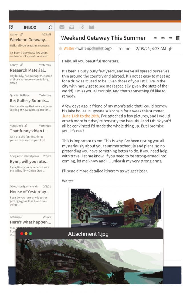
I’m curious about pages like this one, which depicts Ryan’s email inbox, most specifically the email she received from Walter talking about their getaway trip and the amazing house they’d be staying at. Do you build out all visual elements for the book, even the pages like this? Or is this you working in concert with someone else?
ÁMB: Oh, that has to be James, Deron and the guys at AndWorld Design credit. I usually provide illustrations for those design pages – and sometimes, like in issue #3’s notepad pages, I illustrate the whole thing – but they create all these fantastic pieces. And, let me say, they are incredibly well done, giving lots of information and making the story move forward while looking exciting and modern. There’s one particular design page in issue 4 that is so powerful that, for once, we couldn’t say that an image is worth a thousand words, but rather the opposite. I couldn’t land that idea with drawings. I love what they are doing.
I wanted to talk about the house itself. How did that specific house become the house? Is it a house that existed that you adapted into the comic, or did you build it out yourself? And when you work on the book, do you have the entire layout of the house figured out so you can make sure you’re mapping scenes out correctly?
ÁMB: It was a collaboration between James, Chris, and me. We were looking for a really special house – it could not be otherwise in a series with that title! – inspired by the Californian residential architecture of the 20th century, by Lloyd Wright, Richard Meier, Richard Neutra or Ray Kappe. I started looking for references of those beautiful, open spaces when we were right in the middle of COVID-19 lockdown so you can tell it was a pretty strange experience! Then we drew up a list of the spaces we needed for the story and began to distribute them on a basic floor plan. I made a lot of sketches and plans, until I found a layout that convinced me and seemed interesting.
Next, I began to raise as many views as I could to imagine the rooms and the basic appearance of the house, as well as its fit in the landscape. Then, at some point, I started to simplify it as much as I could. The first views were richer and more complex than the final version, but I realized that there has to be an unsettling feeling to the house, in addition to its opulence, so I decided minimalism was the way to do that. At the same time, I didn’t want to lose a kind of a warmth to it, so I opened it very much to the natural surroundings, with huge windows and platforms overlooking the lake. You can realize with the passing of the issues that the space surrounding the characters becomes more and more abstract. There are backgrounds that are only a black square with a few lines over it. I’m starting to feel very comfortable with those graphic approaches.
I have to ask: does an official team map of the larger area exist? I know a character in issue #3 was busily figuring out the area himself, but I imagine for you all to be able to tell that part of the story, you’ll need to know the area yourselves.
ÁMB: It’s a bit more organic than that. We know that there are a few locations key to the story but otherwise we don’t want to restrain ourselves very much. It’s kind of a round trip collaboration. For that particular scene you mention James gave me the freedom to create all those spaces, the greenhouse, the sculptures tunnel…I just came up with them and then James crafted his magic over it, with all those crazy ideas about birds and sound suppression. Likewise, in other occasions its him who describes the location and I follow his guidelines.
When it comes to interiors like this, which are set in the interior of the house, how do you go about maintaining consistency of layout and look issue to issue? Do you have this room built out in some sort of software like SketchUp or something for consistency, or do you approach it some other way?
ÁMB: At first, I thought I could use a 3D version of the house and I even reached out a friend who is an architect to help me create blueprints with AutoCAD that I could export later to a 3D program or use as a guideline. We did a couple of floor plans but then I realized I really needed to start producing actual comic pages (and he was very busy as well) so I left it aside. I do have dozens of freehand sketches of the house so it’s pretty clear in my head. Again, I don’t want to restrain myself and, if I want to change a particular room or space for story purposes, I just do it. It is something that I have discovered in my way of working. I need a lot of previous planning work to feel safe but, at a certain point, I have to let go of the reins a little. Otherwise I get stressed.
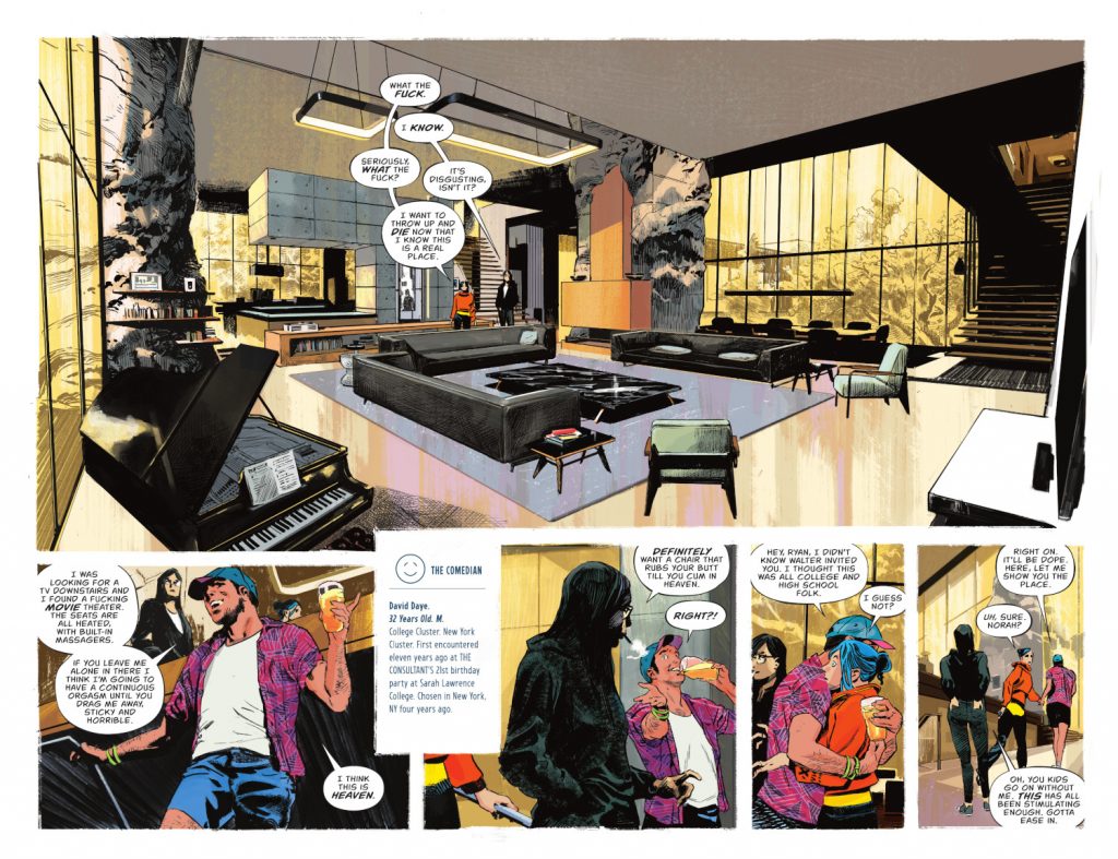
This spread really starts working other characters into the book, and I wanted to ask about them, the cast. This title has a finite cast, and it’s crucial that they aren’t just written differently, but each given their own unique visual identities from one another. How closely did you and James work together in developing these characters, and what was your approach to turning these characters into true individuals, both in terms of how they look and how they dress?
ÁMB: Yes, it’s crucial for me indeed. I’m aware that with a cast this large, with regular people dressed in casual clothes might be a bit challenging for the reader at first to get familiar with. I honestly don’t know how James managed to fit all that info in only one issue, but I tried my best to live up to it and make them look distinct. This was difficult because they don’t have colorful uniforms or props or stuff that made them easily recognizable, like in superhero comics. James’ descriptions of the characters were very clear – I think he used his friends as inspiration – and that made it easier for me to visualize them.
What I did was, again, ask for advice from a friend of mine who works in fashion, and we gathered together a full wardrobe for the characters, trying to reflect their personalities with it. We also made Pinterest folders for everyone which turned out like an excellent tool for references. Keeping consistency while offering a personal look for each one of them is definitely one of the graphic challenges of the series. What I couldn’t see coming was that, in the end, they would spend most of the time wearing swimsuits, PJs and stuff like that. (laughs)
This shows one of the icons that represent each character: The Comedian, with a smiley face. Did you create that iconography? How did that develop?
ÁMB: That’s right, those are my designs.
James launched the idea that they should have logos and a designation, and I thought it was a brilliant one because I was quite obsessed with finding recognizable graphic elements for the reader to identify quickly. The symbols worked perfectly not only for that but also for building the mythology of the series. The same thing goes for the statues.
In designing the icons, I tried to stay quite simple. I traced two concentric circles with two 45 degrees crosses and some dots at the points where they crossed. (I cheated a bit with a couple of them though!) Then I started decomposing that into all the symbols. I’m very proud of a few of them, like the one you mention or The Writer one.
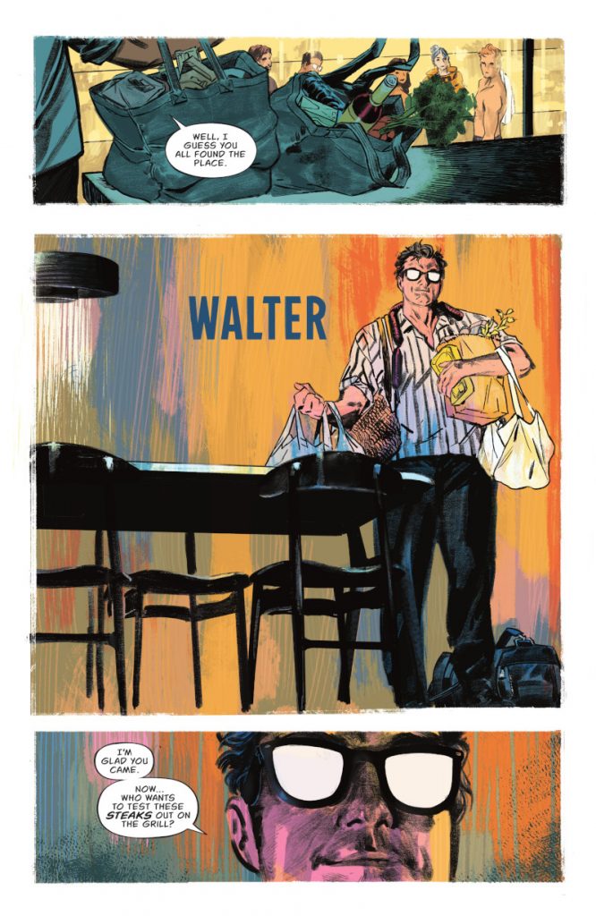
Walter is obviously a pretty important character in this story. He also is an outsider, and someone who has less of an identity than his friends to us as readers, both visually and in terms of what defines him as a “person.” I imagine, perhaps even more than his friends, you and James talked about what Walter needed to look like. When you were first designing him, what were the most important visual characteristics to Walter, and how did those help define and differentiate him?
ÁMB: Walter is a very complex character so, yeah, it took a while to develop his visual appearance. James based Walter on himself, so l already had some of the path clear. He also proposed the blank glasses, which tied me a bit expression-wise but helped very much to convey a most needed weirdness to him.
In my first sketches he was way more unsettling, wearing a raincoat and kind of looking like a serial killer so we had to back up a bit. James pointed out that, of course, he should look mysterious and, undoubtedly, he had put the cast into a horrific situation. But he was also their dear friend, and he did care for them. He had to be charming but scary as hell too. I remember thinking very much on Phillip Seymour Hoffman, one of my favorite actors, while sketching, how he had that innocent yet disturbing expression at the same time. It didn’t take much longer to have something that we could use once I had all these concepts clear.
And then there was his “other form” – trying to avoid spoilers as much as I can! We went back and forth with it, from “organic” approaches to more “glitchy” ones until I found a combination of them. Francis Bacon was a huge inspiration here, of course.
One nice part about this page are the streaks of color behind Walter, which don’t say anything specific about him but do give us a certain feeling as we read it. They’re a perfect decision by Jordie. When it comes to the colors, do you and Jordie talk a lot about the feeling you’re all going for? Or is she just such a pro, you just let her go at it?
ÁMB: A curiosity about that page. I drew the entire kitchen behind Walter – it took me almost a day to do that! – but decided to eliminate it in a fit. I thought that a little air was necessary after the density of the previous pages, very demanding for the reader with the presentation of all the characters. Jordie just did magic with that color streaks. By the time she colored that particular page she already had blown the minds of the entire crew a couple of times and yet she did it again.
I remember she first sent a few pages in as a trial with a slightly more contained color approach that was already amazing, but then sent another one where she started to cut loose, asking us if it was okay if she did so…of course, we said yes. I’m constantly amazed by the fact that, even if she already has had a long, successful established career, she is still trying to evolve. I think her color art in TNHOTL had made this book stand out on the shelves. It’s unique.
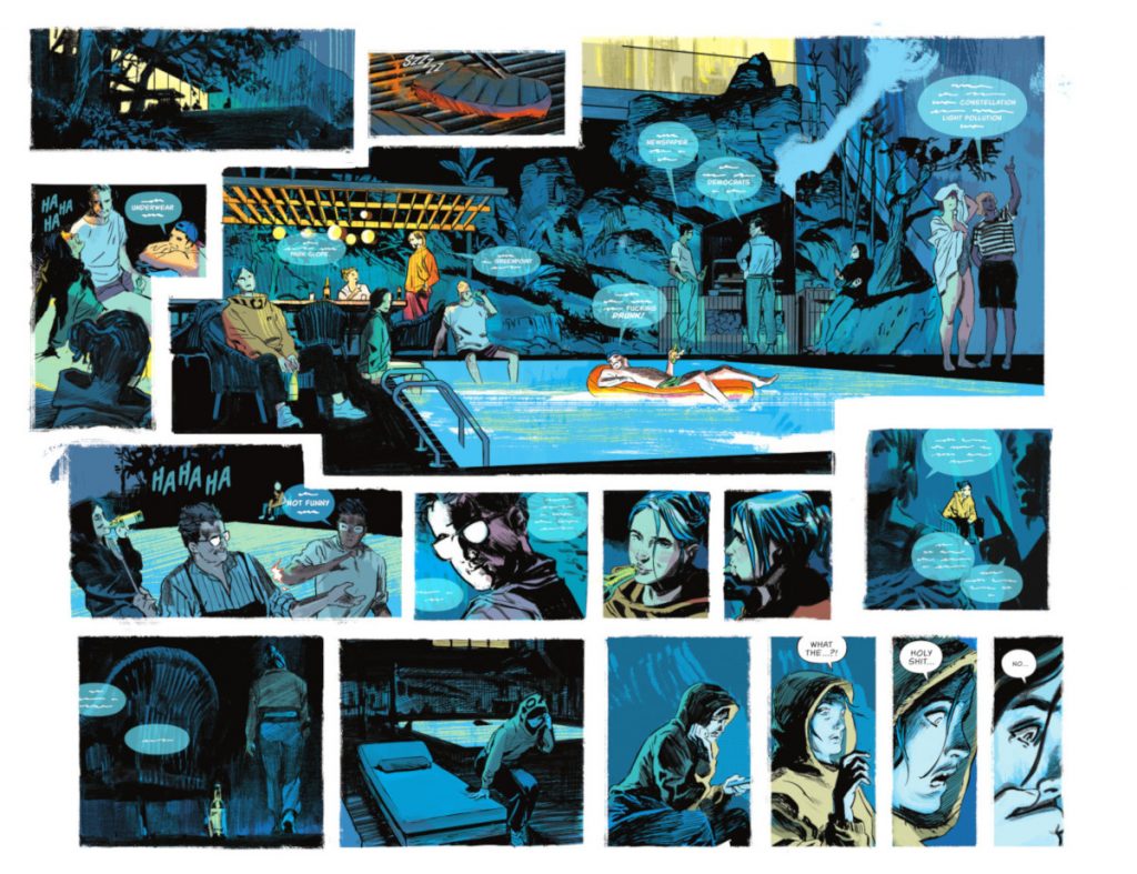
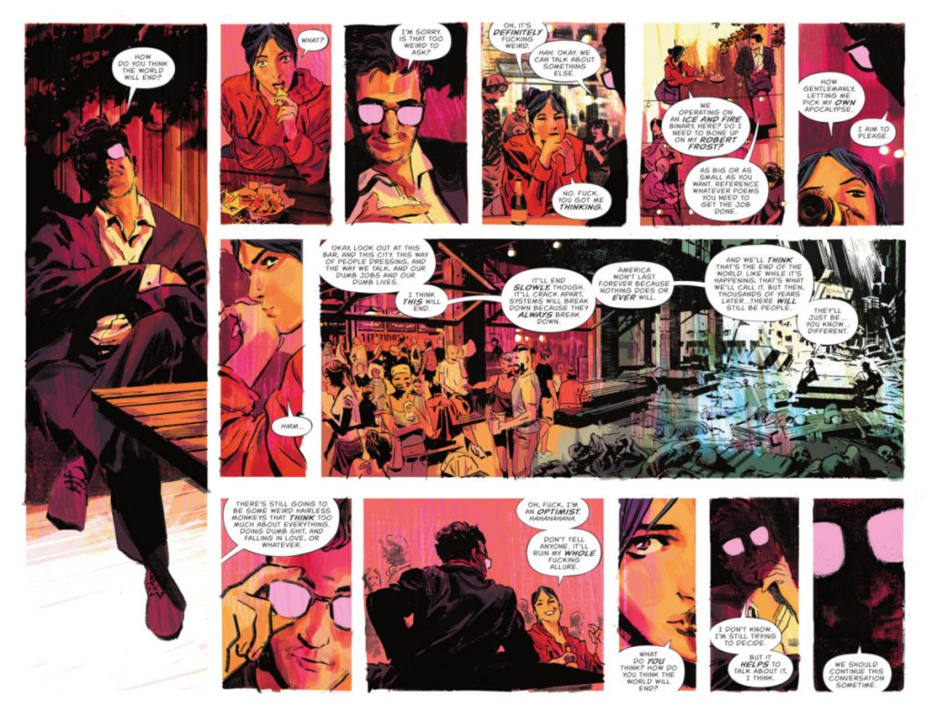
This page is another Tetris page layout, but I wanted to ask specifically about the final four panels of it. They’re perfect examples of pacing, how zooming in changes our read, and character acting, with those three working together to make this moment really hit. When it came to this moment, why split it into those four rapid panels like that? And how does that help you elevate the impact of the moment?
ÁMB: This was a tricky double page spread! In this case, there was only a brief description of the scene by James, so I had to come up with almost everything. The one thing (that was) very clear is that everything had to build up to that specific moment. We had to start with a peaceful, friendly scene, perhaps the last moments of happiness our characters would have for the rest of the series, moving from there to that pure horror final discovery. So the first thing I did was separate the page into two layouts.
The first one, in which we needed to convey that joyful summer night feeling would have a central big panel and all of that brief, buzzing, last glimpses of happiness would orbit around it, giving the feeling of a mosaic. Then, Ryan’s growing discomfort would lead her to abandon the scene, so I placed that bottom tier apart from the rest of the composition. This helped me to just focus on her and, like you said, bang the drum with rapid panels, zooming in to her face for that final revelation.
Also, I would love to give a shoutout to Deron and AndWorld for their lettering work here…it’s just outstanding.
I love your character acting. Each of these characters feels so real, and a huge part of that is every choice you make with each cast member. To you, what’s the key to bringing characters to life without perhaps overselling the mannerisms and gestures that help you do that? Is there a balance necessary there?
ÁMB: Thank you very much, good character acting is something that really matters to me. I realized very quickly that I had to up my game in this regard with this series because the cast felt so alive in James’ script that I knew it was my duty to live up to it.
A good balance is necessary. You are absolutely right. I obviously searched for inspiration of all kinds while creating the visual aspect, and I use photo reference taken by myself or found in Google from time to time to help me visualize specific poses or expressions. But I try to avoid relying on them (so) much because it would lead to that mannerism you mention. I searched for real people reference at the very beginning of the development stage for each one of them — and I could make a list of the exact references, some are mixes of famous people, some are friends or people that I know – but, at some point, they “clicked” in my head.
From there, I stopped looking because the moment they “click,” they already seem real to me. But that doesn’t mean that they are fully formed in my head. I also have to internalize them; I have to know them. And, since each number is centered on one character, that’s when I fully assimilate that particular character. I know it’s something that perhaps should be clearer from the start, but it is also a journey that I do. It is interesting that they grow in me as they do in the reader.
On a more graphic note, I’m trying to experiment with my linework when it comes to figures. Sometimes I start with a huge freehand brush stroke and start building the faces or the bodies from that, others I do a very regular outline with no variation and then I start breaking it. This allows me a fresh approach every time and I think it shows in the final page.
It’s obvious that a whole lot goes into this book visually. That’s why it didn’t come as much of a surprise that you all were taking a significant break between the first and second arc. What does that help you do? Does that buy you enough time to be able to keep this level of quality going throughout the whole run? Is that the hope at least?
ÁMB: Yeah, I’ve seen some people online speculating about this hiatus being motivated by James starting to work with Substack, but, while James surely has a lot on his plate now, it’s mostly me who needs this extra time to achieve the quality standard I set myself up to, unfortunately. I’m definitely not a quick artist and in Justice League Dark or the other series I have worked on I could rely on having other artists doing a few issues every now and then to catch my breath – and yet I was able to do almost 20 issues of JLD in two years – but that’s not the case anymore.
TNHOTL has to be drawn all by me, so this is something that was planned many months back, when it became clear that I wasn’t able to keep up with a standard comic book pacing. I wish it was otherwise but I truly believe this is in benefit of the story and the reader. I also would like to take the opportunity to thank all the people who have expressed their support for this decision.
Thanks for reading this interview with Álvaro Martinez Bueno. Want to read more content like this? Subscribe to SKTCHD for weekly features, interviews, and more.