Cartoonist Ben Sears Talks His Art, Background and The Sweeper
In 2016, the comic industry’s an increasingly competitive one. There are a ton of comics being released today, so that means it can be hard to get your own work get noticed – even if you’re releasing your comic at what is ostensibly a bigger publisher. And for the people who are self-publishing or releasing their work at smaller houses, it can be even more complicated. But in that side of the industry, there’s a ton of phenomenal work being created on the regular. And for me, one of the most exciting cartoonists publishing work of any size is Ben Sears. He’s a guy that’s released work at Koyama Press and Study Group Comics (including a favorite from last year, The Gleaming Corridor), but also publishing his own work, like The Sweeper, a wonderful short story he’s dropping this month.
Today, Sears talks with me about his art, how he got into comics, his process, how the Sweeper came together, his affinity for silent comics, and much more. Sears is an exciting new creator, and one I’m really happy to see new work coming in the form of The Sweeper and April’s new Double + adventure, Night Air.
If Sears is new to you, make sure to check out his site, follow him on Twitter, and give his webcomic Double + a read on his site.
You’re newer to comics, although from the sound of it, art has been a big part of your life for a long time. What made you want to get into crafting your own comics, and what was the biggest push into getting them published on a bigger scale?
Sears: I’d spent most of my life drawing and enjoying it, but it wasn’t until my last semester of college that something in my head clicked and I decided I wanted to draw comics. I’d been doing artwork for bands before that, so it was something new and challenging. Going to SPX in 2014 and experiencing a big group of people who made and supported weird little comics was a fire that I’ve kept under me ever since.
What’s your art background? Did you go to school for art at all, or are you entirely self taught?
Sears: I have a BFA in graphic design. I wanted to stay in Louisville, and it was the closest thing to commercial illustration that U of L had. My parents have always supported my drawing, and high school had a great art program, so that was how I got foundations down. I think having that graphic design education was great. The cartooning I like is all about getting the information across in an economical way, and that’s the bulk of graphic design so it worked out pretty well. I’m pretty much self taught with drawing comics, though. I struggled for a year or so doing really bad comics that were only a few panels or pages, and I guess after that I worked out enough of the kinks to try something longer.
I have to ask…I read in an interview with you before that DC’s New 52 initiative was a big thing for you in terms of making comics accessible to you. I found that to be super interesting. That said, looking at your work, I’d be hard pressed to look at any of that as an influence. For you, what were the biggest influences both inside and outside of comics?
Sears: That was a big thing for me in terms of getting into mainstream and monthly comics. It’s pretty nerve-wracking to walk into comic shop for the first time wanting to read Batman and thinking you’ll have to read the other 637 issues to know what’s going on, so having a bunch of #1’s (however horrible they were) made it easy. I still really love that Batman INC comic. Far Side, Calvin & Hobbes, and newspaper comics like Foxtrot have always been a big part of my life. The way Bill Amend drew Nintendo 64 controllers in that strip still sticks with me for some reason. I didn’t know there was even an alternative comics scene at the time, and if I had then I probably would’ve gone with those when I started reading comics again. I think I knew about Jason’s comics, and maybe that’s it. When I actually started drawing comics seriously, I found that I drew more from stuff like Mr. Bean, The Three Stooges, Indiana Jones, and Pokemon & Zelda video games.
It seems you’ve struck up some pretty great partnerships with Koyama Press and Study Group Comics when it comes to getting your work published. As a creator, what makes those houses great places for you to publish your work through?
Sears: They’re great to work with because they’re both run by people who are decent human beings. Zack was nice enough to run a comic made by a nobody on his website, and then help put out the printed version. I’m always going to be thankful for that. Annie Koyama only puts out good comics, so it was shocking when she said she would put out something I made. She cares a lot about the books she puts out, but she also cares about how I’m doing, too. You don’t really encounter that in many professional relationships, and I feel like all Koyama books benefit from that extra attention.
Let’s talk about The Sweeper, your upcoming comic that you’re going to release. For a book like that, what’s your process like? Are you writing a script out, or is it really you figuring things out as you draw? And beyond that, what are you using to craft your art? Seems like a mix of traditional and digital mediums, but I’ve been wrong before!
Sears: That comic was born from a need to be distracted while I was pulling shifts at the hospital helping out with a family illness. I had wanted to do something with those characters for awhile, and all that time sitting around made it easy to get it done quickly. It’s a silent comic, so it was more of a list of things I wanted to happen. After I got the beats down and pages thumbnailed, it went pretty quick. A lot of the humor and action gets figured out through tiny gestural drawings in the thumbnails, so the hardest part is usually figuring out how to translate that to a bigger comic panel Everything I draw is just pen on paper, with digital color if I need it.

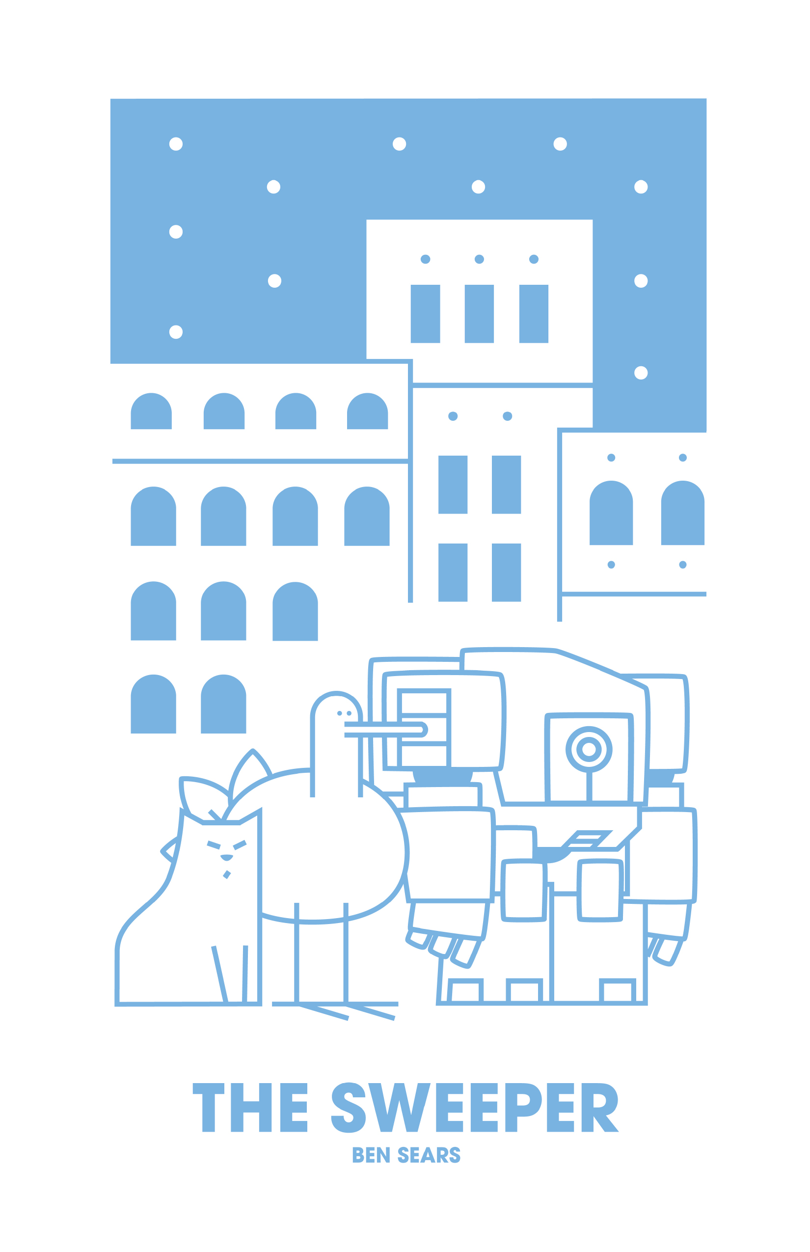
I wanted to start with a question about the cover. I love it. It’s quiet, simple and charming, and it introduces the players well. But one thing I noticed on both this and The Gleaming Corridor is how, unlike the interiors, it’s not pen. You go with a much more graphic look. Why is that?
Sears: I like the more illustrative design work of Alvin Lustig, Raymond Loewy, Ellen Raskin, Tomi Ungerer and Ann Jonas. It’s a lot of icons, bold lines, and flat colors, which I think works well for posters and book covers. Those artists are pretty far off from my cartooning style, but when I design things I find myself going back to their work for inspiration. The Sweeper cover is more narrative and straightforward, which reflects the story inside. The Gleaming Corridor has a lot of different themes going on, so I tried to just combine all of them into a family crest kind of design. All of the design work I do for my band ends up looking like this, and I have a feeling I’ll eventually make a comic in that style.
For the story itself, it really reminded me of a lot more of animated films I’d seen in the past more than any comic, particularly Wall-E. Were there any notable inspirations for you on this project? Or was it more of something that just came together as you were having fun with the characters?
Sears: I drew this comic pretty recently after seeing The Third Man and Shaun The Sheep. I’d been messing around with silent comics on The Gleaming Corridor, and seeing Shaun The Sheep convinced me to keep going with it. Those two movies were fresh in my mind, but Jacques Tati’s influence has been working its way into the stuff I do for awhile.

Both this and The Gleaming Corridor are completely silent. I mean, you use word bubbles, but only to communicate sounds – no actual words. I know that wasn’t the case for Double +, but for The Sweeper in particular, what made this a story that you wanted to tell entirely with your art?
Sears: I’m not a very talkative person, so silent stuff has always been more appealing to me. I think it was a subconscious gravitation that I wasn’t aware of until recently. Mr. Bean and Three Stooges were always on when I was growing up. Three Stooges shorts have dialog, but there will be like a five minute span of just violence or sound effects that says more about the characters than dialog would. I saw Tati’s Playtime for the first time a year or two ago and it was a revelation. There are maybe a dozen lines in the movie and it was the greatest thing I had ever seen. The whole thing is just one big set piece after the other, and the movement of every actor seems like it’s painstakingly coordinated. After I saw that movie I made it a personal goal to try and recreate that feeling with my comics. It’s tricky since I don’t have control over what music people are listening to, but it’s a good challenge. Even though Mission Impossible: Ghost Protocol is a huge summer blockbuster movie, there are a few really great sequences where no one is really talking. It’s so engaging for me to sit and watch characters interacting with their environment in silence.
Not to make it seem like you’re a complete neophyte, but you’re newer to comics. Not only that, but you’re doing things on your own, mostly. Do you find that each project you take on you’re learning more about your style and how you like to tell a story? Or do you have a pretty good grasp on what you’re trying to do at this point?
Sears: Before I drew comics I would put out little zines of my sketchbook drawings, so I was used to putting everything into booklet form, taking it to Kinko’s, and then selling it a few hours later. Now whenever I have a few weeks or a month in between big jobs, I’ll draw a comic and put it out myself. It ends up filling the gap in between the published things coming out, which is nice because it keeps myself and hopefully readers interested.
With every new comic I try and do something that’s out of my comfort zone. If I’m just doing the same thing every time then I’ll get bored and that will be reflected in the comics. I’m definitely still learning how to tell stories visually, but I feel like I’ve got the basics down and now I can work on style experimentation. I’m going to keep doing comics set in the Double+ world until I don’t have anything left to say, which I don’t really see happening anytime soon. That’s nice because I know exactly what that world looks like, I just have to figure out how to draw it.

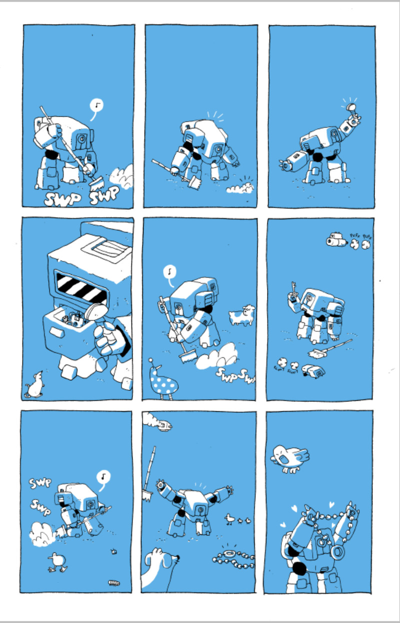
The nine panel grid is a comic classic, but one thing I really like about the way you do it is how its all hand drawn. The panels are imperfect, but it adds charm to the page. Was deciding to go that route more related to the situation you were in while developing the book, or is that just how you prefer to line out your panels?
Sears: I used to stress about perfect panel borders, but then I saw a Moebius comic where they were super shaky and inconsistent. I figured if he could do it, it’s probably okay. I lay out all my panel borders on the computer and print them out on drawing paper, but I trace over the template freehand so it’s got some character. I think it suits my linework, so I just do that with everything now.
I have to ask: why blue? What made that the right color to work with in this book?
Sears: I knew the limitations of the printer I was going to be using, so I picked the color from their inventory that matched the vibe of the story.

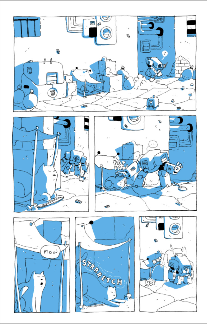
The three main characters in this comic are a robot street sweeper, a cat and a bird. Not exactly the most typically emotive creatures ever. But there’s a ton of charm in each of them, and throughout the comic. I know you said you work on them on a much smaller scale to start with, but what do you think the key is it to bringing characters of any variety to life in a way that resonates with readers?
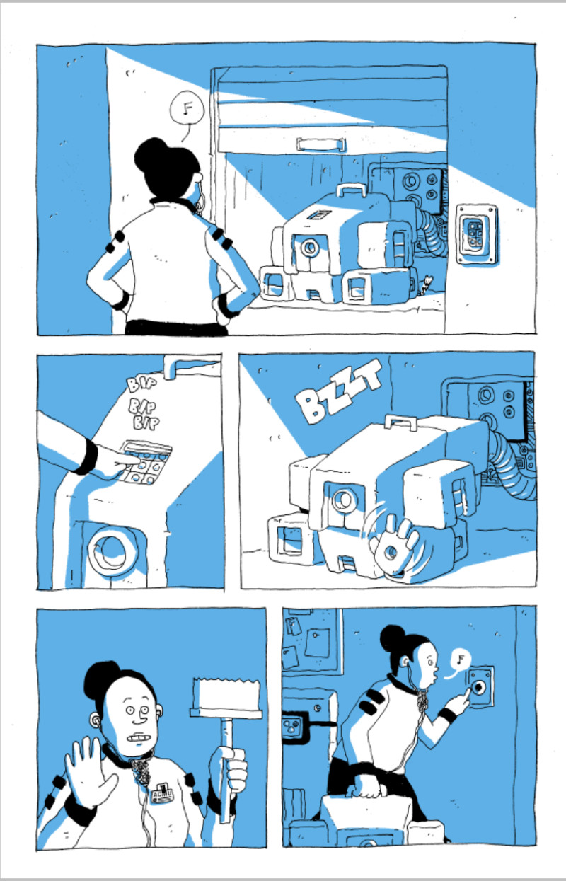
Sears: I work from home now mostly, so I’ve had a lot of time to observe my girlfriend’s cat and watch parrot videos on the Internet. Most birds are weird and have this spastic bodily language that doesn’t make any sense. Cats are really lazy and make great faces when they sleep. The real trick was making the robot funny. Going back to the Three Stooges (again), there’s a lot of bits with them just sweeping up an office or trying to put up wallpaper that are great, even though there’s nothing funny about either of those things. I guess drawing a character being either slightly inconvenienced by a simple task, or being overly enthusiastic about it, makes it funny. Having the robot be overly enthusiastic about clocking in to its night shift made it more endearing.
When The Sweeper is released in full, is it going to be printed in a similar fashion as The Gleaming Corridor? Or is the final version going to arrive in a different format than your last work?
Sears: I’m getting The Sweeper printed as a two-color risograph book. I’ve either worked full color or black and white up until now, so doing a two tone book and formatting it for that printing process was a new challenge that I wanted to give myself.
Like the look of the book? Pre-order it on Sears’ site. Seriously. Pre-order it. It’s a great little comic that is well worth a read.
