
“I’m Not Looking for Limits”: Bruno Redondo on the Art of Nightwing
If I had to power rank all current superhero comics based off how broadly liked they are, the current Nightwing run from writer Tom Taylor, artist Bruno Redondo, colorist Adriano Lucas, and letterer Wes Abbott would be #1 with a bullet. I’ve heard and seen many, many people sing its praises and have yet to see a real significant complaint about the title when the full team is onboard. And it’s for good reason: this Nightwing run is tremendous.
It’s a classic of the back to basics structure, with the story as much about Dick Grayson and his extended friends and family as his superhero alter ego. It’s a very human story, one that excels equally at exploring lived in, personal beats or exceptional, extended (sometimes very extended in the case of issue #87) action sequences. There are a lot of reasons this series is as good as it is. Every creator onboard is at the top of their game. But Redondo makes it for me, as the Spanish artist gives the series so much of the life and heart we adore it for, with Lucas elevating all of it with his colors, of course. It’s a continuation of a long-standing partnership between Redondo and Taylor, and in the eyes of many, Nightwing is their finest work — so far.
Similarly to Nightwing in the eyes of adoring superhero fans, Redondo has topped my list of potential art feature interviews for the last while. There’s so much to Redondo’s decision making on the page that is exemplary, from showy issues like the single continuous image of #87 to little details that help us better understand and appreciate the title’s cast and its world. Needless to say, I had questions. And recently, we were able to make that interview happen, as Redondo joined me on Zoom for a lengthy chat about his appreciation of art, where inspiration can come from, his partnership with Taylor, his affinity for certain techniques, trying to maximize the language of comics, the gifts of some of his artistic collaborators, and a whole lot more as we discussed a selection of pages from his run on Nightwing. It was an absolute delight, and an illuminating exploration of Redondo’s work, something you might enjoy if you, you know, like some of the finest art in superhero comics today.
This interview has been edited for length and clarity. 1 Also: it’s open to non-subscribers, but if you enjoy interviews like this, please consider subscribing to SKTCHD. Your subscription gets you access to interviews like this, longforms and features, weekly columns, and more. More than that, it supports the work. You can learn more about subscriptions here, each of which come with a seven-day free trial and cost the same or less than a single comic a month.
Let’s start with the basics. What came for you first, drawing or comics? Have those two always been connected to a degree?
Bruno: For me, drawing was first. Like with every kid, drawing was a way for me to keep something that I experienced before in a movie or on the TV real. But at some point, I needed to do something more with it, like telling a scene in different, separate drawings. And that was comics. In my house, we used to have comics. Comedic comics, mainly, but comics were something I could read when I was growing up.
Did your interest in art grow alongside of your interest in comics?
Bruno: I’d say in parallel. It was all together. In fact, I’m interested in comics and focused on comics, but I love many different arts. I love music. I love movies. I love books. I love video games. The point is, I work in comics because it was the kind of thing that allowed me to control storytelling on my own. At some point, knowingly or not, I chose comics. And for me as a creator, it absorbs all the available time I have. So, it’s comics because it’s the thing that I grew into. But I also love many other arts that inspire me for comics too.
One of the pages I was going to bring up initially was the first page of issue #88, which is just an unbelievably striking image. But then I read that it was an homage to Caspar David Friedrich’s painting, Wanderer Above the Sea of Fog. That’s one of the things that I think is really interesting about your art. Sometimes you read a comic and maybe you see Stuart Immonen in the art or you see Jim Lee or someone like that. But for your art, you can see Wanderer Above the Sea of Fog, or and this is one of my radical theories, in the little instruction diagrams you do for Dick’s gear, my guess is these come from one of two things. One, it’s either the seatbelt instructions in airplanes that inspires you there, or it’s IKEA instructions.
Bruno: It’s both.

Really?
Bruno: Yeah, because IKEA is a way to understand complex instructions, but the flat colors of the airplane’s emergency instructions are closer to a comic. And I was looking for that feeling. Airplane instructions are lovely because those are awful comics, but they are comics too. (laughs)
Well, and they get their point across with the instructions, which is what you’re going for with Nightwing. That’s one of the things I think is interesting about your work. It seems to me, just in listening to you talk about this and also looking at where some of these things come from for you, you’re not just looking at comics. You’re just looking at the world, and influences and inspiration can come from anywhere, whether it’s a German painter from the 1800s or IKEA instructions. Are you always looking to expand your horizons for art because you never know where inspiration might come from?
Bruno: Some of the artists I admire the most, in comics or in other media, don’t only feed from the media or genre they are into. They bring in influences from everywhere, avoiding endogamy and building something richer. Sometimes it works, sometimes it doesn’t. So I guess, yeah, I’m kind of open to everything or able to use any tool around to tell the story, no matter where it comes from, if it does the work. I tend to study from many different storytellers or illustrators from different eras and fields. My reference shelves are some kind of madness.
I imagine what works really depends on the situation. It seems like when you’re depicting how Nightwing’s Escrima sticks work, it comes down to problem solving. That’s you trying to find the right solution for the problem that faces you as a visual artist.
Bruno: Something that I’m very fond of from the superhero comics I grew up with in the ’80s was there used to be maps of the secret hideout or the vehicles and airplanes. I remember in the X-Men comics, the maps of the underground levels under the X-Mansion…that made that real. Now I know where the characters are moving through. And I like the places. I like to understand how gadgets work. I think that’s really fun.
So, when Tom mentioned we were going to do something new, I said that we could use the grappling gun in the way we do. I said, “I need to explain this. Let me try something.” So, we turned that into our own trademark. We thought this guy doesn’t have a utility belt, doesn’t have pockets, doesn’t have anything, so it’s possible that these batons have a lot of resources and inner tools. He has everything right there. He’s not like Batman, who wears a lot of gadgets and has airplanes and everything. This guy is minimalist. He’s almost naked in his suit. So, the point was let’s help that feeling. I saw other Nightwing suits had pockets in the arms or in boots, but we were looking for a more naked figure, so it’s just one man jumping from places that no one should.

My first page is going to fit with this. I love these two pages from Nightwing #80 because it features perfect storytelling, but also because it’s so precisely laid out. Did you map out Dick’s apartment before getting into this? Because it feels like you have to go into something like this with a plan, especially considering how often we see inside his home.
Bruno: Yes, I did. Tom is not really a fan of my need to have a map of everything, because if you already have a map, you are tied to the space. And he likes to build that while we are working. But I told him I would feel more comfortable if I knew where everything was. And I could adjust and add some details, but I needed to know how the space works. So, the point was if Dick Grayson is back to his old apartment, maybe he is working on some improvements of the space. That’s why on this page, he’s remodeling the space.
It was a visual metaphor for what we are doing with the comic, with the series, with the character. It was like we’re going back home, but we will remodel some of the details. So it’s like having the reader living in this remodeling phase with us.
One thing I really like about your work, and we’re going to bring this up more later, is that it feels like there’s a real sense of place. This being a metaphor for how Dick is remodeling his own life makes a ton of sense, but is it important for you to feel like we understand the space and the city and everything that Dick is part of because that’s so crucial to the story? Is that important storytelling to you?
Bruno: Yes, because it’s part of the character himself. His apartment tells you about who he is in the same way that his clothes do. I know it’s a cliche and easy to say, but the city is a character too. It’s important that it’s not random.
This isn’t the first time that this type of thing has happened in this run nor is it the first time it’s happened in your work period with Tom or otherwise. But this page has something you really seem to enjoy, which are the continuous images and cutouts of buildings. They show up a lot. So, it’s either you like it, or Tom really likes torturing you.
Bruno: No. I like it. (laughs) But it’s like I started it. I started putting a lot of continuous movement images in, but once Tom saw this in some of our pages, he started to repeat the idea of what we did in issue #87, for example. It’s something I feel comes from Nightwing himself. I like to do it with this character, and Tom saw that it was a way to tell things with this character in a different way than what we do with other characters in other series.
It’s not that it’s never been done before, but at the same time, it does seem like you almost have signature solutions for different characters. That one makes sense for Nightwing. Does some of that come from you coming up with a solution on the spot and then, like what you said, Tom sees that it works for this character, so he keeps bringing it back?
Bruno: It’s obviously not my thing. It’s not something I invented. It’s something that, for me, comes from older ideas. I think it was in (Amazing) Spider-Man from Steve Ditko, but we can go further and find a lot of these in Little Nemo and other classic comic strips. I recently started hearing this called the “De Luca effect” in honor of the brilliant Italian comic artist Gianni De Luca. I feel it’s something that’s been done and developed before, but this artist made the best and most intense use of it. So I guess that’s the reason. It’s not my thing, but the thing that I love to do in this series is use solutions and resources that belong to comics and that can only be done in comics. To use the sound effects, to use some of the movement lines. It’s like going back to the basics. But we can take that a step further, sometimes. I’m trying. Sometimes it will work, and sometimes it won’t.
But the point is to try.
To keep pushing yourself.
Bruno: Yeah.
Let’s talk about Tom really quick. You two have worked together a lot. Nightwing is obviously the current project, but there was also Injustice, Suicide Squad, a DC Universe online comic, and most surprisingly, I didn’t realize you two had worked on a Star Wars: Darth Maul comic back in 2012. I’m sure the longer you work together, the more you understand each other’s strengths and what you like to do. What is it about working with Tom that makes it something that you both want to keep going?
Bruno: It’s what you said. But it’s not only something that happens with time. In our first works together, the thing that I loved to about Tom was that a lot of the things that he was asking about the kind of shot, about the kind of humor, about the kind of character behavior, it was the same way I would do that. It was like finding someone like me in another part of the world. Some of the classic things that we do right now have been like this since we first worked together.
So, in Nightwing, maybe we are feeling comfortable enough to break some rules or to try some weird experiments. And sometimes we decide, “Don’t write anything else in this page. Allow me to finish it.” Or he says, “I wrote that, but if you find another way, we can talk about it.” There’s a lot of conversation while we are working. And I fight a lot for some ideas, and he explains future plans. We talk a lot. Too much if you ask some of my family members. (laughs) It’s also important how much freedom our editors have allowed us throughout, the confidence that Andrea Shea or Jessica Chen — just to mention the most recent editors — gave us, which allows some cool things to happen.
The next page I wanted to bring up is another page from issue 80. When I talk to creators, one thing that comes up is that when you work together for a while, you start to develop more trust. It’s not that you don’t trust your collaborators to start, but you really begin to understand each other, you trust each other, you know that that person is going to come up with the right solution. So, for a page like this, it’s silent, it’s five panels, all horizontal. Is that you figuring this out? Does Tom give you a lot of freedom in the script just to find the right way to depict a scene like this?
Bruno: For something like this, Tom tells me that it starts at this point, but we need it to finish at this point in the last panel. He’ll always tell me, “I can write the fight, but I think you probably will enjoy it more to work on this freely.” That allows me to do these things because I don’t have a plan (going in). But on this page, I had this idea because Tom gave me space.
And I try to do something different each time. Sometimes there are some common elements like the still shot and then the character is moving around, but trying something new in my current pages, for example. I find it fun to try something new in each chapter.
One thing that’s really cool about this, and this ties into something you said earlier about the setting of the story, is how you depicted it says a lot about how in sync Tim and Dick are as characters. Do you look at sequences like this as explorations of character in their own way?
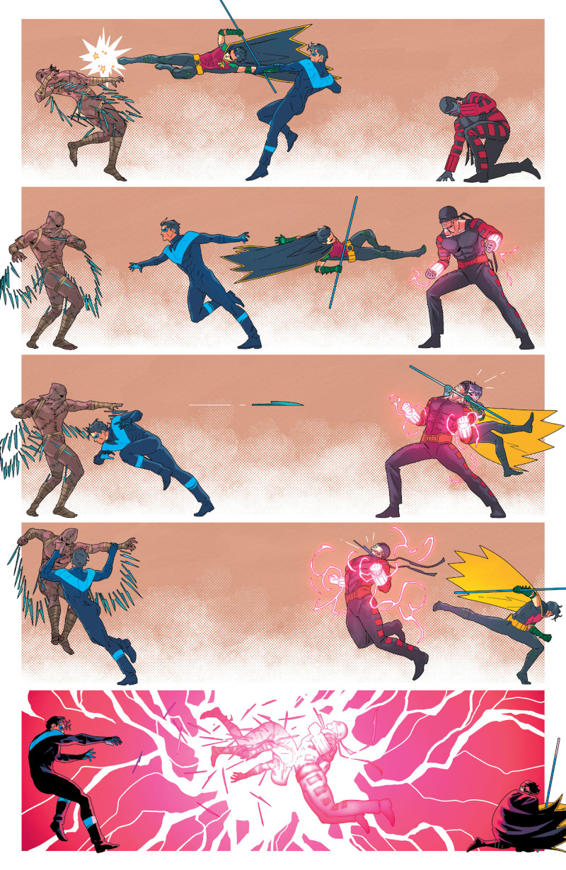
Bruno: Yes. There are characters that don’t just fight, they dance together, and they almost know what the other character is doing without any communication. So, in this case, I was trying to show how these different Robins know each other and they almost can predict the other character moves.
When it comes to a fight scene like this, what’s the key to choreographing a sequence like this? Is this about like feel, like you don’t even necessarily go in with a plan? Or do you have a specific approach to fight scenes?
Bruno: It’s possible that someone who really knows how to fight thinks that my fights are really unrealistic. I’m pretty sure about that. Sometimes I read some negative comments about how my characters use a weapon, for example. And I try to learn from that next time. I try to introduce that in the individual language of the characters. So no, there’s not a plan. There are things I like characters to do. For example, I love that Nightwing jumps over other characters and lands with his boots on their face, and it’s something that I used to repeat just because I think it’s part of his visual language and it’s an effective way to use your corporal weight to stabilize another fighter. But I should learn more about fighting.
I don’t recommend studying it too intensely because then I think your family might be upset about something else, which would be you’re getting in a lot of fights. (laughs)
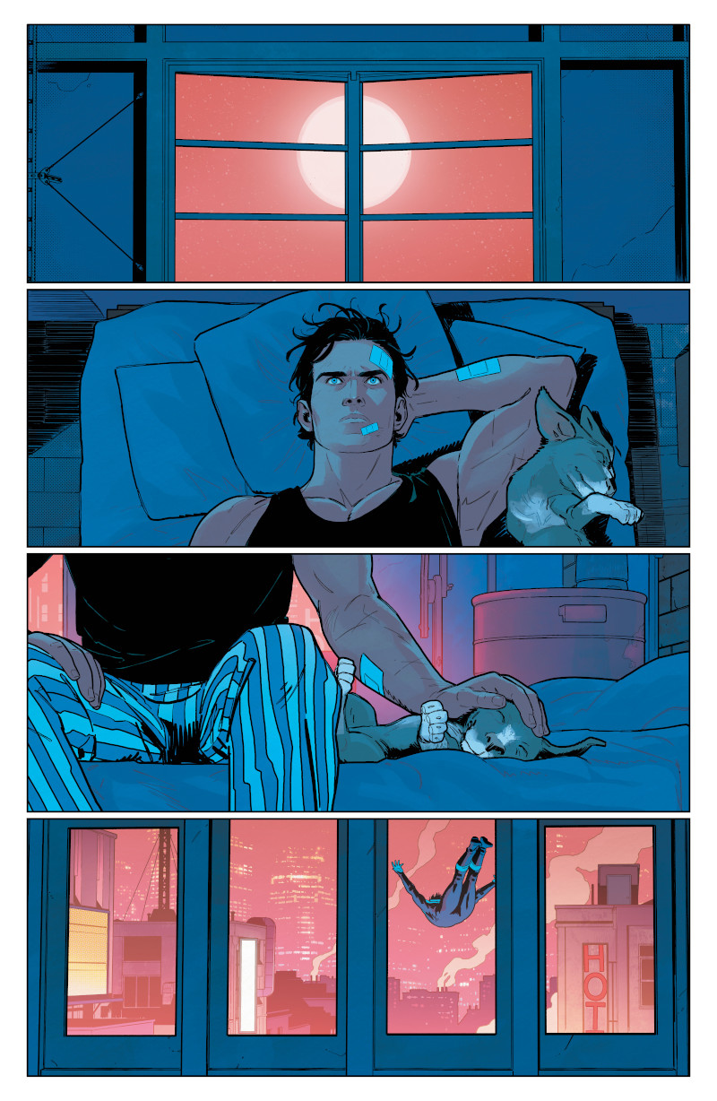
Let’s talk about this wordless page from issue #81. I love it for a number of reasons, but I do want to bring up one thing in specific. I think that a really good shortcut to making everyone love your book is having a really adorable dog and Haley/Bitewing is absolutely adorable. But what you do with Haley underlines something that you’re very good at: character acting. Your character acting is, in my opinion, across the board just excellent. You’re one of the best there is at it right now. Everyone feels so alive. Is that similar to a fight scene where it’s less about doing photo reference or specifics and it’s more about trying to create something that feels right? Is there an approach to making these characters feels so alive that is the right one for you?
Bruno: I could say I take photo reference to know how the character moves. But, many times when you take photo reference, it probably doesn’t show the acting in the way you think it does. Sometimes “reality” is not the best reference. It’s like in a live theater. In the theater, the characters on stage are really far from the eye. They overact more and to talk louder to reach their audience. I think in comics with static characters it’s more useful to force a bit more in the acting.
And what I used to trust the most is my first sketch. I used to do a really weak first sketch, which is more like a cartoon. It’s kind of like Bruce Timm’s style. Not exactly. That’s too generous, as these are hard to read… well. In this sketch, I draw without any compromise, without overthinking anything. But there has to be movement. There has to be a placed arm under the head or something. And what I learned is to trust my first instinct because when I overthink or take too many photo realistic pictures, it’s weaker than the first draft.
I also imagine doing photo reference for Nightwing would be dangerous. I would die.
Bruno: I have a lot of toys for that. That’s their commitment. Or that’s the way I justify myself as toy collector.
Some of the stuff he does, I don’t think my body can physically do that. When I look at this page, I love it. I love the page layout. I love how you move the eye down to the center of the image. It’s beautifully done. But when I look at this, and also working off of what you’re saying about going with your first instinct, it feels like the layout phase, where you’re figuring out what the page really looks like and how it’s going to flow, is probably disproportionately valuable for you compared to other artists. I talk to some that say penciling is the most important. Others say inking. But I talk to others, and the layouts are the most important because that’s where you really figure out the storytelling. Each phase is important, but is the layout phase the most important for you because that’s where you do your problem solving?
Bruno: Yes. For me, layouts are the moment I feel the most comfortable because it’s when most of the magic happens. And it’s funny, it’s quick but it’s a big effort. I would finish exhausted. When I have to do the layout of a whole issue, it takes me one or two days. Maybe I’m slow. The layout is one of my favorite parts, but also the inking, when all of the insecurities that I had in the pencil stage (go away) and when something mediocre can become beautiful in some way. It’s something that Pepe Larraz told me once. He told me that for him, the magic was in the inking stage. I’m not doing complex inking. But it’s true that this final render helps me sell the visual idea, either detailing more or, usually, detailing less.
But there’s something else that means much more than people might think. The color in this comic creates like half of the atmosphere. (Colorist) Adriano Lucas is doing something incredible in this comic. And I thank him every time I can. He knows how much I love what he is doing.
He’s coming up next actually, but before we get into that, I did want to bring up one thing. In Superman: Son of Kal-El #9, Wade von Grawbadger inked you for part of the issue. It sounds like inking is an important part of your process. How does it change things when you don’t ink yourself? Is it just basically removing one step of the process, or do you approach your pencils differently when you know someone else is going to ink you?
Bruno: The thing is, I haven’t been inked in years.
So, maybe I finish too many of the lines in the pencils. But anyway, Jess (Jessica Chen, Nightwing’s editor) told me we needed some help with the inks for this issue. She was absolutely right. She told me we had some options, and I felt really intimidated by the chance to work with Wade because he’s one of my all-time favorites. In fact, I have some of his originals in the background that I bought from him some time ago. 2
Me too. I have a Stuart Immonen page inked by Wade from Star Wars.
Bruno: Yeah. Exactly. I have some of the Avengers right there. I love him. And the point is that some of my inking style is trying to ink like Wade.
Wow.
Bruno: So, it was perfect. I told Jess, “Are you kidding?” (when she said Von Grawbadger would be inking the issue). It’s been awesome to work with him. I like to ink myself. But if I have to work with an inker, I’d love to work with him again if he’s available. Also, he’s a really kind guy.
Sometimes you can tell when somebody else is inking somebody that normally inks themselves. Not here. It was hard to differentiate your ink line versus his ink line. I think he did a really good job there.
Bruno: Wade was really nice about it too because he was saying, “I’m here to help. I’m here to keep it all together.” He had no ego about it. He said, “We are trying it to work together, and we don’t want the reader to notice if there’s a change between one inker and another.” And that coming from an Eisner-winning inker just makes him even better.
I said I was going to bring up Adriano again, and I want to bring him up on this. I love that final panel. It has so much mood to it. It feels to me like one of those panels that maybe isn’t something that most would think of as a standout moment for colors, but for me, it really pops and shows just how amazing Adriano really is on this book. What is it about Adriano’s work that helps bring out the best in your line work?
Bruno: The thing about Adriano’s work in this comic is he’s really committed to being a storyteller with color. It’s not like, “I am trying to make this panel beautiful by itself.” Every panel’s color must work to tell the whole story, to make you focus on one thing or another. We discussed the color style a lot before starting Nightwing, and we both decided that it was more interesting to do less rendering if we wanted to focus on the storytelling. It’s easier to process, to read, to organize. We are maybe leaning a bit closer to cartoon, to a Disney movie color. We are closer to this than some of the current commercial color style. But I’m absolutely in love with this. It’s a less is more kind of philosophy.
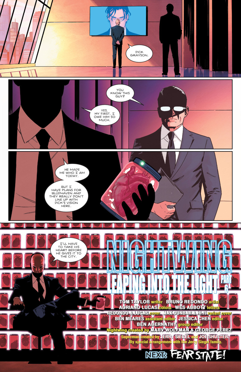
Tying into this, this does feature Heartless, who is a new character, so someone you had to design. And I love his generally fancy rich guy look with the mask whenever he shows up. But you mentioned earlier, with Nightwing himself, you had to figure out solutions when it came to how he managed all his gear, but also there’s the new costume that was made for him. It seems like you put a lot of thought into your character design. Is design part of the job you really enjoy when you take on a project like this?
Bruno: Yes. There’s not much design work in Nightwing because it’s Year One style and we don’t have many new characters. Heartless is maybe our only one at this point with a strong new design, but otherwise, I’m designing a little bit the backgrounds mainly. But I don’t consider it design as much when what you are trying to do is to portray common places, to portray something that feels a bit real. It’s more like make a visual composition, taking parts of reality.
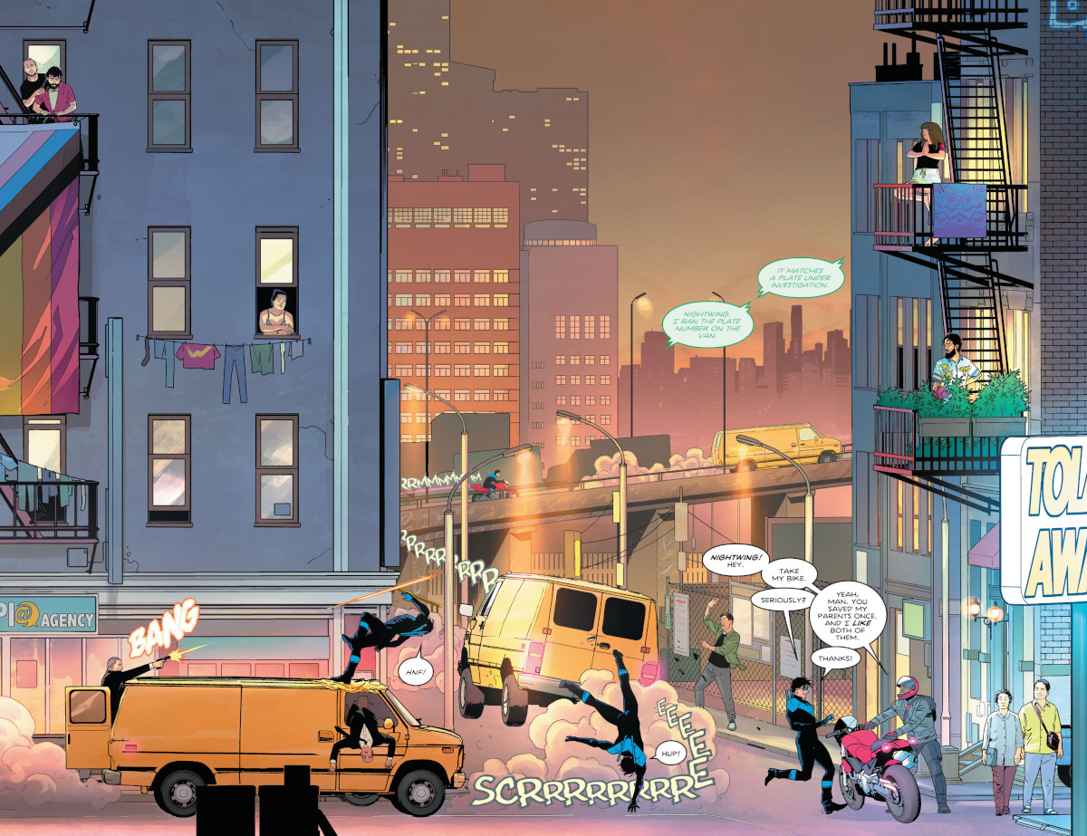
That is a perfect jump off to my next thing I wanted to bring up. I know everyone wants to talk about the continuous image part of #87, which obviously was amazing. You all did a remarkable job. But I wanted to bring up something involving what you were just saying. I loved how you worked in the details of the world throughout this issue and how you made it feel alive. I love the woman doing yoga up in the top right corner and then the couple crossing the street in the bottom right.
And the thing that I really love about it is, first, it shows what you value as an artist, and it seems to me that you really like giving life to the world. And second, it underlines just how unfazed the residents of this city are because there is a car chase going on and they are still crossing the street and doing yoga and all this stuff like that, which is amazing. Like I said, though, you’re very good at giving worlds a lot of life in this way, even if it isn’t always to this degree. Is it important to you as an artist to make the environment you’re depicting feel alive? Because it feels like it is as a reader.
Bruno: In this issue, it was necessary to make the background feel alive because, well, I wanted it to be a character obviously. But I needed to feed the reader more than usual. If you don’t look at the background details and just look at the action of Nightwing and the bad guys on this page, it happens in a few seconds. And these are two pages. So, I needed to get the reader to live a little in each page because I don’t like the idea that someone could consume this comic in only two or three minutes.
That’s not fair. That’s not the deal. My point was I needed to fill these pages so maybe (the reader) doesn’t catch everything the first time, but they can read it a few times and notice new details and backgrounds (each time). So that was the point. Before I was starting to work on this issue, I heard another artist praising Steve Rude’s capability of making the backgrounds alive. So it inspired me to try to go in that way. It also was a chance to make a portrait of the city that Dick Grayson is trying to save.
I loved that, two pages after this, I think, the little kids in the camp from issue #81 are playing with the Escrima sticks that they were given. I love those little details. You put in a lot of fun details throughout the series. In Superman: Son of Kal-El #9, Dick is wearing a shirt that is the Comics Code Authority, but it says DC Comics on it. And then also I love in issue 88 or 89, Dick is wearing a Teen Titans shirt as he sleeps, and it’s the Teen Titans’ logo from the animated series. For something like that, is that you? Is that Adriano? Where does something like that get worked in?
Bruno: That’s me because I hate when characters wear just random flat t-shirts. I don’t like that because I’d never do that. I think that everybody is expressing something about themselves with their clothes, and t-shirts are really the funniest place to express yourself. So, I do that just because it’s funny. I think that people enjoy that, and I enjoy expressing myself. And that gives you the chance to build a deeper world. If one character has a Black Canary concert t-shirt on, that tells you about the character far beyond what happens on the page, some readers wondered what kind of relation Dick has to Canary, or if he just went to one of her concerts. This also allows me to make Dick a David Bowie stan if you pay attention. So, it happens because it’s funny for me, but also useful and goes deeper into the storytelling.
It seems like you don’t really waste many opportunities to express something about the characters. Like you’re saying with the shirt or with fight scenes and everything like that. It seems like character is always top of mind for you.
Bruno: That’s something I like to remember that I learned from Carlos Pacheco. In his first American comic works, he used to put names on the books or music on the shelves or you see posters in the backgrounds to tell you more about the characters. And I found that amazing, how the characters have interest in music. They like movies. So what do they consume? And that tells you about what they are like when they are not hitting evil people in the face.
Right. It gives you some of their internal life.
Bruno: Yeah.
One last thing with #87. Obviously, everyone loved the single continuous image of it. You and the rest of the team did a phenomenal job with it, but it’s an unusual issue. Everything about it is unusual. I’ve seen people that have literally cut up the book so they can stretch it out and show it like that, which is amazing that you could do that.
Bruno: Yeah. I loved that. Readers feedback gives me life. It just completes the communication circle for me. Also, Nightwing fans are reacting in a such positive and constructive ways, that makes me think it’s the right way.
And then your editor, Jess, she laid next to all the original pages just to be like, “This is how long this is,” which was incredible. The response was incredible, but I’m interested in the experience. For you as an artist, was it considerably more difficult than a regular issue or was it more different than anything else?
Bruno: It was more difficult because you can’t focus on drawing pages without considering the pages around it. Because in this kind of shot, the horizon line must continue along all of the 22 pages. So, I had to develop a new template system to compare the pages, how they were fitting with the next one and the previous one. And I had to check this against the whole picture the whole time. The whole time I was checking, checking, checking and keeping the size of the characters coherent all along. It was a nightmare too because it was like doing animation. If you made a mistake about the sizes of the characters or the buildings that ruins the whole effect. So, most of difficult parts of this was not obvious. You can only appreciate that behind the curtain.
It seems like depth is almost your biggest issue there because when the characters are close up, that’s when they’re going to be bigger and then when they’re further away and it’s just trying to make sure that you have those elements consistent.
Bruno: That’s only one way to do that. To make it in one specific height where the camera is placed. If the characters comes closer but they are walking in the ground, it doesn’t work because they go off camera. I was trying to build some excuses to start with the character close to the camera and then bring the character closer to the camera again and change the size because any other way, it could have been too boring. Like an old side-scrolling video game.

That makes sense. Okay. So last page I want to bring up is actually not a page. It is the cover to 87, and it’s really just giving me an opportunity to bring up a couple of things. First off, I love your covers. I know that they’re both really good, but they’ve also been hugely different from one another. I know that a lot of comic shops I talked to were in love with the second printing cover for issue #79 because that’s one of … with all the different iterations of Dick Grayson and his different costumes and stuff, that was one that fans super loved. But it just seems like you have a great eye for not only coming up with great cover solutions that are really striking but ones that also tell a story and also tell stories in different ways. What’s your approach to covers? Do you have a general approach to all of them or is it really, does it depend on the issue you’re working on and what that issue is going to be about ultimately?
Bruno: The covers thing…it is becoming a nightmare.
Because you have to keep coming up with different solutions?
Bruno: Yes. I can’t do the same thing on every cover. And I place some expectations on myself to keep a kind of style when I’m doing Nightwing’s covers. Because something I like is that the covers must pop out a bit on the shelves. It breaks my mind to find different ways to do this. And it’s amazing to me when I look around at people like Jorge Fornes. Jorge Fornes is doing five or six brilliant covers every month.
And that amazes me because all of those have a high sense of design and composition. But I totally live in advanced imposter syndrome. (laughs) So I feel like I’m trying to keep it working under my own high expectations, while feeling I don’t know how I’m gonna get away with the next one. But anyway, when I look back, I’m not sure how, but it’s working. I feel proud of the covers, but those are not coming easy (laughs). I feel covers are part of our stage trademark in Nightwing, so I’ll try to keep working on each of them.
Yeah. Well, and also, you can’t draw every single issue’s interiors. So, if you’re the consistent element on the covers at least, you’re always there. I will say though, I am always amazed by some of the people who do so many covers, like Mike Del Mundo and Julian Totino Tedesco, those artists who are consistently doing inventive work and doing dozens and dozens and dozens of covers every single year.
Bruno: Every time. Yeah.
Oh, it’s unbelievable. But I will say given the fact that you were doing interiors and these, you’re doing a hell of a job, so good job.
Bruno: Thank you.
The final thing I want to bring up really is an aspect of your work I love that shows up a lot. I don’t even know if I can zoom in, but you’re going to know what I’m talking about, the zipatone effect with the dots and everything. And I can’t even explain what I love about it so much, but you use it so well and it’s an effect, honestly, I mostly think of Arthur Adams with zipatone, but what is it about that zipatone effect that you like so much? And what do you feel it adds to the page?
Bruno: It’s the same as what I told you about some of the classic comic resources. Those are the kind of things that only work in comics. And the zipatones, that’s something that is very classic in comics and in manga, and I feel that it makes you feel comfortable because it’s something familiar. Something you grew up with. And I don’t want it to take too much spotlight. It might work with everything else and be subtle. That’s why I only use that in dark areas of Nightwing’s suit, for example. That also gives some texture to the suit, some feeling that this it’s not just flat leather, flat fabric. And I don’t know…I’m trying to do something that feels old and new at the same time.
And the zipatones are an important part of it. And it’s great when Adriano uses zipatones in the color in a flashback scene. It makes you time travel.
Yeah, it really does. It seems like a really important thing for you as an artist is balance. You want the old and the new. You want to bring something new, but you also want to be very clear in its storytelling. Is that what it’s all about for you as an artist? Keep pushing yourself, but also don’t lose your standards as a storyteller?
Bruno: Yeah. Look. Something that inspired a lot of the visual ideas that I’m doing in Nightwing is not even a comic. It’s the Spider-Man: Into the Spider-Verse movie.
I feel that it’s a love song of comics, that comes from comics. It made me think that they were trying to do was a lot of things that can only work properly in comic, but they’re trying to do it in animation. They are playing with the bright colors, with the line effects and that’s beautiful. I thought, “Why don’t we do that more ourselves in comics?” And sometimes I feel like we feel shame to look pop or to look like something for kids. But I think that you can embrace those old techniques, those old details or resources from comics, from all eras, from all stages, and build something stylish and new and fresh and adult with all of that. Well, it’s an attempt.
Thanks for reading this interview with artist Bruno Redondo. Want to read more features like this? Consider subscribing to SKTCHD for more interviews, features, columns, and more. You can learn more about subscriptions here.