
Going Down the Black Road with Artist Garry Brown
The artist of the upcoming Image Comics title talks his art and craft
Don’t get me wrong: I love colorists. The work they do adds an entire different dimension to comic art that adds storytelling power and all kinds of nuance that many readers don’t even think about. But one thing I really enjoy is getting a look at the art before colors, as the inks of many artists show a ton of detail and perspective that we often miss otherwise.
So when I had the chance to talk with Garry Brown, the artist of Black Road, an upcoming book at Image with Brian Wood, about his craft while getting to highlight his exceptional inked pages, I jumped at the opportunity. Today, Brown and I talk about his collaboration with Wood, his process, his approach on the book, what appeals to him about this new Viking tale they’re telling, and much more. Give it a read, and look for Black Road #1 to drop on April 13th.
Black Road was announced back in early 2015 at Image Expo, so it feels like a long time coming despite the fact that you and Brian rolled out another mini of The Massive between now and then. What can you tell us about this project? What’s Black Road all about?
GB: Yeah, we’ve been working on it for a while. On and off since we both have other projects going on. It’s definitely something we wanted to do, a story we wanted to tell.
In Black Road, the Viking north is an occupied war zone. Magnus, our main character, is a fixer for Rome. The influx of Christianity leads to a lot of brutality and distrust between the occupying christians and the locals. Magnus is paid to take a client north, along the Black Road, but things get a bit dark from there on out. There’s lots of great character stuff in the book.
After working on The Massive and related stories for the last little while, now you’re going in the direction of vikings, an area Brian is well versed in. For you, though, what was the appeal of this project and the subject matter?
GB: When Brian first told me about it I was sold. I think all he said was ‘it’s a viking book’ and I wanted in. I’m a huge fan of Northlanders. The guy knows his vikings.
It also appealed to me because it’s radically different from The Massive (which I was on for about two years or so). The massive was very structural visually. Black Road is almost completely organic. I get to draw a lot of landscapes. Something I really enjoy. Its a great mood setter.
I’m sure you’re asked about this creative partnership all the time, but you’ve been working with Brian for a while now. It’s clear you guys enjoy working together. What is it about working him that you feel brings out the best of your art? Is there a trust and comfort level there that helps you bring your A game each and every issue?
GB: I learned a lot from Brian on The Massive. There were a lot of specifics in the book. Ships, weapons, places, etc. He’s easy to work with because he’s an intelligent writer and artist in his own right too so that helps. There’s no disconnect when we’re talking about an art technique or frame of reference. Black Road is the culmination of our work together, I think, it’s all been leading to this. I love working on the book. Hopefully it shows.
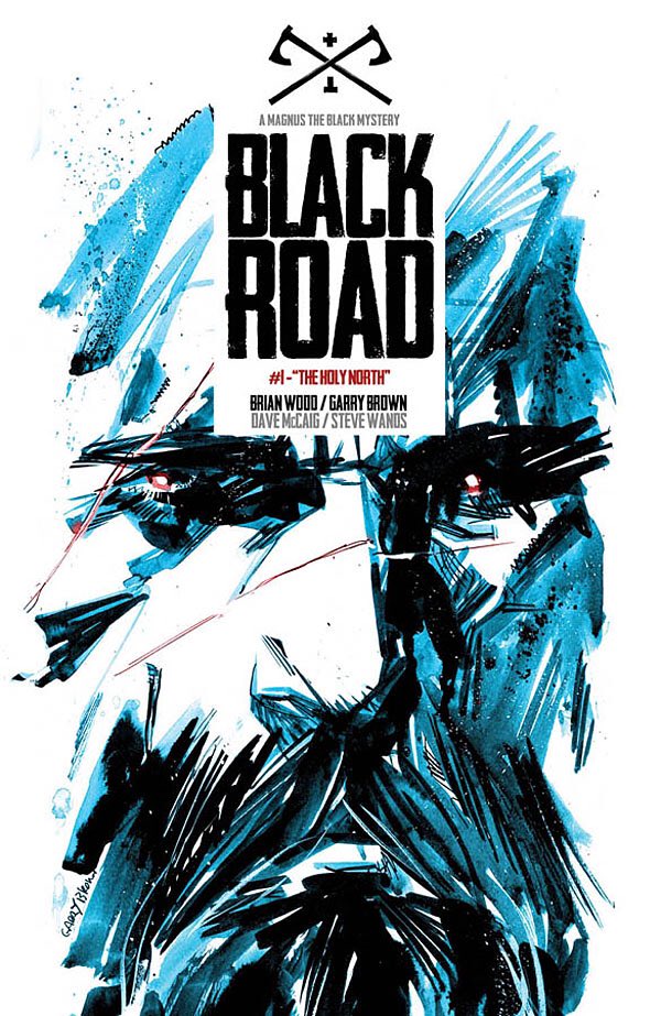
I’m a huge fan of well made comic covers, and I really dig this one. It’s very striking and it uses a simple color palette and pretty rough lines to really draw the line. This also doubles as the first image we saw back when the book was announced. When you were first putting this image together, what made this shot of presumably Magnus the way to go? And is Brian doing the design work for the covers?
GB: Thanks. This was really the first image that came to me. A close up of a grim looking Magnus. I was experimenting a bit with ink wash and China marker. I figured the rougher look to it would fit the book. Trying to keep an energy in the image. As for the colors, I prefer more simple, limited color palettes. It makes the cover pop off the shelves more I think. It makes the image more powerful.
And yeah, Brian did the logo design. He did quite a few passes on it before we settled on the brand style. We weren’t sure if the book would be Black Road or The Black Road. It was a fun process to be a part of.
There are a lot of different approaches you can make on a comic cover. For me, I think a cover should do three things: make a reader want to pick up the comic from the stands; be a quality piece of art; and speak to something in the story. I feel like this cover does that. But I’m curious, as a comic artist, what do you think makes a good cover?
GB: I’d agree with everything you just said. Number one on the list has to be catching someone’s eye. I always approach covers from an illustrators point of view rather than a comic arist. It might seem like not much of a distinction but it is to me. I like to try and not be too literal with the cover images. I prefer a simple single image. It’s stronger I think.
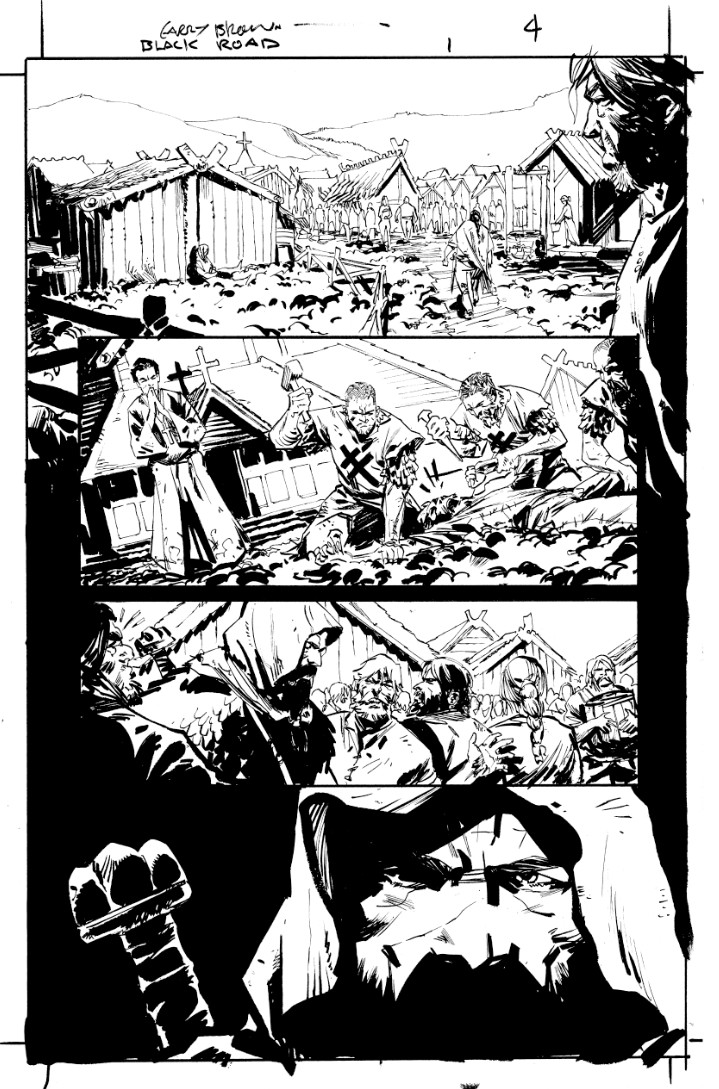
We see men in uniforms, a pretty classic sword hilt, and some regional specific housing going on in this page. It’s, at least for me, an introduction to the world of Black Road, and for projects like this, it often seems like research is essential to getting it right. Are you a research guy? For a fictional story built in a very real time in this world, do you want to do what you can to make sure you represent the world correctly?
GB: Yeah, pretty much. Although I’m working with Brian and he’s probably the best resource I have. He’s giving me huge files of Viking reference and in his scripts he has a lot of descriptions and accurate information. He makes it pretty easy. For Black Road we are fudging a bit of the history so that gives us some freedom too.
But yeah we are trying to keep the accuracy and reality of the world as long as it doesn’t confuse the story.
Every project and creative team is different, but for Black Road, I’m curious: what’s your process in bringing an issue to life visually? And by that, I mean once you get a script in hand, how do you approach taking that script and turning it into a page like this, both in terms of step by step experience and what tools you’re using?
GB: I try not to read the script before I work on the layouts. That’s the opposite of almost everyone I know. It’s just easier to get my fresh reactions down while reading it for the first time. I use a Cintiq 24hd to do layouts/breakdowns, then I’ll send off the layouts to Brian in case I mistakenly added too many guys or not enough or I missed something.
Then I tighten them up a little and print them out as blue line on vellum Bristol board.
I then ink the pages traditionally. I mostly use no. 2 brush and a 512 nib. I’ll use tech pens for things like weapons or really small details. I also use white out, sometimes for mistakes but mostly for effects. And that’s it. I scan pages, format them to Image specs then upload them to Dave for colors.
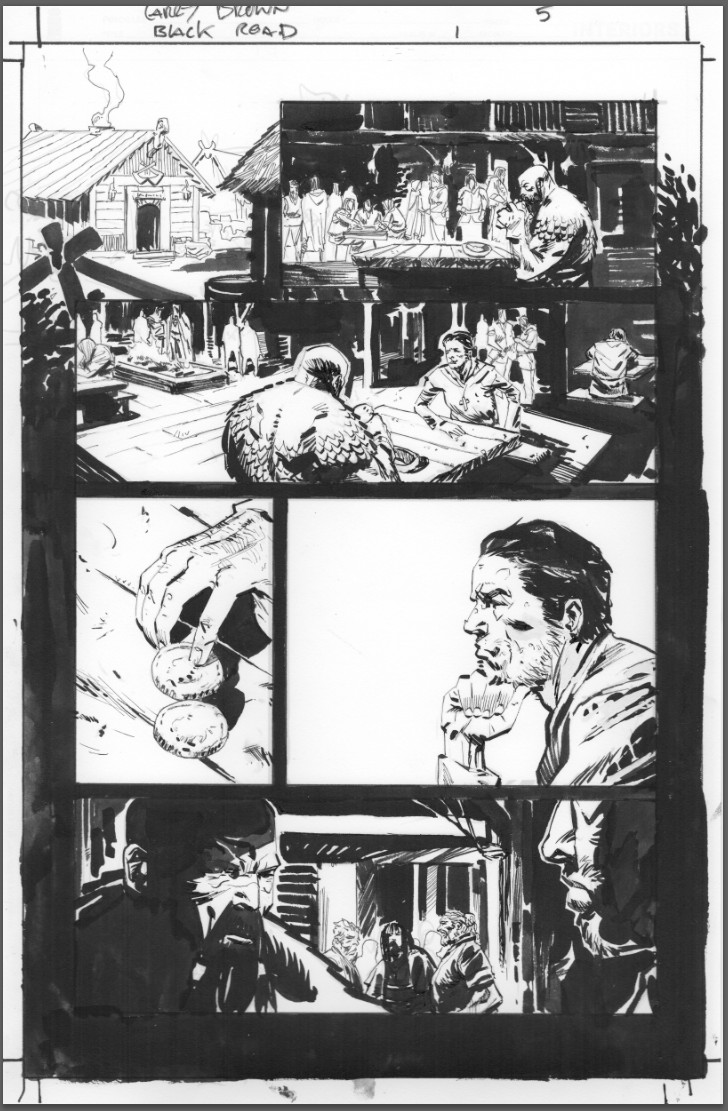
This page I find to be really interesting if only because its blacks aren’t nearly as deep as the previous page. The previous one look like you’re working digitally while this one looks like you did it entirely traditionally. Is that the case, or were you just going for a different look on this page?
GB: Ah yeah. The previous page has been leveled out in Photoshop. That’s what the pages look like when they go to Dave for colors. This page is the raw scan before it’s been formatted for print.
Conversely, on this project you’re working with Dave McCaig, who is – in my opinion – one of the best in the business. When you were developing this book and its look, did you and Dave chat about how you both wanted the book to look?
GB: Yeah, we are pretty lucky to have Dave. I’ve been a fan of his work for a long time now. We pretty much give Dave free reign over the color style. He’s a partner in the book. I think the only info we gave was that muted, desaturated colors would be preferred. Unusual color palettes, etc. He really nailed it.
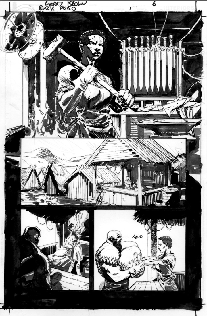
Big burly men and a badass woman blacksmith. That’s pretty much what we get here in this preview. For a people who are so built on physicality and toughness, how does that change your approach on your character work? Both in terms of what they look like and how they act, as Vikings are broadly known as the types who let action do the talking.
GB: It’s important in the book to show the women as equal warriors to men. A lot of Viking woman were in the heart of the battle with the men. That’s just what it was like back then, you had to be ready to go at any time. I don’t think it’d look believable if we had any mousey damsels in there.
In the three pages we see here, all three are built around a more prominent image (or pair of images in the first one’s case) with panels floating over the core shot. What’s your approach to laying out a page? Do you stick pretty close to Brian’s scripts, or do you have carte blanche to adjust a page if you figure out a better way to tackle it?
GB: The scripts for Black Road are pretty different from the Massive or Ninth Wave. Those scripts were really specific but with Black Road I have more creative freedom, as long as I’m not changing the events of the book. I try to have at least on open panel on a page, just for aesthetics. To me it connects all the images and gives it a more cohesive feel.