
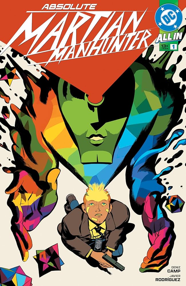
“I Want to Be Invisible”: Javier Rodriguez on the Art and Collaboration of Absolute Martian Manhunter
I’ve said this already and I’ll say it again: If any project defines DC’s Absolute line, it’s Absolute Martian Manhunter. Nothing expresses the potential and power of the line better than it, as writer Deniz Camp, artist Javier Rodriguez, and letterer Hassan Otsmane-Elhaou have crafted something truly remarkable with this series — and somehow turned a comic that stars (a version of) Martian Manhunter into a massive hit in the process.
That’s an incredible thing. And a big part of its success comes from Rodriguez, an artist whose work has long been beloved by certain audiences even if he’s perhaps never found the project that gave him the visibility his prowess deserves. That is, until now. More than that, he found an apt partner in Camp, and that team has turned the character and this world into the most improvisational feeling and emotionally resonant superhero series on the stands, if not the most of any single-issue title, period. It’s a tremendous work, one that has helped a much larger audience realize something I’ve been saying for a long time: Rodriguez might be the greatest artist working in single-issue comics today.
Naturally, I wanted to talk with Rodriguez about the series and his efforts in it, and that’s what we did recently. However, this one had a real change of pace. Typically our interviews are over email, as they had been when we talked the art of Spider-Woman and Defenders before. But this was a rare video chat, and it was a true delight to get to talk with Rodriguez face to face (in a sense) for this one. So, today, you can read this conversation with Rodriguez in full, as we talk about his evolution, the way he thinks about art, how he approaches layouts, the importance of color in his work, information delivery, what’s next for Absolute Martian Manhunter, and more as we discuss an array of pages (including some surprises) from the title’s first arc.
You can read that conversation below. It’s been edited for length and clarity.
This is the third time we’ve done one of these chats, going all the way back to Spider-Woman, back in 2016. I’m going to start you off with a hard one. How do you feel like you’ve evolved and grown as an artist over that time? Like, do you feel like you’ve improved?
Javier: Yeah. This morning, I saw a reminder on Facebook of a page of Doctor Strange and the Sorcerers Supreme. It was the preview of the first issue. And I thought to myself, I’ve improved a lot because I saw a guy that was afraid.
Afraid about the art, and afraid to achieve the minimum that the publisher asked for. And suddenly I thought to myself, you know, it’s crazy because it’s like five years ago maybe, and I can see more confidence by myself. I feel more confident now than when I started with Spider-Woman, but I can tell you that I’m even more confident than when I was drawing Zatanna: Bring Down the House past year, honestly.
How do you think that confidence manifests on the page? What can you see between Zatanna and Absolute Martian Manhunter where you’re like, “This is a place where I’m more confident.”
Javier: Especially when I clean up the images. When I feel that all the information you see on the page is necessary, no more and no less. When I see the pictures, I say that the concept is more important than the art. My main concern is to achieve, for example, a sophisticated conceptual request on the part of story rather than the finest drawing. I am much more concerned with conveying the concepts that make a story understandable through my drawings than achieving beautiful anatomy or beautiful lines.
For me, the most important thing is how the entire page ends up, so cleaning up the irrelevant information is the most important thing for me right now.
There is a nice spot where the image is clean, perfect, all the info that the writer and I want to be there is there, and there is nothing else because the rest of the information can be filled in by the readers. It’s like when you are in an airport and you know that the bathroom is there because you see a symbol, and you see, “This is my bathroom.”
That’s the ultimate expression of this simplicity, but I want to achieve it in comics using the language of comics and using my skills as an artist. I want to be cleaner and as simple as possible. I want to achieve that.
So, you want to simplify and deliver clarity. You want it to be a very clear image, but doing it in your own way, kind of like the high concept that’s in your head, right?
Javier: Yeah. In fact, working with Deniz, my objective is to express this high, emotional concept. With that stuff, you need the participation of the reader. You need them to be 100% involved in the story. To do that, you need to be pretty clear.
Using my skills of composition, the use of color, the use of shapes…that’s as important as the use of the drawing to achieve that. I want to transmit it like a pure language. I know that this maybe sounds pompous, but it’s true. This is what I’m researching now. If you read the classics like (Steve) Ditko, (Jack) Kirby, the Hernandez brothers, Daniel Clowes, Chris Ware, or (Osamu) Tezuka, there is a common element there, and that’s to make the narrative and the language clean.
I want to achieve that. My research is something like that. I’m like Ahab looking for Moby Dick. But I want to explore these paths.
It’s interesting that you said that it’s more important for you to express shapes. It reminds me of something I’ve heard from other artists like Chris Samnee. He talks about how he’s aiming for the same impact with fewer lines. He wants to go in the direction of simplicity. It seems that in your own way you’re going for simplicity and clarity. It’s just everyone has a different version of what that looks like. And it’s interesting to hear you specifically say shapes because I can see that in your work.
Javier: The biggest thing is when you turn invisible. I remember that feeling when I was child, when you are so into the story that you forget you’re reading a comic book. Of course you’re reading one and of course the artist and writer are important, because you are enjoying it. It’s something that will be adored by you all your life. That is very important, but at the same time, it’s invisible.
There is a moment that you forget that you are reading a John Romita comic because you are very into the comic. It is something that is achieved and obtained when the reader is allowed to be the protagonist of the story. In the end, we put together all these visuals and build a tale in your head that’s put together with the script…that is very important with becoming invisible after two or three pages. Suddenly you are not the main character.
That’s the reason I’m not just focusing on doing big pinups or the kind of stuff that maybe is more mainstream. I love it and I read comics like that. But for my stuff, I’m more interested in how the reader interacts with the book. In a way, it takes the spotlight off me.
A pinup is designed to almost make the reader aware of that moment. But the way you work is you’re trying to get a reader to immerse themselves in a real way. Doing pinups would be almost antithetical to your goals.
Javier: Yeah. At that moment, you’re saying, “Look at me, I am the artist. I am the guy that did that.” Suddenly you appear there. You break the fourth wall. Sometimes people say that the breaking the fourth wall is like in Doctor Strange and the Sorcerers Supreme, when the characters appear outside of the panels or whatever. But to me, when you break the fourth wall, it’s when you realize they are comic characters, and there is no the interaction between images.
Suddenly you can play with the proposal, because to me, when you read, you are playing with the proposal of the artist. I give you these images here in 2D on paper, and you have to build around this. I know this doesn’t make a lot of sense, but it’s the base of my work. It’s the way I want to approach the page. And it’s a long road to get there. A process that takes years in my case.
Evolution is the main thing. If you read the Argentinian artist (Alberto) Breccia. He ended up doing comics with collage, like Matisse. He was playing with pure shapes. We are talking about one of the biggest comic artists ever. Of course, it’s not my goal to end up in the collage. I want to keep my comics under control, with a taste for lines and figures. But anyway, I think it’s a good example of how the search for narrative purity leads you to simplify. To give the reader more prominence.
I think that right now in Absolute Martian Manhunter, we have a chance to show that.
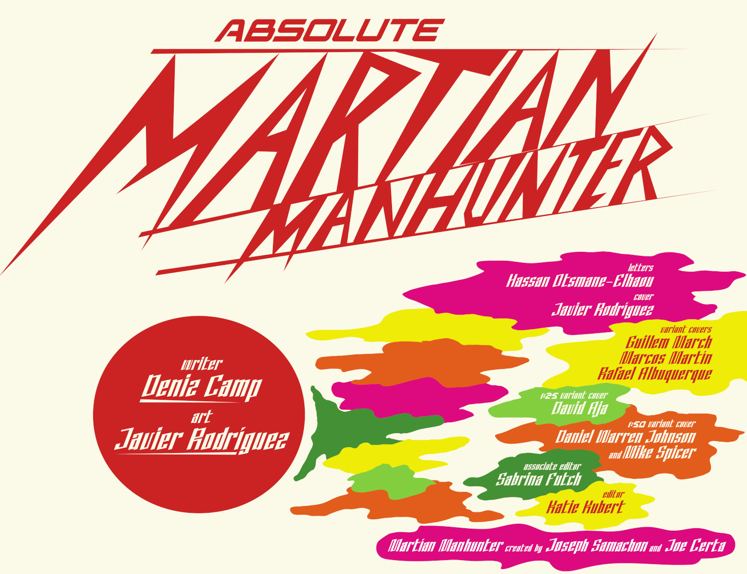
Let’s get into some pages. I’m going to start with a weird one. It’s the title page from the first issue. How much of this, the logo, the colored smoke like bubbles, the design, did you do? Was this you?
Javier: This page composition is from Hassan Otsmane-Elhaou, who is amazing. He nailed it. He took some elements from inside and one of them is the smoke. That smoke, for example, came from so many influences. One of them is Milton Glaser. He was the designer of the DC logo. It was super nice that they brought it back because I love Milton Glaser’s work. He was a huge influence on this book.
The idea for the logo design is mine. The final touches were in the design department in DC Comics, but I did the sketch of the logo. To me, what was important in the logo was that the Martian was the biggest. And I like this kind of straight line. It’s somehow retro but somehow, it’s like flashes. It’s like when you have an experience with panic attacks. Suddenly, all this looks sharp to you.
When Deniz showed me the script, I thought there could be a dialogue with 20th-century art history. There are graphic elements that give us the feeling of a journey or a hallucination, and I think art captures that moment. We have an FBI agent who came from a black-and-white life. That was what he understood as normal, and suddenly he starts to have Panavision, a colorful view of life. Suddenly he realizes that there are shapes he can see, he can see colors that are thoughts, and that people have diverse opinions. Another point of view.
Suddenly, you have a guide. Things that are good or evil suddenly have colors. So, the way to show shapes was the smoke. When Deniz told me, “I see smoke as a graphic element to show people’s thoughts. Colorful smoke,” I said, “Obviously it’s smoke.” In that moment, we connected. Of course, it totally makes sense to me. I know that for a lot of people the easy comparison is they’re getting high. If there’s smoke, obviously drugs are there. But you know, it’s not necessarily only a drug reference. It’s like American pop art from the 1960s. I saw it because it is a representation of the ordinary in a way that is not what you expected.
For example, Andy Warhol’s can of Campbell’s Soup. Or like Magritte’s “Ceci n’est pas une pipe.” (“This is not a pipe.”) Suddenly, common objects take on a new vision when you put it out of the context. That’s pop art. Surrealism, too, in such a way that an object changes when you isolate it and display it in a room. At that moment, it becomes art. Like Lichtenstein’s famous panels, which out of context are pop art paintings, and which, incidentally, irritate comic book artists so much.
I’m researching pop art and symbolism; this art movement of the 20th century that represented that to me was important. The smoke is something that I took from there. It was nice when someone pointed out that the shape of the smoke was close to the Velvet Underground cover with the Metro subway, which was one of the inspirations. Another is Guy Peellaert, the artist of David Bowie’s cover to Diamond Dogs, but his previous works.
I take influences from there, but my favorite artist is Jean-Claude Forest, the artist behind Barbarella. Forest is one of my biggest influences in general.
Part of the reason I wanted to bring up this credits page was because I felt like you did the logo at the very least. Obviously, the smoke came from inside the book, and obviously Hass used it because he is a genius. But it seems like you’ve been progressively getting more control on your projects. When you started, you were coloring and then penciling and inking. Now you’re doing all that. It feels like with Absolute Martian Manhunter in particular, you have a larger vision of your art.
Is that your preference? Do you want to handle as many aspects of the visuals as possible?
Javier: That’s how I used to work when I started making comics. I have many projects that I did on my own, including the script. For example, this is Wake Up, a comic that I did for Glénat. Everything in this comic is mine. I did the design of the comic, the pages, the script. So, I came from here. It’s a long path to achieving this in the American market.
Do you want to get back to that?
Javier: Yeah. I believe that I have something to do in comic books. When I was a child, I did my own comic books. I did my own 20-page comic books for my mates in class. I did the Xerox, I put the staples in, because I love the format. So, when I arrived at Marvel, Steve Wacker gave me a chance to do a book. When they asked me, “Do you want to draw?” I said absolutely, I want to do it all. Because I came from that. To me, the natural way to do comics is to take control of the whole book.
Don’t get me wrong, I love to work with writers more than ever. When I started working as a colorist, I couldn’t understand why Marcos Martin or Javier Pulido, my friends that I worked with then, they told me, “You know, this is all wrong.” And I said to myself, “No, it’s correct,” and they said, “No, you changed a lot of shapes.” But because I never had the chance to be colored by someone else, after the first time I understood perfectly what they were saying.
Colors change the art and the drawing. The color is part of the art. Even when you create the render or the shadows in a picture you are drawing, you are doing more than just coloring the page. You are changing the intention. You are changing the language. To me, it’s important to have a comic where I have control of the whole thing. And this came with Zatanna.
I tried to do that at Marvel, but it was difficult because the deadlines and the way they work. It’s more difficult. But when I arrived at DC, I had the chance to work in Zatanna, and it was like, “Wow.”
This is a page from #1. You already talked about this to some degree, but maybe even more than any other series you’ve done, Absolute Martian Manhunter is extremely color oriented. What made that the right answer for this book? And how did that determine your approach as you have been working through the series?
Javier: I don’t know, honestly. It was natural. When Deniz asked me to show how John changed the way he saw the world, I thought colors were the easy way to do it. Suddenly I realized that the colors could have even more protagonism. It was something natural. I realized how to portray the world as this guy lives in black and white when we have John in his FBI role and it’s colorful when the Martian appears.
I started playing with color palettes. FBI colors were more boring. It’s not that it isn’t colorful. You have colors in the pages at the beginning of the issue. You have a colorful world, but it’s muted. The way I worked was fun. I created the palette for the Martian. I started with colors of the original character, and I added three or four colors. I built the rest of the color palette around those colors, so when these colors are in the page, they are like fluorescent. Not because the colors, but I designed a color palette just to make these colors look fluorescent.
It’s all built around the original color palette of the character. I know it sounds crazy, but I just started doing jazz and it was the same to create the character well. I took the request of doing an Absolute version of the character seriously but being respectful with the source. So, the colors are built around that concept. I’ve built it around the green, the red, the blue, and the yellow.
And finally, I built the Jones normal vision of things around that. You see in this page, when the character feels blue, it is blue. I don’t try to be natural. I was looking for something more emotional, honestly, because when Deniz told me the pitch of the book, he said he wanted to do a very emotional book. It’s about emotions. It’s about feelings. It’s about mood. And the mood will be resolved by color. So, colors were very important in this book.
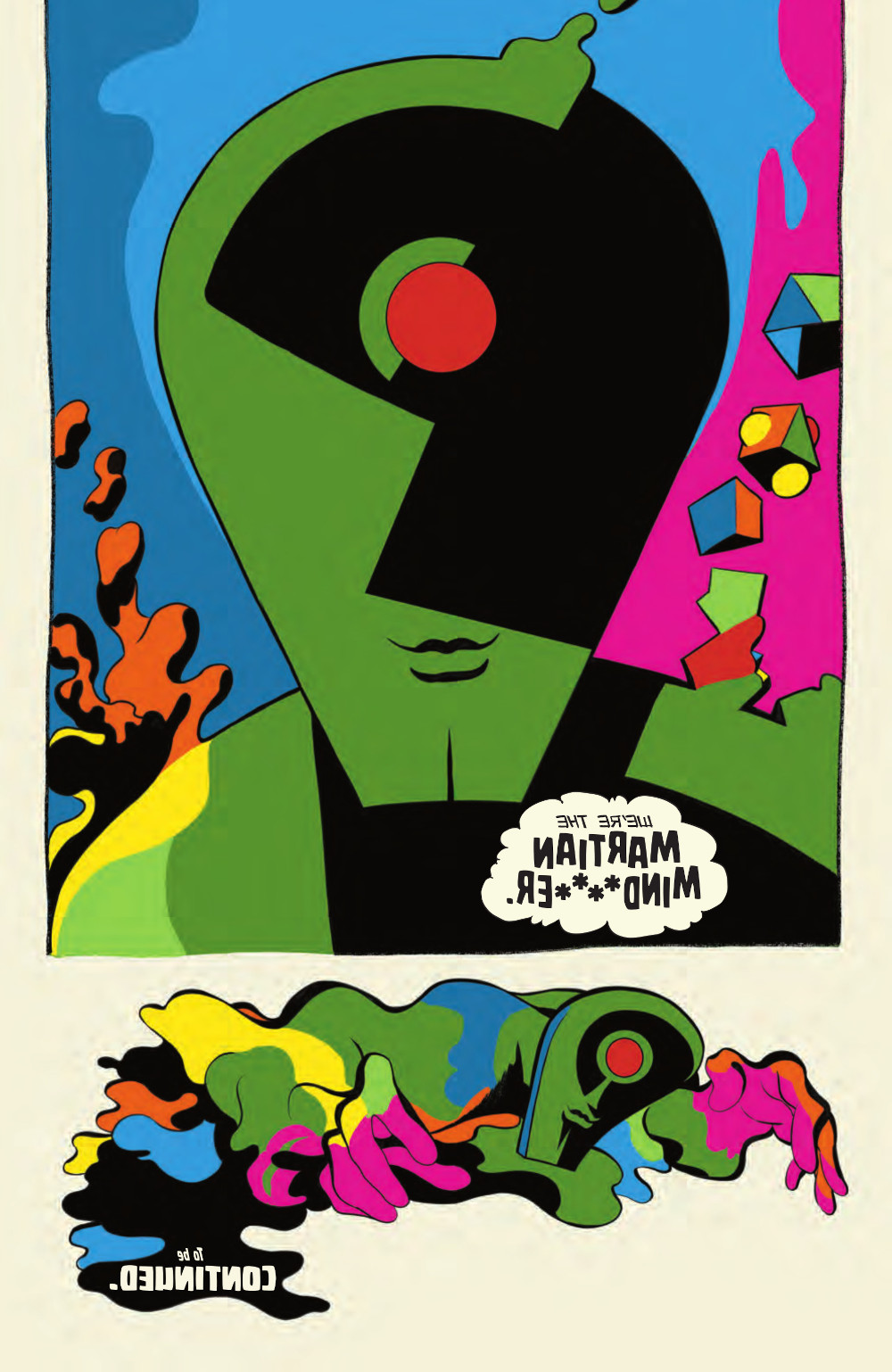
You already mentioned it, but it is like that moment in Wizard of Oz when the world becomes color and the Panavision hits. I love the moment in the sixth issue where John has his moment of catharsis where he unlocks Panavision. Did you know how your color approach would progress throughout the series, or was that something you were figuring out on the fly?
Javier: We had little time. We had a month to build this book. To create the design, to create the look, to create everything. I think that was all done in less than a month. So yeah, of course we were improvising all the time. There were a lot of things that I thought would work, but I wasn’t sure until I proved it.
It’s like the final page in the book, I came up with this idea I know that Katie (Kubert) the editor was very concerned about, about whether it would actually work. I had to print it to prove it. I knew it was a risk for DC to print something like that. It could fail. But these were all works in progress. We didn’t have time to pre-produce the comic. We were the last ones on the Absolute line. And in my case, I was still finishing Zatanna. I finished that and suddenly we started with Absolute Martian Manhunter. We had to do the designs. I think it was a week.
You just talked about the kind of echo for this in the sixth issue. One of the questions I had you already pretty much answered. How did you figure this out, and that it would work?
Javier: Yeah. This is something that is important to me. I think a lot before I do anything. I spent hours thinking about this. I read the script like an actor from a play would, and I started thinking about it and taking walks. I live close to the sea, and I take my walks in the morning. I picture all the pages and images in my head as I walk.
But with this one in particular… I usually take my daughters to swimming lessons, and while they’re in class, I stay outside in a pool near the sea, just thinking about these things. In the original script, the revelation was that John appeared on one page, and when you turned the page, the Martian appeared on the last page. I thought about this idea of transparency and thought it could be great.
And it fits perfectly with the idea of attracting people to comics as if they were small artifacts, in a literal sense. I still think that, even though some people get upset, the floppy is a cheap format for me, and for little money, you have something valuable to take home. It’s two staples and a few sheets of paper, okay, but if the book is that good, you’ll remember it for the rest of your life, and you’ll share it with your friends and reread it. It’s something that gives you a lot for very little. Don’t you think?
Absolutely.
Javier: Offering great artistic concepts to people for little money is incredible. That’s my ideal philosophy. That’s why, when I was a kid, I remember saying that comics are a work of art to me. Jack Kirby had to be on the same level as Andy Warhol or (Edward) Hopper or anyone else you can think of. Jack Kirby is at that level. Therefore, comics are a work of art. No one doubts that. Treat them as such when you make them, give them that respect. It’s a way of showing respect for the format, for the medium.
I don’t like selling originals. I don’t usually do commissions. For me, the main focus is the comic. The comic as an object that you hold in your hands. Maybe it’s because I’m a former graphic designer. When I was a student, I experienced the transition to digital. I had the opportunity to work with printing machines, real offset machines. I made my own film, the negatives that go on the offset rolls. I knew how to do the whole process, from the drawing board to the printed object. I know the process inside out because that’s what I learned to do.
So, to me, the comic is the piece of art. I love originals and collect originals, and I have drawings from my friends. But in my career, my research has been about achieving the perfect comic book. Nice colors, nice print, nice format, you have the control of the design, the cover, the package. This is my task.
For me, it’s a valuable item that’s inexpensive, so it’s fantastic. It’s pop culture, and something I love.
You said that Deniz’s original script had a similar concept, but you shaped it in a different way. Did he have the idea?
Javier: He wanted to flop the page so on one page you have the face of John reflecting and the Martian on the other page, it was super nice because it’s a huge cliffhanger. A good one. The way Deniz built that scene, that crescendo is just phenomenal. It’s a perfect way to end the comic.
subscribers only.
Learn more about what you get with a subscription