
“That’s What Comic Book Collaboration is About”: Michael Walsh on the Art and Teamwork of Exquisite Corpses
If I had to pick an original comic that’s going to hit — and hit big — in 2025, it’s James Tynion IV and Michael Walsh’s upcoming Image Comics series Exquisite Corpses. You might already know that to be true, because I actually did select it as my pick to click for the year back in January. There are many reasons it was my choice too. The heat around Tynion. The title’s plot, which finds the richest families in the world deploying their monstrous champions on a small town in Maine to decide which of them will control everything in the near future. The thought going into this creator-owned and horror answer to the Energon Universe. The marketing efforts behind the book, which we’ll get into tomorrow. The incredible team working on the series, including colorist Jordie Bellaire, letterer Becca Carey, and the Corpse Crew that is working with the team, a lineup that features names like Pornsak Pichetshote, Tyler Boss, Che Grayson, Valentine De Landro, and a whole lot more.
But one of the biggest parts for me as a reader is Walsh. The artist slash cartoonist is one of the most thoughtful creators out there, and his gifts at atmosphere and terror in horror stories are astonishing. I believed in his ability to build a visual foundation for this 13-issue series that will resonate throughout its run, even if it especially pops in the issues he draws. And you know what? I was right. Having read the triple-sized first issue, I can say conclusively that Walsh is doing what he does best here — and then some. The pacing, the storytelling, and, perhaps especially in this case, the design he does on Exquisite Corpses is, for a lack of a better word, exquisite. And that’s true even if it’s aimed at some monstrous folks and the people caught in their way.
So, with this week being Exquisite Corpses Week on the site, it felt like a good time to continue my conversation with Walsh that started in this week’s episode of Off Panel. Walsh and I recently popped on Zoom to talk about the art of Exquisite Corpses, as we used five pages and two covers from the series as a jump off to discussing his work with Tynion and Bellaire, his approach to covers, the design of the cast of this series, how he thinks of page layouts, whether he thinks in color, and a whole lot more. It’s a great chat, and one you can read in full below, albeit in an edited for length and clarity form.
What’s your general approach for covers? Do you have consistent goals for every cover, or is it very dependent on what Exquisite Corpses needs?
Michael: It’s so project dependent, but I’m not someone who generally wants to necessarily do a story cover. A lot of covers put you in a scene as if they were a panel from inside the comic. But for me, I think of covers as having a different purpose from interior art. I’m thinking more about an image that is immediately attention-grabbing. My first thought going into covers is always, “Is this going to stand out on the shelf next to the hundreds of other comic books that it’s sitting beside?”
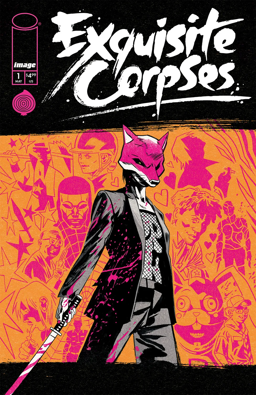
So, my process is usually pretty conceptual, initially. I’m thinking about what stylistically I want to do on the cover, how I think it should be colored if I wanted to show just a single character or multiple characters. Exquisite Corpses itself was a tough one because there are so many characters. There are 12 very dynamic killers, and none of them are really the main killer in the book. Different issues spotlight different killers, and different readers will have an attachment to killers that strike a chord with them. It’s not like the Fox Mask Killer, who is highlighted on the first cover, is going to be the main one throughout the book.
I needed to come up with a way that would show off all the killers, but it wouldn’t be too busy. It would still be a striking singular image. I really was channeling risograph concert posters, and an anime-punk aesthetic. Throughout the book that’s of an aesthetic that we are mining, both with the comic and the card game. These two or three colored images. They look like pop art in some ways, but they’re very design focused and very color focused because having so many killers and so many distinct palettes that are unique to each killer means that if you were to have all these killers in their full colors and their full regalia on that first issue cover, it would be incredibly busy and get lost on the shelf.
I’m not a fan of a super busy cover, even though this is has a lot of visual elements. I like when you look at a cover and you just see an image and it pops out at you. I know that when I first designed the killers, James was really enamored with the Fox Mask killer, and he thought that would be a good killer to showcase early on when we’re starting to do our teasers and then the covers. So, I knew that I was thinking each of the covers for this book could showcase a different killer, but then we could use this flat and graphic background to highlight other killers or other scenes within the book. We’re still getting moments from the book. We’re still getting a little bit of story. But it’s not overwhelming and still very focused.
Did you color this?
Michael: I did.
I like the blood splatter on the jacket. It’s a nice touch.
Michael: Thank you. This was inked and colored by me as well as the killer reveal pages on the inside of the book. I colored just the single panel of the killer reveal that is usually two or three colors, and then Jordie colored the other half of the page.
Jordie and I collaborated on those pages because I had a distinct idea of how I wanted those killer reveals to look, where I would be blocking out color holds in the backgrounds and doing these cutouts on the inks that would be impossible for somebody else to do with the way that I had envisioned it. There’s no way to do that in the ink stage. So, I sent Jordie colors for half of the page and then she colored the other half of the page and tied it all together, which was a fun process.
There are a lot of different ways you can structure a cover, but I really like the way that this is handled. The top has the titling, and it’s got clean black break on it. The bottom has the credits, and it has a clean black break on that, although the Fox Mask Killer’s sword crosses that. Will the titling/art/credits mix be consistent throughout on your covers? Are you using that risograph poster structure throughout, or is it going to vary depending on what each cover needs?
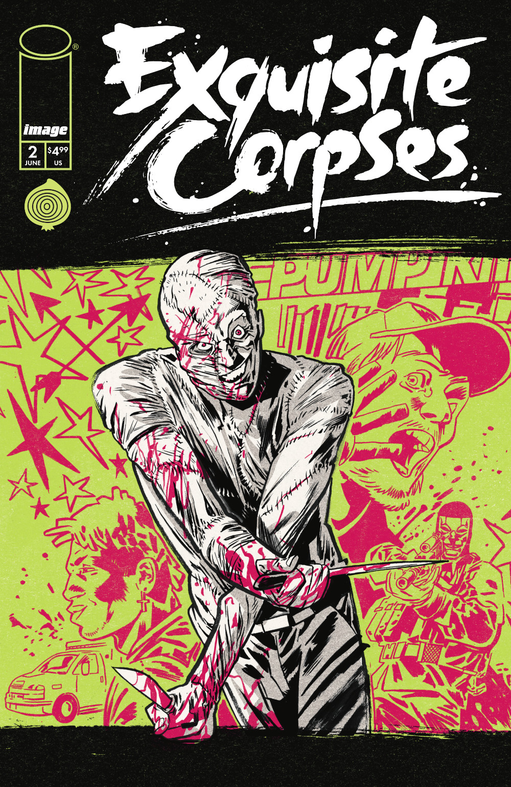
Michael: I’m doing one or two covers for each issue, and this is the template for the A covers. It’s always going to have that blocked out top and bottom for the credits and the logo, and then I’m going to be using different palettes and highlighting different killers on each.
Nice.
Michael: I’ll share issue #2’s cover with you. Across the board on each cover, we’re going to have the bar at the top and the bar at the bottom. We’re going to have the killer in a limited palette, and then we’re going to use a different palettes for the lines on the back and then the backing color. That’s fun because I’m flexing completely different muscles in the coloring on this and getting to play with so many strange and unique palettes. When you’re only using two colors, it actually frees up a lot of options that you don’t see very often together. This one is a lime, neon green with a magenta red, and I feel like it pops so much.
Who designed the logo?
Michael: I did the logo. When we first started working on the book, I said I wouldn’t mind taking a crack at the logo to see if I could come up with something that we all like. I think initially the idea was that I would do as many art assets as I could on the first issue so that there was a really cohesive visual identity to the book moving through the other issues, since we’re bringing in other artists as well, besides myself and Jordie.
I bought a Japanese calligraphy brush in Japan when I was travelling, and it has a huge tip on it. I used that brush and I just wrote Exquisite Corpses out on a piece of paper a hundred times, and then I took all my favorite characters 4 that I had drawn and mashed them up together to form the logo. We’re using that inky, hand-drawn lettering on each issue, so I’ve just had to draw everybody’s name that’s involved with the book so that we can credit them in my own inky handwriting. (David laughs)
It actually felt like your hand when I saw that. That’s funny.
Michael: Yeah.
It sounds like you knew that James…I don’t want to say favored the Fox Mask Killer, but knew that the Fox Mask Killer popped in a real way. So that was who you focused on for the first issue. But when it comes to covers, are you left to your own devices, or do you talk with the team? How does that work?
Michael: The Tiny Onion team and James himself have a lot of faith and confidence in me, and they let me go with the grace of God when I am feeling inspired in a specific way and want to do something. But if I’m waffling between two choices or if I’m going back and forth on a few options, then I’ll immediately approach them because they’re just such an incredible crew of people, editors, and creators alike that all have good insights on what we’re going to be doing and what visually pops.
Jazzlyn (Stone, Tiny Onion’s Director of Marketing) has such a great visual sense. Same with Courtney (Menard, Tiny Onion’s Director of Production), I’ve leaned on Courtney and Jazzlyn both in different instances to make a decision on an idea I was going back and forth on because I just think that they both have a very good intuitive design sense and they have a good idea of what’s going to look good up on a shelf, on a page, on merch. A good sense of “cool”.
The Tiny Onion merch looks awesome because of those two people that are working hand in hand designing it with the rest of the Tiny Onion crew. So, I generally am going with my own intuition and what I think is going to look good but also leaning on Tiny Onion when I need to.
I like all the killers, but initially I think James had an inclination that the Fox Mask Killer would be one of the ones that people latch onto right off the hop. And I always trust James’s sense of character because he created some of the most memorable and iconic characters in comics in the last few years in Erica Slaughter from SIKTC, Dept of Truth, W0RLDTR33 to name a few. He has such a good sense of character, and he always is building worlds with characters that people connect with. So I trusted him in that. But again, I like Fox Mask Killer a lot too. I think she’s visually interesting and a fun character.
I’m just going to make a quick comment. You don’t have to respond to it. Your structure works excellently except for the fact that there’s 13 issues, which means that the final cover is going to have to be something different, which is interesting. Maybe there’s a reason for that! (laughs)
Michael: I suspect we won’t be revealing the cover to #13 in solicits.
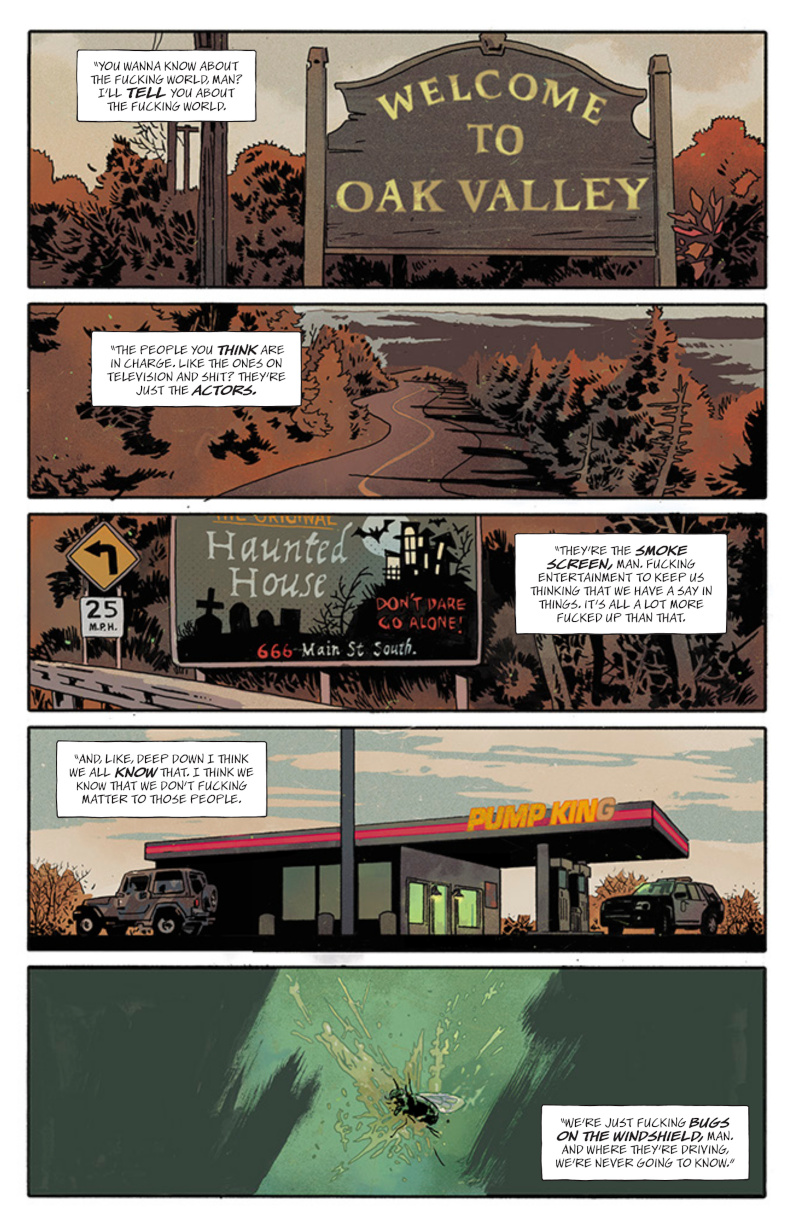
This is the first page, and I think it’s an important one because it sets the mood. There’s been some talk about Stephen King in advance of the release of this book, and this page establishes that vibe from the jump. I feel like the third and fourth panels are essential. You have this very small town feel to it, the light out on the G, the haunted house, all these things. How important is it for you to not just establish the setting in a story early, but the mood as well?
Michael: A big part of just my art in general is mood and atmosphere. I think that’s part of the reason why James thought I would be the right artist for this book and the right person to co-create the book with. If you look at my work on Silver Coin or on Frankenstein, a lot of what I’m doing is establishing mood and tension through the atmosphere and the panel to panel pacing. So with this book, we really just wanted to nail that message that this is a small town.
I grew up in a suburb of Hamilton, which was pretty small. I spent many days just partying in the woods with my teenager friends, and that kind of vibe is what we were really trying to land in in the first few pages here.
I feel like I’ve been to The Pit (the place teens party at in the book) before.
Michael: It’s funny, when we had our very first summit in Buffalo, James and I were hashing out all the bigger picture stuff. We were hashing out the setting and all the killers and the civilians, and when we were talking about the kids leaving the concert at one point because they need to go somewhere, there needed to be a big party. That’s an outdoor setting. I came up with The Pit because I actually had a pit where I grew up.
When I was in high school, there was a place called The Pit that was out in the woods that was just far away enough from suburban homes that you weren’t going to get any noise complaints, but it was still close enough that everyone could walk there from where they lived and from where the high school was. We’d walk up the escarpment into the deep woods. The location was passed down generationally from the grade elevens and twelves to the younger people, they would show you where The Pit was, and that would be a place where you would go on the weekends in the fall, spring and summer.
Every town’s got a pit.
Michael: Every town’s got a pit.
How did you and James work on the first issue? I know you’d worked together before, but was it much the same? Or was it even more collaborative?
Michael: I think so. James is such an open collaborator. When we did our issue of Silver Coin, we jumped on a phone call and he had a rough idea of what he wanted to do for his issue. He wanted to do this creepy diner setting, but he also wanted to know what my plans were for issue 15 of the series. So, I told him my rundown of what was going to happen in issue 15 of Silver Coin, and then he took a character from my issue and was like, “I really want to put him in this issue to tie our issues together.” That’s just the way that James works. He’s such an open collaborator. So, when we started working on Exquisite Corpses, there was just a lot of back and forth of ideas and visual things that I think would look cool in the book.
A lot of the settings are based on places I grew up in. So when we were at the summit, it was not just going through bigger story beats, but also just going through locations and atmosphere and characters and what would the police station look like in this little small town like this, or a mall, or a used car lot…. James would write with all these ideas in mind that we’d really fleshed out together in Buffalo at the summit. And then also on calls that, because me and James have a standing Zoom call every two weeks to go through a bunch of stuff with this book because it’s so big in scope that it helps to just meet up and go through everything every so often.
Once you get the scripts though, are you free to just find the right solutions?
Michael: Oh yeah. James is not someone who’s super stringent on sticking as close to the script as possible. There are a lot of times when I will add a panel or take away a panel just to make the pacing work for me when I’m telling the story, or to make sure that the narrative structure is the cleanest or the most clear. Everybody thinks of a page in a different way. And I think when I’m drawing things on a page, especially in a book as dense as this…it’s not necessarily verbose, but there is a lot of world-building to be done.
In this first issue, it’s 60 pages, so there was a lot of visual information I needed to fit on each page. So there were a lot of times where I’d condense two scripted panels into one so that I could add a panel here or there to make sure I’m showing off both characters faces or having space to do a lot of world building just through background imagery as well, which you see in a bunch of the pages here that arent as wordy.
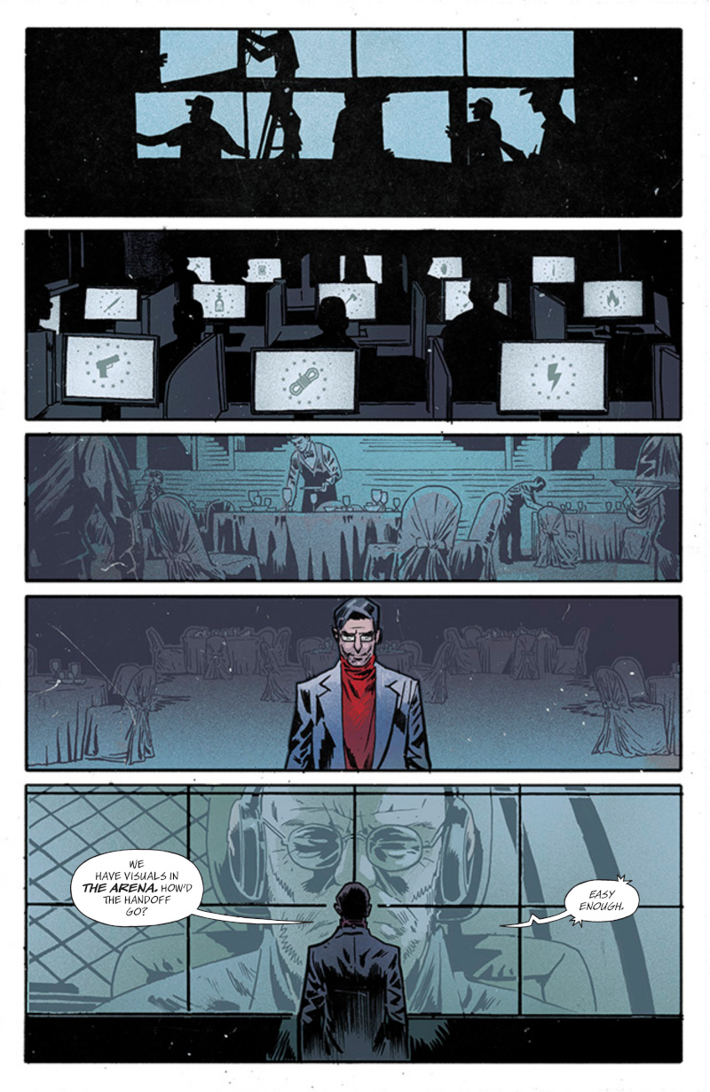
Oh, speaking of, let’s go to page 11. It’s an interesting page because of what it says about the 13 and what it says about Exquisite Corpses. This is the type of page that you could have skipped and it probably wouldn’t have terribly impacted the read, but I think it’s better that it’s in it. It underlines all the work that goes into the terrible games these people play. I mean, just the fact that you see all these workers setting up the meals and setting up the screens and working at the screens, it underlines how much of production it is to take over a town and set killers on it.
It’s not as simple as that sounds, and it really underlines the industry of this monstrous behavior. Was it important for you to show how much of a production this all is and to show the support they need to terrorize an entire city? Oddly, I feel like that’s one of the most horrific things from the entire first issue.
Michael: Yeah, I mean, it’s not necessarily a grounded horror story. This feels like exaggerated real life. But I think showing all these little moments with the 13 families and showing the production that the gamesmaster and the groundskeeper are going through to make these games happen, it grounds it a little bit and adds a bit of realism and helps to suspend your disbelief.
This stuff is important when you’re doing a horror story. And it also just adds to the pacing of the book too, where it slows you down for a minute before we get some of the big reveals because you want to play with the speed of the story as much as possible, especially in a horror story where you want there to be arcs and valleys in terms of what you’re taking in visually and how quickly you’re reading.
Is that James in panel four? Is that the gamesmaster?
Michael: Yeah. There’s a bit of a meta element in the design of the groundskeeper and the gamesmaster. I thought it would be funny, James agreed, if the gamesmaster had a bit of a resemblance to James and then the groundskeeper had a bit of a resemblance to me because that’s the role we took in the creation of this story. When we brought all the other writers and artists into the room, James was the gamesmaster in that room and I was the groundskeeper. I was the one on the ground with all the character designs making sure all that stuff worked. And then James was the gamesmaster behind the scenes organizing the story and making sure that worked.
These are the roles we took in the production of the comic. So I just thought it would be amusing if we also modeled the characters after us a little bit, although I did make the groundskeeper a lot older looking than me just because I felt like it fit the story a little better. (laughs)
So, for your audience, I do not look that old yet. (David laughs)
This first issue is triple sized. How did that open things up for this first issue? Did that allow you to do things like this that you maybe would not have been able to do if it was a typical 20-page issue?
Michael: 100%. I think we honestly had to. If we didn’t do this giant sized first issue and we spread this across the first three issues, I think it would’ve started too slow. You want to see a bunch of kills, but we also wanted to spend our time establishing this world and introducing all the killers in a very dynamic and big way. So being able to do that across one single issue, to dedicate an entire page to introducing a killer and the family that controls them in 12 pages, that’s more than half of an issue. And then you don’t get any of the civilians.
I think we had started off with the idea that this would just be a double sized issue, but in the writing of it, James was like, I can’t make this work in 40 pages. We need to just go as big as possible and go for a 60-page first issue. And then the idea was also that, well, we don’t want to price it like a 60-page issue because we want there to be a low barrier of entry for this first issue. So, let’s just do this as a $4.99 60-page issue, which is something you just don’t see in comics anymore.
This page showcases an important piece of work that went into the development of the series, which is the creation of iconography for the weapon each of the families uses in the arena. It shows up on the card each family holds up in the first issue. It’s shown on the monitors here in the second panel. How much time and effort did you put into, for a lack of better word, the lore of Exquisite Corpses?
Michael: Oh god, so much. I actually didn’t design the logos for each weapon. I had some rough ideas for them, and then Dylan Todd actually took the reins and took some time to design some of the iconography for the 13, just because I have an overflowing plate for this project. I’m designing so much and designing so many characters and so many different settings.
There was a point where I had started designing these, and I can’t remember who it was, but either James or someone at Tiny Onion was like, “We’ve got Dylan Todd designing a bunch of stuff for us. Do you want to get Dylan to design the logos for each different weapon that the 13 uses and some of the 13 stuff?” That worked for me in terms of the storytelling of it because I felt like I wanted all the design elements for the 13 themselves to have an elegance to them, and they’re almost a little bit more decorative than a lot of the other design stuff in this book. So, I thought it would be fun if we had another designer push something totally different than I was doing in the main world and add a different flavor to that.
Dylan’s an incredible designer, he did a great job on all of the 13 stuff, all the different weapons, and then he designed the 13 logo itself.
subscribers only.
Learn more about what you get with a subscription