
Design Talk: Tom Muller on Some of His Favorite Logos and Design from Comic History
I’ve noticed a recent uptick in people tweeting pretty similar questions about one subject lately, and that’s, “Who are the best designers in comics?” I’m not sure if it’s happening because of random chance or because there’s a genuine groundswell of support for better design in comics, but almost all of these tweets come with one core caveat: “Who are the best designers in comics…besides Tom Muller?” Because let’s face it, Muller is both one of the best and the most recognizable designers in comics, especially thanks to his work on the X-Men titles over the past year starting with House of X and Powers of X.
I’m definitely onboard with this increase in interest in design in comics, because better design means better comics, especially when it’s a top to bottom consideration on a title. But good design in comics is both not a new thing and something that can be factored in at a very basic level, like in the varying iconic logo designs throughout the history of comics. The roots of the work of someone like Muller are found within the near century of comic book history there is.
With that in mind, I thought it’d be fun to look back on some of the best logos in comic book history, but instead of me choosing them, it’d be Muller sharing some of his favorites. So that’s just what we did recently, as we chatted about five of his favorite logos from throughout comic history and one project that he thought exemplified design as not just a nice touch, but as a core element of a comic book project. It’s a super fun chat – and one that’s been edited for clarity – and an excellent tour of design throughout comic book history.
Give it a read, and hey, if you enjoy it, maybe consider subscribing to SKTCHD. It’s typically a subscription only site, but this week’s content will be open to non-subscribers. I hope you dig it, and again, if you enjoy, check out the site’s subscription page.
So we’re here to talk about five of your favorite logos and one comic that had front to back, top to bottom holistic design that you loved. We’re going to go over the logos first. Are these your five favorite or are these just five favorites?
Tom Muller: I was kind of thinking about that when you initially asked me if we wanted to do this and I think I landed on five logos that have always stuck with me or that have always been… They’re not necessarily books I would read over and over again, but they’re still at the front of mind. So I think it’s more of like designs that made an impact on me and that made an impression on me that stayed with me.
I was thinking about it this morning. Logos are effectively just comic branding. The ideal result, even if it’s a comic that you don’t love because obviously the logo has a little to do with what’s inside the book, is it does stick with you even if the comic itself doesn’t. It’s like you still remember seeing that.
TM: Yeah, exactly.
I do want to say I think it’s kind of funny because I had almost mentioned to you, but I was going to be like, “I don’t think you should include an X-Men logo. Just ignore that.” And you definitely didn’t go inside the box here. I feel I didn’t need to say that because I expected one classic Marvel or DC logo and it is very clear that that was not a thing that happened.
TM: No. I was going to be like, “Yeah, the House of X logo is so cool.”
“Holy shit, Drifter. My god. That guy rules.”
I was thinking about it too because I’m sorry that I always bring this up, Tom, but in our first podcast you brought the oil tanker idea about Marvel and DC and I never forget it, but I think it’s interesting because a lot of your logos were from the ’80s and ’90s. It’s interesting because it seems to me that at least early on in comics, all the most interesting design for a long time was happening in comics outside of superhero comics. Maybe not because that oil tanker idea, but maybe because they were a little bit more creator driven.
TM: Probably. I think part of the reason why I chose these logos as well is that was like… Maybe I was at a more “impressionable” age, that kind of thing. But I think pretty much all of them were… I was already studying design and I was already on that path. So maybe it’s because you kind of like to know you’re always looking for something interesting, like art students always trying to be a little bit outside of the mainstream and find these cool hidden things, which are still mainstream really.
The choices I made were things I liked or that impressed me as an arts and design student back then that still resonate with me today.
Yeah. A creator told me once that Paul Levitz had said that the comic you love the most when you’re 13 will forever be your favorite comic or something like that, and I wonder if to a certain degree that’s the case with other things. It’s like the stuff that you saw when you were figuring yourself out as a designer carries with you. I mean, even though you’re obviously always looking at new things, it carries with you because it was a foundational thing.
TM: Also, I think the ones that I chose like the majority of them are pretty timeless. They still look modern today and they don’t look like, “Oh, yeah. That was designed 20 or 30 years ago.” It still has that kind of very powerful graphic quality that could have been designed a few months ago, for example. So I think that’s kind of why these designs kind of stay with me or they’ve come… The design has come back in fashion almost.
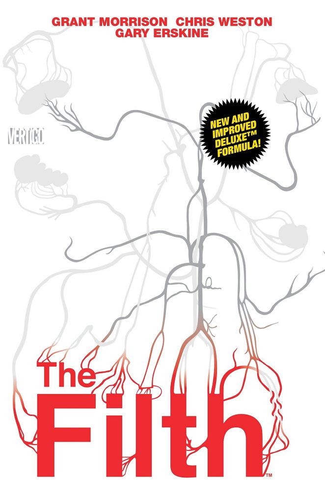
Well, let’s start with one that was in the early 2000s. So it’s the outlier here. It’s Grant Morrison, Chris Weston, and Gary Erskine’s The Filth, which I think is exactly one of the ones you’re talking about. Honestly, if that cover came out now, people would immediately be like, “This book looks amazing,” just from a design standpoint. So why is this a stand out to you?
TM: Well, I think the covers were all designed by a design agency called Segura Inc. I think it was Carlos Segura himself who illustrated the covers. They came out 2000-2001.
It was 2002 to 2003 when it was released.
TM: It looked nothing else on the shelves and it looked it was designed by a designer. And that doesn’t mean that there’s no designers in comics at that time, but it looked something that you’d find, say, in something that was pulled out of the design industry or magazine publishing or editorial design. It didn’t look a comic. The very pared back design approach. Everything was just set in Helvetica 75 bold. It had these really graphic… not graphic violent, but it had a very graphic design quality to it. All the illustrations were like diagrams.
There wasn’t any actual comic book art on the cover. So it looked if I would go to say a bookstore and go look for design books on typography, magazine design, like that kind of thing, it looked it had kind of left out of those books onto the front of a cover. I think that was the thing that immediately popped out to me. I mean, I was going to buy the books anyway because I knew who the creative team was and I still am a big Grant Morrison fan and it had Chris Weston and Gary on the art.
So that was kind of like a done deal. I was going to buy the series anyway. But it was those covers that really, and as a set of all 12 issues, it just looked like nothing else. It said to me, “Oh, wow. There is room for contemporary design in comics at that time.” And I just moved to London two years before that. So it was right in the middle of the whole design scene here. It felt very fresh and very contemporary. I’ll always pull that example out of my head whenever someone asks me like, “Give me a good example of a cover designer designing comics.” That really impressed me.
I think one thing that’s interesting about it is… I remember when it was coming out that other comics, you look at them and the logos are always kind of just where they are. They’re kind of a fixed element that’s at the top of the book. Sometimes they’ll be like, “Oh, I’m going to go crazy. I’m going to put it on the bottom.” But it’s normally oriented in the same space.
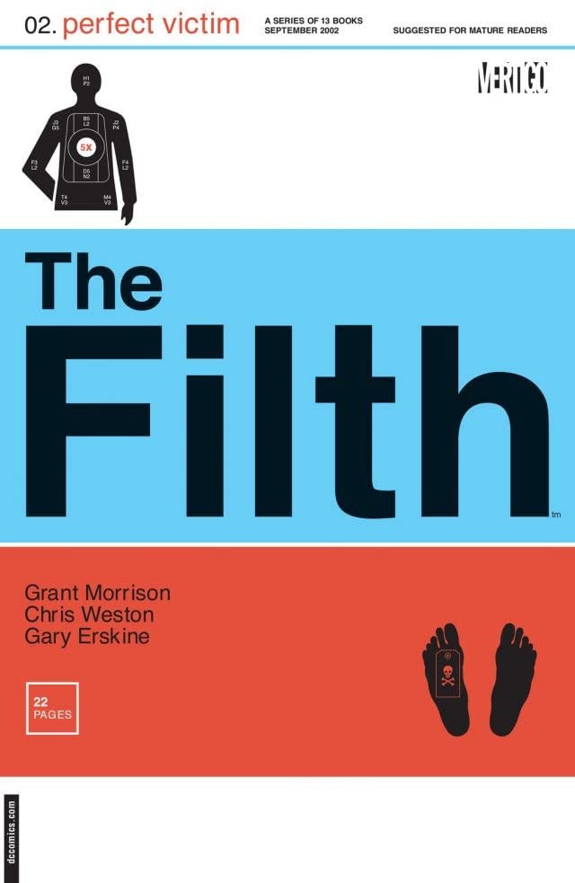
The Filth #2 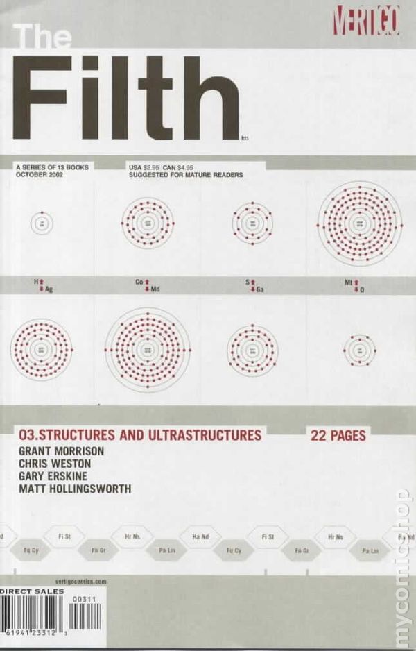
The Filth #3 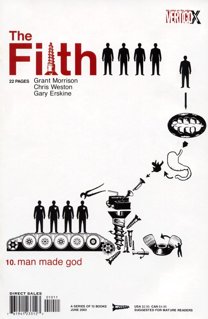
The Filth #10
One thing I thought was interesting about The Filth covers is when you look through them, it’s like where it is, is always shifting. What it’s interacting with is always shifting. On the trade cover, it’s like interacting with a nervous system. And it’s really interesting because it always feels like an interactive element with the rest of the cover. In a lot of ways, it actually kind of feels… You said like those design books. It reminds me of really good magazine design too in a lot of ways.
TM: Exactly.
And I think that’s interesting because I don’t know… One of the things that I always look for in a cover, and I’m not saying that you deliberately have to do something crazy to get my attention or something, but it’s just like you want to do something to stand out. I think the thing that’s interesting about the logo design is the fact that it’s holistically integrated into the cover design in a way that makes the logo. It’s always the same, but also it makes it feel slightly different every time.
TM: Like you say, it looks it could have been like a science magazine or something on newsstands or at a Borders or whatever. I think that was the thing that really intrigued me. It kind of tapped into this kind of aesthetic of what was very current in design at that time and I think even now, it still looks… Because it looks kind of timeless, right?
It does.
TM: It’s not really beholden to any kind of specific trends of that era and I think that’s why it’s just so powerful and it stays contemporary.
It reminds me actually in a lot of ways of what your guy Jonathan (Hickman) would do with a lot of his stuff where it’s just very graphic and everything. It’s obviously not the same, but there’s this one’s cover that’s like… What is it? It’s The Filth #3 I’m looking at right now and it’s all circles. It’s like structures and ultra structures. It feels on vibe with the stuff that maybe he would do or we’re going to talk about somebody else here in a little bit for the grand finale, the one that’s not just the logo, it’s everything. It reminds me of something that gentleman would do as well and just the way it’s kind of integrated.
TM: Yeah, exactly. I had the choice of either go with that gentleman or pick something from Jonathan. But we can come back to that later. It’s that kind of like just looking at design and doing something that’s not really beholden to what you would expect to see on a cover.
Yeah. I have to say one thing that surprised me is I was trying very, very hard, I was reading everything I could find about The Filth to try to find out who designed this logo, which is funny because it led to me reading The Filth’s Wikipedia page which is actually very hilarious. I had no idea it was an agency that did that. Was that atypical for DC/Vertigo to do or was this a special case? Because I had no idea that somebody like Segura Inc. would be doing logos for a comic.
TM: I have no idea. I think when I found out, that was for me the kind of… Also, a bit of an eye-opener like, “Oh, yeah. That’s possible.” I didn’t really know how comics or commissioning of work would happen because at that time I was just kind of just starting out and working with Ashley Wood which was completely independent. I had no idea still at that time how the system would work for the Big Two for example.
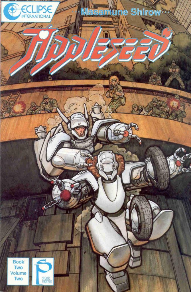
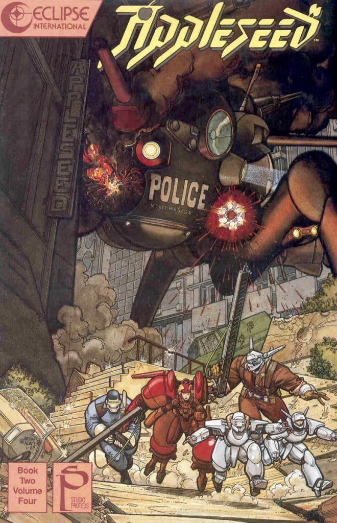
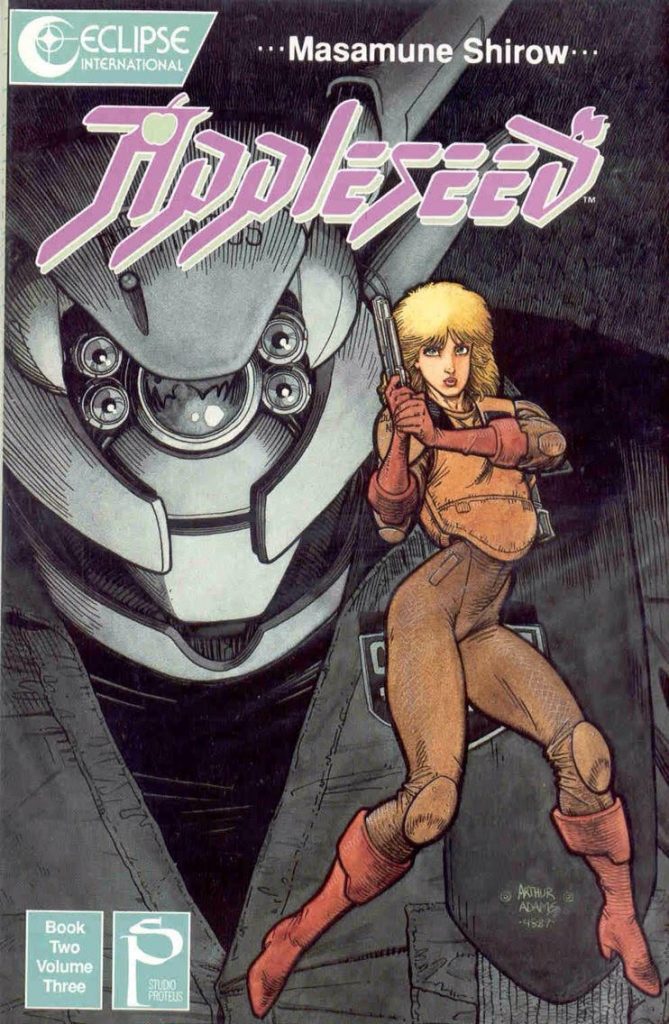
Yeah. I mean, I always thought that for the most part it was either in-house design or it was crater driven. Okay. So next example, we’re going to go to is Appleseed by Masamune Shirow.
TM: Oh, yeah.
Another one I tried to find an answer for who designed it… Actually, all these did and I was very bad at finding answers. I have to assume that he designed this himself, but I don’t know.
TM: I mean, the logo kind of persisted, but it was like the old Appleseed comics that were published by Eclipse. The American logo was designed by… I hope I don’t mispronounce his name. But it’s designed by Tom Orzechowski, the letterer. The guy who basically lettered every X-Men comic under the sun when Claremont was writing. I think he also designed the Spawn logo when Image was formed and a few other things. But he designed the Appleseed logo.
Like the one I sent you?
TM: Yeah. But I think the original Appleseed logo in Japanese had a similar design, but in Japanese obviously.
Right.
TM: I’m not 100% sure on this so I don’t want to mix it up.
It felt structurally similar. It was interesting because if Tom designed that, I mean, it’s kind of emulating shapes and everything. Obviously, language is going to shift and everything, but it felt very on vibe comparing the two.
TM: And I think the thing that spoke to me when that came out, because I think those early Eclipse editions, they came out and just looking 1989-ish, like late ’80s. Before the whole Appleseed and all the Shirow books moved over to Dark Horse, and they kind of kept the logo and that was used on the early Appleseed anime and everything. For all intents and purposes, it looked like sci-fi Japanese manga. It had a very abstract quality to it. The kind of like odd shapes on how, say, the P was formed and the little apple motifs within the A and the D and the extended shapes at angles.
It created a very, almost to my eyes back then, otherworldly, very strong graphic shape. If you look at graphic design now and… There’s this whole circular thing which pretty much happens with everything in culture and design that everything is kind of circular and trends and styles will come back in fashion. You see a lot of younger designers going back to design that was from the late ’80s, early ’90s, that kind of aesthetic.
It has already kind of come back. I can see that in type design and typography, that kind of like distorted shapes of letter forms. It reminds me of that Appleseed logo where you slightly start pushing the legibility of individual letters, but it’s still as a word, it reads very clearly. But when you start to look at the individual details, you start to see all these weird angles and how the shapes are constructed. I think that’s still one of my favorites.
It helped that all the covers were very early Arthur Adams art as well for that whole series of volumes that Eclipse did. So it was this kind of beautiful art with an amazing logo that immediately gave you a sense of “wow” to get an idea of what you’re to be reading.
That’s what one note I wrote down about this is it’s really interesting looking at those covers and then looking at the logo. It just all feels very on vibe. It feels very consistent with each other which I think is really important because it’s like The Filth is the same way. It’s like you said, it was Helvetica, what?
TM: I think it was a Helvetica 75 bold.
Yeah. It’s like there’s something about that that just fits that. And this custom one, the Appleseed logo, everything about it just feels very on vibe. And I think that goes back to the branding thing. It’s just like you want to be consistent with what your identity is and what Tom came up with is very on point.
TM: And also, it somewhat reflects the character designs, like the shapes that you see within the story is kind of extrapolated into the design and the shapes of the logo. I love that.
You know what it reminds me of? It reminds me of when somebody’s doing sound effects in a book with the art and everything like that and it’s the artists themselves, when they do it themselves, it feels of one part because it’s the same hand doing it. What Tom kind of achieved here is in the same way, he did a very excellent impression of that because it feels sort of the same hand.
TM: Yeah, exactly.
I have to admit, this is one of those books that I’ve never actually read, but I remember Daniel Warren Johnson hyping it up when I talked to him once about Murder Falcon.
TM: Of course. Yeah, he would.
And it’s funny because now that I’ve looked at this, I’m like, “Why have I not read this?” It’s ridiculous.
TM: It’s not as dense as, say, Ghost in the Shell, but it’s very layered like, “Oh, his stories are very layered.” It’s not just action and big robots, but I think that logo just completely complements the story.
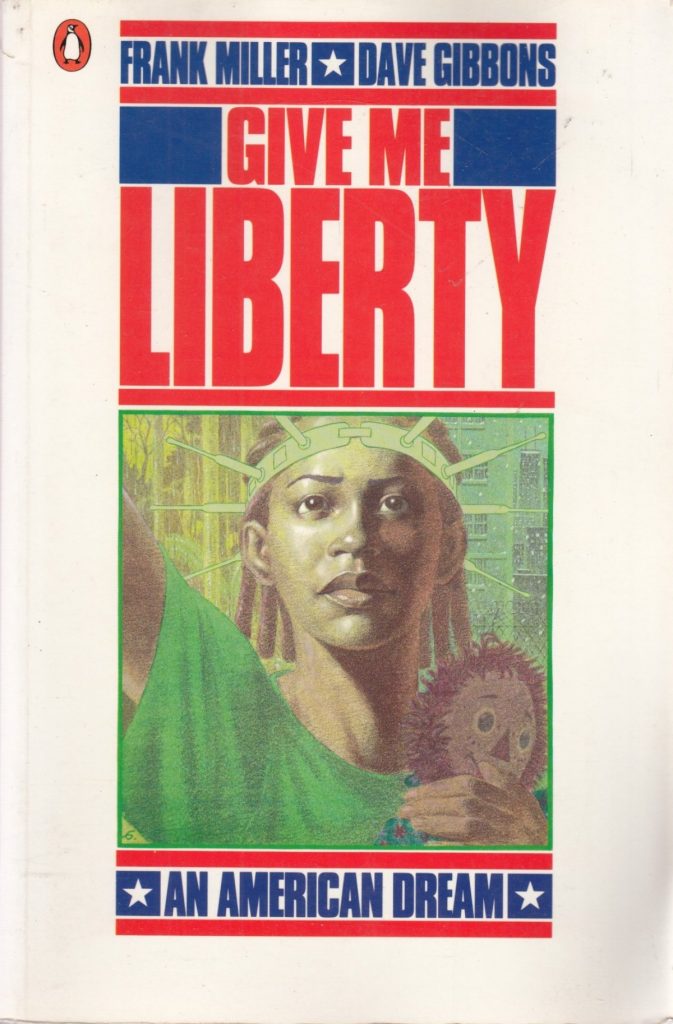
Well, the next one we’re going to talk about I think does the same. It’s Give Me Liberty, Frank Miller, Dave Gibbons. I really love this one. I think it’s really interesting because its art and design has a fixed width. It’s really interesting seeing how the single issues and the trade are different because in the single issues, it has An American Dream underneath Give Me Liberty and then at the bottom there’s a title for each issue. It’s very uniformly designed. It’s very well thought out, but for you, what stands out about this one?
TM: Actually, I discovered Give Me Liberty while I was still living in Belgium and they published translated editions of Give Me Liberty and Watchmen around the same time I think. And they published them in album format. But because of the American comic book format is slightly taller and narrower, if you were to kind of scaling it up to a European album format. What they did was they came out with this what would be… I think you can compare it to a thick prestige format kind of one shot almost, but a lot bigger and taller. It had a thick card cardboard stock.
So I’m kind of thinking what the closest equivalent would be for… I don’t think there’s any kind of example similar in kind of that size of how it was published in American Comics or graphic novels, but it was really big. Especially that title block just screamed at you. I think it was the first series of Give Me Liberty, so they published it in four books and you had Give Me Liberty, the subtitle.
Even though it was in Dutch, they still adhered to the design and the type treatments and everything. It’s just such a simple design of perfect type setting. You get the feeling, you get the sense of the American flag immediately through the use of the colors even when later, they start to kind of tweak the color blocks and the color on the text.
But you still get that because you still recognize it as a bit of a flag just in the way that it’s constructed. And I think it’s just a perfect example of don’t use anything but ready available fonts, very well type set, very well designed. And it has this kind of almost like 50-50 split between what’s design and what’s art on the cover. Again, it’s one of these books that can be published any year and that design will never go out of fashion.
I think it’s funny that you said that Give Me Liberty kind of screams at you and everything, because I remember the first time I saw this, I want to say I was in Burien, Washington visiting family and I was in this old bookstore and I was looking through comics because every time I’m in a bookstore, I’m like the philistine who goes straight to the comic section, because I just want to see what they have. I’m flipping through and I see Give Me Liberty. I’m like holy crap. I mean it’s like in your face.
I mean, that’s one of those things that I really look for in a cover personally is you want something to draw your attention, like the way that they did it is just being in your face. That really works. But I did want to say, I think that this is a good example of the integration of the art with the actual design because a lot of times I feel like… Well, I mean just by the nature of comics, those two items are developed separately.
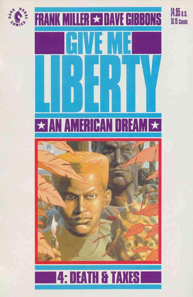
It’s like the art is designed or is created and then the logo is integrated into that when the logo already exists or the design elements are retrofitted onto it the best way you possibly can. I don’t know who did this.
TM: Probably Dave Gibbons. I wouldn’t be surprised if Dave Gibbons did the design or had at least a big input into the design of the covers.
Yeah, that’s kind of what I thought. It feels it’s coming from one mind for sure because it’s so carefully and perfectly integrated with each other.
TM: And also if you look at the covers, so you’ve got basically the text block in the image kind of sitting in the middle and you’ve got the big white gutters with the Dark Horse logo and the kind of the price and everything on the sides. I remember now on the Dutch versions, they basically almost trimmed off those sides so you got quite a very tall rectangular format for the comics. I mean, they were like albums really so I think that kind of helped sell that design even more because you lost that white space. So everything gets much more kind of compact and deliberate.
I do want to say one other thing about it too. I mentioned this earlier, but on the single issues how it would say, for example on the first issue, on the bottom where it says An American Dream, it would say, 1. Homes and Gardens. And then the American Dream shifts up. I think it’s funny that this is both a very set fixed design, but also really flexible. That’s a tough line to walk.
TM: Then I think afterwards when you go into the all the sequels that they’ve produced like Martha Washington Goes to War. They break the format a little bit, but it still kind of works in a way. But I think especially the original cover design for the original series is still very powerful, very timeless. Even when they did the big omnibus a few years ago. I mean, they just kind of took that design and nothing really needed to change.
Well, it’s the timelessness that we were talking about earlier. If it’s really well designed, it just kind of lasts.
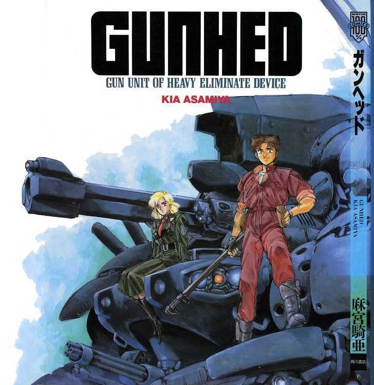
Now, the next one, I feel this just has an immortal quality to it, at least in part because it’s really simple compared to the rest. Gunhed.
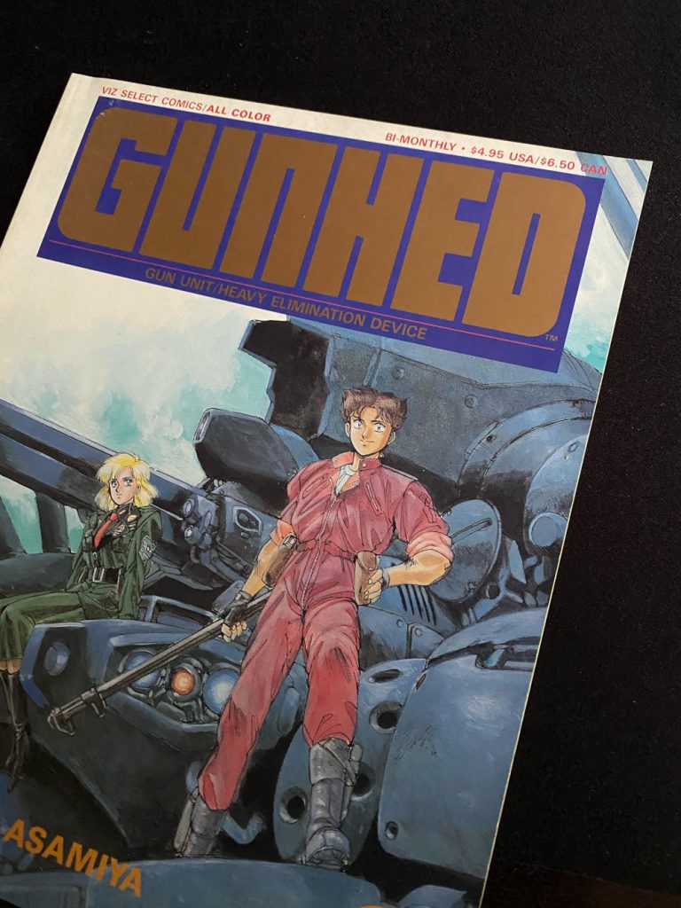
TM: Yes. That’s a weird one because actually, I bought that first issue on a whim whenever it came out, again in the early ’90s. It was Viz Comics. Again, I was already studying design and was looking for something different from the usual Big Two kind of comics. And the thing that attracted me to the book was it’s a very small square perfect bound format and the actual comic, the front, has the title. I think it’s printed in a gold Pantone, a metallic Pantone color and it’s the same for the back.
The back is basically gold with the Gunhed logo and then the subtitle of Gun Unit Heavy/Elimination Device. That kind of lockup in the center of basically what looks a gold square set in very dark blue. As a design student back then, I was really attracted to that simplicity and the beauty of the geometric shapes. I think it’s all pretty much the same, where the U and the N are basically the same shape but inverted.
There’s no round corners except for the G and the D. It’s in a design style that I really like and that I’m guilty of using as well when the right project comes along. I really like that, very timeless. I think that’s kind of the thread here of what we’re going for with all these logos. It’s very timeless. It doesn’t give away when it was designed. It looks very straightforward and oh, yeah, someone just typed out the word Gunhed in a condensed sans serif.
But then when you start looking at the details, you notice that it’s all custom. It’s a bespoke logo design that just fits perfectly on that format. Because it’s only three issues. I think in the second issue, they use bright Pantone colors again. So it’s that very kind of bright colors with just a very strong graphic word mark that just sells it to me.
I think one of the interesting things is the kerning in it. It’s so tight that when you look at it, it’s like I almost get lost in it. It’s like I’m looking at a maze of letters. There’s something really attractive to it because it very clearly says Gunhed, but you also can get lost in it in this really potent way. I don’t know. This one is really fascinating to me. I really like it.
TM: The fun thing is, is that this is basically a manga adaptation of one of these like ’90s live-action, big robot movies. I think it was a co-production between an American production company and a Japanese company. I mean, I love the logo for the film as well, but it is completely different from the logo they went with on the manga. I mean, they could have used the film logo and it would have been fine, but it’s I think that kind of contrast is quite interesting as well.
We have five very different logos in a lot of ways and there’s the timelessness that we’re talking about, but they’re very different. I’m curious if these logos that stand out to you have… Do you feel there’s a real impact on you as a designer even subconsciously or is it more…
TM: Oh, yeah. Definitely. I mean, looking at maybe not so much the Appleseed logo per se, but just the approach of-
The mindset behind it?
TM: The mindset behind it and it’s basically, I think they kind of confirmed my bias or kind of the way that I think design should be and those designers and those logos that they kind of affirmed, “Oh, yeah. I fit in that kind of way of thinking.” And the way that I want to approach design was already being validated in a way. As a young designer, it kind of spurs you on to dig a bit deeper into the way that those logos are designed and then when I start designing logos, it is in the back of your mind because like you said with that Paul Levitz quote, I think even for artists and writers, that comic that you read when you were 13 years old, that will in some way inform you when you actually start writing or drawing or anything else. So I think in a way those kind of are foundational logos for me in terms of my tastes in approach to design.
Yeah. I mean, when you were talking about Appleseed, you were talking about the shapes and some of the way that works off of each other and everything. In a lot of ways, it reminded me of some of the stuff I’ve read from you in talking about the variant X-Men logos and how it’s the same design language, but you move them out from there. It starts in the same spot. Sometimes, it’s not even the look of the design, it’s like the premise of it and what it’s trying to do.
TM: Definitely. The logic behind the design decision and how you can kind of stretch that and tie it back into the thing you’re actually designing for.
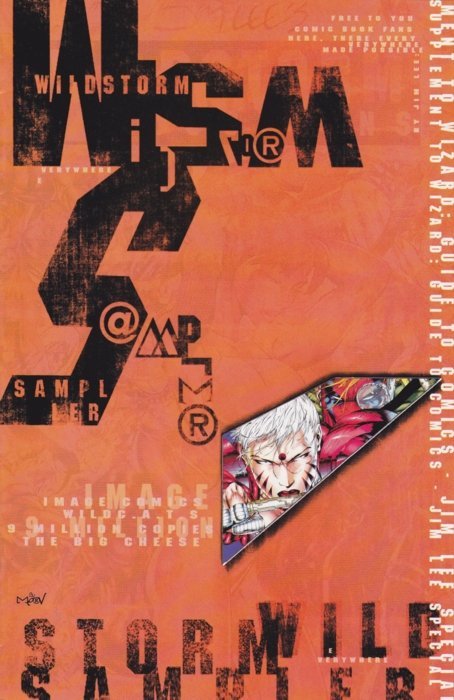
So the last logo we’re going to talk about, I think this one is really funny because I was a hardcore WildStorm fan back then. Granted I was 12 when this came out. But at the same time, I have never seen this in my entire life. And the first thing I wrote down for this one was you were just trying to do a deep cut on this one, weren’t you? It’s the WildStorm Sampler 1996.
TM: Yeah, 1996. So I was two years from graduating college, and at that time I was working at a comic book shop in Antwerp. So maybe that’s why I managed to get a copy. But it was like one of those freebies that just would come in and there’d be a stack in the store so people would just take them and it’s a promo material for the next slate of WildStorm comics because I think it was that second wave of when Warren Ellis came in, when the second wave of artists and titles came in, like Aron Wiesenfeld had done Team 7 and then he was going to do that amazing Wolverine/Deathblow team up.
I think it was also the X-Men/Wildcats, like those four books that came out. This was just kind of like one of those promo giveaways, and that just hit me right between the eyes when that came out because it looked like someone had designed this and then someone must have… To me, that felt someone had designed that in the credits. It says like, “The art is formerly known as Merv.” I have no idea who that is.
But it looked to me like he designed that thing and then someone came in. He’s like, “Oh, no. Actually, this is for comic books so we need to have some art and stuff in it. It’s not just like a magazine thing.” To me as a design student, it was like “wow.” I didn’t know you could do that in comics because it looked like the design, the thing back then, we were all enamored by the work of David Carson, Tomato Substance design…Carson did Ray Gun Magazine then Substance and Neil Ashford took over after David Carson left.
Tomato obviously was a very well-known design collaborative art group here in the UK, and still is, who’ve done amazing projects and worked in typography type design, like commercials and everything. It was that kind of aesthetic that the person that designed that sampler used to design that whole booklet. I’m not too super keen on the actual internal pages because then it becomes more a splash page of “here’s Gen 13, here’s Brass.”
The design had to make way for the traditional comic book art and promo pieces. But that front cover was… I still think it’s an amazing piece of rogue design that somehow made its way into into the WildStorm outputs. And the funny thing is back then I always had it in my sketchbook because it was… It’s a really thin pamphlet. So I would always have it as a point of reference and kind of just a cool thing to look at.
One year, Dave McKean came to do a signing at the comic shop where I was working. So I handed him my sketchbook for him to do a piece and he opens it and he sees that thing, the cover, that sampler and even he went like, “Oh, that’s interesting.” I mean he was like, “Well, no that’s not one of mine.” Because I think Dave McKean used to do that very kind of collage-y approach when he was designing titles like cutting and pasting different shapes of different fonts and shapes of different individual letters to create a new shape of “A” or whatever.
So there was a bit of that in the design as well. So he was kind of looking and did a double take, “Hang on a second. No, it’s not one of mine,” which I thought back then was very cool. This like is a very random deep cut for me.
Well, it’s funny though because in some ways, this is the one I can see you the most in. I don’t mean it is exactly like that, but one thing I really appreciate about your work is that you don’t always go with what… It’s like when you’re designing, you don’t have a set style. You find the right answer for each project you’re taking on. This was this person finding the right answer for the project they were taking on.
I don’t know. It really works. But I do think it’s funny though, because I feel WildStorm was on the design or they were in there a little earlier than others were. Because did you ever see Wildcats 3.0?
TM: Yes. Well, that was all Rian Hughes’s work.
And that was great looking.
TM: Oh, yeah. That came after this.
It did, yeah. It was around 1999, 2000-ish.
TM: I’m just kind of flipping through the book. I think they’re advertising the… I think it was Alan Moore. He joined Wildcats and it was after his run ended. Joe Casey and…
Sean Phillips?
TM: Sean Phillips took over and then Rian did the whole dress for that run of the series.
That was a really wild stretch for WildStorm because you got Joe Casey and Sean Phillips and then it was Joe Casey and Dustin Nguyen. I will say, I don’t know this to be a 100% fact, but I always feel like Joe Casey books are interesting looking. I don’t have good point for that, but it’s like I remember Butcher Baker looking really interesting. And maybe that’s a Mike Huddleston thing. I don’t know.
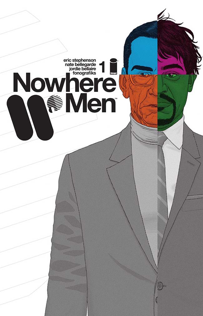
The last thing we’re going to talk about is the big project that has a holistic design that you really love. I was really not surprised by this one because it’s one that I absolutely love too. It’s Nowhere Men, Eric Stephenson, Nate Bellegarde, Jordie Bellaire. But most importantly, letterer/designer Fonografiks, aka, Steven Finch.
TM: I think Steven should have a website because I’m always like I’d love for him to put all his work online because it’s so great and then I can just look at it and I’ll go at it.
I feel like he’s incredibly underrated. People don’t really talk about him when it comes to designers. I’m trying to think of what he’s done. Saga is obviously a big one. I mean, Nowhere Men is huge. He didn’t do They’re Not Like Us, did he? Did he?
TM: I think he might have. 1
It’s very similar.
TM: He’s done Injection. He’s done… Now, I forgot. 2
It’s funny because the very first time I interviewed him it was for Zuda. Do you remember Zuda?
TM: Oh, yeah.
Yeah it was for a Zuda comic that he lettered and it was funny because at that point, I was just like, “I don’t know who this guy is.” And then he was lettering a bunch of stuff and designing it. I was like, “this guy is amazing.” So what is it about this book that stands out for you from a holistic design standpoint?
TM: To begin with, when I saw the book announced and then saw the first issue, the first thing that popped in my head was like, “Oh, I wish I would have been able to do stuff like that.” So basically when I had to choose the the holistic look of one thing, I immediately went Nowhere Men, but then I was also thinking, “Oh, maybe The Nightly News,” because that throughout the whole thing has a very strong design point of view.
I chose Nowhere Men because for me there was just some… Like just the quality of the application of design within the story and the way that Steve’s design just gels incredibly well with Nate’s artwork because the whole story, it goes back and forth in time and it starts in the ’50s and ’60s, and it goes forward and you’ve got that mid-century corporate American modernism design, and he just nails it.
It’s just so understated, but crisp and fresh. Because sometimes you get these things where you have to do a pastiche of something or you try to mimic a design style from a certain period. A lot of times that can just completely backfire because you maybe unconsciously would like…something would seep in from your current design styles or trends and it wouldn’t really work.
Every design element in Nowhere Men just clicks. When you go through the book and you’ve got all your magazine pages, your ads, your kind of just like graphic almost interstitials or breaker pages. It’s all pitch perfect for me. So that’s why I’ve chosen that one as my kind of holistic design approach.
I think it’s really funny. Relative to the way that comics normally work, the very first page of the first issue being an ad for World Corp. that was designed by Steven with art by Nate is such a wild choice, but it’s kind of like this perfect introduction to how this is not going to be a comic that you normally read.
TM: Exactly. Just everything kind of clicks because you got Nate’s art, but Jordie’s way of coloring this book. It’s kind of understated as well. She uses a lot of flat colors without very dramatic rendering and shading. I think Steve just hooks into that with his color palette. It all just kind of works and it blends into each other. So you don’t get that thing where you’re reading and then all of a sudden it’s like, “There’s a page and then now I’m back in the comic.” I mean, it’s kind of like the contrast on the X-Men comics with the white pages especially to create a bit of a jarring break between the comic pages and the data pages. But here, it just seamlessly blends and it’s one solid consistent reading experience.
I was going to bring those up because obviously those… Are you calling them white pages now or is it…
TM: No, no. Data pages.
Okay, data pages. I remember the one person who grumped at you for the white pages and I was just, “Oh no. Did he win? Are we calling it that now?”
TM: No, no, no. With those pages, Jonathan really wanted to make-
A hard break.
TM: A hard break. So that’s why they’re basically colorless except for some red accents. But that was kind of the inverse of what the team here for Nowhere Men basically did.
Yeah. It’s funny though because looking back on it… I remember when House of X #1 came out and everyone was like, “Oh my god. I’ve never seen anything like this.” I’m not saying that you guys aren’t cool. You guys are definitely cool, but the stuff that they were doing here like there’s the… God, what is it, the scientific… It’s not Scientific American.
TSC. It’s The Science Chronicle. It’s like this perfect introduction to the the four guys from World Corp, the guys who started it and you get all this information on it. But at the same time it’s like that type of data delivery is such a great way to deliver information that helps you in your read, but it also got Nate’s art in there. It’s designed by Steven.
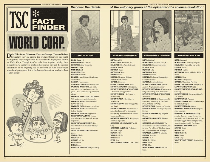
One thing I really like in the very first one of those is this really cartoony version of the characters that Nate did in there. It’s really nicely worked into it. I mean, I just think it’s interesting because this is like a proto, but opposite, version of what you guys do with your data pages.
TM: Yeah. I just love the whole design approach of the whole book. I mean, I’m holding the first volume right now just kind of flipping through it and it’s like… The design pages, they give you a little bit of a break, but it’s done in such a way that it’s kind of like, “This makes sense. This is part of the story.” You’re not kind of being pulled out of the experience.
Yeah, exactly. So I’m going to use a word that I feel is very Jonathan, but it’s got all the apocrypha from the world and everything. It reminds me of how Lazarus does a lot of this stuff really well, where everything from the book feels like it’s from that world. So it makes it feel like it’s a very immersive read for that. This is a weird compliment for Steven for Fonografiks, but I really like how he uses back covers and uses credit space and everything like that.
The back cover for the first issue of Nowhere Men is really nice and it’s funny because I think it was actually eventually repurposed as a front cover. There was a variant that was used for it. The credits on the back, which is actually what would normally show on I think basically the inside front cover – all the indicia and everything like that – it’s like he creates such a minimalist version of it that really separates it as far as you possibly can from the main text. And I think that’s just really smart.
TM: And as well as all the individual covers for the single issues. They keep that very minimal. There is a link, I think between those covers and The Filth. It’s the kind of same aesthetic approach. Very iconic but very clean and it becomes hard to date those comics because the design is so timeless. And especially because the whole aesthetic here is very purposefully based on that kind of mid-century American modernism.
It’s kind of like it has already aged, but it’s still timeless and relevant. So it doesn’t matter when you would pick up one of those comics. It would still look like, “Oh, yeah. That just came out.”
Tom, I love that you brought that full circle because I was planning on it, but you beat me to the punch. This is perfect. I mean, it is interesting. It’s funny how you’re talking about mid-century and then you’re also talking about timeless. I don’t know what makes that timeless, but it’s just the clean minimalist look just feels like it always belongs everywhere.
TM: Yeah. If you read up on design history and when American modernism in graphic design and advertising came in, it was kind of a revolt against overdecorating things and going through this very purposeful functional look and design approach where ornament makes way for function and timeless utility that works across everything.
Pretty much every massive corporation gets a logo and a brand identity that’s set in Helvetica with an abstract geometric logo. I mean, that’s what Nowhere Men in Steven’s work perfectly bites into, just nailing that kind of aesthetic. And again with the previous examples, it’s an aesthetic that I personally buy into and use. That’s my mindset when I design a lot of things. So there was an immediate kind of like, “Oh, man. I love this” when I saw that.
Thanks for reading this featured interview with designer Tom Muller. If you enjoyed this chat, consider subscribing to SKTCHD for more content in this vein going forward.