
“All of Decorum is a Group Effort”: Mike Huddleston on the Style and Art of Decorum
I’m not sure if I’ve adequately conveyed this out there on the internets, but I am something of a fan of artist Mike Huddleston’s work on Decorum. Honestly, I’m always a fan of Huddleston’s art, but his Image Comics collaboration with writer Jonathan Hickman, designer Sasha E. Head, and letterer Rus Wooton has turned him into a human highlight reel, and the artist who has impressed me the most in 2020. His effortless shifting between styles, his gorgeous colors, his alternately stately and effect character work…it’s all perfection and very much up my alley.
Naturally, I had to reach out to Huddleston, if only to gush directly to him about his work. So that’s exactly what I did, and it led to an extended conversation with Huddleston about his art, influences, partnership with Hickman, and more, before we dove into varying pages and works from the series itself. If you’re a fan of Decorum, you’ll love this. If you love this, you should read Decorum. You should really read it anyways.
Also, this interview is open to non-subscribers, but if you enjoy it, please consider subscribing to SKTCHD for more content like this or of a hopefully similar quality!
Your work in Decorum feels like it is a melting pot of ideas and styles and all kinds of other things – in a very good way! – with you being able to reach into a bag of tricks and find the right solutions for every problem. I know you went to art school, but where do you think the seemingly voracious appetite you have for art comes from, and how did you learn to manifest it in your own work?
Mike Huddleston: Wow, those are good questions. As far as appetite for art I think it’s something that has evolved over time. Like any kid I loved to draw and watch cartoons but I wasn’t exposed to a lot of culture or anything really artsy growing up. My mom started buying me comic books as a way to keep me entertained on nine hour car rides to my grandparents’ house but that lit the fire, I guess.
Shortly after that I’m in my room studying “How to Draw Comics the Marvel Way,” books on how to draw animals, perspective, how to render with markers, etc… so I was wanting to make something, but I didn’t have any aesthetic appreciation for “art.”
The first artist I remember being able to identify and really liking was Marc Silvestri when he was on X-Men, and then when Jim Lee showed up I was just blown away. I couldn’t tell you what “style” was but I was starting to have opinions about it.
I think everything really changed in high school when I just happened to pick up Dave McKean’s Arkham Asylum. It just melted my brain… I had no idea what I was looking at. I remember taking it home and just staring at it. It was a comic book… but it made me feel strange. It was scary. I couldn’t figure out how any of the images were made. It was an enormous experience for me. Pretty quickly after that I picked up Kent Williams and Jon Muth’s Meltdown and Sienkiewicz’s Stray Toasters.
It was those three books that really made me go: “This. I want to do this.” And those books in turn opened doors to the Tarot, Barron Storey, Egon Schiele, ’50’s advertising illustrations, Mark English, Bob Peak, etc. There are a lot of influences condensed in there.
So I think I just fell in love with that experience of having my mind blown by some new discovery.
Taking all that into my work though didn’t really begin until after art school when I had my first job working at Hallmark Cards. At the time, Hallmark had one of the largest creative staffs anywhere and I was exposed to a universe of art and styles I had never even thought of: floral artists, people specializing in watercolors and pastels, calligraphers, designers, etc. It was amazing! The department I worked in pushed you to have a range in your art so not only was I learning most of what I know about color and design there, but I had this low risk laboratory to try out new styles constantly. Hallmark was really my art school.
Once I left Hallmark and started working full time in comics it then became a question of how to find spots to stretch and experiment with what I was doing. On my creator owned books I was using the covers as my opportunity to try stuff but my interiors were still pretty basic. The first real move towards where I am now was on my second project with Phil Hester, Deep Sleeper. That story took place in our world and in the spirit world so I illustrated each in a different style, and that has slowly grown into my approach on Decorum.
When it comes to influences for your work, do you have a pretty set group of go tos when you need inspiration, or does it really depend on the project?
MH: Much of it is dependent upon the project. I do a lot of researching for whatever I’m working on and that can take me pretty far afield. Something like Decorum especially has me doing research on architecture, vehicles, creature design, sculpture, fashion etc so I’m just taking in a ton of ideas all the time.
As far as “go tos,” artists like Moebius, Katsuhiro Otomo, Mignola and Bill Sienkiewicz are all regular sources of inspiration or help when I’m stuck on how to solve something.
There are also a ton of artists I look to, not so much for direct inspiration exactly, but to keep the pressure on myself to get better. Artists like Nic Klein, Eric Canete, Dan Panosian, Viktor Kalvachev, Claire Wendling, Katsuya Terada, etc. etc. The talent level in and around comics now is incredibly high.
It seems like there was a lot of lead up to this book before it was even announced, with five issues completed by about the time it was even announced. What’s the origin story of this project, and why did working with Jonathan appeal to you?
MH: Decorum really got started with a Facebook message from Skottie Young. Skottie messaged me and asked if I’d be interested in talking to Jonathan about a project, which of course I jumped at. When Jonathan and I finally connected he basically said “I like your work, what do you want to draw?” Stunned, I said I’d like to do something big and sci-fi, and that was really it.
Jonathan went off and created Decorum and started feeding me scripts. It still feels unreal how it all came together.
You know, at the beginning working with Jonathan was appealing because obviously he was a great writer, he’s a huge name, and he has a passion for science fiction and design, which those last two I share.
What I couldn’t have known then is how well our sensibilities would work together, both as collaborators and as co-creators of a world. It’s been a really unique experience, and hopefully we can do it again.
What’s your process when it comes to Decorum? Does it start once you get a script from Jonathan, or are you two talking out what’s going on in the book before you even get to scripts?
MH: The process starts off pretty simply: Jonathan sends me some writing, which can range from a full issue to a single scene, and I get started laying that out. We aren’t working with full scripts that call out panels and page counts etc., so this is the first time I’ve had a lot of input in the pacing and storytelling.
Once I’ve broken the writing down I’ll let Jonathan know it equates to “X number of pages” so we both have a vague sense of how big each issue is getting and then he often doesn’t see anything until the art is finished.
When reading the script if I have an idea that seems really crazy or maybe overly interpretive of something Jonathan wrote I’ll email him a “how about this?” pitch, to which his answer 99.9% of the time is “Sounds cool.”
In the early days of working on Decorum there was more talking back and forth between us as the project was all in Jonathan’s head and I was just getting to know the world. The first idea I had for Imogen’s look was all wrong, there was at least one location I pitched that set the wrong tone for the book, the first covers I pitched didn’t tell readers anything.
What’s evolved over time though is kind of an interpretive relay race where I do my thing and riff on whatever Jonathan has written, then he and Sasha 1 go off and respond to that with an additional layer of writing and design work that wraps around the art, often providing whole new story ideas or making surprising connections between ideas already in the book.
There’s a feedback loop here too where I’ve been inspired by some detail or info in the design pages and that has worked its way into the art in a later issue. This is probably my favorite part of working on Decorum and it makes me thankful for the whole team we have on this book.
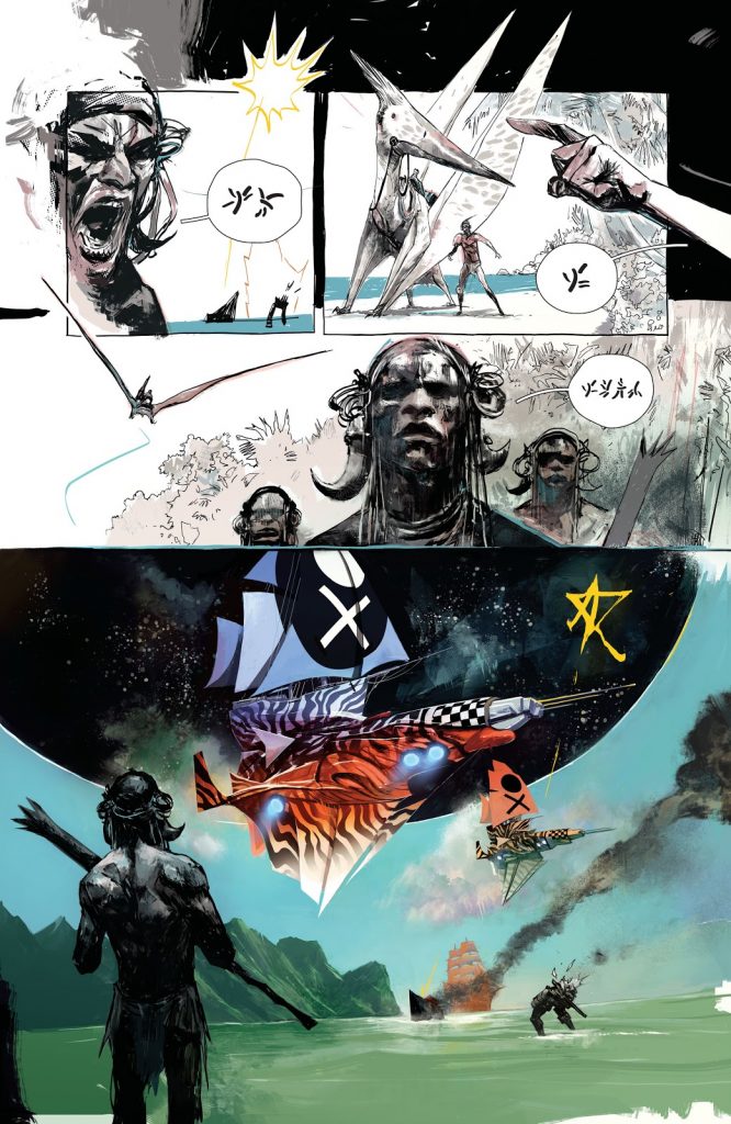
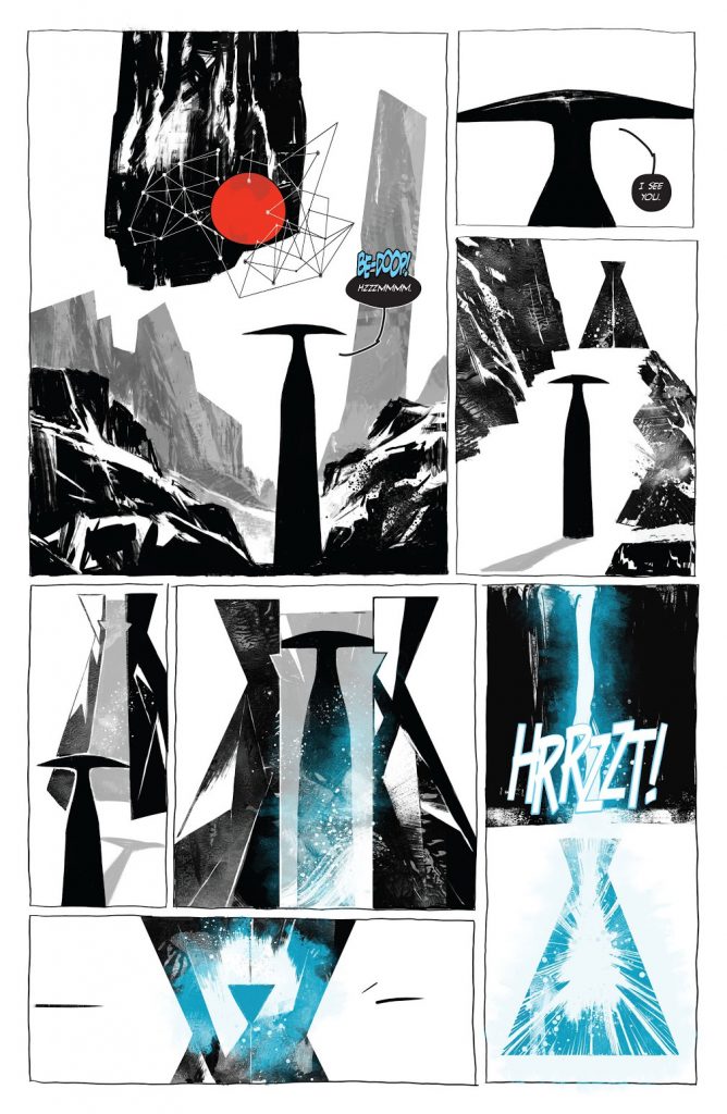
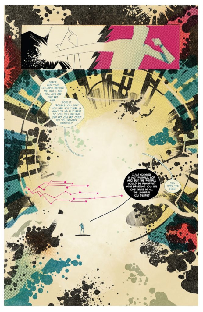
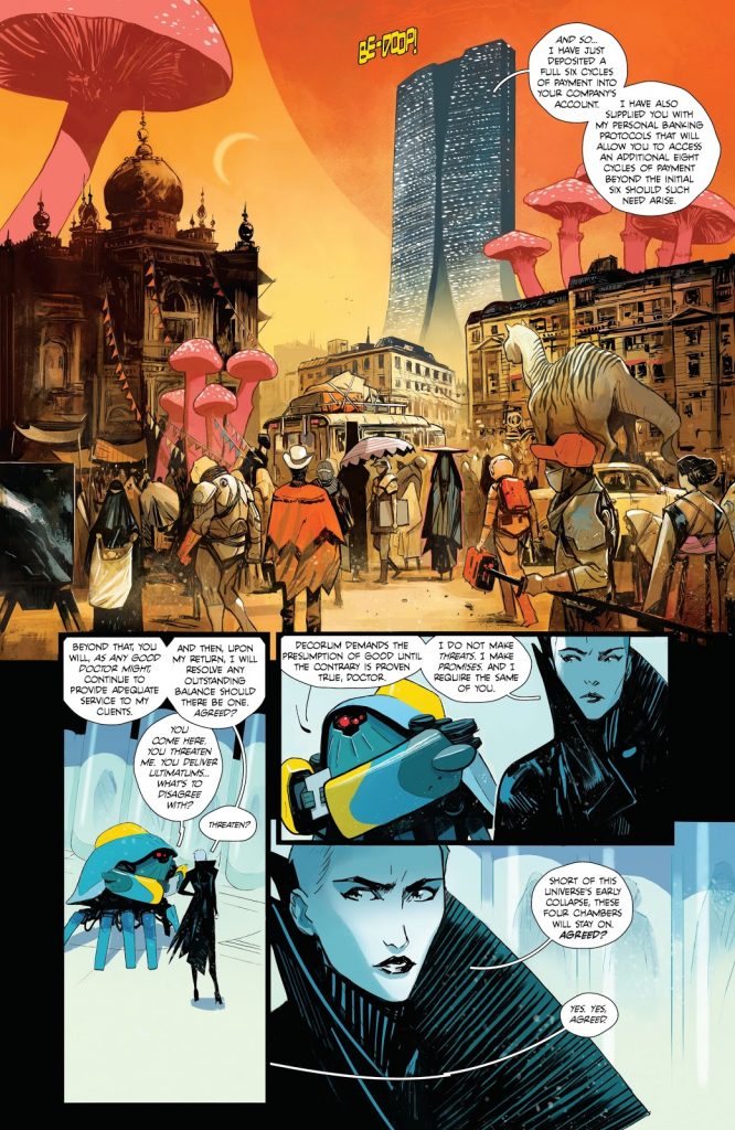
I talked about your varying styles already, so we might as well start there. I selected three pages from the first two issues of Decorum as examples of just how much your look and approach vary from scene to scene, situation to situation, and certainly issue to issue. Presuming it isn’t a spoiler – which it very well may be! – is your approach for each section in Decorum purely dependent on environment/story thread? And when you were developing the visuals for the book, how did you define the style for each thread? Are there specific rules, or is it a little more feel based?
MH: It’s entirely “feel” based at first. When I read Jonathan’s scripts I’m seeing the scenes in my head and somewhere in there a feeling or idea is getting attached to those images. My thought process then is about how best to communicate those ideas and for me, style is a big part of that.
So for the images above, it probably went something like: 1 ) “This scene feels huge and exotic plus it’s a reader’s first look at this world, how do I sell this?” 2) “This needs to feel as alien and austere as possible,” and 3) “Okay we’re meeting a cosmic god, how do you get that across in comics?”
At that point all my personal likes and influences start dictating how those visuals come together and you end up with pages where the art lands in very different places. The only rule I’ve imposed on myself is that once a place is defined that style needs to stay consistent if we return, unless something in the story motivates a change.
That all being said there are times when I’ve tried things simply because I felt like it or I thought it would look cool.
While you’re not always shifting styles within projects like this, something like The Strain and Butcher Baker – for two examples – certainly feel unique from one another. Do you feel you have a core style that’s purely the Mike Huddleston style, or is the look of what you’re trying to do always dependent on finding the right answer for the project you’re working on?
MH: That’s a big question, and it’s always in the back of my mind somewhere.
Honestly, I don’t think I’ve arrived yet at a style that is purely “me.” And on one hand, that feels like a real failure on my part to develop as an artist…but at the same time my excitement making art usually comes from trying out new techniques or smashing really disparate ideas together to see what happens. So I don’t really know how to think about it.
I’m influenced a lot by music and some of my favorite musicians are like John Zorn (and related artists like Mike Patton) where eclecticism is the style. For those artists having speed metal, jazz, klezmer and bossa nova all in one song is the whole point, so I think my work on stuff like Decorum inherits a lot from that.
But that’s creator-owned stuff where I have the freedom to do whatever I want, projects like The Strain where I’m part of a creative team and I’m really there to execute someone else’s vision it’s an entirely different mindset. There, my job (once the tone is set for the art) is to be professional and on time as possible and just try to focus on the fundamentals and deliver the most solid work I can.
There’s a real dichotomy there that may in fact be more self-imposed than anything, but we’ll see. If a work for hire gig arrives one day and they say “we want you to go crazy, just do whatever,” I’ll be curious to see what I do.
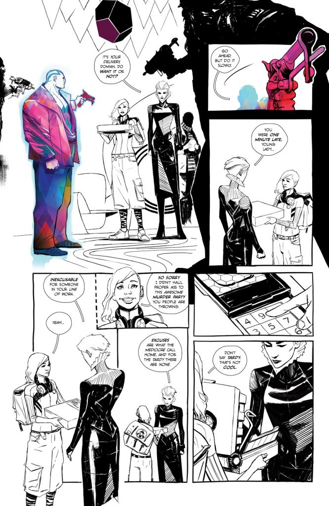
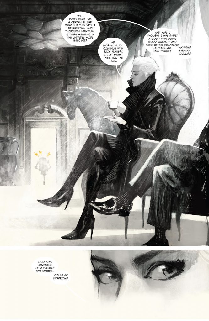
There will be more on color later on, but I wanted to specifically ask about how you used it on this page. There are some pages where only specific characters or aspects on the page earn colors while the rest is black and white. I love it, and it feels only fitting on this page that the character with the technicolor dreamsuit gets that visual pop. When it comes to those pages, are those specific instances of color largely you trying to achieve a certain feel in the read, is it trying to draw the eye in a specific way, or is it really dependent on the page?
(note from me to you: in this one it does feel like the color is used to specifically highlight Imogen’s main target/threat, and I love that once he’s been disarmed – literally! – it goes full color again effectively) 2
MH: I apologize but I’m going to be a little cagey with this answer, but it’s for a reason.
There’s a kind of pretentious conversation in art about whether the artist’s intention is the final word on the meaning of their work, or if the audience’s interpretation is equally as valid – or maybe even more valid.
For now, I’m of the opinion that it’s a huge mistake to say to your reader or audience: “Hey, the way you’re experiencing this is wrong. All of those personal associations or ideas you’re bringing to this, that enhance your enjoyment here, well throw those all away and let me tell you what I meant.”
The reason I even bring this up in a conversation about a comic book, which definitely has a specific narrative, is that I’ve noticed on projects like Decorum when I get to experiment a lot with the art, people start interpreting it.
Readers will theorize why something is colored a specific way or if there’s a connection between similar elements, what something means… and some of those theories end up being really close to what I was intending, while others are something I never would have thought of but are fantastic ideas that I wish I could take credit for.
So, the last thing I want to do is say “Hey, I made this choice because of X, Y or Z” and just shut all those interpretations down. That to me just seems self-defeating.
There are a lot of different things that go into the art and color choices: storytelling, page design, sometimes an off hand comment from Jonathan that sparks a whole narrative idea, and sometimes something as mundane as schedule, but I don’t want to give too much insight into those choices. I feel like we’ve done a lot of work to create a big weird universe and I don’t want to undo that by explaining any of the mystery away.
The yellow, weathered background to the bulk of the panels on this page are an incredibly interesting choice, and it’s one of the many things that separates this section from the others without being over the top. Why is a subtle element like this, one that isn’t even a line art choice, important to you from a visual standpoint? And beyond that, when you’re thinking of page design, how holistically do you like to approach it from? Is it crucial to you to control every aspect of a page like that, especially in Decorum?
MH: Approaching a subtle page like this isn’t much different from handling a page that’s more full color, it’s still about capturing a mood – of the place, or the people, or both. It can also be about setting up contrasts. If the world outside is hectic and crazy but home is very quiet and peaceful, can the art be used to help communicate that? So yes, the color choices for me are incredibly important, as much as the drawing or anything else.
Page design can be tough. It’s like telling a story, playing Tetris with panel shapes and designing a poster all at once.
When I’m initially laying out a sequence I’m thinking more about the storytelling and in-panel compositions, but later when I’m spotting blacks and planning the color I’ve shifted more to thinking of the page as one large design. I don’t think my pages really ever function as one big image but if they hang together aesthetically and guide the viewer through the story I’m happy.
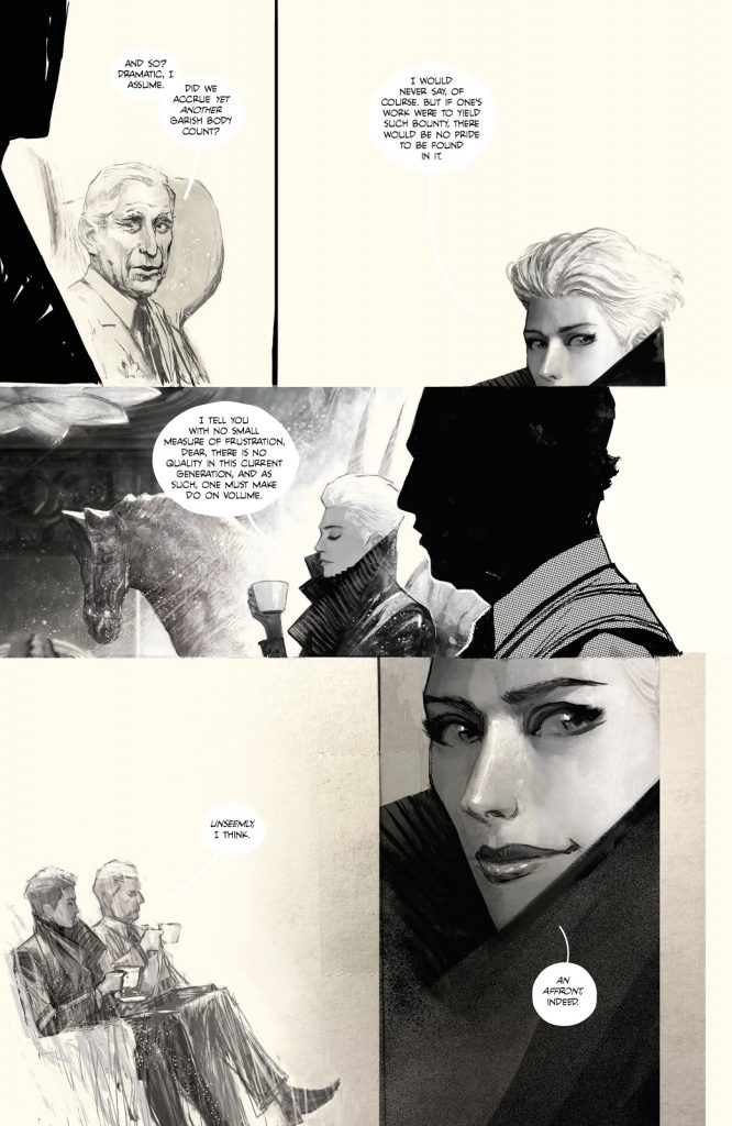
The section with Mr. Morley has a more…sort of sketchbook like feel to it at times, particularly when it comes to Mr. Morley himself. It makes it feel almost like a memory as much as anything. It certainly evoked a very specific feeling as I read it. Which made me think: to you, how much overlap is there between style and storytelling? On a project like this, are they almost one for one?
MH: Yes, in a project like Decorum it’s all the same thing.
When I listen to movie directors talk about storytelling in films so much of those conversations are about lighting and color usage and the types of lenses they use and how each of those choices subconsciously inform the viewer. Now I wouldn’t compare comic book making to film directing, but I think visual artists similarly have a huge toolbox available to them when they are taking their readers through a story.
I don’t even really have a useful question here, I just wanted to make sure I highlighted this page because it’s astonishingly gorgeous to me. But, just to save face, when it came to bring Imogen Smith Morley to life, the title’s main character of a sort who is “the most deadly assassin in the world, as well as the most polite,” how important was getting her design right? Because she sort of looks like exactly what her press clippings say she is, even without knowing that about her.
MH: Her design was incredibly important and probably the one that required the most back and forth between Jonathan and myself. The first image that came to my mind for Imogen was entirely wrong but once Jonathan told me an actress he imagined in this role it pointed a definite direction.
One of the things, strangely, that took the most time was designing clothes for Imogen. I am by no means fluent in fashion design but I knew her overall look was crucial. I spent forever designing a dress for her big entrance scene that I ultimately discarded and never used in the series.
If she looks exactly the way she’s described then that’s fantastic, I guess it all worked!
I said color would come back, and here we are. It seems to me that color is a crucial part of your process, especially when it comes to differentiating worlds, situations and characters in this book. How important is color to your overall process, and is Decorum a project you think would have worked for you nearly as well if you had someone else coloring you?
MH: Decorum would be an entirely different book if I worked with a colorist. Not better or worse necessarily, but totally different.
First, I need to say that I have nothing but admiration for colorists that work in comics. These pros that can knock out an issue – or several – in a month are my heroes. I don’t know how they do what they do. I’m just pretending to know what I’m doing here. Color is really hard!
But I think my approach in Decorum is so personal there’s no way I could communicate what I’m doing to a collaborator. So many of my decisions are made, again, by feel, purposeful happy accidents, or sometimes just wanting to try something unorthodox.
If I brought a colorist in on Decorum it would need to be for something that purposefully felt that way, like a different voice was telling that part of the story, if that makes sense.
Another weird thing is that big chunks of Decorum are black and white, I don’t know how comfortable I’d feel asking a colorist to not contribute to whole sections of a book.
Related to that and the other, earlier color question: do certain characters/environments have fairly set color palettes that come with them? Neha seems to often come with a limited palette, but that may also come from her design, I suppose.
MH: Once an environment comes together it does get married with a style and color usage, so when we return to a location hopefully that helps indicate where we are. But if that environment goes through some drastic change that could motivate the art to change too.
As far as Neha and her color palette, I don’t want to comment too specifically. It’s a mixed bag of things that motivate these decisions including sometimes setting up contrasts between where a character is now and where they may be later on in the story. Again I’m trying to avoid spoiling anything.
Lastly, I wanted to ask about the covers for the book. The covers very much feel like a perfect fusion of Jonathan’s style aesthetic and your art. How do those come together? Is it just you, or is it you, Jonathan and designer Sasha Head working together to find the right answers for each effort?
MH: Any complete cover is a group effort by Jonathan, Sasha and myself, but it’s the same type of collaborative process as the interiors. I do something, then they respond to it, and the final piece is a melding of those related but separate efforts. There’s not really any group planning on these.
At the very beginning Jonathan and I talked about about what we wanted to do with the covers, things like the wraparound covers and me doing variants. But the only time I got real definitive notes from Jonathan on the art was for cover #1A which you’re showing here.
My first pitches for covers 1A and B were focused on Imogen and Neha but were super abstract and really told the reader nothing about what Decorum was. Jonathan responded saying this first cover needed to be the space opera cover, and he was totally right.
After that issue though it’s just me pitching ideas to Jonathan and him saying go for it. Once I hand it over to Sasha I’m not really sure if she gets many notes from Jonathan but my guess is no. Jonathan seems to be from the school of “hire people you think are good and let them do their thing.”
Ultimately all of Decorum is a group effort. I send artwork for the covers and interior pages off and it comes back with all these layers of art and graphic design, not to mention Rus (Wooton’s) brilliant lettering, and it’s just a different animal.
Thanks for reading this art feature interview with artist Mike Huddleston. If you enjoyed this conversation, consider subscribing to SKTCHD for more content like it.