Nick Barber Talks Breaking Into Comics and Building Ringside
How do you break into comics? That’s a question that comes up eventually for every successful creator. Fans always want to know how you can make it happen, and once upon a time, there were only a few ways to do it. In today’s industry? Tomorrow’s big names can come from anywhere, from the traditional print route to webcomics, Kickstarters, self-published books, and more. The biggest commonality amongst the people who make it is simple: they keep making comics and they find a way to get them in front of people.
And for Nick Barber, that’s something he never lost sight of despite a path that was even more unusual than we usually see. Coming from New Zealand and having worked in television and animation both there and in Japan, he’s come a long way to make his debut in the upcoming Ringside at Image Comics with Joe Keatinge. The wrestling epic drops on November 25th at comic shops everywhere, and to get you hyped for it, I talked with Barber about his path to breaking into comics, how he partnered with Keatinge, what their process is, and we break down some pages from the book to give some insight into how he works. It’s a great chat with a new talent, and if you like what you see, make sure to pre-order the book at your local shop.
Ringside’s the real deal for you: it’s your debut, near as I can tell, which is really cool. What’s your art background, and how did your path eventually lead to you working with Joe on Ringside?
NB: I grew up a fan of comics from an early age. As a kid I always wanted to draw for one of the big publishers in the US, that was always the dream. I was pretty earnest about getting there – practicing as much as possible, putting together portfolios and that sort of thing. My parents had to break it to me that you can’t make a living drawing comics in New Zealand (which you couldn’t really back then). Still I wasn’t really deterred, I figured if I was exceptionally skilled surely I would HAVE to get a job drawing comics at some point. I would show my work around conventions (well, it’s more a singular convention we have here once a year) to which people were pretty encouraging – I think I was probably 11 or 12 at this point something like that. Yet, without an ‘industry’ for comics in New Zealand other creators told me to just self-publish. So that’s what I did – I made some really awful 90’s style comics, with a lot of characters gritting their teeth. I did this for quite a few years.
Around the time I went to University I was still making comics, but more sporadically – I was majoring in film studies so I got more into movies and I guess my focus shifted a little bit. I graduated University and worked in television for about seven years. Mostly as a camera operator – I worked on a LOT of reality tv shows, ‘factual’ style shows with police, ambulance, etc. (picture the film Nightcrawler, but I wasn’t selling footage… and wasn’t a creep). It wasn’t a very fulfilling job, and I was still drawing a lot and wanting to make comics. So I went to animation school, which seemed like the most surefire way to make a living from drawing. For my first year there I was still filming a TV show with the police, so I’d go to animation school during the day, and ride around with cops filming crime at night.
I got a job in animation really fast and didn’t need to finish my course which was great. I worked in animation for a few years, mostly on Nickelodeon stuff like the Kung Fu Panda TV series. I (was) offered a job in Japan for a Pac-Man TV show, they sorted out the visa and all the admin stuff so I went to live in Tokyo and did that, I also worked on Transformers: Robots in Disguise and my last project over there was animating cinematics on Street Fighter 5. Living in Japan I got a lot more into manga and European comics as they’re literally everywhere. The whole time I was working in animation I would put my personal art work online – I was working incredibly hard to improve my art and storytelling skills. I was getting some awesome feedback from people whose work I loved. I should apologize to all those people about the numerous times I bugged them for advice!
I started working on a comic with Matthew Southworth (which I’m still working on) which was the first comic I had done in years, it was like starting completely from scratch in a lot of ways. During work on Street Fighter my art got Joe Keatinge’s attention. We started talking on Skype about the possibility of collaborating on something, and what that ‘something’ might be. Our tastes seem to be on a very similar wavelength, which was a big reason I wanted to work with Joe. I said I wanted to make a Michael Mann style comic, particularly in the vein of ‘Thief’. Joe had been developing Ringside for quite awhile, he pitched the idea to me and it sounded perfect for what we wanted to do. We figured it all out on Skype at some crazy hour, since he’s in the states and I was in Japan. I was so excited about the project that I didn’t sleep, I just went into work that morning and gave my leaving notice. Flew back to New Zealand and started drawing Ringside. So that is how you break into comics!
What’s your process for putting the book together with Joe? Do you guys talk about each issue before putting it together? And beyond that, how do you work? Are you a traditional or digital guy, or a hybrid of both?
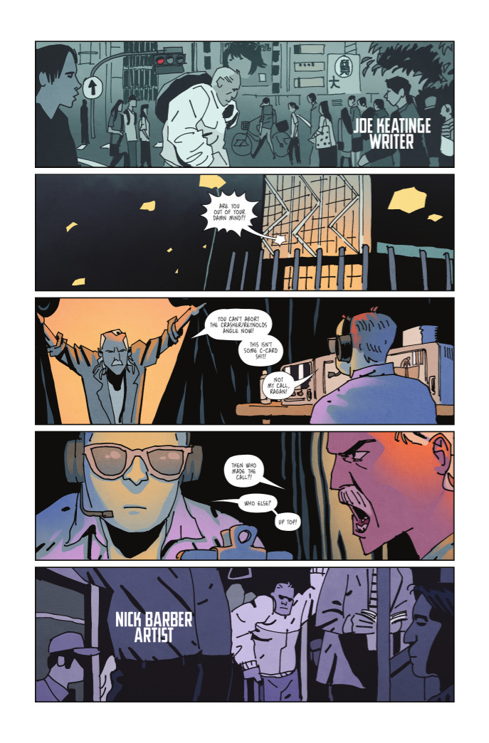
NB: The process is pretty much the standard approach for comics, Joe will send me a script – I will read it and email him any questions I may have. My input basically comes from the layouts – I might change staging or something for instance, and send that to him and to our editor to make sure we’re all on the same page. Joe is really good with collaboration, so as long as the story is still being told as he intended I can pretty much approach the visual side of things however I like.
Once everyone is happy with the layouts I’ll do the ‘pencils’. This is probably the time to bring up that the majority of Ringside has been done completely digitally. Although, I have dabbled with the hybrid approach which is probably going to be where things end up going for me. One of the huge benefits of working completely digitally is that if the layouts are detailed enough, then the ‘pencilling’ basically just becomes a matter of formalizing some of the perspectives and fleshing out some details. A lot of things won’t need to be redrawn, ideally a lot of stuff from the layouts will have enough information to go straight to ‘inks’. Digital inking is probably closer to drawing actually so you don’t really need detailed pencils. In fact, detailed pencils seem to produce pretty lifeless digital inks. Not having to redraw things multiple times I think is key to getting things done promptly and preserving sanity.
The danger of digital is obviously that things can become pretty lifeless, but with the style I wanted to go for one this book which is very rough, sketchy and loose it wasn’t a problem – also I like a pretty ‘dead’ line weight most of the time so again digital is fine for that approach.

Let’s talk about the wrestling in Ringside. I know it’s more of a human drama, but there are still some great examples of moves from the sport. Are you a wrestling fan yourself, and beyond that, when it came to bringing this story to life, how much research did you have to do to ensure that part felt as realistic as it could?
NB: Yeah, I grew up a fan of wrestling, but to be honest this project didn’t spawn out of fandom. I just wanted to make a great comic. When I told Joe I wanted to do a Michael Mann style comic and he said he had a pro wrestling pitch, the combination of those two things was what interested me more than anything else. As far as research goes I’m not really worried about it being realistic, it’s grounded in the real world but it’s a fictional story. I’ve joked about my research consisting of watching four seasons of Total Divas – but you do actually get to see more backstage stuff on something like that – you can see where the costumes get repaired, the human resources office, where people eat, etc etc. Before we started I watched as many wrestling documentaries as possible.

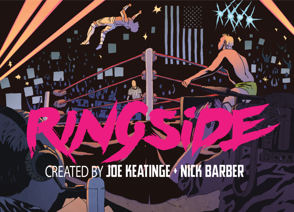
I love this spread. It’s really fantastic. It feels very cinematic and is such a great introduction to the bigger world of wrestling. Why did you and Joe decide to go big on this two-page spread?
NB: Thank you. That’s all Joe really, as the opening to issue one cross cuts between two different scenes and ramps up to that big double page spread. It’s paced really specifically, there’s a rhythm so I just had to pick a visual to support the BIG opening. The moonsault seemed like a perfect move, as he hangs in the air time kind of slows down – that was the intention anyway. It puts the reader right there at ringside too, which was important.
You talked about how great Joe is with collaboration. As the book developed, how closely did the two of you work in figuring out the look and feel of Ringside and its cast?
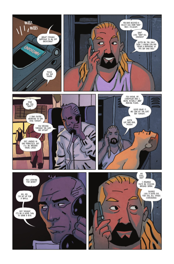
NB: It’s pretty organic I guess, I don’t ‘design’ any of the cast – I just read the script and draw them straight from how they’re described and how they feel to me. Usually from drawing a character in layouts I will have figured out how I want them to look. Joe has put a lot of trust in me to just do my thing, but he’ll tell me if something is off. When it came to developing the look and feel of the book, that was probably the most important thing to me. I got a sense of the tone immediately from Joe’s pitch, it’s not a standard wrestling book. We seemed to be on the same page immediately with how it should feel, and our whole team including Simon (Gough, who is the colourist) and Ariana (Maher, who is the letterer) understand the style and contribute to the overall feel of the book.

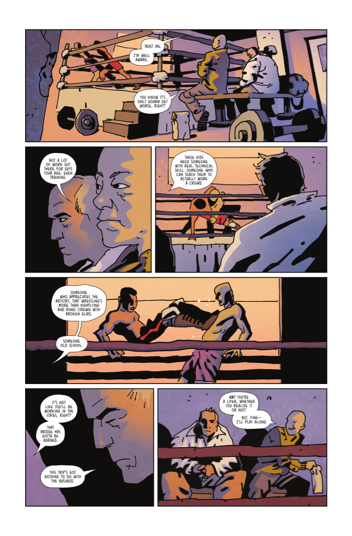
Let’s talk about how you approach layout. I really like this page, as it has fantastic flow down the page and creates an immersive atmosphere. As a storyteller, how do you approach page layouts? What’s your primary goal when you’re going through an issue and putting together the layout of the book?
NB: Thanks David. My approach is just to make things simple and clear. I’m still learning a lot though as this is my first professional comic book. Layout is probably my favorite part. I’m getting to a point now where the layouts are pretty thorough – it’s nice to get to the end of layout and look at the whole issue basically finished – even though it’s not inked or anything, it’s all there and it reads as intended. That said, layout is definitely the hardest part, it’s the foundation – so the nicest line work in the world doesn’t mean much if the storytelling doesn’t work. I look at Urasawa’s work a lot, especially for the layout. It’s very simple and functional – refined is probably the best description. And Toth too, which is probably more obvious in my stuff. Nothing extraneous is my goal.

You talked about how you wanted your style in this to be a bit more rough and loose, and I think it works for the book as it keeps the look of the book simple in a good way. Why did you decide to go that route? Was it because of the project’s more character driven nature?
NB: When I started issue one I probably re-did the first pages with a lot of different looks. I can remember emailing Joe like “The style is going to be like THIS…” and then a few days later: “now I’m thinking more like THIS…” I had no idea. But it really solidified when I stop thinking so much and just did it from the heart. I’m sure some people are going to hate the crudeness, but I can’t see this comic being any other way. So far people have been responding in a really positive way though. It’s kind of the equivalent to shooting with a camera on a tripod vs. handheld… something a little unclean, shaky, a little rough… but with life to it.
Ringside #1 by Joe Keatinge, Nick Barber, Simon Gough and Ariana Maher is set to drop on November 25th. Interested in picking it up? Share the Diamond code SEP150595 with your local retailer ASAP and get that pre-order in.
