“There’s Been So Much Fanboy Glee”: Russell Dauterman on the Design and Delight of His Recent X-Men Work
Russell Dauterman is a lot of things. He’s the primary artist of one of the most renowned runs in Marvel’s history. He’s a cover artist whose work endlessly impresses no matter the project he takes on. He’s a designer whose craft wowed the X-Men reading world in the recent Hellfire Gala.
More than that, personally, and perhaps less than that for you, Dauterman is one of my absolute favorite artists, an astonishing talent whose gift for storytelling and character work perpetually blows me away. Pair that with the fact he’s been working with my beloved X-Men of late in a different capacity than we’ve been used to, and you have a situation where I simply had to talk to the artist about what he’s been up to and the craft behind it.
So over my recent break, that’s exactly what I did. Dauterman and I chatted over email, or, more specifically, Google Docs, for an art feature interview about his connection to the X-Men, his feelings towards interiors and covers, his objective on covers, and more, before we dive into breaking down a deluge of his recent covers and design work related to the X-Men and its recent Hellfire Gala event (experience?).
Let’s talk about your personal history with the X-Men. I know when we first chatted, you told me that above all, your gateway into comics was X-Men: The Animated Series from the 1990s, and that Storm and Rogue in particular were characters you connected with. How has that love of the X-Men and the look of them carried forward and inspired you? Was there always a part of you that was hoping to work with these characters in some capacity?
Russell Dauterman: Oh, absolutely! Drawing the X-Men is definitely bucket-list stuff for me.
I probably wouldn’t be in this profession if not for my love of the X-Men. Because of them, I started reading comics — I loved the animated series and wanted more of those characters. I don’t know that I would have become a comic book fan otherwise. And that set me on the path that led to my career.
The X-Men have remained one of my favorite things since I was 7 years old. And the design work has been incredibly exciting — when I would draw for fun as a teenager, I’d mostly be doodling an X-character in all their various costumes.
For one of the Hellfire Gala designs you did – Storm – I know there were elements worked in that you had thought of years before if you ever had the chance to design something for her. That history you came in with interests me in that regard. Does it change things for you an artist when you’re working on something you have a personal connection to in such a way? Either in terms of the passion you have for it or in the history you carry with the characters?
RD: The biggest benefit with the X-Men is that I know these characters. I still need to do research to get the details right, but I’m building on an understanding that already exists. That helps me feel more confident in my depictions of them, and I think it helps the characters’ personalities come through, and helps them feel richer. Or, I hope it does, anyway.
Having that connection to the characters was a huge help in doing the Gala designs. I wanted looks that were fresh and new, but still felt true to the characters. And I wanted to incorporate iconography from their previous looks. Being familiar with all that let me focus my time and research on other aspects of the designs — I was adding to a foundation, not starting from scratch.
I’m interested in where you are right now in terms of projects, and I’m sure part of the answer is, “I can’t talk about it.” And yet, here I am, asking all the same! For readers, you’ve been very cover-centric since your larger Thor/War of the Realms run concluded, with your regular gig on Marauders and varying variants leading the way for you, beyond the Gala stuff. Why is that? Is that a deliberate choice to take a breather after a long, assuredly arduous run on interiors, or is it more cover work is more appealing than interiors in the near-term? Or a bit of both!
RD: Haha, a bit of both!
I really love drawing covers! I love telling a story in a single illustration.
I hate complaining about this, because mine is not a hard job — and I’m incredibly lucky and grateful to have this career, and grateful to Marvel for all the opportunities — but still, producing the sort of work that I want to put out does take me a long time. And working long hours, 7 days a week, with few breaks, is hard for me to maintain long-term. I’m very proud of Thor and very happy to have that body of work, but after WOTR, I was burned out.
I’m sure I’ll do more interiors. (I have some out today, as we’re talking!) 3 I’m just being selective and enjoying what I’ve been doing lately — the Gala work, Giant-Size X-Men, the covers — it’s some of my favorite work I’ve done.
Speaking of covers, before we get into any of the work you’ve done as of late, either for the Gala or for the covers, I wanted to talk about process with them. When you’re working on a cover project, say for an issue of Marauders, what’s your process and ultimate goal? Is it about reflecting the issue within? Selling the book? Making an iconic image? What guides you as you go from taking on the piece to finishing it?
RD: I think the goal is all of those things!
With every cover — whether it’s story-driven or more representational — I’m trying to make an iconic image. They don’t all end up that way, but that’s the aim!
Trying to create an indelible image is really appealing to me. I like putting a lot into one illustration — something that can tell you a whole story or give you enough to imagine a story around it; or something that tells you about a character, that captures their personality. And that’s all in one, hopefully eye-catching image, incorporating graphic design, which is exciting.
Gerry Duggan has often talked about giving “gifts” to characters. I think about that a lot with covers: what’s an exciting image for this character, and what would make a fan of this character excited? I try to balance that with the assignment and the story beats I need to hit.
-
Dauterman’s X-Men #1 variant -
Dauterman’s Excalibur #18 variant -
Dauterman’s S.W.O.R.D. #8 variant -
Dauterman’s Hellions #13 variant
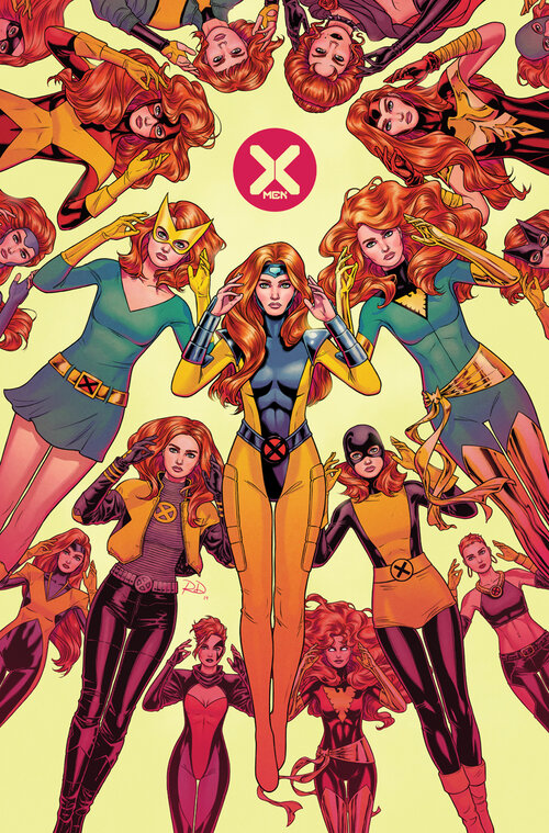
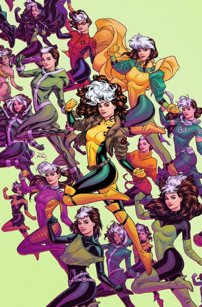
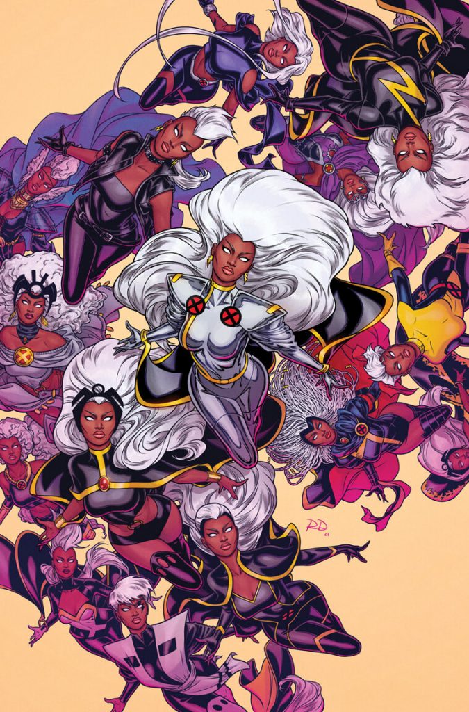
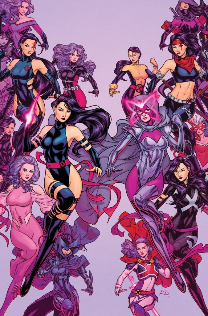
Speaking of covers, one of your current cover projects is a series of single-character variants for the X-Men titles where you showcase specific characters and a deluge of their costumes from their history. I’m interested in the roots of something like this. Like the Hellfire Gala designs, this feels singularly fitting to you. When it comes to the origins of a variant project like this, are you recruited for the idea, are you asked to draw variants and then you pitch the idea, or what? This one just feels on vibe for you.
RD: This actually started with a Jean Grey costumes cover — a variant for X-Men #1 — that I pitched to Marvel!
I drew up a rough sketch of the cover, sent it to Marvel, and asked if there was a place where it could be a variant. Marvel had done some “a character in their various looks!” covers before and I’d always wanted to do one. I was really thrilled when they went for it! And more thrilled when they said it could be a series.
This really stemmed out of my love for Jean, and love of X-Men costumes.
When the Rogue one dropped, I remember quickly noting that it reminded me of Jim Lee’s Rogue card from his X-Men trading card set, which you said was definitely part of the equation. Related to that, these are all repeated poses, something that should feel on vibe for each character, as the emphasis is on the costumes, not the pose by any means. What acted as a guide for determining that idealized pose? Was this one of those situations where it helps a lot that you “know these characters?”
RD: I think so! There are definitely iconic poses for a lot of the X-Men characters: Cyclops with the two fingers on the visor, Jean with her hands near her temples, etc. For Rogue, I combined a few recognizable poses — that amazing Jim Lee card illustration was a big reference, plus I always like when she’s flexing or making a fist, and a bit of a smile to show her lighter/flirtier side.
How did you determine which costumes to include? Was this dealer’s choice, or did everyone from the X-Team pitch in ideas of what to include?
RD: Dealer’s choice! I include all the costumes that I think are important — things the character wore for a long time, or wore in a significant run or moment, or just generally popular. The rest are personal favorites.
I want the center image — the focal point — to be the character’s most iconic look. Those have tended to be the 90s costumes since I think those looks have made the biggest impact. Sometimes those are my favorites, too, but not always.
I have to ask a process question. I know you work digitally. Is there a digital shortcut for you to execute covers like this, one where the pose is by and large the same and the costumes are largely what change?
RD: Yes and no. Since there are 15+ figures on the cover, repeating the same pose does help save time. But I also thought that would be cool as a graphic element, and thematically. I (digitally) pencil the face/body, and then draw the various costumes over that in separate layers — paperdoll-style. Then I arrange everything per my rough layout.
But that’s where the shortcut stops because I ink every figure separately, as one whole piece — like I was inking on paper.
I’m also doing the colors on all of these — which has been challenging, but really rewarding.
-
-
-
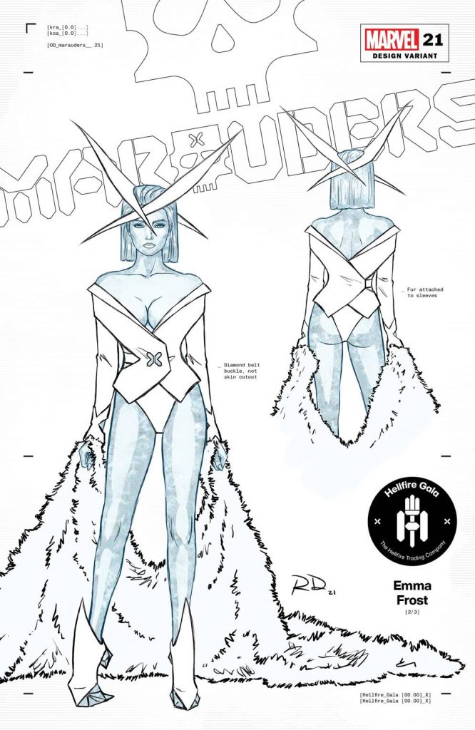
Dauterman’s Marauders #21 variant
Now, I know you only worked on Captain America: The First Avenger briefly! But the fact that you worked in the Marvel Cinematic Universe specifically in the costume department and became a comics fan because of the X-Men makes the Hellfire Gala design gig feel…well, at the very least a great fit, if not fateful. Not to be dramatic, but in some ways, does being asked to design the A-team costumes for the Gala feel like a culmination of your career and interests?
RD: It does, yes! (Ha, to also sound dramatic!)
For a while in school, I thought I would be a costume designer for film and TV. That shifted to illustration/character design and eventually I realized that a comics career could include those things, as well as other areas of art I was interested in — so that’s what I pursued.
But, comic book jobs can often be “right place, right time” situations. The chance to work on your favorite characters or to work on them in a specific capacity — like character design — might never happen.
So the Gala designs really did feel like a massive opportunity, and one that I’d been wanting for most of my life. And then the list of characters came in, and it had my favorites! Designing for the X-Men at all — and Jean, Storm, and Rogue, especially — was a total dream job.
I really didn’t want to &*#% it up!
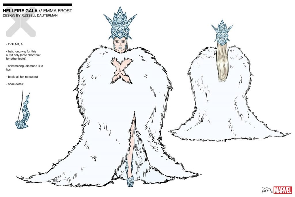
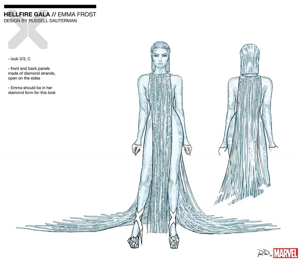
We aren’t going to get into a lot of specific outfits here, but if we have to talk about one, it’s going to be Emma Frost. She’s a dominant force upon the Gala, both because she’s the host and the only person I believe who goes through multiple costume changes. That’s a point I’m curious about in specific: the multiple costume changes, and the chicken and the egg of it all. Were you specifically tasked with coming up with multiple outfits for Emma because that’s what the team wanted for her, or did you come up with multiple outfits and that fed into the story?
RD: When I got my brief from the X-team, the editors/writers said that Emma would have three Gala looks — so that was part of the story already. Some characters had more direction from the start, but Emma’s looks were open-ended.
When it came to a character that had multiple outfits like Emma, what were the driving forces for you in designing and distinguishing each in a way that made sense for the character? Was it powers out, so to speak, or was it more about Emma as an individual?
RD: Definitely more of Emma as a character. I wanted her looks to be provocative — that’s who she is.
I thought I’d give her looks that represented different roles she’s had. So we’ve got a White Queen look, a business suit, and an evening gown (fitting her role as host of the Gala). And, like with all the characters, I tried to include references to past costumes — like the X-cutout as a nod to Frank Quitely’s amazing design.
With the powers thing — I did think it would be cool if the mutants were using their powers as part of their costumes, doing something with clothes that only mutants could do. Jean is holding up her headpiece telekinetically, Betsy has psychic X-butterflies, Storm’s cape is made of clouds and lightning. (The X-Office actually suggested Storm wearing weather in their initial brief — I thought that was brilliant and it sparked the cape idea for me.)
I thought Emma could use her diamond form as jewelry. That became crucial to a couple of her designs.
subscribers only.
Learn more about what you get with a subscription
