Story First: Benjamin Dewey on the Art and Wonder of The Autumnlands
The artist of The Autumnlands pulls back the curtain on how he brings the story to life
In the past five years, the comic industry has seen absolutely remarkable growth, and a lot of that is thanks to some of the very exciting creative voices who have entered the fray during that same span. New ideas are a big thing for comics, especially in an era that is more creator-driven than ever. For me, I’ve discovered a lot of new favorites in that timeframe. However, one of my favorites is Benjamin Dewey, the artist of The Autumnlands at Image Comics with writer Kurt Busiek, colorist Jordie Bellaire and letterer John Roshell. While The Autumnlands has been a magnificent read so far, Dewey’s known for more than just that. His webcomic – the painfully hilarious and hilariously painful Tragedy Series – was collected as a book and I Was the Cat – his graphic novel with writer Paul Tobin – earned an Eisner nomination. He’s been pretty busy.
It’s been a meteoric rise for Dewey, but a deserved one as well. The guy’s as nice as he is talented, and that’s saying something. He’s a brilliant artist who brings a unique perspective and a rare sense of storytelling to the page, and we’re seeing that play out in all its glory on the pages of The Autumnlands. In this week’s art feature, I talk with Dewey about his experience on the book, his path to working in comics, what the most important focus is for a comic artist, how the Autumnlands team puts the book together, the magic of Jordie Bellaire, and much more. It provides great insight into the craft of one of the next – and current – great artists in comics.
The Autumnlands Vol. 1: Tooth & Claw is out now, and you can buy it digitally or in the local comic book store near you.
Everyone has a different path into comics, but for you, what made you want to draw comics, and who or what helped you cultivate your craft as you were developing your storytelling sensibilities?
BD: Comics is a funny line of work because it’s both a semi-exclusive club of highly skilled professionals and a populist art form that requires very little to participate in materially. You can make a mini comic for pennies but getting to a point where you make a living is a long and unmarked path with lots of weird twists and turns that requires luck to navigate. I loved titles by the big 2 as a kid and grew up trying to draw my own stories all the way up through high school. When I got to college I had a girlfriend (Chicago-based artist, Christa Donner) that loved indie books and non-cape stuff; I learned a lot from her about that side of the comics world. She showed me that you didn’t have to have a job doing it to be active in the culture. My thesis project was an ambitious, but flawed comics-shaped meditation on identity and blues music that never really went anywhere. I followed that up with a few meandering webcomics. It wasn’t until I got to Periscope Studio that I received mentorship from Steve Lieber (and others) that I was able to synthesize all of the disparate elements into a more cohesive approach. Steve was the fellow who got me to start making ‘the tragedy series’ after a loving but brutally honest critique of my previous web-project as ‘a slog.’ That one conversation made me start thinking about story, design, craft, cartooning and carefully choosing collaborators.
Now I am lucky to be working with Kurt Busiek because he helps focus that drive more with every issue of our book, Autumnlands. We talk over script and he has very good reasons for rejecting or embracing choices I’ve made while being able to offer alternative solutions that emerge from a lifetime of comics analysis, writing and readership. Combine his influence with that of my studio-mates, specifically, Joelle Jones, Natalie Nourigat, Wook-Jin Clark and Leila del Duca, and I never want for more prompts to improve as I go.
You’ve worked on Eisner nominated graphic novels. You’ve created a lauded webcomic that was turned into a beautiful book. Now, with The Autumnlands, you’re telling your first full ongoing story and one, in a previous interview we did, you described as your “ideal project.” Now that you’re a full arc in, what have you learned from the experience? As your experience on the book grows, are you finding new and better mindsets to approach your work?
BD: I’ve been lucky to have done a wide variety of things, it’s true! Every one of those endeavors taught me things and had their own challenges. In many ways, that array of jobs prepared me to appreciate my current gig and be in the best possible headspace to enjoy the work. The best aspect of working on Autumnlands is how truly collaborative it is. Every part of the creative team brings something important and unique to the book. As I move into the next phase of the project, I try to keep in mind what could showcase Jordie’s talents best, What JG might expand on and what little easter-eggs I can put into the backgrounds, or incorporate as parts of a design, that Kurt can exploit later like Chekhov’s Gun.
If you respect and appreciate your team as much as I do, it behooves you to make sure you don’t leave them hanging. I try to avoid any choices in my life that might keep them from being able to do their best work, by creating a bottleneck in the schedule. It happens occasionally anyhow because life is messy sometimes and drawing comics isn’t like making widgets. Some pages or paintings take longer than I’d like. I also have to balance my work with my life outside of comics. I have a wife that I love, a massive guitar collection, three cats and dear friends that I want to spend time with. The better I am at finding a space in my day for things that aren’t comics, the better comics I’ll make. You have to sew the seeds of inspiration by reading good books, rocking out, running, going to a movie with your sweetheart etc. If you don’t make an effort, there’s no good energy coming in. I know what that version of this life is like from periods I spent working on other projects, without an outside existence. It was miserable.
I think making space for a healthy downtime amongst the steady storm of working on a monthly title. Comics are amazing and I love them but you only live once so you have to savor it.
Speaking of learning, for someone who is newer to comics relatively to those around you, how valuable is it to have not just people like Kurt Busiek, Jordie Bellaire and John Roshell to talk things out with, but the Periscope Studios crew as well? Do you find yourself picking their brains to help think things out in your work and craft?
BD: Oh man! The people at Periscope are amazing. It’s very much like a family. Sometimes we have friction, like any group of our size, but by and large, we care about each other, want to see one another succeed and inform each other’s work in positive ways. When you get to a place of comfort and emotional intimacy with fellow creatives, you can trust them to offer honest and constructive criticism that you often internalize and are less likely to take personally. There are countless tips that have been offered to me directly or that emerged in casual conversation which corral my best qualities and help negate my unhelpful excesses.
I’ve already mentioned a few people in the studio who I interact with a lot and their help is a daily gift.
I will ask some people specific questions on given projects, but everyone there has something to offer in broad strokes. Ron Chan is a wizard with just about every aspect of comics making. I feel guilty intruding on him but he has a laser-like precision in explanations of complex things. I bounce ideas off Cat Ferris and Terry Blas for immediate, earnest feedback. Ron Randall keeps me prioritizing the right things in my art and life. Colleen Coover taught me early on to embrace basic layouts for clarity. Rich Ellis showed me the first technique for digital coloring that made any sense to me. Grace Allison demonstrated what dedication looks like under crazy pressure. Jesse Hamm has innumerable systems for many common problems. Lukas Ketner is unfailingly inspiring. Jeff Parker knows how to make comics fun. Paul Tobin got me to appreciate and incorporate fashion. Erika Moen is masterful at getting the word out and I try to adapt her methods to my own efforts as much as possible. Jonathan Case is a pure craftsman of the highest order. Terri Nelson and I talk science and painting. Dylan Meconis and Paul Guinan brilliant at incorporating historical themes into world building. Lucy Bellwood is an expert level networker… the list goes on and on; even interns who have passed through have offered gems of knowledge.
Periscope is a very special place and I will always be grateful to its many members for embracing me as one of their own.
You have a hell of a creative team working on the Autumnlands with you, and lots and lots of experience between you all. From open to close of an issue, what’s the process for putting a book together like, and how closely do you all collaborate?
BD: It starts with Kurt’s magic brain. He’s the architect of the story and my role tends to be contributing little things here and there that he incorporates or decides against. I like to watch and read a lot of science-related material so I will tell him little bits of biology that I encounter, physics stuff, anthropology and offer up little details to augment things kurt tells me he’s thinking. Sometimes this kind of exchange leads to cool stuff that makes it’s way into the story. After initial meetings or conversations, I will receive a script that Kurt completes separately and I then do a series of rough thumbnails. We talk over the options that I come up with and he either confirms choices or walks me through where I’ve misinterpreted his intent and we come up with a solution. I work out my pencils digitally (mostly), print those out on bristol, refine some aspects of pencils as I go, and ink over those with occasional improvisations. I take reference shots of myself in various states of undress or costumes I’ve MacGyver’d; I can’t always do that around other people!
Once the inks are done, I scan them, level them and clean them (or my wife Lindsey does) and we send them off to Jordie who enacts her hue-sorcery to great effect! Generally, I’ve saved the painting for last and I do it as Jordie is coloring inked pages. I have to be delicate with the leveling process, with the painting, to get as clear a version as possible because it won’t be worked on for further polish by anyone except comicraft. JG and his crew add the finishing touches of lettering and top-notch design and it arrives a few months later at my doorstep in a nondescript brown box. I love it and I’m exhausted by the end so I generally treat myself to some fun thing like playing guitars, going to a movie with Lindsey or a little videogamery.

It’s one thing to have anthropomorphic animals and just have them look like people. It’s another thing entirely to do what you do in making them feel like animals as well, especially with Dusty and the very dog like mannerisms he has. For this book, were you trying to maintain their animal identity in their characters? Did you actually look to animals to capture them correctly in your art?
BD: There are a whole host of things people tend to do when dealing with non-human characters to make them relatable but they all tend to come down on one of two sides; cartoony or stiff. It is an uncanny valley problem like the type you see in CG effects. You have to give yourself rules and know why you enacted them in the first place.
I like drawing animals because they offer interesting textures, light patterns and opportunities for symbolism. The best trick, in my opinion, is to treat them with the same critical eye you would when drawing anything of importance and not to fetishize features. If you’re drawing a lizard, don’t give them eye-lashes or boobs if you want to indicate secondary sexual characteristics. I tried to consciously depart from what I saw done so effectively in ‘Blacksad’ or ‘Disney’s Robin Hood’ and use other things like angle, clothing and posture to tell readers the nature of the individual they were seeing depicted. those features chiefly arise from what those creatures really do in a natural context and I adapt it the best I can.
I look at animals, pay attention to biology texts, read up on anatomy and share what I think is relevant with Kurt. There’s one major rule that helps limit the number of alterations; I call it the silly putty rule. Simply put: you can’t add anything that isn’t already there. You put the putty down on the sunday comic, you peel it off and you can push and pull but no sticking on extra bits! I look at the arm bones of a bird and I imagine what sort of hand you could conceivably make with that configuration. To give more away would get into spoilers but I think about it a lot and I strictly adhere to my guidelines.
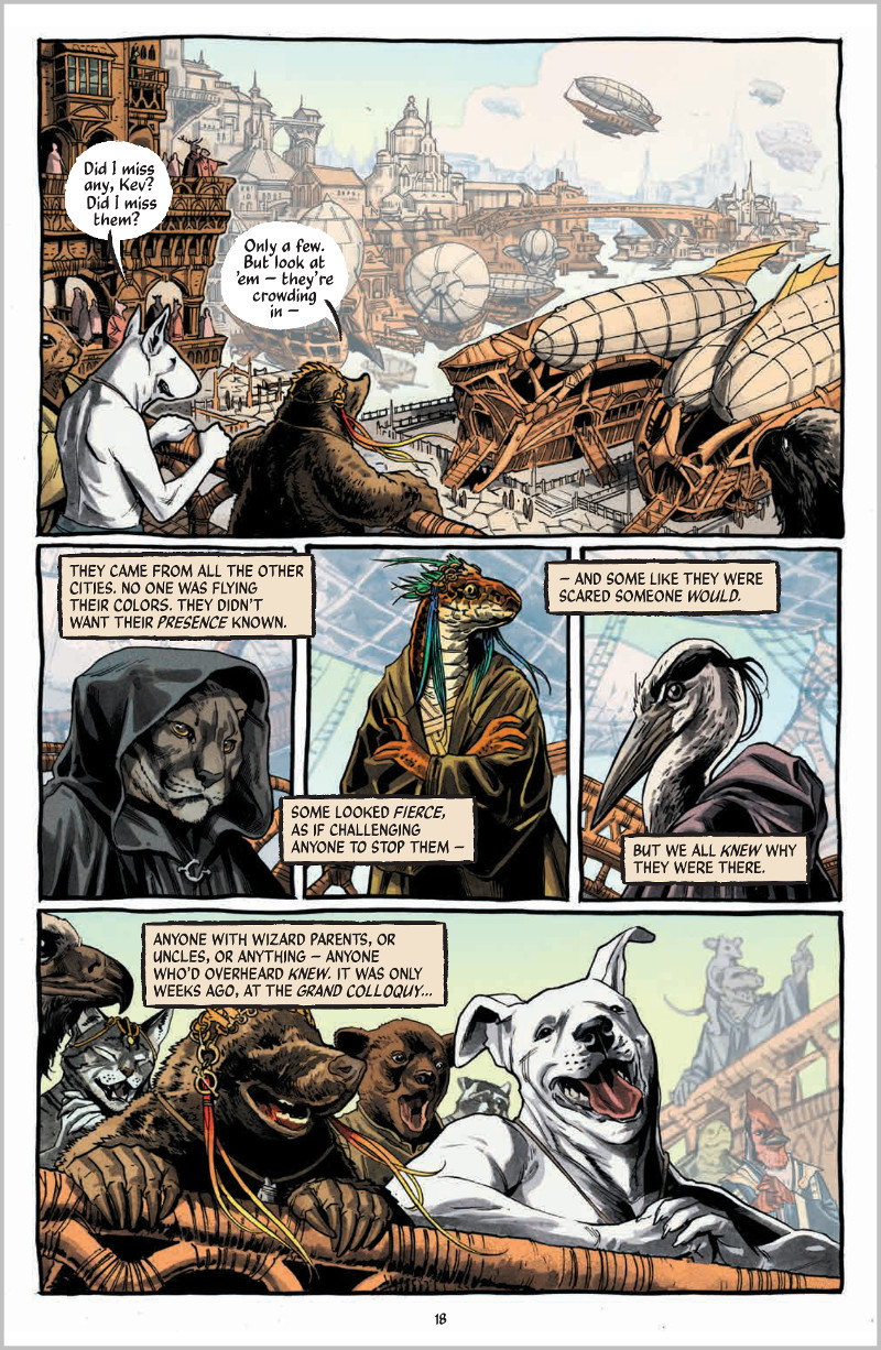
I’m a big fan of airships, and they’re a perfect fit for the world of The Autumnlands. For elements like that and the general look and feel of the world, was that something you worked closely with Kurt in developing? What did you look to for inspiration when you were putting the book together?
BD: Kurt and I talk a lot about things that will appear in the world and often times he will offer up specifics like ‘these things are made of wicker’ or ‘the mechanical tornado-like phantom is highly reflective yet made up of only four segments’ and it’s my job to work out what that means in terms of a reasonable design. I tend to draw a handful of versions and Kurt picks what he likes best. I develop it further from there in the finished art. Most of this is done on the fly at the thumbnail or even the penciling stage. I don’t know where other artists find the time to do all those tidy turn-arounds and style sheets.
I loved doing the airships and I hope we get to do more with those.
Kurt and I are both interested in the world broadly. We each take the multitude of subjects that we find compelling and mine them for relevant gems to put in the chest of our world. I love to read non-fiction science books and I was an anthropology minor in college. Kurt has read, watched and listened to a wider array of cultural materials than just about anyone I know. His bench of references and aesthetic tenants is deep as can be. He is a detail-oriented guy and we will talk over nuances even if they don’t come up in the story so that we know our world as well as can be.
For inspiration on design stuff I look to James Gurney, Prague, Jared Diamond’s ‘Guns, Germs and Steel’, Sam Bosma, Claire Hummel, The Secret of Nimh, The Dark Crystal, Jacob Bronowski’s ‘Ascent of Man’ and a zillion other things that I’ve internalized at one point or another. I grew up in the Cleveland Museum of Art because my Dad worked there so that helps too!

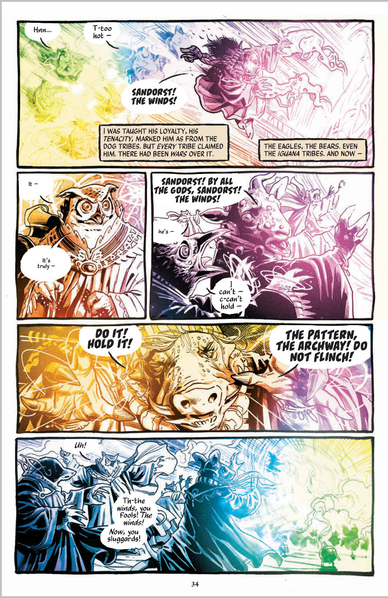
So you already talked about her a bit, but on a page like this, it’s hard not to look at everything and say, “damn, Jordie is good.” What is it about Jordie’s coloring that does such a great job at bringing the best out of your art?
BD: Jordie is a storyteller. She is such a pro and master of nuance that people don’t generally know that the emotional content arising in their brain as they read, is placed there by her color choices. I do have moments where I will imagine something differently but the best part of collaboration is that new, unforeseen facets emerge from working with other contemplative creators. Sticking to a single vision no matter what is how the world ended up with three horrible Star Wars prequels. I trust Jordie and I know she has damn-good reasons for the choices she makes which, in turn, enhance my contribution by strengthening it where it could be stronger and reinforcing the best aspects to greater effect. The whole team is great and I feel like I’m getting to hang out with the ‘cool kids’ of comics. I do my best to be worthy of the implied parity.
I really like that you hand draw your own panels. It’s not always super noticeable, but to me it adds to the storybook-esque feel of the story. Is that just a personal preference or was it a choice for the story?
The loosely hand-drawn borders were suggested by Kurt early on to create an aesthetic signature and nod toward a more organic and imaginative world. It’s cool that you take note of it. There’s a lot in Autumnlands that we’ve thought about, discussed and worked out in exhaustive detail. There are also a ton of things that are up in the air along with the possibility of spontaneous creations which work their way in. Kurt is very thorough and open to evolution of themes and characters; it’s a treat to watch which parts are planned versus organic and the transit between those states as we progress.

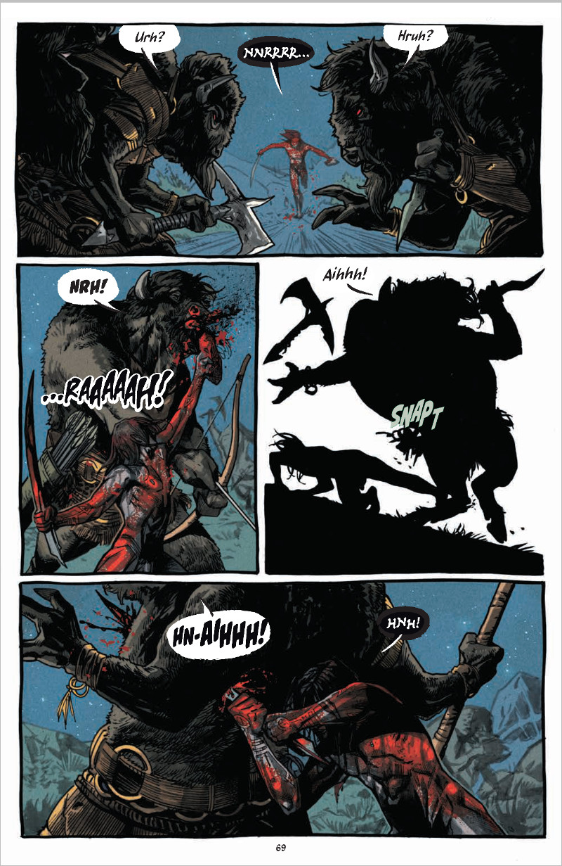
Let’s talk about the Great Champion, Learoyd. Given his “greatness” and his mythic yet underwhelming (to some) nature, he seems like he’d have been hard to define visually. Was there someone you built him off of, or characteristics you wanted to make sure to feature?
BD: Yeah, it’s a tricky thing because he’s the only human in the book and we had a lot of discussions about the possibility of him being a her, being of an identifiably non-caucasian ethnicity and about the physical proportions. I had imagined him as either Lance Reddick or Yolandi Visser while Kurt was imagining more of a James Spader-type. The problem, as we saw it was that this human was going to be a problematic person and if you don’t navigate that very carefully, it’s possible that there will be broad, negative implications about whatever they are to the animal inhabitants of the Autumnlands and by readers. Ultimately I chose Saturday Night Live band leader G.E. Smith as the model for his face because I always thought he was interesting looking and offered enough ambiguity that he could be potentially representative of a few different heritages. It’s not perfect but I am going to make an effort to keep injecting diverse representation into this book wherever possible.
Kurt lays great stress on the fact that his effectiveness doesn’t come from his size or strength but rather his grasp of tactics and a ruthless pragmatism. I see him as a sort of ragged edge, frontline special forces type who prioritizes cooly and I aimed for a balance between intelligent and rugged. It’s never appeared exactly the way I want it but I feel like I’m getting who he is more and more as we go. I have heard some criticisms of his look and/or, generally, the way I draw people. I’m trying to practice that part of the job so I can get a little closer to the Terry/Rachel Dodson charming end of the pool without giving up all the grit in the process. It’s a long process but I’m committed to cracking that visual charisma-code.
Ultimately, he is meant to work against typical hero tropes so his clothes don’t fit, his hair is all over the place and he’s not classically handsome. I think that kind of thing can be a breath of fresh air for comics. We artists tend to idealize almost everything. If even your ‘bad looking’ villains are always appealing to look at, you miss out on a tool that aims squarely at a very real human perception tendencies. There’s utility in not playing to the center. You can do a lot by thinking a little. I try to think a lot; it may not always work out but I’d rather try.

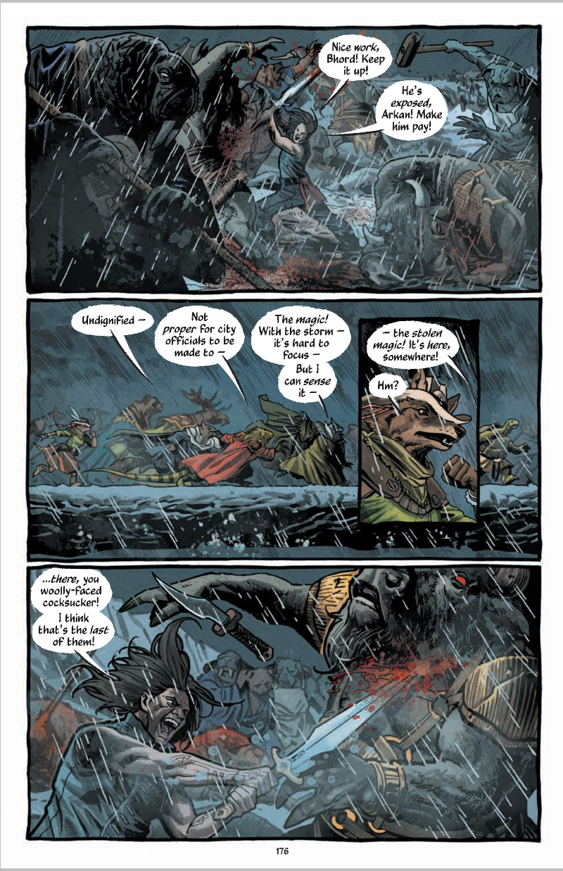
I really liked this page and the quick usage of the inset panel to zoom in on Goodfoot as she’s putting things together. How loose are Kurt’s scripts as far as panel layouts are concerned? As an artist, when you’re laying pages out what do you focus on?
BD: Thanks! I love that whole page. I can’t say that about all of them.
Kurt definitely knows what he likes when he sees it. The scripts are just the right balance of detailed and open. He gives me the pertinent information which I use as the basis for some pretty varied iterations of each panel and a host of layouts. Kurt and I then discuss which of those sets of panels and layouts best convey the point of the story moment we’re trying to depict. There are certainly layouts or panels that ‘look cooler’ than what we may settle on but flashier variations generally don’t defer to story as the priority. I love guitar solos but they are best in context. I love visual effects but if you inject them into a scene that plays without them you get the ‘special editions’ of the original Star Wars trilogy (blech). Those movies and the creative/financial push-pull that continues to unfold with them is instructive: story matters more than spectacle and popularity shouldn’t be your motivation for narrative choices.
Focus on the story, friends. Steve Lieber taught me that and I use it every single day.
