ODY-C’s Christian Ward Shares the Experience of Transitioning from Traditional to Digital Art
For me, being an artist is about the balance between confidence and insecurity. There are certainly days when I feel both about my work, sometimes simultaneously or sometimes one neatly following after the other. I remind myself that it’s normal to obsess over details and endlessly compare and contrast your work with that of your peers in the life of someone working in a creative field. That’s normal, right?
Insecurity in art isn’t a bad thing, though. Far from it; it’s what pushes me to be better. To take my work to the next level. To keep improving. It’s what led me to make a jump to working all digital.
We can, it has to be said, partially blame Duncan Fegredo and Jamie McKelvie for this transition. Both are keen proponents of the all digital movement and I’ve had multiple conversations with both about the merits of working digitally. On meeting the former at comic store event earlier this year, Duncan could barely see any reason why I wouldn’t make the move. Sure I’d lose the money made from my original art sales but the time I’d save would be fantastic. Since so much of my work is about the colour – which I already do digitally – why not do it all the way.
In fact, it wasn’t just the colouring that I did digitally. In reality, each page starts out digitally. For the first arc of ODY-C I’d sketch the page out digitally. This allowed me to move things around and get the composition and flow of the page right.
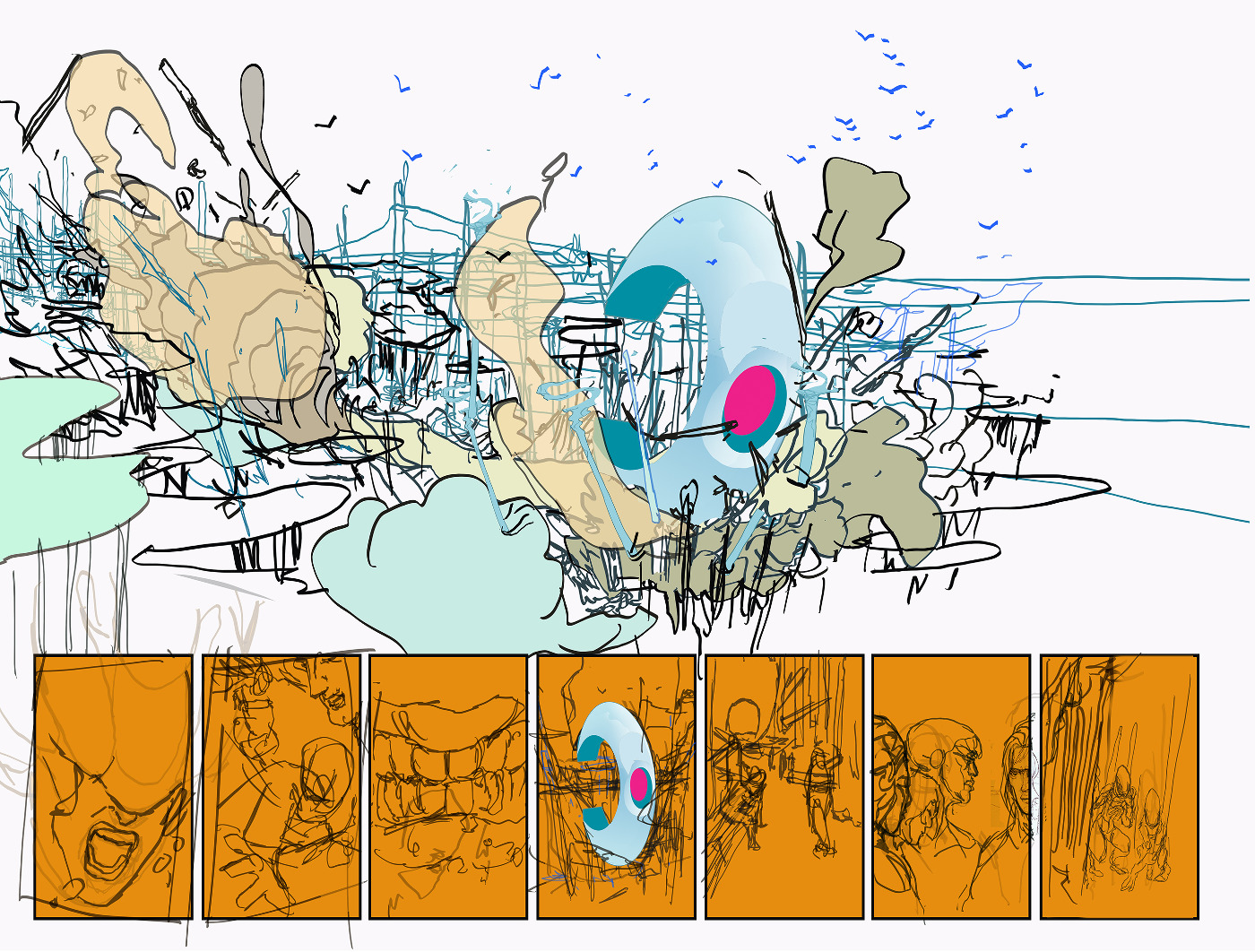
Then I’d print this off and use a lightbox to draw the final pencils.
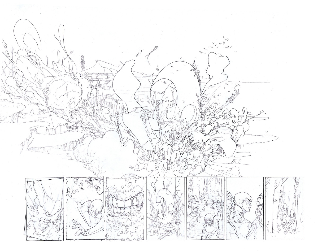
In some cases, I’d have TWO pencils – a rough and then a more refined version.
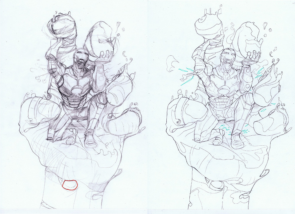
Once the pencils were done, I’d scan them in and this was where the fun began. And when I say fun, I mean grind.
First of all, I have to adjust the pencils in Photoshop to get them ready for colour, done simply by adjusting the levels. Making the blacks black and the whites white. But it’s also where I’d have to clean the image up, removing sketch lines, sharpening final lines, etc. So even the traditional pencils had a healthy percentage of digital in them. At this point, I’d often have drawn the page twice digitally and then twice again in actual pencils before spending up to an hour on each page getting them ready to colour. If there was ever a dampener for creativity, it’s ‘grind’.
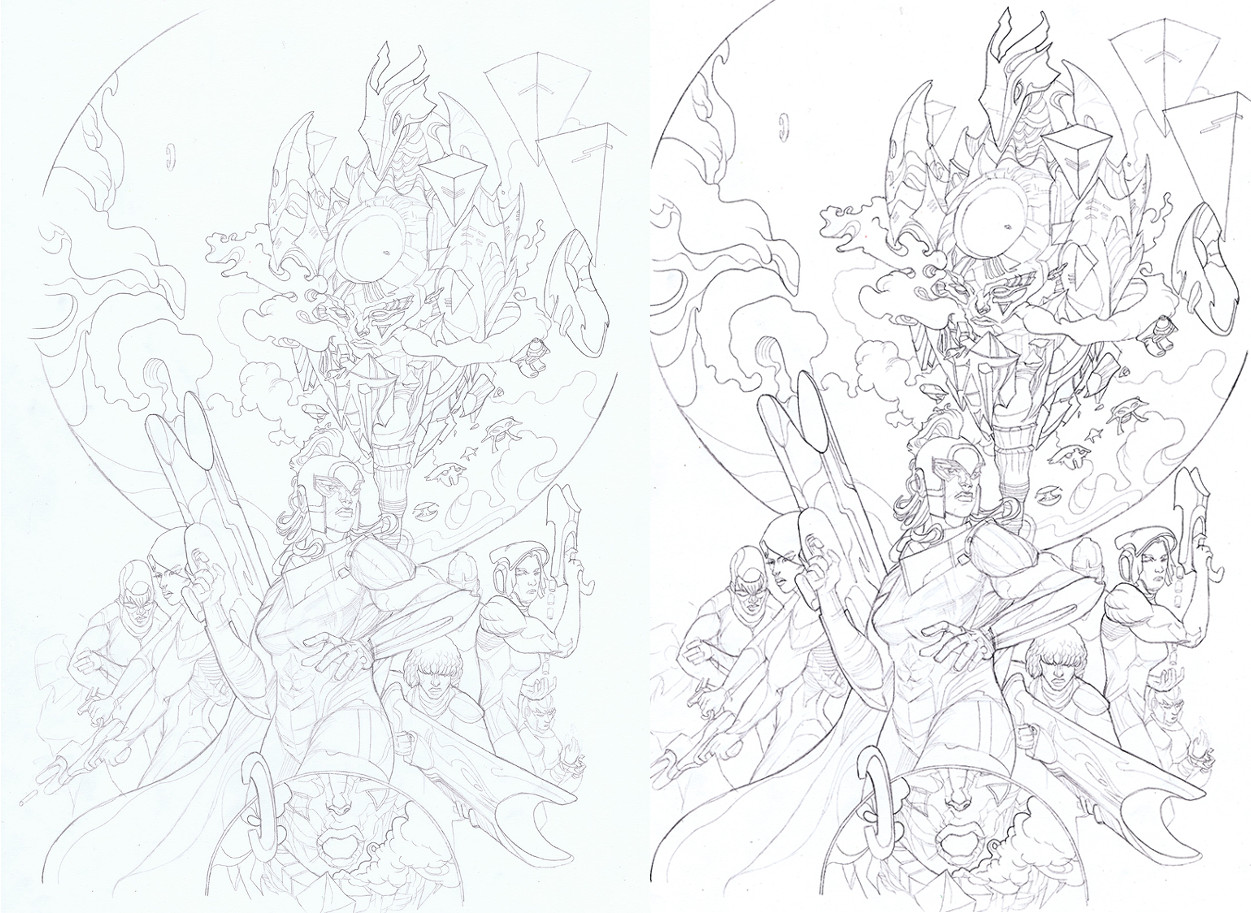
On top of that, what I began to notice over the course of the first arc of ODY-C is between this stage of cleaning and adjusting lines and beginning to add the colour in Photoshop is many of the final, more subtle lines in my pencils were being lost. Other lines would ‘break,’ giving what look like azure lines on paper a little sketchier look on the page. Going back to me being the obsessing artist, at times I found this maddening. Even here on the screen it’s hard to see what’s being lost in translation. One day Matt and I hope to publish a sort of artist edition of one of these earlier issues.
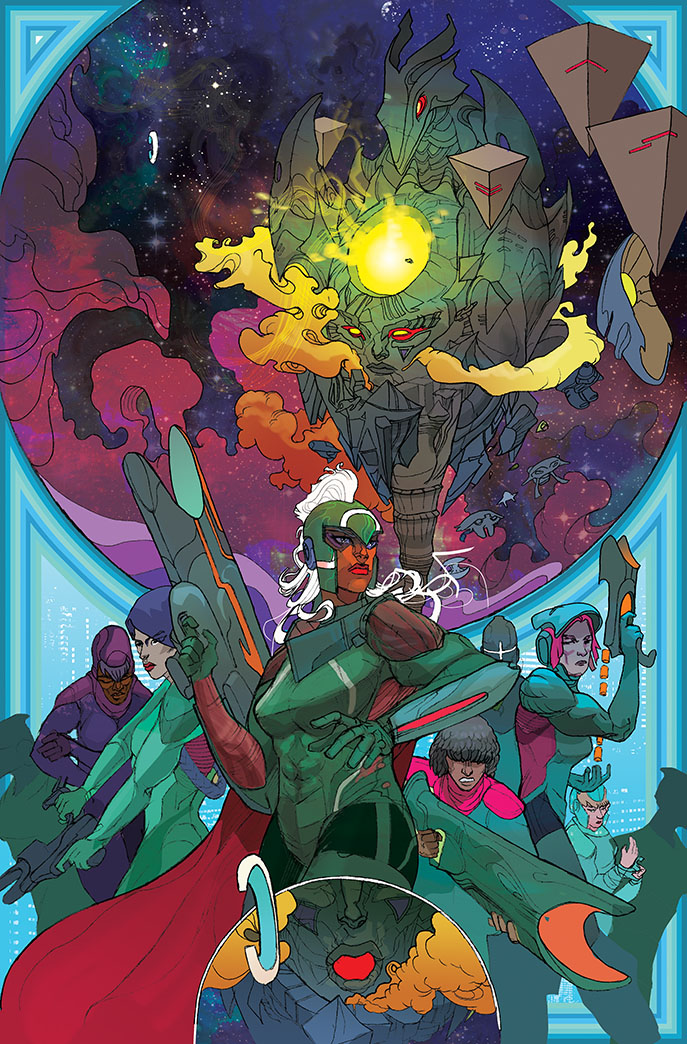
So, Duncan and Jamie convinced me to give it a go. This could be a way of not only working more efficiently but also of being able to control the line and the look of the final page even more. To make it better.
Matt and I had already planned a two month break from ODY-C – issue #5 being out late May, trade in June and then issue #6 out early August. Plenty of time to make the switch and get this look right. Moreover, issue #6 starts a new arc and is a departure from the course of the first five issues. We were starting now to swim in our own waters pulling in inspiration from not only 1001 Arabian Nights but also Moby Dick. Issue #6 was the perfect issue to try something new.
So I went in for a penny, in for a pound. I upgraded my Cintiq and my computer and set sail.
This is how my first digital issue went:
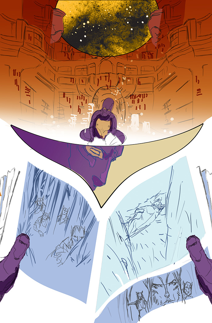
Rough: as always it begins with a digital rough. Just a worked up layout. So no change here from my usual method. A quick digital rough of how the page read. Characters roughly blocked in. This is more about getting the flow and structure of the page right.
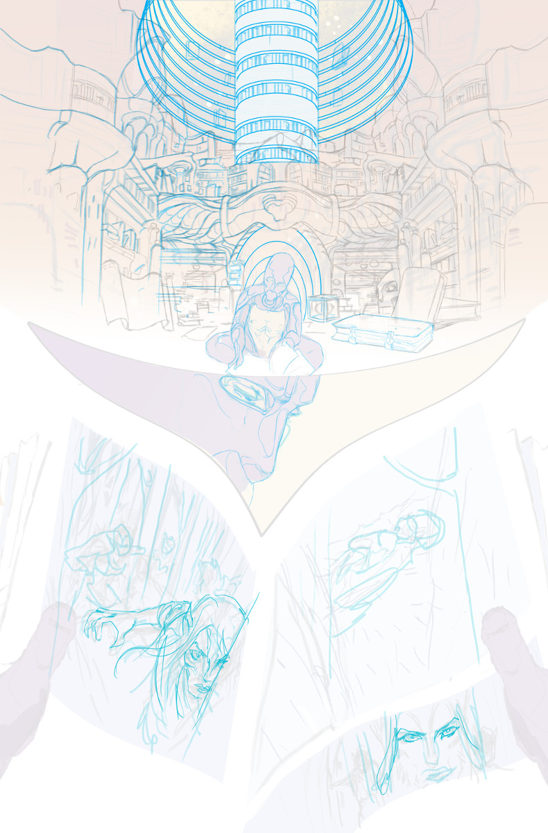
Blue line: rather than print that out, I lay over a extra layer of white – which I reduce the transparency on – and another for blue lines. These will be more worked up line-work. Here I add more details and start to define the characters.
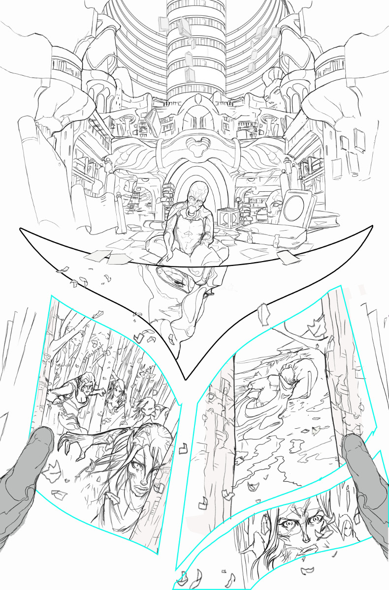
Pencils: Another layer of white is added and then a layer of final pencils. This stage replaces the ‘print-lightbox, draw draw draw and (the oh god how I hate) scanning’ stage of my traditional method. The scanning really is an area of comic book art making I shan’t miss.
This is the stage that is most different. This is the part that’s new. What has most allowed me to shift over to all digital has been to use the custom made Kyle T Webster brushes.
Kyle makes brushes which mimic traditional media. So far I’ve been experimenting with using his HB pro pencils as I didn’t want my line work to look overtly different (although traditionally I’ve always used 2H and H pencils). By reducing the opacity and flow of the pencil, I’ve been trying to create the same balance of soft and hard lines. Much like in my traditional work. I then use a little Stumpy pencil for a bolder line on key objects or characters just to give them a little pop.
Because these are digital lines, there’s no degradation of the lines when I start adding colour. I don’t need to adjust them. How they look uncoloured is unchanged once colour is applied. Additionally, although I want to avoid a wholly CGI look, I can also build certain 3D elements into this step far more naturally.
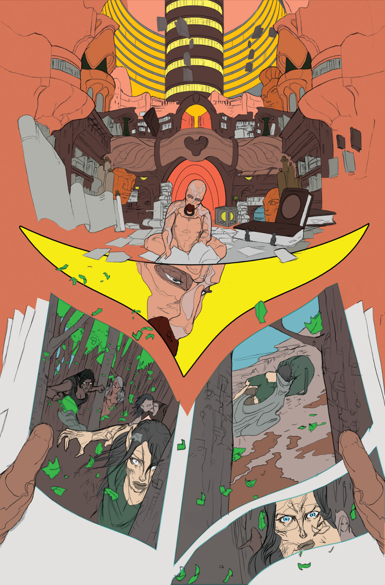
Flats: the next stage of the baton belongs to my flatter Dee Cunniffe (flatter to the Stars). Dee’s been a big fan of my move over to digital. These digital pencils are a lot easier to flat – especially since previously despite my efforts, the traditional pencil pages always needed just that little bit more cleaning up by Dee before he began the flats.
For those that don’t know, flatting is the process of laying down basic shapes of flat colour onto the page. Often these are done in ‘clown colours’ – these are random colours which don’t appear in the final page. The key thing is the shapes.
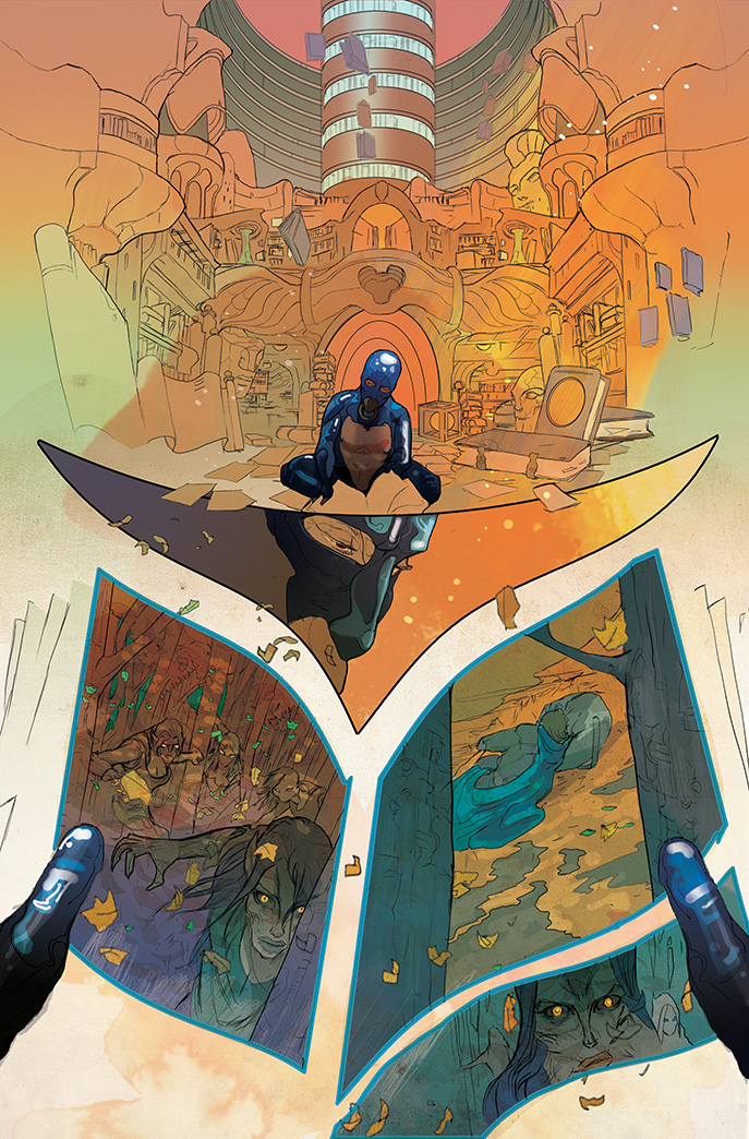
Colours: I then use these shapes for my colours. Using these shapes previously defined by Dee I’m able to use the “magic wand” or “paint bucket” tool to quickly add my own colour choices. Once I have that down, I can then start digitally painting my colours over the top. Adding texture, rendering light and tone and adding patterns.
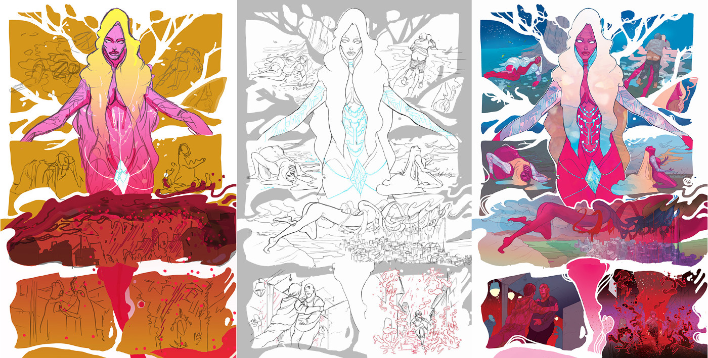
Now beyond the streamlining of process to create a page, what most excites me about digital art is what I can do with it that I couldn’t do traditionally.
For starters, panel layout and page structure are big parts of my work on ODY-C and now I can start to warp that even more by literally warping panels and playing with how I create borders. For instance, even something as simple as having no border lines is easier to achieve with this new method.
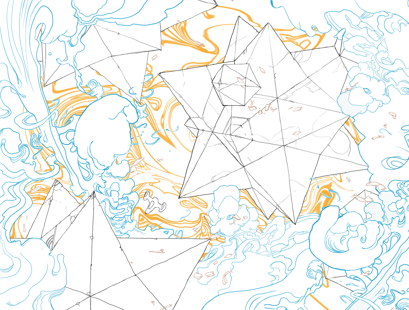
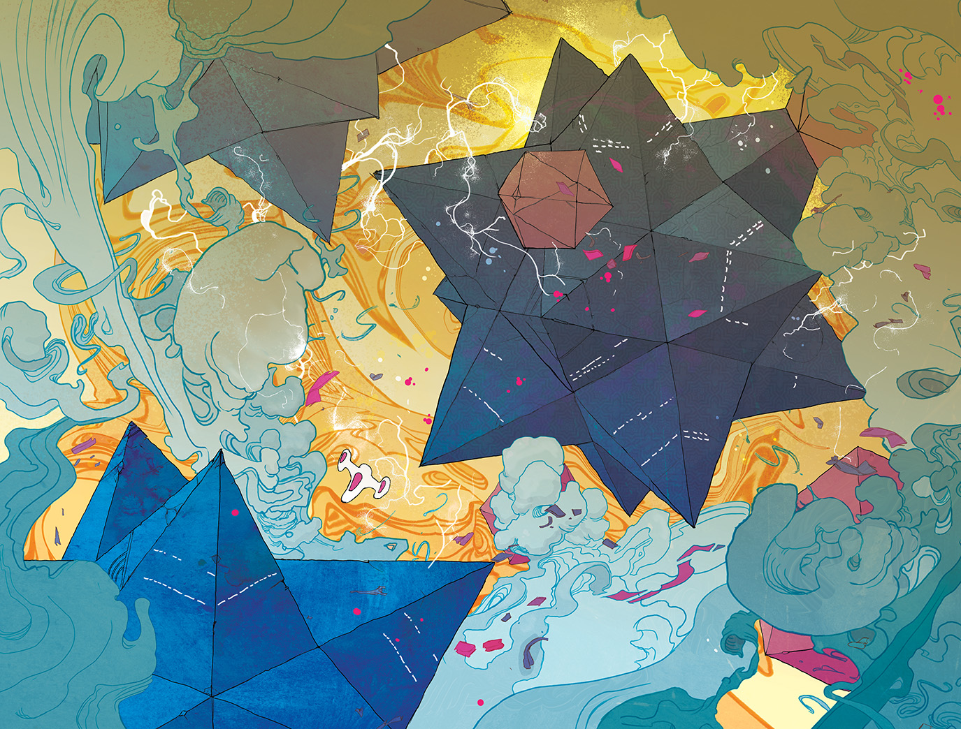
The other main advantage (and the area that brought me here in the first place) is the line; I can experiment far more with the colour of the line, the weight of the line, distorting the line. In fact one thing I’m getting a real kick out of is that I can make the line and colour far more interconnected. I can bring more design elements to a page. I can play the depth of a page. All in all, I can make decisions about the line when thinking about the final colour rather than each level be distinct. ‘Thinking.’ That’s the rub of it. I spend too much time thinking. Thinking about elements no one else would even notice. Turns out digital just gives you more things to think about.
Is this new work better? Honestly, I’ll give you a different answer on a different day but I think it’s definitely more exciting and I think eventually going to be better. Beyond that, I’m nervous but excited to see what readers think when ODY-C #6 hits this week.
It was my insecurity that brought me here, worrying about my line and worrying how my work compared to my peers. Does working digital solve that? Nope. Like Duncan suggested, am I saving time? No, unfortunately not. There’s less grind but a digital page perhaps takes even longer to draw than a traditional one. It’s so much easier to zoom in an obsess. To zoom in and draw that part that the human eye won’t even register. All in all, I still have no real idea what I’m doing. This method has just given me new neuroses, new choices and perhaps even endless aspects to worry about…but I’m excited about each and every one of them. I have no idea what future issues of ODY-C are going to look like but I can’t wait to find out.
Christian Ward is the artist and co-creator of ODY-C with Matt Fraction at Image Comics. The second arc of ODY-C begins Wednesday with issue #6. You can buy the first volume in print or digitally, right now. You can follow his journeys as an artist on Tumblr and buy his original art at Cadence Comic Art.
