Visual Chameleon: Talking Art and Empress with Stuart Immonen
Read our extended chat with the art giant about his new book with Mark Millar
I’ve been writing about comics for a long time now – closing in on seven years, I think – and after all that time, I’ve still maintained a bucket list of creators I’d love to interview. While I’m not about to lay out a list of who I’d love to talk to, I can say that Stuart Immonen has been near the head of the list since I started. And why not? His work is some of the most diverse and impressive art you can find in comics, from his superhero work on books like All New X-Men and Ultimate Spider-Man to graphic novels like Russian Olive to Red King and Moving Pictures. Hell, you can see his ability to shift styles without a loss in pure storytelling ability in Nextwave – particularly issue #10 – which doubles as one of my favorite comics ever.
So he’s long been at the top of my list, and today, you can read a conversation with Immonen about his art, career and the work he’s putting in on his latest project – Empress at Marvel/Icon with writer Mark Millar. Give it a read below, and look for the second issue of Empress tomorrow in comic shops everywhere.
You’ve been doing this a long time, but what made you want to become a comic artist? And beyond that, did you have any formal training as you were developing your craft?
SI: For as long as I’d been able to read, and probably before, I’d had an interest in comics, and I’d always had an interest in drawing, but growing up, I never put the two things together. Obviously, I knew drawing comics was a job and that real people did it, but I had no idea how someone could attain that goal, so I didn’t even consider it as a possibility in my adult life.
Fast forward to the late 1980s — Kathryn and I are living in Toronto, and Vortex Comics is publishing local cartoonists’ work from an office above the Silver Snail Comic Shop, and Andromeda is distributing indie stuff nationwide, and the steps suddenly seem less opaque. In fact, there didn’t appear to be any steps. You make a comic and bam you’re in the industry.
I did study Fine Art at York University for a year but it was a disaster, and before the second semester was finished I had already elected not to return. So apart from what I learned at high school, or from my mom, or from how-to books, no, I have no formal training. I spent the years from 1989 to 1993 working for various small and medium-sized comic companies, trying to angle my way in at Marvel or DC, while Kathryn supported us with film and theatre work, and I basically consider that my training period, though I still have a lot to learn.
I’ve described you in the past as an art chameleon. While many comic artists will stick to a base look, you go from a more cartoonish, bombastic look on your superhero work to a more spartan, quiet feel in your projects with your wife, Kathryn. That ability is something you and Warren Ellis played with famously in an issue of Nextwave. Is that just you finding the best fit for each story? And beyond that, I’ve always wondered, do you feel you have a core style the others diverge from?
SI: Well I’m not sure I would characterize my superhero work as either bombastic or cartoonish, at least not universally. Certainly SUPERMAN: SECRET IDENTITY is neither of those things. Neither were my runs on THOR and THE HULK. Conversely, Kathryn and I have done some more animation-inspired work together; NEVER AS BAD AS YOU THINK, published by BOOM! for example. So, the answer is yes, obviously, I’m always searching for a style that suits the story at hand, regardless of genre. I could trace this back to something Adam Hughes said in a totally casual, off-hand way to me back in ’92 or ’93, that he wished he could be like Moebius and have a different look for different kinds of projects. I thought, “why not?” and seized the opportunity when it came up. Of course, Adam is one of the greatest artists of our generation, if not the century, while I have this parlor trick I trot out.
As for NEXTWAVE, I assume you’re referencing issue 10, with various scenes rendered in different styles, which was not part of the script, but rather something editor Nick Lowe suggested, bless him. But I’ll go out on a limb and say that NEXTWAVE as a whole stood apart from my oeuvre up to that point, and pretty much was wandering around lost from the rest of what Marvel was publishing at the time.
I’ve always had… I don’t know, a short attention span, or a restless soul, or whatever you want to call it, and have resisted getting locked into one way of doing things. I’m also terribly worried about my own shortcomings as an illustrator, and I see other people’s work that I admire and think, if I could incorporate this technique or that effect, my own work would improve. Fear is a great motivator. But I think you’re right, I can probably never escape that thing that makes something identifiable as mine, which is probably the thing I hate most and am desperately trying to change.
For artists of many varieties, there’s the “one for them, one for me” stratagem. The idea that a writer or actor or musician or whomever would create a work that’s for a wider audience to fund a passion project of theirs. While your career doesn’t have that exact ratio by any means, with works like Star Wars and All-New X-Men interspersed between projects you put together with Kathryn like Moving Pictures and Russian Olive to Red King, I’m curious, do you have a similar philosophy? Or is it more of a situation where you have varied interests and your artistic itches get scratched by different things?
SI: I don’t think I’ve ever consciously compartmentalized my work like that, but I suppose there’s an element of truth to it, but mostly it’s a matter of keeping things from stagnating by forcing yourself to think about the technical problems of storytelling in different ways. If you don’t have colour to fall back on, or speed lines, or some other arbitrary choice, you find other solutions and those solutions creep into the other styles. Also — for me, anyway — it’s all drawing, it’s all comics. I enjoy the genre work and I enjoy the more experimental work. I’m frequently asked what character I’d like to draw, and I just don’t look at it like that. I’m not saving myself for Aquaman or Captain Universe or some other thing; you have to find something to excite and interest you in every project and put everything you’ve got into what’s in front of you. At a recent convention, a fellow creator stopped by to purchase a copy of RUSSIAN OLIVE and while I was occupied with something else, he asked Kathryn what kind of project I would really love to “cut loose on,” to which she replied, “You’re holding it.” The implications being that a) I’m somehow holding back on work-for-hire jobs and b) our “art comics” are not valid somehow.
Regarding ratio, well, let’s see… in 2015, I finished my run on ALL-NEW CAPTAIN AMERICA and pencilled five issues of STAR WARS and a couple of pages in ALL-NEW X-MEN… that’s about 180 pages. And RUSSIAN OLIVE TO RED KING, which also came out last year, was 190-ish pages long. But that was an unusual year, and really RUSSIAN OLIVE should be amortized over the previous four years, during which we also published CENTIFOLIA II, and SNIPE, and contributed to the OUTLAW TERRITORY and ABOVE THE DREAMLESS DEAD anthologies… I think it splits pretty evenly, actually. The problem we’ve seen with having a foot in two camps is the perception that we do not belong to either.
Given the cavalcade of superstar artists he works with, many wonder how Mark Millar can keep attracting this kind of artistic talent to his books. For you, what was the appeal of working with Mark, and what attracted you to Empress in specific?
SI: In a word, enthusiasm. There are lots of talented people in the industry and I’ve been fortunate to work with many of them, but I’ve never worked with anyone who is as excited and energetic and committed as Mark. And clearly, he’s no slouch in the talent department; another comics writer said a great idea is like a diamond and for most people that’s true, but Mark has three or four or more great ideas per issue, like Lucas or Tolkien level Great Ideas, so many that he doesn’t have to nurture or coddle them, but is able to introduce an inventive concept or a set piece and chuck it aside. Think about everything that was introduced in the first Star Wars film; wookies, jawas, moisture farming, landspeeders, interpreter droids, Jabba the Hutt, the Kessel Run, The Death Star, the Jedi Knights, the Force. It comes at you like a machine gun. Mark’s writing is like that, and working with him is like riding the whirlwind.
We’ve been trying to sync our schedules literally for decades. If circumstances had permitted, we would have worked together years ago.
Once you get your script from Mark, what’s your process like, and what tools do you use to bring an issue of the book to life?
SI: My process on EMPRESS is the same as on any other project with the notable exception of having to commit to months of world-building design work that preceded the actual script. I mean, every issue of every monthly comic has some designing– costumes, locations, a villain, a vehicle and sometimes it can be done on the fly, but EMPRESS required all of that well before beginning.
Once the foundation work was established, though, it was business as usual; I start on page one and lay out the panels in a thumbnail a couple of centimeters high, and start pencilling panel one. The shape and arrangement of the panel grid dictates the composition within the panels, so a lot of the actual drawing is intuitive; whatever feels right, fills the space, excites the eye, but primarily moves the story forward.
My tools are simple; a non-repro blue pencil for rough composition work, and a couple of hardness grades of graphite lead pencil. For EMPRESS, Wade and I talked about a finer line overall, so my leads are harder than they’ve been on other projects. I’ve also switched to a more resilient paper stock. Same eraser, though, a Staedtler Mars white, which I use embarrassingly often.
I use photo reference for just about everything, and when I can’t find or create a photo, say, for an invented space ship which is seen often and from various angles, I’ll build a quick, basic 3D model which I’ll then be able to refer to as required, sometimes traced, but just as often drawn by eye, just as I would interpret a figure or an environment. Some tough-guy artists still claim this is “cheating” somehow, but it works for me. In his book Moving Heavy Things, Jan Adkins seventh precept is “simple forces applied intelligently should carry the day,” which are words to live and work by.
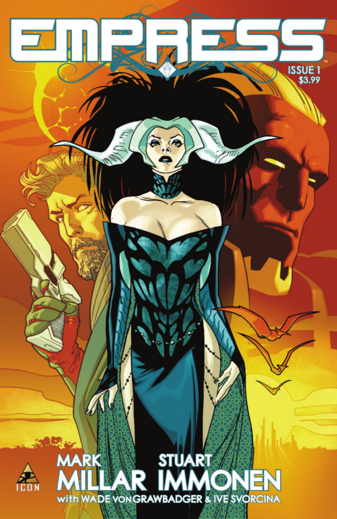
This was, I believe, the first image we saw from the book. It’s also the cover to Empress #1. While it’s not one-for-one, it has a classic sci-fi, Drew Struzan feel to the layout. Given its nature as a lead image for the book online, in Previews and in comic shops themselves, what were you going for with this piece? And what’s your approach on covers overall?
SI: I’m not worthy of being mentioned in the same sentence as Struzan, but yes, it’s basically a classic movie poster montage. People casually scanning the stands ought to be able to suss at least the basic idea of the series from this one image, and still find it pleasing to look at.
I’m terrible at covers. Every one of them is a struggle for me. I’m much more interested in juxtaposing a series of images, Plus, I prefer to draw smaller.
I was pretty happy with the logo however.
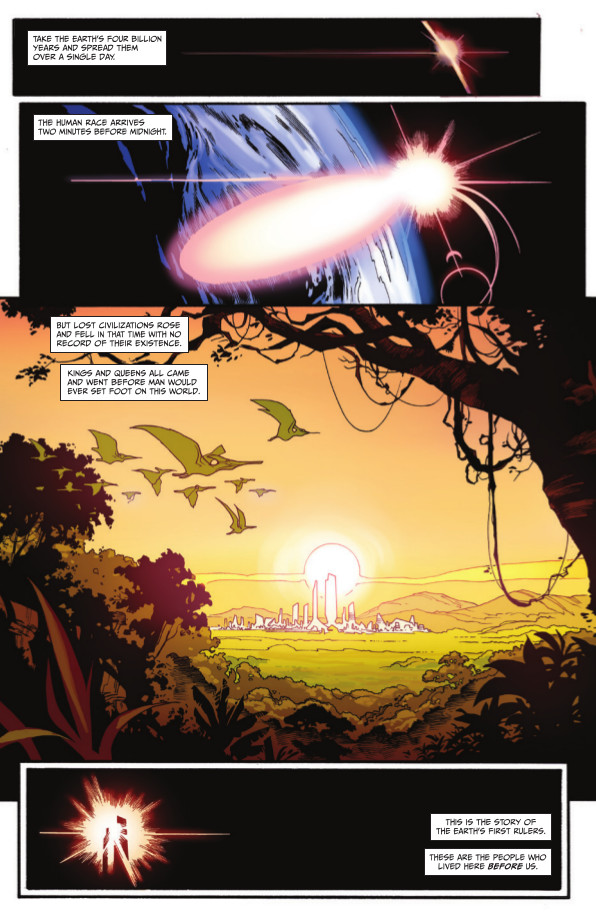
One thing that stands out about this book is how focused the pages are on driving the eye down the page. It’s much more stacked, wide panels than I’m used to you in your work – only 8 of 25 pages have vertical panels, by my count – and it gives the first issue a brisk pace that fits the urgency of the story. While part of it comes from Mark’s script, I’m sure, what made this kind of layout the best fit for the story?
SI: Mark is fond of four panel pages with relatively light dialogue, and for me, the panel compositions seem much more natural in a landscape format. It’s really that simple. Pages with talking heads, dense dialogue, or multiple quick actions require a different layout. I don’t often encounter scripts with specific panel arrangements– Mark’s do not– but in my experience, it’s often best to treat them as requests rather than law. One of the joys of working in collaboration is the ability to pass the baton and be surprised by the result.
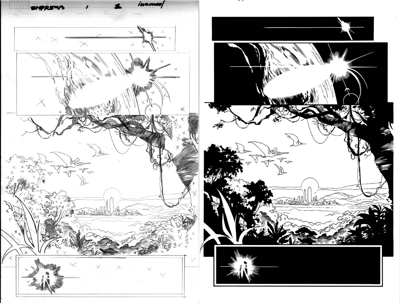
Near as I can tell, this is the first time you’ve worked with colorist Ive Svorcina. What is it about Svorcina’s colors that fit your work so well in Empress? And did you talk with him at all before hand to find the best ways to work together, or are you more hands off with your artistic partners?
SI: Working at arm’s length goes for pencillers as well as writers. On projects where I have the time and inclination and desire to colour, I’m happy to do so. Otherwise, my philosophy is to surround yourself with great people and let them do the thing they were brought on board to do. Ive has equal facility with epic sci-fi material and more intimate scenes. It goes without saying that he has a superb palette, and great range and a variety of styles at his disposal; in particular, I was very keen on seeing how his softer touch would play against the angularity of the linework Wade and I chose. The result has been wonderful and sometimes unexpected, inspiring me approach the work differently than I otherwise might.
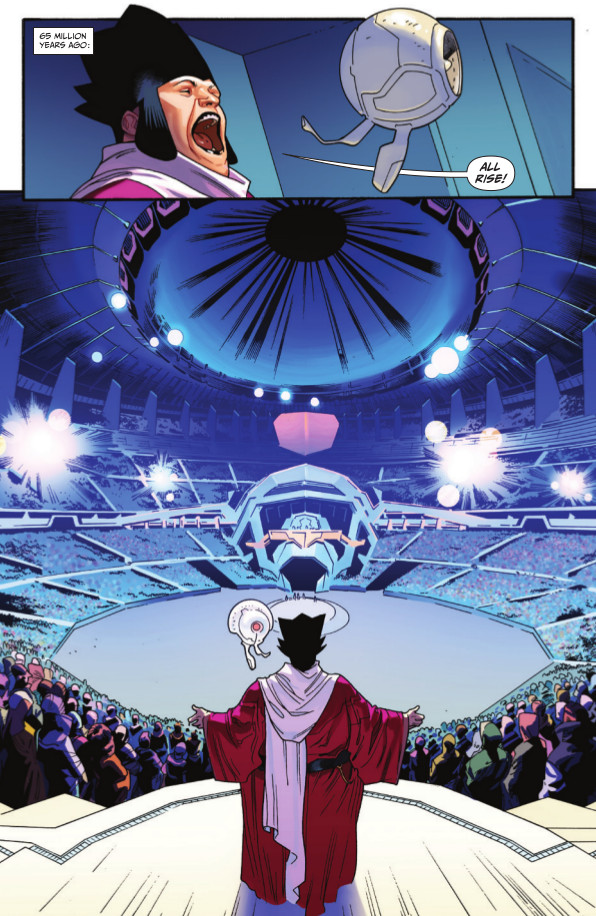
From what I read, you put a lot of advance work in as you developed Empress and its look and feel. How far down the rabbit hole do you get? Is most of the effort focused on character and world designs, or are we talking vehicles, ships, clothing, tech and everything we can imagine?
SI: Everything that appears in the book, everything that needs to be drawn, needs to be designed. It should look natural, or at least likely, in context, and hopefully not step on toes in the very crowded arena of sci-fi concept work. So… I’m not sure how to answer this more specifically.
It’s hard to talk about your work without asking about your constant partner-in-crime, inker Wade von Grawbadger. He’s inking you here as he always is it seems. What is it about his work that brings out the best in your work, and I’m curious, is it just understood at this point that you two are a package deal?
SI: As I said before, it’s best to find talented people and set them loose to do the thing they do well and not interfere. Wade’s the best in the business. He’s won all the industry awards. He’s recognized by his peers and by his audience. He’s got a line you could split atoms with. I’m lucky to be able to keep convincing him that somehow it’s a good idea to keep working with me, especially when I keep pulling the rug out from under him, stylistically. He’s curious in his creativity, willing and eager to search for, explore, and perfect new ideas and techniques. We both “play the field” a bit, but yes, it’s basically a given that when one of us is on a gig, the other comes with.
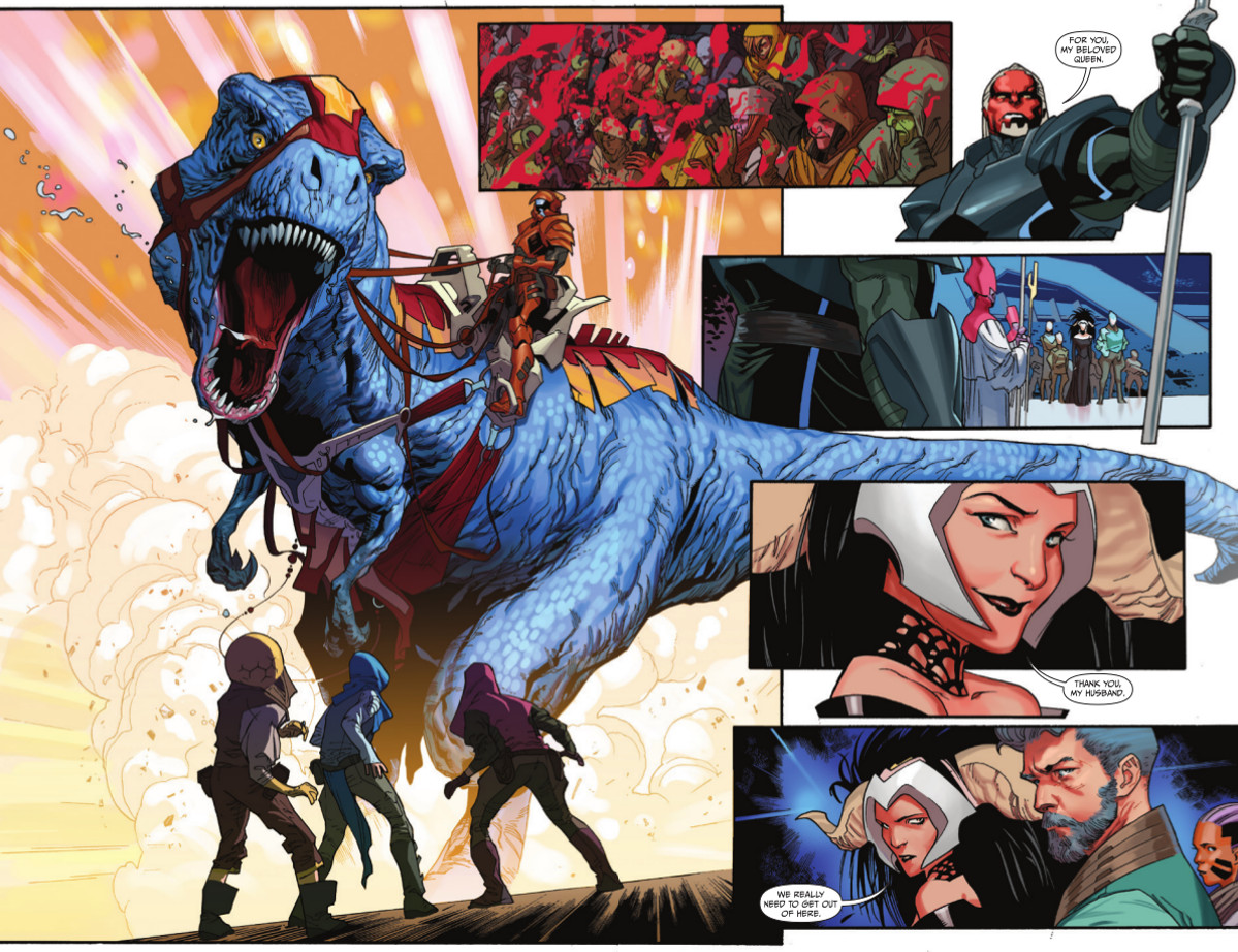
One thing I’ve always appreciated about your work is how effective your character acting is. A lot of my favorite parts of Nextwave were the character-centric jokes you sold visually, for example. And here on panels five and six, we get our first indicator as to what’s really going on right on Emporia’s face. The way her head turn comes with a complete change in expression is perfect. To you, what’s the key to effective character acting?
SI: Thank you. From my perspective, there’s a lot that’s lacking in my work; the anatomy is all over the place, page and panel compositions are up and down, I frequently get bogged down in unnecessary detail or fudge things I can’t work out satisfactorily. But when the reader can follow the story without dialogue, when a character has weight or naturalness or verisimilitude, that’s a glorious win.
When it comes to character acting, do you use photo reference or is it more of a feel thing for you?
SI: Like I said, I use photo reference for just about everything, regardless of the “finish” of the work. For expressions, it’s often a photo of my own face. The details of hair and bone structure, the shape of the nose and so on don’t matter as much as capturing the nuance of an emotion, which can sometimes be layered, as in the panel you mention, where Emporia is smiling with her mouth, but almost wincing in pain with her eyes. Her right shoulder is brought forward in a protective posture, her head is turned only slightly toward the reader. When it works, it’s usually an accumulation of various subtle aspects, which for me is more satisfying and elusive work than drawing a massive fistfight.
Empress #2 by Immonen and Mark Millar arrives tomorrow at comic shops everywhere from Marvel/Icon.
