
The Tone-Setter: An Appreciation of Jen Bartel’s Exceptional Cover Run on She-Hulk
While I love a lot of current comics, one current series that I’m seemingly much higher on than everyone else is the current volume of She-Hulk. Written by Rainbow Rowell with art by Rogê Antônio and Luca Maresca and colors by Rico Renzi, this ongoing fuses much of what we love about the character – the smashing! the lawyering! the personality! the relationships! – from throughout history with all of the strengths of its creative team. Connecting She-Hulk (or Jennifer Walters) and her shifting present and figures from her past, this is a rock solid Marvel comic that executes the publisher’s formula perfectly, but with a real swagger to it.
Despite those gifts, the aspect the team on She-Hulk stands out above perhaps any other Marvel title right now is in vibe creation, making it an heir apparent to the hang-out comic throne vacated by Rowell’s own Runaways title and Ryan North, Erica Henderson, Derek Charm, and Renzi’s The Unbeatable Squirrel Girl. There’s something about this series that just feels right, like each beat is hitting in the exact way it should, with every creative decision being the necessary one to help the title (and character) live its best life.
And yet, as great as the interior creative team is, there’s one person and element that perfectly encapsulates those good vibes. That’s Jen Bartel and her covers for the series. Each exterior so far – there have been seven revealed, even though only five issues have been released 5 – has set the tone for the interiors, helping readers understand exactly what kind of series they’re getting themselves. While some titles might have better covers by certain standards, 6 no current Marvel covers better fit and define a title’s identity than She-Hulk’s.
I’ve wanted to write about these covers — and just what makes Bartel’s efforts so exceptional — for a while now. Today, I’m going to do just that, as I share an appreciation of Jen Bartel’s work by looking at each of her She-Hulk covers and seven ways they stand out as exceptional examples of the form.
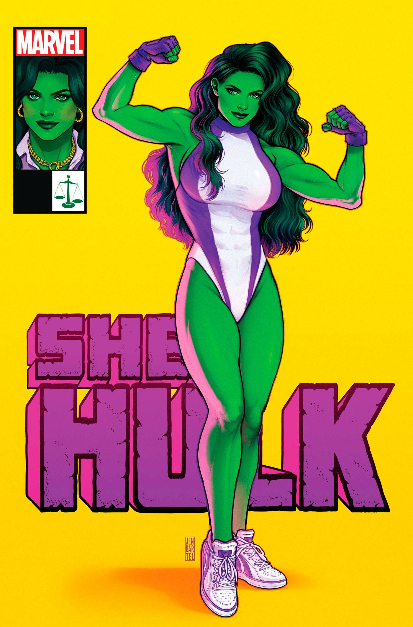
Issue #1: The Tone-Setter
First issues are all about setting the tone, establishing a feel for a series going forward. For that reason, first issue covers tend to do the same — well, not all of them, as debuts tend to have a lot of variants — trying to help readers get a better understanding of what a series is really all about before they dive in while drawing their eyes at the comic shop. In that regard, Bartel’s cover to the debut of this She-Hulk run is a sensation, creating a vibe for the book before you even open the issue.
It does that in a number of ways. The color choices, as the golden background and the purple titling pairs nicely with Rico Renzi’s interior work and in how it complements She-Hulk’s look on the cover. The playful feel to She-Hulk herself, from her half smile to her sneakers. The blending of corner box art with main cover art, keying readers in to how this title exists with one foot on each side of the character’s identity. Even elements like the scales of justice being worked into the corner box, emphasizing the delicate balance of who the character is. It’s a beautiful fusion, telling us just what’s waiting for us inside these pages.
Beyond the tone setting, though, it also does important work by looking absolutely incredible. It stands out with that striking, single color background to the cover. Bartel’s seen a lot of success with this approach before — see: Blackbird, Bartel’s series at Image with writer Sam Humphries — and she executes the same concept exceptionally well throughout the first volume of the series. It pops when you are at the comic shop, while fitting the book’s energy at the same time.
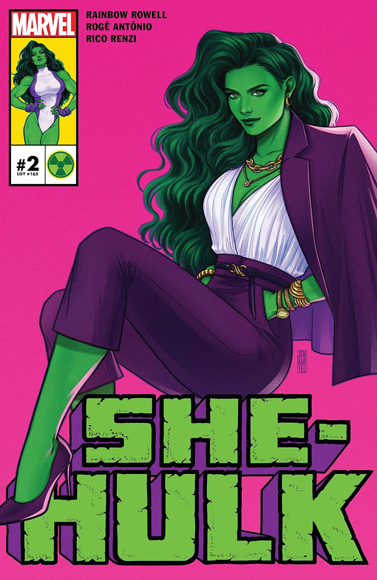
Issue #2: The Balancing Act
I always say comic covers are designed to do three things: create a striking piece of art; stand out on the racks in a comic shop; and represent the comic it’s a part of. While that premise might not stand up to the test of time in the variant era we live in, I like to think it’s still largely true.
If that’s the case, then Bartel’s covers are ones that live up to that theory, excelling at all three simultaneously. I already talked about how these single color backgrounds help each issue stand out in comic shops. I suspect I don’t really need to explain how an Eisner-winning cover artist is good at creating art. Instead of focusing on those two elements, we’re going to look at the “representing the comic it’s a part of” for this cover. Simply put, the way this cover does that is by inverting the approach to the cover for #1. Where superhero She-Hulk earned the lead image on the first cover with professional She-Hulk in the corner box, this issue flips that script, making the stylish, Janet Van Dyne-clothed lawyer version the most prominent look, emphasizing implicitly that She-Hulk is always trying to find her footing as a person and as a hero.
This series is about a lot of things, but much of it comes down to She-Hulk balancing the different sides of her life. She’s a lawyer but also an Avenger but also a normal person trying to find her place in the world but also someone with a complicated relationship with Jack of Hearts. All of these things are true and more. Bartel excels at representing the character’s varying sides on this cover, but also each of the covers, really. That mix of the corner box art and the primary art comes down to the different sides of the character being represented simultaneously in a single cover. It’s smart as heck, and exceptionally well done.
subscribers only.
Learn more about what you get with a subscription
Over a truly strange schedule, in which each issue’s release cadence has been seemingly decided by roulette wheel as much as anything else.↩
I’m not saying I agree with that premise, I’m just saying some have other preferences.↩
Over a truly strange schedule, in which each issue’s release cadence has been seemingly decided by roulette wheel as much as anything else.↩
I’m not saying I agree with that premise, I’m just saying some have other preferences.↩
Over a truly strange schedule, in which each issue’s release cadence has been seemingly decided by roulette wheel as much as anything else.↩
I’m not saying I agree with that premise, I’m just saying some have other preferences.↩