
Building a Mystery: Let’s Power Rank Superhero Teaser Campaign Structures
As you may have realized from this week’s feature piece, I’m a bit of an enthusiast of the superhero comic teaser. These advertisements that allude to something on the horizon through art and text, all the while playing it coy about what they really represent, can be remarkably effective. My personal buying history as a comic fan is dotted with titles I bought or rolled even deeper on because of a teaser that may have inspired me to speculate wildly or simply be excited about the possibilities. Teasers, when done right, don’t just convince you to purchase something: they build anticipation and enhance the experience of being a fan through that.
Part of the difficulty of these sorts of campaigns, though, is that they’re high variance. For every stone cold classic, there’s at least one utterly forgettable effort, a weak, undercooked ad that Don Draper might see and simply utter, “I don’t think about you at all.” Determining what’s the right approach and what’s the wrong one can mean everything to an industrious comics marketer looking to roll out their next teaser campaign. The tricky thing is that even the right approaches come with attached downside, so it’s even more difficult than that might seem.
Thankfully, I’m a bit of a connoisseur of the form and someone who spends way too much time thinking about these sorts of things, so I’ve tried to figure out an answer to what really is the best of the teaser form.
That’s why I’ve been digging into everything — my memory, old comics, old issues of Wizard Magazine, foggy memories of something Marvel may or may not have done to promote a volume of Uncanny X-Force — for the last while to find teasers from throughout comic history. From the shockingly direct to the bizarrely ambiguous, I found examples from times both recent and from decades past. Now, one crucial note is teasers are not the same as ads. Ads are typically direct about their objectives or goals, promoting something in a clear and concise way. There’s no mystery to it. Teasers are ads, but they try to conceal what they’re really about. There’s a difference.
And today, I’ll be power ranking the best and worst teaser structures to really drill into what works and what doesn’t. There’s a very important part of what I just said there too: it’s not the best and worst teasers, but teaser structures, the repeatable frameworks teasers utilize to build excitement and enthusiasm. These will be ranked in reverse order, worst to best, and we’ll start with the only place we can, which is the most confounding teaser flavor of them all.

11. The “Uhhh…What?“
The “Uhhh…What?” might sound like a meaningless name. It isn’t really saying anything. It’s just the sound someone might make when they’re confused. That can’t be what I mean, can it?
No, it’s absolutely what I mean. This class of teaser earns that name because it’s that sub-category of teasers that do not clearly belong to any other one and inspire little more than confusion when someone sees it. The “Uhhh…What?” of it all is the only response possible, as we as comic fans stare at these teaser images slack jawed before quickly moving on.
While any number of teasers might have worked here — these come up far more often than they should, considering they aren’t effective on any level — was this onslaught of single image ads Marvel created for 2016’s Marvel Now relaunch. This might have been the moment teasers – and line-wide relaunches – well and truly jumped the shark. It was designed around showcasing mirrored Marvel characters for the second relaunch called Marvel Now, and it was halfway to being somewhat successful. A-listers were included like Black Panther, Thor, and Captain Marvel, and that generates some level of curb appeal.
It’s just they were often paired with D-listers like Slapstick, Foolkiller, and Solo. Let me tell you this: If you build a teaser campaign around Slapstick, the only question people will ask is, “Why did Marvel build a teaser campaign around Slapstick?” And that’s not useful from a building excitement standpoint. It is from an “inspiring jokes” one. But that isn’t the best attribute if you’re trying to get people to read comics, it turns out (Slapstick, Foolkiller, and Solo’s titles lasted for a combined 17 issues, so those titles didn’t prove to be enormously long for this world anyways).
Now, in this case, there was at least unintended benefit. It resulted in Mike Deodato, Jr. drawing Slapstick once, which, for a cartoonish clown character who always packs a similarly cartoonist mallet with him, is far and away the most intense the character has ever looked. I did enjoy that part.
The real problem here, though, is this structure says nothing. It’s just mirrored image with no room for speculation or intrigue. Sure, we have no idea what’s going on here, which is oddly important to the teaser formula. But we also have no reason to care about what’s going on here. It’s the definition of forgettable, save for that unusually intense looking Slapstick.
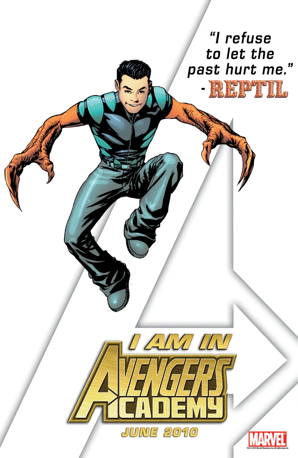
10. The New Character Specific Approach
The character specific approach can be interesting. If it’s an existing character with some clear change to who they are — Spider-Man has six arms, Wolverine has bone claws, whatever — with no guidance as to why that’s happened, readers will naturally wonder, “What the heck is going on here?!” I also understand why a publisher would want to tease a new character. Trying to hook potential readers with the next hot character — as well as collectors/speculators thirsting for any clue of a first appearance — isn’t a bad idea, if only because comic fans love to be able to have “their” characters. Having a young character to root for when you’re first getting into comics is a giant draw. It certainly was for me with Impulse.
The problem with this idea, and specifically this Avengers Academy teaser, is just showing a new character is meaningless as a marketing tool. There’s no mystery to it or impactful hook. It’s just a drawing and a quote, one with no connective sentiment that might drive a purchase, unless you are super into dinosaur arms and generic quotes. It’s theoretically interesting, but in terms of motivating action and stimulating conversation, I’m skeptical.
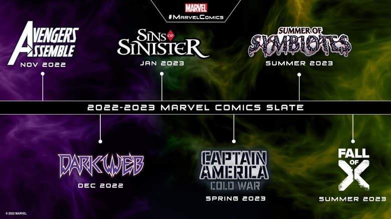
9. The MCU Structure
The Marvel Cinematic Universe has been very clever about how they announce their movies and TV shows. Any time they create a graphic that’s a timeline of newly announced releases, it quickly becomes one of the most shared images in the world. It builds and focuses the energy people are feeling for these new announcements, because it showcases just how robust the lineup is and how many cool things are on the horizon.
Because of that, I understand why Marvel recently leveraged the same concept for its upcoming events. The problem is, comics are not movies, and comic fans genuinely do suffer from event fatigue on the regular. Showcasing six events over what looks like an eight month span doesn’t seem exciting as much as it might seem exhausting. More than that, there are just a lot more comics than there are comic movies and shows — although they’re trying to catch up! — and this timeline concept mostly works because that’s the totality of release schedules rather than just a fraction of it.
I’ll be honest: this is my least favorite teaser in recent memory. Maybe ever. I cannot stand this thing. You might be wondering why it doesn’t finish lower then. There are two reasons for that. One is that while this teaser isn’t very effective as an excitement building tool, it is a nice tool for retailers to have in theory, as it’s an easily printable handout you can give the Marvel fans at your shop to encourage pre-orders. It’s a nice little one-stop shop advertisement for what’s coming. It’s not a great teaser, but it’s a decent promotional tool.
The other reason is there’s a version of this that can work. DC’s current Dawn of DC timeline – which isn’t exactly the same but has clear commonalities – works much better because it obfuscates some of the pending announcements. By doing that, you naturally make people wonder, “What’s next?!” And that’s a key goal of all teasers. The idea is good, but the execution was flawed in this case. Apparently the team over there did not realize that people would absolutely brighten up the images to reveal shrouded details. In their defense, though, it’s also possible that they did realize that, and this was them leaning into that type of excitable behavior, because finding hidden treasure in a teaser is the whole point. Clever, clever, DC! I see what you may have done there!
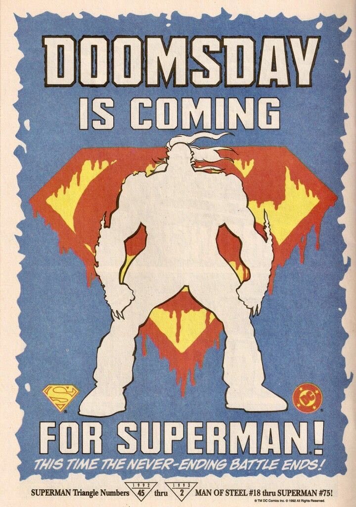
8. The Obscured Threat
A big selling point for any superhero comic is creating a credible threat. This is extraordinarily difficult to do, especially now, considering that a) no one ever stays dead and b) most characters have been “dead” at least once at this point. 1 But it’s still important, because without the belief that there could be a challenge or a cost for heroes, the narrative kayfabe of superhero storytelling crumbles to some degree. That’s why this type of teaser – what I call “The Obscured Threat” – is an effective one. It very easily lays out the idea of what’s coming — “Okay, we know it’s called Doomsday, or it probably is, and we know it looks scary and it’s going to be a problem, and they’re sort of suggesting here Superman might die…this is crazy!” — and how to follow up. This one definitely straddles the line of teaser and just being a straight up ad.
What keeps it in this class is Doomsday himself being obscured. We can’t see him, so at this point, he could be anything! He could be a character we know! He could be something new! Anything is possible!
That’s what I thought when I was an eight year old flipping through comics for free in my local comic book shop like the urchin I was. I saw this, and I remember thinking, “I’m going to have to get my mom to buy those for me.” I was all the way in, as I convinced my mom to buy all the issues for me, 2 and by the time Superman himself was killed by Doomsday, I was hooked on DC comics for the first time. I remember walking in a parade in the mall my shop, Bosco’s, was located, all as part of a celebration of life for Superman upon his untimely demise at the hands of Doomsday. There were kazoos involved. In retrospect, it was terribly embarrassing. I loved every second.
This teaser was so powerful it ultimately led to me walking through a mall playing a kazoo. That’s unbelievably powerful, and it’s all because I believed in that obscured threat when I saw this teaser.

7. The Big Swing
Objectively, this is the funniest campaign of the entire list. It’s also far and away the least easy to classify, save for the first one we went over. No other effort has been like Marvel’s decision to work Skrulls into a series of stock photo-like images to promote its line-wide event Secret Invasion, which was about how Skrulls had secretly been taking over key positions and people on Earth for years. It, when combined with a website building up the anticipation and a TV ad Marvel created (and apparently ran!), was the biggest swing creatively amongst all the teaser campaigns on this entire list. And it worked! It reinforced the entire idea and stood out from the pack with its unconventional approach.
Here’s a fun wrinkle that I learned while putting this piece together: Greg Horn made these ads, and he created them by manipulating an existing photograph by adding all the typical Skrull like bits. Even more bizarrely, apparently Marvel didn’t even pay for these images??? A wild choice, but apparently it worked out just fine for them.
The only reason it doesn’t finish higher is I’m not sure how impactful it was in terms of actually motivating people to read the comic, nor do I know how repeatable something like this is. It’s a great idea, but did it work as a marketing tool? I’m not sure! It’s certainly difficult to say for me, as I was already all the way committed to the larger Marvel tapestry at that point. It’s still a fun idea, though.
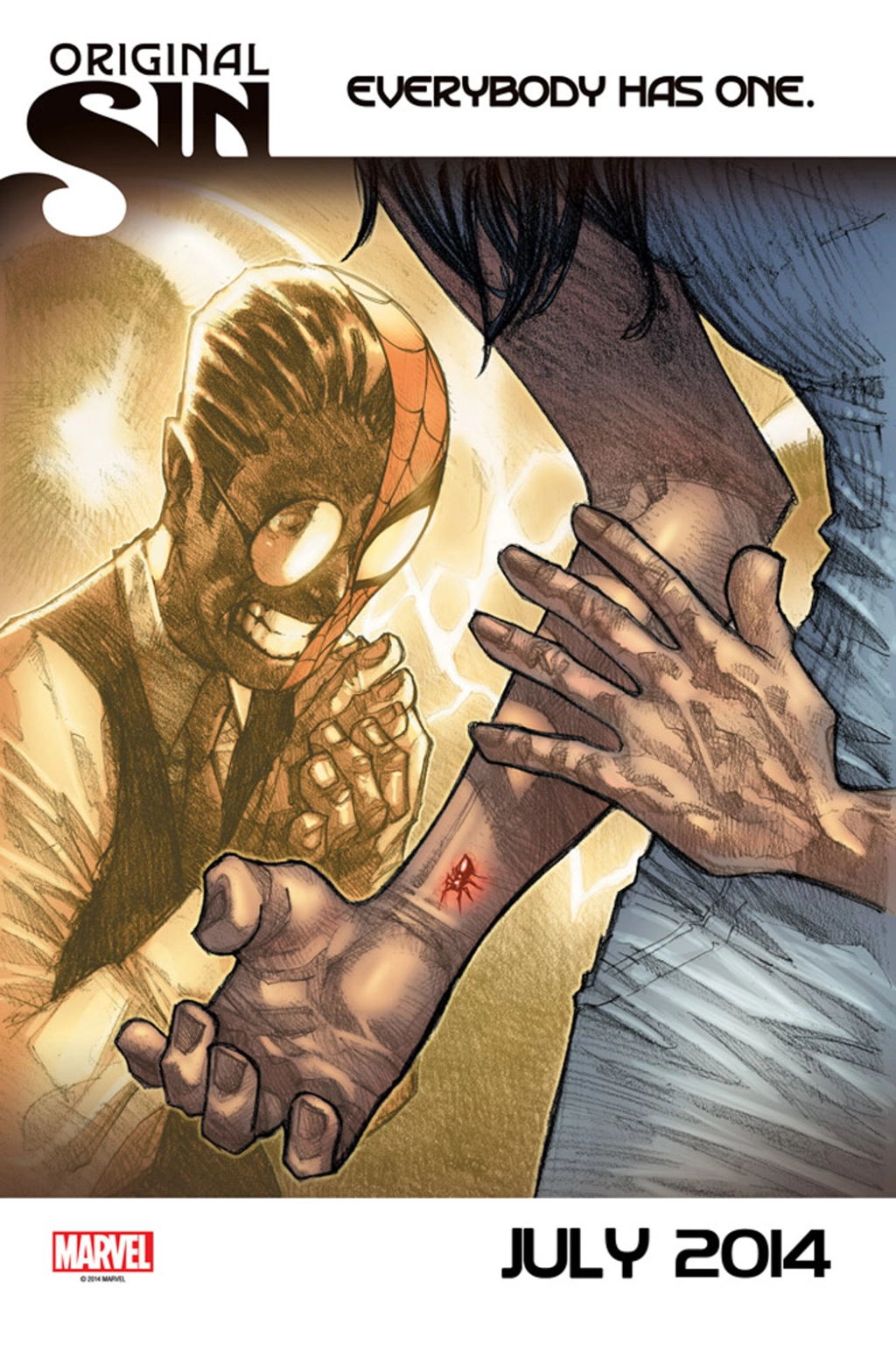
6. Says Nothing…But Says a Lot
While Original Sin itself was alternately forgettable 3 and delightfully insane, 4 these teasers in the build up were actually a lot of fun. The idea was delightfully basic. Original Sin would reveal that “everybody has” a secret, with a bevy of major characters earning an ad teasing what theirs might be. They ranged in impact, from fairly meager (see: Deadpool’s one) to extremely spicy. The above is the best example of the latter, and of this specific teaser concept, one that says basically nothing — it’s really just an image with a few words — but most readers will recognize that it means a whole lot: Peter Parker wasn’t the only one bitten by that radioactive spider way back when!
But who was it? And what happened to them? The answers on said teaser were “No clue” and “Who knows?” as well as you’ll need to come back in July to find out. So, you know, people did, because it was an impactful teaser, one that made readers ask questions that they wanted answers to.
It gets bonus points because it proved to be Cindy Moon, aka Silk, a great character in her own right. While teasers don’t have to pay off to be effective, it’s fun when they do!
It’s worth noting, though, that this structure is a particularly high variance one. While this specific instance says a lot in its limited details, there are versions that say very little on them and just don’t move the needle at all because of that. Marvel’s rollout for its Inhumanity storyline was likely fated to not be a notable one simply because it was related to the Inhumans and that’s just their destiny, but its “Are You Inhuman?” teaser campaign did not help at all. It asked a question that no one wanted an answer to, and inspired very little energy in the process. The line between “saying a lot” and “saying nothing at all” with these types of teasers is rather thin, which is the main reason it didn’t finish any higher.
5. The Anything is Possible
When you’re promoting a comic, you want people to be intrigued by the possibilities presented to them. It isn’t just about getting ideas out there or informing them of important details. You want them to be excited about the potential of something, because anything is possible in that moment.
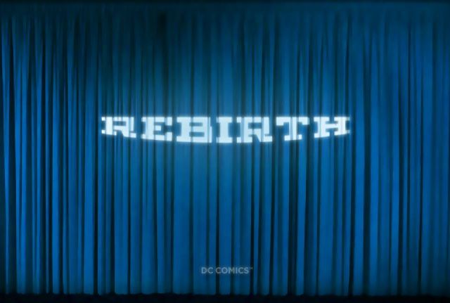
DC’s initial Rebirth teaser – but honestly its larger rollout of the idea – was a perfect example of this, even if it wasn’t promoting a single comic. When Dan DiDio tweeted the above image out with a single hashtag in #Rebirth, it started the rumor mill swirling. “It’s a reboot!” “It’s a series!” “It’s a million different things!” It inspired all those takes, but you know what’s amazing about that? It’s just an image of curtains with the word “Rebirth” projected on it, along with DC Comics across the bottom! It barely says anything. And yet, it drove people wild.
This was coming at the end of the larger New 52 initiative and right before the Convergence storyline that provided cover for the publisher’s move across country from New York to California, and DiDio’s initial teaser was followed the next month by Jim Lee tweeting the same thing but with “It’s Not a Reboot…” underneath Rebirth while Geoff Johns added “And It Never Was” underneath on another graphic one minute later. They added details, but all that did was take one option off the table. And speculation continued! Readers were hooked, even if we didn’t know precisely what it was (and still thought it was a reboot of some sort, which it kind of was).
Honestly, this whole roll out was a delight, with it eventually culminating in a livestreamed event at Wondercon where DC announced each title and creative team. I watched that whole event, and while those titles proved to be less interesting than the build up was, it was still a highly successful effort by DC. And it all just started with curtains!
4. The Single Word
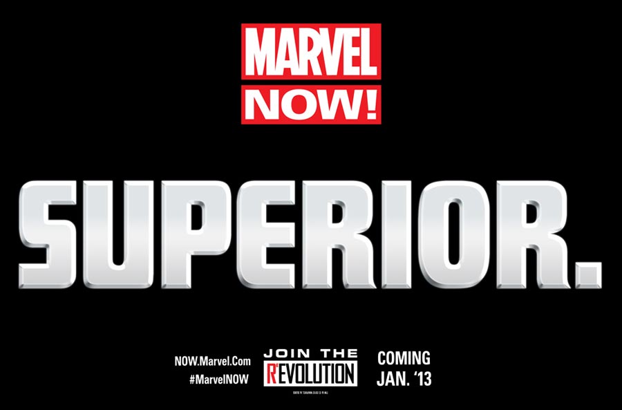
“Less is more” is a key phrase when it comes to teaser building. The less you say, the more the value, typically. That was certainly the case for Marvel Now – the 2012/2013 variety, not the 2016 one we covered earlier, or even All-New Marvel Now which hit in 2023 – which I believe first deployed “The Single Word” structure of teaser. You genuinely could not say less! It’s just one word with no other details at all! And yet, when this series of teasers saying “SUPERIOR.” or “FAMILY.” or “AMATEURS.” or whatever hit, I remember being stirred up in a major way. These don’t say much at all, but the approach Marvel took in developing it created an openness to speculation and just enough information to reward it. It’s fantastic.
The fun thing about this idea too is if you do it the way this original one did, you get multiple teasers from the same book without saying much at all. In this case, that came in the form of a second teaser that added creator names to it. While there’s a lot of fun to this too, I’d argue that variant is slightly weaker. It’s not that I’m against knowing creative teams. Quite the opposite, actually. It’s just once they added creator names to this teaser in specific, the jig was up. We generally had an idea what the book would be, with Dan Slott, Ryan Stegman, Humberto Ramos, and Giuseppe Camuncoli making it clear that this would be a continuation of Amazing Spider-Man in some way. Did we know it was going to be Superior Spider-Man, with Doctor Octopus in Peter Parker’s body? No, not quite. But we knew enough that the mystery was somewhat diminished. But it’s still fun that this one structure can lead to two different and useful variations of the same idea, both of which can inspire speculation.
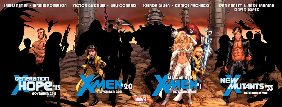
3. The Shadows
There are a lot of other names you could use for this type of teaser. “The Cast Reveal.” “The Filling in the Blanks.” I call it The Shadows. Whatever you want to call it, this teaser structure is built on a simple concept. An image shows up with either zero or one character revealed from the cast of a title, and the remainder of those characters are obfuscated as pure black cut outs. There are two ways to handle it from there. One is you can just immediately go to revealing the entire cast next. That’s the wrong way. The right way is to post the zero or one character teaser on day one — say, a Monday — and fill in the blanks throughout the remainder of the week until the full cast is revealed on Friday. That gives you five bites at the promotional apple, and a week of fan speculation. It’s a tasty concoction, and it’s lowkey my favorite, even if I feel like it’s not quite as effective.
What can I say? I love to speculate.
The funny thing is, this was for Zeb Wells and Stephen Segovia’s Hellions, and my joke tweet about it got nearly half the cast right, which was pretty spectacular. But that’s where the magic in this sort of teaser lies. A lot of comic fans see these things and cannot help but guess who might be on the team. You could put one for a Legion book on there and I’d still try guessing, despite the fact that I’m not a Legion fan and I’d just guess Matter-Eater Lad for every person.
There are downsides, of course. It’s not that versatile — this is a lot less interesting when you’re trying to promote a solo title, for example — and guessing the cast only works as a draw on certain titles and lines (this is a layup for the X-Men, because X-Men fans love to speculate). But this is still clearly one of the best, and not just because I love it.
2. The All Will Be Revealed
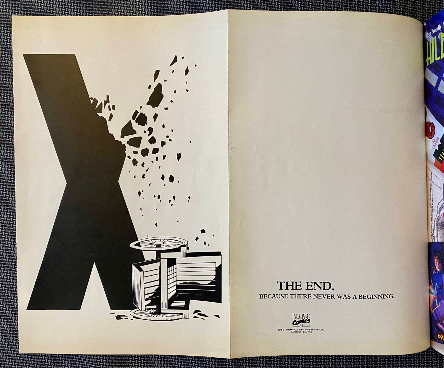
This premise is a very common teaser tactic, and as with all of them, there are good versions and bad. That said, I’d argue that this concept – the one that promises a big, crazy storyline where nothing will ever be the same – has a higher hit rate than others. Whether it’s something like the above Age of Apocalypse teaser or this Age of Ultron one, these give you some real material to work with, but not enough to know what’s really going on. But taking you to the precipice of knowing something is just a masterful move of the teaser arts, and this structure does that well.
That said, that Age of Apocalypse teaser? That’s the Mona Lisa of the form. I took that picture from an old issue of Wizard Magazine, and as soon as I opened it up, I was immediately transported to my childhood body where I felt nothing but concern for my beloved mutants. And the incredible thing is, this gatefold piece works really well, but each page even works in isolation. The giant crumbling “X” with the toppled wheelchair of Professor X? Banger. The page where it just says, “The End. Because there never was a beginning.” Also a banger! Bangers both! This promises so much and tells you absolutely nothing, and it was just an incendiary example of the teaser form. I love it so.
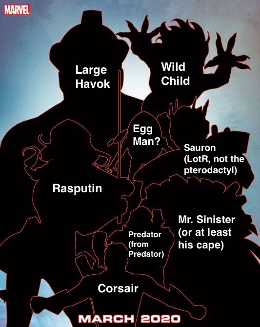
1. The Piece of Art That Makes Readers Ask a Million Questions Because There are Tons of Clues But Maybe They’re Red Herrings Who Knows Let’s Speculate Wildly Anyways!
I hardly need to get into this after my piece on Tuesday made it clear that this is my pick for the best teaser form, but I’m going to anyways. This structure is the best, and it isn’t close. And the reason for that is it lets the art do the talking, and allows readers to fill in the blanks themselves. Creating a great piece of art filled with details that may or may not come true with characters that may or may not appear in locations that may or may not factor in is the surest path to the superhero comic fan’s equivalent to a Pavlovian response: we see this kind of thing and we’re just going to start speculating like insane people.
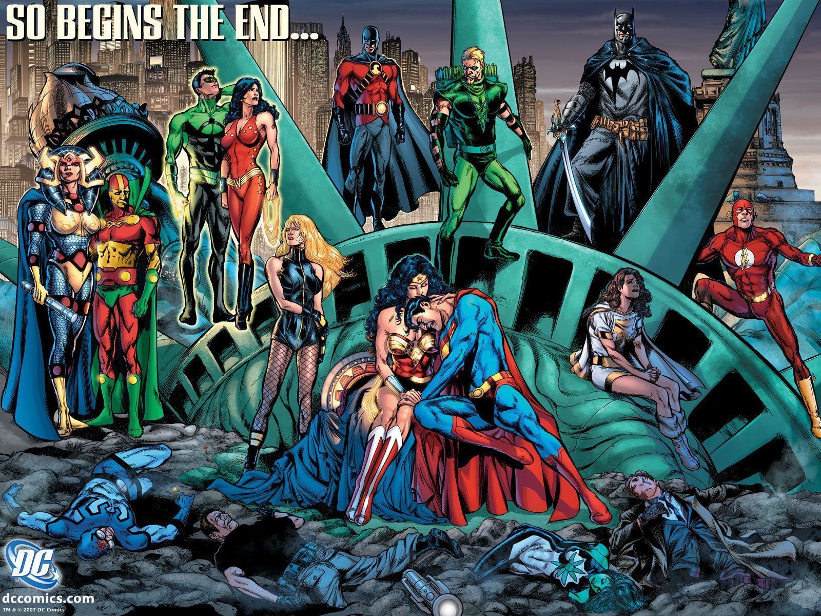
And the best part about this idea is it kind of works for everything? You could roll this out for basically any title, whether it’s an event, whatever you’d call House of X and Powers of X, Squirrel Girl, the recent Jimmy Olsen book, or whatever, and I would dissect it all the same. And it can be played with in a serious fashion or in a comedic one. Either way, I’d still analyze the thing, because that’s what we do when we see these things. It’s just the most flexible, versatile, and easy to speculate on idea, and it’s a perfect teaser for the social media era even relative to the rest. I can’t help but imagine how many quote tweets these Countdown to Final Crisis teasers would have had if Twitter was at full power when they hit. It would have been just a non-stop spice fest from comic fans.
The point is, though, these are the clear choice for the top pick. While it’s not my favorite – shouts to The Shadows – it is the best, and irrefutably so in my opinion.