
Comics Disassembled: Ten Things I Liked or Didn’t Like from the Past Week in Comics, Led by the Winds of Change
It was kind of insane week of comics news, to the point I am genuinely wondering if publishers are already clearing the decks for their big San Diego Comic Con announcements. I guess we’ll find out officially next month, but for now, let’s get into ten things I liked or didn’t like from the week of comics, led by upcoming moves at the Big Two hinting at what could be on the horizon.
1. The Big Two, Ch-Ch-Changin’
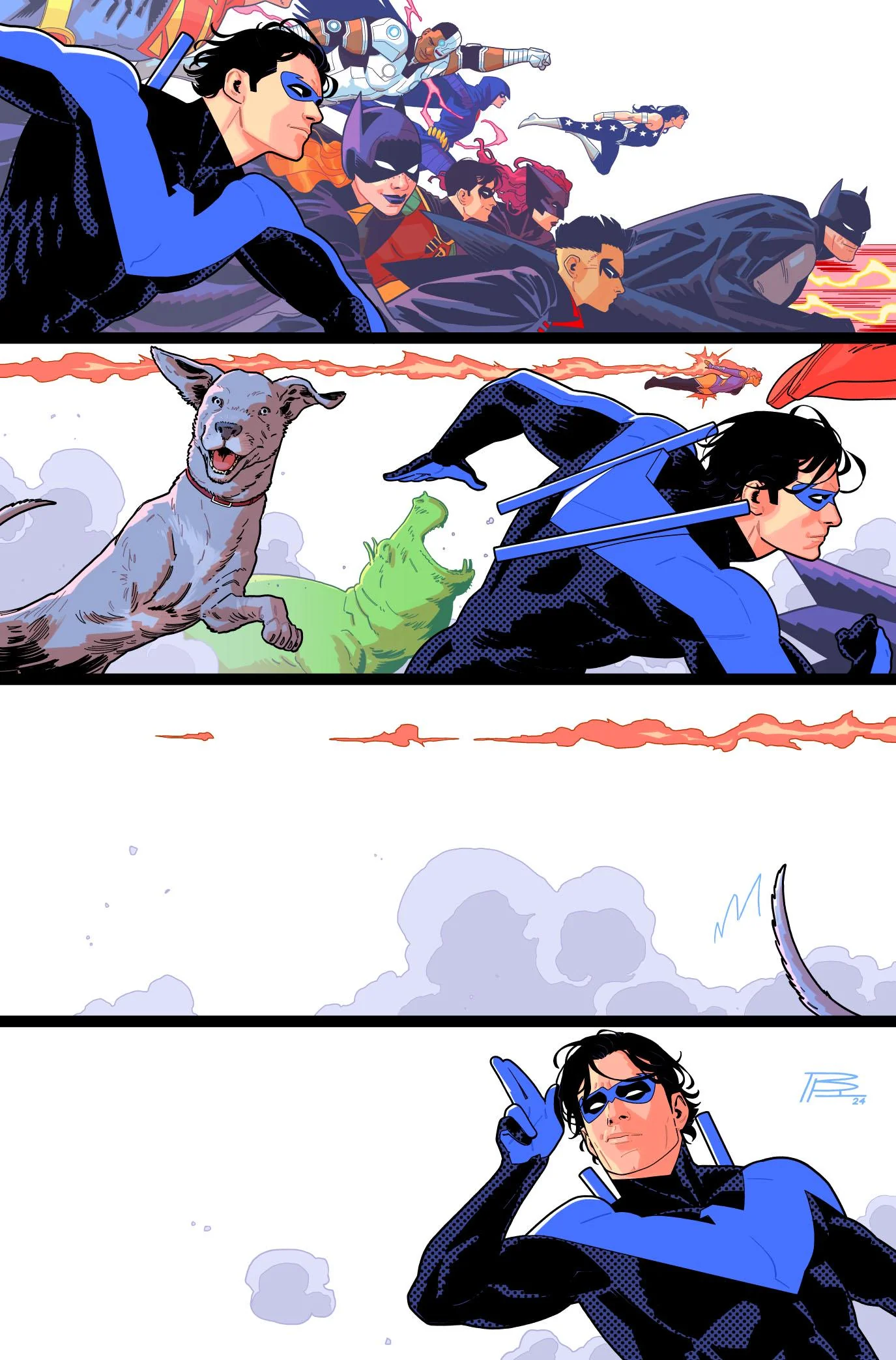
If there was a theme to this week’s Big Two news, it was endings. Marvel revealed that Zeb Wells and John Romita, Jr. will be leaving Amazing Spider-Man, Rainbow Rowell shared that Sensational She-Hulk is ending, and while this doesn’t mean the title itself is ending (or that the artist himself is on the outs), the current Doctor Strange volume doesn’t have an issue in September after a suspiciously final issue sounding solicit the previous month, and the current Fantastic Four volume does not feature an Alex Ross cover for the first time with its 25th issue, giving that title a transition-like feel. Meanwhile, a bevy of DC titles are ending or at least undergoing creative team changes in September or October, with Tom Taylor and Bruno Redondo completing their Nightwing run (which we already knew, I just wanted to share Redondo’s incredible variant for #118, the final issue), Joshua Williamson leaving both Batman & Robin and Green Arrow (although he did hint at other teams coming for both), and Harley Quinn as well as Catwoman both wrapping by then too. It was enough change happening in a similar timeframe that even Tini Howard, the writer of Harley Quinn and Catwoman, commented about their being a lot of endings happening at the same time in her newsletter.
So, what does it all mean?
I have no idea.
Absolutely no idea.
Naturally, there’s a lot of pointing towards the potential of Scott Snyder’s rumored Absolute line at DC, as well as who the heck knows what at Marvel. It all came at an interesting time, as Snyder has been talking about big things coming at San Diego Comic Con in his newsletter and Marvel rolled out its new branding for Marvel Comics this week that aligned (ish) its look with Marvel Studios and other related brands. The ultimate point is we don’t know, but it is certainly interesting. Whatever it is, there’s a lot of smoke about change coming at the Big Two. We’ll see if there’s fire later on…and probably at San Diego Comic Con!
2. Marvel Comics, Rebranding
Speaking of that new branding, I do want to quickly talk about the new logo Marvel has for its comics side. There was a lot of analysis about the mistakes made in its design — with previous Marvel logo designer Rian Hughes quickly, hilariously telling the world he had no part in it, even — much of which was understandable, both in isolation and in terms of its fit with other Marvel brands. And let’s call a spade a spade: it’s not a great logo. There’s a reason designers were scratching their heads about it. It just feels like an attempt at synergy that failed at its modest goals. It doesn’t match Marvel’s other brands and looks a little chunky as it does that.
But I want to compliment this logo on what it means, or at least what it means to me. This is an indication that the larger Marvel mothership (and Disney behind it) views Marvel Comics as an important pillar of its future plans. There’s always a lot of concern of, “What if Marvel or DC closes up the comic shop because they just don’t need them anymore?” I’ve always found that silly because massive corporations are not typically big on closing up profitable sides of their business. But this (and the rollout of the comic wing’s own social presences) really underlines that they’re thinking of Marvel Comics as something they need to promote better. Which seems pretty dang obvious but, you know, congrats on that, I guess. You don’t create new branding if you’re thinking short-term, so this suggests to me a long-term commitment, which is a very good thing!
I am not excited to see that super horizontal logo on the front of Marvel’s comics, though. It’s a funky fit for the shape of comics, and I think an ideal implementation would be just keeping the Hughes’ Marvel logo by itself, as we already know the logo is for comics because it’s on a comic. But we’ll see what they end up doing with it. They could do pretty much anything and it wouldn’t surprise me. But as long as they keep publishing comics, they can do whatever they want with their logos, to be honest.
subscribers only.
Learn more about what you get with a subscription