
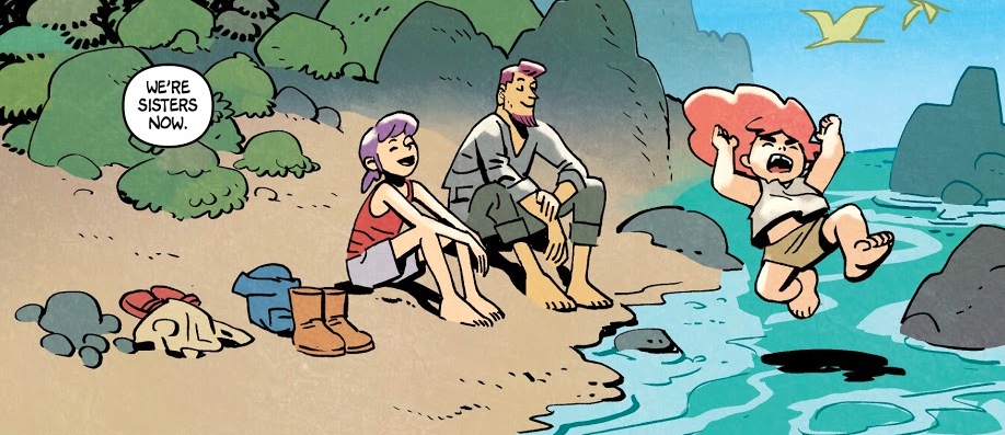
The Little Things: The Gang Goes Pace and Space in Jonna and the Unpossible Monsters
Welcome to The Little Things, a new semi-regular column 1 in which I celebrate the, you guessed it, little things that make specific comics or creators from today great. Now, if we’re being honest, the factors that make a story exceptional are often considerable. Many of them are big and hard to miss, and those are the beats that make the rounds on social media as we all exclaim, “Look! Look at how genius this person is!” Those are wonderful, but this column isn’t about those. Instead, it’s about the storytelling decisions that have a major impact in a less obvious way. Like I said: the little things.
And to start, we’ll be looking at the first six issues of Jonna and the Unpossible Monsters by Chris and Laura Samnee, Matt Wilson, and CRANK!, a title that’s absolutely lousy with lovable details. As a spoiler for my end of the year rankings, Jonna will almost certainly be making an appearance in my favorite comics of the year list, as this all-ages series from Oni Press that follows two sisters – the titular wild child Jonna and the caring yet strong Rainbow – has impressed me endlessly over its run so far. I don’t often say this, but it has Big Jeff Smith energy with a real Bone-like feel, which is one of the highest compliments I can give any comic, let alone an all-ages one. It’s everything one would want from a comic that comes straight from the brain of Chris Samnee, one of the best and brightest talents we have in all of comics.
But what makes it such a great title? The obvious answers are obvious: the Samnees’ work at bringing the two leads to life, Chris’ astonishingly perfect line-art, Wilson’s always on-point colors, CRANK! tying the whole thing together with his letters, and last but not least, some big freakin’ monsters, man. This isn’t about those, though. This is about the little things. And today, we’re going to be looking at specific beats from those first six issues – with big plot spoilers being avoided, despite covering all of the issues to date – to underline what those are to me, starting with the first moment I knew I was going to love this title. Let’s get to it.
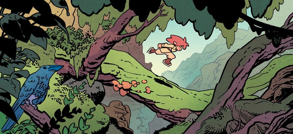
Foreground/Background/All Grounds (from Jonna and the Unpossible Monsters #1)
A common theme here will be that Chris Samnee, line artist, takes no plays off. The world of Jonna and the Unpossible Monsters feels fully realized and alive because of that, as we’re given so many panels and pages that don’t just zero in on the core storytelling focus – which, in this case, is a wonderfully simple Jonna speeding through the trees so quickly she appears to be almost levitating – but give us a little of everything around that central aspect.
What signifies this approach the most and made me first realize I was going to love this comic is that bird in the bottom left corner there. I love that bird. If it wasn’t there, it wouldn’t impact the experience of probably half or more of the readers of this title. But that bird of a beautiful blue hue 2 was included, and it said so much to me about what we can expect going forward from this title, as if those who appreciate the little things have to come to the right place. And boy did we. That lovely bird is an indicator that each visual within the book will be full of love, care and consideration, because this isn’t just a title Samnee is working on, but one he and the rest of the team are bringing to life in full. It is them. That means something. I’m not going to say that bird is a mission statement, but my friends, that bird is a mission statement.
Okay, I said it.
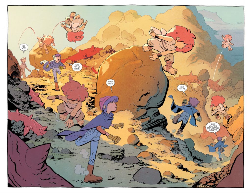
Setting the Tone (from Jonna and the Unpossible Monsters #1)
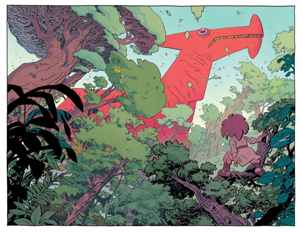
This double page spread from the first issue is one of two spreads that act as the debut’s showstopper pieces. Which is great! I love those! But we’re not here to talk about how dang cool this spread is. 3 Instead, I want to talk about what it means, or, more specifically, how this spread underlines the values expressed within this story. When you have a 20ish page issue to contend with, most creative teams wouldn’t take two of them and use them on a relatively quiet moment that doesn’t push the story, even if it does feature one big and cool unpossible monster. Not this team, though!
Throughout the first six issues, there are a bevy of panels and pages that are more about setting the tone and establishing the pace of the story than doing anything one might define as crucial to the plot. And it’s all the better for it. This spread perfectly reflects the values the Samnees bring to this title, and I love it for that.
That said, it is worth noting: that is one big and cool unpossible monster!
Keeping It Simple (from Jonna and the Unpossible Monsters #2)
When I say that Chris Samnee’s art continues to get simpler with each passing project, I do not mean that in a bad way in the slightest. And he’s at his apex in that regard here. What Chris can accomplish with minimal linework haunts other artists for a reason, and it’s because he has such remarkable control of his craft that he can speak volumes with fewer strokes of the pen than many can with an endless supply of ink. 4 And I love this panel from the second issue for that reason, as it says so much of the family dynamic of our core cast on this memorable day from the past – from the content nature of the missing dad to the joy Rainbow feels and the big, explosive zeal Jonna approaches water with – but does so with shockingly few lines.
Just look at it! Samnee conveys these emotions with facial expressions made up of something like 13 or 14 lines. This whole panel is delivered in the most minimalist way possible, basically, and its simplicity makes each aspect of it pop. I wish I could ever look as tranquil as the dad does here, but unfortunately, my design is far too detailed.
A lot of comic fans equate rigorous detail with quality in art, and I get that. There are some artists who go wild on the page and make magic happen. But Samnee proves with each project – especially this one – that more lines do not necessarily mean more impact. It can! But sometimes fewer can as well.
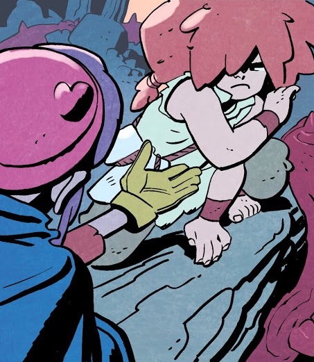
Best Actor Goes To… (from Jonna and the Unpossible Monsters #2)
I’m a super fan of artists who are expressive and effective character actors in their work. It might be my favorite aspect of comic art. I don’t know if he’s necessarily the best, but Chris Samnee would undoubtedly be on my shortlist of faves, and it’s for moments like this one between Rainbow and Jonna from issue #2. In this scene, Jonna’s been by herself for the past year, living a free, seemingly almost animalistic existence during that time. When Rainbow tries to rebuild their connection, reaching a single hand out to draw her in, Jonna recoils, with her hair and limbs forming an almost protective shell for her from this potential threat. The single eye poking around the corner of her hair expresses doubt and uncertainty, just in case her body language doesn’t get you there. It’s just one panel, but it tells us everything we need to know about where Jonna is at this point in the story.
And this is honestly only one of, like, 300 perfect examples of effective character acting in comic art from these six issues. Honestly, there is a version of this article that is just me sharing amazing faces Chris draws with two dots and two other lines, and all I do is write the equivalent of gesturing at its greatness while in utter disbelief. The whole series is a highlight reel of Chris Samnee character acting.
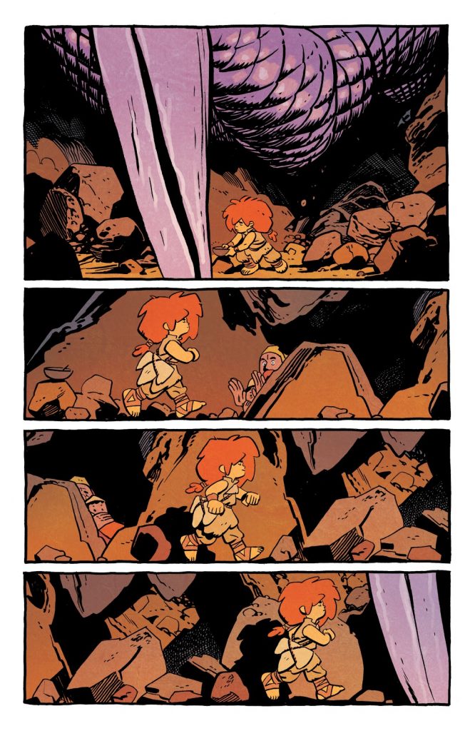
Trusting the Process (from Jonna and the Unpossible Monsters #3)
There are a few of these double page spreads within the book where Samnee uses different instances of Rainbow and Jonna to show the passage of time without any panels. I love all of them, but this is probably my favorite, if only because it does such a phenomenal job of showing readers what a challenge Rainbow faces as she tries to protect – “protect” – and keep track of her sister. I mean, imagine if your sibling was effectively a superhuman who looked at ruined landscapes as an opportunity for elite parkour moves? I tricked you, because you don’t have to, as Samnee shows us on these two pages.
By showing us the process in situations like this, you can convey a lot of information very quickly. Samnee excels at that, and while it’s clear he’s very deliberate about how often he uses the same tricks in this title, this one works each time he deploys it.
Also: bonus points for Wilson’s coloring here, as the lighting alone seems like it’d be a real pain. Throughout Jonna’s first six issues, Wilson exemplifies how crucial coloring is to comic book storytelling, and I love what he does throughout this double page spread.
Details, details, details! (from Jonna and the Unpossible Monsters #3)
I could mean so many different things on this page with that header. Look at that incredible tree! Look at the little circular insent panel Samnee adds in of a distant Jonna waving and smiling at a lagging Rainbow! Look at the choice to show Rainbow struggling to get into this cabin in the trees as another reinforcement of Jonna’s physicality towering over hers! Really just look at all of Rainbow’s expression there, with that beat reminding me of about one thousand different times in my life where I labored to climb something others did with ease.
This page is two panels of a landscape and an interior shot, and I probably spent five minutes looking at it when I first read the issue. With each beat like this, the creative team emphasizes to readers with their choices that this isn’t a normal comic; it’s a special one.
Again, detail isn’t everything. But it can be really, really dang awesome to see the details certain artists include when they want to bring it.
1, 2, 3… (from Jonna and the Unpossible Monsters #4)
Paneling in comics is often best used to show the passage of time, an expression of things happening in sequence within this rather sequential form of art. There are a lot of fun things you can do with that, and this creative team does so, so, so many of them. This is my favorite though. It’s from issue #4, and it’s right after a giant monster showed up to attack a group of humans enjoying a meal. Everyone flips out and hides, beside Jonna. What does she do? Casually puts her bowl down, and then in the ensuing panels, she progresses from that spot to where the monster is, using the remainder of the page to not just express time but also space.
Some might say it’s simple stuff, which I would not disagree with! (I already admitted I admire the simplicity of the art choices within the book!) But it’s also cool as heck, and something that shows us equally what bosses Jonna and Chris Samnee both are. It establishes a rhythm for the moment that, when the final beat hits on the next page – sorry! you’ll need to pick up the trade paperback for that! – it’s all the better because Samnee built it up in this way. Again, some might say it’s simple, or even unnecessary. But if it’s cool, who cares? And this sure is cool.
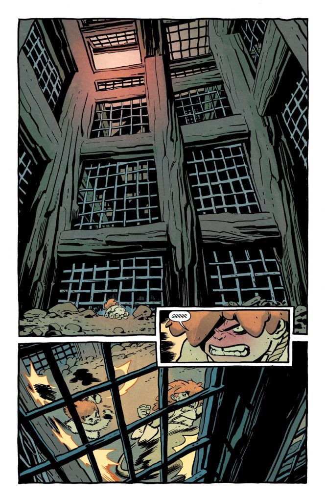
Establishing Scale (from Jonna and the Unpossible Monsters #5)
There are a lot of big things in this series. You can’t have a book with “monsters” in the title without that. That gives Chris Samnee a lot of opportunities to play with scale in his art, and I love the way he establishes it throughout. Take this page as an example. Jonna’s in a tough spot, as she’s at the bottom of a cage designed for enormous beasts. Instead of saying, “Whoa that’s a big cage!” or something similarly wasteful and unusual with the dialogue, Samnee just shows a tiny Jonna at the base from a perspective that allows us to see the insurmountably immense environment she’s trapped in. Whether he’s using scale to show us how tough Jonna is or what a tight spot she finds herself in, I love it all the same. It always works.
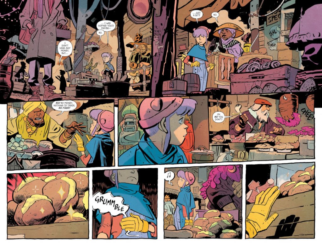
Showing Your Work (from Jonna and the Unpossible Monsters #6)
This entire double page sequence is all about Rainbow trying to get food in a market. Obviously I love it because it involves food, but it’s more than that. It’s about how the creative team makes the decision to not just boil this down to the storytelling essentials of “Rainbow is in a market, she’s hungry, she’s considering making a bold decision to steal some food.” By stretching it out over seven panels – one of which is a horizontal third that is a sequence unto itself – the team tells us just how desperate Rainbow is, so when she actually makes her move to snag some of that food with a manga esque glow to it, we know this is something that has been a weighty process for her.
It looks great. It reads perfectly. It fills out the world. It makes me hungry. But most of all, by showing the work, the team helps us better understand Rainbow as a person. This creative team excels at choosing when to speed things up and when to throttle it back, and this is an excellent example of the value in doing the latter.
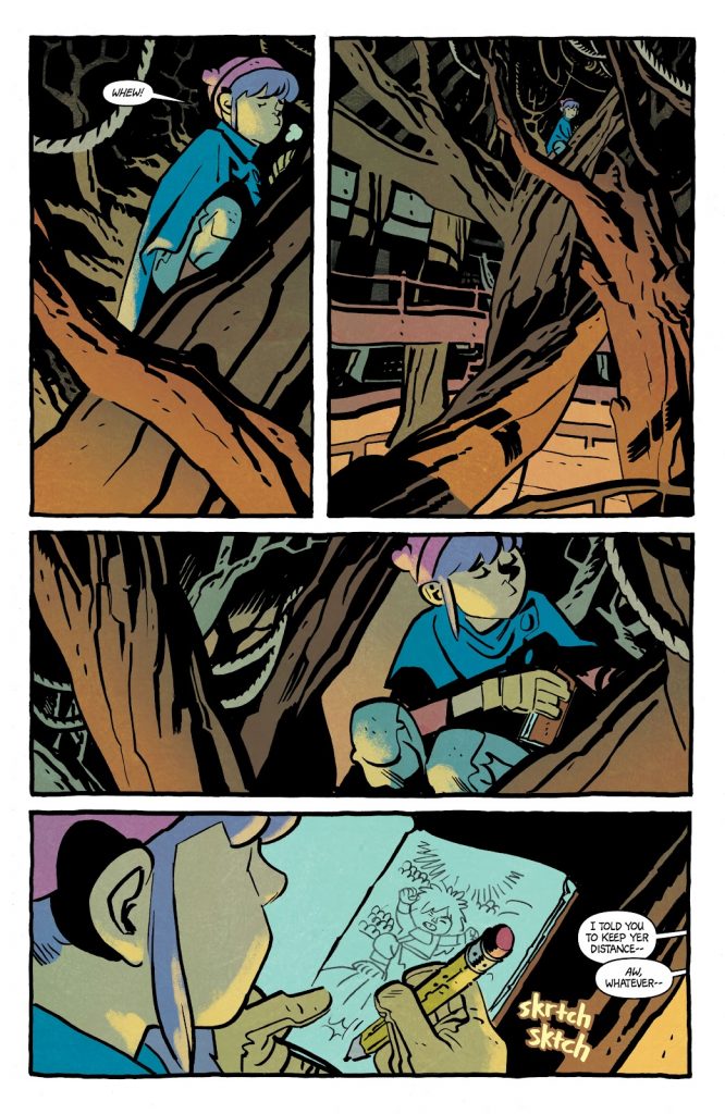
Taking a Breath (from Jonna and the Unpossible Monsters #6)
This goes back to the second point I made, but I love this sequence so much I wanted to reiterate it in a different way. This four panel page is of a physically taxed Rainbow taking a breath – literally – and winding down for a minute before she moves on to whatever is next for her. But what I love about it is how it allows them to take a breath in the story as well. Instead of rushing the story forward into whatever is next, the creative team says, no, let’s give Rainbow and readers a moment after a few very busy pages (including the previous one in this piece) to catch up.
And it works so well! This is one of my favorite things the team does in this title, as they inject panels and pages with characters doing anything from quietly enjoying a drink together to contemplating the smells of food in a nearby market, even if they don’t specifically add to the story in a “plot” sense. What they do is alter our reading experience and how we feel about it. And that’s immensely valuable, acting as just one more reason why it’s unpossible to not love Jonna and the Unpossible Monsters.