The SKTCHIES: Favorite Comics of 2015
All of our favorite comics of the year, reformatted into one convenient - and super long! - article
Now that the SKTCHIES have wrapped, it’s time to give you a one stop shop for all of our picks for the comics of the year. You can find all 25 awards given out in this year’s awards ceremony in one place, from A to W because this one doesn’t go to Z. As a reminder, these aren’t meant to be a comprehensive labeling of the “best” comics of the year. It’s more about the ones that one reader enjoyed the most in all forms of comics, from comics to graphic novels and beyond. The ultimate point of the SKTCHIES isn’t that I can define the best for you, I can just share what I enjoyed the most and perhaps from there you can find a new favorite.
So give it a browse below, and if you think I missed something great, let me know in the comments. I always appreciate suggestions for comics I missed.
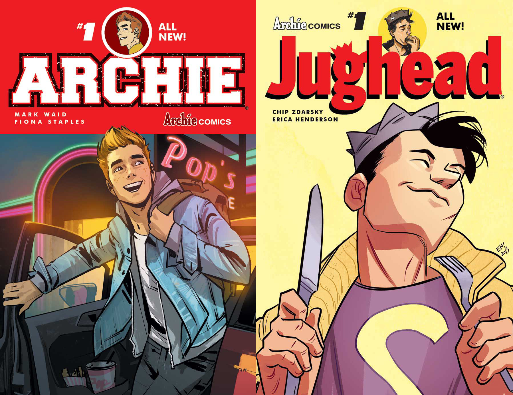
The What’s Old is New Award: Archie/Jughead (Archie Comics)
Before 2015, there three things I was certain of: death, taxes and not buying Archie comics. It’s not that I have some sort of unstated vendetta against Archie – it’s just that world never interested me unless it was being taken to pieces by a zombie outbreak. It didn’t seem for me, and why would I pick up something that just wasn’t my cup of tea? These were questions that had comfortable answers for a long time.
But then they decided to relaunch the main titles with superstar creators like Mark Waid, Fiona Staples and Chip Zdarsky involved, and that all went out the window. If you read my review of the first issue of Archie’s relaunch, you’ll know where I stand on it, but here’s the crazy thing: it may have only gotten better from there. Story beats like the payoff for the #LipstickIncident and how Archie’s life has changed since Veronica has gotten involved are experiences most anyone could relate to, because it’s all about how life changes as you age. It’s a phenomenal book that has a real universality to it even though it’s still very much an Archie story, and like Archie was always meant to be, it’s a lot of fun too. Plus, Staples and her follow-up artist Annie Wu have given the book a visual edge and storytelling flair that the book always lacked for me. That’s a big deal.
It’s not just the main book, though. Zdarsky and Erica Henderson’s Jughead is a legit revelation. That book is bananas. It’s like my idealized life revealed to me, down to the free market burgers and the time travel hijinks. It’s everything I think I could want from a Jughead book, except it’s actually happening. It’s fun, unique and really takes advantage of the potential of comic books, mostly in the fact that it’s kind of over the top crazy.
That’s where my last point about these books come in: this wouldn’t be possible if Archie Comics didn’t decide to take a risk. They could have rested on their laurels and lived off their existing audience forever and likely been okay. But they continue to take risks in exciting ways, whether that means publishing a zombie book or a book about witchcraft or reinventing their flagship books for a modern audience. That takes guts, and their fearless decision to turn something old into something new hasn’t just been a success: it’s been a game changer.
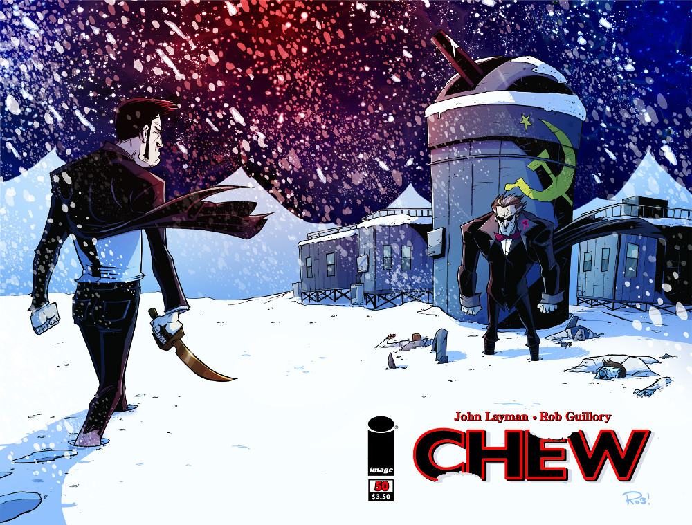
The Old Guard Award: Chew (Image Comics)
I’ve said a rough approximation of this fact before, but get this: John Layman and Rob Guillory’s Chew was tied for the fourth highest numbered comic in the top 200 of the Diamond sales charts in October. That’s insane. This is a comic that has now released 52 issues and has been published for just over six years and in today’s era of relaunches and reboots, it’s basically the Old Man Winter of the comic industry. And because of that, we ignore it. The comic industry rewards recency, which means comics like Chew or other well-crafted confederates of the “older” variety are ignored. I’ll be writing about this more in the future, but that’s an odd, sad side effect of industry trends.
The reason it’s sad, though, is because Chew’s still every bit as good as it was when it was an Eisner winning darling. Layman and Guillory continue to tell a hilarious, heartbreaking and surprising story filled with the raw imagination we want from our comic books. They hit a landmark issue this year – #50 – and in it, they paid off their main thread storyline in a big way. While it’s by no means easy to launch a comic, maintaining the same quality of work/interest and even improving on it is possibly the hardest thing for a comic creator to do these days. Besides bringing your story to a close, that is, which is something they’ll be doing in 2016.
If 2015 and the years that preceded it have proven anything, it’s that this duo will find a way to give the book and its readers a satisfying conclusion. We have years of evidence, and in 2015, they’ve shown that they are still firing on all cylinders like they have been from day one. Success like that is worth paying attention to, even if it doesn’t have the glamor of some of the books it lines up against.
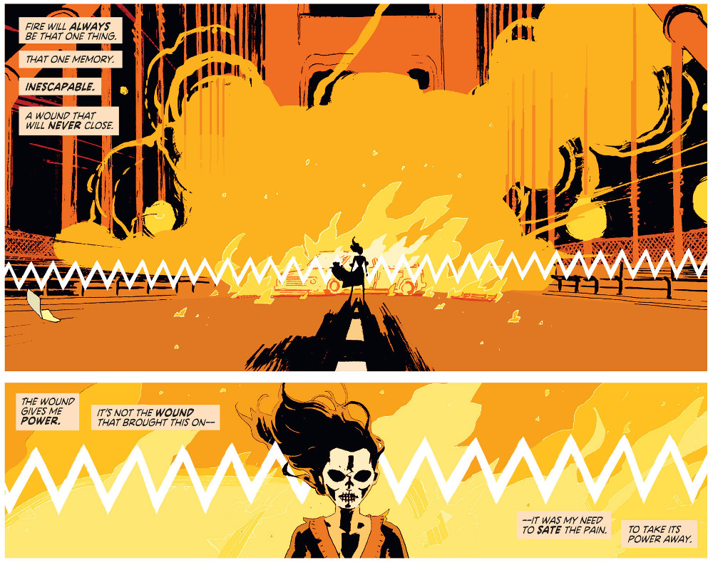
The Heartbreak City Award: Deadly Class (Image Comics)
Deadly Class is on my short list for best comics these days, and it’s easy to see why. I’m not sure I’ve ever read a story that really gets what it’s like to be young better than this book, even if I’ve never been to a school for assassins and I was never a habitual drug user who was a borderline train wreck. But it’s not really about what series lead Marcus does that creates that universality the team on the book – Rick Remender, Wes Craig, Lee Loughridge, et al – accomplishes. It’s just about the general feelings of confusion and alienation and self-destruction and anger that your late teens create in you. I remember being in high school and thinking that everyone hated me. Everyone. I had friends that cared for me and my family loved me and still you feel like it’s an act, and it’s one that you and only you can see through. It wasn’t true, and it never was. But it felt true, just like it did for Marcus.
That’s in part because you’re a little bit stupid when you’re young, of course. For Marcus, though, his setup is infinitely more entertaining that mine was. It’s high drama with murderous classmates and even worse faculty, and that’s not even mentioning the love interests. My god, the love interests. Deadly Class proves that few people can do more damage – mentally, physically and emotionally – than the people you care most about, although thankfully no one I ever dated carried a sword.
It’s an intense book, but it’s also a beautiful one. I called Craig the best artist in comics the other day, but it’s worth mentioning that it isn’t just Craig – although he’s an art monster designed for kinetic action sequences and heartbreaking character moments. Loughridge’s colors are huge, and while he’s doing something he’s done for his long career – enhancing the mood and impact of every bit of story we get – he’s found a perfect fit for his work here. His work on issue #12 was straight up spectacular.
Deadly Class is a beautiful disaster, and one that only looks to get better in 2016. There are a lot of books to look forward to this upcoming year, but its return at the end of this month in beyond promises to only up the ante (and insanity level) a few more notches. I can’t wait, even if I’m sure its lead can.
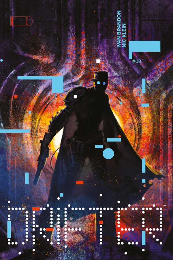
The Immersion Award: Drifter (Image Comics)
When you take in a story, part of you is always looking to it as an escape. Not that every person who reads a book or comic or watches a movie or TV show is trying to get away from something, but you want to find a world that you lose yourself in. It’s an experience where the world drifts away and you’re left in this new place, there to discover what’s next along with everyone else. It may be a romanticized view of the narrative experience, but for me, it’s something I look for.
Few comics this year delivered a more immersive experience in the sense that I’m talking about more than Drifter. This series from Ivan Brandon and Nic Klein tells the tale of Abram Pollux, a man who crash landed on a spartan, forgotten planet named Ouro who is looking to discover what happened to him and what is next in his life, and it’s an incredible read. I can say wholeheartedly that there are no other comics being published today like it. It exudes attitude from each panel, page and issue, and you feel it as you read it. There’s a longing to it – an odd sadness that underlies what’s happening on the page. Each person on Ouro is lost, and they’re just trying to find their way. Brandon’s scripts do a phenomenal job of conveying that, and Klein’s art…well, he’s one of the best.
Drifter should be read just to experience Klein’s art. He’s doing everything, art wise, and his colors alone are worth the price of admission. He brings the stark, broken nature of Ouro to life in the worst parts and the mystery and unexpected grandeur to the page in others, but every element is nothing short of gorgeous. For the readers who complain about modern art being unfinished in parts, you won’t find that here. Klein delivers every detail in fully realized fashion.
It’s not just the main team, though. Clem Robins is doing great work lettering the book – I really enjoy the special look he gives who runs the show behind the scenes in Ouro’s frontier town – and Tom Muller…well, I’ve talked about him quite a bit, but his contributions should never go unmentioned. He helps make the book.
Part of the problem in comics in 2015 is we’re reaching a point where there’s almost no way good books can be read by everyone – there are just so many good books! It’s like what TV is going through now – #PeakTV – and a book like Drifter can be missed because it doesn’t have the high concept that immediately grabs you or the superstar creative team. But it has what it takes because it’s a great comic and one that you get lost in with the greatest of ease. I hate to pitch readers but the first and second volumes are $9.99. I heartily recommend trying it out, as you might find something new to love in a book that may have gotten lost in the shuffle for many readers.
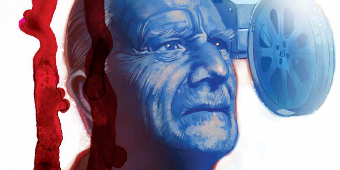
The Comics Can Be Anything Award: The Fade Out (Image Comics)
People talk about comics and their capability all the time. They say things like “comics can be anything” and “the amazing thing about comics is the only restriction is your imagination,” and they’re right. Those are impressive statements about what make comics special, and both are things I’ve said myself. But that doesn’t mean every comic has to be some sort of grandiose adventure or mind bending trips through time and space. Comics can be anything, and sometimes, we’re better off with the occasional book that looks to unexpected places in the past and focuses on smaller stories built on people.
Ed Brubaker and Sean Phillips have been telling stories like that for years, and they all have their own unique angle. Sleeper’s built on secret cabals and super powers. Criminal’s focused on the seedy underbelly of the world. Incognito was a pulp, superpowered jaunt. Fatale was their attempt at tackling the supernatural and Lovecraftian parts of the world. The Fade Out? It’s especially interesting because it has the Hollywood angle and it’s ostensibly a crime/noir story too, but there’s nothing from beyond our scope as people, really. It’s about the good and bad within all of us, and no one really feels larger than life outside of security/muscle man Phil Brodsky. And I love the book all the more for it.
Brubaker’s writing and Phillips’s art are as good as ever here, and they’ve crafted a haunting, unforgettable story loaded with exceptional characters and a revealing look into the dark side of Hollywood. Elizabeth Breitweiser joined the pair on Fatale midway through, and she’s really hitting her stride on this book, pairing perfectly with Phillips’ art to create a mood and sensibility that’s both fitting and immersive. The trio’s firing on all cylinders, and with the finale coming right after the turn of the new year, the ante is being upped in a major way.
That’s because it’s all built on people, and this creative team knows what it takes to go deep into their hearts and tell the story that’s within them. Whatever happens to Charlie Parish and whatever happened to Valeria Sommers will most likely be revealed, but whatever happens, I’m confident that will be a phenomenal read, just like the eleven that preceded it have been.
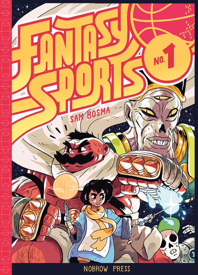
The Heat Check Award: Fantasy Sports No. 1 (Nobrow Press)
One of the most trite questions in comic interviews is the classic “what are your influences?” line. I say that with love, as I ask it on the regular and there’s a reason it’s asked – it can be a valuable question when used right. Of course, that’s rarely the case, but that’s neither here nor there.
The reason I bring it up, however, is Sam Bosma’s Fantasy Sports No. 1 is a book that wears its influences on its sleeves, and that isn’t a bad thing. Influences are powerful things – just like that question can be – when used right and not as a crutch. Bosma’s graphic novel was previously self-published, but it was republished this year by Nobrow Press but in full color, and it’s a gorgeous, fun book that showcases its creator’s love for disparate sources like dungeon crawling video games, basketball and Hayao Miyazaki’s work. As a fan of all of those things, I recognize that and enjoy it more because of it, but it doesn’t define the book. It’s enjoyable for anyone, really, as it’s a light, fun read that has its own identity even with the evident influences.
It tells the tale of Wiz and Mug – two mages of varying talents – whose job it is to raid dungeons and claim the magical booty within. The main conceit is it shows what happens when they’re challenged to a game to 21 in basketball by the enormous (and talented) mummy at the center of the dungeon, He of the Giant Steps. Spoiler alert: gloriousness happens. Whether you’re talking about the sassy repartee between the two mages or the climactic hoops showdown, this book is a joy to read, and it showcases a cartoonist firing on all cylinders. The art is the main event, of course, and it never ceases to impress, whether you’re talking action sequences or a quiet moment. It’s clear Bosma put a lot of love and care into the book, and you can see that in elements like the costumes of his cast. I love Wiz’s look, and her varying looks are simple touches that add a lot to the character.
Fantasy Sports No. 1 is a superb book, and it’s one that feels very unique even with Bosma wearing his influences on his sleeve. It’s also a whole lot of fun, which is something that is welcomed with open arms by yours truly. It’s an all too rare characteristic. Better yet, this new edition of his graphic novel comes in a gorgeous package. Nobrow Press did phenomenal work in making sure that every detail of the cover and design works well (the basketball court print on the binding is especially appreciated), and it enhanced the experience for this reader in a big way.
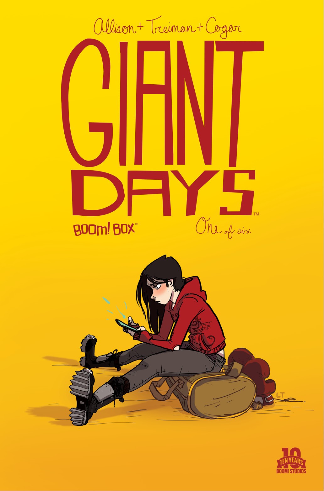
The Undeclared Award: Giant Days (BOOM! Studios)
No title shows how my personal practices as a comic reader have changed in 2015 more than Giant Days. I’ve been ride or die with floppy comics for a long time, and I have never been a trade waiter. I’d say it’s because I believe in supporting creators with single issues so they get paid sooner, but that’d be a lie. The simple answer is if I try to trade wait, more often than not, I’ll forget about the book. It’s out of sight, out of mind, and it isn’t just with run of the mill comics. It has happened to comics I like a whole lot. That’s on me.
But in 2015 – thanks to a gateway drug comic I’ll talk about tomorrow – I’ve finally started to break down the walls and stick to trade waiting on some books, and Giant Days? That’s one of them. Part of it was it took a few issues for me to hear the buzz behind the book, and part is on Boom! doing a really great job with the production on their trades. Besides a book that’s set to appear on the last day, I wait for trade on every Boom! title (which is a weird little trend within a trend). Their quality production goes a long way to ensuring that.
Whatever the explanation is, that means I’m behind on this comic overall. I’ve only read the first four issues, but trust me when I say it’s a hell of a start. As you saw in the creator section, I’m gaga over artist Lissa Treiman’s work, and writer John Allison’s no slouch himself. Their collaboration is a beauty, showcasing two creators in complete lockstep. It is a highly entertaining, relatable look at college life with charming characters throughout the cast. It’s a good concept, but my first real hook for the title was Treiman’s art. The cover to #1 (which became the cover to Volume One) got a hook in me deep, and I was curious from then on. Treiman draws some of the best character acting in comics and makes series leads Esther, Daisy and Susan impossible not to love. The weirdest compliment I could give the book is with how Treiman draws and Allison writes the trio of leads, I at one point thought about how I’d like to be friends with them. That’s not weird, right?
Allison gives superb perspective on what college life is like too. It reminds me quite a bit of Judd Apatow’s oft forgotten TV series Undeclared. Neither of them were exactly like my college experience, but having went through the ridiculousness of university life, it’s hard not to see their adventures as what life could have been like if just few things were different. Its focus is lovely and small, and it’s a charmer throughout. I’ve said a lot about this book already, but it’s worth saying once again: this is a great comic, and one you should definitely give a shot. I hear the first trade is quite nice, even for you folks out there who are hard line on single issues traditionally.
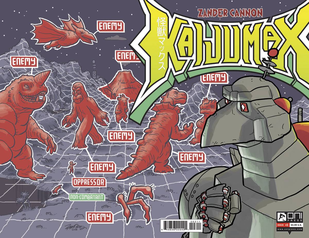
The “Why Am I Crying?” Award: Kaijumax (Oni Press)
I touched on this last week in the creator lists, but don’t let its fun and friendly look fool you: Kaijumax is emotional dynamite. While it ostensibly looks and sounds like a comic that would just be a blast thanks to its high concept – a look at a Supermax prison for Kaiju – and Zander Cannon’s happy color palette and cartoony art, that kind of thinking is a one-way ticket to Heartbreak City. This book will rip your heart out and enjoy the experience in the process.
With that said, it is still very fun. I know that’s contradictory to my opening paragraph, but the slang Cannon’s created for the inmates, the absurd situations and the warped perspective on both monster movies and prison stories gives this book a whole mess of grin-worthy moments. Even the letters column – which is one of the best in the biz – sets the book up as a fun, community experience. It really is fun at times, just like it looks. But it’s kind of like a great football team using the run to set up the pass. When Cannon starts drawing you in, that’s when you know he’s going to go play action for the kill.
Cannon’s a maestro of reader emotions. He brings you up and tears you down as you become invested in Electrogor and other characters, and he puts you and his cast through the ringer on the regular. There have only been six issues so far, but each is as memorable as anything I read this year, and it’s undoubtedly one of the most unique books on the market. These are all impressive things, especially when you consider it’s basically a one-man show on Kaijumax. It is one of the best comics of 2015, and no creator carries more weight yet works it as well as Cannon does on a monthly basis.
When I asked Cannon about the experience of handling almost every role on the book himself, every month, he described it as a “questionable move, at best.” It’s understandable why he’d say that. It’s a huge burden. But it’s worth it from this outsider’s perspective, as it has resulted in something rare in comics: something unlike anything else around that is all created by one person. That, my friends, is a hell of a thing, and something I’ll pay attention to in comics any time.
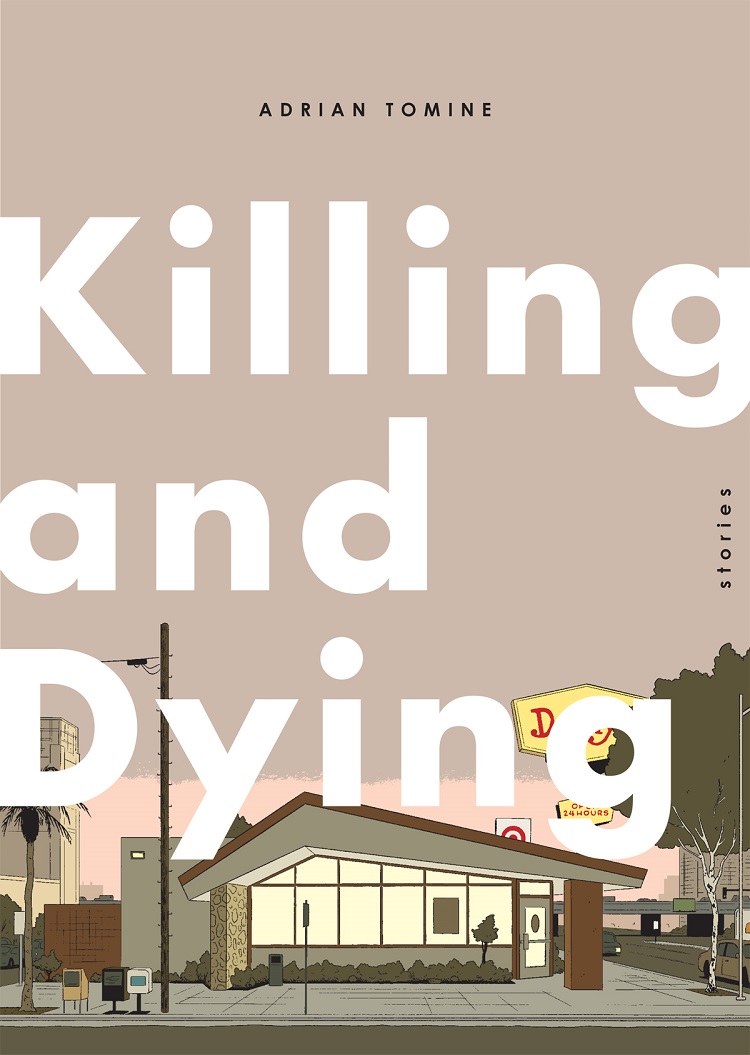
The Dose of Perspective Award: Killing and Dying (Drawn & Quarterly)
Even at their most narrowly focused, most monthly comics fall into some level of genre fiction as an umbrella. They’re about relationships and people, but they’re often about them in space or through the prism of a zombie outbreak or some other sort of angle. And that’s fine. Not every comic has to be the same, and there’s room for plenty of diversity in today’s era of comics. But reading a comic that provides real insight into an ordinary part of the world and the perspectives that can come from unexpected places can be an exhilarating experience in its own right. Few do that as well as cartoonist Adrian Tomine.
His graphic novel Killing and Dying is one of his finest works yet, and while it collects work that had been previously published for the most part – mostly in his own series Optic Nerve – it doesn’t make it any less insightful or powerful. Comprised of six short stories, each story in Killing and Dying has its own merits and impact. For me, the standout was Amber Sweet (previously published in Optic Nerve #12), which tells the story of a young woman who looks eerily similar to the titular character (who happens to be an adult film actress). It’s a fascinating look into how your own life can be hijacked by something unexpected, and how your relationships can be colored by things outside of your control. The base concept is a gem in of itself, but the way Tomine executes the story makes it rise above its origins. The reading experience can (or at least it did for me) create real introspection, and it made it an even more rewarding read. As a young man digesting the story, it made me think of how I treat women and how much more little actions I take can impact others around me in a major way. Not many comics do that.
But that’s what makes Tomine’s work so riveting. Some would look at this book and say it seems simple; even cartoony. But that’s what he wants, as he’s focusing on clarity of story to maximize the impact of the events on the page. The simplicity belies its emotional complexity. In vignettes like the one where the book itself gets its title or “Translated, From the Japanese,” this helps make the sorrow and yearning he’s conveying dig into you all the more. Each story has a wildly different perspective to it, and it showcases both Tomine’s versatility and his rare gift of being able to bring truth out of any situation. It’s a stunning work, and one that lives with you far past closing the book the final time.
The production itself is worth noting as well. The package is a beauty, with a hearty stock giving the cover and the book as a whole a real weight to it. This book is a worthwhile pick up even if it was produced on looseleaf newspaper stock, but the gorgeous work on the cover production and the quality paper stock give it a bonus for people who pay attention to things of that sort.
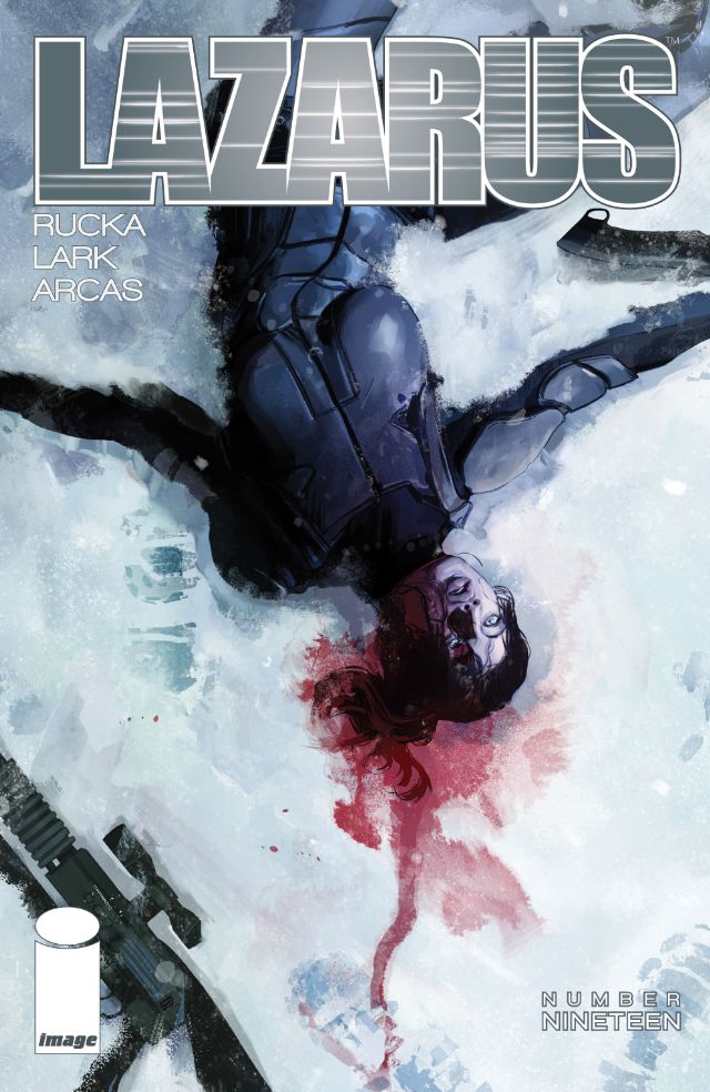
The Whole New World Award: Lazarus (Image Comics)
Back in July, I called Lazarus the best comic Image was publishing at the time, and little has changed since then. It is still one of the best in the business, as Greg Rucka, Michael Lark, Santi Arcas, Jodi Wynne and Eric Trautmann craft a sprawling story that immerses you in this broken version of the world we know. It is an expertly crafted and unforgettable read, but I want to highlight one thing above all, and and I’m not going to say family. Instead, I want to talk about world building.
Lazarus is a master class of world building. It finds the team tearing down our known world and replacing it with where the world could go from here, if families and corporations effectively took over everything. The team has meticulously built out the key elements of this world – who the families are, where they rule, what they do, what their relationships are, etc. – and they do so in the story, in the backmatter and even the back covers of each issue. Comics do have a limitation of space, to a degree, and Team Lazarus solved that problem by using each and every page to more fully realize this twisted Earth.
Everything about the book is good, but the world building? That’s the ace up their sleeve. Both volumes from this year – Conclave and Poison – have used that as the flint they sharpen their edges against, as we’ve seen more families and locations than ever before. It only makes the book better and better. Lazarus is one of the few books that the main question I have as a reader isn’t “what’s going to happen next?”, instead making me ask “where are we going to go from here?” It’s an exciting characteristic, and one mostly unique to Lazarus.
The Lovability to the Max Award: Lumberjanes (BOOM! Studios)
There’s something to be said about comics being fun. Quite often, it can be a dour medium, as it’s always crisis this or wars that. Fun? It can be refreshing, especially if handled right. And Lumberjanes is a book that does that right, and does it in a full-hearted, impossible to not love sort of way.
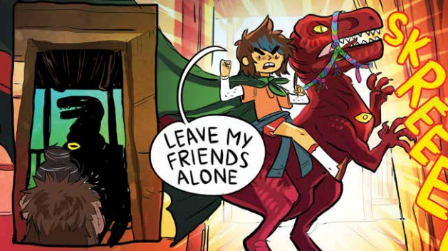
Here’s where I make an admission: I read Lumberjanes entirely in trade. That means 2015 was a big year for me, as the first two trades were released this year, so it was actually my rookie year as a reader of the book. And what a rookie year it was, as this book from Shannon Watters, Grace Ellis, Noelle Stevenson and Brooke Allen charmed the heck out of me in its first two trades. It didn’t matter if the book was tackling an age-old battle between Artemis and Apollo (which had spilled into the Lumberjanes camp) or a mysterious raptor outbreak (which, as you can see at the top, was handled in appropriate fashion by Ripley), the book and its cast always found a solution, and one that stayed true to the characters and what they represented as people.
That’s one of the most impressive things the team has accomplished on this book. It doesn’t matter if you’re talking about April or Mal or Molly or Ripley or whomever; even in the craziest moments of the book, you never forget that these people you’re reading about are just that – people. I talked with Watters about how they handle the characters in the book on Off Panel, and how it doesn’t matter how something like April’s super strength came to be. It’s just part of who she is, and she isn’t defined by it. None of these characters are defined by any one thing, just like people are. It’s refreshing and delightful to read a comic that gets that so, so right.
However, I do want to define a character by one thing: Ripley is awesome. The mere fact she was named after Ellen Ripley from the Alien series is enough for her to be a favorite, but few characters make me laugh more often than her. So yeah, as much as I don’t want to say any character is one thing, I feel like I can get away with that. Ripley is the best, and I have no problem admitting it.
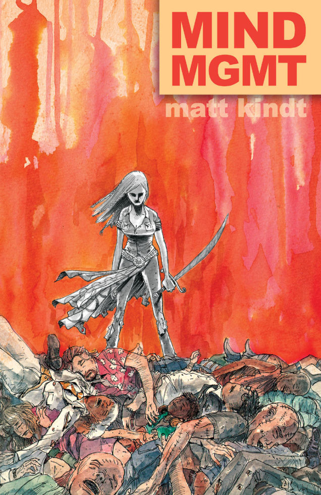
The Master Class Award: MIND MGMT (Dark Horse Comics)
I mentioned this yesterday in passing, but MIND MGMT has an important distinction: it’s the first book I ever trade waited. I read the first issue, liked it but then fell behind. And then on Free Comic Book Day 2014, I won a 25% discount off any graphic novel or trade, and I used it to buy the first hardcover of the series. I loved the production value and overall presentation of the packaging so much that I decided that I was more than happy to wait for trade on the book, and now here I am. But the weird position that puts me in is it makes my year end list in 2015 even though I haven’t finished the series because the sixth collection hasn’t been released yet.
I can’t hold that against the book, though, as it’s just too good to keep off my list because of my reading methods. Matt Kindt has built an absolute classic here, and it’s one of the most fascinating and surprising comics I’ve ever read. The book is like a set of Matryoshka dolls, as there’s plot within a plot within a plot and it all fits together perfectly. Better yet, we figure things out right alongside series Meru, who gains more knowledge about herself and power through it with each passing volume. Plot isn’t like something I like to push in what ostensibly amounts to a review, but Kindt is dealing with plot on an entirely different level of most comics. It’s impressive how he weaves things together and reveals the picture one puzzle piece at a time.
And his art is exceptional as well. I really enjoy how varied it is, as he uses washes and watercolors on the regular (often to varying levels of saturation or intensity), but sometimes he’ll tell an interlude that’s straight pen and pencil. You never really know what to expect from his art, besides the fact that it will be beautiful. The presentation of the story is also unique and all over the place, with varying shards and artifacts from the world being leveraged as tools to deliver more information. It’s an ingenious read, and one that finds Kindt having fun with form as much as anyone does in comics. Of course, I’m a cover fiend as well, and Kindt’s covers are some of the best in the business. He never sticks to one look there either, and I enjoy it when he steps way outside the box and uses a cover as a step by step showcase for how Meru might defeat an enemy.
This book really is a master class of comic creation, and Kindt is doing it all himself. That’s impressive. Maintaining the level of quality for any book is a feat unto itself, but doing it all yourself over several years? That’s even more of an accomplishment.
It’s a little silly to say, but I’m thankful for this book. The decision to switch to trade on one book was a tough one, but it’s one that has both helped my reading experience of MIND MGMT itself and changed the way I read comics overall. The experience of reading MIND MGMT in trade has been such a positive one that it’s opened up my world to a whole different way of reading, and I dig it even if it means I have to wait a little longer than everyone else for the concluding chapters of this story.
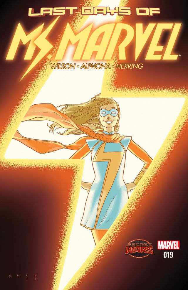
The Future Award: Ms. Marvel (Marvel Comics)
I’m going to try and be short on this one, as it might be get crazy effusive otherwise, but here’s my main point about G. Willow Wilson and Adrian Alphona’s Ms. Marvel: it’s everything I want for the future of comics.
Some people may hem and haw about that and say I’m trying to play a role or some such nonsense, but it’s true. Ms. Marvel should be the playbook for Marvel or DC’s futures, and I don’t even mean it in the way you think. What I mean is Ms. Marvel takes all of the strengths of Marvel’s history – the legacy, our ability to see ourselves in the characters, the person getting equal billing with the hero – and it pairs it perfectly with where we are in the world. Some pin this book as “fodder for hipsters” or some such nonsense, but I have news for you: I’m more similar to Kamala Khan than any other character in Marvel’s universe, and it’s because she’s so representative of the way people really are.
Wilson’s writing uncovers that, and Alphona’s art – who has always been so very good at finding a soul in his subjects – deepens our connection to it, and what comes out is such a refreshing joy to read that it’s no wonder the book is the sensation it is. I’ve said it before, but Ms. Marvel is to 2015 Marvel what Spider-Man was for Marvel in the 60’s. She’s the person we know or the person we are or the person we want to be. She could be a mirror or she could be aspirational, but one way or another, she’s someone we care about. And that’s special. Kamala Khan is the future of comics, and thanks to the work of Wilson, Alphona and confederates like Jake Wyatt and Takeshi Miyazawa, I have a secret to share with you: the future is now, and it comes on a monthly schedule.
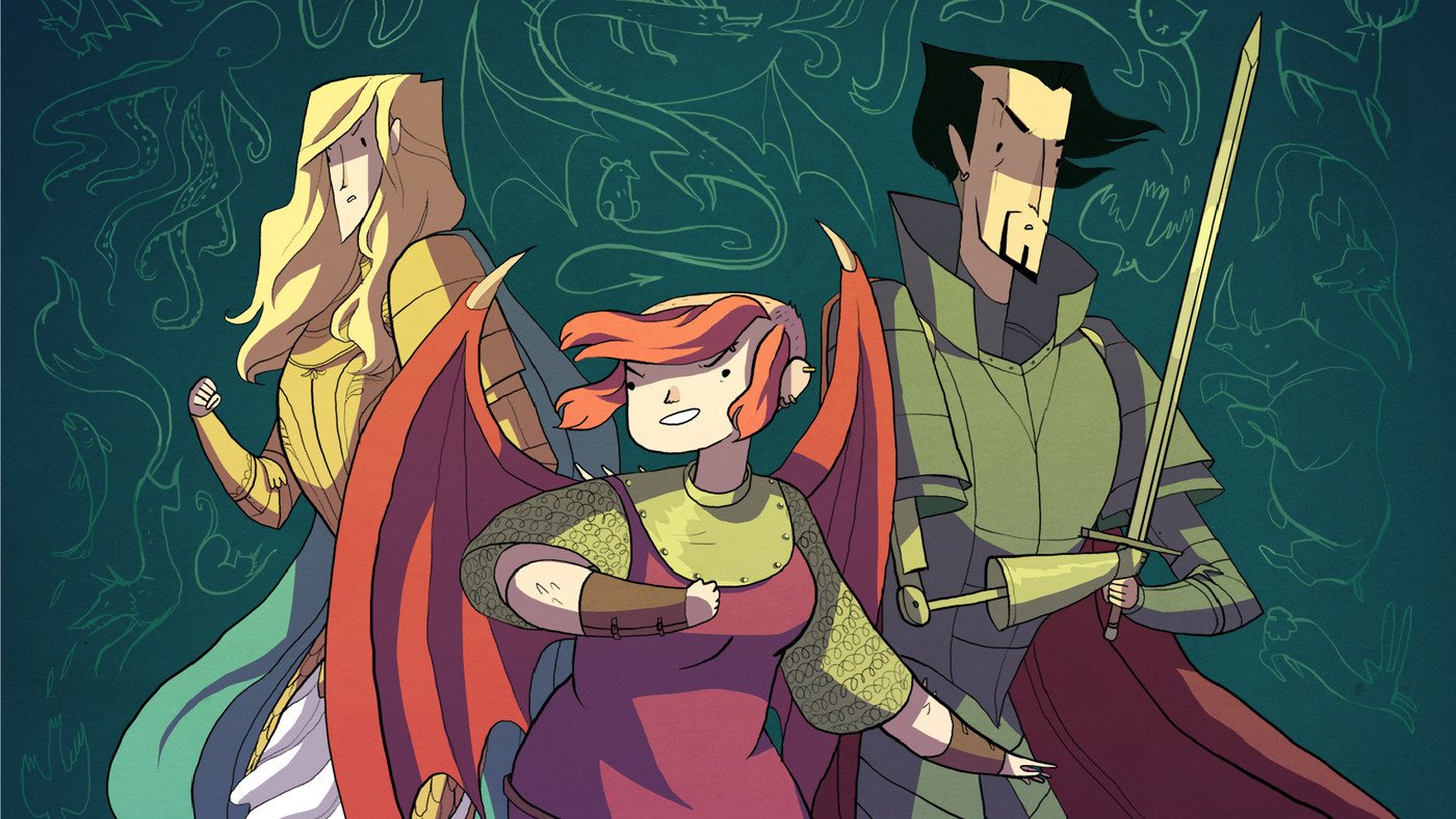
The Late to the Party Award: Nimona (HarperTeen)
A weird theme that has come up on my list as a whole is I’m often late to the mix for comics, and that’s represented on these lists in books that I join in on via trade or collections far down the line. I think that’s a product of a couple things, really. One: there are just so many comics today that it’s impossible to keep up with everything. Two: I’m really bad at staying on top of comics that aren’t print.
It’s part of my failings as a reader, but that’s the main reason why I had never read Noelle Stevenson’s Nimona until this year when it was released in print. I don’t really have a great excuse, besides that. However, now that I have read it, I can say that I wholeheartedly adore it. I reviewed it back in July so I won’t get too deep into it, but this is a very special book that grows and develops in fascinating ways throughout its run. The evolution of its titular character as she struggles with her own identity and who she really wants to be is a deeply affecting arc, and it’s perhaps matched by co-lead Ballister Blackheart’s story. Their partnership and relationship is the core of the story, and it’s a wonder to watch it unfold.
One of the most interesting things about this comic is how if you just read it in snippets – particularly the early strips – you’ll think, “oh, what a charming and fun comic.” And it is. It can be very funny and sweet. But like our own social media curated lives, there’s always something along the borders brewing that isn’t as simple as what’s presented. Our lives are complex, and being able to transform into basically anything you want is cool until you wonder about the cost behind it. Everything has a price, even if we’d prefer to forget about it. Stevenson conveys that artfully throughout, and with a real empathy for her characters. It’s a beautiful, emotional story, and one I imagine will be reread by yours truly well into the future.
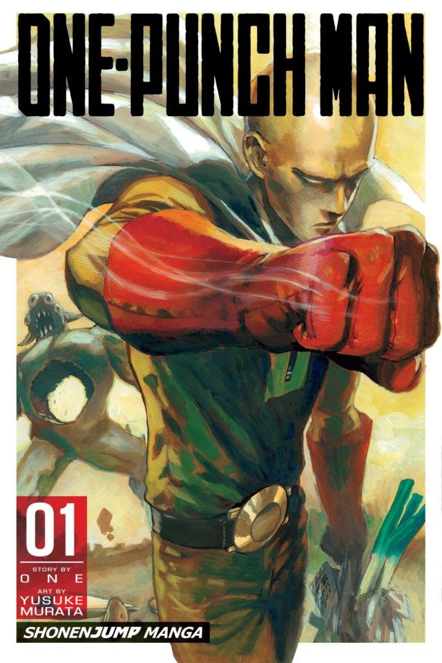
The Knockout Award: One-Punch Man (Viz Media)
One-Punch Man has probably been the comic that I’ve had the most interesting and unexpected relationship with in 2015, and it’s mostly because of how fervent the passion for the book was all around me. For a while there, it felt like the adoration of this series by ONE and Yusuke Murata was omnipresent. First it came when Multiversity Comics’ writing staff was insisting everyone should read it. Then one of my readers recommended it. Then it came out and I forgot to preorder it, so I went to my local comic shop who had sold out of it besides one copy of volume one, which they admitted to buying from Barnes and Noble because the demand was so high for it. And when I bought volume two from Barnes and Noble – apparently my shop hadn’t harvested that one yet – the bookseller raved about it.
So yeah, the buzz for this book was high.
Yet, incredibly, the hype was worth it. One-Punch Man is maybe the oddest and most basely entertaining comic I’ve read this year – worth noting: I’ve only read the first few volumes – but it is presented with so much confidence and matter-of-factness that it’s impossible not to love. The premise is stupid awesome, as it’s more or less the story of a the world’s greatest hero and what he does when he figures out he can beat anyone in one punch. Wouldn’t that get boring? Well, it turns out the answer is yes, and Saitama’s quest to find someone worth fighting and seeing how he perpetually gets roped into heroic activities is a joy to read.
And let me tell you this one important fact: nothing made me laugh harder in comics this year than the revelation of Saitama’s training regimen that he used to become the world’s greatest hero. That paired with the reactions had me rolling.
One-Punch Man is a comic that anyone can enjoy, even if you’ve never read manga. Maybe especially if that’s the case. It’s such an easy book to love, and for those superhero fans who have never gave manga a chance, you’ll almost certainly find something to love. Trust me on that.
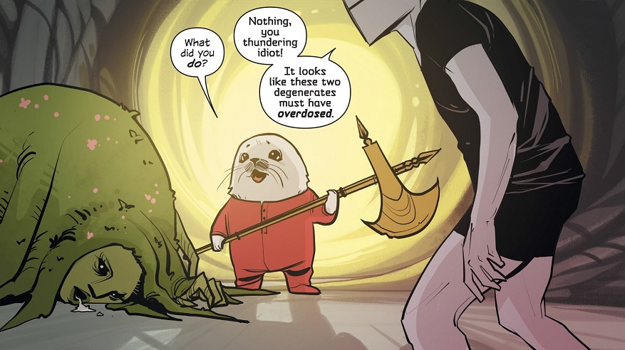
The Metronome Award: Saga (Image Comics)
Saga is arguably the most popular comic in the industry, but in a weird way, you can feel an undercurrent of malaise about the book. It’s a comic that sells well, it wins all of the awards and the creative team is adored, through and through, but there’s a quietness that surrounds it. I don’t know if I’d quite call it a backlash against the book, but what I will say is it’s a comic that doesn’t get the amount of attention that a book like this usually might. It’s what I call a Metronome comic. You always know what to expect from it (“ho hum, another great issue of Saga.”), especially now that it’s been around for almost four years.
However, when it’s predictable greatness, that’s still worth celebrating. And Saga continues to be as regular of a title as you can find both in schedule – there’s a reason why everyone calls the release schedule for most Image titles the “Saga schedule” – and in quality. Just think about this: have you ever read an issue of Saga and thought, “you know, that wasn’t very good.” No. You haven’t. Because one doesn’t exist. Brian K. Vaughan and Fiona Staples are so damn good that an off issue for them would still earn rave reviews. And the issues they’re on point for? We’re talking transcendent quality, my friends.
It’s a beautiful and special book, and one that continues to win awards and sell a ton for a reason: because it’s damn good. Like I alluded to earlier, Saga’s problem is it is a comic that’s predictably great. I have to imagine many creators out there would be more than happy for that to be their problem.
The Let’s Be Honest with Ourselves Award: Secret Wars (Marvel Comics)
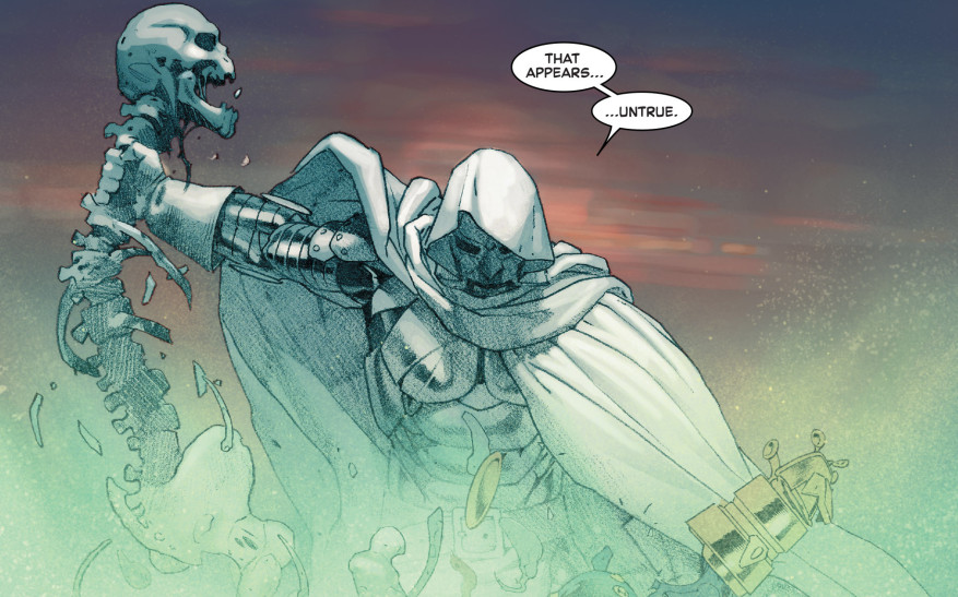
A little while back, I wrote about how the delays Secret Wars was having and how its schedule had slipped into the post relaunch realm was impacting Marvel’s potential for success. That was legitimate, and after that article, I heard from an array of readers about how frustrating the Secret Wars experience has been for them. I believe it, and to a degree, the massively extended schedule, the break for Marvel’s regular line and how it seeped into ANAD time was a downer for me too. However, there’s one thing we shouldn’t mix those negatives up with, and that’s that the event itself has been lacking in some way. Because it hasn’t. Now here’s where my hot take cannon gets ready to fire. Are you ready?
If Secret Wars #9 sticks the landing in January, it’s my belief that Secret Wars could – and should – be considered Marvel’s greatest event ever.
There are a whole mess of events throughout Marvel’s history, but I’ll be honest: none of them have ever been as grandiose or spectacular as Jonathan Hickman and Esad Ribic’s joint. It shouldn’t be surprising, though. Hickman does big ideas better than anyone, and Secret Wars is really just a continuation of his epic run on the Avengers books. This is the magnum opus of his entire time on Marvel. And Esad Ribic? He’s the comic book equivalent of Homer. If the times of yore needed someone to tell their tale, they’d want someone exactly like Esad Ribic. He’s the Ronnie James Dio of comic book art, and by god, he’s painting his Sistine Chapel here.
Secret Wars is the “this one goes to 11” of comic book events, and while many have issues with it for this reason or that, let’s be honest with ourselves: we all know it’s awesome. It’s comics like this that make us want to read superhero comics, and if more events were like this, the phrase “event fatigue” would never have entered our cultural lexicon.
The Gray Area Award: Southern Bastards (Image Comics)
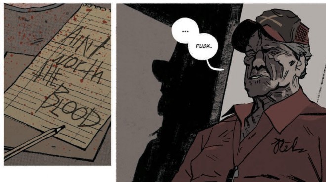
I’ve already hit Jason Aaron and Jason Latour pretty hard for their roles in making me feel confusing emotions about series villain Coach Boss, so I don’t want to dig into that again too far, but I will emphasize this: The Jasons made me feel more empathy for a despicable villain than most comics make me feel for their heroes. I’ve said this a lot lately it feels in life, but the world isn’t black and white. It’s a series of grays, and most everyone – the heroes, the villains and everyone in-between – lives somewhere in that area. Life is all about ambiguity and right or wrong being a matter of perspective, and The Jasons? They live in that area in this book, and they mine its fertile grounds for a beautiful, heartbreaking story where there’s no certainty besides everyone losing when it gets to the end.
Latour’s art is moody and atmospheric, and it adds so much to each story. His work in my favorite issue of the series from this year – issue #11 – was a beautiful look at a different part of Craw County than we’re used to, as well as an engrossing introduction to Deacon Boone (aka the Piggy Wiggly’s least likely customer). The specter of Boone departing the wooded area near his home, deer in tow, was one of the most quietly affecting marriages of image and text in any comic this year, and showcase a partnership that is deeper than two guys who share a first name. The Jasons clearly share sensibilities and agree upon the right way to tell a story, and it’s always a treat when a new issue comes around.
Southern Bastards is widely considered to be one of the best monthly comics around today, and simply reading an issue reveals why that’s the case. These guys are at the peak of their powers, and this? They’re working perfectly in lockstep. I couldn’t enjoy it more, even if they make me mad on occasion because their work makes me feel uncomfortable emotions.
The Kids Do the Darndest Things Award: Space Dumplins (Scholastic)
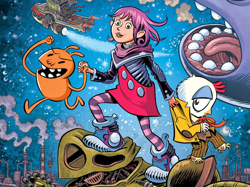
Craig Thompson is – in my opinion – one of the greatest cartoonists in comics. He’s proven it in works like Blankets and Habibi, and this year, he took his work in a slightly different direction: he crafted an all-ages graphic novel called Space Dumplins. Some of the highbrow audience who enjoys his work may have hemmed and hawed about Thompson doing such a thing, but when I first heard that he was doing that, I was overjoyed. I’m always hopeful for my favorite creators to do more work that isn’t focused on one audience or another, instead looking to tell a story that anyone could enjoy. And Thompson didn’t just try here, he thrived.
From a ten thousand foot view, Space Dumplins is about a little girl and her friends trying to save her father, but it’s about more than that. It’s about figuring out who you are, and from there, growing comfortable and confident in your ability to handle things yourself and, better yet, with your friends and family. Violet and her pals get into some seriously sticky situations, and together, they find solutions and themselves in the process. It’s a beautiful book, and not just in the affecting story, but in the art. Thompson’s one of the most gifted artists in the business, and he showcases every trick in his bag here. Thompson’s line has always been a lively one, and it’s always fun to see how he uses that energy in his storytelling. It fits perfectly for the youthful story of Violet and her friends.
Space Dumplins is a lovely little book. While it may not be the same type of instant classic some of Thompson’s other work is, it’s a very welcome change of pace from one of the best cartoonists in comics, and something I hope many young readers get to read and love.
The Comic of the Year Award: The Unbeatable Squirrel Girl (Marvel Comics)
For me, comics are all about the enjoyment of the read. Sure, I can get a highbrow reading experience from many comics, but when it gets down to it, the experience I’m always in pursuit of is the joy I felt as a kid in the 90’s reading X-Men comics. People lament the era all of the time, but for 8 to 10 year old David Harper, those comics would straight up blow my mind. When I read comics, I just want to scratch that itch. The one where I read a comic and it makes me smile and it stays with me afterwards in a positive way.
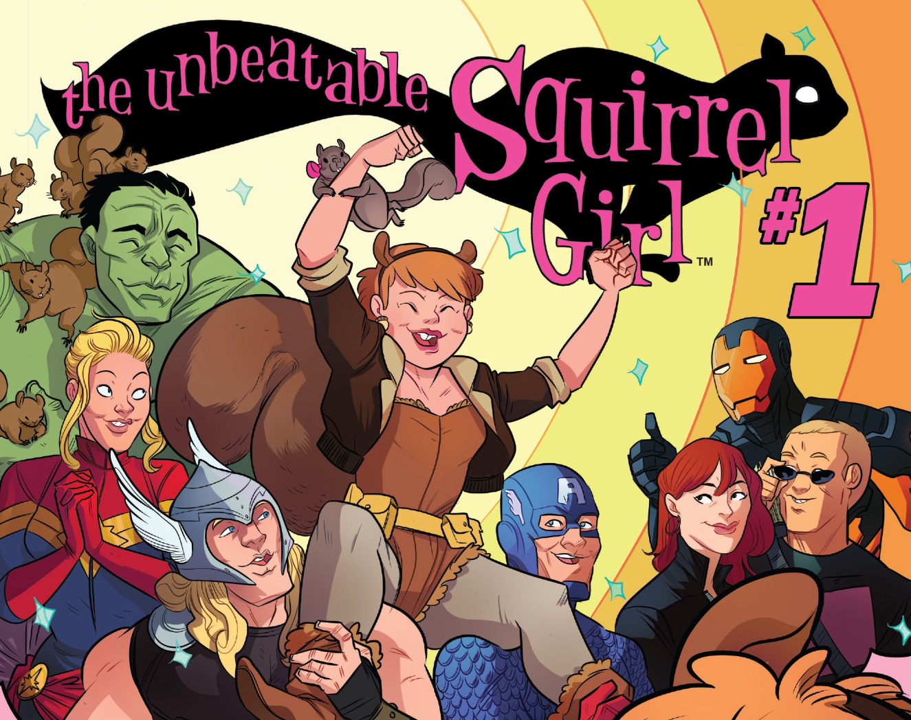
Which is why there wasn’t any other option for my pick for my favorite comic of 2015. Ryan Q. North and Erica Henderson’s The Unbeatable Squirrel Girl may not be the very best comic I read this year, but I enjoyed nothing more than it. A big part of it is the creative team, all of whom are doing big, unique things here. North’s one of the most clever and hilarious writers in comics, and his outside the box thinking on superheroics give it a feel unlike any of its brethren. Henderson’s art is full of charm and she sells a joke better than almost any artist (especially during the Kraven fight), and perhaps best of all, some of the faces she gives people (namely Galactus) make me giggle. Rico Renzi’s colors are a perfect tonal fit for the book, and the pop flair he gives moments like the Kirby-ish Galactus scenes add a whole lot to our reads even if we aren’t actively thinking about it.
But it goes beyond the specific contributions of the creative team, and into what they accomplish as a team. That’s where the magic lies. The tales of Doreen Green as she joined college and “fought” Galactus and had team ups with other heroes with rhyming names (like Koi Boi and Chipmunk Hunk) were the best time in comics this year. Its perpetually refreshing approach to the superhero genre and how Doreen always looked for alternative solutions to problems led to some of the most joyous reads of my year, led by issue #4 in which she confronted Galactus on the moon. That was, bar none, my favorite single issue this year, and the way she handles the Devourer of Worlds was basically the best “win” in a fight I’ve ever read in my two plus decades of reading comics. It also doubles as the only comic I’ve ever read that ran its letters column on the second page, which is much more charming than it sounds.
So yeah, it’s a bit atypical. North’s very meta humor – particularly with the footnotes and Squirrel Girl’s cards she consults for villain fighting advice – might read strangely to those who have a rigid view of what superhero comics are all about. Henderson’s art isn’t all pulsing muscles and posturing beef/cheesecake. But sometimes a little atypical is needed, and The Unbeatable Squirrel Girl is a comic that we could all use a little more of. It’s a wonder to read, and something I’m happy I made the choice to pick up. If I hadn’t, I would have missed out on my very favorite comic of the year, and one I hope to have at the top of my reading pile for a long time coming.
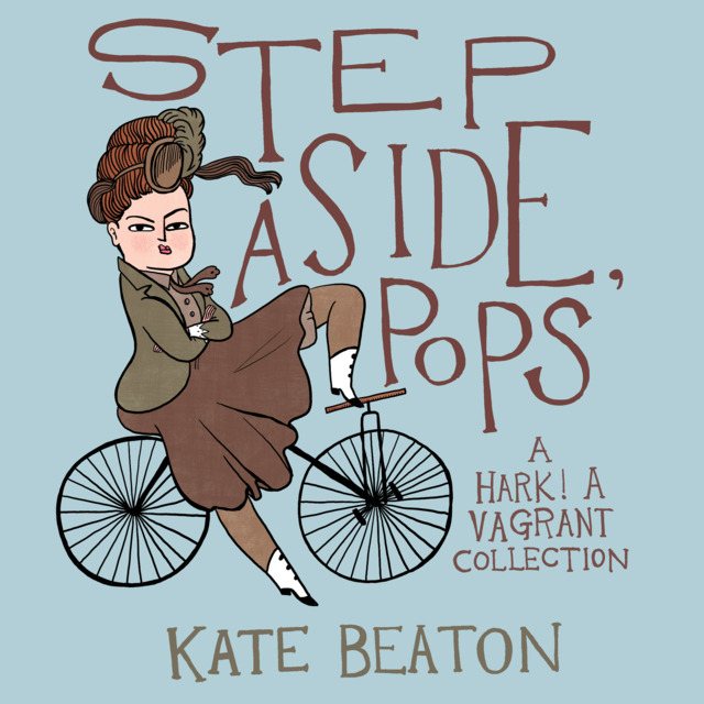
The “History is Fun!” Award: Step Aside, Pops (Drawn & Quarterly)
History is defined by the victors, or so the old saying goes. Those who are still there in the end get to decide how people are represented and how everything went down. It’s a natural benefit of winning, but I’m sure few would disagree with my personal variation: we’re all winners when Kate Beaton’s defining history.
That’s not to say Beaton, who is one of the best and brightest cartoonists around, is simply making things up. It’s clear she puts a lot of time into ensuring that her work on her webcomic Hark! A Vagrant and in collections like this year’s Step Aside, Pops are as reflective of the facts and source material as she can be while still finding humor in it. She just finds kernels of hilarity in incredible places, like Goethe dealing with adoring fans or Chopin and Listz’s friendship/rivalry, and fans those flames until they are a torrent of pure entertainment. Beaton’s ability to take aspects of people and characters and create comedy from them is unrivaled in the comic medium, and this latest collection showcases that in full.
One of the rarest gifts she demonstrates throughout this book, though, is how well she refines these famous and complex individuals into short three panel strips. It reminds me of something someone once told me, in which they said “you can tell when someone really knows and appreciates a subject…it’s when they explain easily enough so anyone can understand it.” If a storyteller can express something in condensed fashion, that’s how you know they fully know and appreciate it. And it works for Beaton: she can express difficult people in wondrously simple ways. Her cartooning helps, of course, as it’s so full of life and charm that her pictures say a lot the words can’t capture. It’s lovely work, and less focused on being real and more about selling the narrative and jokes. It’s the straw that stirs the drink of the book.
Kate Beaton is comic book royalty, and work like this just reminds us all as to why that’s true. She’s one of a kind, and her work is a perpetual reminder of how deep and varied the comic form can be.
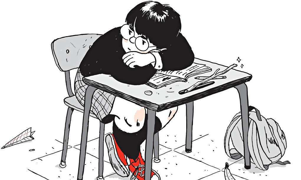
The Wooderson Award: SuperMutant Magic Academy (Drawn & Quarterly)
I’m confident in saying that Jillian Tamaki’s SuperMutant Magic Academy is unlike anything else I’ve ever read. That could be a good thing or a bad thing, but in this case, it’s most definitely a good thing. Originally a webcomic before being published in print this year by Drawn & Quarterly, SuperMutant Magic Academy is a comic strip (of a sort) that tells the idiosyncratic stories of the titular school. On Off Panel recently, I suggested it feels like the lovechild between the Harry Potter series (naturally) with Richard Linklater’s Dazed and Confused, but even that feels a bit off if only because just how spectacularly odd this comic can get. It gives you an idea of what this book is all about though.
Take Everlasting Boy, for example. There will be little interludes here or there that star this character, and they are often odd little existential gems about the history of the world through his eyes. You actually see the beginning and endings of civilizations through his perspective (not directly, but with him as a prism), and they’re often quite funny and mostly very strange (but in a good way). When this book gets big, it gets big. But it can also get very micro in its focus. Other characters like Frances stay in the here and now, which in her case means whatever her latest art exhibit may be (although it typically involves her own body). Whether the focus is narrow or grandiose, Tamaki brings insight and humor to the page throughout. It’s a thoughtful look an human interactions, but it’s also one that rarely passes on a great setup for a laugh.
Tamaki’s art fluctuates dramatically strip to strip, with some having a very unfinished feel, while others have flares of color in an otherwise black and white world. Her cartooning adds a lot to the equation, especially in the facial expressions of some characters. Marsha may be her finest achievement in the book overall, as her complexity and internal conflict feels so human, but Tamaki’s visual demonstration of her emotions is brilliant. There’s one part where Cheddar – a mostly secondary character who might be my personal favorite overall – recounts one of Marsha’s finer moments, and Tamaki depicts Marsha’s face with a beautiful Schultzian smile that elevates the moment. There’s a lot of charm in her art.
One thing I really enjoy about the printed version of the book is how almost every strip is an island until the very end. We get little views into this world, but for the most part, the cast and setting is all that unifies it. Towards the close, though, there’s an ongoing narrative for the last fifth or so about Cheddar and Marsha dealing with everyone’s least favorite classmate while Wendy goes to prom, before they meet in the middle for a perfect ending to the book. It’s a surprise, but a welcome one. It makes it the type of comic that you can just pick up and enjoy for a bit, or if you’re looking for a longer read, it can pay off in that way too. It just depends on what you’re looking for. Either way, if you’re looking for a good comic, there’s one here. SuperMutant Magic Academy is one of the books from 2015 I can see myself revisiting most often going forward, and that’s a rare and welcome characteristic in a comic for me.
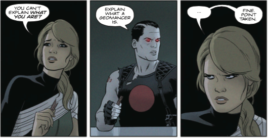
The Game Changer Award: The Valiant (Valiant Comics)
While this series started in 2014, it came to a close in 2015 and it did something significant: it redefined the Valiant universe. Now, for many, that may not seem like a big deal. It’s a young universe, so there wasn’t that much that really needed redefining. But still, The Valiant was a major deal, and not just because of its game changing nature: it was also a very good comic.
Since their relaunch, one of the most interesting things about Valiant is how well they’ve done with event comics. They can be tricky for most publishers, as they tend to involve massive parts of your line and actually restrict progression rather than make major change. But that’s not the case for Valiant. They have done them very, very well, and it’s because of two major reasons: they keep them relatively small and they put their best on the books. And The Valiant filled both of those qualifications, as it was a standalone four-issue mini-series crafted by Jeff Lemire, Matt Kindt and Paolo Rivera. I don’t think I need to tell you how good those three are.
The Valiant itself was an event, through and through, but it was more than that. Sure, it had bombastic action sequences, but it was also a wonderful character piece. The relationship between Kay the Geomancer and Bloodshot, for one, was delightful and unexpected, and the pain the Eternal Warrior had been through after failing Geomancers for so long made it a lovely little arc for him. It was built character first, and that helped the story beats hit harder than they may have otherwise. The Valiant played off the past, present and future of the Valiant universe in a real way, but it wasn’t beholden to it. It never struggled to stay focused on its own story, instead using the rest of the Valiant universe as set up for its own powerful story.
The Valiant was the rarest of events in that it both was a great comic and an excellent jumping on point. If you were a longtime Valiant fan, this book would be your jam. If you weren’t, this would be a great place to start. Because of that and its storytelling power, it was one of the finest superhero comics of the year. It has something for all types of readers, and it encapsulated everything that was special about this burgeoning universe in one four issue series. That’s pretty impressive.
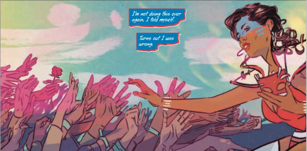
The 808s & Heartbreak Award: The Wicked + The Divine (Image Comics)
When you’re an artist, change can be your most frightening enemy. Whether you write or draw comics or make music, trying something new after you establish what people love about your work can be the riskiest proposition of all. While we all peacock around saying we want something new, most fans want more of what we already love rather than something different. Take Kanye West, for example. His career began with three incredible rap albums: The College Dropout; Late Registration; and Graduation. He was at the peak of his powers and challenging all comers for being the king of the rap game after the last one came out.
And then he dropped 808s & Heartbreak, an album that was more electropop and R&B than rap. It featured a huge shift in production and a healthy dose of autotune, and I remember the general response being fairly negative from fans and mixed from critics. As a fan of the record, the thought crossed my mind that its biggest issue wasn’t that it was bad, it was that it wasn’t a “Kanye West album.” Or at least what the average person would want or expect from one. But I loved it at the time, and even as I listen to Paranoid from that album right now, I still groove to it. It’s a good one. It was just different.
For Kieron Gillen, Jamie McKelvie, Matt Wilson and Clayton Cowles’ The Wicked + The Divine, 2015 was the book’s 808s & Heartbreak in many ways. They finished off their second arc, and what an arc it was. It blew everyone’s minds – some of us more literally than others – and created a seismic shift in where the book was going and our relationship with the book overall. And then…well, everything changed. McKelvie and Wilson moved to Phonogram: The Immaterial Girl for the rest of the year, and that meant the book needed to find a new twist for the next arc. So for the third arc, they featured guest artists and a slightly different approach, with each issue being more or less told from the point-of-view of one of the gods. It was a huge change, as we’d gotten used to living through the perspective of our proxy – Laura – in the first two arcs, and now we are getting perspective from all kinds of different people. It was different. It was new. It could have broken the book.
But instead, it enriched it. It helped that artists like Stephanie Hans, Leila del Duca and Tula Lotay guested, but it wasn’t just the art. It was the overall fearlessness in the storytelling. Issue #13, a Tara focused issue featuring Lotay’s art, was maybe the most heartbreaking issue of any comic this year. It was an incendiary takedown of behavior on social media and the brutality modern celebrities can face every day. If I could hand someone any comic to explain the downside of modern culture, this would be it. Issue #14 was similarly gutsy, as this Woden-centric issue was entirely a remix of previously used art to tell this Daft Punk lookalike’s role in everything we’d seen so far. With a complete lack of new art, I easily could have seen readers stage a mini riot about this issue, but the way they handled it worked incredibly well and it was so, so fitting for the character. It was impossible not to love, even if it was different.
But that’s the point. People fear new and they fear different, but that doesn’t mean it can’t be great. Because of their situation, Team WicDiv was forced to take an enormous left turn and try new things. They had to make some bold decisions, and because of those choices, their book soared to higher levels than even before. Like 808s & Heartbreak, The Wicked + The Divine’s second year is proof that sometimes new or different can lead to something unique and exciting and challenging. And who couldn’t use a little more of that from time to time?
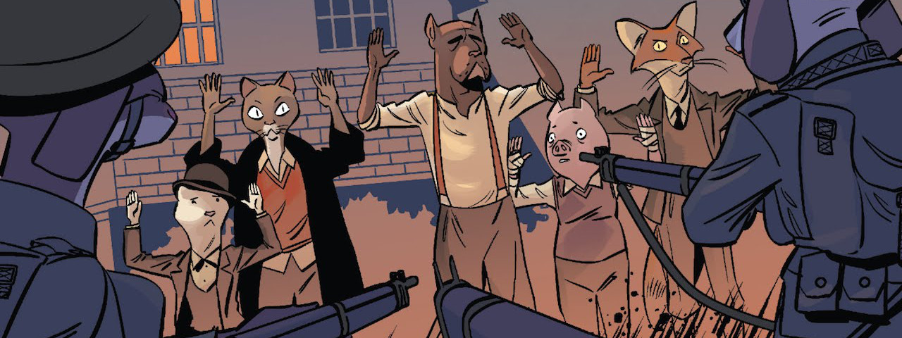
The Truth is Out There Award: Wild’s End (BOOM! Studios)
After five days of write-ups about comics, it can become a bit of a struggle to find something new to say about a comic. Every comic is different, of course, but it can sometimes feel like you’re hitting the same beats over and over again. So instead of breaking down how great the writing and art on Wild’s End is – and it is, as INJ Culbard made my creators of the year list for his art and Dan Abnett’s writing a very interesting and surprising story – or digging into where it ranks in my personal list of comics for the year – it’s #2, if you’re interested – I want to say this: there’s no comic I wish more people were reading.
This comic is described as War of the Worlds meets The Wind in the Willows, which is a pretty unique angle. It has a small town British feel mixed with alien based paranoia, and it comes from a smaller publisher and a phenomenal but not big name creative team. For all those reasons, I totally understand why readers may have missed this from the start. But it’s a truly fantastic read, and one that I’m confident that anyone could like. The character work is exceptional, the art is gorgeous and it’s just an incredibly told story. In short, it’s everything readers want from any comic.
But I’ll be honest: I don’t know a single person who is reading it. So here’s how I bring this year to a close. Do yourself a favor and take a chance on a comic you haven’t read that someone talked about in one of the infinite best of lists out there. I heartily recommend Wild’s End, and the first trade – which collects the first series – is out now. It’s phenomenal and leads into the excellent follow-up mini, The Enemy Within. But if not this, try something else out. We’re in a great place in comics in 2015, with one of the biggest issues we face being that there are just too many good comics to realistically read. That’s a real thing. But even with that in mind, we have no excuse to just read what we’ve always read because it’s what we’ve always read. As the year comes to a close, take an adventure with what you read, and maybe take it with this book. We’d all be better off if readers took a few more chances on something small and potentially great. Just think: you might just find your new favorite comic.
