
“One of My Favorite Parts of My Job”: Writers on the Pieces of Art from Collaborators That Blew Them Away
One recurring topic on Off Panel, my weekly comics interview podcast, is writers sharing their excitement at receiving pages from their artistic collaborators. It’s regularly mentioned as a favorite, if not the favorite, part of the job amongst the writers who guest on the show. My favorite example of that came from writer Brian K. Vaughan, who described the experience of receiving pages from artist Pia Guerra via fax as the moment when Y the Last Man became real. Seeing those characters come to life thanks to Guerra’s unbelievable gifts changed everything for Vaughan. That’s often the case for other writers as well, even if they rarely receive them via fax anymore.
I love that subject whenever it comes up, but it did make me wonder: Do writers have any favorite experiences with this? While it’s no doubt that writers enjoy nearly every time they receive pages, as the wonders artists come up with are endlessly inspirational, I figured there had to be stand out moments amongst the lot of them. With that in mind, I decided to ask writers about this very subject at Emerald City Comic Con and, in two special cases, via Zoom and email. Those conversations and answers are what you can read below, as writers share the pages or pieces of art that first came to mind when they were considering times their collaborators blew them away. The tricky part is not all of them are from projects that came out, so we aren’t able to see all of the art. But it’s still fun to see what everyone came up with.
Please enjoy the perspective of these writers below, as this feature is open to non-subscribers. If you like what you read, consider subscribing to SKTCHD for more like it, as a subscription to the site only costs as much as one comic a month.
Chip Zdarsky: Even before I get to these pages, what you’re saying about Brian (K. Vaughan) makes a ton of sense because when I was starting on Stillwater, Skybound wanted four scripts done before they would even approach an artist. And I think maybe around the issue three script, I told them, “I just can’t do this. I can’t keep writing without actually seeing the characters.” Because they become real at that point. I needed to actually see the world and feel the world before I could continue on with it. So, that stage of getting the work back is super important. Where it’s like, “Oh, this is a real thing now.” It really informs the writing.
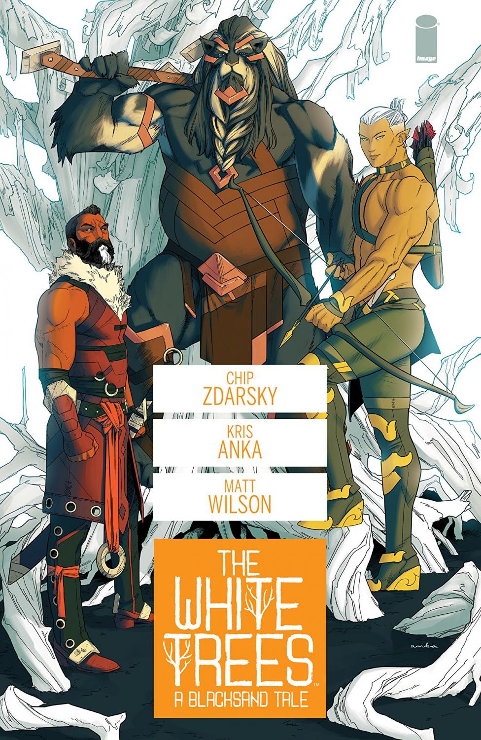
But I picked White Trees. Specifically, a few pages from issue two, because Kris Anka and Matt Wilson are the dream team, frankly. I’ve worked with tons of amazing artists, and I could have gone through any title and picked pages that stood out to me. But with Kris and Matt, I think they’re the only creators who just got it and understand storytelling on a level that maybe some other comic artists don’t. Some comic artists are more concerned with kind of filling the page than they are with the story beats.
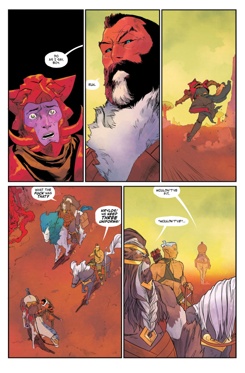
And so, the examples I sent you…one looks kind of boring. (laughs) It’s a page of talking, a guy running, and that’s it. But the placement of the characters and the color choices just really make it shine. Having that character who’s clearly down on the ground with the empty space above him, looking up with the tears in his eyes, and then the next panel is looking up at our main character and positioning him so he’s higher…and then the shot of the character running away, which is a beautiful action shot…that’s just elegant storytelling from Kris. And Matt just brings it to life so beautifully.
And he doesn’t shy away from how the next shot is a looking down shot of a guy getting on a horse and a couple guys trotting up on horses. Most artists would just shy away from that completely. They’d try to crop out the horses. They’d try to do something. They’d fill it far too much. But you get a sense of space between the characters here and in the next panel as well. That sense of space…it’s deceptively simple.
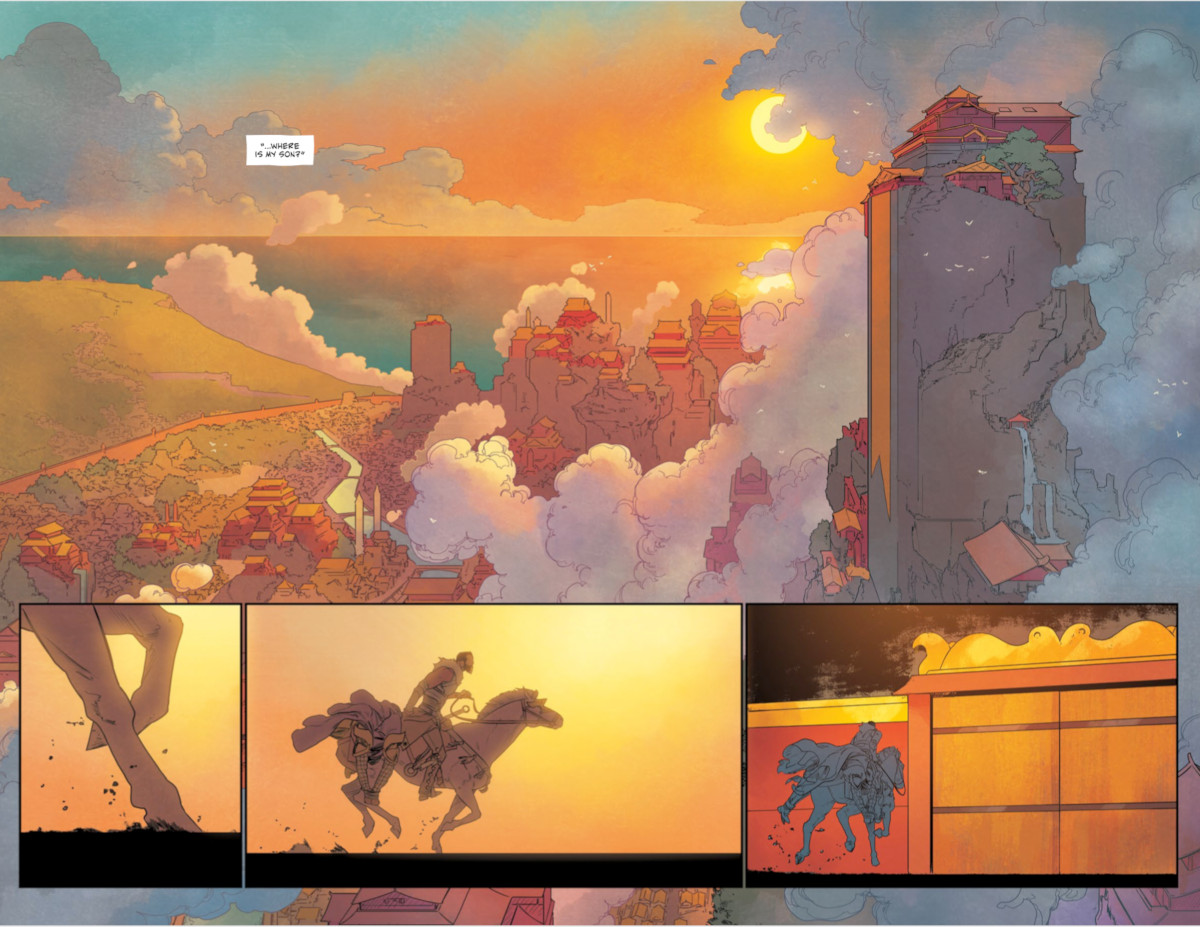
But then you have the other pages, like the double page spread of the beautiful cityscape. There’s not a lot of line work there because Kris trusts Matt so much. The line work coming in from Kris, I’m like, “Oh, that’s going to be a really lovely shot.” So when Matt delivered the final, I was like, “Oh, this is one of the most beautiful spreads I’ve ever seen.” That sense of peace…it was just lovely. Even how Matt keeps the character and the horse kind of one tone, a cool tone, in that final panel…it’s elegant. Another less experienced colorist would’ve colored it all in like, “Oh this is a horse color. This is the color of the guy.” But Matt just knows to pick the colors that are happening elsewhere around the page and use them to tell the story.
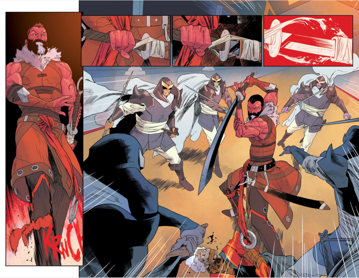
And then the big kind of action double page spread…this was just two panels, essentially. The script just had the fighting, and Kris added pulling the sword out of the holster, tearing the tape. I don’t know if it was Kris or Matt who decided that fourth panel. But it’s awesome. It’s so awesome. Especially since it’s the same color red as the sound effect of the “KRNCH” in panel one, the fact that that ties together these two bits of violence is just amazing. It’s lovely. The whole story is leading up to this moment of a guy who has renounced violence and now he’s just letting it all be unleashed. So that added panel that was not in the script of the tear of the tape is just gorgeous.
It’s beautiful. I can’t get over those. I was going through those issues again this morning. There were like no notes. I don’t recall giving notes on anything, and if I did, it was because I screwed something up in the script. Kris just gets story and where characters should be placed on a page in a panel to create the emotional effect that we’re going for. Whereas some other artists just wouldn’t even consider it at all, which is shocking to me. They’d just be like “Okay, characters in the panel.” ” Okay…but where in the panel is the character?” Are they far away from us? Is there empty space around them? Are they constrained by the panel? Those are all different feelings and Kris just gets it.
G. Willow Wilson: Oh, my gosh. This is like being asked to choose between your children.
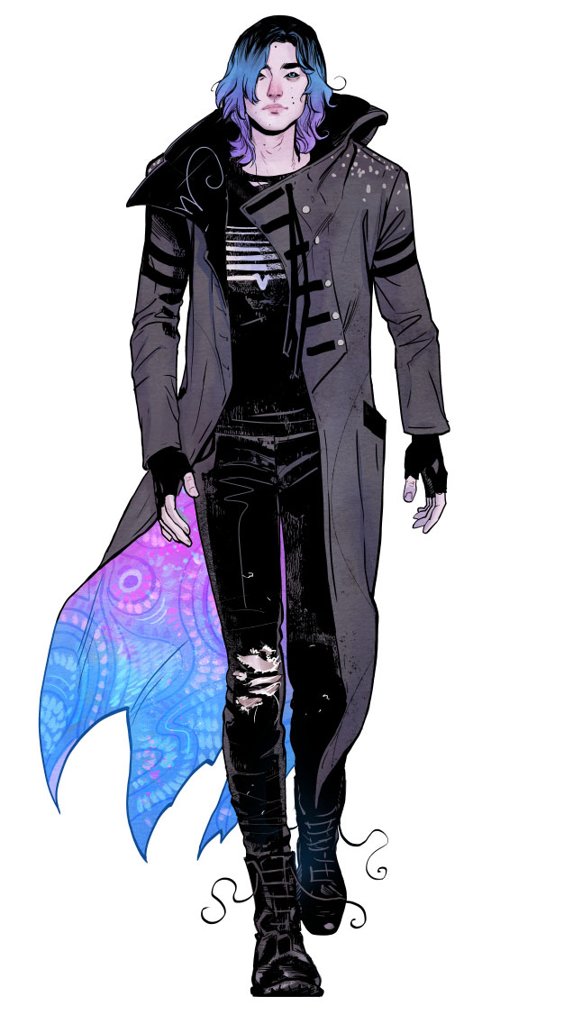
I have to say, when Nick Robles and I were working on The Dreaming and he started sending in…it wasn’t even pages, it was character sketches…I just kind of melted into a puddle because he’s so good with the human form and with getting really detailed, intricate, true to life positions of hands and facial expressions and things. And every artist has their own unique set of strengths. It’s why you can look at a table full of books and say, “Oh, that’s Kris Anka. Oh, that’s Jim Lee.” They’re so distinct. And so, it’s difficult to say that any one of them is better than the other because they’re just unique. You can’t really compare them. But I have to say when Nick sent those sketches in, I was blown away because everybody was so beautiful that I just wanted to print it out immediately and hang it on my wall.
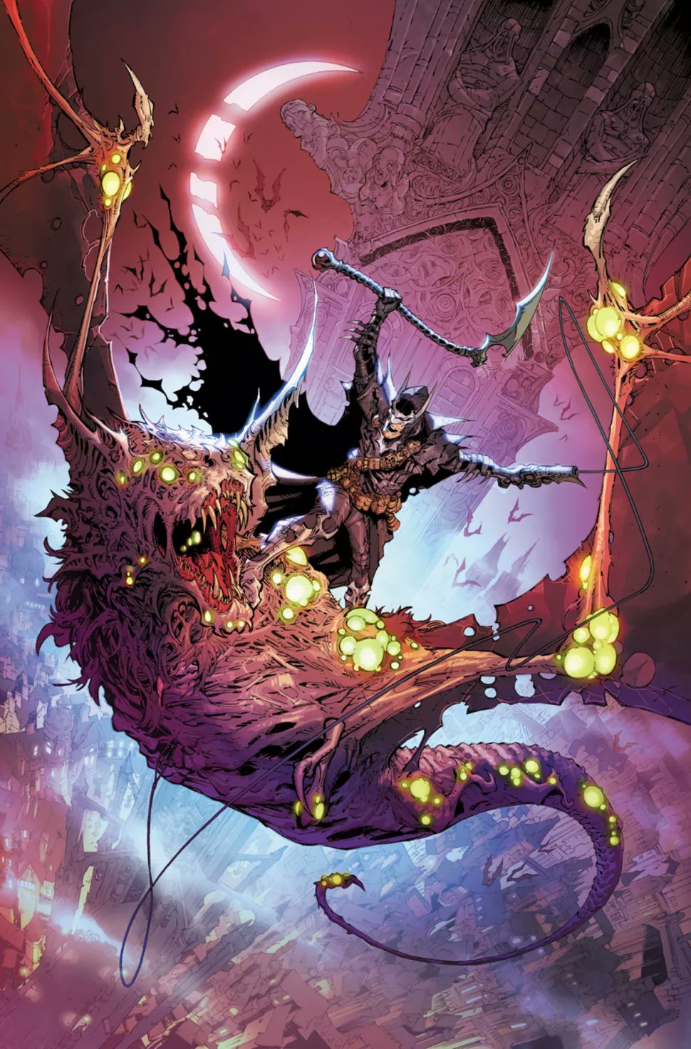
Jim Zub: I’ll tell you a very recent one. I’m doing a new story called Castle Arkham (in Batman: Urban Legends #20). It’s sort of an Elseworlds where Batman is this supernatural monster hunter on the streets of a city called Arkham. Max Dunbar, who is a longtime collaborator of mine…we worked on Dungeons and Dragons together, we did Stone Star together. I know this guy really well. I know his strengths. I know what he’s capable of. And yet, this particular project has inspired him to such a degree that every single time he sends me a page, I am genuinely awestruck by it.
He is in his element. He’s drawing these incredible gothic interiors and this city with these soaring spires and minarets and all this stuff. And I wrote the thing. I know exactly what’s coming next. I told him what I wanted. I send him reference this kind of thing, and he’s just pushing beyond it. I am blown away by every page that’s coming into my inbox. This is going to be a milestone book for us, and I cannot wait for people to read it.
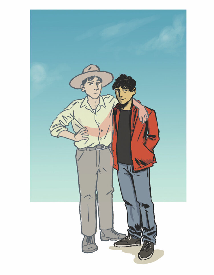
Julio Anta: Well, I’ll talk about our book 1 that’s coming out, Frontera. It’s a book that takes place in the Sonoran Desert. So, there’s all these beautiful desert landscapes, and he did a double page spread in the book that’s just our two characters walking in the desert. It’s so beautiful. Especially when it was colored. So that for me…all it was in the script is one line where it’s like, “The characters are walking through the desert and it’s just to transition between scenes.” And it blew me away.
Matthew Rosenberg: I feel like everyone who knows me will be able to guess what piece of art really stands out to me, but it was the first pages of 4 KIDS WALK INTO A BANK from Tyler Boss. That’s not to diminish all of the amazing art that has had my dumb name associated with it. Some of my absolute favorite artists of all time have drawn covers and pages for books I worked on. People like Leinil Yu, Alex Ross, Darick Robertson, Skottie Young, David Lapham, Joe Quesada, Los Bros Hernandez, and more. Hell, I got a Jim Lee cover in my inbox this week! But making 4 Kids was a really strange journey early in my career. Both Tyler and I were both working in a comic shop and making the book in our time off. So there was a lot of the book built in the backroom of the shop, or on the A train home. And I was seeing a lot of sketches and roughs over his shoulder on our lunch breaks. But even then it felt sort of abstract. It was something we talked about a lot, and tinkered with a lot, but it never felt “real” if that makes sense.
But I remember late one night he emailed me a picture of the first 6 inked pages, all at once, in one photo. He didn’t have a working scanner at the time, so he just used his shitty cellphone camera to show me that the pages were real and done, laid out on his floor. I had to zoom in to see any details at all. It was the absolute worst way to send someone art I could imagine. It felt more like a hostage proof of life photo than a comic collaboration. But it was so exciting. It was the first time I’d had the chance to make something with an artist who was a friend first. And this was the first time the project had felt real. And, from what I could gather from that shitty, pixelated photo, it looked amazing. I remember just being so excited because this wasn’t the dry, clinical, anonymous, transactional nature of making comics I was used to. This felt different. It felt like what I wanted making comics to feel like the whole time I was trying to make them. And it felt like what I wanted to do for the rest of my life.
Scott Bryan Wilson: It happens a lot. I’m just going to say, on the John Paul Leon Batman story, the first pages that came in were the first pages of mine that I had ever seen brought to life in comics form. And by someone from the Mount Rushmore of comics to me…it was very emotional, but I also was just utterly blown away by how he transformed what I wrote and made it so much better than what I saw in my head.
Mark Doyle commissioned me to write the script and I wrote it not knowing who the artist was going to be assuming it’d be somebody like me, some newbie. He said, “Hey, I really like the script. Let’s talk about an artist.” He says, “I was thinking either Klaus Janson or John Paul Leon.” And I just went, “What the fuck, dude? What am I supposed to do here?” And I really didn’t know what to answer, because it felt disrespectful to pick one over the other. But Klaus was inking something else at the time. So I said, Hey, I guess I’ll take John Paul.
From that point, I could’ve never written another comic again and it would’ve been amazing. I could’ve been happy. I could’ve been satisfied.
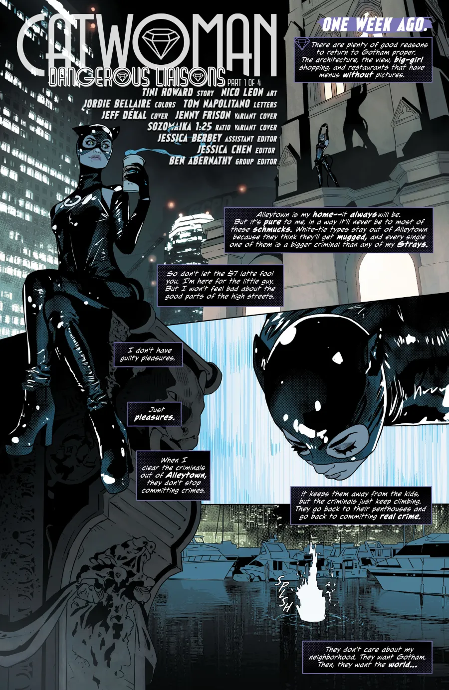
Tini Howard: I got a page like that yesterday. It was a Catwoman page from Nico Leon. And it was just a page where Nico and I are…We work closely together. He’s definitely an artist who, when I write a script, he reads it, and he comes back with notes. They are art notes that are like, “Here’s how I think this could be more visually interesting. Can I add this element in here to have a bit of visual storytelling?” And I almost always am eagerly into it. It’s really our book. We work really closely together. And I just had a page that I wrote it wanting it to be sexy, and Nico turned it in, and I was like, “This is beyond sexy.” 2
I blushed when I opened the email. They might even have to censor parts of it. But I’ve seen the real thing. I saw the Director’s cut. And it’s beautiful. So yes, that happens to me a lot. It happens to me a lot with Phil (Sevy) with Phenomenocity, because so much of that world lives with him too. But yeah, for sure. (Getting pages in is) one of my favorite parts of my job.
Thanks for reading this feature. If you enjoyed it, consider subscribing to SKTCHD for more like it!