
Assassin Nation Week: Deron Bennett Takes us Inside the World of Lettering
Our week long look at the making of Assassin Nation continues with an interview with the title's letterer
Lettering is…not a heavily explored part of the comics world. Relative to the other roles on any given comic, lettering doesn’t get nearly as much play or press. Which is too bad because, well, it turns out that unless your comic stars Snake Eyes from G.I. Joe, odds are a good letterer is going to make a huge difference to the success of your comic.
And today, as part of Assassin Nation Week, we’ll be talking to a very, very good letterer, and someone who makes this Skybound/Image series work as well as it does. It’s letterer Deron Bennett, and he takes us into how he does his job, what guides him in his work, matching the style of artist Erica Henderson’s work, decision making on issue #3, and a whole lot more. It’s a great look inside a side of comics that is often unexplored, and a big thanks to Bennett for the chat. Give it a read, and come back tomorrow for a conversation with series editor Jon Moisan about his work.
Let’s start at the beginning of an average project for you. As a letterer, where do most of your gigs come from, publishers or creative teams? Or is there a lot of variance in regards to that? And how did Assassin Nation in specific come together for you?
DB: Most of my gigs come from the publisher. I know it’s different for some other letterers, so the answer can certainly vary depending on who you talk to. But for me, personally, I get a lot of my jobs directly from editorial. There are definitely instances where an independent creative team will bring me in, but that’ll usually happen before a book is pitched.
With Assassin Nation, I was a newcomer to Skybound. I’d just started working on Excellence and my editor, Sean Mackiewicz, recommended me to Jon Moisan. He reached out to me about this new series by Kyle and Erica, and we took off from there.
For Assassin Nation, did you have any conversations with Kyle and Erica about the book and what the look and the feel was going to be in a broader sense? If so, how does that factor into your approach on a lettering standpoint?
DB: A lot of the interaction happens directly between Jon and I. And this sort of thing will happen more often than not with a publisher. He gave me a brief rundown of the book, and I remember saying, “that sounds insane!” So I fully expected a fun, over-the-top romp in the criminal underworld.
And that’s sort of how I approached it. I wanted the look to be fun and playful and not too serious. I was given a blank canvas and started to play around with styles that I thought would work and landed on something that Kyle, Erica, and Jon all loved.
What are the biggest determining factors for you when you’re defining the lettering style for a comic like Assassin Nation?
DB: Art and line-work are the most significant factors for me. I always want the lettering to feel like it is something that the artist would do. So most of my influence in Assassin Nation is taken from Erica’s art style. There are thick contours with slight variations in line-weight, so that’s what I used in the balloons. The shapes she draws are also a bit squarish, but not perfectly rounded. There’s a nice balance. So I went less round on the balloons and used what we call “TV” balloon shapes that have that more squarish shape. This also helps fit dialog as well, so I thought it was a smart choice. Erica does most of the SFX herself, but in the odd chance there’s one still lingering in the script, I try to match what she might do.
How much of the look of a book like Assassin Nation is decided before it even launches from a lettering standpoint?
DB: Everything is already nailed down art-wise before it comes to me. I think when I initially sent in samples of my lettering style, only the SFX were not in place. So that sort of decision-making was still in flux. But generally, once I get my hands on it, I come up with a lettering template and start building on as I go. I’ll create the essentials for the issue, balloons, fonts, etc., but there are still things that might get established later on. I think we didn’t see radio balloons until the second issue and I am just now getting to caption styles well after issue 1!
Caps is the typical lettering play in comics, but some books go mixed case on occasion, so that can be a thing. What made caps the right play for Assassin Nation?
DB: One of the things that I try to do is to commit to specific personal rules with lettering. It not only helps me with my personal style and approach, but it also sets a baseline for the lettering studio that I own, AndWorld Design. As a rule of thumb, I try to avoid mixed case fonts as the main dialogue font. I think it works best for exceptional circumstances like a whispered voice or something like that. If I use it as the main font, it might be on a book that looks like it’s intended for all ages or if the rest of the team prefers it. I do think the case could be made here since Erica has an exaggerated style and the book is comedic in tone, so a less serious font might work. But even then, mixed case presents a few other challenges like text crashing, so I felt it wasn’t the right move altogether.
You talked about how radio balloons and caption styles have come in after you already had the general look and feel of the varying lettering solutions buttoned up. When you’re having to come up with other elements later on, do you try to match what’s happening within a given issue – especially if they’re something that isn’t heavily used elsewhere in the series – or is it more important to ensure that it meshes with the overall whole?
DB: A little bit of both. With the general look established, it’s easier to play off of what exists within the issue. So for something like a radio balloon, I won’t necessarily go back and revisit a previous issue. I can just come up with something that fits the template. However, with something like a caption, where I want the box to identify with the character, there might be a reason to check into other issues. I look to see if the character has a general color scheme or if there are some signifiers that I can use to make it work with the overall series. It’s not absolutely necessary, but you never want to look back at the completed series and feel like you could have chosen a different look.
We’re going to be focusing on issue #3 the rest of the way here. Let’s talk about the process on a specific issue. When do you enter into the process, and what’s the handoff like?
DB: On Assassin Nation, I typically get to dive in when the writing and artwork are all finished. Jon will set me up with the full-color pages on the server along with the script. Depending on my schedule, I’ll either dive right in or have someone in my studio balloon pages. It’s sort of like having a flatter as a colorist. They will set the pages up for me with balloons and text in place using the template that I’ve built and I’ll go in and finalize the book. For issue 3, I had Ringo-nominated letterer, Justin Birch assist me.
For Assassin Nation #3, I’m sure your tools were much the same as most any issue, but what tools do you use when you letter? And do you ever have to bust out something atypical if an element like designing caption boxes enters the equation later on?
DB: I work in Adobe Illustrator on a heavy diet of the shape, pen, and type tools. Nothing too fancy. If a cap requires an icon or something I would stick to those tools as well to design something. I try to stay in a single program to make it easier for production. I haven’t really found a need to jump into another application on Assassin Nation, but there have been times when I’ll do some brushwork or digital handwriting or sound effects in Photoshop. It’s a bit time consuming, so you don’t want to make that a staple, but it can produce some beautiful results.
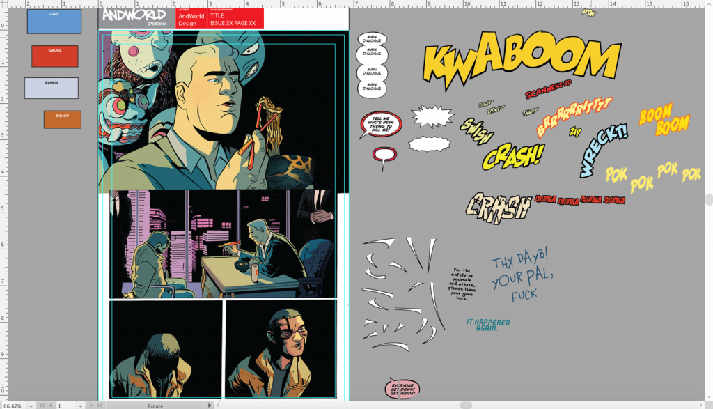
Assassin Nation #3, Page 1, original 
Assassin Nation #3, Page 1, lettering fixed
For a panel like this, why do you give Dave’s line a huge tail? Is it to match its starting point to where Chad Fingerman’s commentary begins as well? How do you figure out placement of individual elements relative to each other in general?
DB: I always focus on designing a page or panel, and that was the goal here. There is a good deal of whitespace at the top of the page, so I wanted to utilize that area and balance out the layout. Taking speaking order into account, Dave’s balloon was positioned relatively high (hence the long tail) but not so far away from Fingerman as to ruin spatial relationships. I also tried to keep a rhythm and general arching shape to the balloon cluster, which I felt created a sort of symmetry with the lower characters who are also in a semi-circular path.
It actually ended up that I made a mistake with the second balloon, which should have been attributed to Dave. If I just moved the second balloon over, the design isn’t as effective. Dave’s tail would look awkward sweeping from the leftmost balloon and positioning it lower also gives an odd visual. So I moved both over completely and kept my design choices relative to filling out the whitespace as best I could.
Dave and Rankin’s balloons overlap here ever so slightly. What is something like that saying here? Is that a spatial decision, or is that a slight insinuation that Rankin is speaking over the top of Dave?
DB: This one is strictly spatial. It’s just how the dialogue was able to fit in this case. Sometimes you can overlap or space things out to show interruption or create some pauses between speakers. There’s an example on page 9 where Fuck (can I say Fuck?) interrupts Bishop. This is a case where lettering is specifically used to help visually tell the story.
The Echidna has two quick sentences in two separate balloons here. Was that something directly driven by the script, or is that a decision you make to split up the lines for pacing reasons?
DB: That was purely a script decision from Kyle. He has specific beats he likes to hit and I’m conscious of that.
While not specifically related to this panel, I did want to ask about your perspective on balloons and whether there is a theoretical cap on how many words you’d like to see in one. If you got a script from Kyle that was literally hundreds of words meant to be in one balloon – not that he’d do that, of course, but hypothetically – is that something you’d go back to Jon and advise to split up? Or would you find a way to break it up yourself?
DB: Single lines of text in a formatted script tend to fit best. Once you get to a second line in a word processing doc, you have to account for space in the panel, especially if there’ll be another speaker or if there is a lot going on. Three lines is probably a case where you want a good deal of open space. With Kyle specifically, I like to keep the text as he has it to respect those beats that I mentioned. There’s an art to the comedy and I don’t want to break anything in the off chance that it ruins the set up or punchline. If I do end up breaking it up, I find a way to do it myself without messing with the flow. It helps having the trust of the rest of the team to do things like that.
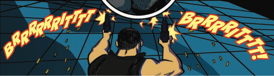
Is this one of the situations where you’re trying to match Erica’s SFX? Broadly speaking, what are you trying to do when you’re attempting to match the SFX, especially when Erica’s SFX has such a hand drawn feel?
DB: Yes. Trying is the key word. I don’t think I can match it completely using fonts, but my goal is to capture enough of the feel. The SFX that she draws tend to be blocky for big action sounds, so that’s what I was going for here. To assist with pulling it into her artwork, I matched the colors from the gun shot blasts. There’s a lot of texture to her hand drawn effects, so unfortunately pulling that in would be a job for Photoshop. Time constraints just didn’t allow for that in this case.
Besides obviously Skybound editorial and production teams, are you the last person to touch an issue of Assassin Nation? What do you have to do to actually prep the file to be ready to go for an issue like #3?
DB: Yep. Letterer is usually the last person on the totem pole. For final files, I provide flattened tifs. It’s a bit different than outlined native files, which is what I usually provide. For tif export, I have to make sure the resolution and the color settings are correct, referencing the specs from the color files. Once the tif is exported from Illustrator, I’ll go into Photoshop and crop out the lettering header that I usually include in my proofs. Once the pages are cropped to size, I send it off to Jon and we have another killer story ready to print.
Thanks for reading the third interview from Assassin Nation Week. Come back tomorrow for a conversation with series editor Jon Moisan. Also, if you’re enjoying this content, consider subscribing to SKTCHD to get content like this on the regular!