
David Rubín Talks the Magic of Comics and “The Rise of Aurora West”
The artist of the Battling Boy spinoff takes us into his process for creating comics
This article first appeared on Multiversity Comics on March 9, 2015, but was written by me. It has been published here as well with their very kind permission.
As I mentioned in my review of the book earlier today, “The Rise of Aurora West” artist David Rubín is not someone I was familiar with before that book. I’d seen him announced for the project, but the first time I read his sequential work was in this book, and now that I have, I’m all in on David Rubín. His work in that book is some of the most brilliant comic art I’ve seen all year, and I’m sure you’ll agree once you get the chance to pick it up.
In fact, once I’d finished this book, the first note I wrote down was “email about setting up Artist Alley interview with David Rubín”, and for once, I remembered! I spoke with Rubín about his work on the book, finding how he first came onto the project, his experience with Paul Pope, how he works, and exploring some of my favorite pages from the graphic novel. It was great getting some insight into the project, and if you haven’t yet, seeing some of his work from the interiors may just convince you to grab this book.
Take a look below, and thanks to both Rubín and First Second for the opportunity.
To start with, how did you first get brought into this project, and what appealed to you about getting into the world of Battling Boy with Paul Pope in The Rise of Aurora West?
DR: I met Paul several years ago, in 2006 or 2007, I think. After that, he started to write me in my old Flikr account, he liked my work and we became friends. Then we collaborated in a few works; I colored some illustrations by Paul for GQ, and one cover for DC’s Haunted Tank.
Then we went our different ways for a few years until one day when Paul asked me about how he could buy a copy of my last book at that moment; The Hero – which will be published in USA in 2015 by Dark Horse. I sent him a copy of the book from Spain to NY and I imagine that Paul saw in this work something that make him to think about me for drawing Aurora West’s adventures in his Battling Boy universe.
Well…the right place in the right moment – it’s an old story.
He’s obviously a legendary artist, but Paul Pope also is an exceptional writer as well. Did working with Paul change your approach to this project at all, given his skills as an artist? Did he tend to give you a lot of feedback to your work, or was he more all about letting you accomplish the vision you had for the visuals?
Paul gave me some points of art direction and a lot of references – old Flash Gordon TV serials, some old horror and adventure films, and a lot of reference photographs for the vehicles, architecture and all that I need for a 360 degree view of his Battling Boy universe.
There was some short but intense preproduction work, I made some concept art that Paul approved to familiarize me with his world and his characters, but after that, I felt totaly free when I was working on the pages. This confidence in me and my work from Paul, JT Petty and all the staff of First Second was comfortable for me and made the work so easy.
When it comes to your approach on this book, did the fact it was black-and-white change anything at all, compared to how you might have worked on it if it was in color like “Battling Boy” had been?
DR: Black and white was an editorial decision, not mine.
Sincerely, the first time I thought about it, I did prefer that Aurora West was published in color. But after I started to work on the first book I changed my opinion.
The action in The Rise of Aurora West is in the past of BB, then B&W works well under that point of view; the present in color, the past in B&W.
My last books for the European market were in full color, and it was fun for me work in B&W again before I started on a lot of works only in color. But working in B&W is almost harder for me, than working on color final art.
I have to draw in a different way if I work on a color book or on a B&W book. Well, the style is the same, but in B&W you need draw more than in a color version. The color provides more atmosphere to the scenes, and in B&W you need offer to the reader the same impact of the atmosphere, but using one ink only. This is harder, but if everything works out well, the final results are more dense and intense than in color.
I’ve worked a lot with the grey tones and storytelling to try to make the pages with the same or similar impact and clarity that a color version would have.
I’m always interested to see how artists bring their work to life. Are you more of a traditional artist, do you heavily lean on digital tools, or do you work with a combination of both?
With a combination; I draw the storyboard for the Book on a little pieces of paper, then I scan the story and print a blue version in A4 paper the size of the story pages, then I make the final and clean art over it, with a pencil.
When the pencil pages are done, I scan the result and print in blue in B4 size papers (a size between A4 and A3). Then I make the ink process there, with a Pentel brushpen.
Inks done, I scan – again – the pages and include the grey tones in Photoshop, and other additional details of the inks by digital, like the splatter of ink in some panels, etc.
There are other ways to work a comic page – many better, for sure! But this one works well for me. And you get two original pages of each page! One in pencil art and the same with the inks!
You can see a graphic explication of my work process for The Rise of Aurora West in my blog.
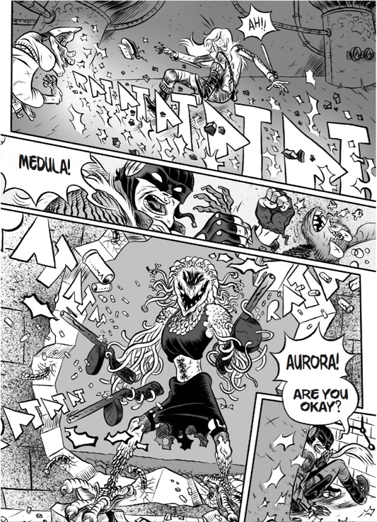
On this page, I think we really see something that’s omnipresent in the book, and that’s a palpable sense of energy. When Medula first strikes, between sounds and bullets firing and bodies flailing, there’s a lot going on, but the way you convey the action and energy feels smooth and inviting. As an artist, is there such a thing as too much energy and activity, and was that something you had to carefully balance on this project?
DR: I think that the action and the violence in the page should be shocking, but at the same time, it should be elegant and aesthetic too. The John Woo way, but in paper and 2D.
I think of the page as a single entity, not as a container of different panels like a sticker album.
I try to play with all of the elements of the medium: onomatopoeias, composition of the panels, composition of the page, and the acting of the characters to try to get that feeling of energy, of action, kinetic and furious, but at the same time giving something nice and comfortable to the reader.
The sound effect lettering had a ton of personality and really interacted with the elements very well. Did you add those elements yourself straight into the art?
DR: Yes, I like to draw all those elements — the onomatopoeia, the balloons — by myself. I think it gives a more organic look to the page, and helps to make the timing more fluid than if you put these elements in a page with a computer in a postproduction work, or if someone else does them.
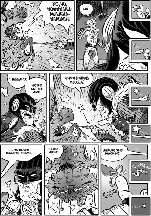
One thing I loved in this book was your usage of inset panels to convey timing based story beats as the page moved along. Was that something you came up with to better convey story beats like Haggard’s interrogation of this monster, or was that something that you working from off the script?
DR: It’s off the script. A book like this is teamwork — everything who is involved in the creation of the book provides his vision and talent to the final result. I think this is the best way to make a good book.
For me, the script is a safety net. I can fly without fear because I follow the script, I know that the safety net is below me. Nothing is set in stone; you must contribute and make changes if that leads to making the story even more striking and visually interesting.
To you as an artist, what do panels like those small inset panels do to help you pace and more fully convey the story visually?
DR: The insets are necessary in some moments for fixing the reader’s attention on something, and in other moments for helping to the pace. But each must be obedient to the needs of the story. Those two things are equally important.
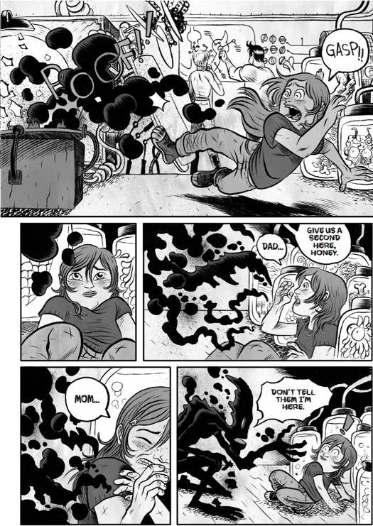
When it came to actually depicting the mysterious Mr. Wurple, he has a certain fun, friendly vibe to him for a monster. He’s the type of creature you could easily see a small child befriending. When it came to creating the look for that character, how did you come up with his final look and something that split the difference between monster and friend?
DR: There are good descriptions of Mr. Wurple in JT and Paul’s script — that made my work easier!
With their information, I tried to design a creature half monster, half friend, without a concrete form: like a shadow, but a friendly shadow!
I think that all the monsters that you can see in AW’s books or BB’s books have two stages in their lives. The first is like Wurple, a diffuse form that will be solid in a second stage for the monster’s final appearance.
You can see this evolution in other monster of the book, a big dark monster who Aurora finds in an abandoned building, at the second part of book one. You can see the final form of this monster in the first volume of Battling Boy — he looks similar to Frankenstein. But in Aurora West, his final form is not formed yet.
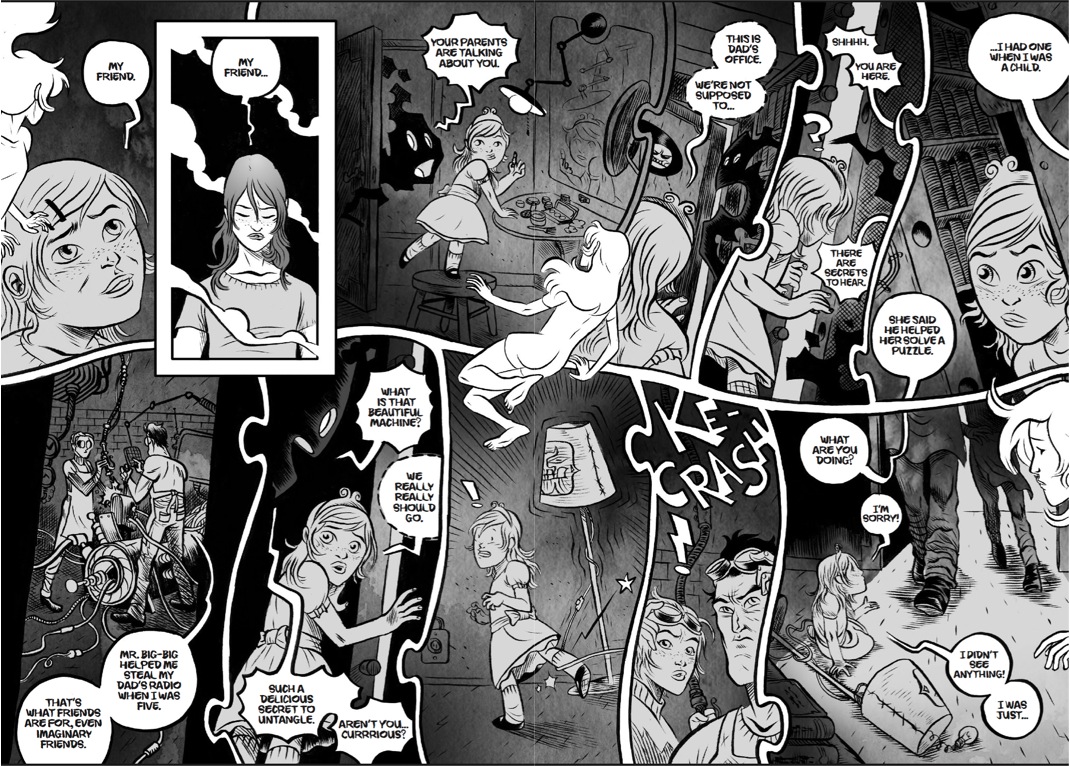
This page is absolute madness, or at least it could have been if handled poorly. With so many different elements – the puzzle panel connectors, Aurora being worked into the center, and all of the main narrative – it’d be easy to get lost, but it works tremendously well. How do you maintain the balance of conveying all of the necessary information without getting readers lost in the storytelling?
DR: Being careful! I could be experimental with my storytelling but, at the same time, this storytelling must be clear for the reader. It should be a tool to drive the attention of the readers through the story.
This page represents a voyage to the center of Aurora’s lost memories.
I use the puzzle panel connectors to enhance the idea that Aurora runs through the interior of her mind to recover her memories, like a puzzle where, piece by piece, you can discover the final big picture.
You said before that you storyboard before getting into your work. When it comes to a page like this, do you go through several iterations, or do you have a pretty good idea going in what you’re going to want to do straight from a script?
DR: I don’t know, really.
I read the script and I thought about the different possibilities to make the sequence work well. Then I choose one of those and drew it.
It’s the magic of comics!!
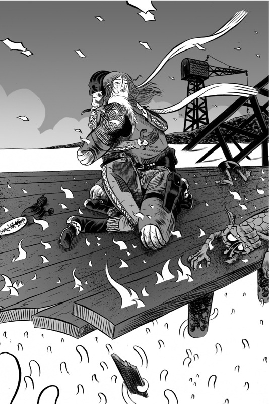
This might be my favorite page in the entire book, as Aurora and Haggard embrace. It firmly but happily reminds us that while they’re both heroes, Aurora is Haggard’s little girl above anything else. When it comes to a page like this, what’s the key to visually conveying something that’s such an important, emotional moment?
DR: Thanks! It’s my favorite too!
I love draw action and adventure sequences, of course, but much more than that, I love drawing emotional and intimate scenes.
The good combination of emotion and action scenes is the key for touching the heart of the reader, I think.