The Artist’s Artist
On Julian Totino Tedesco, the best cover artist in comics today.
If you polled every single-issue comic reader and asked them who the best cover artist is today, Mike Del Mundo would likely finish in the top two. It’s easy to understand why. Del Mundo is the Vince Carter of comics: he’s half man, half amazing. Both his ideas and execution are exemplary, perfectly blending phenomenal storytelling with colors that sear themselves into your brain. He’s been one of the best in the game since the day he got started, blowing everyone away with his work from the jump.
Del Mundo feels the same way about one of his peers, someone he labeled as his favorite cover artist today. When asked why this person’s work is so exceptional, Del Mundo could barely even explain himself. He was at a complete loss for words. He could only describe how this person’s art makes him feel at first.
“It’s hard for me to dissect his art, man,” Del Mundo said. “When I see it, I’m just like, ‘Fuck, this guy’s so good.’”
“’I wish I was that good.’”
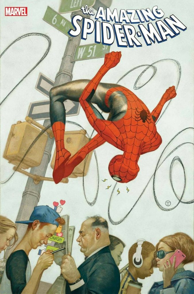
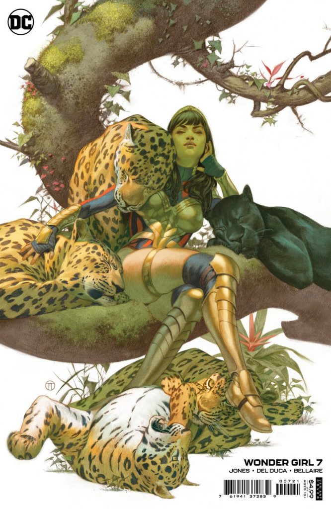
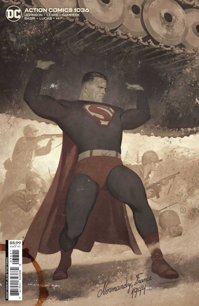
That’s the impact Julian Totino Tedesco can have on his fellow artists. He’s simultaneously one of the best cover artists in the business 1 and the type of talent that makes other comic artists want to put down their pencils out of disgust and up their game in equal measures. He’s an artist’s artist, a draftsman of the highest order, and a master storyteller even when only given a singular image to prove it.
And it’s not just Del Mundo who adores his work. Artists tend to be busy, making them rather difficult to pin down for quotes. That is, unless you want to get their thoughts on Tedesco’s art, apparently. Then they can’t wait to talk.
“His covers are just next-level amazing,” Russell Dauterman said.
“All of my favorite artists are masters of nailing a character’s personality, showing what makes them unique and endearing,” Doc Shaner added. “Julian has that in spades.”
“He’s comics’ N.C. Wyeth, with apologies to Alex Ross,” Chip Zdarsky opined.
While the words may change, the message is the same: Tedesco’s in rarefied air.
It’s been a long road getting there. Tedesco hails from Argentina, a country with a lasting connection with comics via its “historietistas,” or comic book artists. 2 Whether you’re talking Argentine legends like Héctor Germán Oesterheld and Alberto Breccia or transplants like Hugo Pratt to modern names such as Ariel Olivetti and Juan Bobillo, comics and art are inseparable from the country’s identity. Tedesco grew up in a land rich with comic book history and a household filled with them, as his older brother was a fan of the medium, leaving them everywhere in the house for anyone to discover. This inspired Tedesco to both read comics and start drawing. He took to both from the beginning.
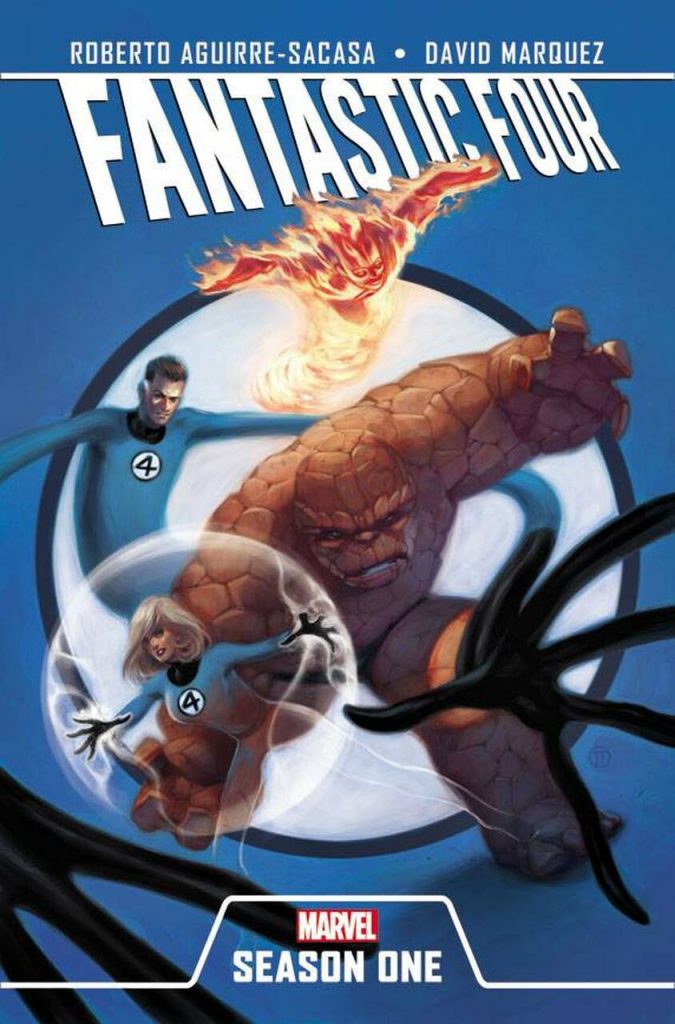
“I couldn’t honestly explain what it is about drawing that I love so much,” Tedesco shared. “I just know that it’s been part of my life and who I am since I can remember.”
His passion for art hasn’t lessened since. It’s been omnipresent and potent throughout his life, almost as if it’s part of his identity rather than an occupation, with Tedesco telling me he couldn’t “imagine life without drawing or without constantly thinking about drawing.” He always knew he wanted to draw for a living. How he might do so, though, was a mystery.
Keep in mind that back in 1999 when he was first getting started, the internet wasn’t quite as robust or sophisticated as it is now. These days you can tweet most editors or gain a following via Instagram, shortening the distance to getting work in comics. That wasn’t an option then. Instead, Tedesco just focused on improving himself.
Much of his growth came from his earliest art teachers and other jobs he took on. While Tedesco didn’t attend art school, he was able to study illustration under Argentinean artists like Olivetti, Bobillo, Horacio Morel, and Marcelo Sosa. He described them as “an enormous influence” on him, part of a stew of inspirations that helped the artist find his voice. While influences are important for all artists, they took on extra weight for Tedesco. Each was a teacher in its own right, as he turned to any artistic medium he could get his hands on. Sometimes that was comics, with two constants being Adam Hughes and Paolo Rivera. Other times it was fields like painting, photography, or illustration, namely legends like J.C. Leyendecker and Norman Rockwell.
Tedesco has always welcomed inspiration from wherever it might come, saying “the more the better” to the variety of art he takes in. Maybe more than anyone else, though, Olivetti and his tutelage had the biggest impact on the artist. Olivetti was someone who had success both locally and internationally at publishers like Marvel. His insight and path fueled Tedesco.
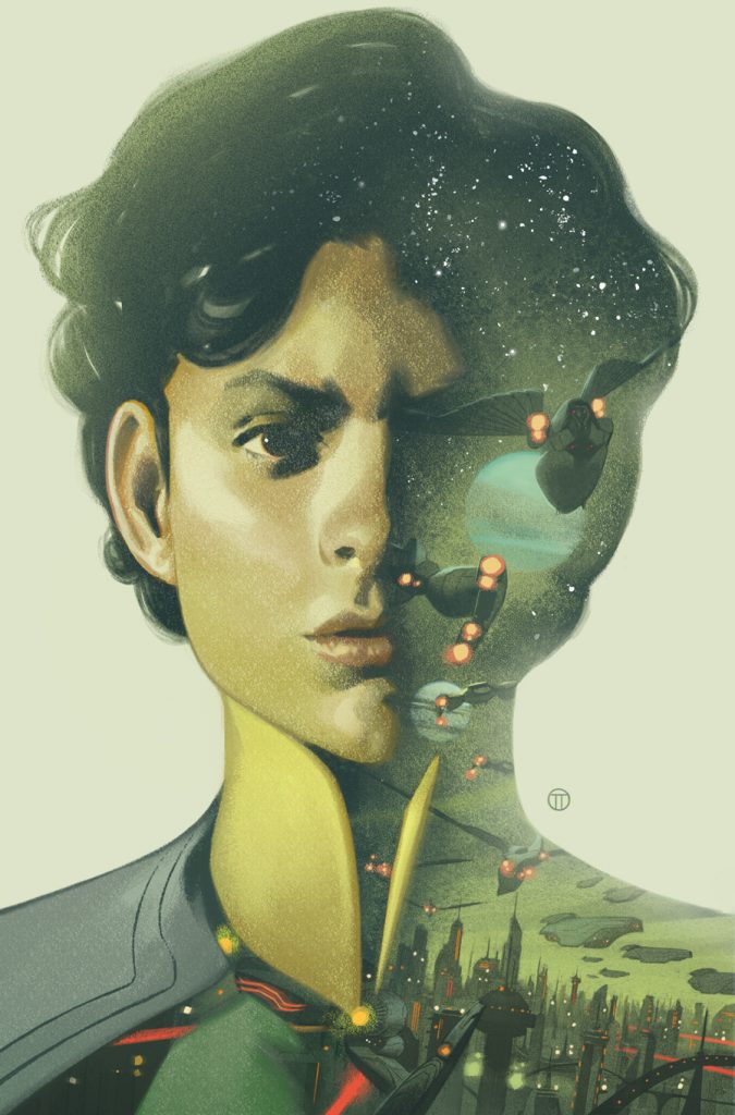
“Being his student gave me a north (star),” Tedesco said. “Here was a guy who drew comics for a living and was doing very well. I figured that if I paid attention and worked hard, I could too.
“And, luckily, so it was.”
Before he made it in comics, though, Tedesco did concept work for commercials as well as painting digital backgrounds on animated movies. He described that time as part of his “formative years.” It didn’t just pay the bills; it had a major impact on his work, especially considering how young he was when he started in animation. At only 21, his “approach to color was quite basic.” It grew on the job, as he “learned a lot about color theory” during that time, ultimately shaping how he works today. Pair that with his commercial work – which asked him to constantly change his style because of how each project required dramatically different things – and you have an important stretch that really “expanded (his) horizons.”
By the time he found a way to make it into comics in 2009 – he got his first work when he posted sample pages on a BOOM! Studios forum, who then offered him a mini-series – Tedesco wasn’t quite fully formed. But the foundation of what makes him a one of the best in the business today was already there thanks to everything he learned during that ten-year period.
Tedesco has always had a clarity of focus about what he wanted to do in comics. While most artists look for work where they can get it, with interiors being their goal, Tedesco’s objective was the opposite. He favored covers, starting with sequentials simply because that was where opportunity lied. Editors were looking for page samples rather than covers, so he leaned into what would get his foot in the door. But that was a means to an end more than anything.
“I always say that interior work was, for me, a kind of Trojan horse,” Tedesco said. “Once I was doing comics, editors were more willing to give me a shot doing cover work.”
While he did exemplary work before then, the first time I really took notice of Tedesco was the second volume of Thunderbolts. This series from writer Daniel Way and artist Steve Dillon launched in 2013, and while it was a decent enough title, its most lasting impact might have been its covers. Tedesco had his first extended run as the primary cover artist there, providing pieces for 23 of its 32 issues. And you can almost see Tedesco either figuring out what he wanted to do with his art or being unleashed to be his best self with each passing cover.
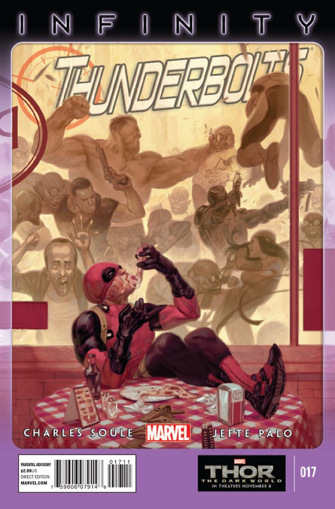
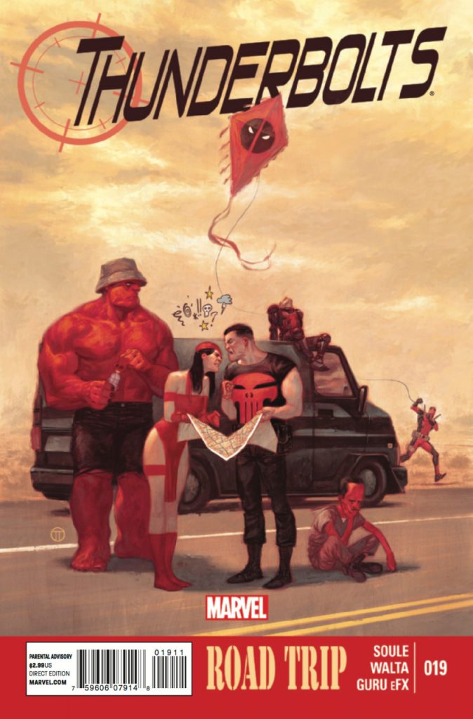
While the covers were always striking, as the limited palette the artist used – color has always been one of his greatest strengths, a point Del Mundo emphasized – made each piece pop, it wasn’t until later in his run when the vivaciousness and personality Tedesco brings really started to stand out. Issues #17 and #19 especially felt like aha moments, as Tedesco turned those covers into little superhero slices of life through a Rockwellian lens.
They also emphasized something Tedesco excels at in particular: character work. Shaner noted that earlier as a strength, but it’s worth reiterating. Tedesco doesn’t just draw characters on his covers; he brings them to life for all to see.
“A lot of the folks who paint, whether traditionally or digitally, are very accomplished artists who are able to mimic and mirror reality back to the reader in a way that’s interesting,” Shaner said. “What Julian does enhances all that, exaggerates and injects life into that school of thought, while maintaining a believability that was shocking to me the first time I saw his work.”
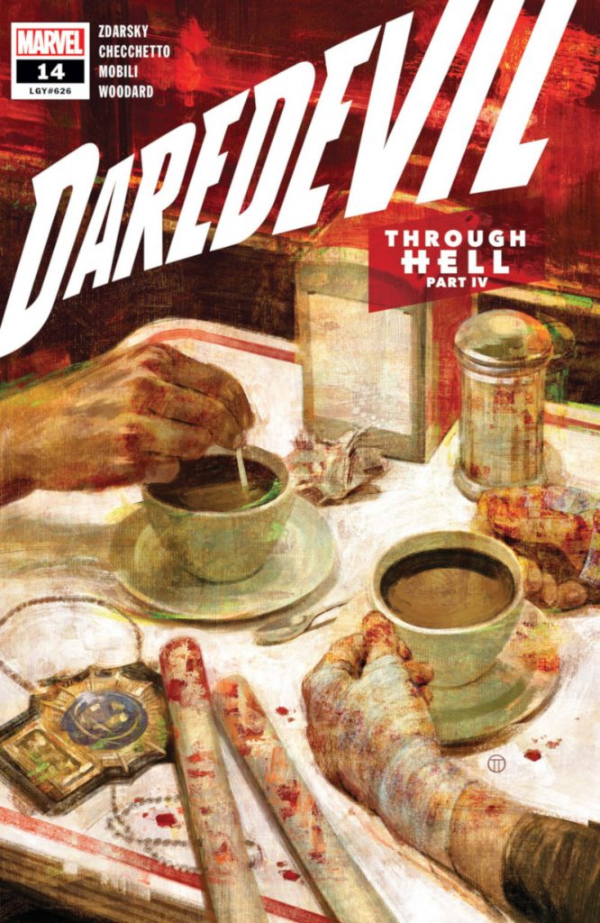
From there, it was on. Tedesco blew everyone away with runs on Kelly Thompson and Leonardo Romero’s 2017 Hawkeye series and the current volume of Daredevil from Chip Zdarsky and Marco Checchetto, to say nothing of the countless other titles he has blessed with his work. And blessed is truly the right word. A Tedesco cover adds weight and gravitas to a release. You know implicitly by its presence that the comic it’s on is a big deal. It can change how a title is viewed, both by the comic reading public and the creators working on it. Zdarsky told me that Tedesco “set not only the tone for” this current volume of Daredevil, “he also set the bar for the quality of it.”
“There’s nothing worse than seeing a gorgeous cover and opening the book and being disappointed by the art and story inside,” Zdarsky shared. “Knowing he was on the cover made Marco, myself, and the rest, raise our game.” 3
Zdarsky is an artist himself, so he knows what to look for when it comes to the craft of comics. While he appreciates the strengths of Tedesco’s peers, he can see weaknesses in most cover art. That’s not the case with Tedesco.
“With almost every great cover artist I can see their shortcomings, but Julian just doesn’t have any that I can see,” Zdarsky said. “Design, color, rendering, concepts, they’re all the best.”
While trying to choose a favorite cover from Tedesco is a near impossible task, the one that has stayed with me the most was his cover to Daredevil #14. It’s an unusual piece relative to your average superhero cover. It’s a close-up of the bloodied hands and fighting sticks of Daredevil as well as the badge of Detective Cole North, as the pair enjoys a cup of diner coffee together. Its unusual nature is one of its greatest strengths. Tedesco often finds an angle here or a way to tell a story there that makes each piece feel singularly like him.
While this idea wasn’t his – Zdarsky created the general concept – it still became something great thanks to Tedesco’s approach to cover art. The artist presented three options to the Daredevil team. Zdarsky knew which to pick, if only because who would be executing it.
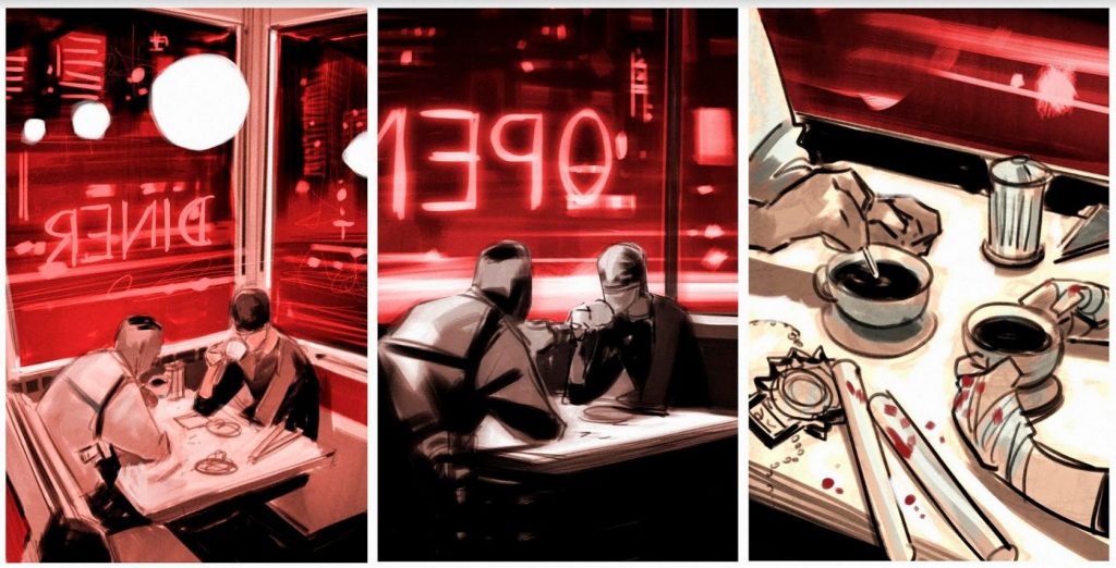
“If it was any other artist, I wouldn’t suggest going for that closeup shot, but we all knew that Julian could make that shot feel heavy in his final,” Zdarsky told me. “And boy did he.”
While Tedesco’s talents are undeniable – Dauterman described the artist as having “this magical combination of art styles,” fusing traditional, painterly illustration with modern graphic design and the energy of comic art – it might be the way he zigs when others might zag that truly sets him apart from his peers. While he can knock us out with an iconic, singular image of a superhero, he always seems to find something unconventional and extraordinary by digging a little deeper than others might, 4 which matches what he looks for in a great cover.
“I love when I’m surprised by a cover,” Tedesco said. “When someone solves a composition peculiarly, or when an artist chooses to go in a direction that I wasn’t expecting.”
That could be the reason Rockwell was the only artist Tedesco mentioned when talking about his approach to cover art, rather than any of his fellow greats in the field. He described the illustrator as someone who “was exceptionally good at telling stories in a single image.” That’s a rare gift. Not everyone can blend each element – the craft, the character, the color, everything – and come out the other end with something that makes people know and feel the right things in the right ways, even if they don’t understand why.
But it’s a gift Tedesco carries with him to each project.
While his peers might be eager to talk about Tedesco’s talents, the artist is considerably more self-effacing about his work. He pushed back against the idea that he’s one of the finest cover artists of this period, telling me he’s happy with “one, maybe two covers (of) every twenty” he does. While most would disagree with his hit rate, perhaps it’s important to Tedesco’s success that he looks at his work in such a way. That could be the reason he keeps looking to push himself in new directions, preferring to never stay too focused on one look or feel for too long. Each project asks different things out of him, but you can look at his body of work and see periods where he moves on towards something new. That’s deliberate.
“I try to have fun, and I try to keep learning and moving on,” Tedesco said about his evolution. “Sometimes I get excited about a specific technique and do that for a while, and suddenly I want to switch to something completely different.”
That’s likely crucial to his success, especially considering Tedesco’s rise has coincided with an evolution of what covers represent in comics. Once designed as trailers of a sort for the comic you’re holding, they’ve become an opportunity for artists to flex their muscles and evoke the feeling of a character or title rather than being as literal as they used to be, especially on variants. 5 Comics critic Oliver Sava believes this has “opened the door for more personal interpretation and stylistic expression” in the form, something Tedesco excels at.
“Tedesco is one of the best when it comes to tapping into a character’s essence, and his recent Action Comics variants showcase that talent by finding fresh ways to explore some of the most classic iconography in superhero comics,” Sava said. “Images like Clark opening his shirt to reveal the S-shield or Superman crashing through a wall gain an extra thrill when filtered through Tedesco’s point of view.”
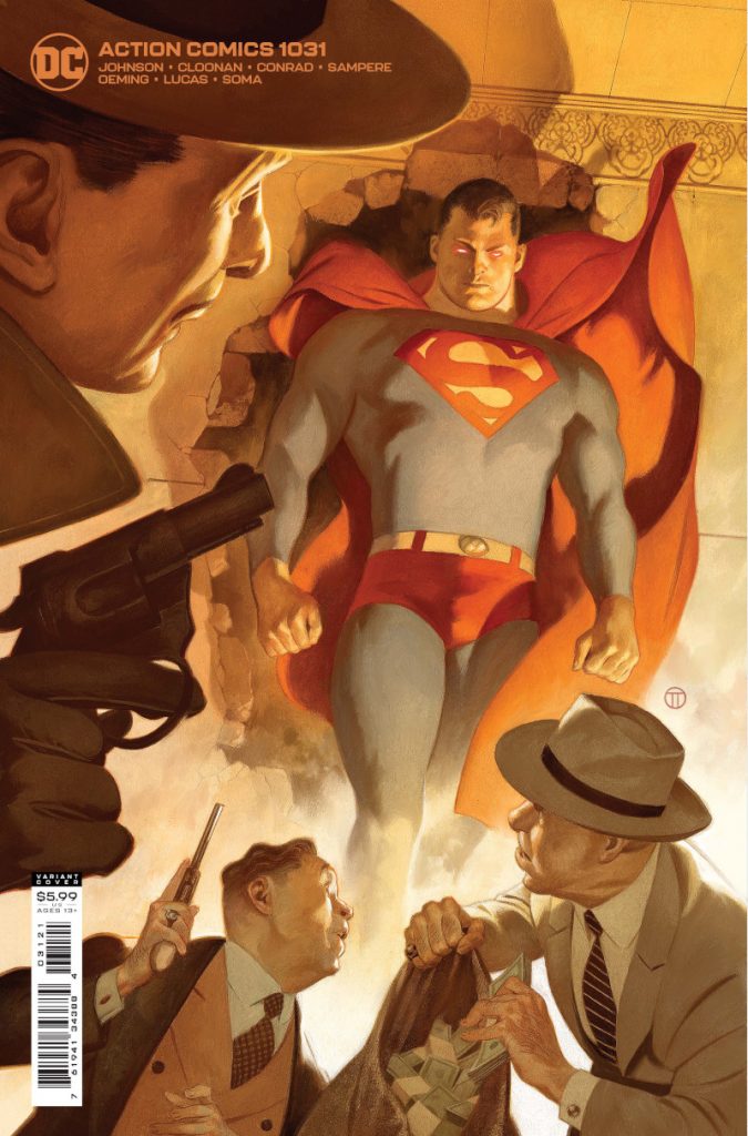
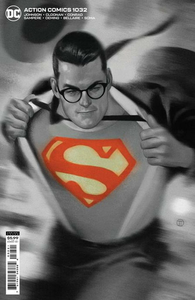
The fascinating thing about those covers Sava is speaking to is they easily could feel like throwbacks. Between his style and the ideas depicted, Tedesco’s Action Comics variants would fit on a magazine cover in the late 1930s celebrating the rise of the hero. But they work equally well today thanks to the enduring nature his art. Marvel editor Nick Lowe said that’s a key aspect to Tedesco’s work. There’s a real timelessness to his covers.
“Sure, art historians or, in this case, comic book nerds like me can find key things that pin it to the current day,” Lowe told me. “But humans from any time period would drool over JTT.”
It’s been 22 years since Tedesco first started on this path. During that time, he went from someone desperate to find a way into comics to one of the finest artists within the form. While he might bristle at the latter sentiment, it’s unfortunately not up to him. An artist’s position isn’t dictated by them as much as it is their peers and those who engage with their work. And when even the most gifted artists in comics look at your work and say, “I want to be like that guy,” well…you’re on a different level.
That’s where Julian Totino Tedesco resides: at the top, always looking for more.
He’s the other person I’d expect to finish in the top two with Del Mundo.↩
This translates more specifically to “cartoonists,” but comic book artists is what Tedesco described the word as.↩
Tedesco left after covering 18 of the volume’s first 20 issues, which made Zdarsky “super grateful that Marco was able to take on covers when Julian left so we could keep that quality going.”↩
A good example of this is how he puts a coffee stain as well as a location and date on his variant to Action Comics #1036, which underlines that this isn’t a drawing of Superman, but a photo. Smart!↩
They’ve also become an increasingly valuable tool in motivating orders from comic shops and purchases from customers, giving someone like Tedesco greater value to the overall comic sales exercise.↩
