
The Substance of Style
The direct market and its readers have a strange relationship with “different” styles in art. Let’s talk about it.
“Style.”
It’s an innocent word on its own. It just means someone’s look or appearance, effectively. That definition isn’t much different when it comes to comics art. For an artist, it’s what you bring to the form, the vibe and energy you realize on the page within your work. It distinguishes you from your peers and, in many ways, becomes your identity in comics. You might not have it from day one, but gradually, it becomes yours and yours alone.
There are many flavors of style an artist can bring to comics, each of which is valid, and each of which has its own strengths. Just think of all the talents out there in the comics space today and how different they can be, all while still being incredibly effective. Julian Totino Tedesco can channel Norman Rockwell as he covers a comic with Chris Samnee’s Toth-like minimalism inside of it. Faith Erin Hicks can marry the energy of manga with the playful cartooning of Jeff Smith. Stephanie Hans might break our hearts with her painterly work while Dan Mora amazes us with his lively lines and even livelier character acting. It’s incredible. Readers are lucky in 2021. There’s a broader mix of styles coming from a greater number of talents than we may have ever seen in comics before.
And yet, the very idea of style can work against artists in surprising ways. Despite its innocence, this word is a loaded one for many on the direct market side of things. It can completely change the perception of a competent artist if their look doesn’t jive with a reader’s vision of what comics are and how they should look. Your work could be labeled as “bad” amongst fans or even ill-fitting for certain genres amongst those in charge — not because of actual storytelling weaknesses, but because your work happens to show influences outside of the accepted norms within the market.
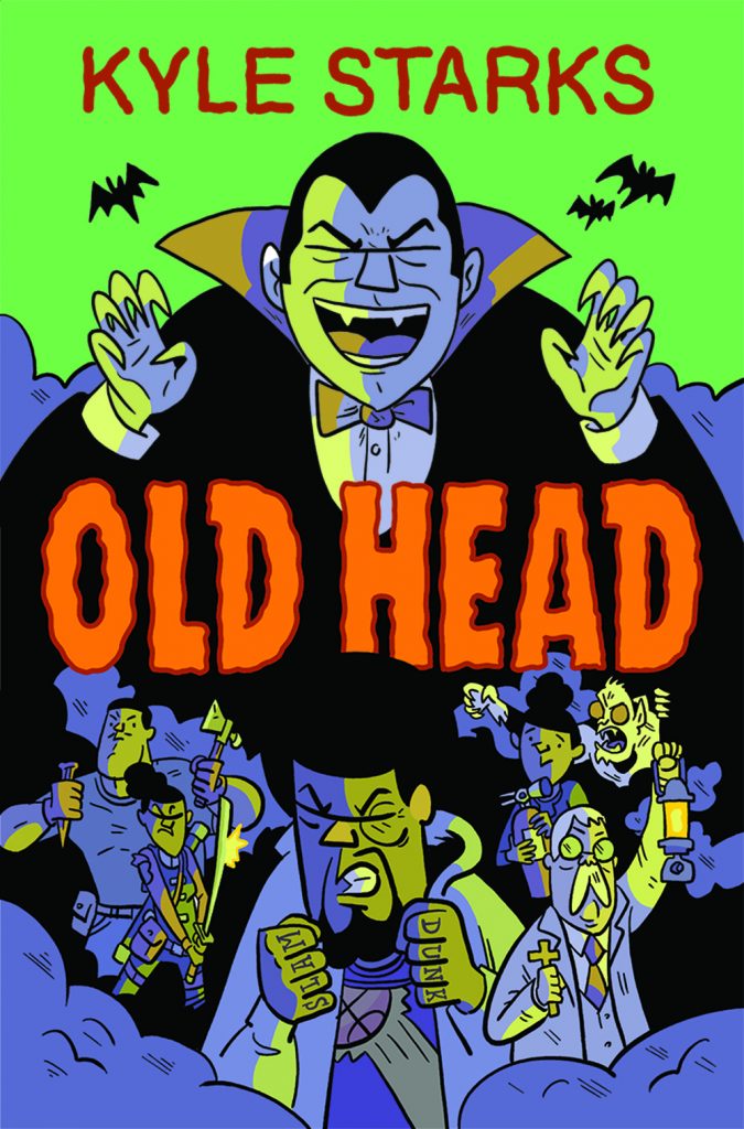
It can be a four-letter word, a bridge too far, a formula no one wants to mess with. And it’s a known issue, something creators with styles that fail to match the “usual” are all too aware of. When I asked Kyle Starks, the cartoonist behind Old Head and Sexcastle, about this subject, he responded with certainty, saying, “A good portion of direct market consumers absolutely prioritize aesthetic over storytelling.”
“No question.”
It’s a subject I’ve long been fascinated by. So many of my favorite artists and titles aren’t ones with looks that are so a) easily defined or b) fitting of the accepted standards of the market. And it’s especially interesting because it’s a focused phenomenon, one that primarily exists in the purview of the direct market. 1 Within the works we see each Wednesday at comic shops, there has long been a box you belong in as an artist. And it could change everything for you if your style resides outside of it.
It’s also a topic that comes with a million questions tethered to it. How big of an issue is it? What kind of impact does it have? How does it affect the approach of artists? Why is it a thing? And perhaps most crucially, is this idea changing as the readership and the shape of the comics industry does? Those sound like some good questions. Let’s try to find some answers.
In discussions with artists, two commonalities quickly stood out: one, this is definitely a thing; and two, they understand why it’s one, at least to a degree.
“Style is everything,” cartoonist Zander Cannon of Kaijumax said. “It has a completely overwhelming effect on whether you believe what’s happening, whether you empathize with characters, whether you want to spend time in this world, etc. I think art style is the single greatest factor that gets books picked up in the first place — both to be published and off the racks.
“People will stick around for good writing, but if the art vibes are off, a book will really struggle right out of the gate.”
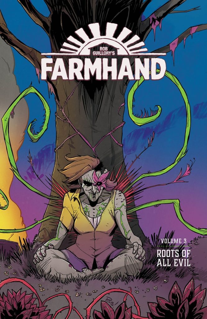
Farmhand cartoonist Rob Guillory gets why readers would focus on style when it comes to art. He described it as “the car readers have to ride in to experience a story.” This changes how fans engage with comics entirely. Where the difficulty really lies in Guillory’s mind is in how it can limit what fans will read, as if one style is wrong and another is right.
“The problem is, some readers will judge the car from the outside at first glance, never get in and miss out on the ride of their lives,” Guillory said. “Many art styles, mine included, aren’t built to be ‘pretty.’ They are built to drive a story forward.”
While there are always exceptions to this, as Frank Quitely and Samnee were mentioned as artists who have stylized looks yet still earn their flowers from fans, 2 it can be a pervasive belief that can affect not just how artists are perceived but also how they view themselves. That’s especially the case for those newer to the industry. Take Max Sarin as an example. These days, they’re known as a wondrous cartoonist, someone who brings bundles of life and energy to projects like Giant Days and Wicked Things. But they had a hard time envisioning a path in comics originally, if only because of how they viewed what comic art had to be to connect with readers and publishers alike.
“I grew up thinking there was only one type of style to draw comics if you wanted to (do) anything ‘serious.’” Sarin said, saying they originally believed, “’I need to draw all the characters with ten thigh- and arm-pockets and sexy nonexistent waists!’”
The mental aspect of crafting art cannot be underrated here, especially for new generations coming in. When you aspire to work at a direct market publisher like Marvel or DC where everything might have a certain look, it can weigh on you when your natural style doesn’t quite fit. An artist could end up believing their style is “wrong” when it’s perfectly valid — especially when you can really tell a story. The narrow vision of what comic art should look like in certain segments of the industry can lead to negative self-reflection from artists or even leaving comics prematurely because they believe that there’s no place for them. Feelings like this are what led to Sarin never even apply for DC, Marvel or other major houses. They were “sure (those publishers) would not find my style appealing.”
It isn’t just mental either. Both Cannon and Guillory told me they had been asked by publishers to draw in different styles earlier in their career, 3 at least in part because they were viewed as capable of changing their natural look. Guillory believed his style was a significant roadblock early on, with editors having a “hard time believing audiences would accept a ‘cartoony’ art style on a serious story.” That resulted in him almost being typecast for more kid-centric, all-ages audiences because of the way his look was perceived. 4
As a parallel to that, working in a specific genre with a style that fits it can become a trap for artists, dictating what your art is and should be going forward to readers and publishers — even if that’s not all you’re capable of or what you want to do going forward. Even worse, it can result in readers passing on titles altogether, as Starks mentioned, “direct market readers want Jim Lee not Jeff Smith and I’m nowhere near either of them!”
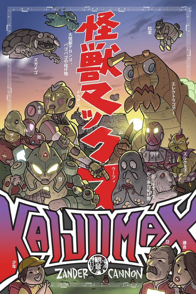
The interesting thing is the problems these artists have had in their careers almost never relate to their gifts as storytellers. A good example of that comes from Cannon. He told me he had run “into a lot of roadblocks” in the 1990s because of how he had “a cartoony style.” While he would do what he could to earn work, he found that he “hit the edges of (his) tolerances pretty quick,” and that his tendencies would always result in his natural style leaking into the background. He didn’t believe this was because of editors. Instead, it was the companies as a whole responding to what direct market readers wanted. Because of that, he turned towards layout work, which leaned into his irrefutable gifts as a storyteller without the perceived baggage of his style. He was eminently hirable — if someone else finished each page. 5
It’s a fascinating phenomenon, and one that has a complex web of reasons for its existence. Starks believes reader perceptions play a big part, saying, “I think people – meaning as a group – have expectations about what a thing is supposed to be.”
“No one wants spaghetti or pizza from McDonalds. I think they want American comics serious and drawn in that superhero house manner,” Starks added. “I think that’s just the expectation of what comics should be and deviating from that expectation is ‘bad.’”
Readers want the right look for the right book, even if that idea has been created by decades of precedent rather than what’s actually “good.” That’s part of the reason Cannon quietly delights in being unable to use real characters like Godzilla and Ultraman in Kaijumax, as these characters would come with expectations from “pedantic kaiju nerds” who know all the details of how these characters should look. It’s also, to a degree, the roots of groups like Comicsgate, whose regressive beliefs as to what comics should look like seemingly stem from the styles of the 1990s. 6 Many readers have expectations, and art that doesn’t match those can be viewed as wrong rather than what it is: different.
Much of it comes from the publishers, though. They respond to what readers seem to like and believe that one success means audiences likely desire more of the same. 7 This created decades of repetition and even homogeny at times, resulting in what many have referred to as “house styles” at Marvel and DC. That’s why it’s hard to pin this trend on any one thing. There’s a bit of the chicken or the egg behind how style is perceived in direct market comics. Do publishers only go with certain artists because it’s what readers want? Or do readers lean towards specific looks because it’s what these publishers have always given them?
Whatever the reason, it does seem to be a mostly Marvel and DC issue, as well as one for the creators who work there. While original titles might occasionally struggle selling themselves to certain readers because of how they look, everyone I talked to suggested that new ideas are freer to do what they want visually because they lack the expectations created by established history. It’s like Cannon told me: “Something new can define itself however it likes.”
But the visuals of superheroes and licensed properties are always measured against what came before them. The past is what you’re expected to live up to as an artist. Guillory experienced this firsthand a few years back when he worked on a Thor one-shot. He told me critical reactions to his work “tended to be along the lines of ‘This isn’t how comics are supposed to look.’” Readers want a certain flavor because that’s the one they’re used to.
It even makes sense to a degree. If a gritty crime comic was drawn in the style of Adventure Time, it might not jive with the story that’s being told. That’s not to say these types of pairings shouldn’t happen, but it can feel incongruous when they do. 8 But it’s worth noting that superheroes aren’t a genre as much as a universe in which genre fiction operates. The idea that any one style should dominate – whether it’s Neal Adams-like or Jim Lee-inspired or whatever – feels reductive for that very reason: the presence of super-powered individuals doesn’t define what a story is.
Other factors from these universes play a part as well. Cannon believes “company-owned, line-wide continuity (is) the culprit here,” as readers who are invested in these worlds want visual assurances that the story they’re engaging with matters. Cannon’s not wrong there. That idea is crucial to the continuation of this problem. In trying to get a read on how “different” styles are perceived at the Big Two, someone at one of the houses noted that the use of certain art styles can define whether a title “counts” in the minds of readers.
Cannon mentioned The Unbeatable Squirrel Girl to me, and that’s a perfect example of what we’re talking about. It almost operated within its own time and place despite carrying all the accoutrements we’ve come to expect from Marvel universe stories. 9 Erica Henderson and Derek Charm crushed that book with pitch perfect visual storytelling throughout, but there’s likely a reason they worked on a book like that rather than an Avengers or Justice League title — and it has nothing to do with ability. Someone like Ivan Reis or Pepe Larraz telegraphs to readers that a book is a big deal. But if you hire Gurihiru and it might suggest a project is more of a lark than something of substance. 10 The significance of a project can be implied by the artist hired for it, or at least that’s the belief.
Marvel and DC’s relationship with style differs significantly, from what I understand. Marvel titles seemingly have much more freedom to do different things visually, especially in universe. That said, while they don’t have strict visual guidelines, it was intimated to me that the sales viability of an artist might be considered in the process of casting a book, at least in the past. It isn’t the top consideration by any means. But the subject has come up before. That can especially be the case for major books. Ones on the periphery get a ton of freedom. Flagship titles might come with expectations.
DC, on the other hand, has long been perceived as a home to the dreaded “house style.” The belief was that only certain looks – often in the school of Jim Lee, Ivan Reis, or Greg Capullo over the past decade – really get the time of day there. But I was told the weight style has in casting considerations isn’t as significant as it was before the departure of Dan DiDio and other voices in editorial. With a younger, more art-focused group of editors, a bit more stylistic freedom is welcome now. Like with Marvel, the significance of a book plays a part in how much leeway one might get – sales numbers are the ultimate guide, and the wrong artist on a book that can make a massive difference – but the rigidity of the past is waning.
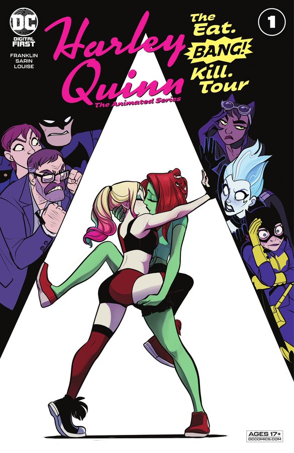
Sarin’s a perfect example of how much accepted styles have shifted at DC. The artist never even considered working for the Big Two as an option because of their style, but fate had other ideas. DC contacted Sarin directly, hiring the artist for Harley Quinn: The Animated Series – The Eat. Bang! Kill. Tour!, a continuation of the HBO Max series that perfectly fit their vibe. Sarin told me they initially believed the offer was sent to the wrong person, but nope. DC wanted to be in the Max Sarin business when Sarin once thought that to be an impossibility.
Cannon believes a path to more styles being accepted at Marvel and DC is leaning into more self-contained, perhaps out-of-continuity stories. The good news is, his belief is being realized in real time. We’re seeing that especially at DC, as domains like Black Label, their YA and middle-grade graphic novels, and their work with mobile comics giant Webtoon has led to the publisher’s characters being brought to life in a wide array of styles. The main line might still be a bit narrower – although with manga-influenced artists like Jorge Jimenez and Dan Mora leading the way for the Batman line, that might even be shifting – but the mix of artistic voices at DC is broader than it ever has been thanks in part to its diversifying approach to publishing.
That’s a good thing. While it will take a while longer for readers to adjust, as they’ve been conditioned to expect certain things from certain books and changing that will be a process, important steps are being taken. And that could have a larger impact even outside of Marvel and DC. Cannon noted that the rigid stylings of Big Two books can create dissonance in readers when an artist moves from superheroes to a considerably different genre. There can be “a reverse effect to a degree” as the superhero energy don’t always translate to, say, a fantasy title. If readers stop being conditioned to expect a specific look depending on genre, that could have an impact on the types of stories artists can find success in.
And it could have an area of effect on non-licensed titles as well. While there’s greater acceptance of different styles on original works like Cannon’s Kaijumax or Guillory’s Farmhand, readers always craving one flavor naturally creates a lowered floor and ceiling for titles that don’t fit. The bulk of direct market customers are in comic shops for Marvel and DC titles, and that limited view of what “good” art is can harm even unrelated comics. It’s like Cannon told me: “there are always people – especially in the direct market – who hate cartoony, absurd things.” That can be difficult to overcome. But if the idea of what comics should look like to direct market readers becomes much more diverse, then that’s going to open a lot of doors.
Everyone I spoke to believes, to varying degrees, that this problem is becoming less of an issue even outside of the purview of Marvel and DC. Sarin has seen a real change just in the short time since they started their run on Giant Days at BOOM! 11
“The variety of styles and appreciation for them has grown immensely,” Sarin said. “The categorizing of styles into genres is the same kind of neat boxing you had for many things in the past and it is thankfully slowly fading away.”
Part of that might be because of the glacial adjustments being made at the monoliths at the head of the direct market. It might also be because readers have become more welcoming as those two make tweaks to their formula. Cannon thinks it has more to do with how the wider comics market has changed and the ways creators can tell their stories have expanded.
“I don’t think that it’s that anyone’s gotten more enlightened, I think it’s just that there are more avenues for artists with an array of different styles to get a foothold,” Cannon said. “Someone can cut their teeth in licensed comics of animated properties and hone all their skills there without ever drawing Batman once. All these brilliant cartoonists that 20 years ago might have done one or two indie books for no money before getting work as an art director somewhere can get kinda-sorta decent paying work and name recognition. I sure would have loved a Rick and Morty or Adventure Time drawing gig back then.
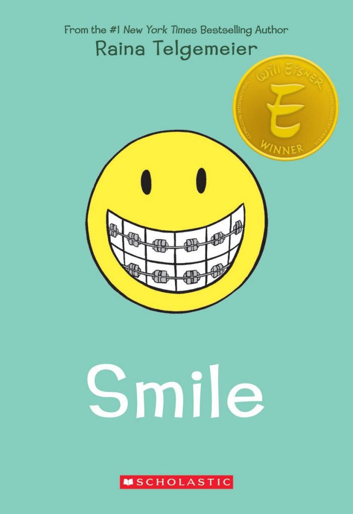
“And having Raina Telgemeier and Dav Pilkey — brilliant artists that never would have made it through the lobby at Marvel — top the charts by huge margins every month, year, and decade sure gives the previous generation of gatekeepers something to think about.”
That last note from Cannon is a crucial one. As the biggest dollars in comics have shifted towards the book market, all-ages comics, manga, and platforms like Webtoon, the center of our known comic universe has moved. The Big Two aren’t even the ones defining what comics should look like for the bulk of readers these days. What the medium can be is much different than what we used to expect from floppy, staple-bound, 30-page comics as the near exclusive format. Many of the new readers don’t have decades of comics in their brains cementing what they should look like. They just look at a comic and enjoy it if it works for them. That’s why you can have a Batman universe story drawn by Jimenez, Andrea Sorrentino, Starbite, Nicole Goux, or whomever today and still see it become a success.
It just comes down to finding the right fit for each project. That’s crucial in Guillory’s mind — and in his career. After years of being pigeonholed as a cartoony guy that should work on kids’ comics, his biggest success came when he took on a project starring a cannibal cop. As he said, Chew proved “there are a lot of readers totally open to a new type of aesthetic. It just needs to fit the right story.”
That’s why someone like Sarin only feels emboldened by this period of change. Once the idea of being called “cartoony” baffled them, but now, Sarin is focused on becoming a better cartoonist, one with “better animation and clearer expressions, more characteristic backgrounds.”
“I enjoy doing expressive faces, lively characters and I trust the right writers/projects find me,” Sarin added. “(Harley Quinn: The Animated Series – The Eat. Bang! Kill. Tour) is proof they do.”
There’s always more that could be done. Starks is eager for a future where fans are “screaming” for exceptional talents like Erica Henderson to draw Wonder Woman or Matt Smith to work on an Avengers book. 12 Those A-list books might be tougher nuts to crack. But if the audience continues to change and what sells keeps shifting, that will go a long way in incentivizing the big companies in the direct market to move with. Money is a heck of a motivating factor. That’s why you see Marvel teaming up with Scholastic and DC partnering with Webtoon: they have a better feel for what moves the needle for the audiences of today than the Big Two. They’ll continue to adjust as the market does.
And readers will adapt as the stories do. A big part of their rigidity likely stems from publishers playing it safe for decades. As we’ve learned in recent years, echo chambers are real things, and breaking people out of those can be difficult. But expanding what comics look like – mainly in the direct market – will push readers to see the medium and what fits certain stories a bit differently. As Guillory mentioned to me, this whole issue has less to do with quality and more to do with readers accepting that a story can be told in a different way than they’re used to. There’s only one way to get there, and it “requires the reader to step outside their comfort zones a bit for the sake of expanding their palette.”
“It’s tricky,” Guillory added.
“But who ever said art was supposed to be a safe enterprise?”
Also known as the land of comic shops. That’s where the focus will fall for this piece. It just doesn’t feel like this issue is as pronounced outside the direct market.↩
As someone who has interviewed both of them and done a lot of research in preparation of those chats, I will note that even they have their detractors based on the subject of style. Quitely’s faces are “weird” and Samnee’s too “cartoony,” to some. Sure!↩
Cannon said his solution was to agree, then draw it in the same way as before, besides adding more detailed backgrounds and more rendering to shadows. That was about it. As he told me, “It was that or making everything look properly proportioned and doing all the perspective correctly, but who has the time for that?”↩
He said this has changed after the success he had on Chew, although he did note that he still gets “the occasional editor who has a hard time visualizing me on a superhero book.”↩
See: Top 10, an incredible series with layouts from Cannon and finishes from Gene Ha.↩
Everything I’ve seen from them certainly seems like it desperately wants to finish in Wizard’s Top 10 Artists list from 1993.↩
See: The 1990s and the invasion of Jim Lee clones.↩
Which can be used to the advantage of the creator, as Cannon shows in Kaijumax.↩
Characters, continuity references, tying in to events, etc.↩
Which is ridiculous. I would read Gurihiru drawing anything so I am clearly a bad fit for this premise. Also: Fun comics are fun!↩
And by that, I mean 2015.↩
I too am all about this future!↩