
Clean Lines and Dirty Sci-Fi: A Look at the Art of Drifter with Nic Klein
This week's art feature focuses on Drifter's artist supreme
As many have said, it’s an awfully good time for comics. You look around enough, it’s pretty easy to find a comic that would interest almost any type of reader. As one with diverse interests, I’m finding a lot to pick up these days, but few books intrigue me as much as Ivan Brandon and Nic Klein’s Drifter. While Brandon’s script and developing plot is deeply fascinating – especially considering how close to the vest they’re playing what is really going on – the main reason for me are the visuals. Tom Muller’s design is second to none, of course, but Klein’s art…it’s the heart and soul of this book.
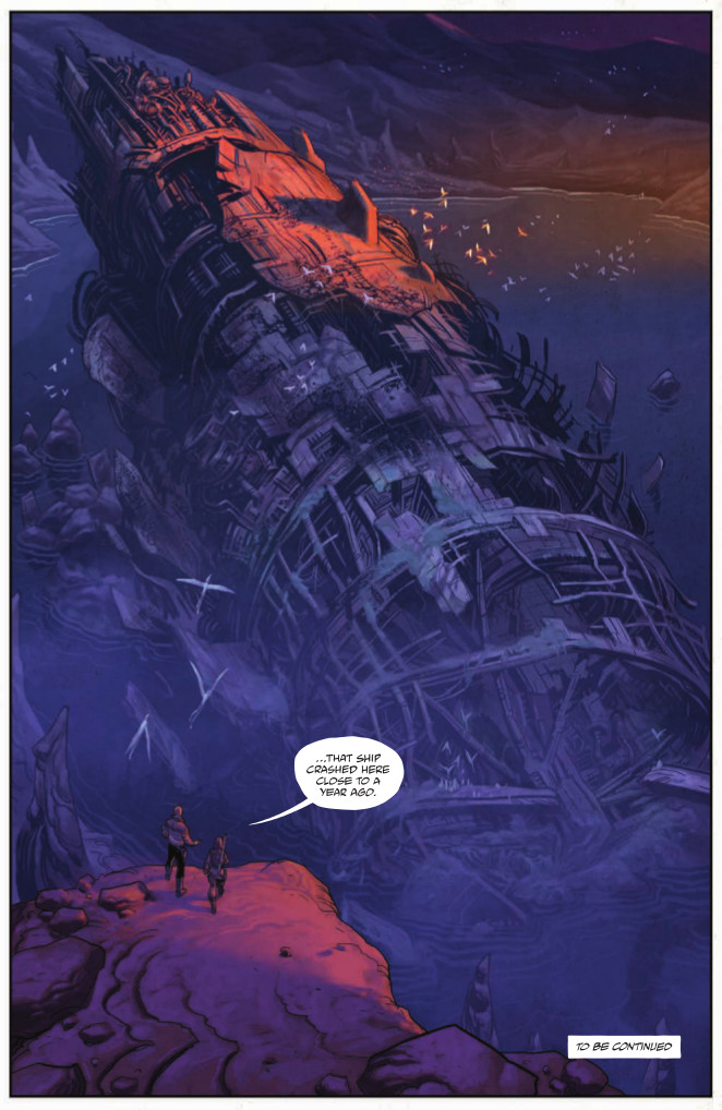
In Drifter, he’s approaching his art in a slightly different way, and it’s resulting in the best work of his career and some of the finest art in comics today. He helps make this story – one of a lost soul named Abram Pollux who is desperate to find out what is going on after he crash landed on a planet called Ouro – one that transcends its genre into being something great for any story.
Klein’s my featured artist on this week’s art feature, and today, we dig into the first volume of the comic and talk about his approach, what he’s doing different on this book, science fiction, what it’s like bringing something gruesome to life, and much more. Take a look, and if you haven’t read the book at all yet, beware some ever so slight spoilers.
Before we jump into the world of “Drifter”, can you share what you use to bring this book to life and how you do it? I know it’s all digital, but I’m curious as to your process for the book as well as what tools you use.
NK: My process is pretty simple, as always I read the script and do thumbnails. At this point I know if there is anything that needs to be designed for the first time (vehicles, ruins, etc.). Sometimes Ivan based things that find their way into the script on scribbles I did before. Sometimes I visualize things he came up with. From there on I move straight to the “pencils” and “inks”. Since, as you mentioned, I work 100% digital on Drifter I do all of this in Photoshop. For the pencils, I just pop a new layer on top of the layouts layer and go. After the inks, I start to color. This part almost takes the most time since I try to do most of the rendering in this stage.
When you and Ivan were first conceptualizing this book, what appealed to you about the story, and have you found the things you enjoy about it evolving as you’ve moved along in the story?
NK: What appealed to me on a meta level was the worn out and used look that everything has on this world. All tech has seen better days, everything is thrown together, this is no shiny sci-fi, people have lived in and with these objects for a long time and it shows.
As for evolving along the way, there is new stuff coming along all the time, so it’s always cool to uncover a different angle of the book visually.
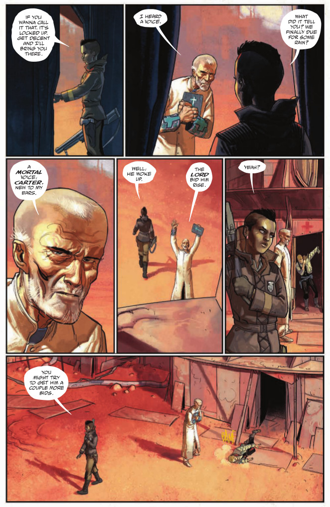
I would hardly call the book a comedy, but there are some bits of Drifter that have made me genuinely laugh out loud. This moment where Abram first makes it outside in Ouro after he wakes up and falls over is a pitch perfect example of words and pictures working together to really nail a moment, or in this case, to make readers laugh. What do you think the key is to making a comedic scene like this work?
NK: Whew, thats a difficult question, comedy is such a broad feeling and often based on personal experience. In a medium that is static I would say the best way to achieve comedy is timing.
In the scene you mentioned for example, had there been a panel showing him fall slowly or trying to soften the fall with his hands it would’ve maybe read as tragic, but from standing to falling on your face from panel to another, along with Carter’s comments to the optimistic Brother Arkady makes for a (hopefully) comedic element.
How do you and Ivan work together? Are you working from a full script, or something else?
NK: Ivan writes a full script for me. We usually have a Skype meeting with our Editor Sebastian Girner and talk about things that need to take place in the next issue, etc. From there, Ivan makes a coherent narrative out of it and polishes it with awesome. Ivan has a great grasp on the characters and their personalities and it almost makes drawing them and their emotions happen automatically without thinking about it a lot.
One of the things I think is the most impressive about your art on this book is the coloring. It’s a sci-fi story, but there’s something about the way you color it that makes a scene like this feel all the more realistic. What were you going for with colors in this book? Weren’t you trying out a slightly new coloring practice for this book in particular?
NK: I wanted a painterly feel but I did not want to drop line art completely. I think what came out was good medley of the two. Most of the rendering is done thru colors and I think that adds a lot, for one thing it takes harshness out of it and adds softness. When you’re rendering with inks (thru line and spotted blacks) you’re adding not only texture but also a lot of darkness. While you can obviously go dark with colors well, it is a different darkness, maybe one that feels richer. Black is the absence of color (or the accumulation of color, depending on what color theory you’re into), so if you’re using a lot of black the art becomes heavy, which is great, but it isn’t the look we wanted on Drifter.
I know the SFX are all you in the book, but one of my favorite things you do is how they’re an interactive element in scenes like this. The BZING SFX is cut by the very bullet that’s making the sound, and it’s a really cool, really unique element to the scene. Is that just one of those magic moments of comics, or do you look for ways to integrate SFX with what is creating it?
NK: I try to make an effort and integrate the SFX into the art. This is by no means something I came up with, it’s been around since comics themselves, although I have the feeling that with digital lettering a large percentage of the SFX are played on top of the art and seem generic.
By having the SFX in the art, and for example behind objects or in the distance etc, you also bring a sense of direction and depth into the image. At least that is what I hope happens. That is how I apply them anyhow. If there is a sound coming from behind a building, I would try to work it that SFX actually look like they’re coming from behind.
The same goes for the “emotion” of a SFX, by choosing a certain style in which to draw the SFX, you’re choosing a feeling that is portrayed. A very clean and jagged looking font, for example, can imply electricity or a sharp pain, and a soft a wiggly font has a soft and slimy feel to it (possibly). The SFX could be a good supporting role like in the “BZING” example…
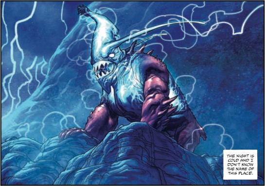
While I’m sure we’ve barely scratched the surface of Ouro so far, we’ve seen a fair bit of the flora and the fauna of Drifter, especially in the thoroughly exciting second issue. This lightning “Bear” is a particularly intense and interesting example, but we also got a look at the aquatic lifeforms when Abram dove into the water earlier. Are elements like the different types of plant and animal life something you developed before the start of the series, or is that something you’re putting together on a more ad hoc basis?
NK: With everything else it’s a bit of both. Some creatures were designed and have a function from the get-go, others are envisioned as they appear in the story. We know where the series will end, but the way there plotted pretty loosely, that means we have room to play along the way, this includes flora/fauna as is needed.
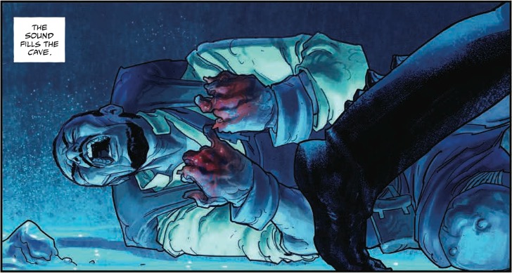
Was this as painful to draw as it was to read?
NK: You know, with stuff like this I try not to think of it being an actual person, because that would gross me out extremely. I also don’t google “reference” for things like this. Some people I know do. I just imagine what it would look like as a drawing, same goes for any kind of gore (like that shattered head in Viking). I try to imagine it very analytically.
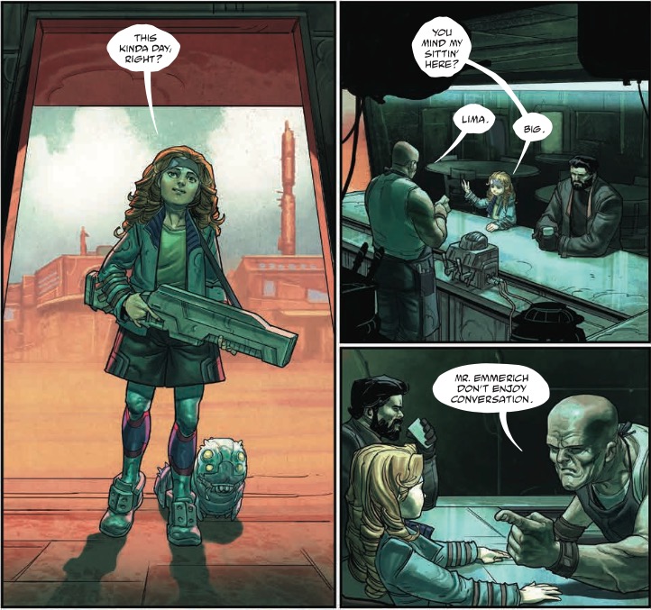
It’s kind of hard to explain, but one thing I’ve noticed with your art on Drifter is it seems you’re using thicker ink lines than ever on characters, and it really gives scenes like Lima’s introduction some serious pop. Was that something you deliberately did from the start, or am I just attributing something else you’re doing to the inks?
NK: Yeah, I’m using thicker lines, mainly due to the fact that most of the rendering is color, so sometimes I feel that I need to enforce the little linework that is there. Also, like you mentioned it does give everything a nice pop.
I didn’t plan this from issue 1, but it did evolve into this, just a visual preference that grew. Maybe it’ll evolve into something else down the road. It’s all a work in progress.
While there’s a pretty colorful cast, I don’t know why but I’ve gotten the impression you enjoy drawing Lima and her small companion more than others. Is that a fair statement? Do you find yourself picking favorites as you work on the book?
NK: I wouldn’t say that I like drawing her more, I find most of the characters are fun to draw. The great thing is that we do have that spectrum of different characters, Ivan makes a point of being diverse in the Inhabitants of this world, and it keeps me on my toes as an artist. It is easy to fall back into drawing the same people over an over when coming up with characters, so having a cast that has all types of personalities/body types makes it exciting.
I do have more fun on some characters than others, but it varies from issue to issue, sometimes it one of the established Protagonists, sometimes its a new character like Lima.
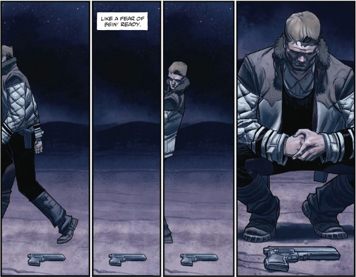
This is another one of those magic of comics series of panels I mentioned earlier, but I had to highlight it because it’s a personal favorite. I love how you keep the camera static and make Abram the element that is moving. For you, how do you develop a scene like this? Is this something that was a pretty straightforward read from the script, or did it come from you finding a better way to depict the scene as you did it?
NK: Ivan wrote this scene pretty much like this in the original script. With Abram exiting the panel and having a static camera, and him returning back into the panel. I added the panel without Abram in the middle, because I though the moment would read even better if there is a passage of time between the leaving and the return. Like most of Drifter everything is a team effort, we both try to make the best book we can so if we see room for improvement we go for it.
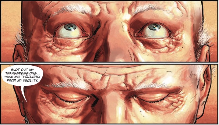
Close-ups on eyes like this are something you see in Westerns, which Drifter very much feels like in many ways. We saw several throughout the first arc, but in the fifth issue, there were three notable moments with three different characters that featured close-ups on their eyes. Was that a shot you were looking to use to parallel the various characters featured, or was it more of a situation where those just happened to be the most fitting options for the shots you had?
NK: In most cases Ivan will write a close up, how close he usually leaves open unless he has a super specific thing in mind, and even if not we can still go over it in the layout phase.
Close ups like this one of Brother Arkady always bring images from the Good, the Bad and the Ugly to my mind, in that showdown at the end. The close ups you mentioned in issue 5 weren’t meant as a parallel at least not from my part, but are more situation based.
All art from Drifter Vol. 1: Out of the Night, now available at fine comic shops and digitally on Image’s site.