
No Plan, Only Instinct: Marco Checchetto on the Art of “Daredevil”
Marco Checchetto was an artist whose work I always liked, but with the 2019 relaunch of Daredevil he took on with writer Chip Zdarsky, a flip switched. I’m not sure if I just connected with his art more or if Checchetto just kept pushing until his work elevated to a different level, but either way, the guy went from someone whose work I liked to an artist whose work I loved. 1 It was an artist ascendant, with a perfect marriage of talent and subject helping lift it even further.
And you know what? He’s only gotten better throughout, as his second arc on the book was even more impressive, bringing some Quesada-like vibes to the table on top of what we already knew him for. It’s brilliant work, but as per usual, I wondered, “How did that happen?” So I reached out to Marco, and yada yada yada, here we are with an art feature interview about his work in the book. Checchetto 2 discusses how he got into comics after growing up in a small town in Italy, what he first thought when he learned Chip was writing Daredevil, his biggest influences, why he loves street level characters, and more, before we dive into a discussion about five pages from his run on the book. Big thanks to Checchetto for taking the time to chat, as he’s a rather busy guy these days, and deservedly so.
You’re from a small town near Venice, Italy, which is probably not the first place most Marvel fans think of when they think of artists. What was your path to getting into comics as an artist from there, and what appealed to you about working in comics in particular?
Marco Checchetto: I was only seven or eight years old. My grandmother gave me a big book collecting comic stories with very different characters. But only one of them caught my attention and that was Spider-Man.
After reading this particular story I decided, not only that one day I would become an artist, but that I would draw Spider-Man for Marvel. I was only a child who dreamed!
Near as I can tell, almost all of your professional comic work so far has been at Marvel. What has made that a good home for you as an artist, and did you have a personal history with Marvel before working there?
MC: As I said before, when I read my first Spider-Man story, I realized I would wanted to be a comics artist. It was my childhood dream. Fortunately, Marvel loves my work and they brought me in on exclusive. It’s been almost 15 years now.
Before Marvel, I worked in Italy as a cover artist for PSM Playstation Magazine and I drew comics of Teenage Mutant Ninja Turtles for kids and other little projects. I’ve (also had) the chance to work for other publishers. I did covers for Image, Kodansha (Attack on Titans), Panini Comics, Sergio Bonelli Editore, etc. etc.
You’ve worked on Daredevil in the past, and in an interview with CBR, you said specifically that street level characters like Matt are your favorites as they “make you forget it’s a job.” Why is that? What’s the appeal of street level characters to you as an artist?
MC: It’s simply because they were my favorites when I was a child. My favorite artists worked on these series. John Romita Sr. an Jr. are my “artist family,” they are the story of Spider-Man and Daredevil. I had a lot of inspiration from Todd McFarlane, Erik Larsen, Gil Kane, Frank Miller, Lee Weeks, Rick Leonardi etc. etc.
You’ve worked on Daredevil before, but this time, you’re doing a much different feeling story with Chip Zdarsky. What appeals to you about working with Chip and the story you two are working on? It feels like you’re really connecting with it, even just through your art.
MC: I love drawing sad and melancholic characters. You know, the kind of gloomy characters (who are like) gargoyles when it’s raining. Spider-Man is my favorite character and the stories I like the most about him are his sad or tragic stories. Daredevil is like Spidey but his stories are always gloomy and gruesome. (laughs) I am a happy and smiling person and I love sharing time with my friends. But when I’m working, I like sadness and darker tones.
I’m so lucky to work with Chip Zdarsky. At first I was a little worried because Chip is crazy. He wrote a lot of funny stories. I loved his run on Spectacular Spider-Man. But when my editors (told) me he was working on Daredevil, I was a bit skeptical.
I was wrong! Chip is writing the best Daredevil (run) possible for me. He’s so dark and the feel is the same from the Miller/Nocenti runs, the best moment for the character, in my opinion. So, when I read the script I decided to take back the same atmosphere in the art too.
We have the same vision for Daredevil and we are working very well together.
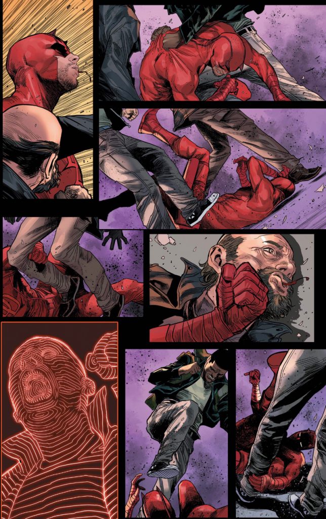
Let’s start with an action scene from #1, and one that ended up being hugely important for this run. I love how you use panels to convey action, like in the second and third where Daredevil’s being thrust downwards, and in the final two panels where we’re getting a look at the beginning of an action and the follow up. When you’re trying to work out a fight sequence like this, how do you sort out which actions to show to convey motion? Is there a right way or wrong way to choreograph an action scene in your mind?
MC: When I have to draw a fight, I like to draw it as fluid I can. I don’t like the scene to start with a punch in the first panel and a kick in the second one. I like to show the pain in the face of the characters and the effect of a punch in the face.
Chip had the same idea, but he used too many panels. (laughs)
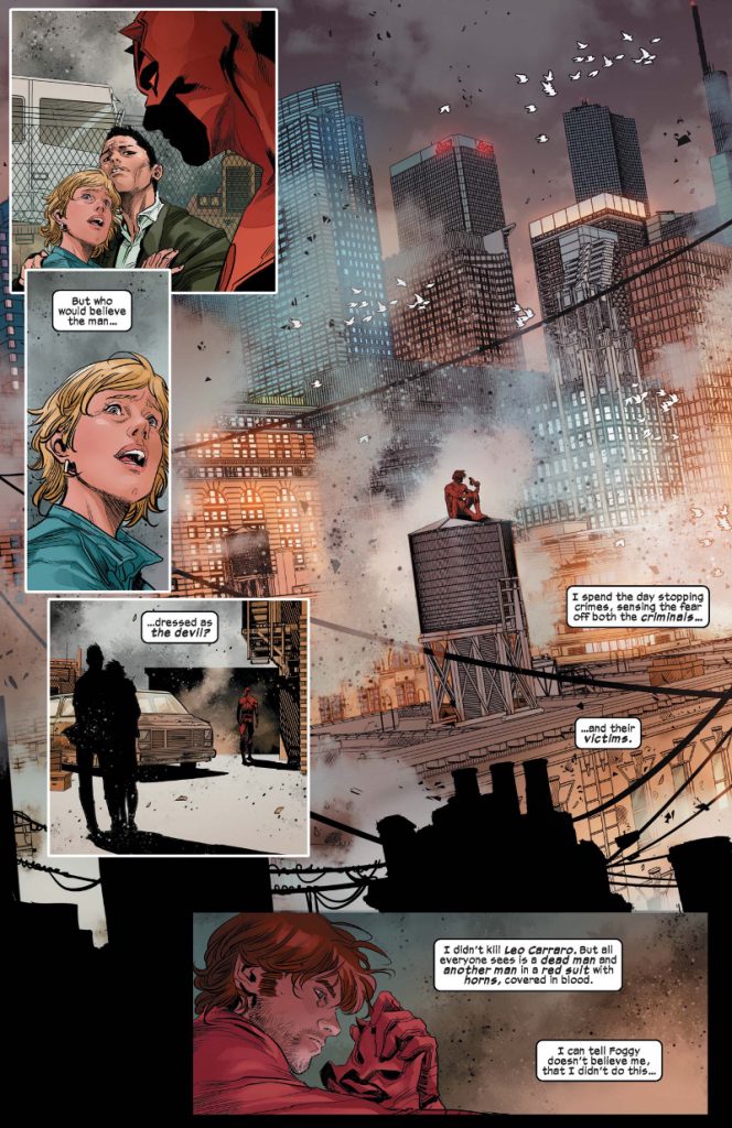
First thing on this page, I wanted to ask about your version of Matt. In a CBR interview, you were inspired by Robert Redford in Three Days of the Condor for the character. How does that play out in this run visually? Is it more of a style thing, a demeanor one or something else?
MC: It’s just a style thing. Matt is a lawyer, okay, but when he’s in a lawyer suit he seems very old. So I decided to draw him more casual to give him a younger and cooler look. Robert Redford is Matt in my mind, ever since I read my first Daredevil comic book. I like him with longer hair and a bit of a beard.
This shot of Matt on the water tower is incredible, with the cityscape of New York dwarfing him. I wanted to ask about the tools you use to bring something like this to life, because New York and Hell’s Kitchen are obviously big parts of Daredevil’s story. When you’re trying to bring a city to life like in this book, are there particular tools, 3D or otherwise, that help in this situation?
MC: Before (we) start(ed) the series, a lot of my time was spent gathering references. I bought action figures, music, movies, comics, books, etc. Anything that could help make my job on the new series easier. For the city of Daredevil, I took a lot of photos in my last trip in New York and I built myself a portion of Hell’s Kitchen in 3D so I can choose the shot I prefer and after that complete the scene with my inks and details.
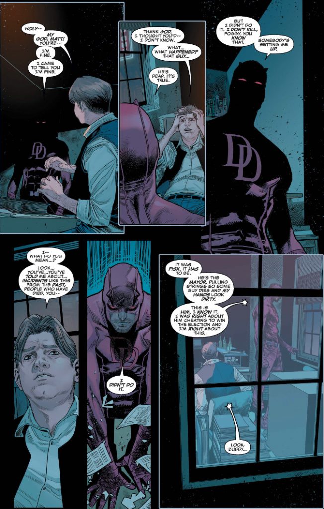
I really like getting that outside view on Matt and Foggy in the last panel. It was a really nice touch, and there are some really nice choices even within it, like having the slat cover Matt’s eyes. I wanted to ask about camera choices and layouts like this one. How do you and Chip work in regards to that? Is it mostly up to you to figure out solutions to how these shots and pages work, or are the scripts pretty specific?
MC: In both cases, (those) were my ideas. After reading the script I usually send the layouts of the pages to Chip and my editors Devin Lewis and Danny Khazem. If they like them, I can finish them all.
This might just be me being weird, but did you make some tweaks to Daredevil’s costume? The pants feel much baggier and, well, realistic here. I like the look. If so, what made you want to change his costume?
MC: I think to give him a more realistic presence and I like to give my vision in all my new projects. All of the series is very realistic, the villains too, and I think we needed a “serious” Daredevil also.
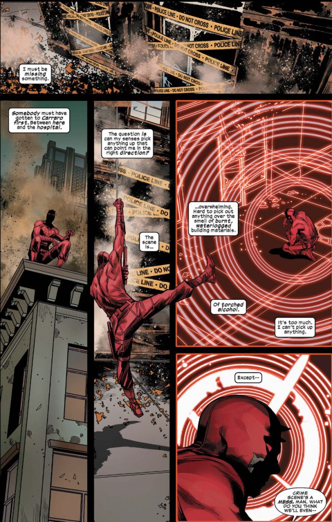
I really liked how Daredevil’s landing in the third panel spills into the other panels around it. It gives the whole page really nice flow. Why do you do something like that? Is there something in particular that you feel the character moving into nearby panels adds to the page?
MC: This is probably my personal feeling in drawing athletic characters. I like to draw them in original poses that we do not usually see. There’s not a plan for that, it’s an instinct.
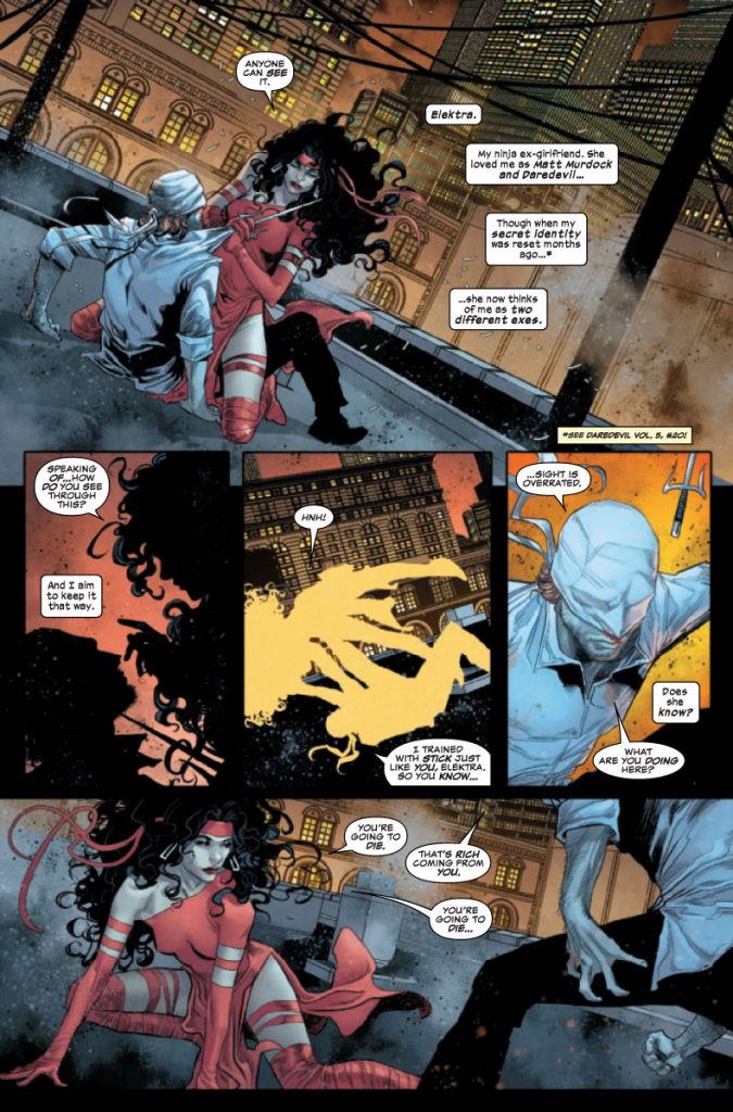
This is from your return issue after taking an arc off. I felt like your first arc found you taking a step up in your work, because it was brilliant, but even this first issue had a slightly different feel almost. Like there’s almost a bit of Joe Quesada’s energy here, particularly with Elektra. Are you trying anything different on this arc and run in general, or does this just feel like the natural evolution of your work?
MC: Every issue will be better and better, just because I take more confidence with the characters and the scripts.
I had a couple questions just about that third panel, but they both tie into the same person: Nolan Woodard, the colorist on this issue. I love how you two rendered Matt and Elektra as yellow silhouettes in that panel. First off, why do that with that panel, and for you, how does Nolan bring the best out of your line work with his colors?
MC: (laughs) My idea was in black/white. Nolan decided (to use) yellow.
I decided for this solution because the panel is too small, but full of things to do. Drawing them in bright light with all the details would have been very confusing. With the black silhouettes, we would have lost them between the buildings or I would have had to cut the background, and so I thought about the solution with the white.