
Razing Canada: Steve Skroce on the Destruction and Storytelling of We Stand on Guard
For artists of all varieties, one of the tricky parts of doing your craft is figuring out which medium you end up bringing it to life in. After all, there’s a multitude of choices. Maybe you end up working in animation, or game development of some variety perhaps. The world of advertising could call to you or maybe you envision yourself as the next Rothko. Movies could be your prospective home, or there’s always good ol’ comic books, the medium we all love. Depending on how you work and your interests, any one of those could be your home.
Steve Skroce is an artist who was lucky enough to make that multiple choice, though. While I knew Skroce as the artist and co-creator of X-Man (Nate Grey to many of you), the filmmakers the Wachowskis knew him as the storyboard artist on films like The Matrix, V for Vendetta and Cloud Atlas. Either one was a career, and for Skroce, he was able to do both. But after nearly a decade of working in the movie business, Skroce made a triumphant return to comics with We Stand on Guard at Image Comics with writer Brian K. Vaughan.
This six issue mini-series told the tale of the freedom fighters standing up for their home of Canada against the villainous invading force of the United States one hundred years of the future, and it’s a pretty rad book. One of the biggest reasons for that was the art. Skroce did not take long at all to remind us of what we missed while he was in the movie business, and even better yet, Skroce clearly picked up a lot in his time working elsewhere. His art was more assured, potent and effective than ever, with storytelling chops that could match anything Vaughan threw his way. Today, we have an art feature with Skroce to talk about his return to comics, why he came back, his process, some of the choices he made in the book, collaborating with colorist Matt Hollingsworth, and much more. Give it a read, and if you missed it, the We Stand on Guard hardcover is out now in comic shops and digital apps everywhere.
Let’s start in the beginning for you, or art wise at least. What drove your development as an artist, and what made you want to apply that craft in the comic form?
SS: Drawing comics was basically all I ever wanted, I joined a comic book club when I was in the second grade and stayed with it my whole life. Super Friends and the Bakshi Spider-Man cartoons introduced me to superheroes and I went looking for more, this led to basement comic swap meets and from there I just started sketching my favorite heroes and never stopped.
A lot of readers know you for the Marvel work you did in the 1990’s – amongst other things – but for the past while, you’ve been storyboarding movies, most notably for the Wachowskis. What drove that decision, and conversely, while you were working in film, were you actively thinking about getting back into comics?
SS: I spent close to a decade doing storyboards for a number of productions but I always told myself that I was just visiting this other creative world. The films I’ve worked on have all been great life experiences but comics is where I belong and I’m thrilled to be back!
When you think of films by the Wachowskis, you rarely think “small” or “simple.” Most of their projects are grandiose and filled with big, diverse ideas. That’s what you’ve been involved with for the last while, and I’m curious, does that experience influence your comic work? Like, did you feel a drive to keep pushing for bigger scope and scale on We Stand on Guard, especially considering the old comic adage of the only limit being a creator’s imagination?
SS: Storyboards have been great for my comics art. When I was younger I’d focus on things that I’d like to draw, like the dynamic action pose of your favorite hero, but sometimes that can limit the storytelling experience of the comic page. To do movie storyboards properly you have to draw everything the script requires you to and then you’ll revise that over and over as the director and production evolve their vision. I’m less precious about every drawings now and more confident about realizing each scene visually, it’s not about just drawing what I like but what’s best for the scene.
So you made your way back to comics with We Stand on Guard. What made that the kind of project that appealed to you as a storyteller? And, be honest, how much did you just want to make sure Brian didn’t completely destroy your homeland of Canada?
SS: I’ve been a BKV fan since the Y days so just working with Brian was the draw and I just loved the concept for WSOG, it was the kind of book that would be on the top of my reading pile even if I wasn’t drawing it. I am all for destroying Canada as long as it’s on the comic book page.
Looking back on the book, how did you and Brian work? What was your process, and are you more of a digital guy or a traditional guy? Or some combination of both?
SS: I think our process was pretty traditional, I’d get a script from him and start sketching pages. His scripts are detailed and concise at the same time, they’re easy to refer to while drawing and you always know where the heart of the scene is.
I moved to digital a couple years ago and there was a time that I thought I’d never do that but digital saves so much time and allows me to put my labor into making the page look as good as I can instead of just spending hours redrawing just to get something to fit into a panel.
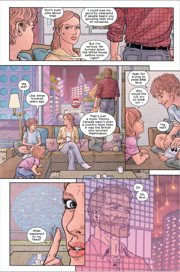
Let’s talk about the future of our world in this book. Obviously a good portion of the book takes place in more rural areas of Canada, but we get a good look at the future of this world and the more things change, the more they stay the same: Tim Horton’s is still front and center in Canada. I have to ask: was that in the script or were you just like, “no one would believe this is Canada without a Tim Horton’s”?
SS: I thought it would be cool to have our country’s most iconic restaurant still going strong 100 years in the future. I hope they’ve solved the problem of their insanely long lines by then.
I really appreciate the character work you do throughout the book. Your characters are very expressive and the interactions between them feel very natural throughout. What do you think is the key to this part of sequential art? To breathing life into characters without making them seem over the top?
SS: That’s something I really work hard on, I do multiple sketches of potential facial expressions while referring to the script over and over, then I’ll do reference photos of myself with my phone once I think I know how the characters would emote. That reminds me, I need to erase those photos!
Naturally I pick the mostly white page to talk colors, but it does a good job of showing the depth colorist Matt Hollingsworth brings to even simple pages. What is it about Hollingsworth that you feel complements your work so well?
SS: Hollingsworth is a genius! A lot of colorists are great at technique and rendering and can over color something so that it becomes gaudy, what separates Matt is that he’s a master at technique but he instinctively understands drama, his colors always add to the tone of the story and never muddies an image. I was super lucky to get him for WSOG.
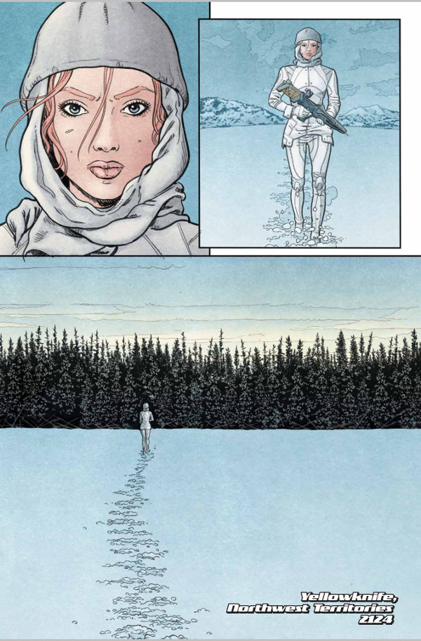
The environment is a huge part of this story. Amber’s familiarity with it is one of her major advantages. That’s an advantage for you too as a Canadian artist. It’s an area you’re familiar with. As a Canadian, did you want to be as reflective of what your country was really like as possible, like in representing what the area of Yellowknife looks like? Or were you just trying to be as generally accurate as possible?
SS: Honestly, I don’t know if I totally stuck the landing in terms of the accuracy of the Yukon’s terrain. I used the web for most of my reference and it wasn’t as detailed as I’d hoped, I met a guy at a signing who’d lived up there and he told me I hadn’t done too bad but the trees there are kind of skinny and not thick trunked as I’d drawn them. Can’t win them all I guess.
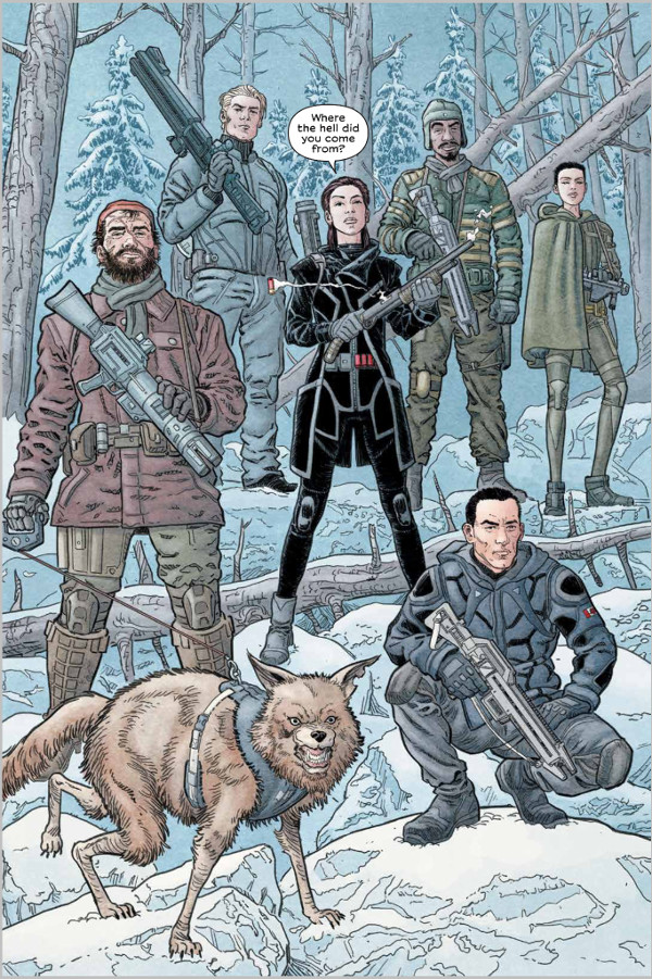
This is our first big look at the Two Four, and I love their varied outfits. When it came to designing the cast, how did the individual personalities and the terrain in particular inform their look? And did anything from the real world inform this part of your process?
SS: I wanted their outfits to feel utilitarian and plausible but still have something futuristic about them. My only regret was Hungry’s, the coy wolf, leash. Brian described a chain and I wound up drawing what was the same leash that I use for my beagles. Looking back I think a chain would have been cooler!
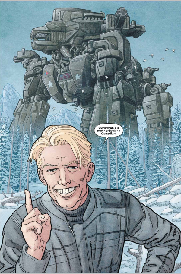
While there are a lot of reasons this book and your work in it stands out, I have to say, you make some wicked mechs and monster machines. I asked about pushing the scope and scale of the story earlier on, but looking at this, you see that realized in a major way. When it came to developing these beast machines, how much design work did you go through, and was this something you talked out ahead of time with Brian?
SS: It was very challenging, there are so many wonderful mech designs out there, I was having trouble coming up with something that would stand out. Brian had a great note. He mentioned that the last mech that had really wowed him was the AT-AT from Empire, that started us thinking about having an animalistic element and about generationally loved popcorn movies. The result was a mech that’s part King Kong and part Godzilla, the idea being the military industrial complex’s pop culture influences had been disseminated into the designs of their war machines. There’s a bit of Giger’s alien in the robo dogs as well.