
The Fear and Freedom of Southern Cross with Andy Belanger
Talking the art and influences of a top Image title with its artist and co-creator
We’re lucky as comic readers. In today’s era of comics, there are more genres covered than ever. Typically, if you want to read something of a specific type, you can because of that diversity. Still, there are some gaps, and for me, one of the gaps I wanted to see filled was sci-fi with a more psychological, horror like vibe. Think Alien or Blade Runner. It’s something that fits the comic genre well, but not something we would see a whole lot.
Over at Image Comics, they now have a couple books that scratch that itch for me. One is Drifter from Ivan Brandon and Nic Klein, and it’s a hell of a thing. Another, and the one we’re going to be focusing on today, is Southern Cross from Becky Cloonan and Andy Belanger. It’s a book that takes place in space, but it’s as much a story of the human mind and the dark places it can go as it is a straightforward sci-fi tale. Its currency is dread, and its coffers are full. It’s an exceptional book that continues this week, as its fifth issue is dropping Wednesday.
As a fan of the book – especially its art from Belanger – I wanted to learn more about where the book came from and what goes into its look and feel. So today, you can read my conversation with Belanger about the story he and Cloonan are creating together, what goes into it, what inspired them to tell this story, the powers of Lee Loughridge, food in science fiction, Paul Verhoeven, and much more. It’s a great look into his work and into a book that has been really impressing.
Let’s start with a question of fit. What appealed to you as an artist about Southern Cross from the beginning? Were you a fan of the more psychological side of science fiction before – Alien comes to mind in specific – or was it more you and Becky looking to do a character piece in a unique setting?
AB: What can I say? I’m a huge kid of the 80’s. It’s where I got my love for comics and film. The summer of ’82 had pretty much my all time favourite movies besides the Shining. Road Warrior, Conan, The Thing, Wrath of Khan, BLADE RUNNER. It was a magical time. Film felt creative, it took chances. Blade Runner was a box office flop but maybe the greatest and most influential sci-fi film ever made. I was just getting into comics at the time and it was all Tomb of Dracula, Werewolf by Night and of course Creature Commandos.
I fell in love with the filmmaking and science fiction of this era. Now being in the biz you realize where these came from. The designers! Moebius, Giger, Foss, Mead, the crew that started with Jodorowsky and then worked with Scott. Mind blowing, life changing work! This is the playground I wanted to work in. I feel like everything in my career so far was a training ground and it was time for people to see what I can really do. I wanted to draw a sci-fi/lo-fi (lo-tech) horror mystery with a very European feel. I think I was about 11 when I discovered Heavy Metal and Metal Hurlant. Incredible stories and artists that blew my mind. They had worlds to their books, lush backgrounds adult stories and yes…sex! Superheroes were done for me from then on. These books took you to places. They weren’t just a pose or shot of a guy in tights.
On a side note to that, I think that is what we need to work on in the comics industry today. I really feel Marvel and DC over the last 30 years since the Frank Miller/Alan Moore era have forgotten that their product is for kids. It’s where readers of our medium start. Batgirl never needed to get sexually assaulted by the Joker. Look at WWE. As soon as they went PG from the Attitude era they turned into a billion dollar industry. Kids and parents can go to the matches together. WWE understood their product.
DC had Vertigo for the adult titles and superheroes for the kids and all ages. When comic companies think kids, they make books like Duplo instead of Lego. Kids don’t want to be talked down to. They want to reach for the top shelf. But these companies can do it without going over the top with swearing, sex and violence. That’s what Vertigo was for. To grow your market inside the company and give adult content to the 18 to 35 market. Neglecting the younger readers have left the industry with next to no readers. Check out the numbers. It’s not something that has happened over night but I’d say over the last 30 years. A slow death.
That’s why I LOVE IMAGE!!!!! Love it!!!! I feel like it’s a driving force to create a market more akin to Japan and Europe where a crime drama, basketball or a cooking comic have the potential to be the hottest comic on the market. I love genre fiction and I want to help be a driving force in North America to break the stigma that comics are only tights. I’ve felt like this since I found Moebius! I wanted to make a comic that reflected some of the design and storytelling I love. And in doing so I think I’ve started to find a real voice and language to my work. Tropes that set my work apart and make it crazy fun to work on. So…getting back to your question here (laughs)…
About a year and a half ago I got the idea to work on something that would look like this. An Alien, Blade Runner-esque haunted house (or on a space ship) opus. I did all kinds of design work while I was wrapping up on a series for IDW. Ships, blueprints, character designs. All kinds of really fun stuff that you dream about drawing as a kid. I was creating a world. But I knew I needed to work with a writer that could bring some real magic to it. Becky came on board with some amazing ideas. When we first started pitching, I would pitch it as The Shining on a haunted space ship. She would pitch it as Poirot on a haunted space ship. It was great! I also feel Becky is bringing in a lot more personal things then a lot of people know. But I’m also speculating. The readers are not the only ones who like to be surprised. I always know the overall story but I like being surprised too. It makes drawing it fun! And scary. We are trying to get under your skin after all!
With both of you being Studio Lounak-ers and friends, how does that change the creative process of creating an issue of Southern Cross for you and Becky? What’s your process for bringing an issue to life, and do you both talk out story and art choices together before hand at all?
AB: Becky and I have a long history and we know each other better than anyone could. Especially when it comes to work. I know how she works and she knows how I work. We try not to get too involved with what each other do. That being said we talk story and art all the time. We have the same views on storytelling and talk a lot about that. We like things subtle and we like things that make the reader work, or at least get involved and think about what comes next. We don’t want to show you the monster. We want you to get involved and imagine. That’s the power of reading. I find it funny when people are reading a mystery and write in asking for more answers. That’s when we know it’s working.
Obviously she’s a brilliant artist as well, but how did you two decide for Becky to provide covers for the series versus you doing them yourself? Was it more of a question of expedience given your other duties, a byproduct of Becky’s skills as a cover artist or some combination of both?
AB: Ha! this one is pretty easy! She’s amazing at covers and it gives her a chance to work those muscles and get some art on the series. I asked her if I remember correctly. I just thought she would do amazing covers and I wasn’t wrong. The covers have been insane and the cover for six is from another planet good. That being said I do most of the art for the fake ads in the back. The world building stuff. Give it a real Verhoeven feel or ode to!
What are your choice tools of the trade? Are you a purely digital guy, all traditional or do you work with both to create your art?
AB: I’m traditional all the way! I sit and hand draw all of those little dials and buttons. I did start working bigger on this series though – 13″ by 19″. I have a real heavy hand when I ink so started working bigger to get the lines a bit finer when the page gets zapped down to comic size. I use mostly Japanese brush pens from Jet Pens. Dave Johnson got me hooked on them. Lee Loughridge does all my colours and rocks the house at that.
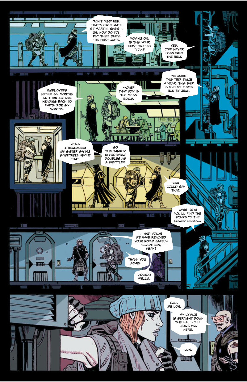
I love this page. There are actually several pages in this first arc that are much more 2D (well, side scrolling 2D, at least), but this one is my favorite. I really like it because it makes the ship feel lived in and more real, but at the same time, it just looks cool as hell. Is this type of thing maddening as an artist, digging into all of that detail and trying to make it all make sense? Or do these keep coming up in part because you love doing them?
AB: The whole idea behind these type of shots points right to one of the most important parts of the story and that’s that the Southern Cross is a character. The side scrolling shots add to the feeling of claustrophobia and give a great sense of scale. They also are an ode to old video games. In particular, my first favorite game Impossible Mission for the Commodore 64. Expect a lot more of this storytelling device. I’ve only started to play with this.
Let’s talk about Lee Loughridge. He’s undoubtedly one of my favorite colorists, but what made him the right person to color Southern Cross, and what does he do to bring the best out of your art?
AB: Lee is amazing! I really got into his work on Deadly Class! The thing with coloring for me is I always think when my work is colored with a lot of rendering (or comics in general) it all prints too dark like mud. Becky and I wanted a flat color look and an artist who really is talented at putting colors together. After we got the first issue back we were sold. He not only solved the “Too Dark Problem” but his coloring is all moody and story based. He knows the perfect scheme for the perfect scene! The flat color style also gives it a bit of an 80’s feel too that I like!
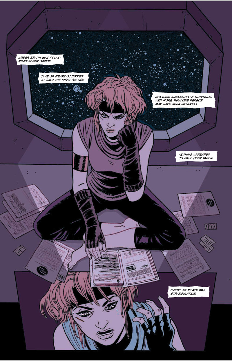
Shapes. There are lots of atypical shapes on this page and throughout this book – I actually didn’t really notice it until I was rereading it – from things like the window frame out into space and the trapezoidal panel at the bottom. Was that a deliberate choice? Was it something you were doing to make it feel more futuristic, or am I just reading way too much into that?
AB: In my storytelling, I like to build layouts based on the mood of the scene. Or I use it to build crescendo, start off with very orderly, 90 degree panel designs and then as the scene gets crazier, like when the Gravity Drive goes insane, I start bending and twisting. The angles for the most part are used to draw and lure the eye through the page and through the story but when she starts to trip out in issue 4, for instance, I deliberately designed them to make the reader work and hopefully create an awkward read to add to the severe confusion of the scene. Doing layouts is like writing music and is the hardest part of the process and has the most room for creativity.
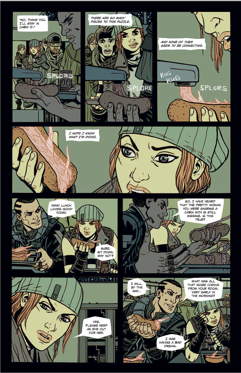
As a food lover, I have to ask: what the hell is Alex getting to eat? It’s like liquid hot dog. I both find it deep disturbing and I want to try it. Also, how much thought do you put into small decisions like that? Was that something you put time into discussing with Becky, or were you guys just like “plasma hot dog, go?”
AB: Food is always Becky and I’s favorite part of world building. Twin Peaks has it’s Coffee and Cherry Pie, Harry Potter has it’s Bertie Botts Every Flavor Beans. I really feel food is a great way to get people in to a story and we talked a lot about that. Wait ’til you see what’s coming in the second arc!
I really enjoy the style of Southern Cross. Every character seems to have their own little flourishes, from Alex’s headwear to Lon’s glasses. How important to you is it to give each character their own visual identity, and did you have any particular influences for the looks of Southern Cross?
AB: I spent a ton of time on character design and each character had about three different designs to them. The idea was to take Au couture fashion and mix it with Lo-Fi tech. I remember I had Braith all designed and then Becky stuck a toque on her on the front cover. So I was like “I guess she wears a Toque now?” I really like it. The little red stripe was a nice touch. It’s super important to have each character have their own look and I added a bunch of early Image comics costume Easter Eggs in the story. Southern Cross is also different from a lot of sci-fi in that our designs are quite bulky where most other stories have the classic body suit. Space is cold!
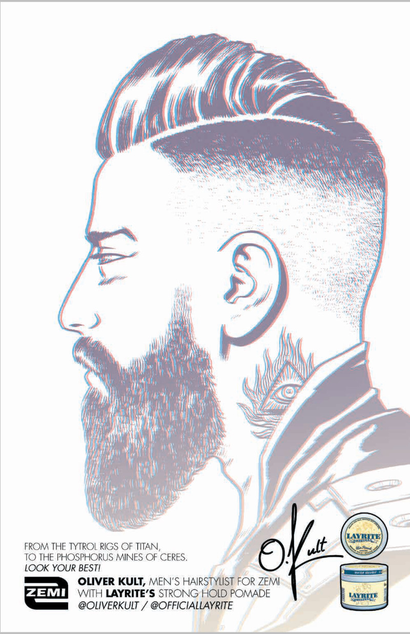
I really love the ads at the end of each issue. They’re really great, and sometimes, they make me really want to sign up for the products (who couldn’t use some strong hold pomade from time to time). How did you two decide to include those? Did you have a particular inspiration, or were they just a cool idea for additional world building in the story?
AB: Southern Cross is really an ode to the films of the 80’s and I thought fake ads would be a great way to add to the world building. Kind of like Robocop had the Yamaha Sports Heart we have ads for shoes and products as well as ads for ZEMI! ZEMI is the oil company running shipments back and forth to Titan. We like to get a little Verhoeven around here!
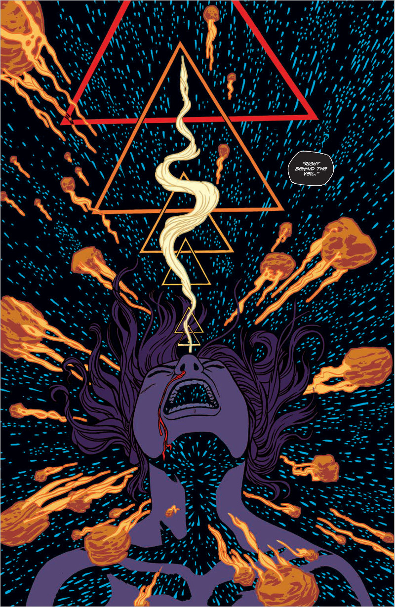
I’d be remiss if I didn’t ask about this page. It’s one of several that really remind me of crazy sci-fi hybridized with Heavy Metal influences. In short, this page was probably your jam. I’m curious as to your process for a page like this. It’s storytelling, for sure, but less traditional than other pages we’ve looked at. How do you approach a page like this, and does it lead to a lot of stressing over achieving what you’re really looking to do?
AB: What can I say? I have a passion for psychedelia. I have always had great ideas for pages like this. Basically blow out montage pages. They are meant to hit you in the face and make you react. This one in particular I think I was thinking about that final scene in 2001: A Space Odyssey. When he’s flying through space and time. It’s like the Gravity Drive is unlocking some new consciousness. These pages are always great to compose and can be quite powerful. The key is not to use them too much! Montage style storytelling has a time and place in the story. It’s weapon in your arsenal!
All pages in article by Becky Cloonan, Andy Belanger, Lee Loughridge and Serge LaPointe and from Southern Cross.